

 TL;DR:
The hex code #FF7A00 serves as a bold, action-oriented digital orange best utilized sparingly for UI highlights and calls-to-action to project momentum without the harsh urgency of pure red.
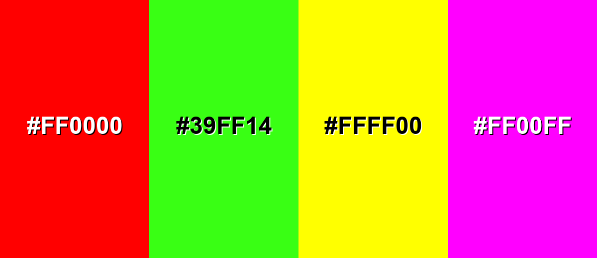
● Establish a crisp visual hierarchy by pairing orange with cool blues, but strictly avoid pure red (#FF0000), neon green (#39FF14), and pure yellow (#FFFF00) to prevent visual vibration and legibility loss.
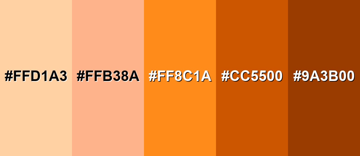
● Apply specific shades based on context: reserve vivid tangerine (#FF8C1A) for high-attention icons, utilize deeper burnt orange (#CC5500) for grounded editorial richness, and use light peach (#FFB38A) for approachable lifestyle backgrounds.
● Prevent visual fatigue and accessibility failures by restricting highly saturated orange to small UI elements and pairing it with off-white or near-black text instead of mid-gray backgrounds.
Ask AI for a summary
 ChatGPT
 Perplexity
 Gemini
 Claude
 Grok
Grok
Orange is a bright, warm hue that sits between red and yellow, often resembling citrus peel, marigolds, and glowing sunsets. A common digital orange is #FF7A00, which reads as bold and energetic on screens.
Many people associate it with friendliness, enthusiasm, and action. Below, you'll find orange color codes, conversions, pairings, shade ideas, and practical tips for using it in design.
Orange Color: Codes & Values
These are the most-used orange color codes for web, UI, and print so you can match the same hue across tools and platforms.
| Parameters | VALUE |
| HEX Code | #FF7A00 |
| RGB DECIMAL | 255, 122, 0 |
| RGB PERCENTAGE | 100%, 48%, 0% |
| CMYK | 0%,52%,100%,0% |
| HSL | 29°, 100%, 50% |
| HSV (HSB) | 29°, 100%, 100% |
| Web Safe | #FF6600 |
Key Color Space Explanations:
- HEX - HEX is the most common way to specify orange for web pages and apps. It encodes the red, green, and blue channels as a six-digit value.
- RGB - RGB describes orange as a mix of red, green, and blue light. It is the standard for screens, UI components, and digital graphics.
- CMYK - CMYK is used for print and refers to cyan, magenta, yellow, and black ink percentages. It helps you predict how orange may shift when printed on different papers.
- HSL - HSL expresses orange by hue, saturation, and lightness, which is convenient for creating tints and shades. It is often easier to adjust for themes and design systems than RGB.
- Web Safe - Web safe is the closest palette used by older displays and limited-color systems. It can help when you need a simplified, broadly compatible orange.
Use HEX or RGB for websites and apps, switch to HSL when you need easy light/dark variations, and rely on CMYK when preparing files for print.
Orange Color Conversions
If you're moving between design software (or from digital to print), this conversion table helps you keep orange consistent.
| Parameters | VALUE | CSS |
| HEX | #ff7a00 | #ff7a00 |
| RGB DECIMAL | 255, 122, 0 | rgb(255,122,0) |
| RGB PERCENTAGE | 100%, 48%, 0% | rgb(100%,48%,0%) |
| CMYK | 0%,52%,100%,0% | cmyk(0%,52%,100%,0%) |
| HSL | 29°, 100%, 50% | hsl(29°,100%,50%) |
| HSV (or HSB) | 29°, 100%, 100% | -- |
| Web Safe | ff6600 | #ff6600 |
| CIE-LAB | 65.1, 47.0, 76.3 | -- |
| XYZ | 53.2, 43.1, 6.2 | -- |
| xyY | 0.52, 0.42, 43.1 | -- |
| CIE-LCH | 65.1, 89.6, 58.4° | -- |
| CIE-LUV | 65.1, 93.8, 55.4 | -- |
| Hunter-Lab | 65.7, 36.1, 70.2 | -- |
| Binary | 11111111 01111010 00000000 | -- |
Want to generate Orange Color photos or posters? Try Media.io's AI Image Generator now!
Orange Color Meaning & Symbolism
Orange commonly represents warmth, optimism, and momentum. It feels more playful than red and more energetic than yellow, which is why it often shows up where you want quick attention. In everyday life, this translates to a sense of friendliness and action, from signage to app buttons and sports branding.
Psychological Effects
Orange tends to read as lively and inviting, especially when used as an accent.
- Liveliness - Helps a space or interface feel upbeat, social, and welcoming.
- Motivation - Often nudges people toward action, which is why it works well for CTAs and highlights.
- Approachability - Can feel friendly and confident without the intensity of pure red.
- Youthful Energy - Frequently reads modern and accessible when paired with clean typography and whitespace.
- Visual Fatigue Risk - Overuse (especially at high saturation on big areas) can feel loud or tiring, so balance it with neutrals or cool tones.
Positive Associations
In everyday design language, orange often signals optimism and "good energy."
- Warmth - Brings a cozy, sunlit feeling that makes visuals feel more human.
- Optimism - Suggests a positive, forward-moving mood that keeps layouts light and upbeat.
- Friendliness - Can make brands and interfaces feel approachable and less formal.
- Enthusiasm - Adds pep to banners, badges, and promos without relying on red's urgency.
- Momentum - Works as a "push" color for progress states, notifications, and key UI moments.
Cultural Significance Across the World
Orange can carry extra meaning depending on place, tradition, and context.
- Harvest Season - Often linked to autumn themes like pumpkins, warmth, and seasonal abundance.
- Visibility - Common in safety gear and signage because it stands out quickly at a distance.
- Celebration - In some settings, it can feel festive and energetic for events and promotions.
- Spirituality - Certain cultures associate orange with spiritual meaning, so it's worth considering your audience when choosing it for identity work.
Design Applications
Orange is most effective when you need emphasis without relying on pure red. The key is controlling saturation, contrast, and surrounding tones so it stays clear and intentional.
Graphic Design Tips
- Use orange for primary actions, badges, or highlights, and keep large areas more muted to avoid visual fatigue.
- Pair orange with cool hues (especially blues) to create crisp separation and stronger hierarchy.
- Reserve the most saturated orange for small, high-value elements like buttons, icons, and progress states.
- When orange sits near light neutrals, check contrast so key labels and UI states stay readable.
- For charts and infographics, use orange as a "pop" category, then support it with calmer tones so the full graphic stays balanced.
If orange is used as a background, choose off-white or near-black text (not mid-gray) to keep readability strong across different screens.
Orange Color in Photography & Video
- Use orange accents (props, wardrobe, signage) to create an instant focal point without overwhelming the frame.
- For warm scenes like sunsets or indoor tungsten light, reduce saturation slightly so skin tones don't skew too orange.
- When color grading, balance orange highlights with cooler shadows to keep the look clean and cinematic.
- For product shots, place orange against deep neutrals to boost perceived contrast and edge clarity.
- In motion graphics, keep bright orange for short bursts (lower thirds, icons, progress) so it stays punchy and not exhausting.
Recommended Tool for Image Enhancement: When incorporating orange color into your photography projects, Media.io's AI Image tools can help you achieve more refined results. With AI-powered color enhancement, photo colorization, image upscaling, and old photo restoration, you can easily enrich orange color tones, improve overall image quality, and highlight the color's elegant and sophisticated aesthetic.
Color Combinations
Orange pairs well with both cool and warm palettes, depending on whether you want high contrast or a softer, sunlit feel. Use the schemes below to build consistent UI themes, posters, and brand palettes.
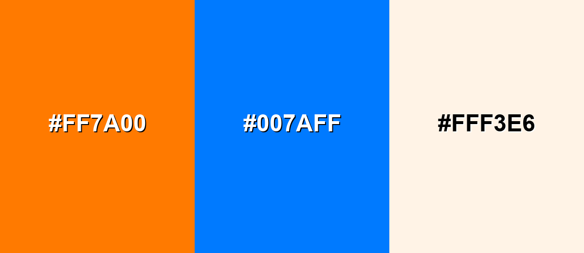
Complementary Colors
A complementary pairing uses opposite hues to create strong contrast and immediate focus. Orange and a vivid blue work especially well for buttons, highlights, and hero sections.
Complementary Palette Example: Try orange as the accent, blue as the anchor, and a warm off-white to keep layouts breathable.
Analogous Color Schemes
Analogous colors sit adjacent to each other on the color wheel, creating harmonious, cohesive palettes with subtle variation.
Orange with amber and red-orange creates a hot, energetic gradient that feels bold and expressive.
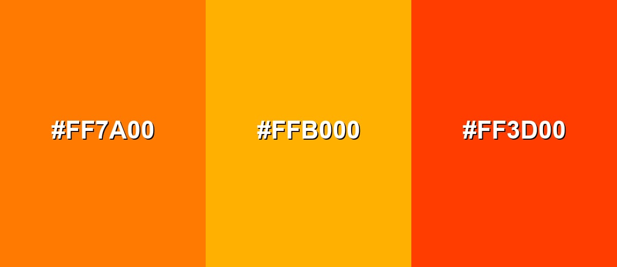
- Orange: #FF7A00
- Amber: #FFB000
- Red-Orange: #FF3D00
A softer analogous set with golden peach tones is friendly for lifestyle visuals and warm UI accents.
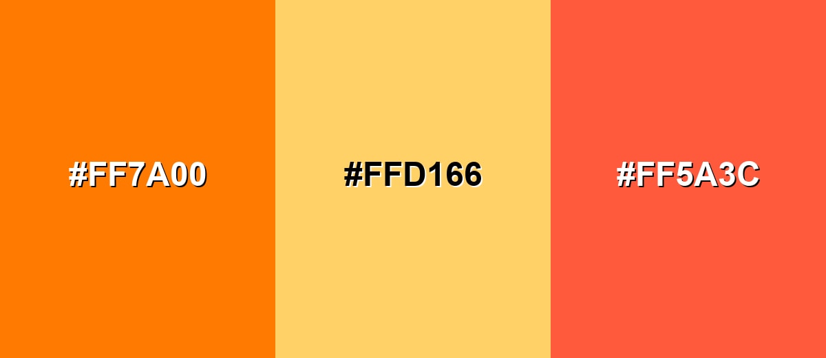
- Orange: #FF7A00
- Golden Peach: #FFD166
- Coral: #FF5A3C
Triadic & Tetradic Combinations
A triadic scheme balances three hues evenly spaced on the wheel for a lively but controlled look.
Orange, teal-green, and violet can feel modern and creative when one tone leads and the other two support.
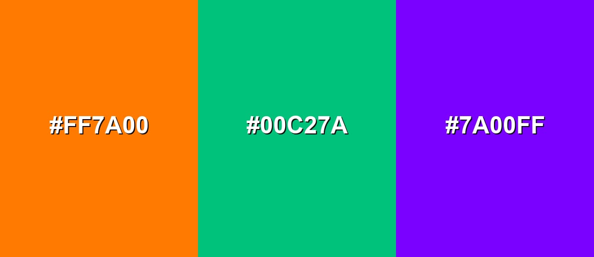
- Orange: #FF7A00
- Teal Green: #00C27A
- Violet: #7A00FF
Colors to Avoid
While orange color is remarkably versatile, certain combinations can create problematic visual effects:
- Pure Red (#FF0000) - Next to orange, pure red can create a harsh, overheated look and reduce clarity in UI highlights.
- Neon Green (#39FF14) - The combination can feel visually vibrating and distracting, especially for text and small icons.
- Pure Yellow (#FFFF00) - Yellow and orange together may lack contrast, making elements blend and reducing legibility.
- Hot Magenta (#FF00FF) - Both are high-energy hues, and used together they can feel chaotic unless carefully muted and spaced.
Shades, Tints & Variations of Orange Color
Orange has a surprisingly wide range—from soft, creamy tints to deep, earthy shades. Knowing these variations makes it easier to control mood, contrast, and readability across UI, branding, and print layouts.
- Light Orange (#FFD1A3) - A soft tint that keeps the warmth of orange but feels airy and gentle. It's best used for Backgrounds, cards, and subtle highlights in warm-themed interfaces..
- Peach (#FFB38A) - A friendly, skin-toned orange that reads approachable and comfortable. It's best used for Lifestyle branding, gradients, and welcoming landing page sections..
- Tangerine (#FF8C1A) - A vivid mid-orange that stays bright without leaning too red. It's best used for Buttons, icons, and emphasis elements that need quick attention..
- Burnt Orange (#CC5500) - A deeper, earthier orange with a grounded, mature feel. It's best used for Headers, packaging, and autumnal palettes that need richness..
- Deep Orange (#9A3B00) - A dark, strong variant that adds weight and contrast. It's best used for Text accents, outlines, and UI states where brighter orange is too intense..
Industry Applications
Because it is warm, noticeable, and action-oriented, orange appears in many industries where clarity and energy matter. It can be playful or professional depending on the shade and what you pair it with.
Fashion & Beauty
- Use orange accents to add energy to seasonal collections, especially for sporty and streetwear-inspired drops.
- Peachy oranges can feel soft and approachable for wellness, skincare, and "clean beauty" visuals.
- Burnt orange reads more premium and grounded, working well for autumn palettes and editorial styling.
- In lookbooks, keep orange as a highlight color and let neutrals do the heavy lifting for balance.
Interior Design & Decor
- Orange works well as an accent (pillows, art, lamps) to warm up rooms without overpowering the space.
- Pair orange with cooler blues for crisp contrast and a clearer visual hierarchy in modern interiors.
- Use lighter tints for backgrounds and walls when you want warmth with less intensity.
- For cozy, earthy rooms, deeper oranges can add richness alongside wood tones and warm neutrals.
Branding & Marketing
- Orange is a strong choice for CTA buttons, badges, and promo banners when you want a friendly push toward action.
- In e-commerce, orange can make sale tags and limited-time offers stand out without the urgency of red.
- For food and beverage, orange accents often suggest warmth, appetite, and freshness alongside clean neutrals.
- In education and kids-focused products, orange helps visuals feel cheerful, approachable, and easy to engage with.
Conclusion
Orange is a warm, energetic color that feels friendly while still demanding attention—making it a smart choice for UI hierarchy, memorable branding accents, and dynamic visuals. Start with #FF7A00 for a bold, modern orange, then adjust lighter or deeper depending on contrast and mood. When you balance orange with neutrals (for breathing room) or cool blues (for crisp separation), it becomes easy to use without overwhelming your layout—whether you're building a landing page, a poster, or a print-ready palette.
Design Smarter with AI: Media.io is an online AI studio that empowers creators with advanced image generation and enhancement tools. From text-to-image and image-to-image creation to AI upscaling and color optimization, it enables fast, creative, and professional results—all in your browser.

Frequently Asked Questions About Orange Color
Here are quick answers to the most common questions about using orange color in digital and print design.
Orange is a warm hue between red and yellow. It often looks like citrus peel, pumpkins, marigolds, and sunset light, with a bright, inviting presence.
Orange is commonly associated with enthusiasm, friendliness, warmth, and action. In design, it often signals movement, emphasis, or a positive nudge to engage.
A widely used digital orange is #ff7a00. It is vivid and high-contrast, making it a popular choice for accents like buttons and highlights.
Cool blues are a classic match because they create strong contrast and clear hierarchy. Warm neutrals and soft ivories also help orange feel balanced and polished.
Use it in smaller doses for key elements, then support it with neutrals and plenty of whitespace. Choosing a softer tint or a deeper burnt shade can also reduce intensity while keeping the warmth.
Orange can work well, but it depends on contrast with the background. For text and critical UI states, use darker variants or pair orange elements with deep neutrals or complementary backgrounds to maintain legibility.


