

Blush pink color is a gentle, muted pink that looks like a natural rosy flush on skin, softened with a touch of warmth. A common reference point for this tone is #f2b5c4, which sits between pastel pink and dusty rose.
It's often read as tender, comforting, and romantic without feeling overly bright. This guide breaks down its meaning, codes, best combinations, shades, and practical uses.
Blush Pink Color: Codes & Values
If you want blush pink to look consistent across screens and print, start with these core values and build your palette from there.
| Parameters | VALUE |
| HEX Code | #F2B5C4 |
| RGB DECIMAL | 242, 181, 196 |
| RGB PERCENTAGE | 95%, 71%, 77% |
| CMYK | 0%,25%,19%,5% |
| HSL | 345°, 70%, 83% |
| HSV (HSB) | 345°, 25%, 95% |
| Web Safe | #FFCCCC |
Key Color Space Explanations:
- HEX - HEX is the most common way to specify blush pink in digital design, using a six-digit code for screen display. Use it in CSS and most design tools for consistent results.
- RGB - RGB mixes red, green, and blue light to produce the shade on screens. It is useful for UI work, motion graphics, and any display-based workflow.
- CMYK - CMYK is used for print and describes how inks combine on paper. It helps you estimate how blush pink will reproduce in brochures, packaging, and stationery.
- HSL - HSL describes hue, saturation, and lightness, which is convenient when building tints and shades. It also makes it easier to adjust softness while keeping the same pink family.
- Web Safe - Web safe is the closest legacy-safe approximation for older displays and palettes. It is mainly helpful for quick matching or when you want a simpler fallback.
Use HEX/RGB for anything screen-based, then switch to CMYK for print prep—especially if you're building stationery, labels, or packaging that needs reliable reproduction.
Blush Pink Color Conversions
These conversions make it easy to match blush pink across design tools, color pickers, and production workflows.
| Parameters | VALUE | CSS |
| HEX | #f2b5c4 | #f2b5c4 |
| RGB DECIMAL | 242, 181, 196 | rgb(242,181,196) |
| RGB PERCENTAGE | 95%, 71%, 77% | rgb(95%,71%,77%) |
| CMYK | 0%,25%,19%,5% | cmyk(0%,25%,19%,5%) |
| HSL | 345°, 70%, 83% | hsl(345°,70%,83%) |
| HSV (or HSB) | 345°, 25%, 95% | -- |
| Web Safe | ffcccc | #ffcccc |
| CIE-LAB | 82.10, 23.80, 3.20 | -- |
| XYZ | 63.85, 58.92, 60.14 | -- |
| xyY | 0.34, 0.31, 58.92 | -- |
| CIE-LCH | 82.10, 24.02, 7.70 | -- |
| CIE-LUV | 82.10, 39.20, 4.10 | -- |
| Hunter-Lab | 76.74, 14.85, 2.05 | -- |
| Binary | 11110010 10110101 11000100 | -- |
Want to generate Blush Pink Color photos or posters? Try Media.io's AI Image Generator now!
Blush Pink Color Meaning & Symbolism
Blush pink is widely associated with softness, warmth, and gentle care. It often signals approachability and sincerity, which is why it appears so often in beauty, lifestyle, and celebration visuals. In everyday life, it can feel like a quieter alternative to brighter pinks, keeping the mood calm and polished.
Psychological Effects
Because it's light and muted, blush pink tends to calm a layout rather than energize it.
- Reduced Visual Intensity - Blush pink tends to reduce visual intensity, helping designs feel friendlier and less demanding.
- Comfort & Ease - It can make people linger and feel at ease when the goal is a gentle, welcoming mood.
- Clean & Delicate Impression - Its light, muted character can suggest cleanliness and delicacy in a subtle way.
- Soft First Impression - It supports personal care, wellness, and event branding where a softer introduction matters.
- Needs Structure - Without contrast, it may read as overly sweet, fragile, or indecisive, so stronger neutrals or deeper accents help.
Positive Associations
These are common "good" reads designers lean on when blush pink is part of the palette.
- Softness - It's widely associated with softness, creating a gentle tone across visuals.
- Warmth - The warmth in blush pink helps it feel human and inviting rather than cold.
- Gentle Care - It often signals gentle care, aligning well with wellness and personal-focused design.
- Approachability - Blush pink can feel approachable and sincere, making brands seem more personable.
- Romance & Celebration - It commonly supports romantic and celebratory themes without the intensity of brighter pinks.
Cultural Significance Across the World
Like most colors, interpretation depends on context—palette, typography, and imagery all shape the final message.
- Modern Romance - In many modern contexts, blush pink is linked to romance, tenderness, and celebration.
- Fashion & Cosmetics Influence - Its popularity is strongly influenced by fashion and cosmetics, where it reads soft and flattering.
- Audience-Dependent Meaning - Meanings can vary by audience, so it's best to design for your specific viewers.
- Context Sets the Tone - The surrounding palette, typography, and imagery help determine whether it feels calm, premium, or playful.
Design Applications
Blush pink works best when you want a gentle, human feel without loud saturation. It's especially effective when you balance it with neutral anchors and clear hierarchy.
Graphic Design Tips
- Use As A Soft Base - Treat blush pink as a background, label tint, or secondary tone so it supports content instead of competing with it.
- Anchor With Darker Neutrals - Pair it with a darker wordmark or crisp neutral to keep logos readable at small sizes.
- Build Calm Sections - Use it for subtle banners, gentle dividers, and supportive surfaces to add warmth without noise.
- Keep Contrast Intentional - Reserve deeper tones for typography and key UI elements so the layout stays clear and polished.
- Proof For Print - Test a proof, since light pinks can shift on different stocks and finishes.
Pro tip: if blush pink starts to look "washed out," don't add more saturation—add structure instead (darker text, a deeper accent, or a clean neutral) so the softness feels modern and intentional.
Blush Pink Color in Photography & Video
- Flattering, Natural Warmth - Use blush pink styling to create a gentle warmth that feels like a natural rosy flush.
- Watch Lighting Shifts - It can appear more beige in warm light and slightly cooler in shadow, so set white balance with care.
- Soft Overlays & Backgrounds - Try blush pink overlays or backdrops for lifestyle and celebration visuals where you want a calm mood.
- Pair With Stronger Accents - Add deeper accents for structure so soft scenes don't feel overly sweet or fragile.
- Refine In Post - Gentle enhancement can help keep blush tones clean and consistent across a series.
Recommended Tool for Image Enhancement: When incorporating blush pink color into your photography projects, Media.io's AI Image tools can help you achieve more refined results. With AI-powered color enhancement, photo colorization, image upscaling, and old photo restoration, you can easily enrich blush pink color tones, improve overall image quality, and highlight the color's elegant and sophisticated aesthetic.
Color Combinations
Blush pink is easiest to style when you treat it as a soft base and add one cooler counterpoint or a deeper anchor. The combinations below cover balanced contrasts, gentle neighbors, and clean multi-hue options.
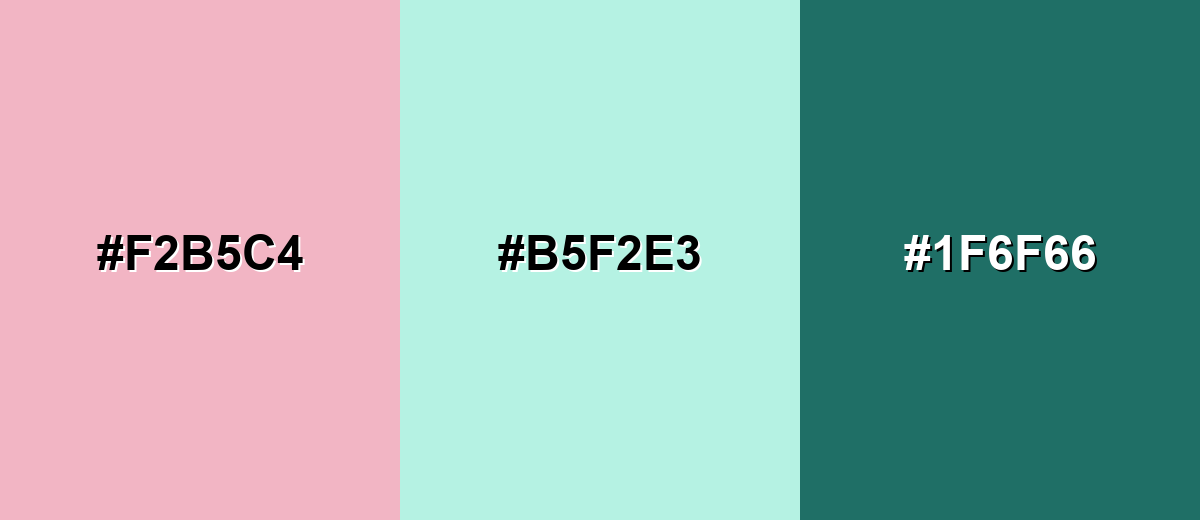
Complementary Colors
A complementary pairing adds contrast by placing blush pink against a cool green-leaning tone. This keeps the palette fresh and contemporary while still feeling soft.
Complementary Palette Example: Use blush pink as the main surface, mint as the airy counterbalance, and deep teal for structure in text, icons, or headers.
Analogous Color Schemes
Analogous colors sit adjacent to each other on the color wheel, creating harmonious, cohesive palettes with subtle variation.
Warm analogous tones (peach to blush) create a cozy, romantic gradient that feels natural in lifestyle visuals.
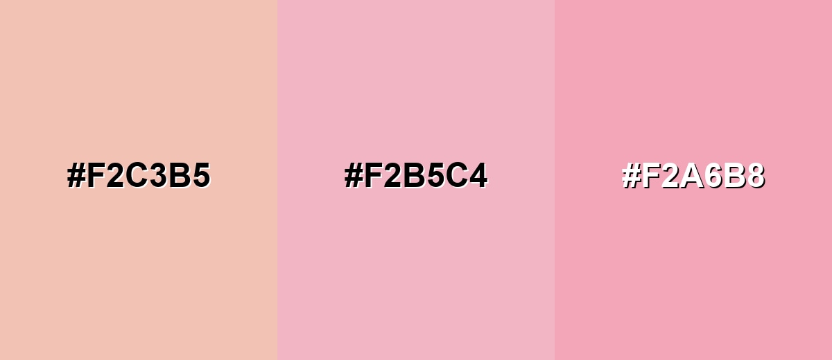
- Soft Peach: #F2C3B5
- Blush Pink: #F2B5C4
- Light Rose: #F2A6B8
A blush-to-lilac analogous set leans dreamy and modern, useful for editorial, beauty, and gentle tech branding.
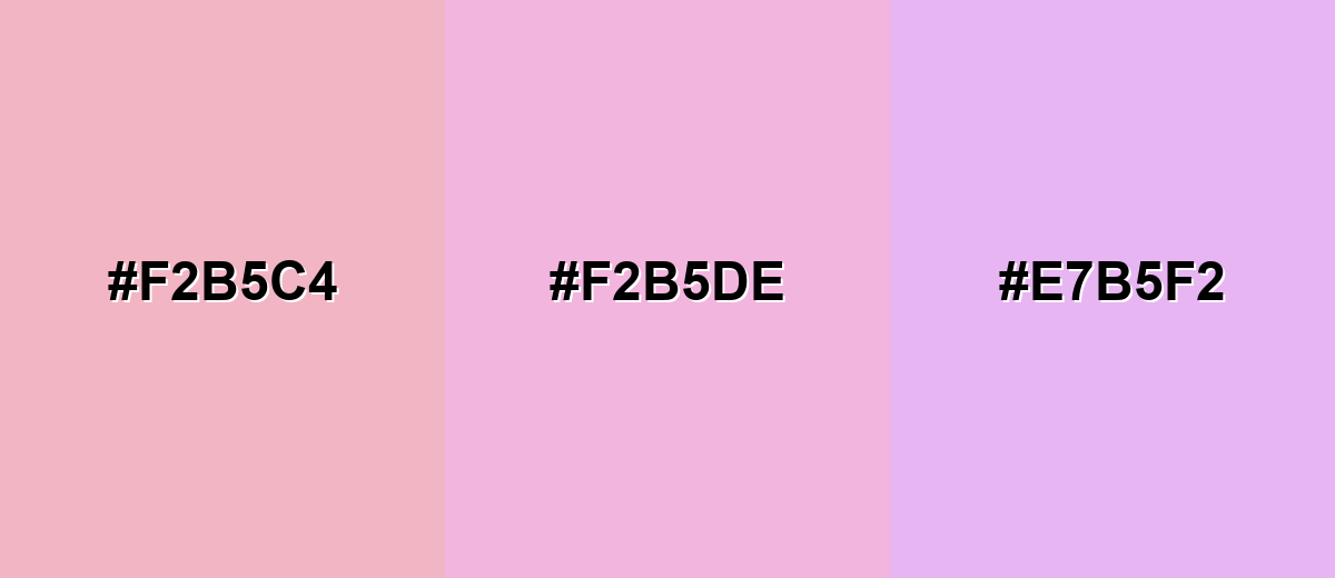
- Blush Pink: #F2B5C4
- Pink Lilac: #F2B5DE
- Soft Lavender: #E7B5F2
Triadic & Tetradic Combinations
Triadic palettes spread hues evenly, keeping energy while still looking balanced.
Blush pink with soft green and pale blue gives playful contrast that still reads clean and approachable.
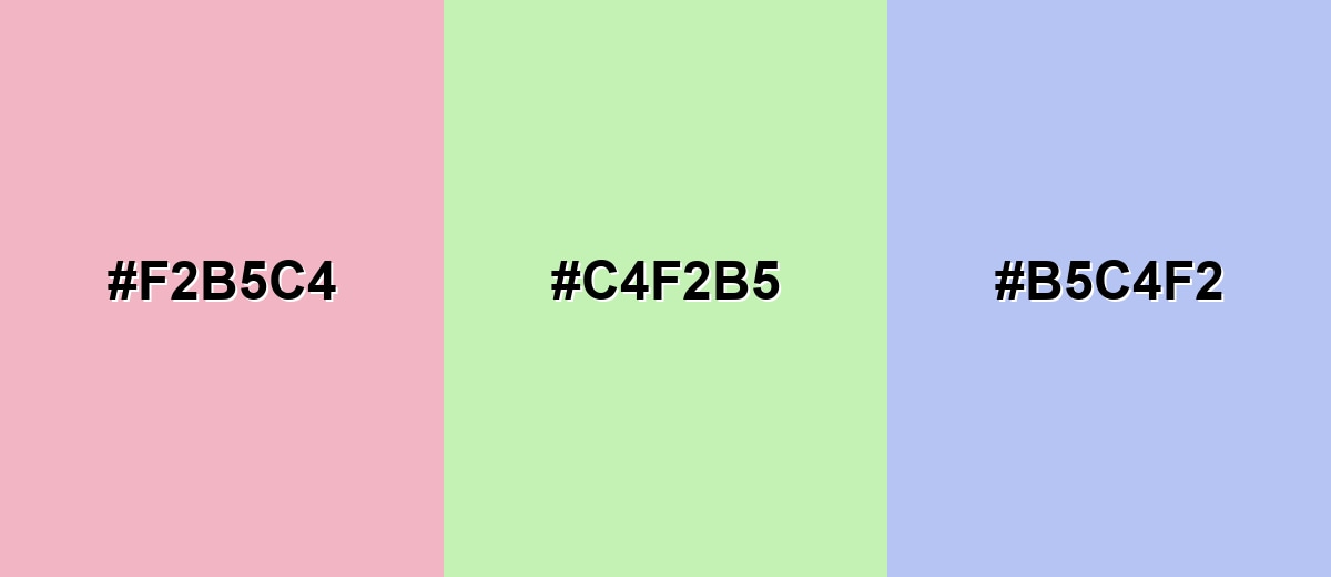
- Blush Pink: #F2B5C4
- Pale Spring Green: #C4F2B5
- Powder Blue: #B5C4F2
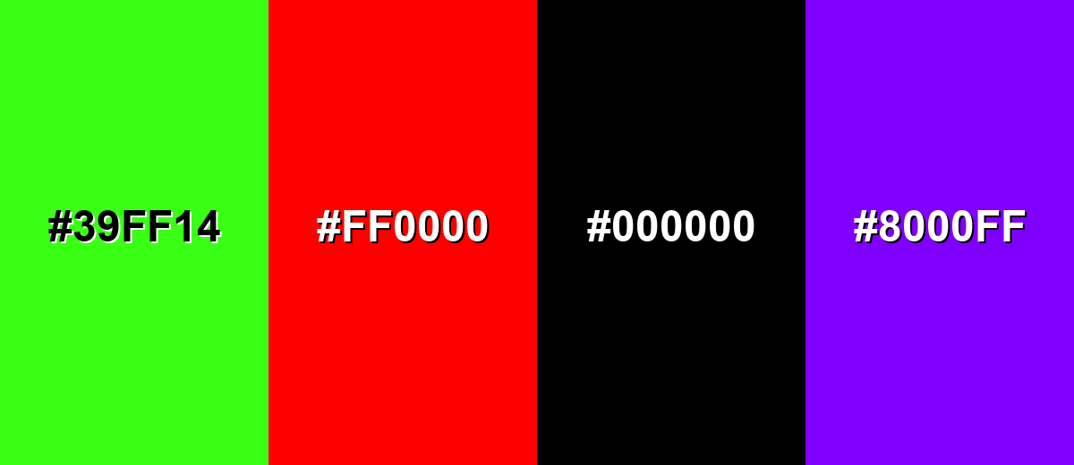
Colors to Avoid
While blush pink color is remarkably versatile, certain combinations can create problematic visual effects:
- Neon Green (#39FF14) - The intensity overwhelms the softness of blush pink, making the overall look feel loud and unbalanced.
- Pure Red (#FF0000) - Strong red can create a harsh, competing warmth that makes blush pink look dull or muddy by comparison.
- True Black (#000000) - The jump in contrast can feel abrupt and heavy; blush pink typically benefits from slightly softer dark neutrals.
- Vivid Purple (#8000FF) - Highly saturated purple can skew the palette toward a synthetic, candy-like feel rather than a refined blush aesthetic.
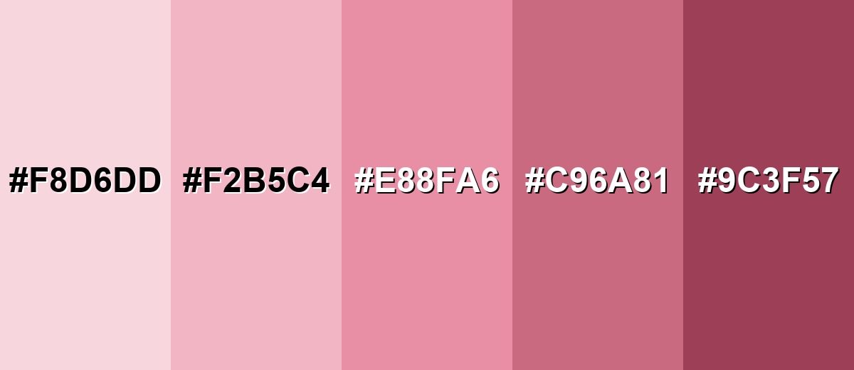
Shades, Tints & Variations of Blush Pink Color
Blush pink has a surprisingly flexible range—from barely-there tints to deeper rosy tones that add structure. Knowing these variations helps you build clearer hierarchy in UI, stronger contrast in branding, and more depth in print.
- Pale Blush (#F8D6DD) - An airy, barely-there blush that feels bright and clean while keeping a rosy warmth. It's best used for Large backgrounds, subtle panels, and soft gradients where you want a hint of warmth without visual weight.
- Classic Blush Pink (#F2B5C4) - The balanced reference shade: muted pink with gentle warmth and a natural rosy look. It's best used for Brand accents, hero sections, product packaging, and supportive UI surfaces.
- Dusty Rose (#E88FA6) - A deeper, slightly muted rose that adds maturity and stronger definition. It's best used for Buttons, headings, illustrations, and areas that need more contrast while staying in the same family.
- Rosewood Blush (#C96A81) - A mid-to-deep rosy tone that reads grounded and elegant rather than sweet. It's best used for Text accents, borders, icons, and premium packaging details.
- Deep Blush (#9C3F57) - A rich, wine-leaning blush that adds drama and structure to soft palettes. It's best used for Strong accents, calls to action when paired with lighter blush tints, and high-contrast decorative elements.
Industry Applications
Blush pink shows up across industries that benefit from warmth, softness, and a personal tone. It can signal care and quality when paired with clean typography and well-chosen accents.
Fashion & Beauty
- Beauty Packaging Backgrounds - Use it for packaging backgrounds to create a clean, delicate first impression.
- Product Labels - Works well on labels where you want a soft, polished look.
- Before-and-After Graphics - Adds a gentle, lifestyle-friendly vibe to comparison visuals.
- Soft Promotional Banners - Ideal for calm promos that feel approachable rather than loud.
Interior Design & Decor
- Stationery-Inspired Styling - Borrow the delicate feel seen in invitations and table cards for a cohesive decor theme.
- Subtle Photo Overlays - Use blush pink overlays in prints or framed visuals for a softened, romantic tone.
- Calm, Layered Neutrals - Supports a warm, comfortable atmosphere when used as a gentle supporting color.
- Premium, Soft Accents - Works as an accent tone that feels personal and refined, especially with clean layout structure.
Branding & Marketing
- Calm Landing Pages - Great for wellness and lifestyle pages where you want people to feel at ease.
- Gentle Section Dividers - Helps organize content without heavy lines or harsh contrast.
- Seasonal Collections & Badges - Fits retail and ecommerce moments like seasonal drops and product badges.
- Onboarding & Empty States - In app and web UI, it's useful for onboarding, empty states, and soft highlights behind content.
Conclusion
Blush pink stands out for its soft, rosy warmth and its ability to feel both romantic and modern at the same time. Starting from the reliable reference shade #F2B5C4, you can build everything from airy pastels to deeper dusty roses for branding, UI surfaces, print pieces, and lifestyle visuals. The key is simple: keep enough contrast and structure—through deeper accents, crisp neutrals, and clear hierarchy—so blush pink stays readable, polished, and intentional in real-world design.
Design Smarter with AI: Media.io is an online AI studio that empowers creators with advanced image generation and enhancement tools. From text-to-image and image-to-image creation to AI upscaling and color optimization, it enables fast, creative, and professional results—all in your browser.

Frequently Asked Questions About Blush Pink Color
Blush pink is a muted, soft pink that resembles a natural rosy flush. It is less bright than hot pink and usually has a gentle warmth that keeps it calm and flattering.
A commonly used blush pink HEX code is #f2b5c4. In design work, this shade is a balanced reference that sits between pastel pink and dusty rose.
Blush pink is often associated with tenderness, comfort, romance, and approachability. In everyday design, the Blush Pink Color meaning usually leans soft and caring rather than loud or playful.
Blush pink pairs well with soft mint and teal for a fresh contrast, peach and rose for warm harmony, and powder blue for a clean modern mix. Neutrals and deeper accents help keep the palette readable and balanced.
Yes, it works well for backgrounds, highlights, onboarding, and gentle branding moments. Because it is light, it typically needs darker text and clear hierarchy to maintain strong readability and accessibility.
Use CMYK values as a starting point and request a proof, especially on uncoated paper where light pinks can shift. Testing with your chosen stock and finish is the most reliable way to keep the tone consistent.


