

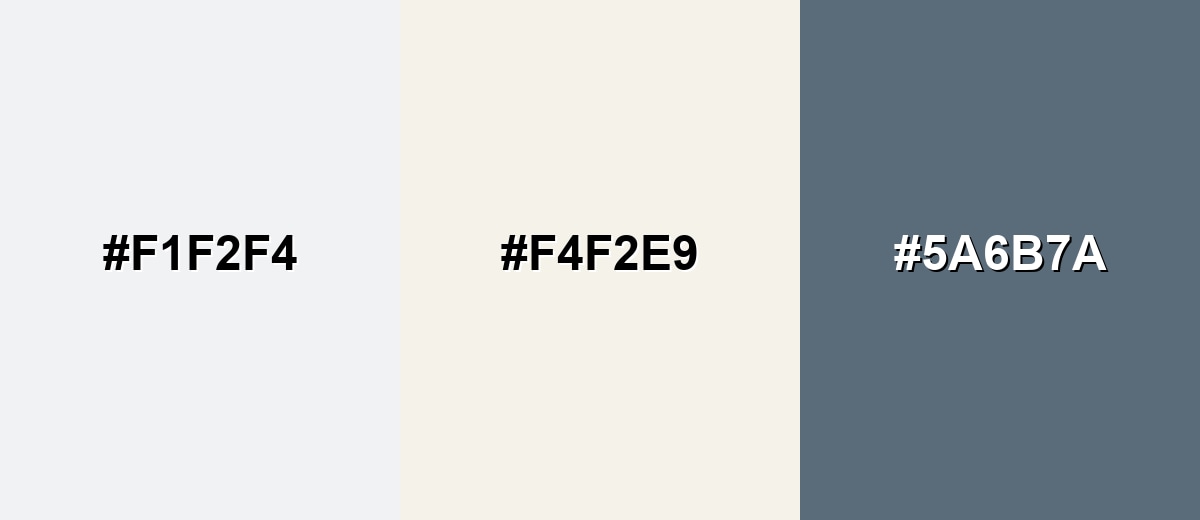
Clowd Dancer color is a soft, cool off-white with a faint blue-gray cast, similar to clean linen in diffuse daylight.
With a dependable base like #F1F2F4, it keeps designs bright without the harshness of pure white—making interfaces and interiors feel calm, tidy, and modern.
Clowd Dancer Color: Codes & Values
Here are the core digital and print-friendly values for Clowd Dancer, so you can match it accurately across UI, branding, and production.
| Parameters | VALUE |
| HEX Code | #F1F2F4 |
| RGB DECIMAL | 241, 242, 244 |
| RGB PERCENTAGE | 95%, 95%, 96% |
| CMYK | 1%,1%,0%,4% |
| HSL | 220°, 12%, 95% |
| HSV (HSB) | 220°, 1%, 96% |
| Web Safe | #FFFFFF |
Key Color Space Explanations:
- HEX - HEX is the most common way to specify this shade on screens and in web design. Use it when you need consistent UI and brand styling across devices.
- RGB - RGB describes how much red, green, and blue light make up the tint on digital displays. It is useful for screen-based work like UI, video, and motion graphics.
- CMYK - CMYK is used for printing and reflects how inks combine on paper. Because this is near-white, paper stock and finishes can noticeably change the final look.
- HSL - HSL explains the hue, saturation, and lightness in a way that is intuitive for adjusting tints and tones. It helps when you want to keep the same character while making it lighter, darker, or slightly more saturated.
- Web Safe - Web-safe is the closest broadly supported fallback in older display contexts. For this shade, the nearest web-safe option is pure white, which will look a bit cleaner and less cool.
Use HEX/RGB for on-screen consistency, and switch to CMYK when preparing print files—especially for near-white tones where stock and lighting can shift the result.
Clowd Dancer Color Conversions
If you need Clowd Dancer across different workflows (web, print, or color-managed pipelines), these conversions make it easy to translate accurately.
| Parameters | VALUE | CSS |
| HEX | #f1f2f4 | #f1f2f4 |
| RGB DECIMAL | 241, 242, 244 | rgb(241,242,244) |
| RGB PERCENTAGE | 95%, 95%, 96% | rgb(95%,95%,96%) |
| CMYK | 1%,1%,0%,4% | cmyk(1%,1%,0%,4%) |
| HSL | 220°, 12%, 95% | hsl(220°, 12%, 95%) |
| HSV (or HSB) | 220°, 1%, 96% | -- |
| Web Safe | ffffff | #ffffff |
| CIE-LAB | 95.5, 0.2, -1.5 | -- |
| XYZ | 88.7, 93.1, 99.6 | -- |
| xyY | 0.312, 0.328, 93.1 | -- |
| CIE-LCH | 95.5, 1.5, 278° | -- |
| CIE-LUV | 95.5, -0.5, -2.3 | -- |
| Hunter-Lab | 96.0, 0.2, -1.2 | -- |
| Binary | 11110001 11110010 11110100 | -- |
Want to generate Clowd Dancer Color photos or posters? Try Media.io's AI Image Generator now!
Clowd Dancer Color Meaning & Symbolism
Clowd Dancer is commonly associated with clarity, calm, and a fresh start. Because it reads as clean but slightly cool, it often suggests order, simplicity, and modern restraint in everyday visuals. In Clowd Dancer Color meaning, it is frequently used to create breathing room and make other tones look more intentional.
Psychological Effects
As a near-white with a cool cast, it quietly shapes how "clean" and organized a layout feels.
- Airy Spaciousness - Creates a light, open surface that makes pages and rooms feel less crowded.
- Visual Clarity - Reduces noise so key elements like headlines, product images, and CTAs stand out.
- Modern Restraint - Signals a tidy, contemporary tone that works well for minimalist systems.
- Cool Detachment - Can feel slightly distant or clinical if used without warmer accents or texture.
- Lighting Sensitivity - May read chilly under cool LEDs or daylight, shifting the mood of the space.
Positive Associations
Designers often lean on Clowd Dancer when they want "clean" without the starkness of pure white.
- Cleanliness - Suggests fresh, well-kept surfaces and careful presentation.
- Simplicity - Supports uncluttered design where content and hierarchy come first.
- Precision - Feels controlled and intentional, especially in grid-based UI layouts.
- Fresh Start - Works like a blank canvas that makes new elements feel purposeful.
- Quiet Premium - Adds a refined backdrop that lets materials, type, and photography lead.
Cultural Significance Across the World
Off-whites are widely understood as neutral, but the cooler undertone adds a modern, "air and light" feel.
- Editorial Minimalism - Common in publishing layouts where whitespace signals clarity and focus.
- Tech Modernity - Frequently used in digital products to communicate cleanliness and precision.
- Craft & Care - Near-white palettes can imply attention to detail in packaging and product presentation.
- Calm Environments - Often chosen for wellness-forward visuals where softness matters more than contrast.
Design Applications
Because it is bright but not stark, Clowd Dancer is a reliable base for modern palettes. It supports contrast, makes accent hues look more polished, and helps typography stay readable when the right text tone is chosen.
Graphic Design Tips
- Use it as a "soft white" canvas - It keeps layouts bright while avoiding the glare of pure white.
- Choose strong text contrast - For body copy, a deep neutral like #1F2933 reads crisp and accessible.
- Build hierarchy with separators - Add subtle dividers and cards so sections don’t blend together.
- Let photography breathe - Product and editorial images look cleaner with this calm background.
- Balance with one anchor tone - Introduce a deeper neutral for navigation, headings, or key UI controls.
If body text looks faint, use a darker neutral and add subtle dividers rather than relying on low-contrast gray-on-off-white.
Clowd Dancer Color in Photography & Video
- High-key backdrops - Great for clean, airy scenes where true white would feel too sharp.
- Soft neutral grading - Helps highlights feel smooth while keeping a modern, cool finish.
- Product detail emphasis - Minimizes distraction so texture, materials, and edges show clearly.
- Wardrobe-friendly base - Plays nicely with muted palettes and doesn’t color-cast skin tones aggressively.
- Subtle set design - Works for minimalist props and interiors where you want calm visual structure.
Recommended Tool for Image Enhancement: When incorporating clowd dancer color into your photography projects, Media.io's AI Image tools can help you achieve more refined results. With AI-powered color enhancement, photo colorization, image upscaling, and old photo restoration, you can easily enrich clowd dancer color tones, improve overall image quality, and highlight the color's elegant and sophisticated aesthetic.
Color Combinations
Clowd Dancer is easiest to pair when you treat it as a cool neutral foundation. These palettes show balanced ways to add warmth, depth, or gentle color while keeping an airy overall feel.
Complementary Colors
A warm, creamy complement adds life and prevents the palette from feeling too icy. Adding a deeper blue-gray anchor improves contrast and gives the scheme structure.
Complementary Palette Example: Pair Clowd Dancer with a soft warm cream and a muted slate for a clean, contemporary mix.
Analogous Color Schemes
Analogous colors sit adjacent to each other on the color wheel, creating harmonious, cohesive palettes with subtle variation.
Cool neighbors in the blue range keep the palette quiet, layered, and easy to use in UI backgrounds.
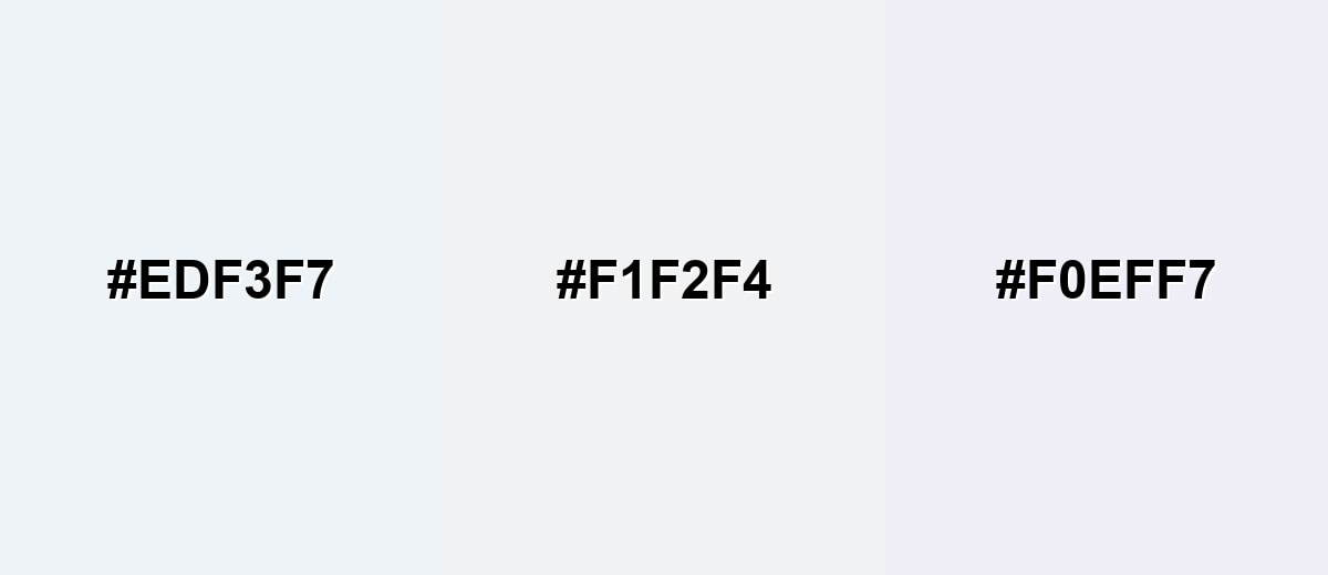
- Pale Ice Blue: #EDF3F7
- Clowd Dancer: #F1F2F4
- Soft Lavender Haze: #F0EFF7
Slightly deeper analogous tones add definition while staying subtle and professional.
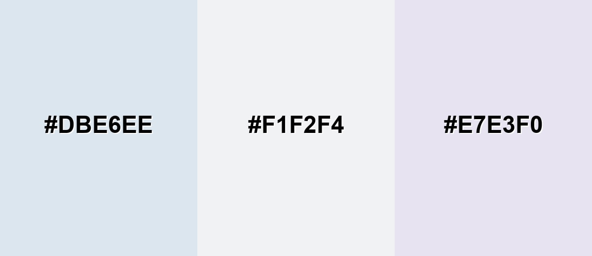
- Light Steel Blue: #DBE6EE
- Clowd Dancer: #F1F2F4
- Misty Lilac Gray: #E7E3F0
Triadic & Tetradic Combinations
A triadic set keeps balance by spreading hue contrast evenly, while soft saturation maintains a gentle look.
Combine Clowd Dancer with a muted blush and a pale mint for a fresh, friendly palette.
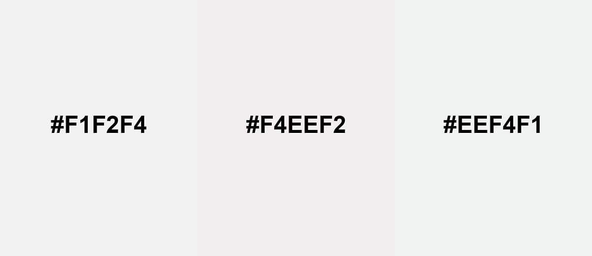
- Clowd Dancer: #F1F2F4
- Powder Blush: #F4EEF2
- Light Mint Veil: #EEF4F1
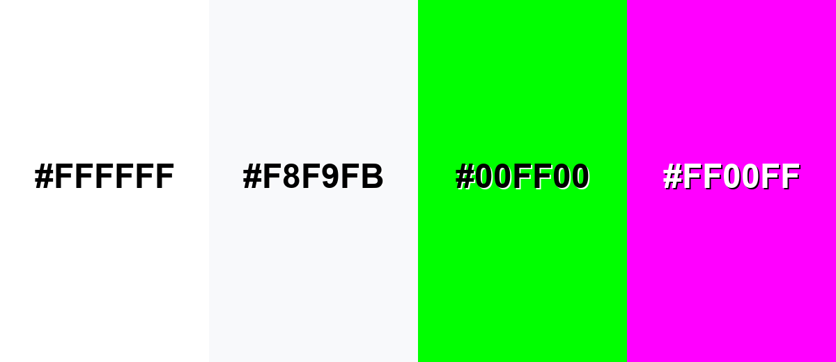
Colors to Avoid
While clowd dancer color is remarkably versatile, certain combinations can create problematic visual effects:
- Pure White (#FFFFFF) - Placed next to Clowd Dancer, it can make the base look dingy or overly gray by comparison, especially in bright UI.
- Ultra Light Gray (#F8F9FB) - The difference is so small that borders, buttons, and sections can blend together and lose hierarchy.
- Neon Green (#00FF00) - The intensity overwhelms this soft neutral and can create eye strain when used for large areas or key UI states.
- Neon Magenta (#FF00FF) - High saturation can feel jarring against the subtle cool base and tends to reduce the refined, calm impression.
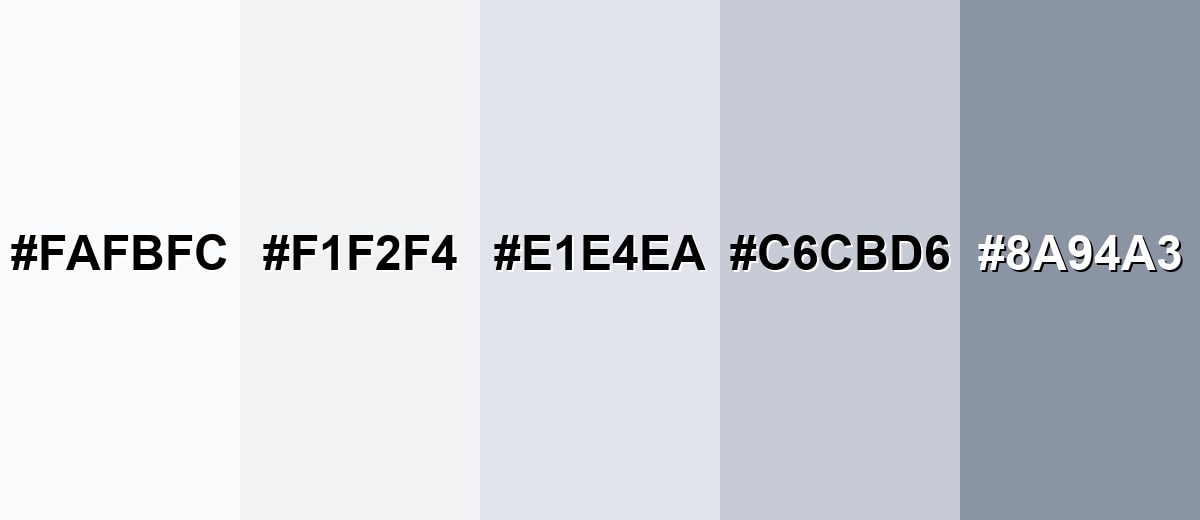
Shades, Tints & Variations of Clowd Dancer Color
This range moves from brighter, paper-like whites to deeper blue-grays that add structure. Having a few close variations on hand makes it easier to build UI hierarchy, define edges, and keep a consistent mood across different surfaces.
- Frosted Pearl (#FAFBFC) - A brighter, near-paper white with a cool sheen that reads extra crisp. It’s best used for Large backgrounds, minimal layouts, and airy product photography backdrops.
- Clowd Dancer (#F1F2F4) - A cool off-white with a gentle blue-gray undertone that stays soft in most lighting. It’s best used for Base surfaces in UI, editorial whitespace, and calm interior palettes.
- Silver Mist (#E1E4EA) - A light blue-gray that adds separation without looking heavy. It’s best used for Cards, borders, subtle dividers, and secondary panels.
- Dove Gray (#C6CBD6) - A mid-light neutral that brings structure and improves contrast for components. It’s best used for Disabled states, outlines, icons, and muted UI controls.
- Slate Drift (#8A94A3) - A deeper, cool gray that pairs naturally with the base while providing weight. It’s best used for Headings, navigation elements, and grounding accents.
Industry Applications
Clowd Dancer is widely usable because it behaves like a refined alternative to white. It supports legibility, makes photography feel cleaner, and helps structured layouts look intentional.
Fashion & Beauty
- Clean lookbooks - Creates airy negative space that keeps attention on styling and silhouettes.
- Premium packaging feel - Helps finishes and material textures read as more intentional.
- Skincare/wellness visuals - Reinforces a calm, tidy tone without feeling harsh or clinical.
- Ecommerce product grids - Keeps pages bright while making product images look crisp.
Interior Design & Decor
- Cool contemporary walls - Brightens spaces while maintaining a modern, restrained mood.
- Trim and ceiling coordination - Gives a softer alternative to pure white for a smoother look.
- Texture-forward styling - Works well with linen, stone, and brushed metals for depth.
- Mood boards - Acts as a clean base that makes accent materials easier to compare.
Branding & Marketing
- Tech and SaaS UI shells - Ideal for dashboards, tables, and cards where clarity matters.
- Editorial systems - Supports typography-first layouts with comfortable whitespace.
- Healthcare messaging - Conveys cleanliness and trust when paired with strong contrast.
- Photography-led campaigns - Keeps backdrops soft so imagery feels refined, not stark.
Conclusion
Clowd Dancer is a cool off-white that feels cleaner than beige but softer than pure white, which makes it an easy win for calm UI, modern branding, and contemporary interiors. With #F1F2F4 as a base, you can build clear hierarchy using deeper neutrals and keep accents looking polished rather than loud. Just remember that near-white shades are sensitive to lighting and contrast—add warmth, texture, and a darker anchor tone to keep the overall look refined instead of sterile.
Design Smarter with AI: Media.io is an online AI studio that empowers creators with advanced image generation and enhancement tools. From text-to-image and image-to-image creation to AI upscaling and color optimization, it enables fast, creative, and professional results—all in your browser.

Frequently Asked Questions About Clowd Dancer Color
Clowd Dancer is a very light, cool off-white with a slight blue-gray undertone. It looks bright and clean, but softer and less stark than pure white.
A commonly used digital hex value for Clowd Dancer is #f1f2f4. This code produces a near-white tone with a cool, airy feel.
It is cool-leaning. The faint blue-gray cast can look especially cool under daylight or cool LED lighting, while warmer lighting can make it appear more neutral.
It pairs well with warm creams, soft blush tones, pale mints, and blue-grays. For stronger contrast, add a deeper slate or charcoal so buttons, headings, and key elements stand out.
Deep neutrals are the safest choice for readability, such as charcoal or near-black grays. Avoid very light gray text, which can fade into the background and reduce accessibility.
Mix in warmer accents and tactile materials: warm wood, sand-toned neutrals, soft textiles, or a muted accent hue. In UI, add gentle shadows, dividers, and a darker anchor color to create hierarchy.


