

 TL;DR:
For web and graphic design, light blue (HEX #ADD8E6) serves best as a breathable, calming background tint that reduces visual stress, provided it is anchored with deeper hues to maintain structural clarity.
● Avoid applying light blue to body text on light surfaces due to insufficient contrast; reserve it for large backgrounds, hero panels, or decorative elements, and use deep navy or charcoal for typography instead of mid-gray or heavy black (#000000).
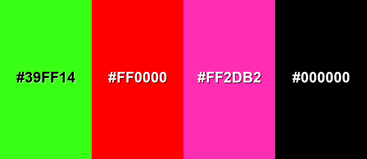
● Prevent visual clashing and washout effects by keeping light blue away from extreme, highly saturated colors like neon green (#39FF14), pure red (#FF0000), and bright magenta (#FF2DB2).
● Counteract the color's risk of feeling cold or sterile in expansive flat layouts by integrating warm complementary accents, such as soft peach, or by introducing warm physical textures like paper grain, linen, or wood.
Ask AI for a summary
 ChatGPT
 Perplexity
 Gemini
 Claude
 Grok
Grok
Light blue is a soft, airy tint that looks like a bright sky washed with a little white. Its HEX code is #ADD8E6, giving it a clean, gentle brightness on screens.
Many people read it as calm, open, and reassuring rather than intense or loud. Below, you’ll find its key color codes, contrast tips, easy pairings, popular shades, and practical ways to use it in design.
Light Blue Color: Codes & Values
Use these standard values to keep light blue consistent across web, UI, and print projects.
| Parameters | VALUE |
| HEX Code | #ADD8E6 |
| RGB DECIMAL | 173, 216, 230 |
| RGB PERCENTAGE | 68%, 85%, 90% |
| CMYK | 25%,6%,0%,10% |
| HSL | 195°, 53%, 79% |
| HSV (HSB) | 195°, 25%, 90% |
| Web Safe | #99CCFF |
Key Color Space Explanations:
- HEX - HEX is the most common way to specify this shade for web and UI work. Use #add8e6 to match the standard light blue tone consistently.
- RGB - RGB mixes red, green, and blue light for screens and digital design. The values 173, 216, 230 create a bright, gentle blue that stays readable with darker text.
- CMYK - CMYK is used for print by mixing cyan, magenta, yellow, and black inks. The CMYK values help your light blue translate more predictably to paper, though results can vary by stock and finish.
- HSL - HSL describes hue, saturation, and lightness, which is useful for making lighter or deeper variations. Light blue sits around 195° on the hue wheel with a high lightness that keeps it soft.
- Web Safe - Web safe values are older, simplified screen-friendly options used for broad consistency. The closest web-safe match to this shade is #99ccff.
If you’re building a UI system, set #ADD8E6 as the base token, then create darker companion blues for text, icons, and buttons to maintain clear contrast.
Light Blue Color Conversions
These conversions make it easy to apply light blue across different tools, workflows, and technical specs.
| Parameters | VALUE | CSS |
| HEX | #add8e6 | #add8e6 |
| RGB DECIMAL | 173, 216, 230 | rgb(173,216,230) |
| RGB PERCENTAGE | 68%, 85%, 90% | rgb(68%,85%,90%) |
| CMYK | 25%,6%,0%,10% | cmyk(25%,6%,0%,10%) |
| HSL | 195°, 53%, 79% | hsl(195°, 53%, 79%) |
| HSV (or HSB) | 195°, 25%, 90% | -- |
| Web Safe | 99ccff | #99ccff |
| CIE-LAB | 83.8, -10.5, -11.6 | -- |
| XYZ | 56.1, 63.7, 84.3 | -- |
| xyY | 0.275, 0.312, 63.7 | -- |
| CIE-LCH | 83.8, 15.7, 227.7° | -- |
| CIE-LUV | 83.8, -22.1, -16.2 | -- |
| Hunter-Lab | 79.8, -10.3, -12.0 | -- |
| Binary | 10101101 11011000 11100110 | -- |
Want to generate Light Blue Color photos or posters? Try Media.io's AI Image Generator now!
Light Blue Color Meaning & Symbolism
Light blue is widely linked with calmness, clarity, and a sense of open space. Because it resembles clear daytime skies and clean water, it often reads as friendly and approachable in everyday visuals. In simple terms, Light Blue Color meaning is frequently about trust, ease, and a quieter kind of confidence.
Psychological Effects
This is the kind of blue that supports focus without feeling heavy.
- Lower Visual Stress - Its high lightness softens layouts, making pages and dashboards feel easier to scan.
- Clearer Information Mood - It’s often read as "helpful" and works well for neutral info states or guidance.
- More Space - Light blue can make interfaces and rooms feel more open, especially with plenty of white space.
- Modern, Clean Finish - It keeps things fresh without the sharp edge that brighter cyan can bring.
- Risk Of Feeling Cold - Overusing it in flat areas can look sterile, so balance with warm neutrals or texture.
Positive Associations
In brand and UI work, light blue is a quick shortcut to "calm and dependable."
- Trust - A gentle way to signal reliability without looking too corporate or strict.
- Clarity - Helps information feel organized, clean, and easy to follow.
- Peace - Brings a relaxed tone that’s great for wellness, education, and service experiences.
- Cleanliness - Often associated with fresh air and water, making it popular in health-related visuals.
- Approachability - Friendly and non-threatening, especially compared with darker or more saturated blues.
Cultural Significance Across the World
Meanings can shift by audience, but light blue is generally easy to use across markets.
- Reliability - Frequently used in institutional and digital products to suggest stability and professionalism.
- Peace - Commonly tied to calm and harmony in many everyday visual contexts.
- Clean Design Language - Often appears in tech and service branding because it feels safe and unobtrusive.
- Sky And Water Symbolism - Naturally links to openness, freshness, and "breathing room" in visual storytelling.
Design Applications
Light blue works best when you want a fresh, breathable look that does not fight with content. The key is to manage contrast and temperature so the design stays clear, not washed out.
Graphic Design Tips
- Use light blue as a background tint to reduce harshness while keeping layouts bright.
- Anchor it with darker blues for structure in headers, icons, and charts.
- Keep typography crisp with deep navy or near-black instead of mid-gray on light blue surfaces.
- Pair with warm neutrals to prevent a cold or clinical feel in large sections.
- Limit saturated accents so light blue stays the "air" of the palette, not the loudest element.
Pro tip: if your design starts to feel "too icy," add warmth through materials (paper texture, grain, soft shadows) or a subtle warm accent in small UI details.
Light Blue Color in Photography & Video
- Use light blue backdrops to create a clean, airy mood for portraits and product shots.
- Watch white balance: slight warming often keeps skin tones natural against cool blue scenes.
- In color grading, lift blues gently and protect highlights so the tint stays soft, not washed out.
- Pair light blue with natural textures (linen, wood, stone) to add depth on camera.
- For video overlays, choose darker text or a stronger blue bar to keep captions readable.
Recommended Tool for Image Enhancement: When incorporating light blue color into your photography projects, Media.io's AI Image tools can help you achieve more refined results. With AI-powered color enhancement, photo colorization, image upscaling, and old photo restoration, you can easily enrich light blue color tones, improve overall image quality, and highlight the color's elegant and sophisticated aesthetic.
Color Combinations
Because light blue is gentle and high in lightness, it pairs best with deeper anchors, warm complements, and soft neighboring hues. The palettes below cover classic harmony options you can apply to UI, branding, and illustrations.
Complementary Colors
A complementary match adds warm energy to balance the cool, airy feel. This is a strong option for callouts, hero sections, and marketing layouts that need a friendly contrast.
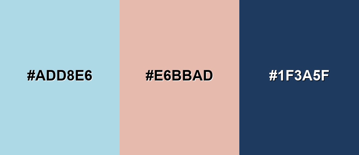
Complementary Palette Example: Try Light Blue with Soft Peach and Deep Navy for a balanced, readable palette.
Analogous Color Schemes
Analogous colors sit adjacent to each other on the color wheel, creating harmonious, cohesive palettes with subtle variation.
Pale Aqua, Light Blue, and Soft Periwinkle create a smooth, sky-like gradient feel.
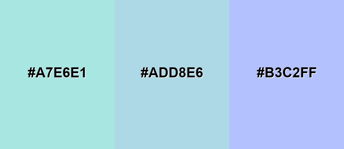
- Pale Aqua: #A7E6E1
- Light Blue: #ADD8E6
- Soft Periwinkle: #B3C2FF
Mint Mist, Light Blue, and Lavender Blue feel calm, fresh, and slightly playful.
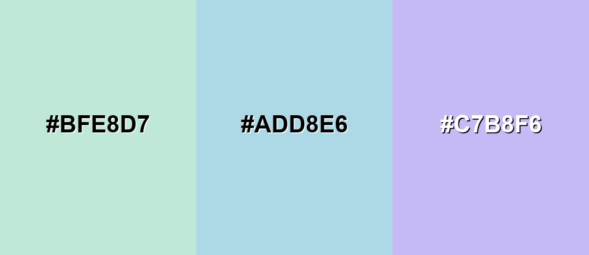
- Mint Mist: #BFE8D7
- Light Blue: #ADD8E6
- Lavender Blue: #C7B8F6
Triadic & Tetradic Combinations
A triadic palette keeps contrast lively while staying balanced across the wheel.
Light Blue, Soft Violet, and Pale Chartreuse work well for illustrations, onboarding screens, and upbeat brand accents.
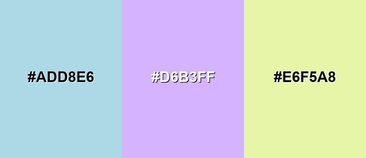
- Light Blue: #ADD8E6
- Soft Violet: #D6B3FF
- Pale Chartreuse: #E6F5A8
Colors to Avoid
While light blue color is remarkably versatile, certain combinations can create problematic visual effects:
- Neon Green (#39FF14) - The saturation contrast is so extreme that light blue can look washed out, and the pairing often feels visually noisy.
- Pure Red (#FF0000) - This creates a sharp, poster-like clash that can feel aggressive and distract from calm or informational messaging.
- Bright Magenta (#FF2DB2) - Both hues compete for attention, which can make interfaces and brand graphics feel unbalanced.
- Heavy Black (#000000) - The jump in value can look harsh; if you need dark contrast, a softer navy or charcoal usually blends better.
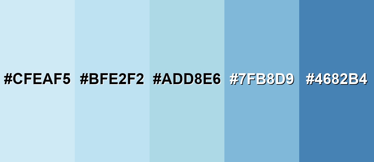
Shades, Tints & Variations of Light Blue Color
Light blue covers a surprisingly useful range—from barely-there misty tints to stronger, more structured blues. Having a few variations on hand makes it easier to build hierarchy (backgrounds, surfaces, accents, and emphasis) without leaving the same calm color family.
- Powder Blue (#CFEAF5) - A very light, airy tint that feels almost like mist. It’s best used for Backgrounds, large sections, and subtle UI surfaces.
- Sky Tint (#BFE2F2) - A clean, slightly brighter tint that still stays gentle. It’s best used for Hero backdrops, info panels, and soft gradients.
- Light Blue (#ADD8E6) - The classic light blue reference shade with a fresh, open look. It’s best used for Brand accents, highlights, and calm interface themes.
- Cornflower Mist (#7FB8D9) - A deeper, clearer blue that adds structure without turning dark. It’s best used for Secondary buttons, icons, charts, and section headers.
- Steel Blue (#4682B4) - A stronger blue with a more serious, grounded tone. It’s best used for Navigation, emphasis states, and high-contrast accents.
Industry Applications
Light blue is popular in digital and physical design because it reads as clear and non-confrontational. It can support information-heavy layouts while still feeling friendly.
Fashion & Beauty
- Great for spring/summer palettes, especially for soft, breathable styling and minimal looks.
- Works well as a "clean" background color for skincare and beauty product photography.
- Pairs nicely with silver-toned accessories and cool neutrals for a polished finish.
- In packaging, it can suggest freshness and gentle formulas without feeling too clinical.
Interior Design & Decor
- Makes rooms feel larger and brighter, especially when used on walls or large textiles.
- Balances beautifully with warm whites, light wood, rattan, and natural fibers.
- Use deeper blue accents to add "anchors" like trim, rugs, or statement furniture.
- Ideal for bedrooms, nurseries, and bathrooms where calm and cleanliness matter.
Branding & Marketing
- Popular in tech, health, education, and service brands that want to feel trustworthy and approachable.
- Strong choice for onboarding screens, info callouts, and supportive UI states.
- Add a warm accent color to keep brand visuals human and welcoming.
- In print campaigns, proof colors on the final stock to ensure the tint doesn’t fade out.
Conclusion
Light blue stands out for its soft brightness and the way it makes designs feel open and easy to navigate. With #ADD8E6 as a reliable reference, you can build clean palettes by pairing it with deeper blues for readable contrast and warmer accents for balance—especially in large backgrounds where stronger hues may feel overwhelming. Used thoughtfully across UI, branding, interiors, and print, light blue delivers a calm, trustworthy look that stays modern and versatile.
Design Smarter with AI: Media.io is an online AI studio that empowers creators with advanced image generation and enhancement tools. From text-to-image and image-to-image creation to AI upscaling and color optimization, it enables fast, creative, and professional results—all in your browser.

Frequently Asked Questions About Light Blue Color
A widely used standard for light blue is #add8e6. It is the CSS named color LightBlue and is a common reference point in UI and web design.
Light blue is generally considered a cool hue. You can make it feel warmer by pairing it with peach, sand, cream, or warm grays.
It often represents calm, clarity, and trust. Designers use it to create friendly interfaces, clean brand impressions, and relaxed environments.
It pairs well with deep navy, charcoal, soft white, warm beige, peach, and gentle greens. For more variety, try triadic accents like soft violet and pale yellow-green.
For body text, light blue is usually too low-contrast on white backgrounds. It works better for large headings, decorative text, or on darker backgrounds where contrast improves.
Mix blue with white to create a lighter tint, then adjust slowly until it matches the brightness you want. Using a touch of green or a cooler blue can shift it toward a more airy, sky-like look.


