

 TL;DR:
Golden yellow (#F5C400) is a warm, saturated hue best utilized as a targeted accent for UI highlights, buttons, and badges to convey success without overpowering the layout.
● Pair this color with deep blues or dark neutrals (like #222222) to maintain high contrast, ensuring you place dark text or icons on top for accessibility rather than using it for light-on-light text.
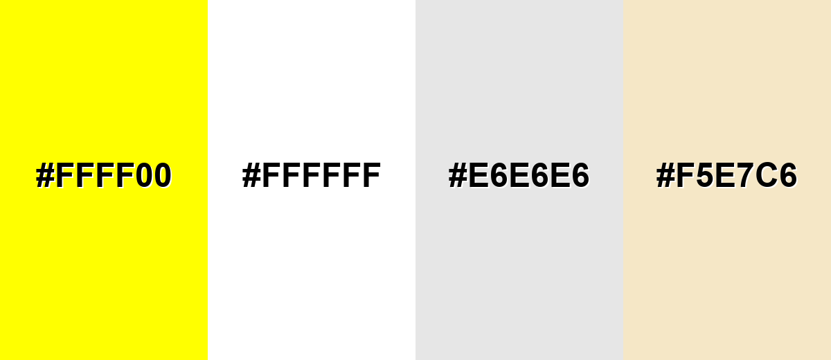
● Avoid combining it with pure white (#FFFFFF), neon yellow (#FFFF00), light gray (#E6E6E6), or pale beige (#F5E7C6), as these pairings cause weak contrast, muddiness, or visual fatigue.
● Use HEX (#F5C400) or RGB (245, 196, 0) for reliable screen consistency, but rely on CMYK (0%, 20%, 100%, 4%) with physical proofs for print, noting that flat process colors cannot replace foil or metallic inks if you require a true metallic effect.
Ask AI for a summary
 ChatGPT
 Perplexity
 Gemini
 Claude
 Grok
Grok
Golden yellow color is a warm, saturated yellow that looks like sunlight hitting polished metal or ripe grain. Its hex code is #f5c400, a vivid tone that reads bright without turning neon.
People often link it with confidence, optimism, and achievement, which is why it works so well for highlights, badges, and "win" moments. Below, you'll find the exact color codes, smart pairings, shade ideas, and practical ways to use it in design.
Golden Yellow Color: Codes & Values
If you want golden yellow color to look consistent across screens and files, start with these standard values and use them as your "source of truth."
| Parameters | VALUE |
| HEX Code | #F5C400 |
| RGB DECIMAL | 245, 196, 0 |
| RGB PERCENTAGE | 96%, 77%, 0% |
| CMYK | 0%,20%,100%,4% |
| HSL | 48°, 100%, 48% |
| HSV (HSB) | 48°, 100%, 96% |
| Web Safe | #FFCC00 |
Key Color Space Explanations:
- HEX is the most common digital notation for screens and web work. Use #f5c400 to reproduce golden yellow consistently in UI and graphics.
- RGB mixes red, green, and blue light for displays. Golden yellow is made with high red, strong green, and no blue, which keeps it warm and punchy.
- CMYK is used for print, mixing inks rather than light. The values help approximate this hue on paper, though stock and finishing can shift the result.
- HSL describes hue, saturation, and lightness in a more intuitive way. It is handy when you need lighter tints, deeper shades, or quick palette adjustments.
- Web Safe is the closest legacy-safe screen approximation. #ffcc00 is a near match that stays consistent on older systems and simplified palettes.
For web and UI, HEX or RGB is usually the easiest choice; for print specs, start with CMYK and always run a proof if accuracy matters.
Golden Yellow Color Conversions
Need golden yellow in a different format for CSS, print, or color grading? Here's a quick conversion table you can copy into your workflow.
| Parameters | VALUE | CSS |
| HEX | #f5c400 | #f5c400 |
| RGB DECIMAL | 245, 196, 0 | rgb(245,196,0) |
| RGB PERCENTAGE | 96%, 77%, 0% | rgb(96%,77%,0%) |
| CMYK | 0%,20%,100%,4% | cmyk(0%,20%,100%,4%) |
| HSL | 48°, 100%, 48% | hsl(48°, 100%, 48%) |
| HSV (or HSB) | 48°, 100%, 96% | -- |
| Web Safe | ffcc00 | #ffcc00 |
| CIE-LAB | 80.7, 6.5, 82.2 | -- |
| XYZ | 62.0, 60.0, 9.1 | -- |
| xyY | 0.49, 0.47, 60.0 | -- |
| CIE-LCH | 80.7, 82.5, 85.5 | -- |
| CIE-LUV | 80.7, 33.0, 95.0 | -- |
| Hunter-Lab | 77.3, 8.2, 74.0 | -- |
| Binary | 111101011100010000000000 | -- |
Want to generate golden yellow color photos or posters? Try Media.io's AI Image Generator now!
Golden Yellow Meaning & Symbolism
Golden yellow is commonly tied to warmth, success, and a sense of positive momentum. In everyday life it shows up where you want attention with a friendly tone, such as highlights, badges, and celebratory visuals.
Psychological Effects
Because it's bright and warm, golden yellow can quickly shift the mood of a design.
- Optimism - Its sunlit vibe can make layouts feel upbeat, energetic, and welcoming.
- Attention & Visibility - High saturation helps key elements stand out fast, especially in busy interfaces.
- Scanability - Small touches can improve hierarchy, guiding the eye to CTAs, badges, and highlights.
- Intensity - Large blocks can feel visually tiring on bright backgrounds, particularly on pure white.
- Perceived Quality - Without balance, it can skew loud or "cheap," so pairing with deep neutrals or blues keeps it refined.
Positive Associations
Used with intention, golden yellow can communicate "good news" without needing extra words.
- Warmth - Adds friendly energy that feels approachable rather than aggressive.
- Success - Suggests achievement, reward, and milestones (perfect for "completed" or "earned" states).
- Confidence - Reads bold and decisive, helping your message feel more certain and forward-moving.
- Celebration - Works naturally in festive visuals, promotions, and standout announcements.
- Value - Its link to gold can hint at premium quality, even in flat digital color.
Cultural Significance Across the World
Golden tones often connect to gold, but meaning can change depending on the audience and context.
- Prestige - In many places, gold-like hues symbolize wealth, quality, and high status.
- Celebration - Golden shades are common in ceremonial and festive design where "special" is the message.
- Heritage & Tradition - Warm golds can feel historical or classic, echoing gold leaf, warm pigments, and ornate craft.
- Context Matters - The same hue can read joyful, official, or overly flashy, so always match the tone to your brand voice.
Design Applications
Golden yellow works best as a deliberate highlight: strong enough to guide attention, but warm enough to feel inviting. A good approach is to treat it like a spotlight rather than a wall paint for every element.
Graphic Design Tips
- Use golden yellow for high-priority UI moments like buttons, badges, and "new" or "featured" tags.
- Pair it with a dark neutral (like #222222) for clean readability and a more premium feel.
- Lean on cool contrast for balance—deep blues are a reliable way to make it pop without looking harsh.
- Keep it consistent: assign golden yellow to one or two roles (CTA + highlight) instead of spreading it everywhere.
- For accessibility, treat it as a background/accent and place dark text/icons on top rather than using it as light-on-light text.
If golden yellow feels too intense, reduce the area it covers (not just the saturation), and let whitespace plus strong typography do the heavy lifting.
Golden Yellow in Photography & Video
- Use golden hour lighting to get naturally rich yellows without pushing saturation too far.
- Watch highlights: bright yellows can clip quickly, so protect detail in skies, fabrics, and reflective surfaces.
- Adjust in HSL carefully—small hue shifts can turn "golden" into "mustard" or "neon" faster than expected.
- Balance warmth with cooler tones (like blues/teals) to keep skin tones and backgrounds from going overly yellow.
- For product shots, add contrast with charcoal or deep blue props to make golden accents feel crisp and intentional.
Recommended Tool for Image Enhancement: When incorporating golden yellow into your photography projects, Media.io's AI Image tools can help you achieve more refined results. With AI-powered color enhancement, photo colorization, image upscaling, and old photo restoration, you can easily enrich golden yellow tones, improve overall image quality, and highlight the color's elegant and sophisticated aesthetic.
Color Combinations
Golden yellow pairs well with deep, cool tones for contrast and with nearby warm tones for a cohesive, sunny palette. The combinations below cover high-contrast options, smooth analogs, and bolder multi-color schemes.
Complementary Colors
A complementary pairing gives maximum contrast by placing golden yellow against a blue from the opposite side of the color wheel. It is ideal for strong CTAs, sports-style energy, or any layout where you want the yellow to pop without looking harsh.
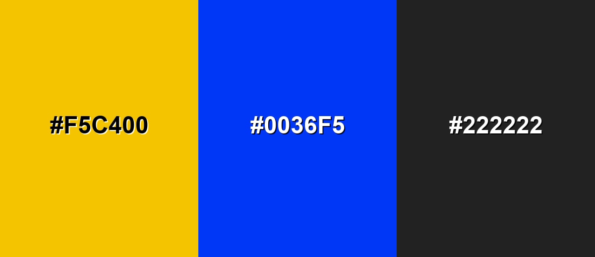
Complementary Palette Example: Use Golden Yellow with Royal Blue and Charcoal for a crisp, modern contrast.
Analogous Color Schemes
Analogous colors sit adjacent to each other on the color wheel, creating harmonious, cohesive palettes with subtle variation.
A sunny warm run: Warm Amber, Golden Yellow, and Lime Zest.
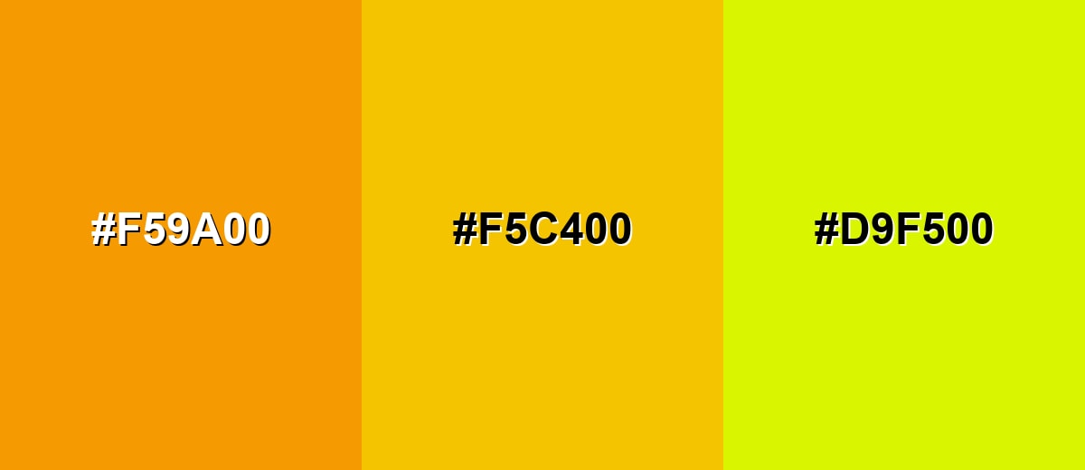
- Warm Amber: #F59A00
- Golden Yellow: #F5C400
- Lime Zest: #D9F500
A deeper, mellow set: Pumpkin Orange, Golden Yellow, and Lemon Glow.
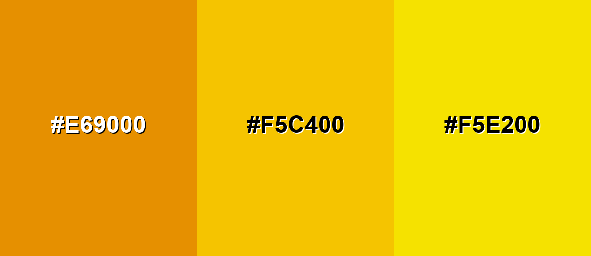
- Pumpkin Orange: #E69000
- Golden Yellow: #F5C400
- Lemon Glow: #F5E200
Triadic & Tetradic Combinations
A triadic scheme balances three evenly spaced hues for a lively, creative look.
Try Golden Yellow with Sea Teal and Electric Purple to keep contrast high while staying playful.
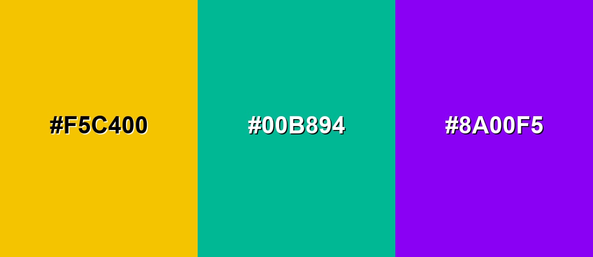
- Golden Yellow: #F5C400
- Sea Teal: #00B894
- Electric Purple: #8A00F5
Colors to Avoid
While golden yellow is remarkably versatile, certain combinations can create problematic visual effects:
- Neon Yellow (#FFFF00) - It can overpower golden yellow and make the palette feel harsh or hard to look at for long.
- Pure White (#FFFFFF) - Golden yellow on white often lacks contrast, especially for text, icons, and thin UI components.
- Light Gray (#E6E6E6) - This pairing can look washed out, reducing the rich, golden character and weakening emphasis.
- Pale Beige (#F5E7C6) - The tones are too close, which can create a muddy, low-definition look with little visual structure.
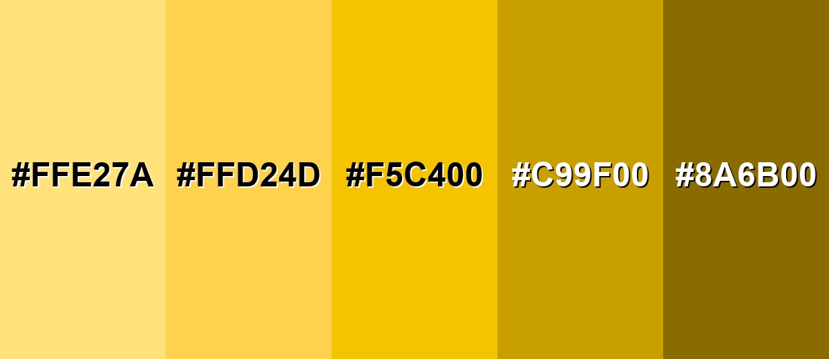
Shades, Tints & Variations of Golden Yellow
Golden yellow has a surprisingly useful range—from soft, airy tints for backgrounds to deeper, antique-leaning shades for premium accents. Mixing these variations helps you build hierarchy, depth, and more flexible color systems without losing the core warmth.
- Light Golden Yellow (#FFE27A) - A soft, airy tint that keeps the warmth while feeling less intense. It's best used for Background washes, subtle highlights, and gentle gradients..
- Soft Marigold (#FFD24D) - A friendly mid-light tone that reads sunny without dominating the layout. It's best used for Cards, banners, and secondary accents in UI or editorial graphics..
- Golden Yellow (#F5C400) - The core shade: vivid, warm, and attention-grabbing with a premium gold-like feel. It's best used for CTAs, badges, icons, and key highlights that need quick visibility..
- Deep Goldenrod (#C99F00) - A darker, more grounded version that feels richer and less flashy. It's best used for Headlines, borders, and paired accents alongside neutrals..
- Antique Gold (#8A6B00) - A muted, brown-leaning shade that suggests heritage and warmth. It's best used for Vintage themes, premium packaging, and supportive typography accents..
Industry Applications
Golden yellow is widely used wherever a brand or interface needs warmth with strong visibility. It can read as premium, cheerful, or energetic depending on what you pair it with and how much you use.
Fashion & Beauty
- Use golden yellow as an accent color in accessories to add a confident, "sunlit" pop.
- In beauty visuals, it pairs nicely with warm skin tones when kept as a highlight rather than an all-over cast.
- For seasonal collections, it fits especially well in summer campaigns and "glow" themed edits.
- On product packaging, combine it with deep neutrals to keep the look elevated instead of overly loud.
Interior Design & Decor
- Bring it in through smaller pieces—pillows, art, lamps, or throws—so the room stays calm but brighter.
- Use deeper shades (like goldenrod or antique gold) for a more grounded, heritage feel.
- It works well for wayfinding and signage details where visibility matters.
- Balance with charcoal, wood tones, or cool blues to prevent the space from feeling too intense.
Branding & Marketing
- Great for promotional highlights, limited-time labels, and reward messaging where you need instant attention.
- In UI, it's a strong choice for CTAs and achievement states—just keep text/icons dark for contrast.
- On packaging and retail, it can create "premium warmth" when paired with deep blues or charcoal tones.
- Use it consistently as a signature accent to build brand recognition without overwhelming the palette.
Conclusion
Golden yellow is a rich, sunlit color that brings instant warmth and visibility to digital and print work. When you use #F5C400 as a controlled accent—paired with deep blues or grounded neutrals—it can guide attention, signal success, and add a subtle premium cue without overpowering the layout. Whether you're building a UI system, a brand kit, or a bold campaign visual, the key is balance: keep contrast strong, limit coverage, and choose the right shade variation for the job.
Design Smarter with AI: Media.io is an online AI studio that empowers creators with advanced image generation and enhancement tools. From text-to-image and image-to-image creation to AI upscaling and color optimization, it enables fast, creative, and professional results—all in your browser.

Frequently Asked Questions About Golden Yellow Color
Golden yellow is a vivid, warm yellow that resembles sunlight and the glow of polished gold. It feels richer than a basic bright yellow and tends to look more premium and grounded.
A commonly used golden yellow hex value is #f5c400. It is a saturated yellow with strong warmth and high visibility for digital design.
It is often associated with optimism, success, warmth, and achievement. In visual communication it can signal emphasis, reward, or a positive highlight when used with restraint.
Deep blues and charcoal neutrals create strong contrast and keep it looking refined. For a softer look, pair it with warm oranges or yellow-greens in an analogous palette.
Yes, it works well for CTAs and highlight states because it draws attention quickly. Use dark text or icons on top and avoid placing golden yellow text on white backgrounds where contrast can be weak.
Start with the CMYK conversion and run a proof on the intended paper stock since yellows can shift noticeably. If you need a true metallic gold effect, consider metallic inks or foil rather than relying on flat process color.


