

Deep purple color is a dark, saturated violet that feels bold without going flashy—think velvet fabric or a ripe plum in low light. A popular web reference is #673AB7, which stays vivid while keeping that modern, shadowy depth.
Because purple sits between red and blue, deep purple can read warmer or cooler depending on what you pair it with. Below, you’ll find the exact codes, conversions, best pairings, shade ideas, and practical ways to use it with strong contrast.
Deep Purple Color: Codes & Values
If you want consistent deep purple across web, UI, and print, start with these core values and build your palette from there.
| Parameters | VALUE |
| HEX Code | #673AB7 |
| RGB DECIMAL | 103, 58, 183 |
| RGB PERCENTAGE | 40.4%, 22.7%, 71.8% |
| CMYK | 44%,68%,0%,28% |
| HSL | 262°, 52%, 47% |
| HSV (HSB) | 262°, 68%, 72% |
| Web Safe | #6633CC |
Key Color Space Explanations:
- HEX - HEX is the most common way to specify deep purple for web and UI. Use #673ab7 in CSS and design tools to match the exact shade.
- RGB - RGB mixes red, green, and blue light for screens. The values 103, 58, 183 create a deep violet that leans slightly cool.
- CMYK - CMYK is used for printing with cyan, magenta, yellow, and black inks. The CMYK values help approximate the same look in print, though paper and ink can shift the result.
- HSL - HSL describes hue, saturation, and lightness, which is useful for adjusting shades while keeping the same basic purple character. It’s especially handy for building UI states like hover and active.
- Web Safe - Web safe values are an older palette designed to reduce banding on limited displays. #6633cc is the closest web safe match to deep purple.
Use HEX/RGB for screens, lean on HSL/HSV to build consistent hover/active states, and reference CMYK when you need a print-friendly approximation.
Deep Purple Color Conversions
These conversions help you match deep purple across different tools, specs, and production workflows without guessing.
| Parameters | VALUE | CSS |
| HEX | #673ab7 | #673ab7 |
| RGB DECIMAL | 103, 58, 183 | rgb(103,58,183) |
| RGB PERCENTAGE | 40.4%, 22.7%, 71.8% | rgb(40.4%,22.7%,71.8%) |
| CMYK | 44%,68%,0%,28% | cmyk(44%,68%,0%,28%) |
| HSL | 262°, 52%, 47% | hsl(262°,52%,47%) |
| HSV (or HSB) | 262°, 68%, 72% | -- |
| Web Safe | 6633cc | #6633cc |
| CIE-LAB | 36.6, 47.0, -59.4 | -- |
| XYZ | 15.63, 9.32, 45.72 | -- |
| xyY | 0.221, 0.132, 9.32 | -- |
| CIE-LCH | 36.6, 75.7, 308.3° | -- |
| CIE-LUV | 36.6, 7.6, -86.4 | -- |
| Hunter-Lab | 30.5, 40.8, -75.0 | -- |
| Binary | 011001110011101010110111 | -- |
Want to generate Deep Purple Color photos or posters? Try Media.io's AI Image Generator now!
Deep Purple Color Meaning & Symbolism
Deep purple is commonly associated with imagination, ambition, and a sense of premium quality. It can feel dramatic without being aggressive, which makes it a popular choice when you want something more expressive than navy but more grounded than bright violet. In everyday life, the Deep Purple Color meaning often shows up in how people describe something as rich, special, or a little mysterious.
Psychological Effects
On screen and in physical spaces, deep purple tends to set a confident, intentional mood.
- Depth - Communicates layers, seriousness, and a “designed on purpose” feeling.
- Creativity - Suggests imagination and originality, especially in modern digital products.
- Cool Control - The blue-leaning undertone can feel focused and composed rather than loud.
- Moody Weight - In large blocks, it may read heavy or overly formal if spacing and light neutrals are missing.
- Memorability - Helps brands and UI elements stand out in a sea of blues and grays.
Positive Associations
When used with good contrast, deep purple often signals “premium” without relying on black.
- Luxury - Feels rich and elevated, echoing historical links to status and ceremony.
- Ambition - Can imply drive, progress, and confidence in a brand’s direction.
- Mystery - Adds intrigue and drama without becoming aggressive or harsh.
- Thoughtfulness - Works well for products that want to feel considered and deliberate.
- Distinctiveness - Creates a recognizable signature color when competitors lean neutral.
Cultural Significance Across the World
Deep purple’s symbolism shifts by context, but its “special occasion” energy tends to carry through.
- Royal Heritage - Historically tied to rare dyes and social status, which still influences modern perception.
- Ceremony - Often associated with formal moments, celebration, and a sense of importance.
- Modern Creativity - Common in creative and tech-forward identities that want to feel smart and expressive.
- Entertainment - Frequently used to add drama and atmosphere in posters, stages, and promotional visuals.
Design Applications
Deep purple is versatile: it can lead a brand, support a premium layout, or punch up details—just keep contrast and balance in mind.
Graphic Design Tips
- Use deep purple as a brand anchor color, then surround it with light neutrals to keep layouts breathable.
- For buttons and badges, keep the background simple so the purple reads as intentional, not noisy.
- Pair it with off-white surfaces for a clean, contemporary vibe; pair with darker neutrals for a moodier, high-end feel.
- Choose white or near-white text on deep purple, and increase weight/line-height for small type.
- Test contrast early—mid-grays and muted blues can reduce readability with deep purple UI elements.
Pro tip: Build a small “purple system” (core, hover, active, and a soft tint) so your UI stays consistent across states instead of shifting to random violets.
Deep Purple Color in Photography & Video
- Use deep purple lighting or gels to create a cinematic, night-scene mood without turning the frame overly cold.
- For portraits, keep skin tones natural by limiting purple to backgrounds, rim lights, or wardrobe accents.
- In product shots, deep purple backdrops can make metallic details and glossy finishes feel more premium.
- In video color grading, watch shadow detail—deep purple can crush blacks if contrast is pushed too far.
- Balance purple scenes with neutral highlights (white, soft gray) to avoid color fatigue and keep focus clear.
Recommended Tool for Image Enhancement: When incorporating deep purple color into your photography projects, Media.io's AI Image tools can help you achieve more refined results. With AI-powered color enhancement, photo colorization, image upscaling, and old photo restoration, you can easily enrich deep purple color tones, improve overall image quality, and highlight the color's elegant and sophisticated aesthetic.
Color Combinations
Deep purple plays well with both crisp neutrals and high-energy accents. Use complementary schemes for punchy contrast, analogous palettes for a smooth gradient feel, and triadic or tetradic sets when you want a lively, balanced system.
Complementary Colors
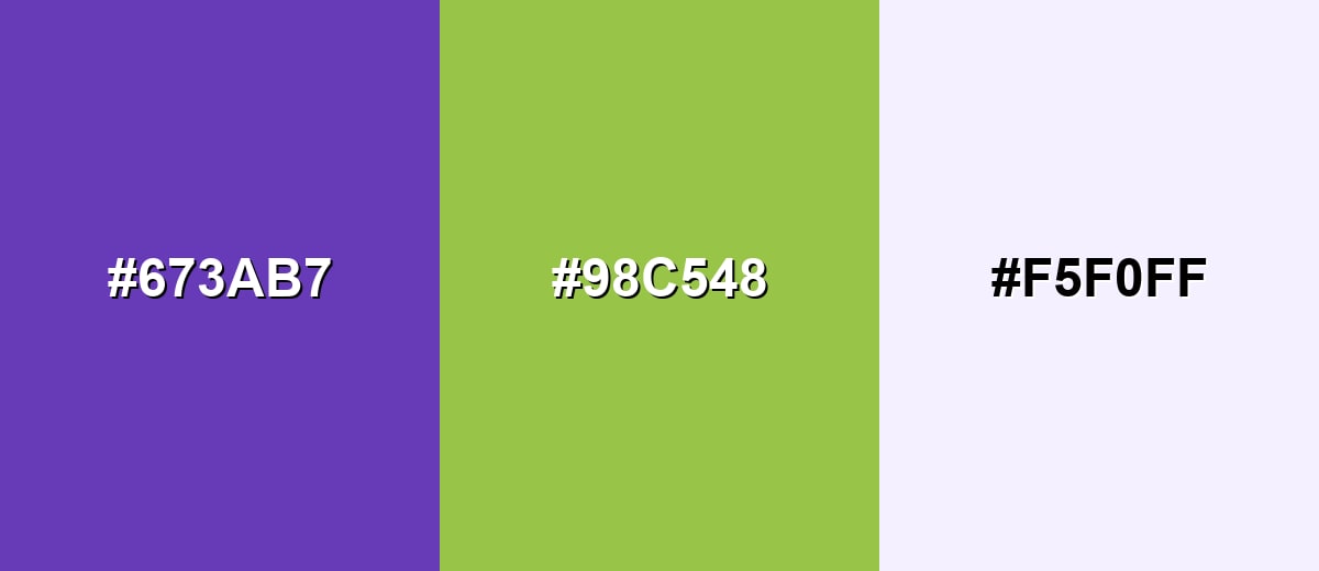
A complementary pairing balances deep purple with a yellow-green accent, creating strong contrast that feels energetic and modern. Keep the green-yellow as a highlight and let deep purple carry the structure.
Complementary Palette Example: Deep Purple with Chartreuse accent and a soft lavender neutral creates a bold but usable contrast.
Analogous Color Schemes
Analogous colors sit adjacent to each other on the color wheel, creating harmonious, cohesive palettes with subtle variation.
Indigo, Deep Purple, and Purple Magenta form a smooth, creative analogous blend.
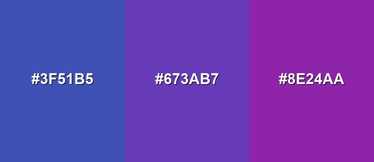
- Indigo Blue: #3F51B5
- Deep Purple: #673AB7
- Purple Magenta: #8E24AA
Deep Indigo, Deep Purple, and Amethyst Purple give a richer, more dramatic gradient.
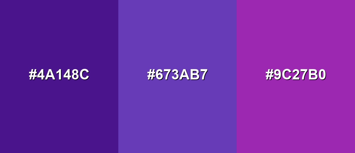
- Deep Indigo: #4A148C
- Deep Purple: #673AB7
- Amethyst Purple: #9C27B0
Triadic & Tetradic Combinations
A triadic palette adds variety while staying balanced, which is useful for dashboards, illustrations, and brand systems with multiple categories.
Deep Purple, Tangerine Orange, and Emerald Green create a vivid, playful triad with clear separation.
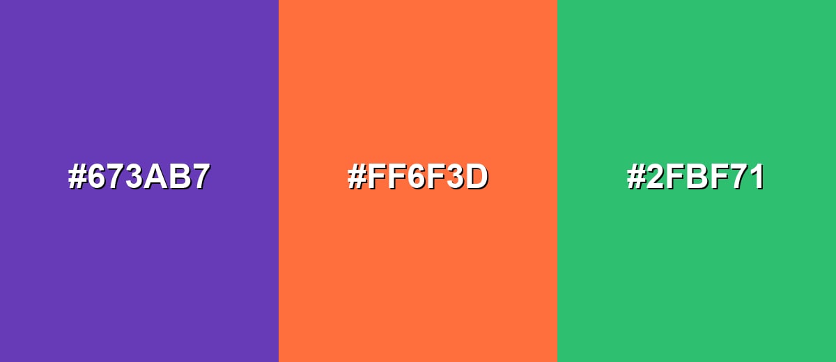
- Deep Purple: #673AB7
- Tangerine: #FF6F3D
- Emerald Green: #2FBF71
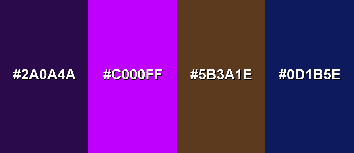
Colors to Avoid
While deep purple color is remarkably versatile, certain combinations can create problematic visual effects:
- Near-Black Purple (#2A0A4A) - Too close in value to deep purple, so UI elements can blend together and lose hierarchy.
- Neon Purple (#C000FF) - Competes with deep purple’s richness and can feel harsh or overly saturated on screens.
- Muddy Brown (#5B3A1E) - Creates a dull, heavy pairing that can look dirty rather than refined unless carefully art-directed.
- Dark Navy (#0D1B5E) - Both are dark and cool, which often reduces contrast and makes layouts feel too dense.
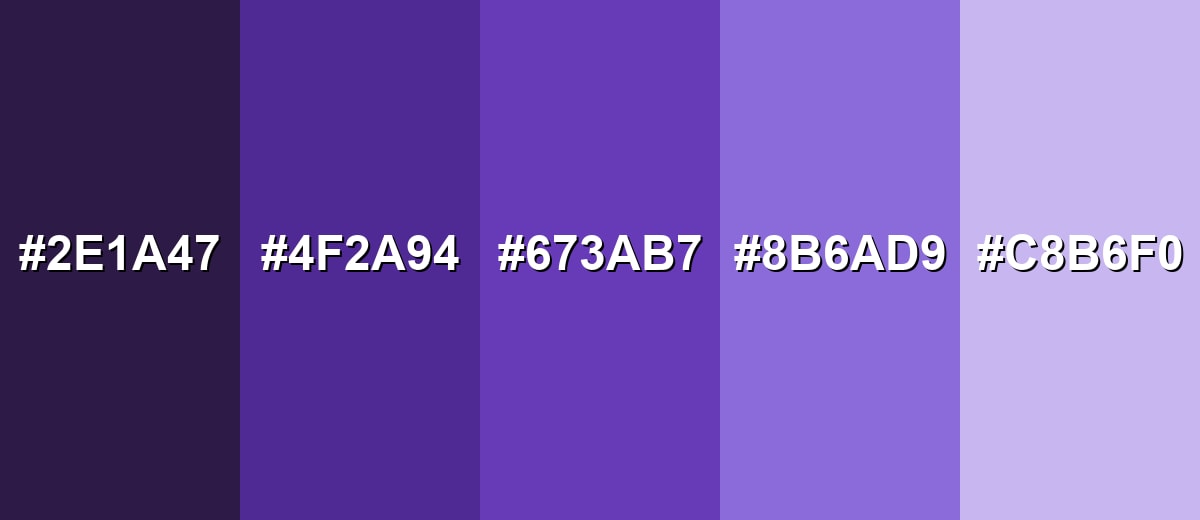
Shades, Tints & Variations of Deep Purple Color
Deep purple isn’t just one shade—it ranges from near-black, cinematic purples to soft lavender tints. Having a few coordinated variations makes it easier to build hierarchy (backgrounds, surfaces, accents, and states) while keeping the same recognizable hue.
- Midnight Purple (#2E1A47) - A near-black purple with a subtle violet undertone that reads moody and cinematic. It’s best used for Dark-mode backgrounds, hero headers, and premium packaging concepts.
- Royal Deep Purple (#4F2A94) - A darker, more regal version that keeps the same personality but adds weight. It’s best used for Brand anchors, navigation bars, and strong accent panels.
- Deep Purple (#673AB7) - The core shade: saturated, cool-leaning, and balanced between violet and indigo. It’s best used for Primary accents, buttons, badges, and standout graphics.
- Soft Purple (#8B6AD9) - A lighter, friendlier purple that still feels modern and intentional. It’s best used for Secondary UI states, gradients, and supportive illustrations.
- Lavender Tint (#C8B6F0) - A pale tint that carries the same hue but feels airy and calm. It’s best used for Background washes, cards, subtle borders, and spacious layouts.
Industry Applications
Deep purple is used across industries that want to signal creativity, quality, and confidence without relying on classic black. It also works well in digital products because it stands out while remaining readable when paired with the right neutrals.
Fashion & Beauty
- Use deep purple accents on packaging to suggest a premium product line without feeling overly harsh.
- Pair it with clean neutrals for a modern “boutique” look in labels, boxes, and product cards.
- In beauty campaigns, deep purple backgrounds add drama while keeping typography readable in white.
- For wellness branding, combine deep purple with soft tints to keep the tone calming but distinctive.
Interior Design & Decor
- Use deep purple as a feature wall color or statement textile for a dramatic, cinematic mood.
- Balance it with light surfaces (off-white, pale tints) to prevent spaces from feeling too heavy.
- Apply it in small doses—pillows, art, or vases—when you want a refined pop of color.
- In mood lighting or event decor, deep purple helps create depth and a sense of occasion.
Branding & Marketing
- In technology and apps, use deep purple for primary buttons, feature highlights, and onboarding emphasis.
- For education and creative tools, it works well as a category/tag color that’s easy to recognize.
- In entertainment promos, deep purple supports bold headlines and adds atmosphere to posters and banners.
- For luxury retail campaigns, deep purple can replace black to feel exclusive while staying more expressive.
Conclusion
Deep purple brings a rare mix of creativity and polish: it’s rich, cool-leaning, and memorable, making it a strong choice for branding, UI accents, and dramatic visuals. With #673AB7 as your reference, you can stay consistent across web and print, then expand into darker or lighter variations for hierarchy and states. Pair it with light neutrals for clarity, or introduce yellow-green and warm orange accents when you want extra energy—just keep contrast high so the elegance doesn’t get lost.
Design Smarter with AI: Media.io is an online AI studio that empowers creators with advanced image generation and enhancement tools. From text-to-image and image-to-image creation to AI upscaling and color optimization, it enables fast, creative, and professional results—all in your browser.

Frequently Asked Questions About Deep Purple Color
Deep purple is a dark, saturated violet that often leans slightly blue. It resembles velvet-like purple fabric, dark grapes, or a dramatic violet ink.
A widely used deep purple hex value is #673ab7. It’s popular in digital design because it stays vibrant while still feeling deep and refined.
Deep purple pairs well with soft off-whites, light lavenders, and cool grays for a clean look. For contrast, try yellow-green accents or warm oranges in small doses.
Most deep purple shades lean cool because they sit closer to blue than red. However, it can feel warmer when paired with gold, orange, or warm neutrals.
Use deep purple as an accent or for larger UI elements with plenty of whitespace, then pair it with high-contrast text (often white). Always test contrast for small text, icons, and disabled states.
Nearby options include indigo, royal purple, amethyst, and darker violet tones. Choosing a slightly darker or lighter variation helps create hover states, depth, and clear hierarchy.


