

 TL;DR:
Chartreuse (#7FFF00) is a highly visible, energetic yellow-green best utilized as a strategic digital accent—such as for UI buttons or call-to-action elements—anchored by deep neutral backgrounds like navy or charcoal to ensure readability.
● Avoid deploying chartreuse as a dominant large-area fill or pairing it with light text, as its high luminosity rapidly reduces contrast and induces screen strain.
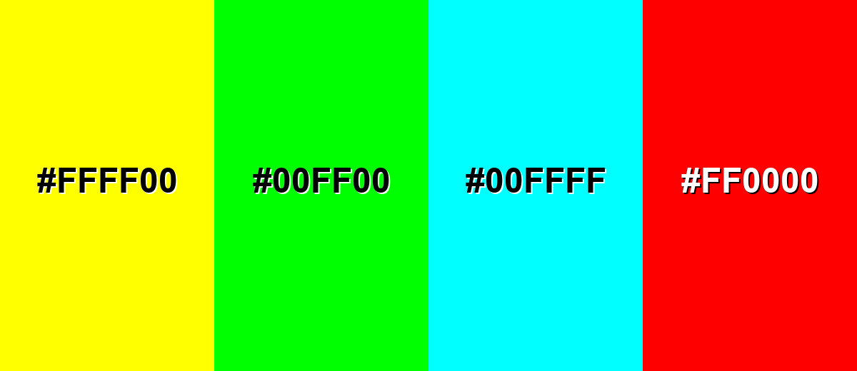
● Exclude pure yellow (#FFFF00), neon green (#00FF00), pure cyan, and bright red from supporting palettes to prevent aggressive visual vibration and blurred design hierarchy.
● When adapting screen designs for physical production, use the baseline CMYK profile of 50%,0%,100%,0% but strictly mandate test proofs, because vivid yellow-greens are highly susceptible to color shifting based on paper and ink combinations.
Ask AI for a summary
 ChatGPT
 Perplexity
 Gemini
 Claude
 Grok
Grok
Chartreuse is a bright yellow-green that feels like fresh spring leaves with a neon edge. The classic chartreuse hex code is #7FFF00, landing right between green and yellow on the spectrum.
It's often read as energetic, attention-grabbing, and modern—but it can feel intense when used across large areas. Below, you'll find practical color codes, conversions, pairings, shade ideas, and real-world ways to use chartreuse with better control.
Chartreuse Color: Codes & Values
If you want chartreuse to look consistent across screens (and as close as possible in print), start with these standard values.
| Parameters | VALUE |
| HEX Code | #7FFF00 |
| RGB DECIMAL | 127, 255, 0 |
| RGB PERCENTAGE | 49.8%, 100%, 0% |
| CMYK | 50%,0%,100%,0% |
| HSL | 90°, 100%, 50% |
| HSV (HSB) | 90°, 100%, 100% |
| Web Safe | #66FF00 |
Key Color Space Explanations:
- HEX - HEX is the most common way to specify chartreuse on screens and in CSS. Use #7fff00 to match the standard bright yellow-green.
- RGB - RGB mixes red, green, and blue light for digital displays. Chartreuse uses strong green (255), mid red (127), and no blue (0) for a vivid result.
- CMYK - CMYK is used for printing with ink rather than light. The CMYK values help you reproduce a chartreuse-like look, though exact output depends on paper and profiles.
- HSL - HSL describes hue, saturation, and lightness, which is handy for building tints and tones. Chartreuse sits around 90° with full saturation and medium lightness.
- Web Safe - Web safe values map to the older 216-color palette. The closest web-safe match to chartreuse is #66ff00.
For web and UI work, HEX and RGB are your go-to values. For print, treat CMYK as a starting point and always test a proof—bright yellow-greens can shift depending on paper and color profiles.
Want to generate Chartreuse color photos or posters? Try Media.io's AI Image Generator now!
Chartreuse Color Conversions
Need chartreuse in different formats for CSS, design software, or production specs? Use the chartreuse conversion table below as a quick reference.
| Parameters | VALUE | CSS |
| HEX | #7fff00 | #7fff00 |
| RGB DECIMAL | 127, 255, 0 | rgb(127,255,0) |
| RGB PERCENTAGE | 49.8%, 100%, 0% | rgb(49.8%,100%,0%) |
| CMYK | 50%,0%,100%,0% | cmyk(50%,0%,100%,0%) |
| HSL | 90°, 100%, 50% | hsl(90°, 100%, 50%) |
| HSV (or HSB) | 90°, 100%, 100% | -- |
| Web Safe | 66ff00 | #66ff00 |
| CIE-LAB | L* 89.9, a* -64.2, b* 86.1 | -- |
| XYZ | 53.6, 80.3, 13.0 | -- |
| xyY | x 0.361, y 0.541, Y 80.3 | -- |
| CIE-LCH | L* 89.9, C* 107.4, h° 126.5 | -- |
| CIE-LUV | L* 89.9, u* -54.8, v* 92.7 | -- |
| Hunter-Lab | 89.6, -43.1, 74.8 | -- |
| Binary | 011111111111111100000000 | -- |
Chartreuse Color Meaning & Symbolism
Chartreuse is commonly linked with energy, freshness, and bold visibility. Because it sits between yellow and green, it blends the optimism of yellow with the growth-and-nature feel of green, making it easy to read in everyday visual communication.
Psychological Effects
Chartreuse tends to grab attention quickly, so it naturally signals action and alertness.
- Lively Alertness - This hue tends to feel lively and alert, which is why it shows up in sporty branding, call-to-action elements, and anything that needs to stand out fast.
- Modern Energy - In small doses, it can make a layout feel more modern and active.
- Motivation Cue - It's energizing and motivating for highlights, buttons, and key indicators.
- Screen Strain Risk - It can feel harsh or tiring if it dominates large areas, particularly on bright screens.
- Overly Loud Mixes - It may read as acidic or overly loud when combined with other intense brights.
Positive Associations
Used with restraint, chartreuse communicates freshness, speed, and clarity.
- Fresh Youthfulness - It feels fresh and youthful, especially when paired with clean whites or cool grays.
- Optimism Meets Growth - Sitting between yellow and green, it combines optimism with a growth-and-nature feel.
- High Visibility - Chartreuse is commonly linked with bold visibility, making it a strong choice for quick visual communication.
- Innovation Signal - In contemporary contexts it often signals innovation.
- Performance Vibe - It can read as outdoorsy or performance-oriented, especially when anchored with stable neutrals.
Cultural Significance Across the World
Its name and modern usage both shape how people interpret chartreuse today.
- French Origin - The name comes from the French liqueur Chartreuse, which helped define the modern idea of a sharp yellow-green.
- Contemporary Innovation - In modern contexts, chartreuse often suggests innovation and a tech-forward edge.
- Visibility First - Because it reads quickly, it's frequently used where bold visibility matters.
- Outdoors And Performance - It commonly carries an outdoorsy, performance-oriented feel in contemporary visual culture.
Design Applications
Chartreuse is powerful because it grabs attention quickly, so it's most effective when you treat it as a strategic highlight rather than a background. Start with a neutral foundation, then add chartreuse where you want the eye to go first.
Graphic Design Tips
- Use As A Highlight - Treat chartreuse as a strategic highlight rather than a background to keep layouts controlled and readable.
- Limit Competing Actions - Reserve it for one main action per screen to avoid a noisy interface.
- Build On A Calm Base - Pair it with a calm base (like a deep anchor) so the message stays clear without visual strain.
- Plan For Print Shifts - Run proofs because bright yellow-greens can shift noticeably depending on paper and ink profiles.
- Respect Contrast - For readable text, prefer dark backgrounds under chartreuse elements, and check contrast ratios for buttons and small labels.
Pro tip: because chartreuse is very light and saturated, contrast changes fast—use it as a fill with dark text/iconography, and avoid chartreuse text on white or light gray.
Chartreuse Color in Photography & Video
- Expect Extra Screen Vividness - Chartreuse tends to appear extra vivid in light-based (screen) color, so keep an eye on intensity during edits.
- Avoid Large Dominant Areas - It can feel harsh or tiring if it dominates large areas, particularly on bright screens.
- Use For Clear Focal Points - It grabs attention quickly, so use it where you want the eye to go first.
- Anchor With Dark Neutrals - For readability and clarity, chartreuse performs best with dark backgrounds like navy, charcoal, or black under key elements.
- Be Careful With Other Brights - It may read as overly loud when combined with other intense brights, which can distract from the subject.
Recommended Tool for Image Enhancement: When incorporating chartreuse color into your photography projects, Media.io's AI Image tools can help you achieve more refined results. With AI-powered color enhancement, photo colorization, image upscaling, and old photo restoration, you can easily enrich chartreuse color tones, improve overall image quality, and highlight the color's elegant and sophisticated aesthetic.
Color Combinations
Chartreuse pairs best with deep, calming anchors and a few carefully chosen supporting tones. These palettes help you balance its brightness while keeping layouts readable and intentional.
Complementary Colors
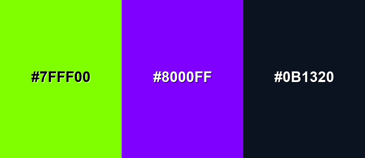
A complementary scheme uses the opposite side of the color wheel to create punchy contrast. With chartreuse, a saturated purple delivers instant energy without looking accidental.
Complementary Palette Example: Use chartreuse with electric purple and deep navy for bold, modern contrast that still feels grounded.
Analogous Color Schemes
Analogous colors sit adjacent to each other on the color wheel, creating harmonious, cohesive palettes with subtle variation.
Yellow-green to green: bright, natural, and smooth for gradients and modern highlights.
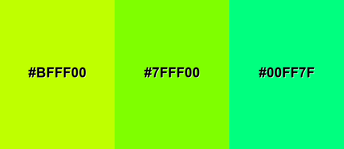
- Lime Zest: #BFFF00
- Chartreuse: #7FFF00
- Spring Green: #00FF7F
Warm-leaning chartreuse: a slightly sunnier trio that feels sporty and upbeat.
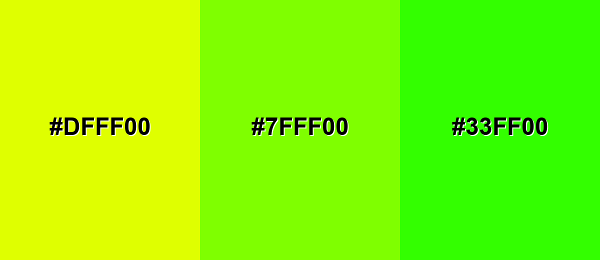
- Acid Yellow: #DFFF00
- Chartreuse: #7FFF00
- Fresh Green: #33FF00
Triadic & Tetradic Combinations
A triadic palette spreads three hues evenly around the wheel for variety without losing balance.
Chartreuse with azure and vivid rose creates playful contrast for illustrations, posters, and bold UI accents.
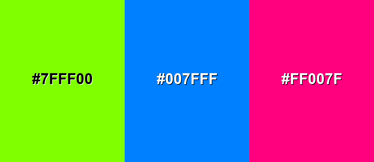
- Chartreuse: #7FFF00
- Azure Blue: #007FFF
- Vivid Rose: #FF007F
Colors to Avoid
While chartreuse color is remarkably versatile, certain combinations can create problematic visual effects:
- Pure Yellow (#FFFF00) - Too close in brightness and intensity, so edges blur and the combination can feel glaring.
- Neon Green (#00FF00) - Competes with chartreuse and reduces hierarchy, making designs look noisy rather than intentional.
- Pure Cyan (#00FFFF) - Both are highly saturated and luminous, which can cause eye fatigue and distract from key content.
- Bright Red (#FF0000) - Creates a sharp, vibrating contrast that can feel aggressive and is hard to use for readable UI elements.
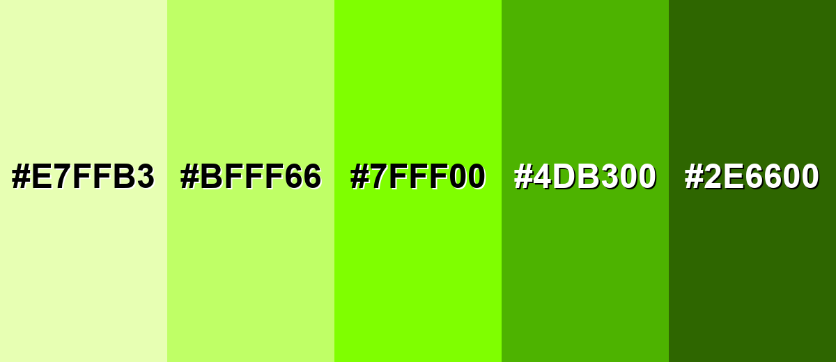
Shades, Tints & Variations of Chartreuse Color
Chartreuse isn't just one "neon" look—there's a useful range from airy tints to grounded olive-leaning shades. Exploring these variations helps you keep the same chartreuse personality while dialing up readability, softness, or depth depending on the project.
- Pale Chartreuse (#E7FFB3) - A light, softened version that keeps the yellow-green character without the neon punch. It's best used for Backgrounds, large surfaces, and gentle highlights..
- Soft Chartreuse (#BFFF66) - A friendlier mid-tint that still feels fresh but is easier to pair with neutrals. It's best used for Cards, UI fills, and brand accents where you want less intensity..
- Classic Chartreuse (#7FFF00) - The bright standard shade, vivid and high-visibility with a strong yellow-green balance. It's best used for CTAs, badges, sports graphics, and attention-focused elements..
- Deep Chartreuse (#4DB300) - A darker, greener take that feels more grounded while staying energetic. It's best used for Buttons, icons, and accents on light backgrounds with better legibility..
- Dark Olive Chartreuse (#2E6600) - A muted, earthy shade that leans into olive, reducing the fluorescent feel. It's best used for Headings, borders, and outdoors-inspired palettes with natural materials..
Industry Applications
Because chartreuse reads quickly at a distance and pops on screens, it shows up in industries that benefit from speed, visibility, and a modern edge. The key is to balance it with stable neutrals so it stays functional, not overwhelming.
Fashion & Beauty
- Sports And Outdoor Details - Feature chartreuse in apparel details for a high-visibility, performance feel.
- Sharp Contrast Styling - Pair it with black or deep gray to keep silhouettes sharp and readable.
- Limited, Intentional Accents - Use chartreuse as an accent rather than a full look to avoid an overly loud effect.
- Performance-Inspired Palettes - Lean into its outdoorsy, performance-oriented vibe for energetic capsule drops or seasonal lines.
Interior Design & Decor
- Small Accent Pieces - Use chartreuse in pillows, art, vases, and feature details for a playful lift.
- Avoid Full Walls In Pure Chartreuse - Skip entire rooms in pure chartreuse; opt for muted tones or tints for larger surfaces.
- Balance With Neutrals - Use warm woods or soft grays to prevent a fluorescent feel.
- Creative Room Energy - It works especially well in studios and creative spaces where energy is desired.
Branding & Marketing
- Signature Accent Identity - Use it as a signature accent on a calm base (black, navy, charcoal) to create a recognizable, energetic mark.
- High-Impact Promotions - Use chartreuse as a punchy highlight for pricing, announcements, or limited offers.
- Packaging Shelf Pop - Add it to labels, caps, or pattern elements to stand out on shelves without overprinting the entire pack.
- Consistency And Proofing - Keep the accent consistent across touchpoints, and check print proofs since bright yellow-greens can shift.
Conclusion
Chartreuse is a vivid yellow-green that's hard to ignore—perfect when you need fast visibility, modern energy, and clear hierarchy. The trick is treating it like a precision tool: use #7FFF00 (or a softer tint/darker shade) as an accent, then support it with stable neutrals and strong contrast so the design stays readable. Whether you're building UI buttons, sporty branding, high-impact ads, or bold packaging, chartreuse delivers personality and punch when it's balanced thoughtfully.
Design Smarter with AI: Media.io is an online AI studio that empowers creators with advanced image generation and enhancement tools. From text-to-image and image-to-image creation to AI upscaling and color optimization, it enables fast, creative, and professional results—all in your browser.

Frequently Asked Questions About Chartreuse Color
Chartreuse is a bright yellow-green hue that sits between green and yellow. It's known for its high visibility and energetic look, especially on screens.
The commonly referenced hex code for chartreuse is #7fff00. It produces a vivid, saturated yellow-green in digital design.
It depends on the exact shade, but classic chartreuse is balanced between the two with a noticeable yellow bias. In brighter tints it reads more yellow; in darker shades it reads more green.
Deep purples, navy, charcoal, and clean whites tend to pair well because they calm the brightness and improve readability. For a bolder look, try azure or vivid pink as supporting accents.
Use it for accents like buttons, badges, and highlights rather than long text blocks. It usually performs best on dark backgrounds, or as a background fill with dark text, after checking contrast.
Bright yellow-greens can shift in print depending on paper and color profiles, so proofs matter. A common starting point is CMYK 50%,0%,100%,0%, then adjust to match your target look.


