

Yellow orange color is a warm golden-orange tone that looks like sunlight hitting ripe citrus peel. Its defining hex code is #FFAE42, blending yellow's cheer with orange's punch.
Because it's high-chroma and visually "advancing," it grabs attention fast—making it a go-to for accents, highlights, and upbeat brand moments. Below, you'll find its values, conversions, pairings, variations, and best real-world uses.
Yellow Orange Color: Codes & Values
If you want a reliable "sunny gold" that stays consistent across tools, these are the core values to copy into your design software.
| Parameters | VALUE |
| HEX Code | #FFAE42 |
| RGB DECIMAL | 255, 174, 66 |
| RGB PERCENTAGE | 100%, 68.2%, 25.9% |
| CMYK | 0%,32%,74%,0% |
| HSL | 34°, 100%, 63% |
| HSV (HSB) | 34°, 74%, 100% |
| Web Safe | #FF9933 |
Key Color Space Explanations:
- HEX - HEX is the most common way to specify this shade in web design and digital tools. Use #ffae42 to reproduce the exact yellow orange tone on screen.
- RGB - RGB defines the amount of red, green, and blue light used on displays. With 255, 174, 66 it stays bright and warm, making it strong as an accent.
- CMYK - CMYK is used for print and describes how inks combine on paper. The 0%,32%,74%,0% mix typically prints as a vivid golden-orange, but paper and profiles can shift it slightly.
- HSL - HSL organizes the hue by angle plus saturation and lightness, which is handy for picking lighter or deeper variations. At 34° with high saturation, it reads as energetic and sunny.
- Web Safe - Web-safe values are the closest older-browser palette equivalents. #ff9933 is a near match that keeps the same warm orange direction.
For most digital projects, start with HEX (#FFAE42). If you're fine-tuning brightness or building a palette, HSL/HSV makes it easier to create consistent tints and deeper accent states.
Yellow Orange Color Conversions
Need this color in a specific format for CSS, print specs, or color-managed workflows? Use the conversion table below as a quick reference.
| Parameters | VALUE | CSS |
| HEX | #ffae42 | #ffae42 |
| RGB DECIMAL | 255, 174, 66 | rgb(255,174,66) |
| RGB PERCENTAGE | 100%, 68.2%, 25.9% | rgb(100%,68.2%,25.9%) |
| CMYK | 0%,32%,74%,0% | cmyk(0%,32%,74%,0%) |
| HSL | 34°, 100%, 63% | hsl(34°,100%,63%) |
| HSV (or HSB) | 34°, 74%, 100% | -- |
| Web Safe | ff9933 | #ff9933 |
| CIE-LAB | 77.3, 20.5, 64.6 | -- |
| XYZ | 57.39, 51.97, 12.16 | -- |
| xyY | 0.472, 0.428, 51.97 | -- |
| CIE-LCH | 77.3, 67.8, 72.4° | -- |
| CIE-LUV | 77.3, 65.3, 67.4 | -- |
| Hunter-Lab | 72.1, 20.4, 39.6 | -- |
| Binary | 11111111 10101110 01000010 | -- |
Want to generate Yellow Orange Color photos or posters? Try Media.io's AI Image Generator now!
Yellow Orange Color Meaning & Symbolism
Yellow orange is commonly associated with warmth, enthusiasm, and friendly confidence. It sits between bright yellow and classic orange, so it often feels both optimistic and action-oriented in everyday visuals. That mix is why Yellow Orange Color meaning is frequently tied to "sunny energy" without the sharpness of neon yellow.
Psychological Effects
In practice, this shade tends to boost visibility and mood while keeping the vibe approachable.
- Inviting Energy - It feels welcoming and upbeat, helping designs look friendly rather than formal.
- Fast Attention - It draws the eye quickly, which is useful for highlights, badges, and key moments.
- Warm Momentum - It suggests activity and movement, making it a natural fit for "get started" actions.
- Appetite & Comfort - The warmth can hint at food, coziness, and satisfaction in packaging and promos.
- Overuse Fatigue - When used too heavily, it can feel loud or visually tiring, so balance matters.
Positive Associations
When people describe yellow orange, the words usually lean optimistic and social.
- Optimism - A sunny, forward-looking tone that feels encouraging.
- Friendliness - Communicates openness and approachability, especially in modern branding.
- Confidence - Bright without being aggressive, giving messages a clear, positive push.
- Creativity - Often reads playful and imaginative, great for campaigns and illustrations.
- Warmth - Feels like light and heat, making visuals seem more human and welcoming.
Cultural Significance Across the World
Meanings vary by context, but yellow-orange hues often show up where warmth and celebration are the point.
- Sunshine Themes - Commonly tied to bright weather, daylight, and cheerful seasonal messaging.
- Harvest & Abundance - Frequently used in autumn visuals to signal ripeness, plenty, and generosity.
- Festive Warmth - Works well for events and entertainment because it feels lively and welcoming.
- Casual Positivity - Often chosen when a message should feel energetic and friendly rather than strict or corporate.
Design Applications
Yellow orange is easiest to use as a controlled highlight: strong enough to lead the eye, warm enough to feel welcoming. Start with small doses, then scale it up only when readability and contrast are secure.
Graphic Design Tips
- Use It As A Highlight - Treat yellow orange as an accent for callouts, stickers, and key UI states.
- Choose Calm Backgrounds - Off-whites and warm grays keep the color bright without creating glare.
- Balance With Depth - Pair with darker structure colors so layouts feel grounded and readable.
- Adjust Saturation When Needed - If it feels too loud, slightly reduce saturation or pick a deeper variation.
- Check Contrast Early - Verify text/icon contrast, especially when layering over light surfaces.
Pro tip: If you're building a brand system, reserve yellow orange for one clear job (CTA, highlight, or reward state). Consistent use makes it feel premium instead of noisy.
Yellow Orange Color in Photography & Video
- Golden Hour Boost - It naturally matches warm sunlight, enhancing "late afternoon" vibes.
- Product Pop - Great for making food, lifestyle items, and packaging details look more inviting.
- Skin Tone Awareness - Warm hues can shift skin; keep whites neutral to avoid an overly orange cast.
- Controlled Accents - Use it in props, wardrobe, or graphics overlays so it guides attention without flooding the scene.
- Clean Color Grading - Balance with cooler shadows or neutral midtones for a modern, cinematic look.
Recommended Tool for Image Enhancement: When incorporating yellow orange color into your photography projects, Media.io's AI Image tools can help you achieve more refined results. With AI-powered color enhancement, photo colorization, image upscaling, and old photo restoration, you can easily enrich yellow orange color tones, improve overall image quality, and highlight the color's elegant and sophisticated aesthetic.
Color Combinations
Yellow orange pairs best with cool blues for contrast, nearby warm hues for smooth gradients, and grounded neutrals for a modern finish. The palettes below show reliable directions you can adapt for brand systems, UI themes, and illustrations.
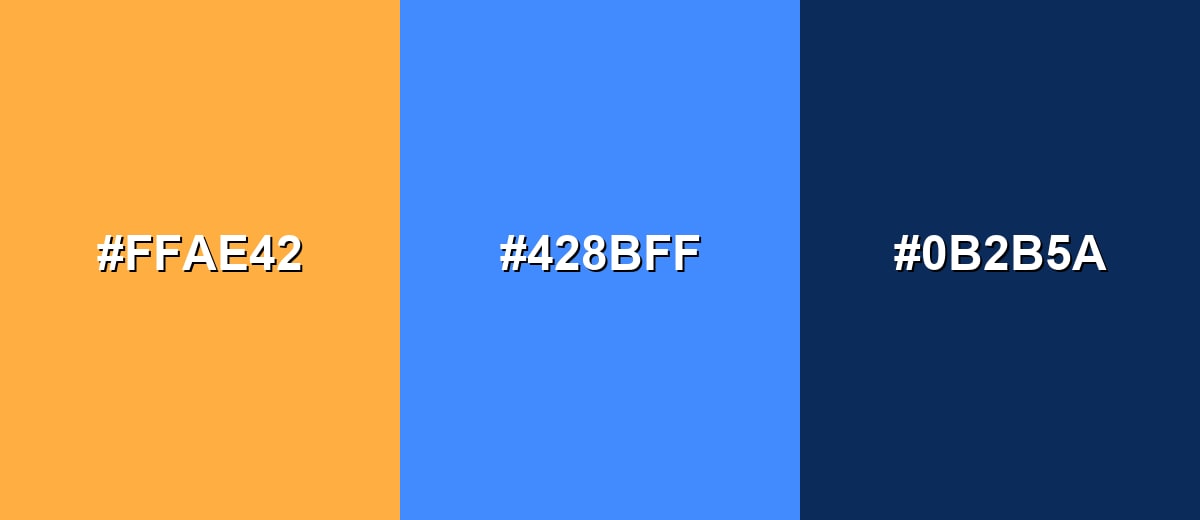
Complementary Colors
A complementary palette balances warm yellow orange with a cool blue opposite on the wheel, creating strong contrast and clear visual hierarchy.
Complementary Palette Example: Use yellow orange for highlights, the blue for anchors (headers, nav, key shapes), and the dark tone for text and structure.
Analogous Color Schemes
Analogous colors sit adjacent to each other on the color wheel, creating harmonious, cohesive palettes with subtle variation.
Warm analogous blend: golden yellow into yellow orange into coral-orange for a smooth, sunny gradient.
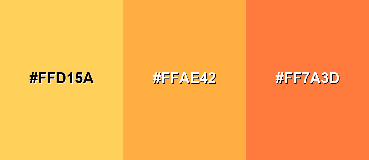
- Golden Yellow: #FFD15A
- Yellow Orange: #FFAE42
- Coral Orange: #FF7A3D
Soft-to-rich warmth: buttery yellow, yellow orange, then pumpkin for depth without losing the bright feel.
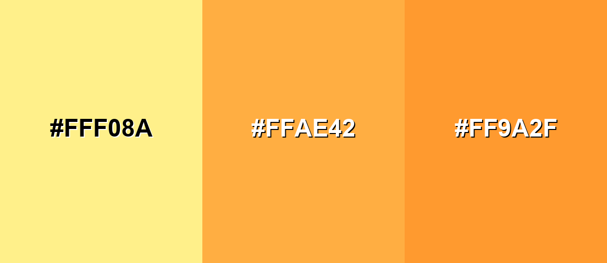
- Buttery Yellow: #FFF08A
- Yellow Orange: #FFAE42
- Pumpkin: #FF9A2F
Triadic & Tetradic Combinations
A triadic setup keeps things lively by spacing hues evenly, which is useful for playful brand systems and bold illustrations.
Yellow orange with mint and violet delivers balanced contrast while staying bright and modern.
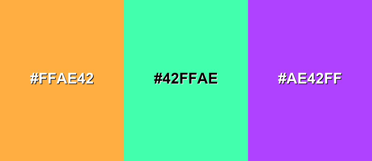
- Yellow Orange: #FFAE42
- Mint Green: #42FFAE
- Violet: #AE42FF
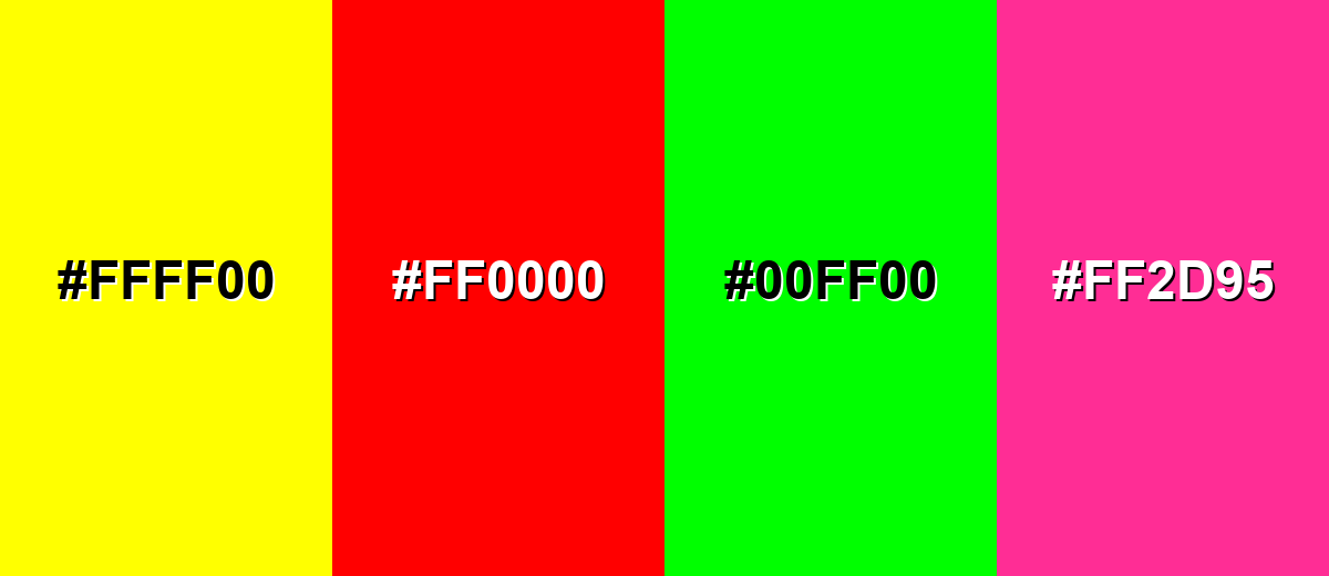
Colors to Avoid
While yellow orange color is remarkably versatile, certain combinations can create problematic visual effects:
- Pure Yellow (#FFFF00) - Too close in brightness and warmth, which can reduce edge definition and make elements blend together.
- Pure Red (#FF0000) - Creates a loud, high-tension pairing that can feel aggressive and distracting in UI and branding.
- Neon Green (#00FF00) - Both hues compete at maximum intensity, often producing a harsh, vibrating look on screens.
- Hot Pink (#FF2D95) - Can push the palette into an overly playful or chaotic direction unless carefully balanced with neutrals.
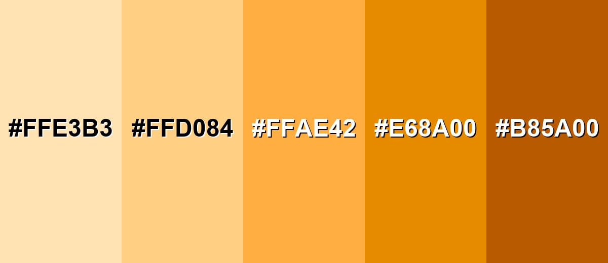
Shades, Tints & Variations of Yellow Orange Color
From soft, creamy tints to deeper marigold tones, yellow orange has a range that's easy to adapt for backgrounds, accents, and stronger contrast states. Using variations helps you keep the same warm personality while improving hierarchy and readability.
- Apricot Cream (#FFE3B3) - A very light, creamy tint that keeps the warm direction while feeling soft and airy. It's best used for Backgrounds, large sections, subtle highlights, and gentle gradients..
- Soft Amber (#FFD084) - A lighter amber tone that still reads sunny but with less punch than the main shade. It's best used for Cards, secondary buttons, charts, and warm UI surfaces..
- Yellow Orange (#FFAE42) - The signature bright golden-orange that looks energetic and attention-friendly. It's best used for Badges, callouts, icons, and brand accents that need visibility..
- Deep Marigold (#E68A00) - A deeper, slightly earthier version that feels more grounded and less playful. It's best used for Headlines, button hover states, outlines, and emphasis with stronger contrast..
- Burnt Orange Brown (#B85A00) - A dark, warm shade with a toasted feel that adds seriousness and stability. It's best used for Text over light amber backgrounds, shadows, dividers, and premium packaging details..
Industry Applications
Because it reads as warm and energetic, yellow orange shows up in places where attention, friendliness, and momentum matter. These examples highlight common ways teams use it without overwhelming the rest of a palette.
Fashion & Beauty
- Seasonal Drops - Works well for sunny spring/summer collections and warm autumn edits that need instant pop.
- Beauty Packaging Accents - Adds an optimistic, "glow" feel on labels when paired with clean neutrals.
- Campaign Graphics - Useful for banners and stickers that should feel upbeat rather than overly aggressive.
- Playful Youth Positioning - Fits energetic, encouraging visuals often seen in education and kids products.
Interior Design & Decor
- Accent Decor - Great for textiles and accessories that lift a space without taking over.
- Warm Feature Moments - Works as a controlled accent wall or nook color for a "sunlit" impression.
- Balanced With Calm Tones - Looks more refined when offset by creams, warm grays, or grounded darker elements.
- Lighting Considerations - In bright lighting it can feel intense, so test samples before committing.
Branding & Marketing
- Food And Beverage Promos - Common for menu highlights and packaging cues that signal warmth and appetite appeal.
- Retail And E-commerce CTAs - Effective for sale tags and limited-time labels where friendly urgency helps conversions.
- Tech And Apps Highlights - Useful for onboarding, achievements, and status indicators paired with deep neutrals.
- Events And Entertainment - Makes posters and social graphics feel like a warm spotlight—bold, lively, and easy to notice.
Conclusion
Yellow orange stands out for its sunny, golden warmth and its ability to pull attention without the sharp urgency of red. In digital design, #FFAE42 works best as a deliberate accent—ideal for badges, CTAs, and highlight states—then balanced with cooler blues or deeper neutrals to keep everything crisp and readable. Its meaning typically lands on optimism, friendliness, and energy, which is why it fits so naturally in branding, UI, posters, packaging, and even decor. Keep coverage measured, choose the right variation when you need more contrast, and yellow orange becomes a modern, practical color you can rely on.
Design Smarter with AI: Media.io is an online AI studio that empowers creators with advanced image generation and enhancement tools. From text-to-image and image-to-image creation to AI upscaling and color optimization, it enables fast, creative, and professional results—all in your browser.

Frequently Asked Questions About Yellow Orange Color
Quick answers to the most common questions about how yellow orange looks, how to use it, and which codes to reference.
It looks like a golden-orange tone similar to warm sunlight on orange peel or marigold petals—brighter than orange, warmer than yellow.
A commonly used hex value for this shade is #ffae42.
It sits between both, but it typically reads slightly closer to yellow because it stays bright and luminous while keeping an orange warmth.
Deep navy and bright blues create clean contrast, while warm neighbors like golden yellow and coral orange make smooth gradients. Creams and warm grays help it feel more refined.
Use it for small, high-impact elements like badges or primary highlights, then balance with neutrals. Keep backgrounds calm and verify contrast for text and icons.
Not always. Screens use light (RGB) while print uses inks (CMYK), so the result can shift based on paper and color profiles; a print proof helps lock in the final look.


