

 TL;DR:
Royal blue (#4169E1) is a highly saturated, vivid blue applied in digital UI and branding to establish clear visual hierarchy and a reliable, premium aesthetic without the heavy formality of navy.
● Use white text instead of black for optimal readability on royal blue backgrounds, and restrict the hue to one dominant area per layout, such as navigation or calls to action, to prevent overpowering the design.
● Pair with golden-orange for high-contrast emphasis or soft off-whites for balance, while strictly avoiding neon red (#FF0033) and hot purple to prevent visual vibration and muddy hierarchy on screens.
● Always proof the CMYK conversion (71%, 53%, 0%, 12%) for paper-specific shifts in print workflows, and apply subtle grain to digital video or photo gradients to prevent banding caused by the color's high saturation.
Ask AI for a summary
 ChatGPT
 Perplexity
 Gemini
 Claude
 Grok
Grok
Royal blue color is a rich, vivid blue that sits between classic blue and a subtle violet tint, so it looks crisp, confident, and instantly noticeable.
Its go-to digital reference is #4169E1. Below, you’ll find the key color codes, conversions, pairings, shades, and practical ways to use royal blue in UI, print, and interiors.
Royal Blue Color: Codes & Values
Use these standard values to keep royal blue consistent across web, product UI, print specs, and brand guidelines.
| Parameters | VALUE |
| HEX Code | #4169E1 |
| RGB DECIMAL | 65, 105, 225 |
| RGB PERCENTAGE | 25.5%, 41.2%, 88.2% |
| CMYK | 71%,53%,0%,12% |
| HSL | 225°, 72%, 57% |
| HSV (HSB) | 225°, 71%, 88% |
| Web Safe | #3366CC |
Key Color Space Explanations:
- HEX HEX is the most common way to specify this shade for web and UI. Use #4169e1 to match the standard royal blue value.
- RGB RGB defines the mix of red, green, and blue light for screens. It is useful for digital design systems and video work where output is additive.
- CMYK CMYK is used for ink-based printing, converting the screen look into cyan, magenta, yellow, and black percentages. Results can shift depending on paper and coatings, so proofing helps.
- HSL HSL describes hue, saturation, and lightness, which is convenient when building tints and tones. It helps you adjust royal blue without changing its overall character.
- Web Safe Web safe is a legacy palette meant to reduce rendering differences on older displays. #3366cc is the closest web-safe alternative to this royal blue.
For design systems, set #4169E1 as your base token, then derive hover/pressed states from HSL lightness so every screen and component stays on-brand.
Royal Blue Color Conversions
These conversions help you move royal blue between CSS, print workflows, and color-managed environments without guesswork.
| Parameters | VALUE | CSS |
| HEX | #4169e1 | #4169e1 |
| RGB DECIMAL | 65, 105, 225 | rgb(65,105,225) |
| RGB PERCENTAGE | 25.5%, 41.2%, 88.2% | rgb(25.5%,41.2%,88.2%) |
| CMYK | 71%,53%,0%,12% | cmyk(71%,53%,0%,12%) |
| HSL | 225°, 72%, 57% | hsl(225°,72%,57%) |
| HSV (or HSB) | 225°, 71%, 88% | -- |
| Web Safe | 3366cc | #3366cc |
| CIE-LAB | 47.9, 26.0, -65.2 | -- |
| XYZ | 20.84, 16.66, 73.47 | -- |
| xyY | 0.188, 0.150, 16.66 | -- |
| CIE-LCH | 47.9, 70.2, 291.9 | -- |
| CIE-LUV | 47.9, -17.5, -101.5 | -- |
| Hunter-Lab | 40.8, 22.6, -87.1 | -- |
| Binary | 01000001 01101001 11100001 | -- |
Want to generate Royal Blue Color photos or posters? Try Media.io's AI Image Generator now!
Royal Blue Color Meaning & Symbolism
Royal blue is commonly linked with confidence, reliability, and a polished sense of importance. In everyday life, it often signals a serious, capable tone without feeling as formal as navy, which is why it shows up in uniforms, tech branding, and bold accents. When people search for Royal Blue Color meaning, they are usually trying to understand why it feels both energetic and trustworthy at the same time.
Psychological Effects
In design, royal blue often shapes how "solid" and "capable" something feels at first glance.
- Stability - Helps layouts feel grounded and dependable, especially with clean spacing and simple typography.
- Focus - Supports a concentrated, task-first vibe, making it a strong choice for dashboards and navigation.
- Energy - Its vivid saturation draws attention quickly, so it works well for highlights and key actions.
- Cool Intensity - Large blocks can feel a bit cold or strict, so balance it with warm materials or soft neutrals.
- Clarity - Creates crisp hierarchy when used for links, selected states, and information cues.
Positive Associations
When used thoughtfully, royal blue communicates "high-quality" without feeling overly formal.
- Trust - Commonly read as reliable and honest, which is why it’s popular in digital products and services.
- Prestige - The "royal" association adds a subtle premium edge in branding and packaging.
- Competence - Feels capable and professional, especially when paired with restrained neutrals.
- Modern Confidence - Looks fresh and current compared with darker blues like navy.
- Cleanliness - On light backgrounds, it can feel crisp and well-organized, ideal for UI accents.
Cultural Significance Across the World
Royal blue’s meaning can shift slightly by context, but it consistently signals importance and authority.
- Royalty & Ceremony - Historically tied to formal dress and high-status symbolism in many Western contexts.
- Institutions - Often used for uniforms and official visuals, adding structure and authority.
- Technology - Popular in modern digital branding where trust and clarity are the priority.
- Sports Identity - Frequently seen in team colors because it stays bold, visible, and high-contrast.
Design Applications
Royal blue is a versatile accent that can look premium in branding and crisp in digital products. The key is deciding whether it should act as the lead hue or as a high-impact highlight, then choosing supporting tones that control its intensity.
Graphic Design Tips
- Use it as an anchor - Let royal blue carry the main brand signal, then keep other colors quieter for balance.
- Pair with calm neutrals - Light off-whites and soft grays help it feel polished rather than overpowering.
- Reserve it for hierarchy - Apply it to headings, badges, and key UI labels so attention goes where it should.
- Build tints for systems - Create lighter steps for hovers, selected states, charts, and background panels.
- Proof for print - Compare CMYK output on your chosen paper/finish since blues can shift between stocks.
Pro tip: If royal blue is your primary brand color, limit it to one dominant area per layout (hero, navigation, or CTA set) and let spacing and typography do the rest—this keeps the design confident, not loud.
Royal Blue Color in Photography & Video
- Wardrobe and props - Royal blue clothing and product props read sharp on camera and hold detail better than some softer blues.
- Lighting control - Watch specular highlights; strong lighting can push saturated blues toward clipping in bright areas.
- Color grading - Use royal blue as a controlled accent in shadows or midtones to add a modern, premium mood.
- Skin tone balance - Pair royal blue accents with warm key lighting so portraits don’t feel too cool.
- Compression awareness - Highly saturated blues can show banding in gradients, so add subtle grain or smooth transitions when needed.
Recommended Tool for Image Enhancement: When incorporating royal blue color into your photography projects, Media.io's AI Image tools can help you achieve more refined results. With AI-powered color enhancement, photo colorization, image upscaling, and old photo restoration, you can easily enrich royal blue color tones, improve overall image quality, and highlight the color's elegant and sophisticated aesthetic.
Color Combinations
Royal blue pairs best when you decide what role it plays: bold anchor, crisp accent, or energetic highlight. The palettes below cover classic complements, smooth neighbor hues, and balanced multi-color schemes you can use in design systems.
Complementary Colors
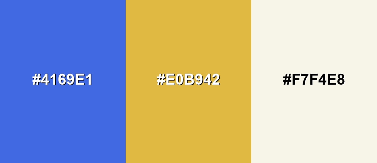
A complementary palette places royal blue opposite a warm golden-orange, creating high contrast that feels lively and premium. This combination is great for calls to action, sports visuals, and attention-focused layouts where clarity is the goal.
Complementary Palette Example: Use royal blue as the anchor, gold-orange for emphasis, and a soft neutral to keep the overall look clean.
Analogous Color Schemes
Analogous colors sit adjacent to each other on the color wheel, creating harmonious, cohesive palettes with subtle variation.
Cool-to-violet analogous: Royal Blue, Indigo Accent, and Blue Violet for a rich, cohesive gradient feel.
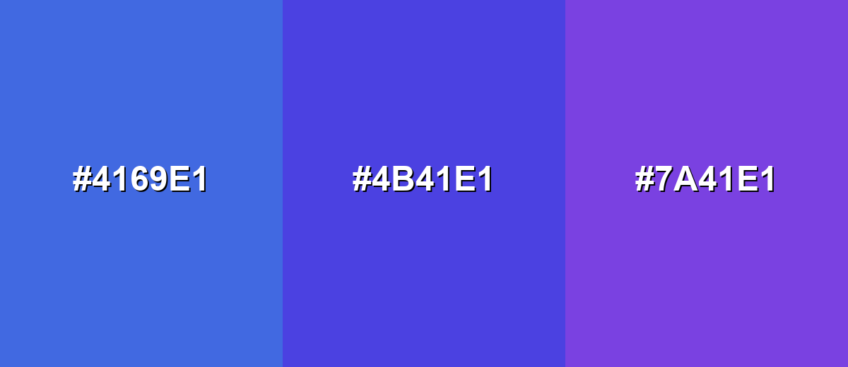
- Royal Blue: #4169E1
- Indigo Accent: #4B41E1
- Blue Violet: #7A41E1
Sky-leaning analogous: Royal Blue with Azure and Bright Cerulean for fresh, clean layouts and dashboards.
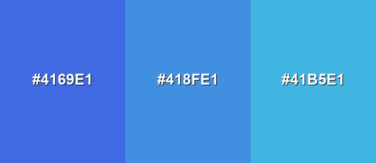
- Royal Blue: #4169E1
- Azure: #418FE1
- Bright Cerulean: #41B5E1
Triadic & Tetradic Combinations
A triadic scheme balances three hues evenly spaced on the wheel, giving you contrast without the sharpness of direct complements.
Royal Blue with Raspberry and Spring Green creates a playful, energetic palette for modern visuals.
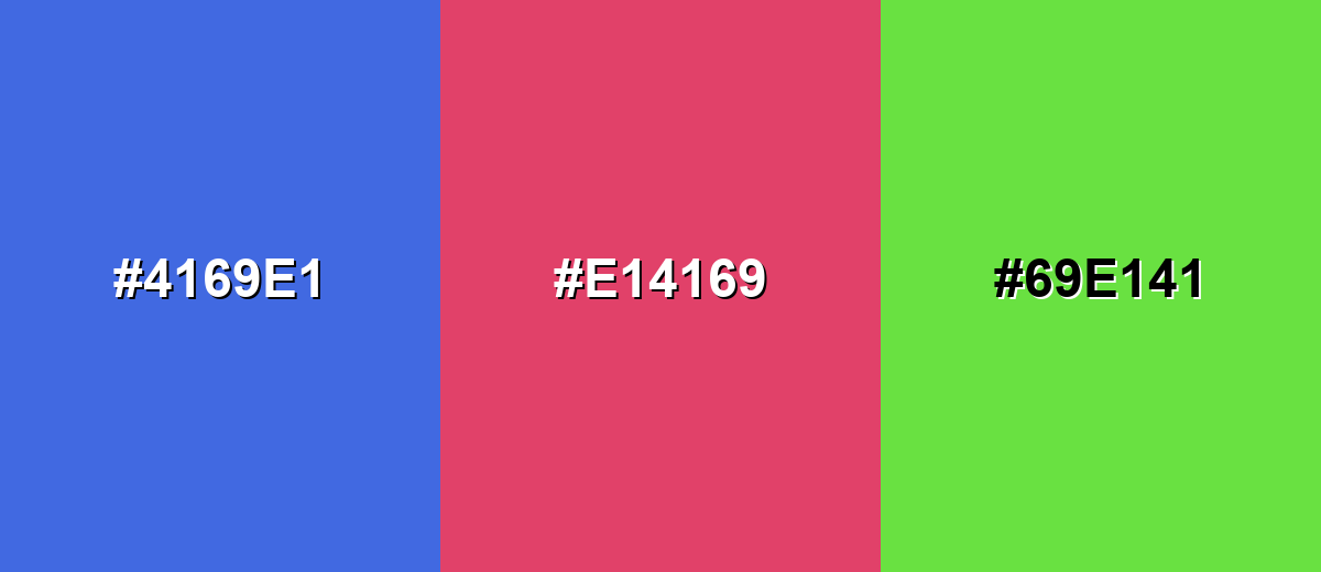
- Royal Blue: #4169E1
- Raspberry: #E14169
- Spring Green: #69E141
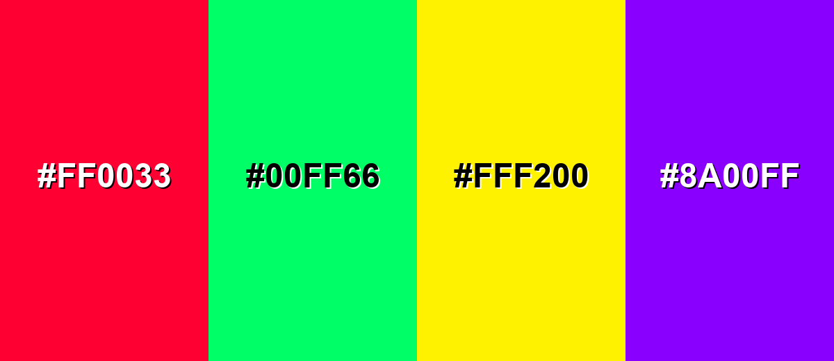
Colors to Avoid
While royal blue color is remarkably versatile, certain combinations can create problematic visual effects:
- Neon Red (#FF0033) - Competes aggressively with royal blue and can create a vibrating, stressful contrast on screens.
- Neon Green (#00FF66) - Both hues are highly saturated, so the pairing can feel loud and reduce readability for UI elements.
- Electric Yellow (#FFF200) - The brightness can overpower royal blue and make layouts look unbalanced unless carefully controlled.
- Hot Purple (#8A00FF) - Sits too close in intensity and can muddy hierarchy, especially in gradients or small typography.
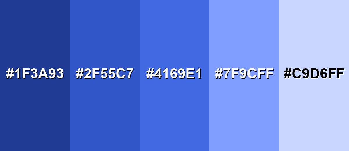
Shades, Tints & Variations of Royal Blue Color
Royal blue isn’t just one "perfect" swatch—its darker shades add authority, while lighter tints soften the vibe for backgrounds, charts, and supportive UI states. Having a small range makes it easier to keep contrast, hierarchy, and mood consistent across designs.
- Midnight Royal Blue (#1F3A93) - A darker, more serious take that keeps the royal character while adding depth. It’s best used for Headers, navigation bars, and premium packaging where you want a strong base tone.
- Deep Royal Blue (#2F55C7) - A saturated mid-deep shade that stays bold but feels a touch calmer than the standard value. It’s best used for Brand accents, icons, and UI components where you need weight without going full navy.
- Classic Royal Blue (#4169E1) - The standard royal blue: vivid, confident, and highly recognizable. It’s best used for Primary actions, highlights, sports graphics, and identity elements that need instant clarity.
- Light Royal Blue (#7F9CFF) - A brighter, softer version that feels friendlier and more approachable. It’s best used for Background panels, charts, gradients, and supportive UI states like hover or selection.
- Powder Blue Tint (#C9D6FF) - A pale tint with a gentle, airy look that reduces intensity while keeping the blue direction. It’s best used for Large backgrounds, subtle sections, and calm layouts where readability is the priority.
Industry Applications
Royal blue shows up across industries because it is easy to spot, reads as dependable, and holds up well in both digital and print contexts. It can look sporty and energetic or corporate and composed depending on the palette around it.
Fashion & Beauty
- Statement pieces - Dresses, jackets, and suits in royal blue feel bold without being flashy.
- Accessories - Bags, shoes, and jewelry packaging use it to signal a premium, polished finish.
- Cosmetic branding - Works well for clean, trustworthy labels with a modern edge.
- Contrast styling - Pairs nicely with warm neutrals so the look stays vibrant but wearable.
Interior Design & Decor
- Accent walls - Adds depth and clarity in living rooms, offices, and creative spaces.
- Upholstery - Sofas and chairs in royal blue create a confident focal point.
- Material pairing - Looks balanced with warm wood, soft whites, and natural textures.
- Metal accents - Gold-like finishes and brass tones help it feel warmer and more inviting.
Branding & Marketing
- Trust-forward identity - Great for brands that need to feel credible, capable, and modern.
- CTA and conversion - Strong choice for buttons, links, and focus states on light backgrounds.
- Campaign contrast - Pops next to warm accents for attention-focused visuals and promos.
- Premium packaging - Works especially well for labels and spot elements where contrast matters.
Conclusion
Royal blue is a designer favorite because it’s vivid, reliable, and naturally "premium" without feeling as heavy as navy. With #4169E1 as your anchor, you can build consistent UI states, print-ready specs, and flexible palettes—pair it with warm complements like golden orange for energy, or neighboring blues for smooth, modern harmony. Use it with intention (especially in large areas), keep your supporting neutrals calm, and royal blue will deliver strong hierarchy, clean readability, and a memorable, trustworthy brand impression.
Design Smarter with AI: Media.io is an online AI studio that empowers creators with advanced image generation and enhancement tools. From text-to-image and image-to-image creation to AI upscaling and color optimization, it enables fast, creative, and professional results—all in your browser.

Frequently Asked Questions About Royal Blue Color
Royal blue is a vivid, saturated blue with a slight violet leaning that looks brighter than navy and more intense than standard medium blue.
A widely used standard for royal blue is #4169e1.
It pairs well with warm ivory and soft grays for a clean look, gold-orange for contrast, and light blues for smooth gradients. Greens and pink-red accents also work in balanced palettes.
No. Navy is much darker and more muted, while royal blue is brighter and more saturated, so it draws attention more quickly in both UI and print.
Start with a strong blue pigment and adjust toward a slightly violet direction with a tiny amount of purple. Add white to create lighter tints, and use small increments because the shade shifts quickly.
White text is usually the best choice for readability on royal blue because it creates strong contrast. Black can look harsh and may not meet contrast needs at smaller sizes.


