

Midnight blue color is an inky, ultra-dark blue that can look almost black until light hits it. Its most recognized digital reference is hex #191970, a classic deep navy with a cool, nighttime cast.
People often read it as calm, serious, and quietly luxurious, making it a common choice for high-trust visuals. The name comes from the look of a late-night sky and the way deep blues compress into near-black in low light; this guide covers meaning, codes, combinations, shades, and practical uses.
Midnight Blue Color: Codes & Values
These core values help you reproduce midnight blue consistently across web, UI, and print workflows.
| Parameters | VALUE |
| HEX Code | #191970 |
| RGB DECIMAL | 25, 25, 112 |
| RGB PERCENTAGE | 9.8%, 9.8%, 43.9% |
| CMYK | 78%,78%,0%,56% |
| HSL | 240°, 64%, 27% |
| HSV (HSB) | 240°, 78%, 44% |
| Web Safe | #000066 |
Key Color Space Explanations:
- HEX - HEX is the most common way to specify a screen-ready shade in web design. Use #191970 in CSS and design tools for consistent rendering.
- RGB - RGB defines the mix of red, green, and blue light used by displays. Midnight blue uses low red and green with a higher blue channel, which gives it a cool, deep look.
- CMYK - CMYK is used for print, mixing cyan, magenta, yellow, and black ink. These values are a practical starting point, but final results can shift based on paper and press profiles.
- HSL - HSL describes hue, saturation, and lightness in a way that is intuitive for tweaking tints and tones. It is useful when building consistent UI states and theme variations.
- Web Safe - Web-safe values approximate a shade using a limited legacy palette. #000066 is the closest web-safe match, though modern screens can display #191970 accurately.
Use HEX or RGB for digital design, and start from CMYK for print—then fine-tune with proofs or on-screen checks to keep the blue from reading too black.
Midnight Blue Color Conversions
If you're translating midnight blue across tools, these conversions make it easier to keep your color consistent from layout to export.
| Parameters | VALUE | CSS |
| HEX | #191970 | #191970 |
| RGB DECIMAL | 25, 25, 112 | rgb(25,25,112) |
| RGB PERCENTAGE | 9.8%, 9.8%, 43.9% | rgb(9.8%,9.8%,43.9%) |
| CMYK | 78%,78%,0%,56% | cmyk(78%,78%,0%,56%) |
| HSL | 240°, 64%, 27% | hsl(240°,64%,27%) |
| HSV (or HSB) | 240°, 78%, 44% | -- |
| Web Safe | 000066 | #000066 |
| CIE-LAB | 15.8, 32.0, -49.8 | -- |
| XYZ | 3.68, 2.07, 15.57 | -- |
| xyY | 0.173, 0.097, 2.07 | -- |
| CIE-LCH | 15.8, 59.2, 302.6° | -- |
| CIE-LUV | 15.8, -3.5, -49.2 | -- |
| Hunter-Lab | 14.4, 21.9, -59.4 | -- |
| Binary | 00011001 00011001 01110000 | -- |
Want to generate Midnight Blue Color photos or posters? Try Media.io's AI Image Generator now!
Midnight Blue Color Meaning & Symbolism
Midnight blue is commonly associated with depth, reliability, and quiet confidence. Because it sits so close to black while staying distinctly blue, it often communicates trust with a softer edge than pure black in everyday visuals.
Psychological Effects
Its ultra-dark value and cool hue shape how it feels in both digital and physical spaces.
- Calm Focus - Helps layouts feel steady and distraction-free, especially when used as a background or frame color.
- Grounded Hierarchy - Makes content feel anchored, which is why it's common in navigation bars, footers, and hero sections.
- Premium Tone - Reads professional and high-end, lending a quietly luxurious mood without the harshness of pure black.
- Accent Amplifier - Makes bright accents appear sharper and more intentional because the base is so deep.
- Visual Weight - Can feel heavy or distant when overused, so it benefits from breathing room and soft neutrals.
Positive Associations
When balanced well, midnight blue supports a confident, trustworthy visual identity.
- Reliability - Suggests steadiness and dependability, which suits high-trust messaging.
- Quiet Confidence - Feels self-assured rather than loud, making it a strong "base color" for systems and brands.
- Sophistication - Brings a refined, polished look that works in premium packaging and elevated interfaces.
- Restful Intimacy - In interiors, it can create an intimate, restful atmosphere when paired with warm lighting and lighter surfaces.
- Clarity Through Contrast - Supports readable typography when paired with white or near-white text.
Cultural Significance Across the World
Dark blues carry familiar signals that influence how midnight blue is read in different contexts.
- Authority - Often linked to uniforms and formal settings, which can add structure and credibility to designs.
- Professionalism - Common in business and institutional visuals, reinforcing seriousness and stability.
- Night-Sky Symbolism - Evokes mystery, reflection, and depth without feeling overly dramatic.
- Formal Wear - Associated with dark blue suits and evening attire, supporting a classic, composed impression.
Design Applications
Midnight blue is a practical base tone when you want contrast, hierarchy, and a refined mood without defaulting to black. It performs especially well as a foundation shade with carefully chosen text and accent colors.
Graphic Design Tips
- Strong UI Framing - Use it for app shells, top navigation, footers, and modal backdrops to create a clean frame around content.
- Readable Typography - Pair with off-white text for comfortable contrast; avoid dark text on midnight blue because contrast drops quickly.
- Controlled Accents - Reserve bright accents for key actions (buttons, links, badges) so the interface stays intentional.
- Brand Fit - Works well for finance, technology, education, and premium positioning where trust matters.
- Accessibility First - Keep interactive states clearly differentiated with brightness or underline rather than color alone.
If you're building a system, treat #191970 as a "foundation" color and create lighter steps (for hover states and secondary panels) so the interface doesn't feel flat or overly heavy.
Midnight Blue Color in Photography & Video
- Moody Backdrops - Use midnight blue in backgrounds to reduce visual noise and make subjects stand out with a premium feel.
- Controlled Highlights - Let warmer highlights (skin tones, lamps, metallics) pop against the cool base for a cinematic contrast.
- Clean Typography Overlays - Choose white or near-white titles for thumbnails and cover frames to keep text crisp and readable.
- Consistent Color Grading - Keep blues cohesive across scenes so the tone stays calm and steady rather than shifting toward purple or black.
- Detail Preservation - Watch shadow crushing; deep blues can swallow texture unless you protect midtones and add gentle separation.
Recommended Tool for Image Enhancement: When incorporating midnight blue color into your photography projects, Media.io's AI Image tools can help you achieve more refined results. With AI-powered color enhancement, photo colorization, image upscaling, and old photo restoration, you can easily enrich midnight blue color tones, improve overall image quality, and highlight the color's elegant and sophisticated aesthetic.
Color Combinations
Midnight blue pairs best with warm, light, or saturated accents that can stand up to its depth. The palettes below cover dependable options for branding, UI, and editorial layouts, from classic complements to bolder multi-color schemes.
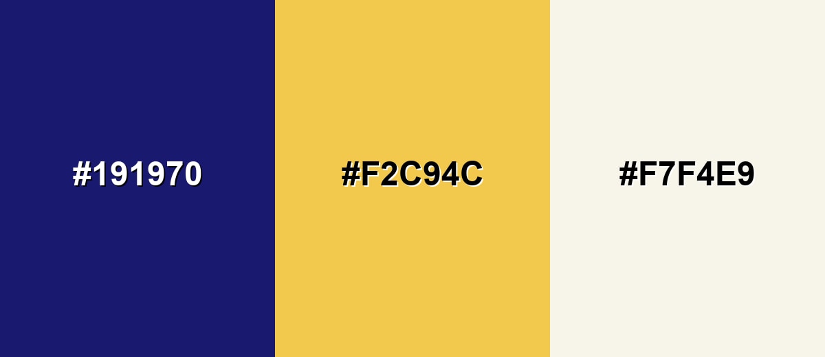
Complementary Colors
A warm golden accent brings out the richness of midnight blue and adds energy without becoming loud. This is a reliable pairing for premium branding, call-to-action buttons, and highlight details.
Complementary Palette Example: Use Midnight Blue as the base, Soft Gold for accents, and Warm Ivory to keep layouts airy and readable.
Analogous Color Schemes
Analogous colors sit adjacent to each other on the color wheel, creating harmonious, cohesive palettes with subtle variation.
Deep Indigo and Ocean Blue sit near midnight blue on the wheel, creating a smooth, layered gradient feel.
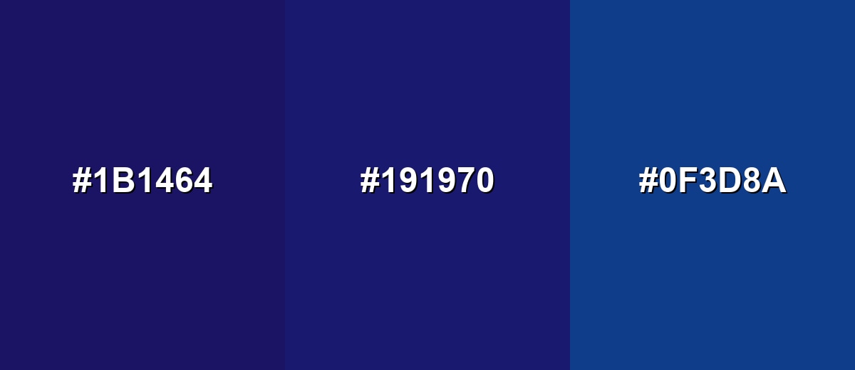
- Deep Indigo: #1B1464
- Midnight Blue: #191970
- Ocean Blue: #0F3D8A
Deep Teal and Slate Cyan add a subtle oceanic shift while keeping the overall mood dark and modern.
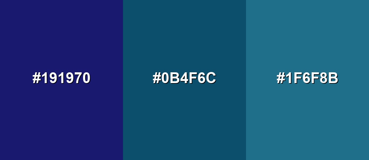
- Midnight Blue: #191970
- Deep Teal: #0B4F6C
- Slate Cyan: #1F6F8B
Triadic & Tetradic Combinations
A triadic palette creates stronger contrast while still feeling balanced when one shade leads and the others support.
Midnight Blue with Deep Crimson and Forest Green works for bold headers, illustrations, and standout brand moments.
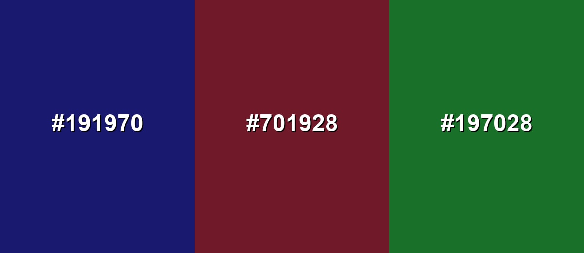
- Midnight Blue: #191970
- Deep Crimson: #701928
- Forest Green: #197028
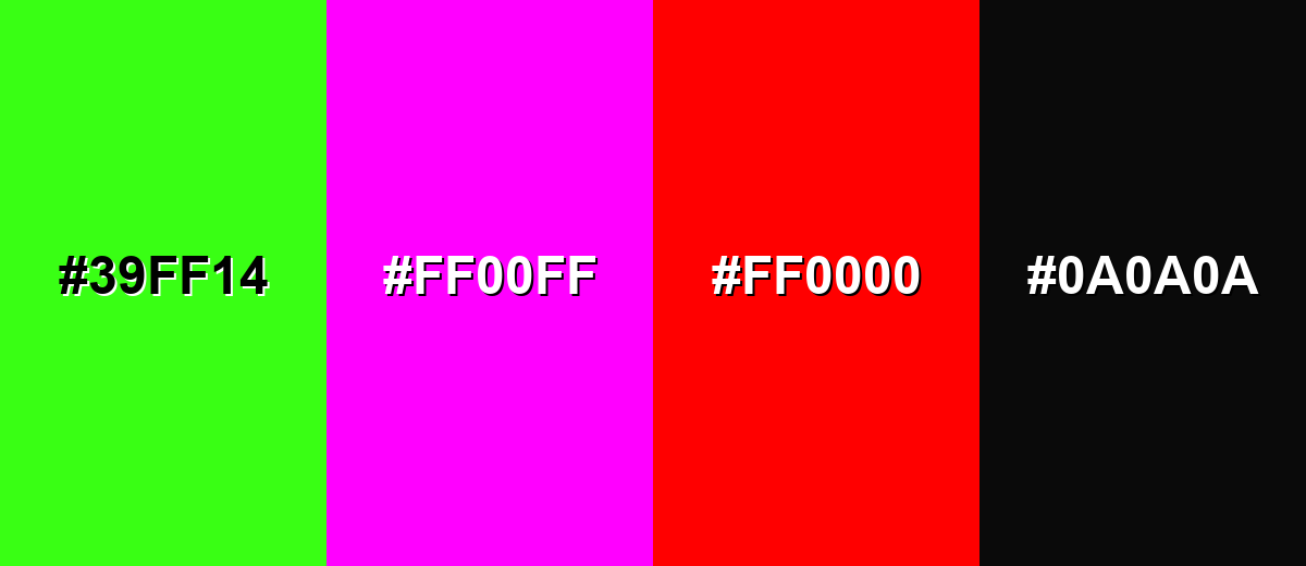
Colors to Avoid
While midnight blue color is remarkably versatile, certain combinations can create problematic visual effects:
- Neon Green (#39FF14) - The intensity can create visual vibration against very dark blue, making layouts feel harsh and harder to read.
- Hot Magenta (#FF00FF) - This pairing can feel overly synthetic and distract from content, especially in professional UI and branding.
- Pure Red (#FF0000) - Strong red on a deep blue base can look aggressive and may overpower typography and hierarchy.
- Near Black (#0A0A0A) - Stacking near-black with midnight blue reduces separation, causing elements to blend together and lose clarity.
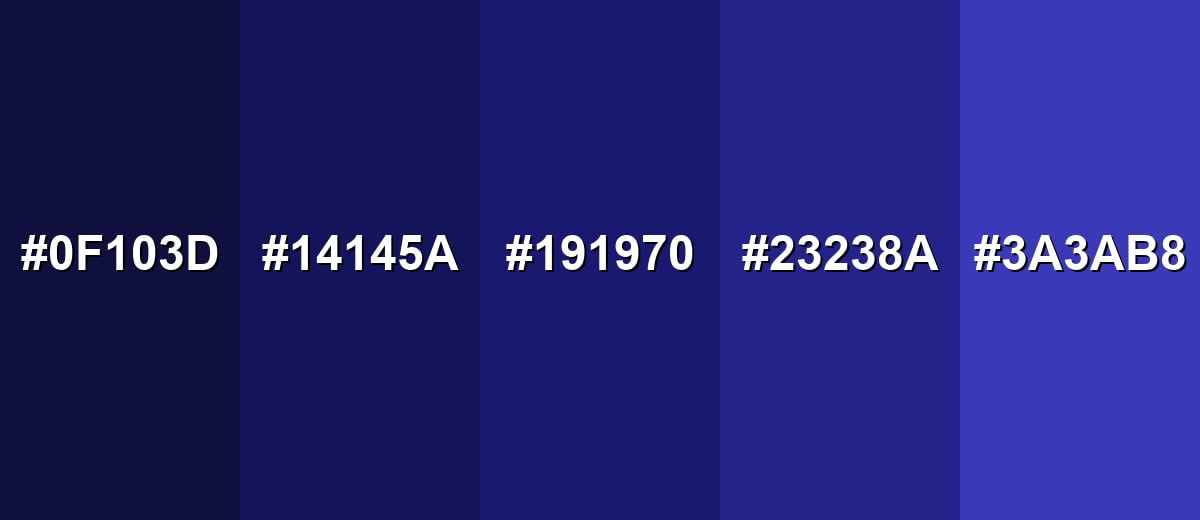
Shades, Tints & Variations of Midnight Blue Color
Midnight blue has a useful range—from almost-black backdrops to brighter, more vivid blue-violet steps. Exploring these variations helps you build clearer hierarchy in UI, smoother gradients in graphics, and better contrast in print and packaging.
- Abyss Blue (#0F103D) - A darker, more shadowed variation that sits even closer to black while staying blue. It's best used for Dark mode backdrops, cinematic posters, and deep framing elements.
- Deep Indigo (#14145A) - A slightly less blackened tone that adds a hint of violet depth to the base. It's best used for Secondary panels, gradients, and layered backgrounds.
- Midnight Blue (#191970) - The classic midnight blue reference, deep and cool with strong contrast against light text. It's best used for Primary brand base, navigation bars, and premium packaging.
- Night Sky Blue (#23238A) - A brighter step that keeps the midnight mood but reads more clearly as blue at a glance. It's best used for Buttons, charts, and UI accents where the base shade feels too dark.
- Twilight Periwinkle (#3A3AB8) - A lighter, more vivid variation that brings energy while staying within the same family. It's best used for Highlights, links, illustrations, and gradient endpoints.
Industry Applications
Because it signals stability and depth, midnight blue fits many industries that need a confident, polished visual tone. It is also flexible: it can feel traditional with warm neutrals or modern with cool grays and crisp typography.
Fashion & Beauty
- Premium Packaging - Packaging with gold or ivory accents to emphasize an elevated look.
- Lookbooks - Premium lookbooks and product photography frames that feel refined and editorial.
- Retail Signage - Store signage that stays readable while looking polished and modern.
- Seasonal Campaigns - Seasonal campaigns where a deep base color helps highlights stand out.
Interior Design & Decor
- Accent Surfaces - Use on accent walls, cabinetry, or textiles to add depth without the harshness of black.
- Warm Balance - Balance with warm wood and cream fabrics to keep the room inviting.
- Layered Lighting - Pair with layered lighting to prevent the space from feeling heavy or cold.
- Restful Mood - Create an intimate, restful atmosphere when paired with lighter surfaces.
Branding & Marketing
- Tech & SaaS UI - Dark theme shells and dashboards that make accent colors pop.
- Trust-First Brands - Brand foundations that feel secure and established for professional services.
- Reports & Presentations - Presentation templates and reports with a stable, serious tone.
- Navigation-Heavy Sites - Web headers and footers that create clear hierarchy and strong contrast.
Conclusion
Midnight blue (#191970) is a go-to "near-black" blue when you want designs to feel calm, trustworthy, and premium without the harshness of pure black. It shines as a foundation color for UI backgrounds, brand systems, and packaging—especially when you pair it with light text for readability and keep accents warm or deliberately saturated for focus. Whether you're building a dark theme, tightening hierarchy in a layout, or creating a refined palette for print, midnight blue gives you depth, contrast, and a polished finish that stays timeless.
Design Smarter with AI: Media.io is an online AI studio that empowers creators with advanced image generation and enhancement tools. From text-to-image and image-to-image creation to AI upscaling and color optimization, it enables fast, creative, and professional results—all in your browser.

Frequently Asked Questions About Midnight Blue Color
A widely used reference for midnight blue is #191970. It is the standard CSS named color value and is a dependable starting point for web and UI work.
They are close, but not always identical. Navy is a broader family of very dark blues, while midnight blue typically reads darker and closer to black with a cooler nighttime cast.
Warm metallics and soft neutrals are classic choices, such as gold, ivory, and warm gray. For a modern feel, pair it with teal or slate blues; for bold contrast, add a controlled warm accent.
It works best as a background with white or near-white text. Dark text on midnight blue often lacks contrast, so keep typography light and ensure interactive states are clearly differentiated.
Use it on an accent wall, cabinetry, or textiles to add depth and sophistication. Balance it with warm lighting, natural wood, and light neutrals so the space stays comfortable rather than heavy.
Very dark blues can shift due to paper, ink limits, and color profiles. Start with the CMYK values, then request a proof or adjust with your printer to avoid the shade turning too black or too purple.


