

 TL;DR:
Peacock blue (hex code #006D8C) is a saturated blue-green shade resembling a deep teal that provides a sophisticated, modern alternative to standard corporate blues in branding, digital UI, and interior design.
● Because the color inherently shifts bluer on digital screens and greener in physical pigments, designers must adjust white balance in photography and utilize specific color space conversions (like CMYK 100%,22%,0%,45% for print) to maintain cross-medium consistency.
● To prevent visual heaviness or a cold impression in large design blocks, reduce the background saturation or introduce spacing and warm neutrals, reserving the full #006D8C hue strictly for primary actions, headers, and key UI accents.
● Pair this shade with warm counterpoints like burnt orange or terracotta for effective contrast, but strictly avoid high-saturation pairings with pure red, hot pink, neon yellow, or neon green to prevent aggressive visual vibration and clashing.
Ask AI for a summary
 ChatGPT
 Perplexity
 Gemini
 Claude
 Grok
Grok
Peacock blue color is a saturated blue-green that reads like deep teal with a cool, oceanic shine. The most common digital reference for this shade is #006D8C, which sits between blue and green depending on lighting and surrounding tones.
It often feels confident and refined, balancing calm with a sense of depth and creativity. Named after peacock plumage, it can shift slightly bluer on screens and more green-leaning in pigments, so context matters.
Peacock Blue Color: Codes & Values
Here are the standard codes designers and developers use to keep peacock blue consistent across UI, print, and brand assets.
| Parameters | VALUE |
| HEX Code | #006D8C |
| RGB DECIMAL | 0, 109, 140 |
| RGB PERCENTAGE | 0%, 43%, 55% |
| CMYK | 100%,22%,0%,45% |
| HSL | 193°, 100%, 27% |
| HSV (HSB) | 193°, 100%, 55% |
| Web Safe | #006699 |
Key Color Space Explanations:
- HEX is the most common way to specify a screen color using six characters. Use it in CSS, design tools, and UI systems for consistent results.
- RGB defines the mix of red, green, and blue light used on displays. It is helpful for digital design, video, and anything that renders on a screen.
- CMYK is used for printing and describes cyan, magenta, yellow, and black ink percentages. It helps approximate how peacock blue may shift when printed on different papers.
- HSL describes hue, saturation, and lightness, which can be easier to adjust by eye. It is useful for building tints, shades, and UI states that stay on-brand.
- Web Safe is the closest legacy-safe approximation built from a limited palette. It is mostly relevant for compatibility testing or retro-styled UI.
For digital work, start with #006D8C (or rgb(0,109,140)) and then adjust lightness in HSL for hover states, backgrounds, and subtle accents.
Peacock Blue Color Conversions
Need peacock blue in a specific format? Use the quick conversion table below for design apps, CSS, and print workflows.
| Parameters | VALUE | CSS |
| HEX | #006d8c | #006d8c |
| RGB DECIMAL | 0, 109, 140 | rgb(0,109,140) |
| RGB PERCENTAGE | 0%, 43%, 55% | rgb(0%,43%,55%) |
| CMYK | 100%,22%,0%,45% | cmyk(100%,22%,0%,45%) |
| HSL | 193°, 100%, 27% | hsl(193°,100%,27%) |
| HSV (or HSB) | 193°, 100%, 55% | -- |
| Web Safe | 006699 | #006699 |
| CIE-LAB | 41.2, -17.3, -23.8 | -- |
| XYZ | 12.8, 16.4, 28.9 | -- |
| xyY | 0.21, 0.27, 16.4 | -- |
| CIE-LCH | 41.2, 29.4, 234.0 | -- |
| CIE-LUV | 41.2, -25.6, -31.0 | -- |
| Hunter-Lab | 40.5, -18.1, -27.4 | -- |
| Binary | 00000000 01101101 10001100 | -- |
Want to generate Peacock Blue Color photos or posters? Try Media.io's AI Image Generator now!
Peacock Blue Color Meaning & Symbolism
Peacock blue is often associated with confidence, clarity, and a polished sense of style. Because it sits between blue and green, it can feel both calming and energizing, which is why it shows up in modern branding, interiors, and fashion. In everyday life, it tends to signal intention and taste without feeling as formal as navy.
Psychological Effects
It's a steady, cool shade that can sharpen focus while still feeling creative.
- Composure - Helps create a calm, controlled mood in busy layouts and information-heavy screens.
- Trust - Often reads reliable and professional, making it a solid choice for product UI and service brands.
- Clarity - Supports clean hierarchy when used for navigation, headings, or key interface states.
- Depth - Adds a premium, layered feel compared to flatter mid-blues or basic teals.
- Cool Distance - In large solid blocks, it can feel a bit cold unless balanced with warmth and texture.
Positive Associations
Peacock blue tends to signal modern taste without looking overly formal.
- Confidence - Feels bold and self-assured without becoming loud or aggressive.
- Refinement - Suggests a polished, contemporary aesthetic that works well in premium contexts.
- Creativity - Sits in the blue-green zone that often feels imaginative and design-forward.
- Freshness - Carries a subtle oceanic energy that can make visuals feel cleaner and brighter.
- Balance - Blends blue calm with green vitality, creating a “steady but alive” impression.
Cultural Significance Across the World
Because it's tied to peacock feathers, the meaning often leans toward beauty and ornament—though context still matters.
- Beauty & Display - The peacock reference naturally connects it with visual richness and showmanship.
- Decorative Craft - Commonly used to suggest detail, pattern, and a handcrafted feel in ornamental styles.
- Richness - Often reads luxurious when paired with metallics, deep neutrals, or layered textures.
- Context-Dependent Symbolism - Can shift in interpretation by audience, region, and how it's used in design.
Design Applications
Peacock blue is versatile: it can behave like a bold brand hue, a calming background, or a high-contrast accent depending on the palette around it. The key is to control saturation and give it enough breathing room so it looks intentional rather than heavy.
Graphic Design Tips
- Use it as an anchor color - Let peacock blue define headers, section dividers, or a primary UI surface for a modern look.
- Balance with warm neutrals - Pair with beige/ivory-style backgrounds to keep layouts from feeling too cool.
- Reserve it for hierarchy - Keep it meaningful by assigning it to primary actions, key stats, or one core chart series.
- Build lighter UI states - Create hover and secondary states by increasing lightness instead of switching to a different hue.
- Watch saturation in large blocks - Break up big areas with spacing, texture, or subtle gradients to avoid visual weight.
Pro tip: If peacock blue feels heavy in a layout, keep the same hue and reduce saturation slightly for backgrounds—then bring the full #006D8C back on buttons, icons, and key highlights.
Peacock Blue Color in Photography & Video
- Use it to shape mood - Works well for sleek, oceanic, or nighttime tones where you want calm depth.
- Pair with warm lighting - Adding warm highlights (skin tones, wood, brass) prevents the frame from feeling too cold.
- Control white balance - Cooler white balance can push it bluer; warmer white balance can reveal more green-teal.
- Protect detail in shadows - Deep blue-greens can crush easily, so lift shadows slightly to keep texture.
- Use as an accent color - Wardrobe, props, or backgrounds in peacock blue can pop without overpowering the subject.
Recommended Tool for Image Enhancement: When incorporating peacock blue color into your photography projects, Media.io's AI Image tools can help you achieve more refined results. With AI-powered color enhancement, photo colorization, image upscaling, and old photo restoration, you can easily enrich peacock blue color tones, improve overall image quality, and highlight the color's elegant and sophisticated aesthetic.
Color Combinations
Peacock blue pairs best with warm counterpoints, clean neutrals, and nearby blue-green neighbors. Use these palettes as starting points, then adjust lightness to match your layout, imagery, or product materials.
Complementary Colors
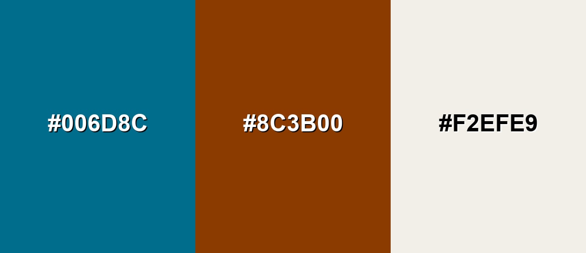
A complementary palette adds energy by balancing peacock blue with a warm opposite hue. This works well for calls to action, featured content, and bold editorial layouts where you want clear visual separation.
Complementary Palette Example: Use peacock blue as the anchor, add burnt orange for contrast, and soften the look with a light parchment neutral.
Analogous Color Schemes
Analogous colors sit adjacent to each other on the color wheel, creating harmonious, cohesive palettes with subtle variation.
Blue-green neighbors create a smooth, modern blend that feels cohesive and calm.
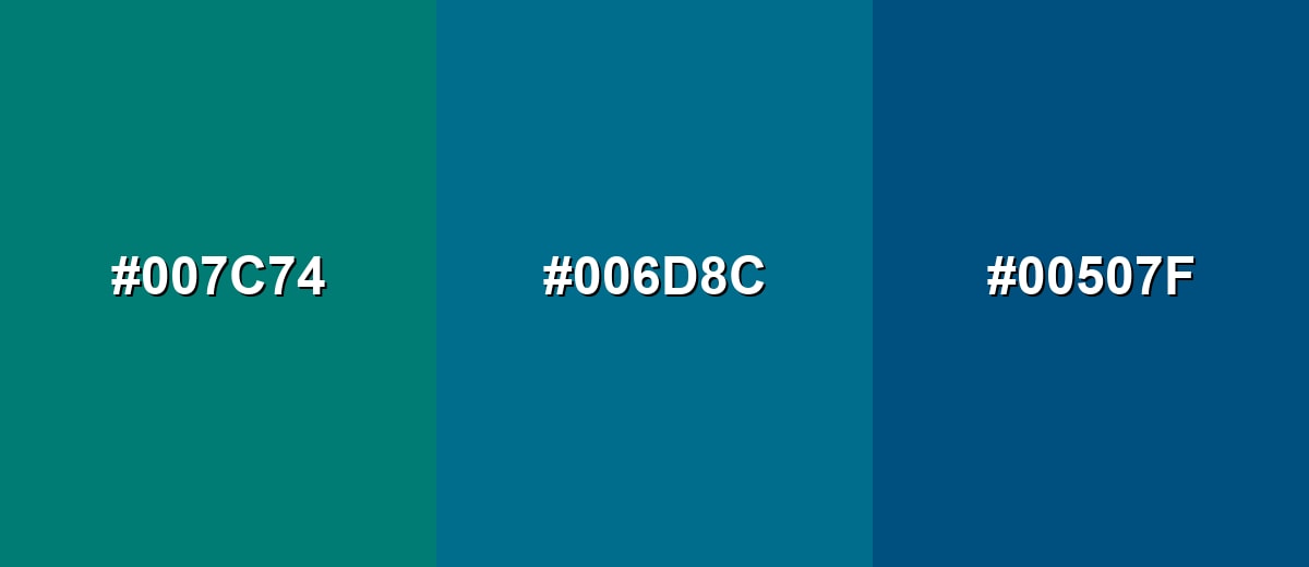
- Deep Teal: #007C74
- Peacock Blue: #006D8C
- Deep Blue: #00507F
A brighter aqua range keeps the look fresh while still reading as refined.
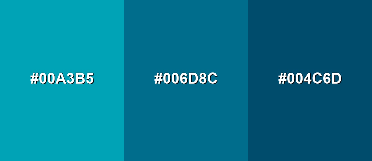
- Aqua: #00A3B5
- Peacock Blue: #006D8C
- Slate Teal: #004C6D
Triadic & Tetradic Combinations
Triadic schemes are lively and balanced, giving you three distinct hues with similar visual weight.
Combine peacock blue with a magenta-plum and a muted chartreuse for a bold but controllable palette.
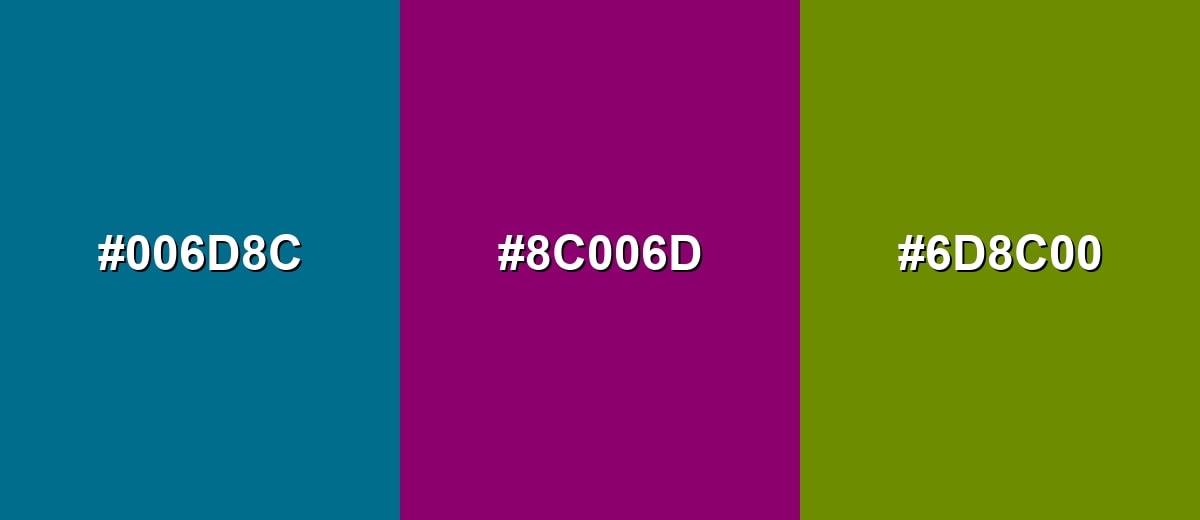
- Peacock Blue: #006D8C
- Plum Magenta: #8C006D
- Chartreuse Olive: #6D8C00
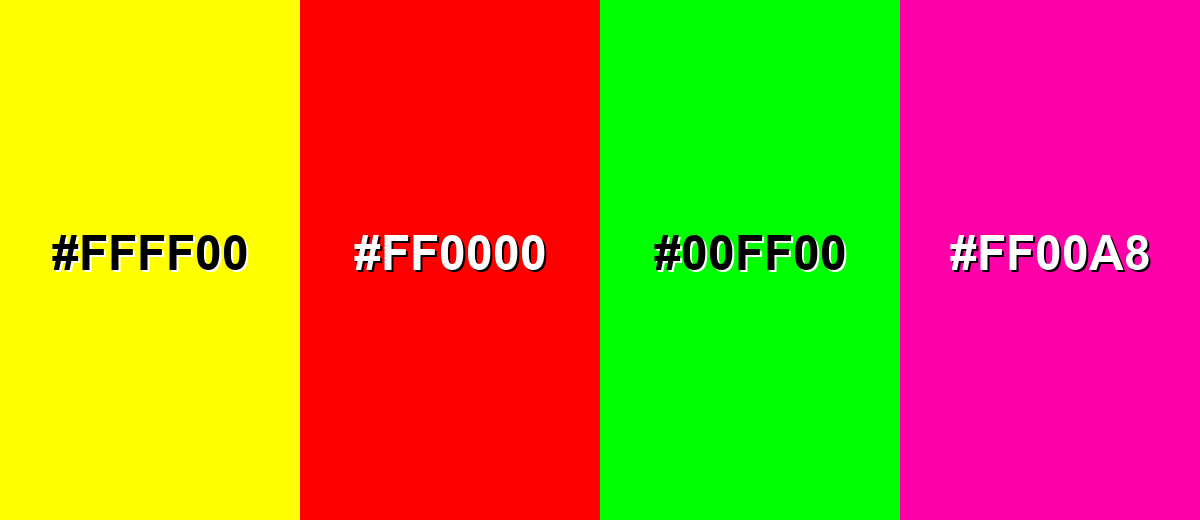
Colors to Avoid
While peacock blue color is remarkably versatile, certain combinations can create problematic visual effects:
- Neon Yellow (#FFFF00) - The extreme brightness can create harsh vibration against peacock blue and distract from content, especially in UI.
- Pure Red (#FF0000) - High-saturation red competes with peacock blue, often looking festive or aggressive instead of refined.
- Neon Green (#00FF00) - The intense green pushes the palette into a loud, unnatural range and can make peacock blue look dull by comparison.
- Hot Pink (#FF00A8) - This pairing can feel overly sharp and busy, reducing the calm, polished impression peacock blue typically creates.
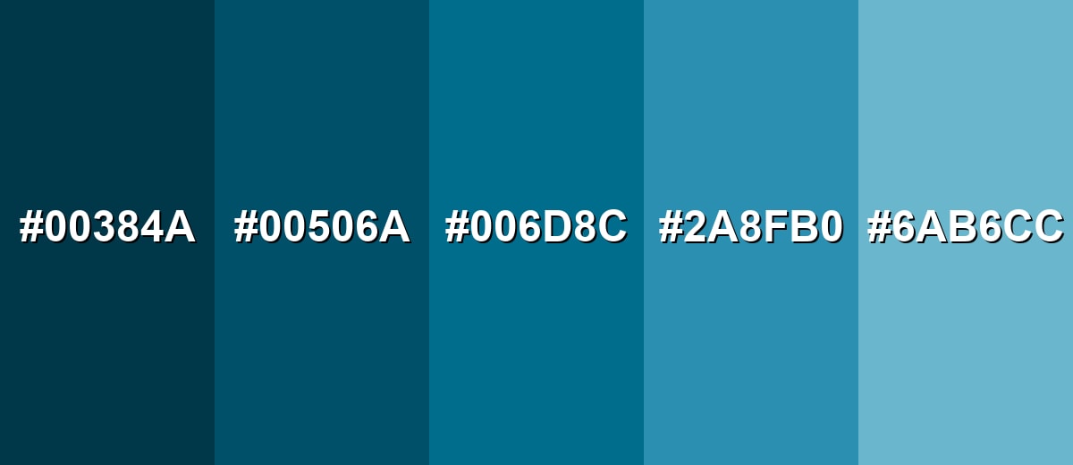
Shades, Tints & Variations of Peacock Blue Color
Peacock blue isn't just one fixed shade—there's a whole range from inky, dramatic darks to airy, coastal tints. Having these variations makes it easier to design consistent UI states, build gradients, and match real-world materials like paint, fabric, or packaging.
- Midnight Peacock (#00384A) - A very dark, inky blue-green that keeps the peacock character while feeling more dramatic. It's best used for Headers, footers, dark-mode panels, and premium packaging accents.
- Deep Peacock Blue (#00506A) - A darker, slightly muted version that reads sophisticated and steady. It's best used for Navigation bars, brand foundations, and background blocks behind light typography.
- Classic Peacock Blue (#006D8C) - The signature saturated blue-green that sits between teal and blue. It's best used for Primary brand hue, key UI accents, and statement elements in layouts.
- Bright Peacock (#2A8FB0) - A lighter, more energetic take that feels airy while staying clearly blue-green. It's best used for Illustrations, charts, hover states, and modern gradients.
- Pale Peacock Mist (#6AB6CC) - A soft tint with a coastal feel that reduces intensity and improves openness. It's best used for Background washes, large surfaces, onboarding screens, and subtle section separation.
Industry Applications
Peacock blue shows up across industries because it communicates clarity and quality while still feeling distinctive. It is especially useful when you want a modern alternative to standard corporate blues.
Fashion & Beauty
- Statement wardrobe pieces - Strong for eveningwear palettes where you want depth without going full navy.
- Sleek packaging - Adds an artistic, modern edge to cosmetics and personal care boxes or labels.
- Editorial layouts - Works well as a premium accent for headlines, rules, and backgrounds.
- Color storytelling - Pairs nicely with warm neutrals and metallic details to feel elevated.
Interior Design & Decor
- Accent walls - Creates a bold focal point while still feeling composed and “grown-up.”
- Textiles & ceramics - Adds richness in cushions, throws, rugs, and glazed decor pieces.
- Warm material pairings - Looks especially balanced next to wood, cream fabrics, and brass tones.
- Photo backdrops - Helps products stand out with depth and contrast for lifestyle shoots.
Branding & Marketing
- Modern trust cue - A strong alternative to standard blues for brands that want stability plus freshness.
- UI theming - Works for navigation and headers, especially with white typography and clear spacing.
- Reports & charts - Supports section headers and data highlights without looking overly corporate.
- Premium accents - Reads high-quality when paired with warm neutrals or subtle metallic elements.
Conclusion
Peacock blue stands out for its rich balance of blue and green, giving it a confident look that still feels composed. With #006D8C as a reliable reference, it's easy to build consistent shades for UI, create modern palettes for branding, or add depth to interiors and print. The key is balance: pair peacock blue with light neutrals for breathing room and bring in one warm accent when you need contrast, and the color will read polished, distinctive, and timeless.
Design Smarter with AI: Media.io is an online AI studio that empowers creators with advanced image generation and enhancement tools. From text-to-image and image-to-image creation to AI upscaling and color optimization, it enables fast, creative, and professional results—all in your browser.

Frequently Asked Questions About Peacock Blue Color
Peacock blue is a saturated blue-green that often resembles deep teal with a cool, glossy depth. It can look slightly bluer on screens and a bit greener in certain paints or fabrics.
A common hex value used to represent peacock blue is #006d8c. Depending on the brand palette or material, nearby variations may also be labeled as peacock blue.
It is closer to teal because it clearly includes a green undertone, but it is typically deeper and more saturated than many light teals. Compared to navy, it feels brighter and more blue-green than blue-only.
Warm oranges and terracotta tones create strong contrast, while creams and soft grays keep the look elegant. Analogous pairings like teal and deep blue work well when you want a smoother, calm palette.
Yes, it often communicates clarity, confidence, and modernity. For accessibility, it usually performs best with white or near-white text and with spacing that keeps saturated areas from feeling heavy.
Use it as an accent on one wall, furniture piece, or textile, then balance it with warm neutrals and natural materials like wood. Softer tints can also be used on larger surfaces to keep the space light and open.


