

Copper color is a warm, earthy metallic tone that looks like polished copper metal with a reddish-brown glow. A widely used reference for this shade is #B87333, which sits between orange and brown and often reads as rich and crafted.
Because it comes from the look of real copper and how it catches light, it can shift from bright and glossy to deep and muted depending on finish and lighting. Below, you'll find copper color meaning, codes, combinations, shades, and practical uses.
Copper Color: Codes & Values
If you want copper to look consistent across screens and print, start with these core color values.
| Parameters | VALUE |
| HEX Code | #B87333 |
| RGB DECIMAL | 184, 115, 51 |
| RGB PERCENTAGE | 72.16%, 45.10%, 20.00% |
| CMYK | 0%,38%,72%,28% |
| HSL | 29°, 57%, 46% |
| HSV (HSB) | 29°, 72%, 72% |
| Web Safe | #CC6633 |
Key Color Space Explanations:
- HEX - HEX is the most common way to specify a shade for websites and digital assets. Use the six-digit value to match copper consistently across screens.
- RGB - RGB mixes red, green, and blue light for displays. It is useful for UI work, motion graphics, and any screen-based design.
- CMYK - CMYK is used for print, combining cyan, magenta, yellow, and black inks. It helps you estimate how copper will reproduce on paper and packaging.
- HSL - HSL describes hue, saturation, and lightness, which makes it easier to create lighter tints or deeper tones. It is handy for building systematic palettes.
- Web Safe - Web safe is the closest legacy palette match that can reduce unexpected shifts on older displays. It is mainly used for compatibility checks and quick fallbacks.
Use HEX/RGB for digital projects, CMYK for print, and HSL/HSV when you need quick tints and tones that still feel like "real" copper.
Copper Color Conversions
Need copper color in a different format for design tools, development, or printing? Use this conversion table as a quick reference.
| Parameters | VALUE | CSS |
| HEX | #b87333 | #b87333 |
| RGB DECIMAL | 184, 115, 51 | rgb(184,115,51) |
| RGB PERCENTAGE | 72.16%, 45.10%, 20.00% | rgb(72.16%,45.10%,20%) |
| CMYK | 0%,38%,72%,28% | cmyk(0%,38%,72%,28%) |
| HSL | 29°, 57%, 46% | hsl(29°,57%,46%) |
| HSV (or HSB) | 29°, 72%, 72% | -- |
| Web Safe | cc6633 | #cc6633 |
| CIE-LAB | 55.1, 18.5, 46.2 | -- |
| XYZ | 26.45, 22.70, 6.11 | -- |
| xyY | 0.478, 0.411, 22.70 | -- |
| CIE-LCH | 55.1, 49.8, 68.5° | -- |
| CIE-LUV | 55.1, 55.0, 44.4 | -- |
| Hunter-Lab | 47.6, 18.9, 25.1 | -- |
| Binary | 10111000 01110011 00110011 | -- |
Want to generate Copper Color photos or posters? Try Media.io's AI Image Generator now!
Copper Color Meaning & Symbolism
Copper commonly represents warmth, resilience, and skilled craftsmanship. Because it is tied to metalwork, wiring, cookware, and architecture, it often feels practical and honest rather than flashy. In everyday design, it can signal comfort, a handmade touch, and a premium finish without looking overly formal.
Psychological Effects
Copper's warm base can change the mood of a layout fast—especially when it's used as an accent.
- Warmth - Copper can make a space or interface feel warmer and more inviting than cooler metals.
- Optimism - It often reads as energetic and optimistic, especially when paired with light neutrals or soft blues.
- Reliability - It can suggest stability and reliability because it resembles durable, functional materials.
- Rustic Heaviness - On the downside, heavy use may feel dated or overly rustic, especially in dark rooms or low-contrast layouts.
- Visual Loudness - Highly saturated copper accents can also feel loud, so it usually works best as a highlight rather than a full-page background.
Positive Associations
When balanced with the right supporting tones, copper is an easy way to add "crafted" personality.
- Craftsmanship - Its strong link to metalwork and handmade detail helps designs feel skilled and thoughtfully made.
- Practical Value - Because it's tied to wiring, cookware, and tools, copper often communicates usefulness and honesty.
- Resilience - Copper's durable, functional feel supports messages of strength and staying power.
- Comfort - The reddish-brown warmth can make branding and interiors feel cozy and approachable.
- Premium Finish - Used as a trim or highlight, copper can signal quality without looking overly formal.
Cultural Significance Across the World
Because copper is a real, widely used material, its symbolism often comes from everyday objects and building traditions.
- Tools & Trade - Copper has long been associated with tools and trade due to its real-world use as a workable metal.
- Craft Traditions - It connects strongly to craft traditions, where making and repairing are valued skills.
- Architecture & Function - Its presence in architecture, wiring, and cookware reinforces a practical, dependable identity.
- Practical Ingenuity - In visual symbolism, it often overlaps with themes of warmth, value, and practical ingenuity.
Design Applications
Copper is easiest to use when you treat it like a finish: a rich accent that adds depth and texture. A small dose can elevate a layout, while smart pairings keep it modern and readable.
Graphic Design Tips
- Use copper for accent elements like icons, buttons, dividers, and badges to create a refined highlight.
- Balance copper with soft neutrals to give the layout breathing room and a clean hierarchy.
- Pair copper with muted blues to keep the look contemporary and reduce visual heaviness.
- For a more metallic feel, add subtle texture or lighting effects instead of increasing saturation.
- Test contrast carefully—copper sits in the mid-range of brightness, so readability can vary by background.
Pro tip: treat copper like a premium "trim" color—use it on the highest-value UI moments (buttons, active states, badges), and support it with clear typography and plenty of neutral space.
Copper Color in Photography & Video
- Lean into copper's warm, reddish-brown glow for highlights and practical, material-focused scenes.
- Use lighting and finish (glossy vs. muted) to shift copper from bright and reflective to deep and grounded.
- Pair copper tones with soft blues or warm off-whites in the frame for balanced, modern contrast.
- Keep copper as an accent color in color grading to avoid a heavy, overly rustic look.
- When copper appears as text or thin overlays, check contrast to keep titles and UI elements readable.
Recommended Tool for Image Enhancement: When incorporating copper color into your photography projects, Media.io's AI Image tools can help you achieve more refined results. With AI-powered color enhancement, photo colorization, image upscaling, and old photo restoration, you can easily enrich copper color tones, improve overall image quality, and highlight the color's elegant and sophisticated aesthetic.
Color Combinations
Copper pairs well with calm blues, warm neutrals, and botanical greens. Use the schemes below to build balanced palettes that feel crafted, modern, or softly luxurious depending on the supporting tones.
Complementary Colors
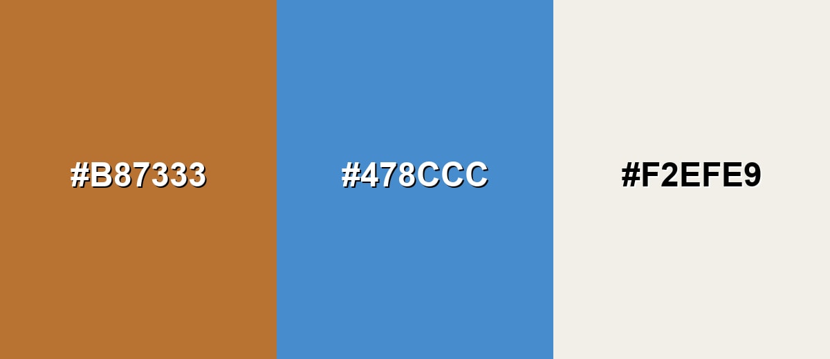
A complementary scheme places copper against a blue opposite on the wheel, creating crisp contrast without feeling harsh when the blue is slightly softened.
Complementary Palette Example: Use copper for the focal elements, blue for balance, and a warm off-white to keep the composition light and readable.
Analogous Color Schemes
Analogous colors sit adjacent to each other on the color wheel, creating harmonious, cohesive palettes with subtle variation.
Copper + amber + toasted brown creates a cohesive, sun-warmed range that feels natural and grounded.
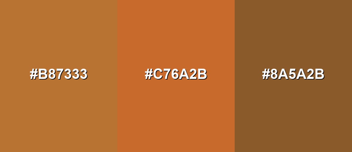
- Copper: #B87333
- Burnt Orange: #C76A2B
- Toasted Brown: #8A5A2B
Copper + golden tan + cinnamon shifts slightly brighter and works well for friendly, upbeat visuals.
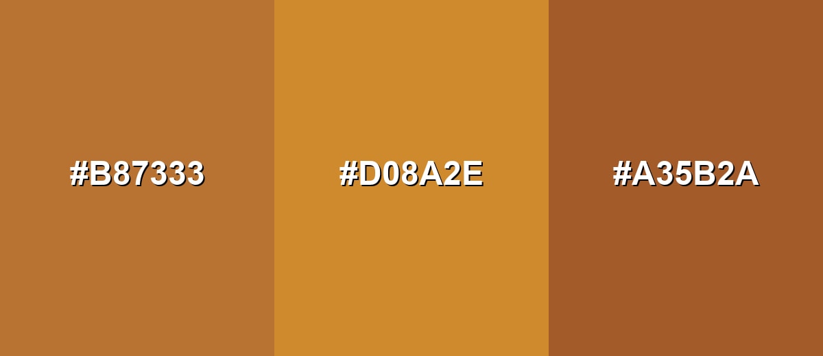
- Copper: #B87333
- Golden Tan: #D08A2E
- Cinnamon: #A35B2A
Triadic & Tetradic Combinations
A triadic scheme adds two evenly spaced hues to keep copper lively but structured.
Copper + fresh green + violet gives a bold, modern contrast that works best when copper leads and the other hues stay secondary.
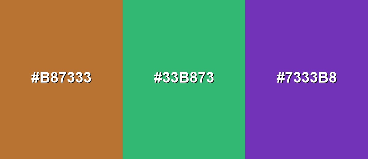
- Copper: #B87333
- Fresh Green: #33B873
- Violet: #7333B8
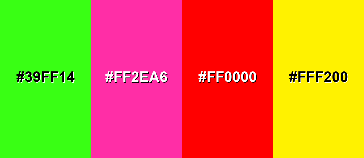
Colors to Avoid
While copper color is remarkably versatile, certain combinations can create problematic visual effects:
- Neon Green (#39FF14) - The intense brightness fights copper's earthy base and creates a vibrating, hard-to-read pairing.
- Hot Pink (#FF2EA6) - Both hues compete for attention, which can make branding and UI elements feel noisy and inconsistent.
- Pure Red (#FF0000) - Red pushes copper toward a muddy, overly warm look and can reduce clarity in call-to-action styling.
- Electric Yellow (#FFF200) - The high luminance can overpower copper and flatten the metallic impression, especially in flat graphics.
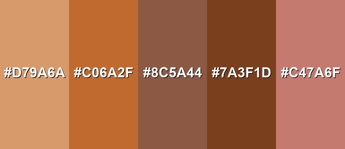
Shades, Tints & Variations of Copper Color
Copper has a surprisingly flexible range—from airy tints to deep, dramatic tones. Using these variations helps you keep the "metal" character while improving hierarchy, contrast, and mood across different layouts.
- Light Copper (#D79A6A) - A softer, brighter take that keeps the warmth but feels more airy and contemporary. It's best used for Background accents, large UI surfaces, and gentle gradients.
- Copper Penny (#C06A2F) - A punchier, more orange-forward copper that reads energetic and attention-grabbing. It's best used for Buttons, badges, and small brand highlights.
- Antique Copper (#8C5A44) - A muted, aged tone that suggests patina, heritage, and a crafted finish. It's best used for Packaging, editorial design, and vintage-inspired palettes.
- Deep Copper (#7A3F1D) - A darker, richer shade that feels sturdy and dramatic while staying warm. It's best used for Headings, frames, and high-end branding accents.
- Rose Copper (#C47A6F) - A copper-leaning rose that adds softness and a more human, personal feel. It's best used for Beauty, lifestyle visuals, and warm skin-tone-friendly themes.
Industry Applications
Copper shows up across digital and physical design because it bridges natural warmth with a refined, material-like finish. It can feel premium, practical, or handcrafted depending on the palette and texture you build around it.
Fashion & Beauty
- Use copper as a premium highlight for personal care branding where warmth matters.
- Lean on a handmade, crafted impression for lifestyle visuals that need to feel human and approachable.
- Pair softer copper variations to keep the look warm without becoming overly formal.
- Use copper as an accent rather than an all-over color to maintain a clean, modern feel.
Interior Design & Decor
- Add copper through hardware, fixtures, and lighting to create warm, layered spaces.
- Use copper as statement pieces against neutral walls for a grounded focal point.
- Combine copper with wood tones, stone textures, and soft textiles for a natural, crafted look.
- Keep balance in darker rooms so copper doesn't turn heavy or overly rustic.
Branding & Marketing
- Support artisan and handmade brands that want a crafted, trustworthy impression.
- Elevate premium food, beverage, or personal care with copper trims and highlight details.
- Give tech and tools brands a human, approachable edge while still feeling capable and reliable.
- Use foil details and metallic inks in packaging and print for premium finishes with earthy warmth.
Conclusion
Copper stands out for its warm, metallic character that feels both crafted and modern. Its natural link to real copper surfaces makes it especially effective as an accent that adds depth, texture, and visual confidence. In branding and UI, it can communicate warmth and reliability while still signaling quality when used with balanced neutrals and calm contrasts. If you need a consistent digital reference, #B87333 is a solid starting point for building palettes and variations. With thoughtful pairings and controlled saturation, Copper Color meaning can support designs that feel inviting, durable, and distinctive.
Design Smarter with AI: Media.io is an online AI studio that empowers creators with advanced image generation and enhancement tools. From text-to-image and image-to-image creation to AI upscaling and color optimization, it enables fast, creative, and professional results—all in your browser.

Frequently Asked Questions About Copper Color
Copper is a warm reddish-brown metallic tone inspired by the look of copper metal. It often appears richer than orange and more vibrant than many browns, especially in glossy finishes.
Copper commonly represents warmth, craftsmanship, durability, and practical value. It can also suggest a premium finish when used as a highlight in visual design.
A commonly used digital reference is #b87333. Depending on lighting, texture, and medium, real copper can look lighter, darker, or more reflective than a flat screen value.
Muted blues, warm off-whites, and earthy browns are reliable partners. Greens can also work well, especially when copper is kept as an accent rather than the main background.
Copper is typically redder and more orange-brown than bronze, which often looks browner or more golden. Compared with rose gold, copper is usually less pink and feels more earthy and industrial.
Use it for small, high-value moments like buttons, icons, and highlights, and support it with plenty of neutral space. Keep contrast in mind and test readability if copper is used for text or thin UI elements.


