

Evergreen color is a deep, cool green inspired by conifer needles—rich, shaded, and slightly blue-leaning. A common reference value is #0B3D2E, which keeps that dark, steady evergreen look without drifting fully into teal.
Because it's naturally moody and low-light, evergreen often feels grounded, dependable, and quietly luxurious. Below, you'll find the exact color codes, conversions, meanings, best pairings, and practical ways to use evergreen in modern design.
Evergreen Color: Codes & Values
If you want evergreen to look consistent across screens, print, and brand assets, start with these standard values.
| Parameters | VALUE |
| HEX Code | #0B3D2E |
| RGB DECIMAL | 11, 61, 46 |
| RGB PERCENTAGE | 4.3%, 23.9%, 18.0% |
| CMYK | 82%,0%,25%,76% |
| HSL | 162°, 70%, 14% |
| HSV (HSB) | 162°, 82%, 24% |
| Web Safe | #003333 |
Key Color Space Explanations:
- HEX - HEX is the most common digital identifier for a shade and is widely used in design tools and CSS. #0b3d2e is a dark evergreen green with a cool, slightly teal undertone.
- RGB - RGB defines the amount of red, green, and blue light used on screens. With low red and moderate green/blue, evergreen reads deep and calm rather than bright.
- CMYK - CMYK is used for ink-based printing, describing how cyan, magenta, yellow, and black combine on paper. Evergreen relies heavily on black and cyan, which helps it stay dark and stable in print.
- HSL - HSL describes hue, saturation, and lightness in a way that's intuitive for adjusting tone. Evergreen sits around a green-cyan hue with high saturation but low lightness, keeping it moody and refined.
- Web Safe - Web-safe values approximate a shade using a limited palette that older displays handled consistently. #003333 is the closest web-safe match, slightly more uniform and less nuanced than the original.
For most workflows, use HEX or RGB in digital design, and CMYK for print—then do a quick test on real materials to confirm the final depth.
Evergreen Color Conversions
Need evergreen in a specific format for CSS, editing apps, or print specs? Use this conversion table as a reliable copy-and-paste reference.
| Parameters | VALUE | CSS |
| HEX | #0b3d2e | #0b3d2e |
| RGB DECIMAL | 11, 61, 46 | rgb(11,61,46) |
| RGB PERCENTAGE | 4.3%, 23.9%, 18.0% | rgb(4.3%,23.9%,18.0%) |
| CMYK | 82%,0%,25%,76% | cmyk(82%,0%,25%,76%) |
| HSL | 162°, 70%, 14% | hsl(162°,70%,14%) |
| HSV (or HSB) | 162°, 82%, 24% | -- |
| Web Safe | 003333 | #003333 |
| CIE-LAB | 22.5, -21.5, 5.0 | -- |
| XYZ | 2.30, 3.61, 3.15 | -- |
| xyY | 0.254, 0.398, 3.61 | -- |
| CIE-LCH | 22.5, 22.1, 167° | -- |
| CIE-LUV | 22.5, -17.0, 7.2 | -- |
| Hunter-Lab | 19.0, -11.0, 2.7 | -- |
| Binary | 00001011 00111101 00101110 | -- |
Want to generate Evergreen Color photos or posters? Try Media.io's AI Image Generator now!
Evergreen Color Meaning & Symbolism
The color evergreen is widely linked with resilience, steadiness, and nature because it mirrors plants that stay green throughout the year. In everyday life it often reads as a dependable, mature green that feels calm without looking fragile. When people look up Evergreen Color meaning, they're usually trying to understand why it feels both natural and polished at the same time.
Psychological Effects
As a dark green, evergreen tends to shape mood through calm structure and visual depth.
- Grounded Calm - Evergreen quiets busy layouts and makes a page or room feel more settled.
- Trust & Stability - In branding and UI, it often signals reliability, security, and long-term value.
- Premium Seriousness - Its low lightness can feel established and upscale rather than trendy.
- Privacy & Shelter - Dark evergreen adds a "protected" feeling that can be cozy in interiors and intimate in visuals.
- Heaviness Risk - Used too broadly without light contrast, it can reduce brightness and make designs feel dense.
Positive Associations
Evergreen's natural roots make it easy to pair with messages of quality, longevity, and balance.
- Resilience - The color echoes year-round foliage and the idea of staying strong through change.
- Continuity - Evergreen suggests consistency, routines, and steady progress over time.
- Nature Connection - It feels organic and outdoorsy, especially next to wood, stone, and warm neutrals.
- Craft & Heritage - Dark greens often imply tradition, workmanship, and "made to last" products.
- Quiet Luxury - It can look refined without relying on high saturation or loud contrast.
Cultural Significance Across the World
Across different contexts, evergreen shades commonly point back to renewal, harmony, and enduring life.
- Continuity & Renewal - Evergreen tones symbolize ongoing life because they're tied to year-round greenery.
- Growth (Muted) - While many greens suggest fresh growth, darker evergreen leans more toward endurance than energy.
- Harmony - Green is frequently associated with balance, and evergreen brings a calmer, more mature version of that feeling.
- Nature & Tradition - In decor and design, evergreen often reads timeless—closer to classic landscapes than bright seasonal color.
Design Applications
Evergreen works as a confident base color, a sophisticated background, or a premium accent—especially when you build in contrast so key elements stay clear.
Graphic Design Tips
- Use evergreen for headers, section dividers, and frames to create structure without harsh black.
- Pair it with warm neutrals to soften the mood, or cool blues to push a more modern, technical look.
- Keep typography simple and spacious—evergreen looks best when the layout can "breathe."
- For CTAs, try light buttons on evergreen backgrounds (or evergreen buttons on light pages) for clean hierarchy.
- In print, do a small test on uncoated stock—deep greens can shift darker and lose detail.
Pro tip: If evergreen feels too heavy, introduce a pale supporting background and reserve the darkest green for navigation, badges, and high-impact highlights.
Evergreen Color in Photography & Video
- Evergreen looks natural in forest, botanical, and outdoor scenes—great for grounded lifestyle visuals.
- In product photography, use evergreen backdrops to make metallics, ceramics, and warm neutrals feel more premium.
- For video, evergreen shadows can add a cinematic tone—just protect skin tones with warmer key light.
- Balance deep greens with clean whites or light tints so the image doesn't look underexposed.
- When color grading, keep saturation controlled; evergreen is strongest when it stays rich, not neon.
Recommended Tool for Image Enhancement: When incorporating evergreen color into your photography projects, Media.io's AI Image tools can help you achieve more refined results. With AI-powered color enhancement, photo colorization, image upscaling, and old photo restoration, you can easily enrich evergreen color tones, improve overall image quality, and highlight the color's elegant and sophisticated aesthetic.
Color Combinations
Because evergreen is deep and cool, it pairs best with tones that either warm it up, brighten it, or add clear hue separation. Use the palettes below as practical starting points for layouts, illustrations, branding, and UI themes.
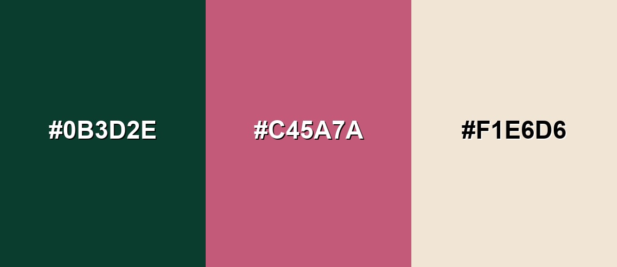
Complementary Colors
A complementary pairing adds the most visible contrast by placing a rose-leaning accent against evergreen's cool green base. This is a strong option for calls to action, editorial highlights, and packaging details where you want the green to feel richer.
Complementary Palette Example: Combine Evergreen with a muted rose and a soft sand neutral for a balanced contrast that still feels natural.
Analogous Color Schemes
Analogous colors sit adjacent to each other on the color wheel, creating harmonious, cohesive palettes with subtle variation.
Deep Teal, Evergreen, and Moss Green create a smooth, nature-forward blend with minimal visual tension.
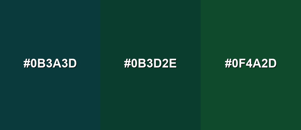
- Deep Teal: #0B3A3D
- Evergreen: #0B3D2E
- Moss Green: #0F4A2D
Forest Green, Evergreen, and Deep Olive work well for layered backgrounds, charts, and calm brand systems.
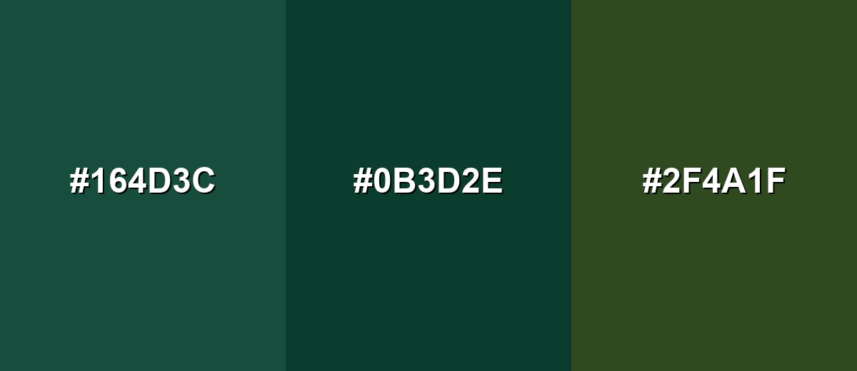
- Forest Green: #164D3C
- Evergreen: #0B3D2E
- Deep Olive: #2F4A1F
Triadic & Tetradic Combinations
A triadic palette brings variety while staying balanced, making it a reliable choice for illustrations and multi-section layouts.
Evergreen with Deep Plum and Warm Ochre creates a sophisticated three-way contrast that still feels earthy.
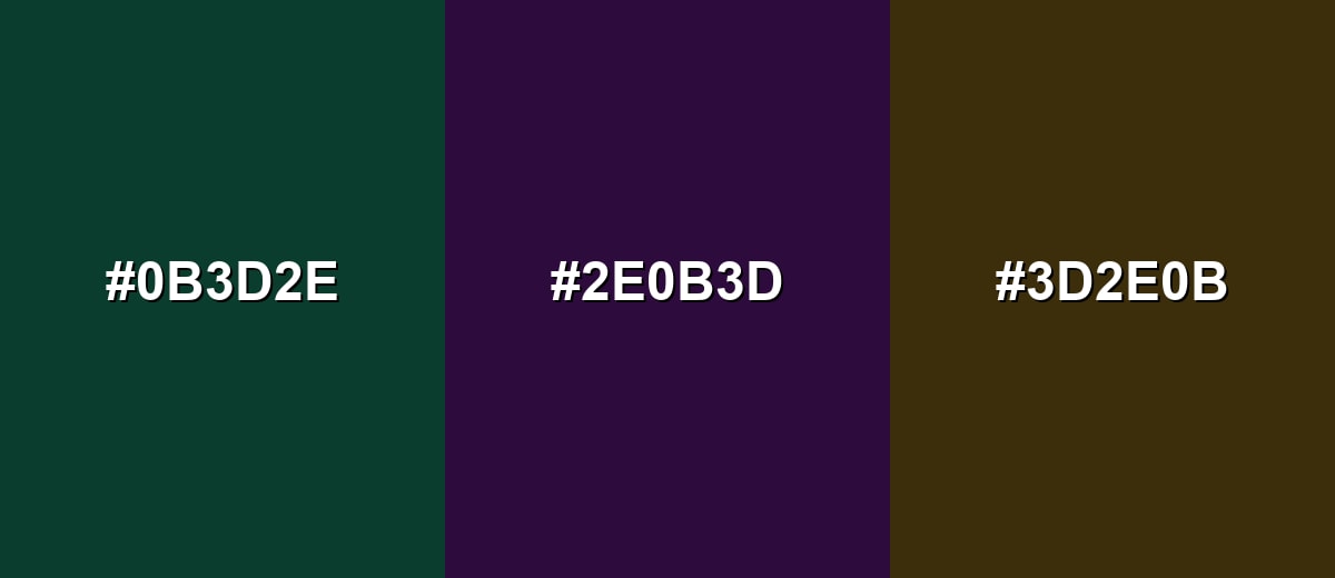
- Evergreen: #0B3D2E
- Deep Plum: #2E0B3D
- Warm Ochre: #3D2E0B
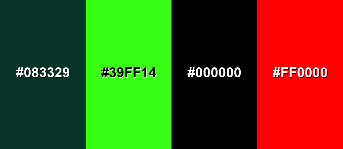
Colors to Avoid
While evergreen color is remarkably versatile, certain combinations can create problematic visual effects:
- Near-Black Green (#083329) - Too close in value to evergreen, so elements blend together and contrast drops, especially for text and icons.
- Neon Green (#39FF14) - The intensity fights evergreen's calm mood and can make designs look noisy or unpolished.
- Pure Black (#000000) - Creates heavy blocks with little separation from evergreen, which can crush detail and reduce readability.
- Pure Red (#FF0000) - Highly saturated red can feel harsh against evergreen and may look overly aggressive in UI and branding contexts.
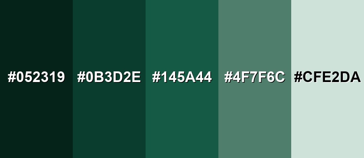
Shades, Tints & Variations of Evergreen Color
Evergreen isn't just one dark green—its range goes from near-ink depths to airy, misty tints. Exploring these variations helps you build a flexible palette for UI states, backgrounds, accents, and print materials without losing the evergreen character.
- Deep Evergreen (#052319) - A near-ink evergreen that feels dense and dramatic, with very little reflected light. It's best used for Premium backgrounds, headers, or subtle framing where you want maximum depth.
- Classic Evergreen (#0B3D2E) - The core evergreen tone: cool, dark, and natural, with a slightly teal-leaning green hue. It's best used for Primary brand shade, navigation surfaces, or grounded accents across a system.
- Spruce Green (#145A44) - A clearer, more open evergreen-leaning green that stays mature but feels less heavy. It's best used for Buttons, highlights, charts, and secondary brand elements.
- Sage Evergreen (#4F7F6C) - A softened, gray-leaning variant that keeps the evergreen character while becoming more approachable. It's best used for Large surfaces, cards, and supporting backgrounds in calm layouts.
- Misty Evergreen (#CFE2DA) - A pale tint with a gentle green cast that reads clean and airy. It's best used for Background fills, subtle sections, and spacious UI where evergreen accents need room to breathe.
Industry Applications
Evergreen fits industries that benefit from trust, craft, sustainability cues, or an established feel. It can read modern or traditional depending on the supporting neutrals, typography, and imagery style.
Fashion & Beauty
- Use evergreen as a "quiet luxury" base for premium collections, lookbooks, and seasonal capsules.
- Pair it with warm neutrals for skincare/wellness packaging that feels calm and grounded.
- In cosmetics visuals, evergreen backdrops help metallic accents and glass packaging stand out.
- Keep contrast crisp for labels—light typography and clean spacing prevent the shade from feeling too heavy.
Interior Design & Decor
- Evergreen is ideal for cabinets, feature walls, and upholstery when you want a timeless, cozy mood.
- Balance it with lighter surfaces and reflective finishes to avoid reducing perceived brightness.
- It looks especially refined on textured materials and matte finishes for a soft, modern feel.
- Use softer variations (like sage-leaning tones) for larger areas when you want a more open look.
Branding & Marketing
- Evergreen supports messaging around reliability, craft, and longevity across brand identity systems.
- It works well for website headers, hero sections, and packaging accents where you want confident framing.
- In SaaS and dashboards, keep layouts light and structured so evergreen adds clarity instead of density.
- For print, test on uncoated stock—evergreen can appear darker and less saturated than expected.
Conclusion
Evergreen is a deep, cool green that feels steady, natural, and quietly refined—making it a smart choice for branding, UI, interiors, and print when you want a timeless foundation. With #0B3D2E as a dependable reference, you can build everything from soft, airy systems using misty tints to dramatic, high-contrast layouts with rose or ochre accents. The key is contrast: pair evergreen with lighter supporting tones, give typography room to breathe, and test readability on real screens and materials so the color stays rich without feeling heavy.
Design Smarter with AI: Media.io is an online AI studio that empowers creators with advanced image generation and enhancement tools. From text-to-image and image-to-image creation to AI upscaling and color optimization, it enables fast, creative, and professional results—all in your browser.

Frequently Asked Questions About Evergreen Color
Evergreen is a deep, cool green inspired by evergreen foliage such as conifers. It typically looks darker than standard green, with a slightly blue-leaning undertone.
A commonly used hex value for evergreen is #0b3d2e, which captures a dark, natural evergreen green suited to modern digital design.
For #0b3d2e, the RGB values are 11, 61, 46 and the CMYK values are 82%,0%,25%,76%. These help you match the same shade across screens and print workflows.
Evergreen pairs well with warm neutrals, muted pinks/roses, deep blues, and earthy gold-leaning tones. These combinations either brighten it, warm it up, or create clear hue separation.
Use evergreen as an anchor for navigation, headers, or key accents, then balance it with generous whitespace and lighter supporting tones. Keeping typography clean and spacing consistent helps it feel modern rather than heavy.
It can be, but contrast needs attention because evergreen is very dark. Pair it with high-contrast text and test small UI elements to ensure labels, icons, and states remain clearly readable.


