

Champagne color is a light, warm beige with a gentle golden shimmer—think pale sparkling wine or satin fabric catching soft light. A common reference for this tone is #F7E7CE.
It feels refined, welcoming, and quietly celebratory without looking loud, and it can read slightly rosier or creamier depending on lighting and nearby colors.
Champagne Color: Codes & Values
Use these values to keep champagne consistent across web, UI, video, and print projects.
| Parameters | VALUE |
| HEX Code | #F7E7CE |
| RGB DECIMAL | 247, 231, 206 |
| RGB PERCENTAGE | 96.9%, 90.6%, 80.8% |
| CMYK | 0%,7%,17%,3% |
| HSL | 37°, 72%, 89% |
| HSV (HSB) | 37°, 17%, 97% |
| Web Safe | #FFFFCC |
Key Color Space Explanations:
- HEX - HEX is the standard web identifier for a specific shade, used in CSS and design tools. For champagne, it ensures consistent rendering across screens.
- RGB - RGB describes the amount of red, green, and blue light mixed to display the tone on digital screens. It is the most common format for UI and video work.
- CMYK - CMYK is used for printing and represents ink percentages for cyan, magenta, yellow, and black. It helps predict how champagne will look on paper compared with a backlit display.
- HSL - HSL organizes the tone by hue, saturation, and lightness, which is handy for creating tints and balanced palettes. Champagne sits in a warm hue range with high lightness.
- Web Safe - Web safe is the closest shorthand palette from older browser-safe color sets. It is useful when you want a similar simplified tone for legacy constraints.
For most digital work, start with HEX (#F7E7CE) or RGB, then switch to CMYK when you're preparing files for print.
Champagne Color Conversions
These conversions help you match champagne across different tools, color models, and production workflows.
| Parameters | VALUE | CSS |
| HEX | #f7e7ce | #f7e7ce |
| RGB DECIMAL | 247, 231, 206 | rgb(247,231,206) |
| RGB PERCENTAGE | 96.9%, 90.6%, 80.8% | rgb(96.9%,90.6%,80.8%) |
| CMYK | 0%,7%,17%,3% | cmyk(0%,7%,17%,3%) |
| HSL | 37°, 72%, 89% | hsl(37°,72%,89%) |
| HSV (or HSB) | 37°, 17%, 97% | -- |
| Web Safe | ffffcc | #ffffcc |
| CIE-LAB | L* 92.3, a* 1.0, b* 14.6 | -- |
| XYZ | 78.0, 81.4, 69.9 | -- |
| xyY | x 0.340, y 0.355, Y 81.4 | -- |
| CIE-LCH | 92.3, 14.6, 86.1° | -- |
| CIE-LUV | L* 92.3, u* 11.0, v* 21.2 | -- |
| Hunter-Lab | L 90.2, a 1.4, b 13.3 | -- |
| Binary | 11110111 11100111 11001110 | -- |
Want to generate Champagne Color photos or posters? Try Media.io's AI Image Generator now!
Champagne Color Meaning & Symbolism
Champagne is widely linked to elegance, warmth, and understated luxury. It reads as polished and celebratory, but still neutral enough to feel calm in everyday settings. When people search for Champagne Color meaning, they are often looking for that balance between softness and sophistication.
Psychological Effects
This tone tends to soften a layout and reduce visual noise, especially in large areas like backgrounds.
- Softens Visual Noise - It calms busy layouts by reducing harsh contrast, making pages and spaces feel less tense.
- Welcoming & Approachable - Champagne creates a gentle first impression that supports comfort and trust in branding, packaging, and interiors.
- Quietly Premium - It suggests refinement and care, elevating product perception without relying on flashy accents.
- Light-Boosting Neutral - As a very light warm tone, it helps bounce light and can make small areas feel brighter.
- Can Feel Flat If Overused - With too much champagne and not enough contrast, designs can look washed out or slightly dull/yellowed on low-quality displays.
Positive Associations
Champagne's appeal comes from how easily it feels special while still staying neutral.
- Elegance - A polished, graceful vibe that reads upscale without being cold or stiff.
- Warmth - A creamy glow that feels friendly and flattering in both digital design and real spaces.
- Understated Luxury - A "premium" signal that doesn't shout, ideal for modern minimal branding.
- Celebration - Subtle party energy tied to toasts, milestones, and special moments.
- Care & Craft - Often linked to thoughtful details—like satin textures, fine stationery, and well-finished packaging.
Cultural Significance Across the World
Because the name is tied to sparkling wine, the color naturally borrows those festive, formal associations.
- Milestones & Toasts - Often used to signal an upscale experience without heavy metallic effects.
- Weddings & Formal Events - A go-to neutral for invitations, décor, and attire where softness feels romantic and timeless.
- Fashion & Eveningwear - Frequently referenced in satin-like fabrics and elegant basics where a subtle glow looks intentional.
- Premium Packaging Cues - Common alongside pearls, satin, and soft gold accents in beauty, fragrance, and gift-ready designs.
Design Applications
Champagne is a versatile neutral that performs well when you need warmth without heaviness. It can act as a main background, a supporting base for typography, or a highlight tone that adds polish.
Graphic Design Tips
- Use champagne for backgrounds, cards, and section blocks to create a calm, premium feel without the starkness of pure white.
- Pair it with a clearly darker anchor for headings, buttons, and icons so the hierarchy stays obvious.
- Lean on texture (grain, paper, fabric-like overlays) to keep large champagne areas from looking flat.
- For print, proof on the final stock—warm neutrals can shift under different lighting and paper tones.
- Check contrast early, especially for body copy and small UI labels, since champagne is very light.
Pro tip: Treat champagne as your "soft canvas," then pick one strong accent color for structure—this keeps the palette elegant and readable at the same time.
Champagne Color in Photography & Video
- Champagne backdrops flatter warm lighting and skin tones, making portraits and product shots feel more inviting.
- Use white balance controls to keep it from drifting too yellow (warm light) or too pink (mixed light).
- Protect highlights—because champagne is very light, overexposure can wipe out its subtle golden cast.
- For lifestyle video, champagne set design (props, walls, fabrics) adds a refined mood without stealing attention.
- Pair it with a darker prop or wardrobe element so the subject doesn't blend into the background.
Recommended Tool for Image Enhancement: When incorporating champagne color into your photography projects, Media.io's AI Image tools can help you achieve more refined results. With AI-powered color enhancement, photo colorization, image upscaling, and old photo restoration, you can easily enrich champagne color tones, improve overall image quality, and highlight the color's elegant and sophisticated aesthetic.
Color Combinations
Champagne pairs best with deep anchors, soft pastels, and nature-inspired neutrals. Use these schemes as starting points, then adjust contrast based on your medium and lighting.
Complementary Colors
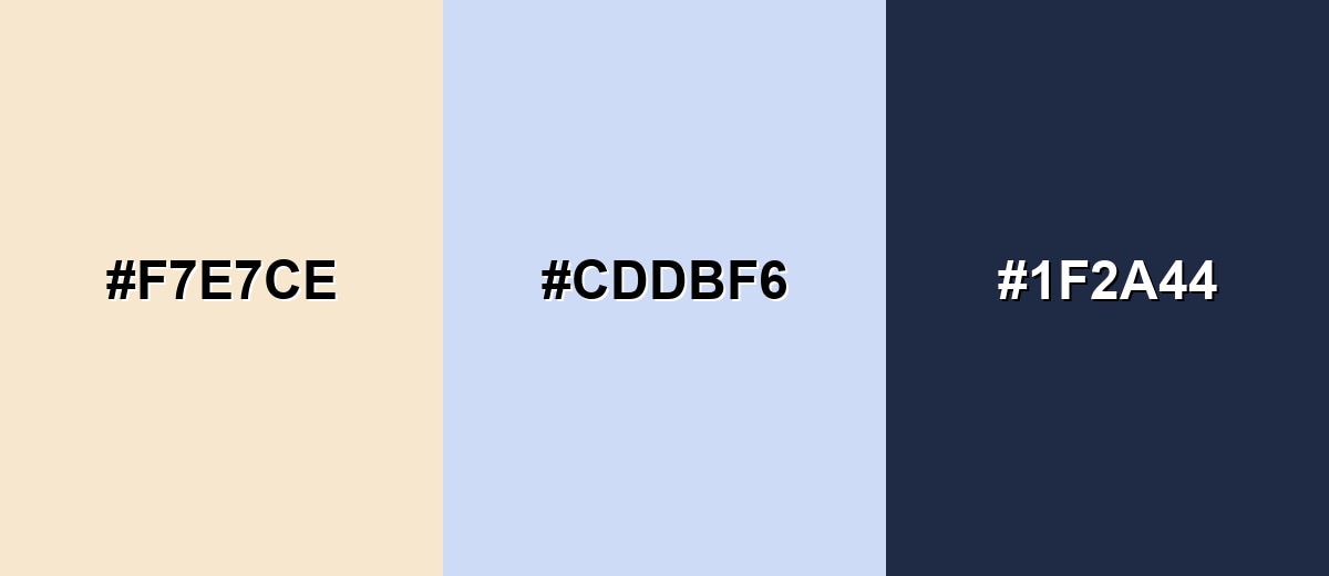
A cool blue counterpoint makes champagne look warmer and more luminous, while a deep navy adds structure and readability.
Complementary Palette Example: Try champagne with a misty blue and a deep navy for a refined, balanced look.
Analogous Color Schemes
Analogous colors sit adjacent to each other on the color wheel, creating harmonious, cohesive palettes with subtle variation.
Warm neighbors create a cozy palette that stays soft and cohesive.
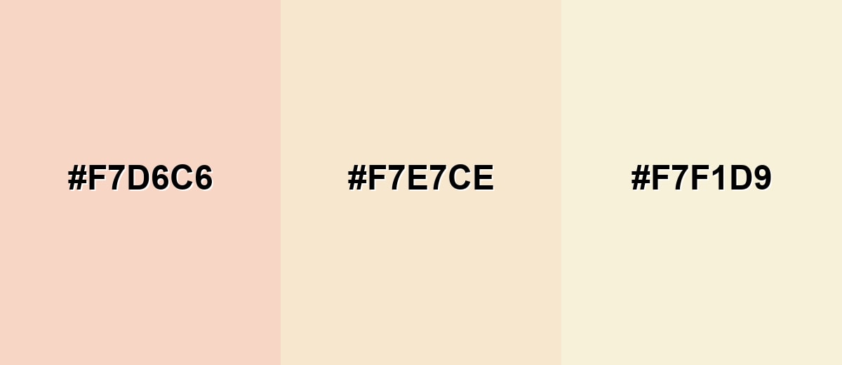
- Soft Blush: #F7D6C6
- Champagne: #F7E7CE
- Ivory Sand: #F7F1D9
A slightly greener set keeps the feel light while adding a fresh, natural edge.
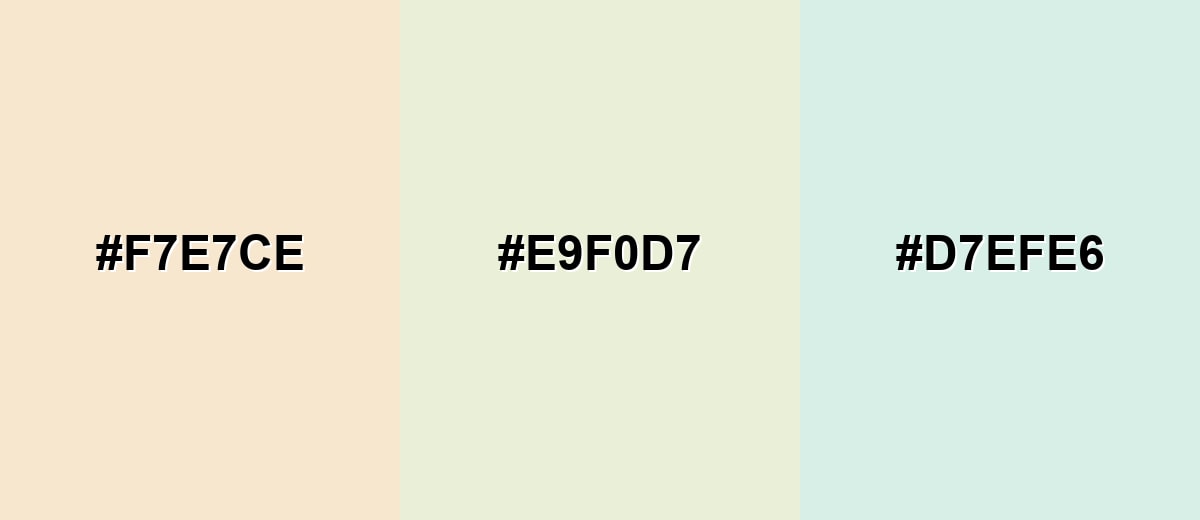
- Champagne: #F7E7CE
- Pale Sage: #E9F0D7
- Mint Mist: #D7EFE6
Triadic & Tetradic Combinations
Triadic palettes add variety while staying harmonious when you keep saturation low.
Use champagne with a soft mint and a light lavender for a gentle, modern contrast.
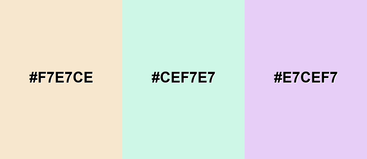
- Champagne: #F7E7CE
- Soft Mint: #CEF7E7
- Light Lavender: #E7CEF7
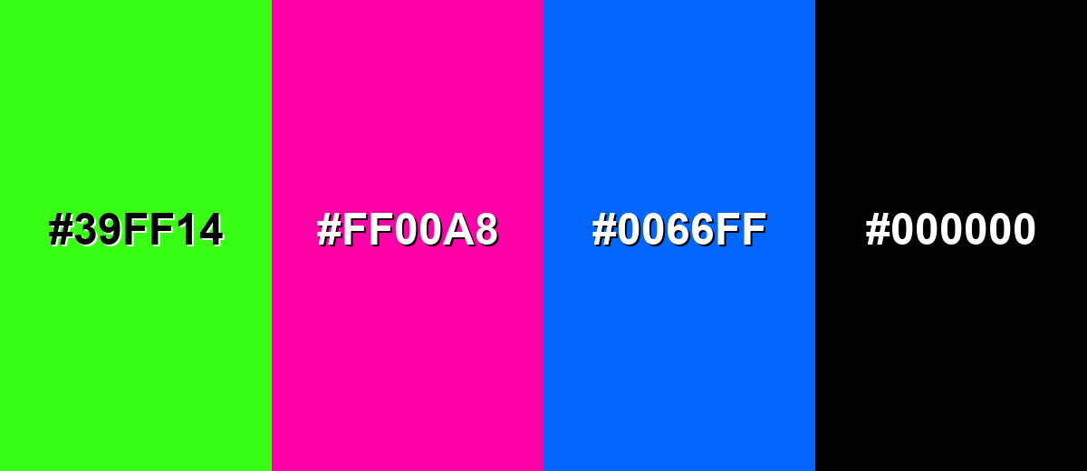
Colors to Avoid
While champagne color is remarkably versatile, certain combinations can create problematic visual effects:
- Neon Green (#39FF14) - The extreme brightness and saturation can overwhelm champagne and make the overall look feel harsh rather than refined.
- Hot Magenta (#FF00A8) - A highly saturated pink can dominate the palette, pushing champagne into the background and reducing its subtle elegance.
- Electric Blue (#0066FF) - Strong, pure blues create aggressive contrast that can clash with champagne's soft, creamy warmth.
- Pure Black (#000000) - Very stark contrast can feel severe; champagne usually looks better with a slightly softened dark anchor.
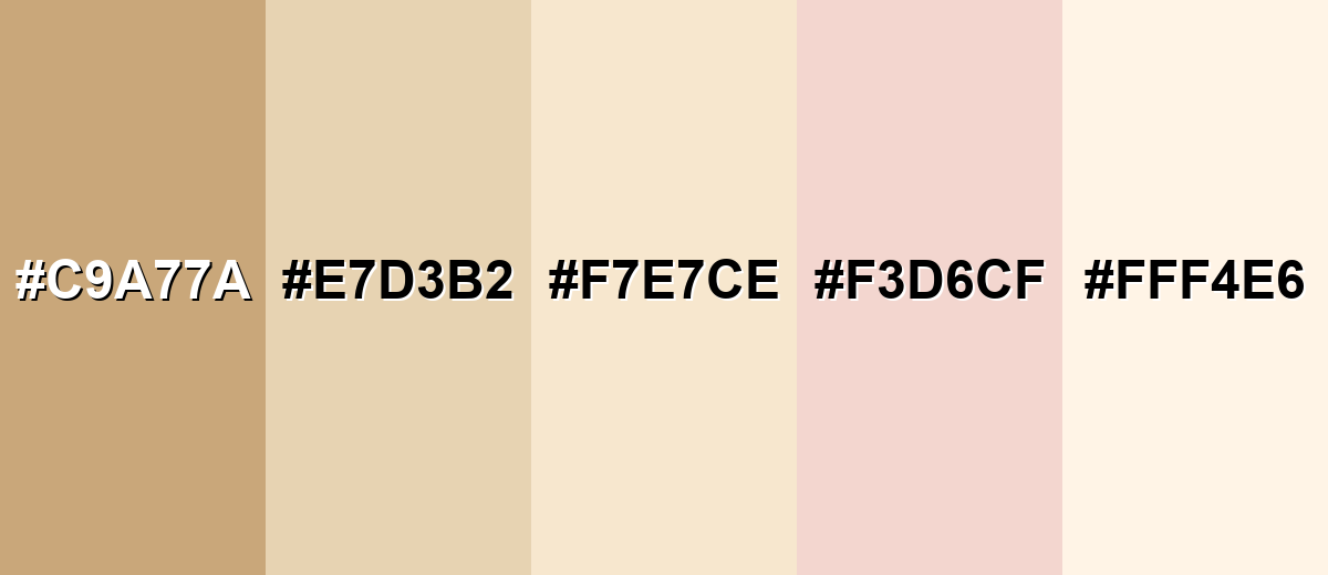
Shades, Tints & Variations of Champagne Color
Champagne isn't just one shade—it ranges from deeper, golden versions to airy, creamy tints. Having a few variations makes it easier to build contrast, add depth, and keep your designs feeling intentional across different screens and materials.
- Deep Champagne (#C9A77A) - A darker, more golden take that feels richer and more grounded than the classic tone. It's best used for Accent blocks, premium labels, headings, and warm metallic-style details.
- Champagne Beige (#E7D3B2) - A slightly deeper beige that keeps the warmth while adding more contrast and definition. It's best used for Background sections, cards, packaging bases, and interior textiles.
- Classic Champagne (#F7E7CE) - The familiar soft beige-gold that reads as light, elegant, and easy to pair. It's best used for UI backgrounds, wedding palettes, stationery, and neutral brand systems.
- Rosy Champagne (#F3D6CF) - A subtle pink-leaning variation that looks warmer and more romantic. It's best used for Beauty branding, invitations, lifestyle graphics, and soft highlight areas.
- Pale Champagne (#FFF4E6) - A very light, creamy tint with an airy finish that reads clean and bright. It's best used for Large backgrounds, minimal layouts, and spaces where you want maximum lightness.
Industry Applications
Because it sits between cream, beige, and soft gold, champagne adapts to many industries without feeling trend-dependent. It is especially useful when you want warmth and polish without overpowering content.
Fashion & Beauty
- Skincare and fragrance packaging with a clean, premium mood
- Soft landing pages and product detail layouts
- Eveningwear, satin-like textiles, and elegant basics
- Product photography backgrounds that flatter many materials
Interior Design & Decor
- Menus and branding where warmth and comfort matter
- Interior accents that feel inviting in low, warm lighting
- Invitations, signage, table settings, and photo backdrops
- Pairing with blush, sage, or navy for a balanced theme
Branding & Marketing
- Minimal UI themes with a softer alternative to pure white
- Lifestyle templates, presentations, and social graphics
- Menus and branding where warmth and comfort matter
- Skincare and fragrance packaging with a clean, premium mood
Conclusion
Champagne stands out as a warm, light neutral that feels elegant without being flashy—and that's exactly why it works so well in everything from modern UI to wedding stationery and premium packaging. Use #F7E7CE as your reliable on-screen reference, then build the palette with deeper anchors for readability and structure. With smart contrast and a few complementary accents, champagne adds a calm sense of celebration while keeping your design clean, inviting, and polished.
Design Smarter with AI: Media.io is an online AI studio that empowers creators with advanced image generation and enhancement tools. From text-to-image and image-to-image creation to AI upscaling and color optimization, it enables fast, creative, and professional results—all in your browser.

Frequently Asked Questions About Champagne Color
Champagne is a light warm beige with a subtle golden cast, inspired by the look and associations of sparkling wine. It sits close to cream and soft gold, making it easy to use as a refined neutral.
It is generally warm because it leans toward beige and soft yellow-gold. Depending on lighting and nearby tones, it can appear more creamy, slightly pink, or a touch more golden.
Deep navy, soft blues, blush tones, sage greens, and gentle lavenders pair well with champagne. These options keep the palette elegant while adding enough contrast for hierarchy.
Beige is often a bit deeper and more plainly brown-leaning, while ivory tends to look whiter and cleaner. Champagne sits in between, usually with a faint golden glow that feels more polished.
A dark anchor works best for readability, such as deep navy or a rich charcoal-like tone. Light text typically lacks contrast on champagne, especially for body copy and small UI labels.
Yes, but it is wise to proof it on the final paper because warm neutrals can shift with stock and lighting. Using the CMYK values as a starting point and testing variations helps keep the result true to the intended look.


