

 TL;DR:
Light pink (#FFB6C1) is a soft, high-lightness pastel best utilized as a background tint or UI accent to convey warmth and approachability without overpowering digital or print layouts.
● Standardize cross-platform assets using HEX #FFB6C1 or RGB (255, 182, 193), switch to CMYK (0%, 29%, 24%, 0%) for print, and anchor the pastel with deep charcoal or navy text to guarantee accessibility and crisp readability.
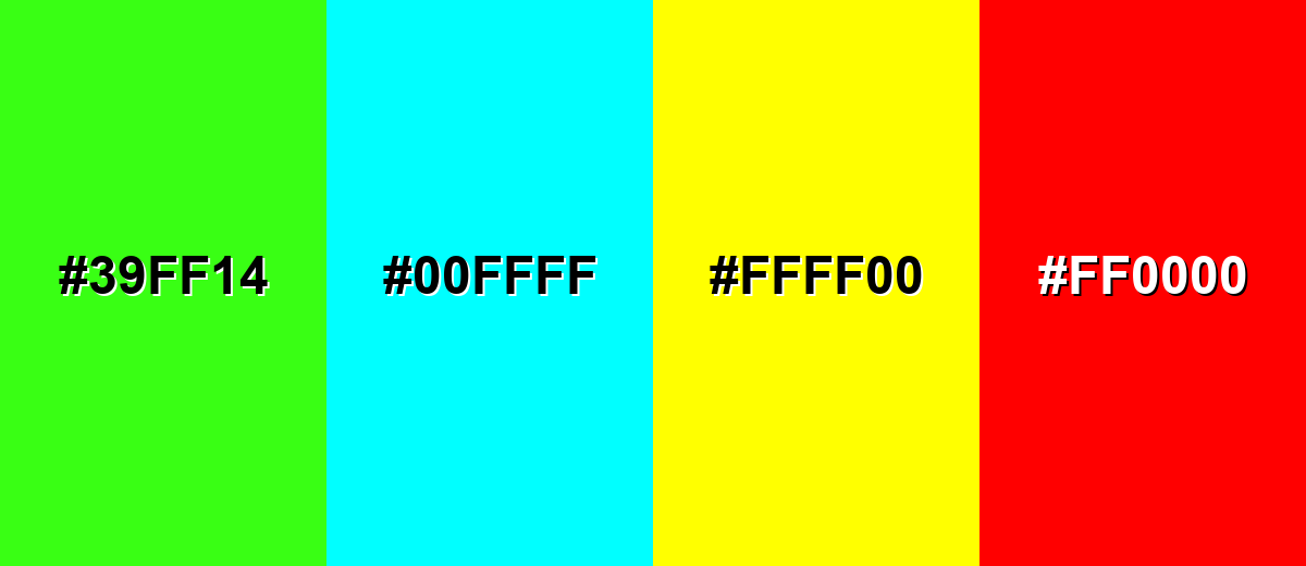
● Avoid pairing light pink with neon green (#39FF14), pure cyan, signal yellow, or vivid red to prevent harsh visual vibrations, and refrain from using it for small typography on light surfaces where it rapidly loses definition.
● When integrating light pink into photography or video content, manually fine-tune white balance to prevent unwanted rosy casts on skin tones, and leverage tools like Media.io's AI Image Generator for accurate color enhancement and upscaling.
Ask AI for a summary
 ChatGPT
 Perplexity
 Gemini
 Claude
 Grok
Grok
Light pink color is a pale, gentle pink that feels soft and airy—like a blush tint on petals or a rosy wash of daylight.
Its hex code is #FFB6C1, giving it a bright base with a light, pastel finish that can look modern, nostalgic, or playful depending on what you pair it with.
Light Pink Color: Codes & Values
Use these standard values to keep light pink consistent across web, UI, and print workflows.
| Parameters | VALUE |
| HEX Code | #FFB6C1 |
| RGB DECIMAL | 255, 182, 193 |
| RGB PERCENTAGE | 100%, 71.37%, 75.69% |
| CMYK | 0%,29%,24%,0% |
| HSL | 351°, 100%, 86% |
| HSV (HSB) | 351°, 29%, 100% |
| Web Safe | #FFCCCC |
Key Color Space Explanations:
- HEX - HEX is the most common way to specify light pink in web design and digital tools. Use #ffb6c1 to match this exact shade across pages and assets.
- RGB - RGB describes how much red, green, and blue light is mixed to create the tone on screens. Light pink is high in red with softened green and blue for a pastel look.
- CMYK - CMYK is used for print and represents ink percentages. Light pink uses little to no black ink, relying mainly on magenta with a touch of yellow.
- HSL - HSL describes the hue angle plus saturation and lightness, which is helpful for picking tints and harmonies. Light pink sits near red (around 351°) with very high lightness.
- Web Safe - Web Safe is the closest older palette match for consistent rendering on legacy displays. For light pink, the closest web-safe value is #ffcccc.
If you're building a design system, start with HEX for UI components, use RGB for screen-based work in apps, and switch to CMYK when you're preparing print-ready assets.
Light Pink Color Conversions
Need light pink in a different format? Use the conversions below to move smoothly between design tools.
| Parameters | VALUE | CSS |
| HEX | #ffb6c1 | #ffb6c1 |
| RGB DECIMAL | 255, 182, 193 | rgb(255,182,193) |
| RGB PERCENTAGE | 100%, 71.37%, 75.69% | rgb(100%,71.37%,75.69%) |
| CMYK | 0%,29%,24%,0% | cmyk(0%,29%,24%,0%) |
| HSL | 351°, 100%, 86% | hsl(351°,100%,86%) |
| HSV (or HSB) | 351°, 29%, 100% | -- |
| Web Safe | ffcccc | #ffcccc |
| CIE-LAB | 81.09, 28.00, 5.20 | -- |
| XYZ | 67.63, 58.65, 58.12 | -- |
| xyY | 0.367, 0.318, 58.65 | -- |
| CIE-LCH | 81.09, 28.50, 10.50° | -- |
| CIE-LUV | 81.09, 45.70, 2.30 | -- |
| Hunter-Lab | 76.60, 23.60, 8.60 | -- |
| Binary | 11111111 10110110 11000001 | -- |
Want to generate light pink color photos or posters? Try Media.io's AI Image Generator now!
Light Pink Meaning & Symbolism
Light pink is widely associated with softness, tenderness, and approachability. Because it is a lighter tint of pink, it often feels more calming and subtle than brighter, more saturated pinks. In everyday life, it's commonly used to signal warmth, care, and gentle optimism without being loud.
Psychological Effects
In visual design, light pink often softens the mood before a single word is read.
- Friendlier First Impression - Light pink can make spaces and interfaces feel more welcoming and less intimidating.
- Softer Messaging - It reduces perceived harshness, which is helpful for supportive content, onboarding, and personal-care visuals.
- Delicate, Airy Feel - The tint reads as light and comforting, so products can feel sweeter or more soothing.
- Freshness When Paired With Neutrals - With clean whites and modern typography, it can feel polished rather than playful.
- Needs Contrast To Avoid “Washed Out” - On bright screens or strong lighting, it can lose definition, so supporting tones matter.
Positive Associations
These are the most common “at-a-glance” feelings audiences attach to light pink.
- Warmth - A gentle, human tone that makes designs feel approachable.
- Tenderness - Often used to communicate care, kindness, and softness.
- Reassurance - Helps content feel calmer and less demanding, especially in supportive contexts.
- Gentle Optimism - Brings an uplifting vibe without the intensity of brighter pinks.
- Lighthearted Playfulness - In bold layouts, it can add a fun edge while staying friendly.
Cultural Significance Across the World
Light pink's meaning shifts with context, so it works best when typography and imagery clarify the intent.
- Affection - Frequently linked with caring gestures, gifts, and sweet, supportive messaging.
- Celebration - Common in event styling where a soft, joyful mood is the goal.
- Gentle Romance - Often used to suggest a romantic tone without the intensity of vivid red.
- Fashion & Lifestyle - Regularly appears in styling and product visuals that aim for softness and approachability.
Design Applications
Light pink is most effective when you treat it as a soft accent or background tint and let structure, contrast, and typography do the heavy lifting.
Graphic Design Tips
- Use light pink for badges, highlights, selected states, or gentle callouts instead of large text-heavy backgrounds.
- Pair it with dark charcoal or deep navy text so type stays crisp and readable.
- Avoid pastel-on-pastel combinations for key UI elements; they can blur hierarchy fast.
- Balance the sweetness with crisp neutrals and strong typography to keep the look modern.
- Test contrast early—thin icons and small text can disappear on white or very light surfaces.
A reliable approach is to use light pink as the “soft layer” (backgrounds and highlights), then choose one darker anchor for structure and one saturated accent for primary actions.
Light Pink in Photography & Video
- Use light pink props or backdrops to create a gentle mood without darkening the frame.
- Watch skin tones—light pink can add a rosy cast, so fine-tune white balance for natural results.
- For product shots, pair light pink with clean neutrals to keep the image feeling fresh and polished.
- In video graphics, keep text overlays high-contrast (deep neutral type on light pink panels).
- Add depth with texture (linen, matte surfaces, soft gradients) so the color doesn't look flat on camera.
Recommended Tool for Image Enhancement: When incorporating light pink into your photography projects, Media.io's AI Image tools can help you achieve more refined results. With AI-powered color enhancement, photo colorization, image upscaling, and old photo restoration, you can easily enrich light pink tones, improve overall image quality, and highlight the color's elegant and sophisticated aesthetic.
Color Combinations
Light pink is easy to pair because it already has high lightness. For a balanced look, combine it with deeper anchors for contrast, or with nearby pastels for a soft, layered palette.
Complementary Colors
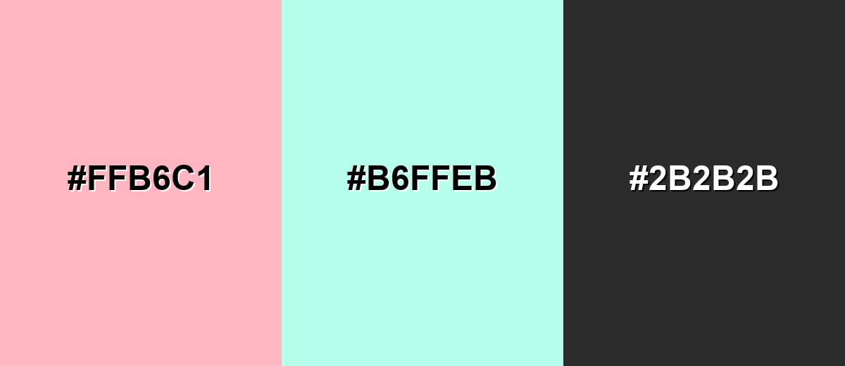
A complementary palette pairs light pink with a soft green-cyan tone for lively contrast that still feels gentle. Add a dark neutral to keep layouts readable and to prevent the pastels from looking overly sweet.
Complementary Palette Example: Try Light Pink with Mint Aqua and Deep Charcoal for a clean, modern balance.
Analogous Color Schemes
Analogous colors sit adjacent to each other on the color wheel, creating harmonious, cohesive palettes with subtle variation.
Analogous blend: Light Pink, Soft Peach, and Warm Rose for a gentle, cohesive look.
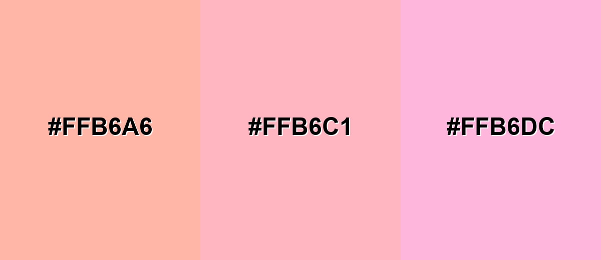
- Soft Peach: #FFB6A6
- Light Pink: #FFB6C1
- Warm Rose: #FFB6DC
Analogous mix: Light Pink with Orchid and Lavender for a dreamy pastel gradient.
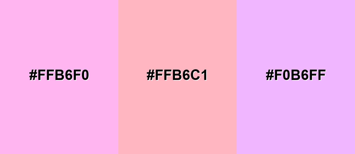
- Orchid Pink: #FFB6F0
- Light Pink: #FFB6C1
- Lavender Tint: #F0B6FF
Triadic & Tetradic Combinations
A triadic scheme adds two evenly spaced hues to create variety while keeping harmony.
Triadic palette: Light Pink, Soft Lime, and Powder Blue for playful, modern layouts.
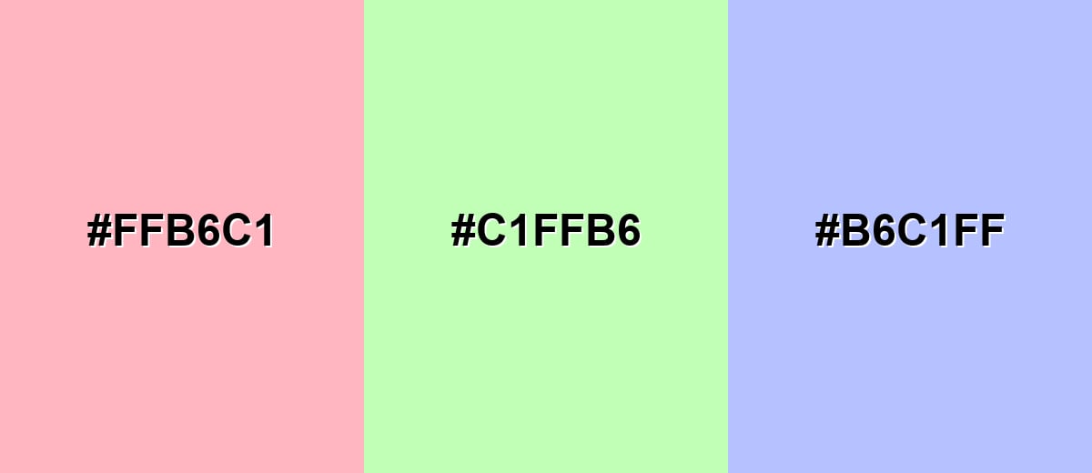
- Light Pink: #FFB6C1
- Soft Lime: #C1FFB6
- Powder Blue: #B6C1FF
Colors to Avoid
While light pink is remarkably versatile, certain combinations can create problematic visual effects:
- Neon Green (#39FF14) - The intensity overwhelms light pink and can create a harsh, vibrating edge in digital layouts.
- Pure Cyan (#00FFFF) - Both are very bright, and the pairing can feel noisy and distract from content or brand messaging.
- Signal Yellow (#FFFF00) - This combination can read as warning-like and reduces the soft, calming impression light pink usually gives.
- Vivid Red (#FF0000) - The strong red competes with the pink base and can make the palette feel aggressive rather than gentle.
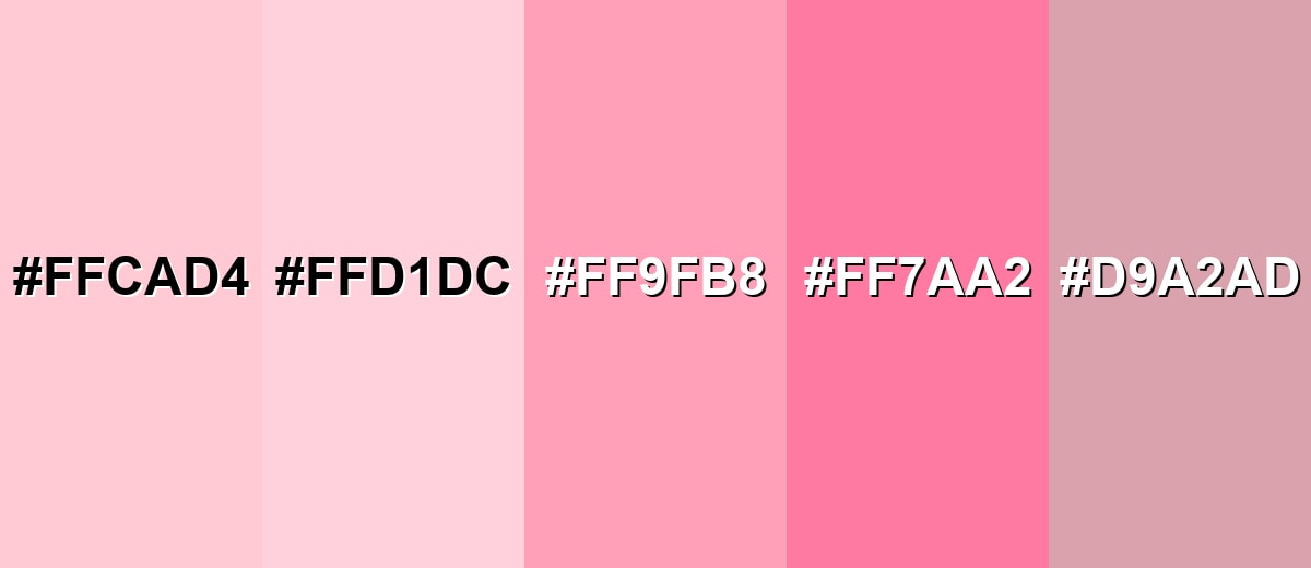
Shades, Tints & Variations of Light Pink
Light pink has a surprisingly flexible range—from barely-there tints to richer, more energetic pinks. Exploring variations helps you keep the same overall mood while adjusting contrast, maturity, and emphasis across layouts.
- Blush Pink (#FFCAD4) - A slightly softer, more muted version that feels powdery and refined. It's best used for Background tints, skincare branding, and editorial layouts..
- Baby Pink (#FFD1DC) - A very light pastel with a sweet, airy presence and minimal visual weight. It's best used for Soft UI panels, packaging accents, and gentle gradients..
- Cotton Candy Pink (#FF9FB8) - A brighter, more playful variation that pops while staying friendly. It's best used for Highlights, promotional banners, and youthful brand accents..
- Rose Pink (#FF7AA2) - A deeper, more saturated take that brings energy and clearer contrast. It's best used for Buttons, key illustrations, and strong supporting accents..
- Dusty Pink (#D9A2AD) - A muted, greyed variation that feels mature and understated. It's best used for Minimal brand systems, interiors mood boards, and premium packaging..
Industry Applications
Light pink shows up across industries because it can communicate softness without losing clarity when paired well. It works especially well when you need an inviting tone that still feels clean and intentional.
Fashion & Beauty
- Use it on packaging to signal gentle, soothing, or fresh positioning.
- Apply it to product pages to soften the overall feel and make shopping flows feel friendlier.
- Build social templates around it for a warm, approachable feed aesthetic.
- Pair it with crisp neutrals to keep beauty visuals polished instead of overly sweet.
Interior Design & Decor
- Use it as a softening wash to add comfort without darkening a space.
- Pair it with warm whites, light woods, or brushed metals for a cozy, airy look.
- Add depth through materials like linen, matte paint, and natural wood so the color doesn't feel flat.
- Ground the palette with a darker anchor in small amounts to keep the room balanced.
Branding & Marketing
- Great for wellness and lifestyle brands where a calming, supportive tone matters.
- Useful for events and celebrations—your companion tones can push it romantic, playful, or elegant.
- In e-commerce, it works well for seasonal collections, highlight badges, and soft promotional blocks that feel friendly rather than urgent.
- In editorial and social content, it supports covers, quote cards, and infographics with a warm, approachable mood.
Conclusion
Light pink (#FFB6C1) is a go-to choice when you want a soft, airy look that still feels intentional in modern design. It can warm up branding, calm down UI, and add an inviting touch to interiors—as long as you support it with clear contrast and a strong anchor color. Pair it with deeper neutrals for readability, or stay in pastel territory with peach and lavender for a smooth, cohesive palette. With a few smart shade swaps (like blush, baby pink, or dusty pink), you can steer the mood from playful to polished without changing the overall vibe.
Design Smarter with AI: Media.io is an online AI studio that empowers creators with advanced image generation and enhancement tools. From text-to-image and image-to-image creation to AI upscaling and color optimization, it enables fast, creative, and professional results—all in your browser.

Frequently Asked Questions About Light Pink Color
Light pink is a pale tint of pink with high lightness, giving it a soft, pastel appearance. It often looks like a gentle blush tone rather than a strong, saturated pink.
A widely used hex value for light pink is #ffb6c1. It matches the common LightPink shade seen in many digital tools and CSS color lists.
It commonly represents warmth, tenderness, and approachability. Designers use it to make interfaces and brand visuals feel friendly, gentle, and emotionally soft.
It pairs well with deep neutrals for contrast, soft greens for a complementary balance, and lavender or peach tones for smooth analogous palettes. The best pairing depends on whether you want the result to feel minimal, playful, or romantic.
It can be, especially as an accent or background tint. For accessibility, avoid using it for small text on white and ensure key elements meet contrast requirements with darker text or stronger supporting tones.
Balance it with structured typography, generous whitespace, and darker anchors like charcoal or navy. Using muted variations and natural textures can also shift the mood toward refined and modern.


