

Hot pink color is a vivid, punchy pink that looks bright, saturated, and slightly playful in real life.
Its most recognized digital reference is the hex code #FF69B4, and it's often read as energetic, confident, and attention-grabbing—so using it well is all about balance.
Hot Pink Color: Codes & Values
Here are the most-used hot pink color codes for web, design tools, and print workflows.
| Parameters | VALUE |
| HEX Code | #FF69B4 |
| RGB DECIMAL | 255, 105, 180 |
| RGB PERCENTAGE | 100%, 41.2%, 70.6% |
| CMYK | 0%,59%,29%,0% |
| HSL | 330°, 100%, 71% |
| HSV (HSB) | 330°, 59%, 100% |
| Web Safe | #FF66CC |
Key Color Space Explanations:
- HEX - HEX is the six-digit code used on the web to define a precise sRGB value. For hot pink, #ff69b4 is a common standard reference.
- RGB - RGB mixes red, green, and blue light to create a screen color. Hot pink is high in red and blue with a moderate green value, which gives it that intense, neon-leaning look.
- CMYK - CMYK is used for printing and describes how much cyan, magenta, yellow, and black ink is needed. Hot pink typically relies heavily on magenta with some yellow, and results can vary by paper and press profile.
- HSL - HSL describes hue, saturation, and lightness, which is convenient for selecting tints and tones. Hot pink sits around 330° with very high saturation and a bright lightness level.
- Web Safe - Web-safe values are the older 216-color set that aimed for consistency across displays. The closest web-safe match to hot pink is #ff66cc.
Use HEX for web and UI, RGB/HSL for fine-tuning on screens, and CMYK when you're preparing files for print.
Hot Pink Color Conversions
If you're moving between design apps, web builds, and print specs, this conversion table helps keep hot pink consistent.
| Parameters | VALUE | CSS |
| HEX | #ff69b4 | #ff69b4 |
| RGB DECIMAL | 255, 105, 180 | rgb(255,105,180) |
| RGB PERCENTAGE | 100%, 41.2%, 70.6% | rgb(100%,41.2%,70.6%) |
| CMYK | 0%,59%,29%,0% | cmyk(0%,59%,29%,0%) |
| HSL | 330°, 100%, 71% | hsl(330°,100%,71%) |
| HSV (or HSB) | 330°, 59%, 100% | -- |
| Web Safe | ff66cc | #ff66cc |
| CIE-LAB | 65.6, 64.0, -10.8 | -- |
| XYZ | 54.6, 34.7, 46.9 | -- |
| xyY | 0.401, 0.255, 34.7 | -- |
| CIE-LCH | 65.6, 64.9, 350.4° | -- |
| CIE-LUV | 65.6, 91.1, -27.3 | -- |
| Hunter-Lab | 58.9, 67.4, -10.0 | -- |
| Binary | 11111111 01101001 10110100 | -- |
Want to generate Hot Pink Color photos or posters? Try Media.io's AI Image Generator now!
Hot Pink Color Meaning & Symbolism
Hot pink is widely associated with bold self-expression, playful confidence, and high visibility. In everyday life, it often signals excitement and modern flair, especially when used as an accent. If you are specifically searching for Hot Pink Color meaning, it is usually read as energetic, attention-forward, and unapologetically vibrant.
Psychological Effects
Because it's so saturated, hot pink tends to grab attention quickly and shape visual hierarchy.
- Lively Energy - Hot pink often feels stimulating and high-energy, which can make layouts look more youthful and dynamic.
- Strong Focus - It naturally pulls the eye, making it effective for highlights, emphasis, and calls to action.
- Memorability - The intensity can help visuals feel more distinctive and easier to recall.
- Empowered Mood - In the right context, it can read as confident and expressive without the heaviness of darker reds.
- Overload Risk - Large blocks can feel loud or overwhelming on bright screens, so it's often best used in controlled doses.
Positive Associations
When balanced with calmer companions, hot pink can feel upbeat, modern, and intentionally bold.
- Playfulness - It brings a fun, expressive edge that feels friendly and contemporary.
- Optimism - The brightness can read as cheerful and uplifting, especially as an accent color.
- Confidence - Hot pink often signals unapologetic self-expression and a strong point of view.
- Modern Flair - It frequently shows up in trend-forward aesthetics that aim to feel current and energetic.
- High Visibility - Its standout nature makes it useful for important UI states, badges, and attention cues.
Cultural Significance Across the World
Like many bold colors, its meaning shifts with context—especially in fashion, pop culture, and branding.
- Pop Culture Energy - Hot pink is commonly linked to pop culture visuals that feel loud, expressive, and modern.
- Fashion Forward - It's strongly associated with bold, trend-driven fashion and beauty aesthetics.
- Campaign Impact - In marketing, it's often used to signal a modern, attention-grabbing tone.
- Context Matters - Pairing it with supporting imagery and typography helps clarify the intended message.
Design Applications
Hot pink is easiest to use when you treat it as a spotlight rather than a background. A few deliberate choices can keep it vibrant while still feeling polished and readable.
Graphic Design Tips
- Use hot pink for one primary focal point (like a headline, badge, or CTA) so the hierarchy stays clean.
- Pair it with deep neutrals for typography and navigation to maintain clarity.
- Use slightly softer tints for larger panels to reduce eye fatigue.
- Build a supporting palette of neutrals plus one cool counterbalance to keep the system versatile.
- Test at small sizes and in one-color applications; bright pinks can “bloom” on some materials and screens.
Pro tip: if hot pink feels too loud, keep the hue but reduce saturation or increase lightness for larger areas—and save the classic shade for accents that truly need attention.
Hot Pink Color in Photography & Video
- Use hot pink as a controlled accent (props, wardrobe, graphics) rather than filling the whole frame.
- Watch highlight clipping and oversaturation—bright pink can lose detail quickly on some displays.
- Balance with dark neutrals or calmer tones so the subject stays readable and intentional.
- For night-mode looks, neon-leaning hot pink can pop strongly against deeper backgrounds.
- Keep accessibility in mind for on-screen titles: dark text on hot pink backgrounds is usually clearer than light-on-bright.
Recommended Tool for Image Enhancement: When incorporating hot pink color into your photography projects, Media.io's AI Image tools can help you achieve more refined results. With AI-powered color enhancement, photo colorization, image upscaling, and old photo restoration, you can easily enrich hot pink color tones, improve overall image quality, and highlight the color's elegant and sophisticated aesthetic.
Color Combinations
Hot pink plays well with crisp neutrals and fresh greens, and it can also anchor bright, playful palettes. Use the combinations below as starting points, then adjust saturation and lightness to match your project.
Complementary Colors
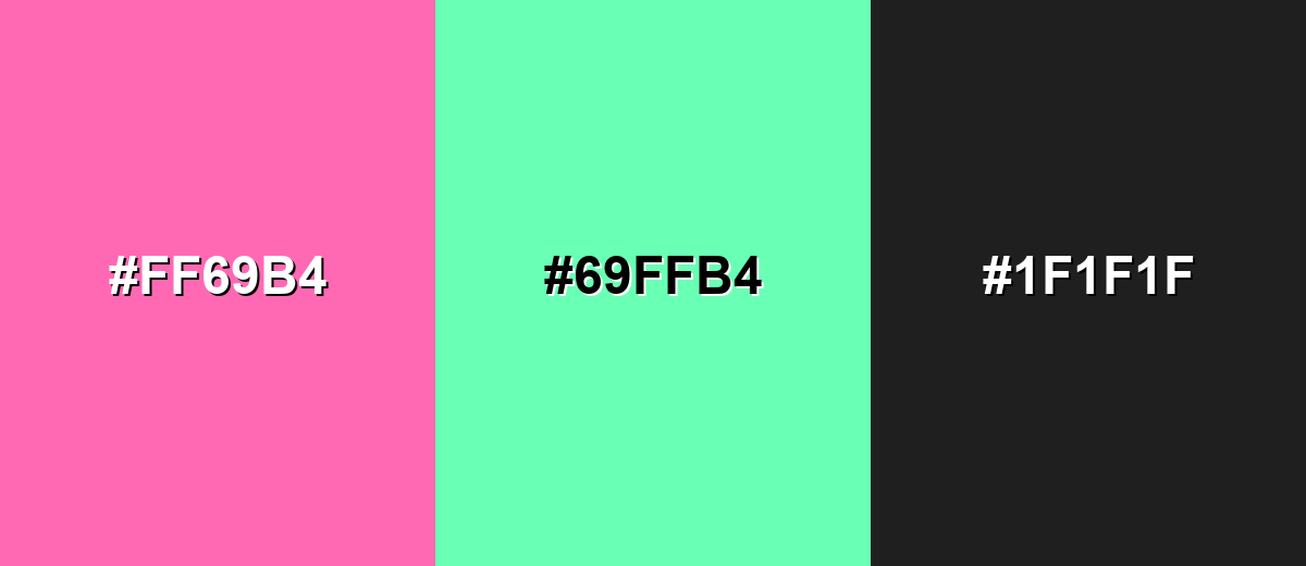
A complementary pairing balances hot pink with a green opposite on the wheel, creating a vivid, high-contrast look. It is great for bold branding, modern posters, and energetic UI accents.
Complementary Palette Example: Try hot pink with spring green and a dark neutral to keep the contrast controlled and readable.
Analogous Color Schemes
Analogous colors sit adjacent to each other on the color wheel, creating harmonious, cohesive palettes with subtle variation.
For a smooth, candy-like gradient, pair hot pink with vivid magenta and a warm pink-red.
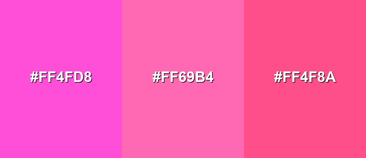
- Vivid Magenta: #FF4FD8
- Hot Pink: #FF69B4
- Pink-Red: #FF4F8A
For a richer look, blend hot pink with orchid purple and a deeper raspberry accent.
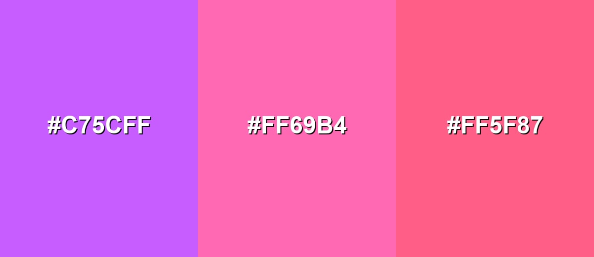
- Orchid Purple: #C75CFF
- Hot Pink: #FF69B4
- Raspberry: #FF5F87
Triadic & Tetradic Combinations
A triadic palette spreads energy across three evenly spaced hues, so it feels bold but balanced.
Use hot pink with a bright lime and a clean sky blue for playful, high-contrast visuals.
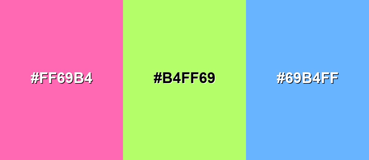
- Hot Pink: #FF69B4
- Bright Lime: #B4FF69
- Sky Blue: #69B4FF
Colors to Avoid
While hot pink color is remarkably versatile, certain combinations can create problematic visual effects:
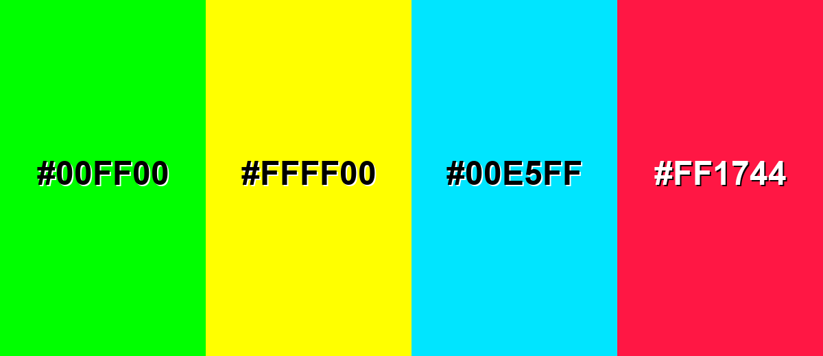
- Neon Green (#00FF00) - Both hues are extremely saturated, which can create visual vibration and make text or icons harder to parse.
- Pure Yellow (#FFFF00) - This combination can feel harsh and noisy, especially on screens, and it often reduces perceived quality in UI layouts.
- Electric Cyan (#00E5FF) - Two high-energy brights compete for attention, which can flatten hierarchy and overwhelm the focal point.
- Hot Red (#FF1744) - Because it sits close in intensity, it can look clashy and make hot pink feel less intentional rather than more vibrant.
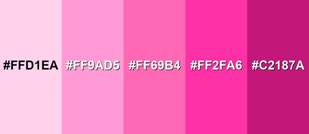
Shades, Tints & Variations of Hot Pink Color
Hot pink has a surprisingly useful range—from airy, pastel-leaning tints to deeper, more premium tones. These variations make it easier to keep the same personality while adjusting for readability, mood, and where the color sits in your layout.
- Blush Hot Pink (#FFD1EA) - A very light tint that keeps the playful character while feeling softer and airier. It's best used for Large backgrounds, subtle panels, and gentle gradients.
- Soft Hot Pink (#FF9AD5) - A lighter, friendlier version that reads warm and approachable without the same intensity. It's best used for UI surfaces, product highlights, and editorial accents.
- Classic Hot Pink (#FF69B4) - The bold, recognizable hot pink often used for energetic accents and high-visibility elements. It's best used for Buttons, badges, branding accents, and standout graphics.
- Neon Hot Pink (#FF2FA6) - A more electric take that feels sharper and more modern, especially on dark backgrounds. It's best used for Night-mode UI accents, event visuals, and high-impact promos.
- Deep Hot Pink (#C2187A) - A deeper, more grounded tone that keeps the attitude while improving sophistication and contrast control. It's best used for Typography accents, premium packaging details, and brand systems.
Industry Applications
Because it is so visible, hot pink is most effective when you need a clear focal point or a distinct brand signature. It shows up across digital and physical design where energy, modernity, and memorability matter.
Fashion & Beauty
- Use it for statement pieces that are meant to stand out immediately.
- Build trend-forward collections around it, especially when you want a bold, modern vibe.
- Apply it to packaging accents to create high shelf impact and quick recognition.
- Pair it with bold promo visuals to keep beauty campaigns energetic and current.
Interior Design & Decor
- Add hot pink through statement decor or art for an instant focal point.
- Use it on small furnishings for a playful pop without overwhelming the room.
- Consider an accent wall in creative spaces where high energy is part of the goal.
- Balance it with warm whites, light grays, or natural textures to keep the look livable.
Branding & Marketing
- Use it as a campaign accent when you need immediate attention.
- Keep it as a distinctive highlight within a broader palette for strong brand recall.
- Lean on it for posters and social assets that aim to feel modern and expressive.
- Apply it consistently to graphic motifs (pull quotes, dividers, thumbnails) for quick recognition.
Conclusion
Hot pink stands out for its bright, saturated punch and its ability to make visuals feel confident and modern. Used thoughtfully, it adds strong emphasis to branding, UI, and marketing without needing a large footprint. The shade defined by #ff69b4 is especially effective as an accent alongside dark neutrals or fresh greens, where contrast stays clear. When you balance its intensity with supportive tones and legible typography, the message feels intentional rather than loud. That practical balance is what makes it such a reliable choice for high-impact visual communication.
Design Smarter with AI: Media.io is an online AI studio that empowers creators with advanced image generation and enhancement tools. From text-to-image and image-to-image creation to AI upscaling and color optimization, it enables fast, creative, and professional results—all in your browser.

Frequently Asked Questions About Hot Pink Color
A widely used hex reference for hot pink is #ff69b4. It is a bright, saturated pink that sits between magenta and rose.
In RGB decimal, hot pink is 255, 105, 180. This high red and blue mix is what gives it a vivid, attention-grabbing look on screens.
They are related but not identical. Fuchsia typically leans more toward a purple-magenta hue, while hot pink often appears slightly warmer and more rose-leaning depending on the reference value used.
Deep neutrals like charcoal and near-black help it feel modern and readable, while fresh greens create a strong complementary contrast. Soft tints of pink and purples also work for smoother, more blended palettes.
It is usually better as an accent than as body text because saturated pink can reduce readability, especially on light backgrounds. For clarity, use dark text on a hot pink background, and test contrast for your specific font sizes.
In CMYK printing, hot pink can shift depending on paper, ink, and the print profile, sometimes appearing less neon than on screens. Proofing or using spot colors can help maintain consistent vibrancy.


