

Gunmetal color is a dark, steel-inspired gray with a cool blue-green undertone, similar to the finish of brushed metal. Its widely used reference HEX code is #2A3439.
It's often read as strong, modern, and quietly refined with a technical edge that feels grounded rather than flashy. Because surrounding light and materials can shift it slightly cooler or warmer, pairing and contrast choices matter.
Gunmetal Color: Codes & Values
If you want a consistent "standard" gunmetal across screens and materials, these core values are the best place to start.
| Parameters | VALUE |
| HEX Code | #2A3439 |
| RGB DECIMAL | 42, 52, 57 |
| RGB PERCENTAGE | 16.5%, 20.4%, 22.4% |
| CMYK | 26%,9%,0%,78% |
| HSL | 200°, 15%, 19% |
| HSV (HSB) | 200°, 26%, 22% |
| Web Safe | #333333 |
Key Color Space Explanations:
- HEX - HEX is the most common way to specify this shade for web and UI. Use #2a3439 to match standard gunmetal in digital designs.
- RGB - RGB defines the red, green, and blue light values used on screens. It helps you recreate gunmetal consistently across apps, video, and UI components.
- CMYK - CMYK is used for print and packaging where ink percentages matter. These values are a starting point, but paper and coatings can shift the final result.
- HSL - HSL describes hue, saturation, and lightness, which is helpful for building palettes and hover states. Gunmetal sits around a 200° hue with low saturation and low lightness.
- Web Safe - Web-safe values approximate a shade using a limited palette from older display standards. #333333 is the closest web-safe match to this gunmetal reference.
Use HEX and RGB for UI and video work, and treat CMYK as a proof-first starting point for print so dark neutrals don't turn muddy on the final material.
Gunmetal Color Conversions
Need gunmetal in a different format for a design system, CSS, or print workflow? Here are the most common conversions in one place.
| Parameters | VALUE | CSS |
| HEX | #2a3439 | #2a3439 |
| RGB DECIMAL | 42, 52, 57 | rgb(42,52,57) |
| RGB PERCENTAGE | 16.5%, 20.4%, 22.4% | rgb(16.5%,20.4%,22.4%) |
| CMYK | 26%,9%,0%,78% | cmyk(26%,9%,0%,78%) |
| HSL | 200°, 15%, 19% | hsl(200°,15%,19%) |
| HSV | 200°, 26%, 22% | -- |
| Web Safe | 333333 | #333333 |
| CIE-LAB | 21.0, -3.0, -7.5 | -- |
| XYZ | 3.7, 4.1, 4.9 | -- |
| xyY | 0.31, 0.34, 4.1 | -- |
| CIE-LCH | 21.0, 8.1, 248° | -- |
| CIE-LUV | 21.0, -5.0, -9.0 | -- |
| Hunter-Lab | 20.0, -2.5, -5.5 | -- |
| Binary | 00101010 00110100 00111001 | -- |
Want to generate Gunmetal Color photos or posters? Try Media.io's AI Image Generator now!
Gunmetal Color Meaning & Symbolism
Gunmetal color is commonly associated with strength, reliability, and restraint. Because it resembles engineered metal surfaces, it often communicates precision and a modern, no-nonsense attitude in everyday design choices. In practice, Gunmetal Color meaning tends to lean toward competence and control rather than warmth or playfulness.
Psychological Effects
As a dark neutral, gunmetal influences mood mostly through contrast, temperature, and how "technical" it feels in context.
- Stable Layouts - Gunmetal can make layouts feel stable and composed, especially when used as a base for typography, navigation, or product frames.
- Serious (Not Harsh) - It reads as serious without being as harsh as pure black, so it often supports a premium or professional tone.
- Clean, Technical Focus - Its cool undertone can create a clean, technical vibe, which is useful when you want users to focus on content and controls.
- Less Visual Noise - In interfaces, it can reduce visual noise and help brighter accents stand out more clearly.
- Can Feel Cold - Large blocks of gunmetal may feel heavy, distant, or slightly cold if there is no balancing warmth.
Positive Associations
Gunmetal tends to signal competence and engineered quality, especially when paired with lighter neutrals and a measured accent.
- Strength - Gunmetal is commonly associated with strength, which helps it work as a confident base color.
- Reliability - It often suggests reliability and steadiness, especially in product frames and structured layouts.
- Restraint - This shade communicates restraint, keeping designs refined rather than flashy.
- Precision - Because it resembles engineered metal surfaces, gunmetal frequently communicates precision and a modern, no-nonsense attitude.
- Control - In practice, it leans toward competence and control, making it a strong choice for professional UI and branding.
Cultural Significance Across the World
While meanings shift by context, the name and finish of gunmetal connect it strongly to industrial and mechanical cues.
- Industrial Heritage - Historically, the term gunmetal relates to metal alloys and industrial finishing.
- Machinery Aesthetic - It often signals durability and machinery-inspired aesthetics through its engineered look.
- Discretion - Symbolically, it is frequently used to imply toughness and discretion rather than loud attention.
- Engineered Quality - It's also used to suggest engineered quality, aligning well with technical products and premium minimalism.
Design Applications
Gunmetal is a versatile dark neutral that works well when you want a refined, modern base with a subtle cool cast. It performs best when you treat it as a foundation and let typography, spacing, and a few strategic accents do the talking.
Graphic Design Tips
- Use gunmetal for headers, sidebars, footers, cards, and dark-mode backgrounds when you want softer contrast than pure black.
- Apply it to outlines, icons, and inactive states to keep UI elements calm and controlled.
- Let typography and spacing carry the hierarchy, then add only a few strategic accents for clarity.
- Pair it naturally with metallic imagery, matte textures, and product photography featuring hardware, tools, or technical materials.
- For text, prioritize strong contrast and test on real screens; gunmetal typically needs light text for comfortable readability.
Pro tip: Reserve the brightest accent for key actions so the interface stays readable and focused. If the layout feels too cold, introduce a warm supporting accent and increase whitespace around dense sections.
Gunmetal Color in Photography & Video
- Use gunmetal as a controlled background tone that helps brighter accents stand out more clearly.
- Lean into its brushed-metal feel with matte textures and engineered surfaces to reinforce a modern, technical vibe.
- Balance large gunmetal areas with lighter neutrals so frames don't feel heavy, distant, or slightly cold.
- For a premium look, treat gunmetal as the "foundation" and let clean composition and spacing do the work.
- When color grading, aim for stable contrast (not pure black) to keep detail in darker areas and avoid flattening.
Recommended Tool for Image Enhancement: When incorporating gunmetal color into your photography projects, Media.io's AI Image tools can help you achieve more refined results. With AI-powered color enhancement, photo colorization, image upscaling, and old photo restoration, you can easily enrich gunmetal color tones, improve overall image quality, and highlight the color's elegant and sophisticated aesthetic.
Color Combinations
Gunmetal is easy to pair because it behaves like a dark neutral with a cool tilt. Use warm accents to add energy, or stay within nearby blue-green tones for a sleek, understated look.
Complementary Colors
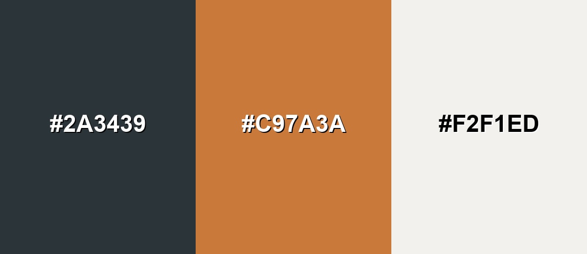
A warm orange accent sits opposite gunmetal's cool blue-green undertone, creating clear contrast without looking overly saturated. This is a strong option for calls-to-action, highlights, and focal points.
Complementary Palette Example: Pair gunmetal with a copper-like orange and a soft off-white to keep the palette bold, readable, and balanced.
Analogous Color Schemes
Analogous colors sit adjacent to each other on the color wheel, creating harmonious, cohesive palettes with subtle variation.
A cool, tech-forward set that stays near gunmetal on the wheel for a seamless, modern gradient.
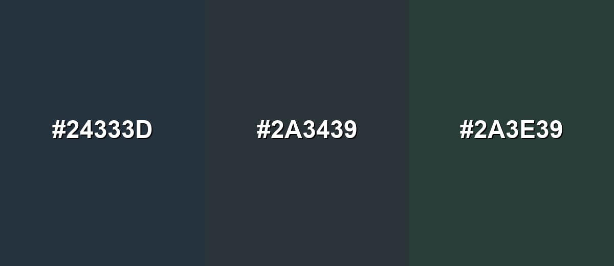
- Deep Blue-Gray: #24333D
- Gunmetal: #2A3439
- Slate Teal: #2A3E39
A slightly brighter, coastal-leaning analogous mix that still feels muted and professional.
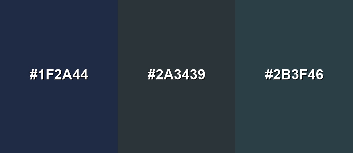
- Inky Navy: #1F2A44
- Gunmetal: #2A3439
- Harbor Teal: #2B3F46
Triadic & Tetradic Combinations
A triadic palette introduces two accents that stay balanced while still giving you clear separation for UI states or brand elements.
Use muted magenta and olive to add personality while keeping gunmetal as the steady base.
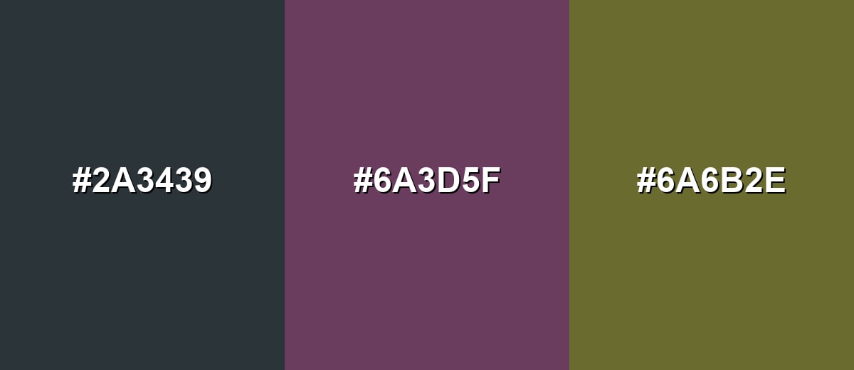
- Gunmetal: #2A3439
- Muted Magenta: #6A3D5F
- Olive Drab: #6A6B2E
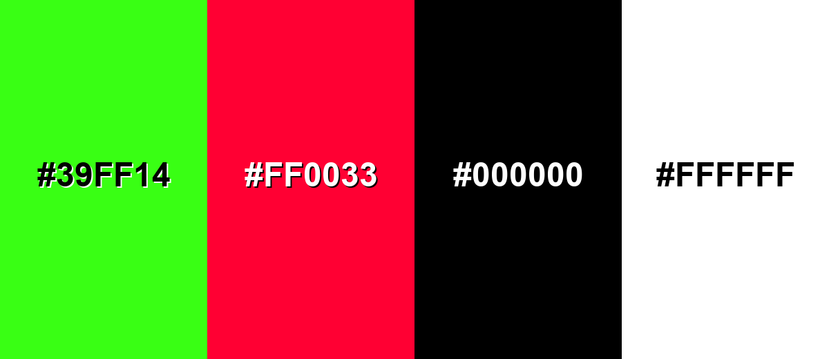
Colors to Avoid
While gunmetal color is remarkably versatile, certain combinations can create problematic visual effects:
- Neon Green (#39FF14) - The neon intensity can overpower gunmetal and make layouts feel noisy rather than refined.
- Vivid Crimson (#FF0033) - High-chroma red can look aggressive against gunmetal and may create unwanted urgency in UI and branding.
- Pure Black (#000000) - Stacking very dark tones can flatten detail and reduce separation between components and shadows.
- Pure White (#FFFFFF) - The jump can feel harsh; a slightly softened light neutral often looks more polished in large areas.
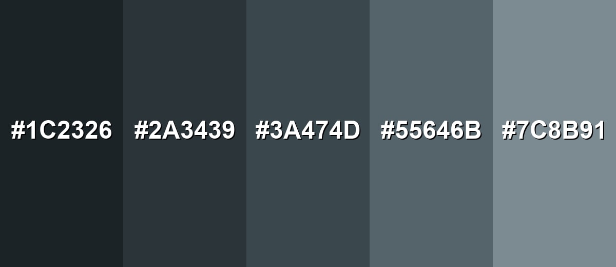
Shades, Tints & Variations of Gunmetal Color
Gunmetal isn't a single fixed tone—its range runs from near-black, cinematic depths to lighter, misty grays that layer cleanly in UI and print. Having a few go-to variations helps you build hierarchy, depth, and states (like panels, borders, and disabled controls) without leaving the same industrial family.
- Midnight Gunmetal (#1C2326) - A darker, more dramatic version that leans closer to black while keeping a cool cast. It's best used for High-end UI backgrounds, hero sections, and cinematic branding.
- Classic Gunmetal (#2A3439) - The reference shade: deep gray with a restrained blue-green undertone. It's best used for Primary neutral for interfaces, product frames, and sophisticated typography.
- Slate Gunmetal (#3A474D) - A slightly lighter slate-like tone that keeps the same industrial character. It's best used for Cards, panels, secondary backgrounds, and subtle dividers.
- Dusty Gunmetal (#55646B) - A softened, desaturated option that feels more approachable and less heavy. It's best used for Secondary text, large surfaces in interiors, and calm brand systems.
- Pale Gunmetal (#7C8B91) - A light, misty variation with a cool undertone and easy layering potential. It's best used for UI borders, disabled states, backgrounds, and airy editorial layouts.
Industry Applications
Because it sits between charcoal and cool gray, gunmetal fits many industries that need a dependable neutral with a modern edge. It is especially effective where clarity, durability, or engineered quality is part of the message.
Fashion & Beauty
- Use it for hardware details to support sleek, understated styling.
- Apply it across lookbooks for monochrome palettes that feel refined and modern.
- Pair it with accessories branding that benefits from a "premium minimalism" tone.
- Lean on it when you want durability and discretion to read first, not flash.
Interior Design & Decor
- Use it in fixtures and hardware when you want a darker finish without the starkness of black.
- Bring it into appliances for a modern, engineered look that stays neutral.
- Try it on feature walls where a brushed-metal mood fits the space.
- In product styling and décor accents, use it to add a modern edge to surfaces and materials.
Branding & Marketing
- Use it to communicate precision, security, performance, or premium minimalism in brand systems.
- Apply it to dark-mode themes, navigation bars, and dashboards where accents need to pop.
- Use it in automotive and mobility visuals that echo metal finishes and trim-inspired branding.
- Lean on it for premium packaging and minimalist marketing layouts, especially in consumer electronics.
Conclusion
Gunmetal stands out as a steel-like dark gray with a cool undertone that feels modern, controlled, and durable. As a foundation shade, it supports clean typography, structured layouts, and high-contrast accents without the harshness of pure black—making #2A3439 a reliable reference for UI, branding, and product visuals. When you balance it with lighter neutrals (and add a touch of warm contrast when needed), gunmetal delivers a refined look that stays readable, technical, and timeless.
Design Smarter with AI: Media.io is an online AI studio that empowers creators with advanced image generation and enhancement tools. From text-to-image and image-to-image creation to AI upscaling and color optimization, it enables fast, creative, and professional results—all in your browser.

Frequently Asked Questions About Gunmetal Color
It is a deep gray inspired by metal finishes, usually with a subtle blue-green cast. It often looks like brushed steel or dark machinery parts rather than a flat charcoal.
A commonly used digital reference for gunmetal is #2a3439. Similar shades may appear under the same name in different libraries, so it helps to confirm with a swatch.
Gunmetal is typically cool because it leans slightly toward blue-green. Surrounding materials and lighting can make it feel cooler next to whites or warmer next to strong blues.
Warm oranges and copper tones create punchy contrast, while off-whites keep layouts readable. For a sleek look, pair it with nearby blue-gray and teal-leaning neutrals.
Yes, it works well as a dark-mode base because it is softer than pure black and can reduce eye strain for some users. Use light text and test contrast to keep small type and icons clear.
Start from the CMYK values and always proof, since paper, coatings, and ink limits can shift dark neutrals. Adding a warm accent and a lighter neutral helps prevent large dark areas from feeling flat.


