

Blue green color is a cool, watery shade that sits between cyan and teal, like shallow ocean water with a hint of blue.
Its hex code is #0D98BA, and it's a go-to choice when you want something calm, crisp, and modern in UI, branding, or print.
Blue Green Color: Codes & Values
If you're building a palette or matching a brand shade, these are the standard values you'll use across digital and print workflows.
| Parameters | VALUE |
| HEX Code | #0D98BA |
| RGB DECIMAL | 13, 152, 186 |
| RGB PERCENTAGE | 5.1%, 59.6%, 72.9% |
| CMYK | 93%,18%,0%,27% |
| HSL | 192°, 87%, 39% |
| HSV (HSB) | 192°, 93%, 73% |
| Web Safe | #0099CC |
Key Color Space Explanations:
- HEX - HEX is the most common way to specify blue green in web design and digital tools. Use #0d98ba when you need consistent screen rendering.
- RGB - RGB mixes red, green, and blue light to create the shade on displays. The RGB value 13, 152, 186 is useful for UI systems and motion graphics.
- CMYK - CMYK is used for print by layering cyan, magenta, yellow, and black inks. 93%,18%,0%,27% is a practical starting point, though print results can shift by paper and profile.
- HSL - HSL describes hue, saturation, and lightness, which helps when making tints and tones. At 192° with high saturation, it stays vivid without looking neon.
- Web Safe - Web safe is the nearest legacy-safe approximation for older palettes. The closest match to this shade is #0099cc.
Use HEX or RGB for screens, CMYK for print, and HSL/HSV when you're building lighter tints, darker tones, or consistent UI states.
Blue Green Color Conversions
Need blue green color values for a specific tool or workflow? This conversion table makes it easy to copy, paste, and stay consistent.
| Parameters | VALUE | CSS |
| HEX | #0d98ba | #0d98ba |
| RGB DECIMAL | 13, 152, 186 | rgb(13,152,186) |
| RGB PERCENTAGE | 5.1%, 59.6%, 72.9% | rgb(5.1%,59.6%,72.9%) |
| CMYK | 93%,18%,0%,27% | cmyk(93%,18%,0%,27%) |
| HSL | 192°, 87%, 39% | hsl(192°, 87%, 39%) |
| HSV (or HSB) | 192°, 93%, 73% | -- |
| Web Safe | 0099cc | #0099cc |
| CIE-LAB | 57.2, -26.4, -21.1 | -- |
| XYZ | 24.6, 32.7, 52.1 | -- |
| xyY | 0.226, 0.300, 32.7 | -- |
| CIE-LCH | 57.2, 33.8, 218.7 | -- |
| CIE-LUV | 57.2, -41.0, -31.5 | -- |
| Hunter-Lab | 51.0, -22.0, -20.0 | -- |
| Binary | 00001101 10011000 10111010 | -- |
Want to generate Blue Green Color photos or posters? Try Media.io's AI Image Generator now!
Blue Green Color Meaning & Symbolism
Blue green is commonly linked with clarity, balance, and a sense of clean momentum. It blends the steadiness people associate with blue and the freshness often tied to green, making it easy to use in everyday visual communication. In practical terms, the Blue Green Color meaning often shows up when you want something to feel reliable, modern, and refreshing without being loud.
Psychological Effects
In most designs, blue green reads cool first, so it naturally calms a layout down.
- Calming Presence - This shade tends to feel cool and steady, helping visuals land as relaxed instead of intense.
- Better Scan-ability - Used for navigation and structure, it can make busy screens feel easier to read and follow.
- Clean & Precise - Its crisp look often hints at cleanliness and accuracy, which supports a polished, professional tone.
- Tech-Forward Energy - When it's highly saturated, it can feel modern and efficient, which suits dashboards and product pages.
- Can Feel Cold - Overusing saturated blue green (especially without warm accents) may come across as distant or clinical.
Positive Associations
When people like a blue green palette, it's usually because it feels fresh without being loud.
- Clarity - Blue green communicates clean intent, making it a strong fit for interfaces and informative layouts.
- Balance - It sits between blue and green, so it often feels level-headed rather than extreme.
- Freshness - The watery, ocean-like vibe can suggest an airy, refreshed mood in both digital and physical spaces.
- Reliability - It borrows trust from blue, helping brands feel steady without going overly corporate.
- Modern Momentum - The vivid, crisp quality can make visuals feel current, efficient, and forward-moving.
Cultural Significance Across the World
Because it's strongly tied to water and air, blue green tends to translate well across audiences.
- Water & Open Air - Often connected to ocean and sky themes, signaling freshness in a broadly understandable way.
- Renewal - Frequently read as clean and restorative, making it popular in wellness-style visuals.
- Digital Modernity - Common in contemporary branding where it suggests clarity, efficiency, and trust.
- Neutral Coolness - In many contexts, its cool tone feels safe and non-aggressive compared with bright reds or yellows.
Design Applications
Blue green is flexible: it can be a clean primary color for modern brands or a supporting accent that lifts neutrals. The key is choosing whether you want it to feel bright and active or deeper and more premium.
Graphic Design Tips
- Use a single main blue green and build the rest of the palette from tints/tones to keep the system consistent.
- Pair blue green with a darker anchor (like a deep navy-style tone) when you need a more serious, professional finish.
- For approachable visuals, offset the coolness with warm neutrals and textured elements instead of stacking more cool grays.
- In UI layouts, reserve the most saturated version for interactive or "active" states to maintain clear hierarchy.
- Always test contrast with real type sizes—blue green can look different across screens, lighting, and materials.
If blue green is your hero color, keep surrounding elements simple—lots of whitespace and a restrained neutral base will make the shade feel intentional (not overpowering).
Blue Green Color in Photography & Video
- Use blue green accents in backgrounds (water, glass, neon signage) to create a clean, coastal mood without heavy grading.
- Pair it with warm skin tones carefully—small warm highlights help subjects feel lively against cooler scenes.
- For product shots, blue green props can signal freshness and cleanliness, especially with bright, soft lighting.
- In motion graphics, blue green works well for lower-thirds, UI overlays, and modern tech visuals.
- Avoid pushing saturation too hard—overly vivid blue green can feel harsh and reduce the "calm" effect.
Recommended Tool for Image Enhancement: When incorporating blue green color into your photography projects, Media.io's AI Image tools can help you achieve more refined results. With AI-powered color enhancement, photo colorization, image upscaling, and old photo restoration, you can easily enrich blue green color tones, improve overall image quality, and highlight the color's elegant and sophisticated aesthetic.
Color Combinations
Blue green color pairs well with warm oranges, clean neutrals, and nearby ocean tones. Use the schemes below as a starting point, then adjust lightness to match your project's contrast needs.
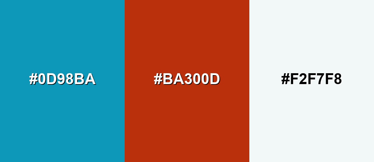
Complementary Colors
A complementary pairing adds instant contrast by placing a warm orange-red opposite the cool base shade. It is great for callouts, charts, and energetic accents while keeping the overall look crisp.
Complementary Palette Example: Combine Blue Green with Rust Orange and a Mist White background for a balanced, high-contrast palette.
Analogous Color Schemes
Analogous colors sit adjacent to each other on the color wheel, creating harmonious, cohesive palettes with subtle variation.
Deep Teal, Blue Green, and Ocean Blue create a smooth, aquatic flow that feels cohesive in UI and branding.
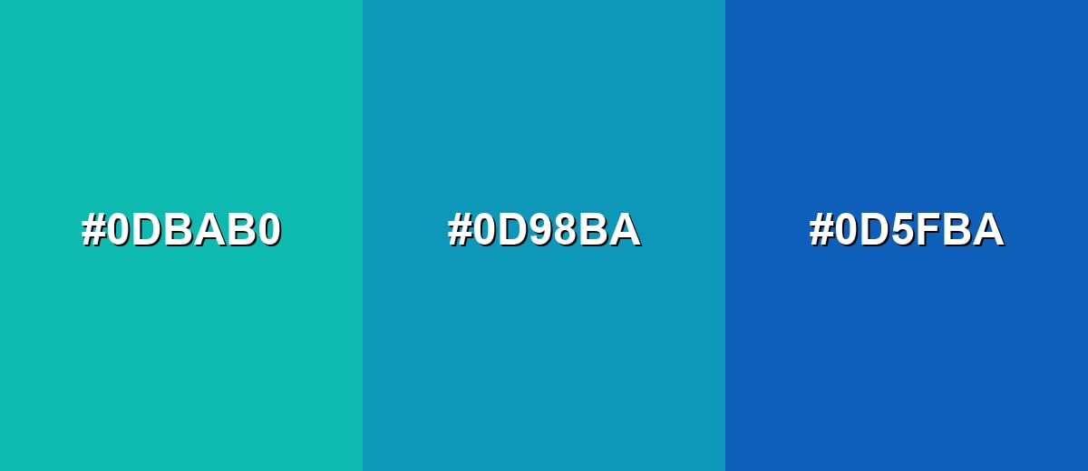
- Deep Teal: #0DBAB0
- Blue Green: #0D98BA
- Ocean Blue: #0D5FBA
Seafoam, Blue Green, and Deep Cyan keep the same family but add more range for backgrounds, icons, and highlights.
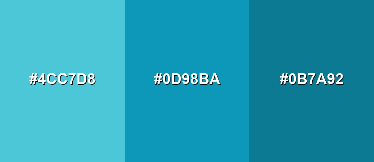
- Seafoam: #4CC7D8
- Blue Green: #0D98BA
- Deep Cyan: #0B7A92
Triadic & Tetradic Combinations
A triadic scheme balances three evenly spaced hues, giving variety without looking chaotic.
Blue Green, Magenta Rose, and Citrus Olive form a lively trio for data viz, playful branding, and illustrative work.
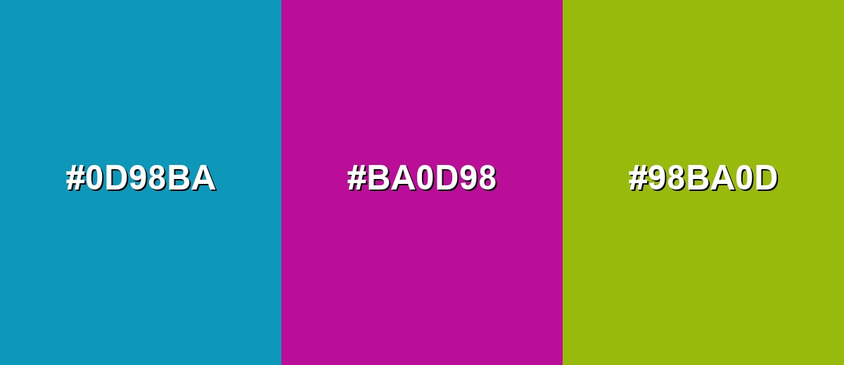
- Blue Green: #0D98BA
- Magenta Rose: #BA0D98
- Citrus Olive: #98BA0D
Colors to Avoid
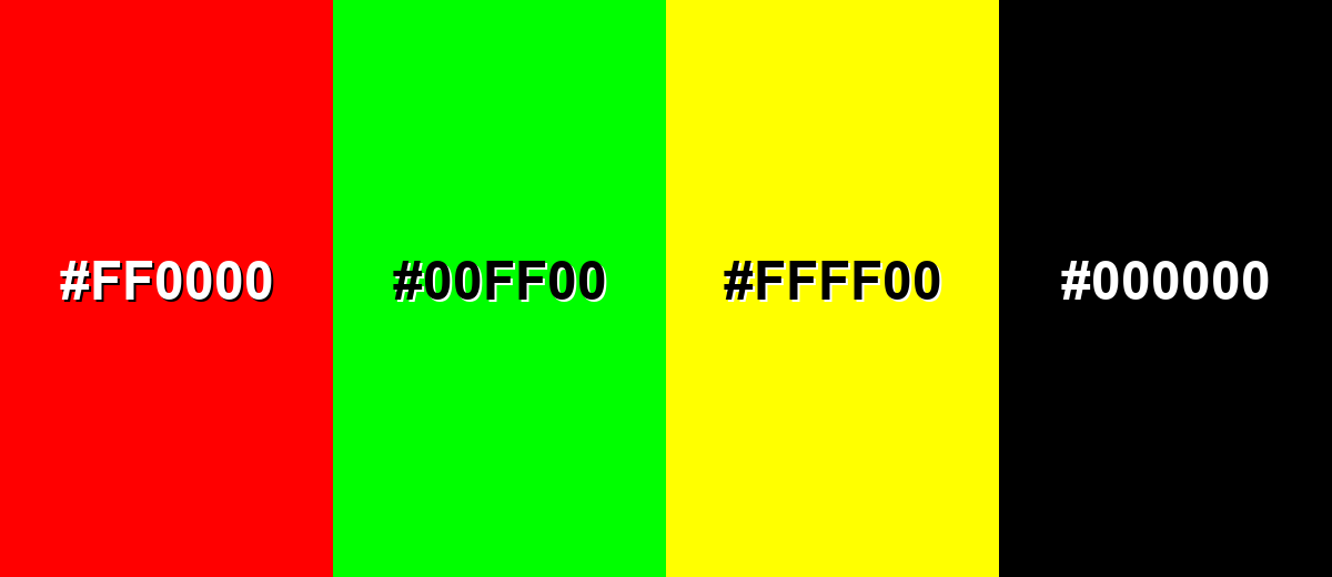
While blue green color is remarkably versatile, certain combinations can create problematic visual effects:
- Pure Red (#FF0000) - At full intensity it can clash with blue green and create vibrating edges, especially in small UI elements.
- Pure Green (#00FF00) - This combination can feel overly neon and distracting, making layouts look less refined.
- Neon Yellow (#FFFF00) - High brightness next to blue green can overwhelm the hierarchy and reduce legibility for text and icons.
- Pure Black (#000000) - The contrast can be harsh and heavy; softer charcoals often look cleaner and more modern.
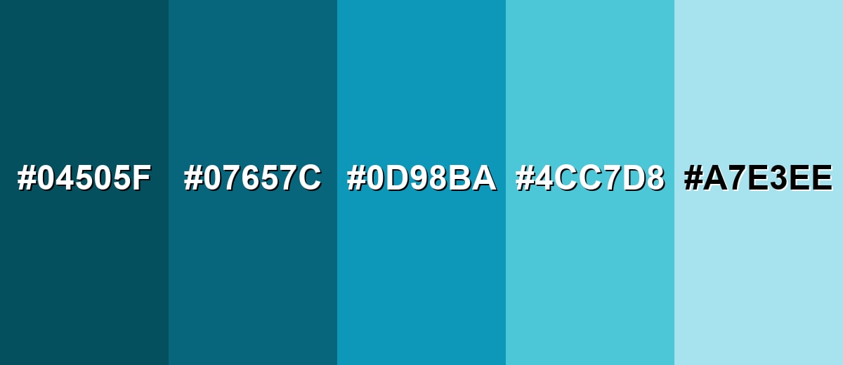
Shades, Tints & Variations of Blue Green Color
Blue green isn't just one look—its range includes deeper, moodier tones for contrast and lighter tints for airy backgrounds. Having a few coordinated variations makes it easier to build hierarchy in UI, create depth in branding, and keep layouts feeling cohesive.
- Deep Blue Green (#04505F) - A dark, teal-leaning version with a moody, professional feel. It's best used for Headers, footers, hero overlays, and white-on-dark UI components..
- Dark Blue Green (#07657C) - A stronger, darker tone that keeps the hue while improving contrast. It's best used for Buttons, active states, charts, and accents on light backgrounds..
- Blue Green (#0D98BA) - The core shade: clean, oceanic, and modern with high saturation. It's best used for Brand accents, icons, highlights, and primary UI styling when you want a fresh look..
- Soft Blue Green (#4CC7D8) - A lighter, friendlier tint that reads airy and approachable. It's best used for Cards, section backgrounds, illustrations, and secondary interface surfaces..
- Pale Blue Green (#A7E3EE) - A very light tint that feels cool, clean, and open. It's best used for Large background areas, subtle panels, and gentle highlights behind dark text..
Industry Applications
Because it feels clean and dependable, blue green fits projects where clarity and trust matter. It also works nicely as an accent color in modern systems that need a fresh, readable look.
Fashion & Beauty
- Use it for clean, "fresh finish" packaging where you want a crisp, modern impression.
- Pair lighter tints with off-whites for skincare and wellness visuals that feel airy and calm.
- Apply deeper tones for premium labels, especially when you want a cool, polished mood.
- Keep warm accents on-hand (in small doses) to prevent the palette from feeling too cold.
Interior Design & Decor
- Bring in warm woods and textured fabrics to balance the coolness and keep spaces inviting.
- Use deeper blue green for cabinetry or feature walls when you want a more grounded, spa-like effect.
- Choose pale tints for bathrooms and bright bedrooms to keep things open and clean.
- Avoid stacking it with too many icy grays unless you're intentionally aiming for minimal and cool.
Branding & Marketing
- Use it as a navigation and highlight color to suggest clarity, efficiency, and trust.
- Pair with dark anchors for a professional look, then add lighter tints for backgrounds and surfaces.
- Reserve the most saturated version for key touchpoints (CTAs, active states, and important badges).
- For campaign visuals, combine it with a warm contrast color to keep messaging energetic and easy to spot.
Conclusion
Blue green stands out for its watery clarity and balanced mix of calm blue and fresh green. With #0D98BA as your anchor, you can build a practical set of tints and deeper tones for UI states, brand systems, and clean interior-inspired palettes—then add warm accents when you need extra approachability. Used thoughtfully, it keeps designs feeling modern, readable, and confidently polished across screens and print.
Design Smarter with AI: Media.io is an online AI studio that empowers creators with advanced image generation and enhancement tools. From text-to-image and image-to-image creation to AI upscaling and color optimization, it enables fast, creative, and professional results—all in your browser.

Frequently Asked Questions About Blue Green Color
Blue green looks like a cool teal with a noticeable blue influence, similar to clear ocean water or a blue-tinted turquoise. It sits between cyan and teal and can shift slightly depending on lighting and surrounding tones.
A commonly used hex value for blue green is #0d98ba. This code is widely used in web and UI design to reproduce the shade consistently on screens.
It is typically closer to teal, but with enough blue to feel cooler than many green-leaning teals. If you reduce saturation it can resemble soft cyan; if you darken it, it reads more like deep teal.
Warm oranges and rust tones create strong contrast, while ocean blues and teals keep things harmonious. Neutrals like off-white and charcoal help it look clean and modern without overwhelming a layout.
Yes, it works well for interactive elements because it is vivid and easy to spot. Make sure contrast is sufficient for your text and add non-color cues (like underlines for links) so the meaning is still clear.
It can print well, but the result depends on the printer, paper, and color profile. Start with the provided CMYK values and request a proof when accurate brand matching is important.


