

 TL;DR:
Dark teal (#004F4F) is a deep blue-green tone that acts as a stable, premium anchor for modern interfaces and branding by conveying quiet authority and steady focus.
● Avoid pairing this shade with low-contrast gray text, pure black, pure red, or neon cyan to prevent missing UI details and harsh vibrating edge effects.
● Always run a physical proof when using its CMYK values (100%, 0%, 0%, 69%) for print workflows, as dark blue-green inks frequently shift depending on paper coating and lighting.
● Balance large dark teal areas like headers and sidebars by introducing warm accents like sand, cream, or brass to prevent the design from feeling overly cold or detached.
Ask AI for a summary
 ChatGPT
 Perplexity
 Gemini
 Claude
 Grok
Grok
Dark teal color is a deep blue-green tone that looks like ocean water in shadow or a richly dyed fabric with a cool green cast. Its hex code is #004F4F, giving it a low-light, sophisticated look that still feels fresh.
Because it sits between blue and green, dark teal can shift slightly cooler or greener depending on lighting and surrounding tones. Below, you'll find its color codes, conversions, pairing ideas, shade variations, and practical ways to use it across design.
Dark Teal Color: Codes & Values
Use these values to keep dark teal consistent across UI, print, and brand assets.
| Parameters | VALUE |
| HEX Code | #004F4F |
| RGB DECIMAL | 0, 79, 79 |
| RGB PERCENTAGE | 0%, 31%, 31% |
| CMYK | 100%,0%,0%,69% |
| HSL | 180°, 100%, 15% |
| HSV (HSB) | 180°, 100%, 31% |
| Web Safe | #006666 |
Key Color Space Explanations:
- HEX - HEX is the most common web notation for screen design. #004f4f defines the red, green, and blue mix used to display this shade in digital interfaces.
- RGB - RGB describes the exact red, green, and blue light values used on screens. Dark teal uses low red with equal green and blue to create a balanced, cool depth.
- CMYK - CMYK is used for print workflows and describes ink percentages. It helps you predict how dark teal may reproduce on paper, where inks and stock can shift the result.
- HSL - HSL describes hue, saturation, and lightness, which is useful for picking tints and shades consistently. Dark teal sits near 180° on the hue wheel with high saturation and low lightness.
- Web Safe - Web safe is the closest legacy-safe approximation built from a limited set of values. #006666 is the nearest match when you need a simplified, broadly compatible alternative.
For digital work, start with HEX or RGB; for print, use CMYK and always proof first—dark blue-green inks can shift depending on paper and lighting.
Dark Teal Color Conversions
This conversion chart helps you match dark teal across different tools, formats, and color systems.
| Parameters | VALUE | CSS |
| HEX | #004f4f | #004f4f |
| RGB DECIMAL | 0, 79, 79 | rgb(0,79,79) |
| RGB PERCENTAGE | 0%, 31%, 31% | rgb(0%,31%,31%) |
| CMYK | 100%,0%,0%,69% | cmyk(100%,0%,0%,69%) |
| HSL | 180°, 100%, 15% | hsl(180°, 100%, 15%) |
| HSV (or HSB) | 180°, 100%, 31% | -- |
| Web Safe | 006666 | #006666 |
| CIE-LAB | 29.8, -21.0, -6.0 | -- |
| XYZ | 4.20, 6.14, 8.34 | -- |
| xyY | 0.225, 0.329, 6.14 | -- |
| CIE-LCH | 29.8, 21.8, 196° | -- |
| CIE-LUV | 29.8, -23.0, -4.9 | -- |
| Hunter-Lab | 24.8, -12.2, -4.3 | -- |
| Binary | 00000000 01001111 01001111 | -- |
Want to generate dark teal color photos or posters? Try Media.io's AI Image Generator now!
Dark Teal Meaning & Symbolism
Dark teal is often associated with calm confidence, self-control, and steady focus. It blends the trust of blue with the restoring feel of green, which is why it shows up in spaces and products meant to feel composed and premium. In everyday life, the dark teal color meaning is usually tied to reliability, quiet strength, and a modern, refined mood.
Psychological Effects
In most designs, dark teal reads steady and focused rather than loud.
- Calm Focus - Helps interfaces and layouts feel clear and composed, especially in information-heavy screens.
- Quiet Authority - Adds seriousness and structure without the harshness of pure black.
- Modern Maturity - Feels premium and restrained, making it a strong base for contemporary branding.
- Cool Distance - Overuse can feel slightly formal or detached, particularly in large dark blocks.
- Contrast Sensitivity - Low-contrast grays can disappear on dark teal, so typography choices matter.
Positive Associations
These are the most common "good" signals dark teal sends in visual communication.
- Reliability - Suggests steadiness and competence, which works well for professional products and services.
- Trust - Carries the dependable feel of blue, making it comfortable for navigation and key UI elements.
- Renewal - Keeps a subtle green freshness that feels restorative and balanced.
- Quality - Often reads as refined and subtly luxurious, especially with warm metallic accents.
- Self-Control - Communicates restraint and clarity, supporting clean hierarchy and minimal layouts.
Cultural Significance Across the World
Meanings vary by context, but teal tones are broadly seen as balanced and modern.
- Water & Depth - Frequently linked with oceans and depth, echoing stability and reflection.
- Balance - Sits between blue and green, so it often symbolizes harmony rather than extremes.
- Professional Modernity - Darker teal shades tend to feel mature and "designed," not playful.
- Renewal - Commonly associated with refreshment and restoration in wellness-forward contexts.
Design Applications
Dark teal works well when you want a strong foundation that still feels fresh. It is versatile across digital products and physical spaces, and it pairs easily with both warm and cool accents.
Graphic Design Tips
- Use dark teal for headers, sidebars, and navigation to add structure without leaning on pure black.
- Pair it with off-white text for clean readability; avoid low-contrast gray body text on dark teal.
- Reserve dark teal for primary actions, then use lighter teal tints for hover and focus states.
- For print, test on the intended stock—dark blue-green inks can shift based on coating and lighting.
- If placing small text over dark teal, choose larger type weights or add tracking to keep it legible.
Pro tip: treat dark teal like a "colored neutral"—anchor big areas with it, then bring warmth back in through sand, cream, wood tones, or brass-style accents.
Dark Teal in Photography & Video
- Use dark teal backgrounds to frame portraits and product shots without overpowering skin tones or key subjects.
- In video, dark teal works well for lower-thirds and UI overlays because it feels calm and modern.
- Pair dark teal grading with warm highlights to keep scenes cinematic instead of cold.
- Watch for crushed shadows—dark teal can hide detail if exposure and contrast are pushed too far.
- When using text overlays, choose off-white or very light tints for clarity and consistent readability.
Recommended Tool for Image Enhancement: When incorporating dark teal into your photography projects, Media.io's AI Image tools can help you achieve more refined results. With AI-powered color enhancement, photo colorization, image upscaling, and old photo restoration, you can easily enrich dark teal tones, improve overall image quality, and highlight the color's elegant and sophisticated aesthetic.
Color Combinations
Dark teal is flexible in palettes because it can act like a deep neutral with personality. The combinations below highlight easy ways to build contrast, harmony, and hierarchy for digital and print work.
Complementary Colors
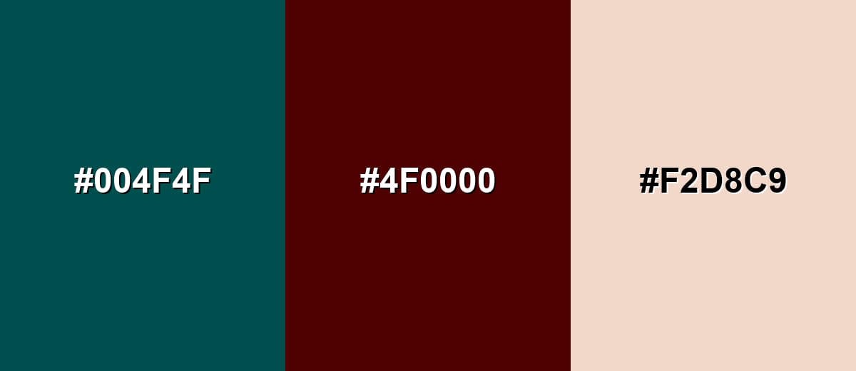
A complementary pairing puts dark teal against a warm opposite tone to create crisp, attention-grabbing contrast without relying on neon saturation.
Complementary Palette Example: Try dark teal with deep maroon and a soft peach for a balanced, high-contrast palette.
Analogous Color Schemes
Analogous colors sit adjacent to each other on the color wheel, creating harmonious, cohesive palettes with subtle variation.
Ocean-leaning neighbors: dark teal with deep blue-teal and deep green.
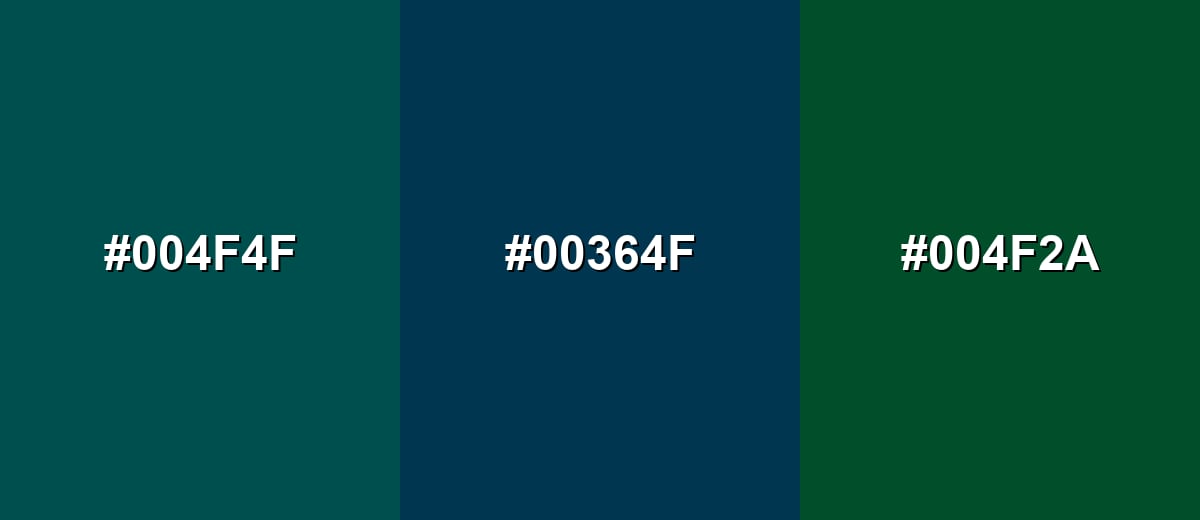
- Dark Teal: #004F4F
- Deep Blue Teal: #00364F
- Deep Green: #004F2A
Softened harmony: dark teal with blue slate and teal green for layered depth.
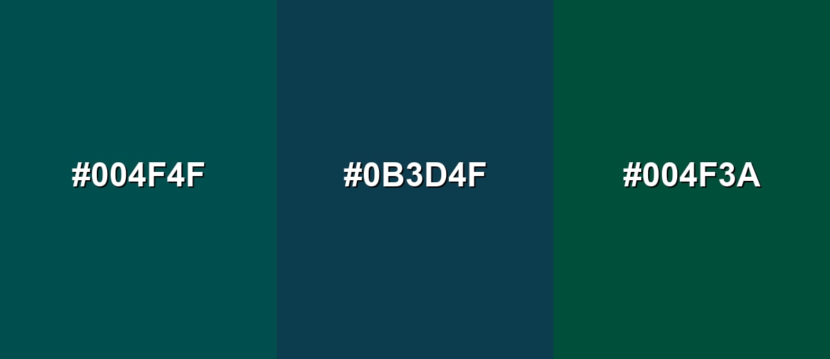
- Dark Teal: #004F4F
- Blue Slate Teal: #0B3D4F
- Teal Green: #004F3A
Triadic & Tetradic Combinations
A triadic scheme uses three evenly spaced hues to stay lively while still feeling controlled.
Dark teal with deep purple and dark mustard creates bold contrast that stays mature.
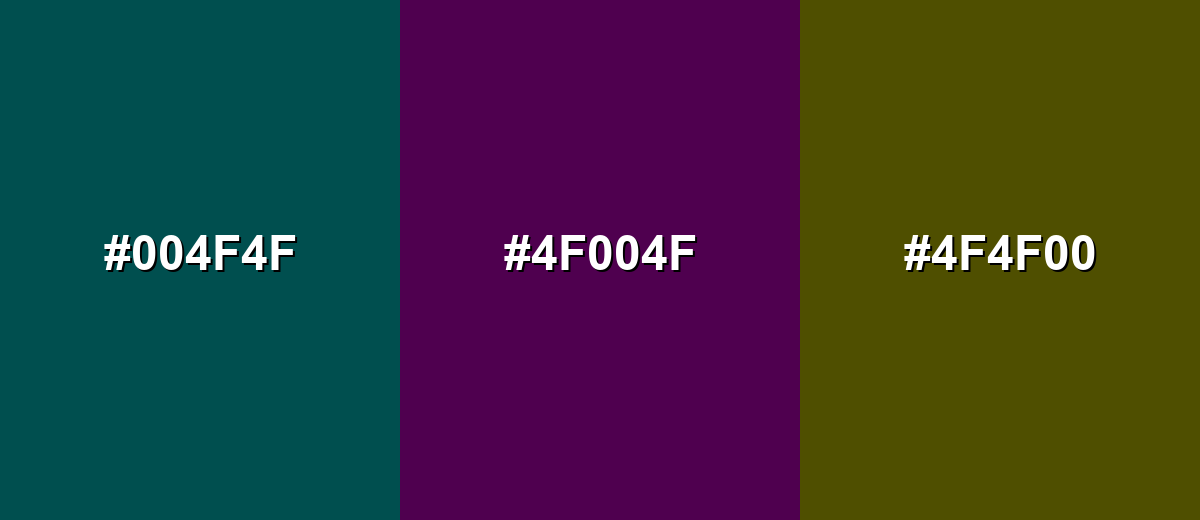
- Dark Teal: #004F4F
- Deep Purple: #4F004F
- Dark Mustard: #4F4F00
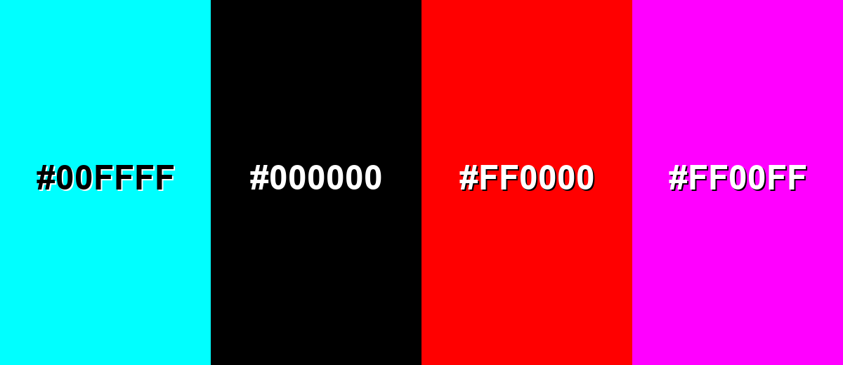
Colors to Avoid
While dark teal is remarkably versatile, certain combinations can create problematic visual effects:
- Neon Cyan (#00FFFF) - The jump in brightness can feel harsh and can create a vibrating edge effect next to a dark, muted base.
- Pure Black (#000000) - This pairing can look heavy and can reduce visible separation in shadows unless you add lighter dividers or texture.
- Pure Red (#FF0000) - High-saturation red can overpower dark teal and read as alarm-like in UI, which is rarely the intent for standard layouts.
- Neon Magenta (#FF00FF) - Strong magenta tends to clash with blue-green tones and can push the palette into a loud, inconsistent mood.
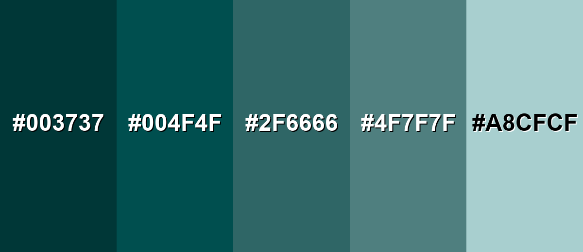
Shades, Tints & Variations of Dark Teal
Dark teal has a surprisingly useful range—from deeper, shadowy tones to airy tints that keep the same blue-green character. Mixing these variations makes it easier to build hierarchy, keep large areas from feeling heavy, and create a consistent design system.
- Deep Teal (#003737) - A darker, more shadowed version that feels serious and minimal. It's best used for Backgrounds, headers, and high-contrast sections with light text.
- Dark Teal (#004F4F) - The classic deep blue-green that reads calm, modern, and grounded. It's best used for Primary brand tone, navigation, and key UI accents.
- Teal Slate (#2F6666) - A slightly softened, gray-leaning teal that feels practical and understated. It's best used for Secondary surfaces, cards, and subdued UI panels.
- Muted Teal (#4F7F7F) - A mid-tone option with less intensity, easier on large areas. It's best used for Large fills, textiles, and supporting sections where you want gentler depth.
- Pale Teal Mist (#A8CFCF) - A light, airy tint that keeps the teal character while feeling open. It's best used for Backgrounds, highlights, and spacious layouts that need a cool, clean lift.
Industry Applications
Dark teal shows up across industries because it is readable, stable, and easy to pair. It can feel premium without being flashy, which makes it useful for both consumer and professional design systems.
Fashion & Beauty
- Use dark teal as a "hero" shade for packaging that needs to feel refined and modern.
- Pair it with warm neutrals (sand and cream) to keep the look inviting instead of cool or clinical.
- For beauty visuals, dark teal backgrounds can make metallic accents and glossy textures stand out cleanly.
- In lookbooks and e-commerce, it frames product photography without competing with the subject.
Interior Design & Decor
- Works well on feature walls, cabinetry, and textiles when you want depth without going fully navy.
- Balance it with warm woods, beige stone, or brass finishes to soften the cool base.
- Use lighter teal tints in nearby elements to keep spaces from feeling enclosed.
- In moodier rooms, add natural textures (linen, rattan, wood grain) for warmth and comfort.
Branding & Marketing
- A strong base color for brands aiming for trust, craftsmanship, or a modern premium feel.
- Fits well with minimal wordmarks, geometric icons, and clean typography.
- For digital campaigns, keep contrast high—off-white type performs better than mid-gray on dark teal.
- Use warm accent colors sparingly to add energy while keeping the overall tone composed.
Conclusion
Dark teal stands out for its ability to feel both calm and confident, with enough depth to anchor a layout without looking flat. It supports clear hierarchy in UI, gives branding a mature edge, and pairs naturally with warm neutrals and muted accents. When you need a dependable base tone that still feels modern, #004F4F is an easy choice to build around. With the right contrast and a few lighter tints, it stays readable and welcoming across screens and print.
Design Smarter with AI: Media.io is an online AI studio that empowers creators with advanced image generation and enhancement tools. From text-to-image and image-to-image creation to AI upscaling and color optimization, it enables fast, creative, and professional results—all in your browser.

Frequently Asked Questions About Dark Teal Color
Dark teal is a deep blue-green that often resembles ocean water in shade. It is darker and more muted than bright teal, with a grounded, modern feel.
A common hex code for dark teal is #004f4f. Small shifts are normal across palettes, but this value is a reliable reference for design systems.
It sits between blue and green, so it can lean either way depending on lighting and nearby tones. Next to warm neutrals it may look bluer; next to cool blues it can look greener.
Warm accents like soft peach, sand, brass, and terracotta create pleasing contrast. It also works with analogous deep blue-teals and greens for a calm, cohesive palette.
Yes, it can be a strong background for headers, sidebars, and hero sections. Use light text and verify contrast ratios, especially for smaller type and disabled states.
It can shift depending on paper stock and ink settings, especially in darker ranges. For best results, run a proof and adjust CMYK values if the result looks too dull or too blue.


