

Celadon color is a light, muted green with a gentle gray cast, often compared to classic ceramic glazes and soft foliage under haze.
Its signature hex code is #ACE1AF, a calm, refined tone that reads balanced and quietly sophisticated across digital and print design.
Celadon Color: Codes & Values
Use these standard values to match celadon accurately in web layouts, branding systems, and print specs.
| Parameters | VALUE |
| HEX Code | #ACE1AF |
| RGB DECIMAL | 172, 225, 175 |
| RGB PERCENTAGE | 67.5%, 88.2%, 68.6% |
| CMYK | 24%,0%,22%,12% |
| HSL | 123°, 47%, 78% |
| HSV (HSB) | 123°, 24%, 88% |
| Web Safe | #99CC99 |
Key Color Space Explanations:
- HEX is the most common digital format for UI and web work. Use #ace1af to match celadon precisely across apps and browsers.
- RGB mixes red, green, and blue light for screens. Celadon is rgb(172,225,175), which explains its light green appearance with a soft gray bias.
- CMYK is used for print, mixing cyan, magenta, yellow, and black ink. The values 24%,0%,22%,12% are a practical starting point, but printing conditions can shift the result.
- HSL describes hue, saturation, and lightness, which is helpful for building tints and tonal palettes. With 123° hue and high lightness, celadon stays gentle even when adjusted.
- Web Safe is the closest legacy palette match used on older displays and systems. For celadon, the nearest web-safe approximation is #99cc99.
For consistency, set #ACE1AF as your base and use HSL/HSV to create lighter backgrounds or deeper UI accents without changing the overall "celadon" feel.
Celadon Color Conversions
Need celadon in another format? Use the table below to copy the exact values into design tools, CSS, or print workflows.
| Parameters | VALUE | CSS |
| HEX | #ace1af | #ace1af |
| RGB DECIMAL | 172, 225, 175 | rgb(172,225,175) |
| RGB PERCENTAGE | 67.5%, 88.2%, 68.6% | rgb(67.5%,88.2%,68.6%) |
| CMYK | 24%,0%,22%,12% | cmyk(24%,0%,22%,12%) |
| HSL | 123°, 47%, 78% | hsl(123°,47%,78%) |
| HSV (or HSB) | 123°, 24%, 88% | -- |
| Web Safe | 99cc99 | #99cc99 |
| CIE-LAB | 84.9, -26.9, 19.0 | -- |
| XYZ | 51.6, 65.7, 50.5 | -- |
| xyY | 0.307, 0.392, 65.7 | -- |
| CIE-LCH | 84.9, 32.9, 144.8° | -- |
| CIE-LUV | 84.9, -26.7, 31.9 | -- |
| Hunter-Lab | 81.0, -24.6, 16.7 | -- |
| Binary | 101011001110000110101111 | -- |
Want to generate Celadon Color photos or posters? Try Media.io's AI Image Generator now!
Celadon Color Meaning & Symbolism
Celadon color is commonly associated with calm, clarity, and quiet renewal. Because it sits between green and gray, it often reads as grounded and refined rather than energetic. In everyday life, this makes it a popular choice when you want a space or interface to feel clean, gentle, and easy to stay in.
Psychological Effects
Celadon’s low-noise, softened green is often used to keep layouts feeling breathable and easy on the eyes.
- Calm Focus - Helps reduce visual tension, making screens and spaces feel steadier and less busy.
- Soft Clarity - Reads clean without feeling stark, especially on large surfaces like panels and sections.
- Gentle Renewal - Suggests a fresh, nature-adjacent mood without the intensity of bright greens.
- Understated Premium - Its muted gray cast can communicate restraint and tastefulness in branding.
- Risk Of Flatness - Overuse can feel sleepy or slightly clinical without warmer balance and contrast.
Positive Associations
When paired thoughtfully, celadon tends to signal care, balance, and an easygoing kind of confidence.
- Wellness - Common in calming themes like self-care, spa visuals, and restorative experiences.
- Freshness - Feels airy and "just-cleaned," making it popular for backgrounds and packaging.
- Trust - Works well in interfaces that need to feel safe, stable, and welcoming over long sessions.
- Nature Connection - Nods to foliage and soft botanical tones without looking loud or overly "eco."
- Craft & Tactility - Often evokes ceramic glaze and handmade materials, reinforcing a refined, tactile vibe.
Cultural Significance Across the World
The name "celadon" is historically tied to ceramic craftsmanship, which still shapes how the color is perceived today.
- Ceramic Heritage - Strongly associated with celadon ceramics and the iconic green glaze used in decorative wares.
- Elegance - Often interpreted as classic and tasteful due to its historic design references.
- Craftsmanship - Suggests care and detail, linking the hue to artisanal quality rather than trend-driven color.
- Modern Neutrality - In contemporary use, it’s more aesthetic than symbolic, valued for softness and versatility.
Design Applications
Celadon is easiest to use when you treat it as a soft foundation rather than a loud statement. The ideas below show where it performs best and how to keep it readable and intentional.
Graphic Design Tips
- Use celadon as a background field to make layouts feel calm, open, and less visually heavy.
- Pair it with a darker anchor for typography so body text stays crisp and easy to scan.
- Keep accents purposeful; a few high-contrast elements help avoid a "flat" overall look.
- Lean into texture (paper grain, ceramics, fabric) to reinforce the color’s refined, tactile vibe.
- Check appearance across devices—muted greens can drift toward gray in low light or dim screens.
Pro tip: If your design starts to feel too pale, don’t push saturation first—add a deeper anchor tone for hierarchy, then introduce one gentle accent to guide attention.
Celadon Color in Photography & Video
- Use celadon props or backdrops to create a clean, spa-like mood without harsh color dominance.
- It works especially well in soft, diffused lighting where the gray-green undertone stays elegant.
- For product shots, pair celadon with warm neutrals to keep skin tones and materials feeling natural.
- In video grading, keep contrast controlled so celadon doesn’t wash out into gray on darker displays.
- When used as a background, add a deeper accent (like a slate tone) to preserve separation and clarity.
Recommended Tool for Image Enhancement: When incorporating celadon color into your photography projects, Media.io's AI Image tools can help you achieve more refined results. With AI-powered color enhancement, photo colorization, image upscaling, and old photo restoration, you can easily enrich celadon color tones, improve overall image quality, and highlight the color's elegant and sophisticated aesthetic.
Color Combinations
Celadon pairs best with tones that keep its softness intact: warm neutrals for comfort, cool accents for freshness, and deeper anchors for contrast. Use the palettes below as starting points, then adjust saturation and contrast based on your medium.
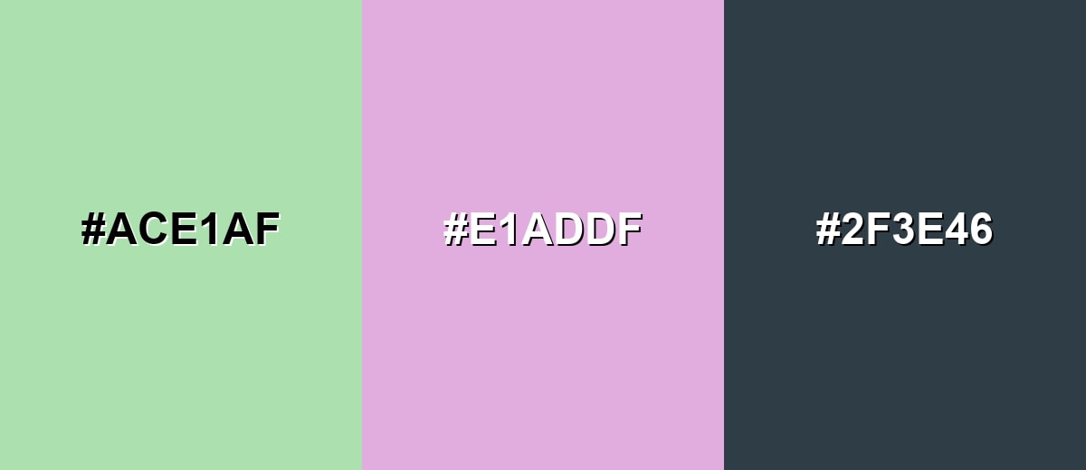
Complementary Colors
A complementary pairing places celadon opposite a gentle mauve on the color wheel, creating clear contrast without becoming harsh. This is a strong option for highlights, small accents, and balanced two-tone layouts.
Complementary Palette Example: Use celadon as the base, mauve as the accent, and deep slate as the anchor for readability and structure.
Analogous Color Schemes
Analogous colors sit adjacent to each other on the color wheel, creating harmonious, cohesive palettes with subtle variation.
A fresh, coastal-leaning scheme that stays light and airy with neighboring green-blue tones.
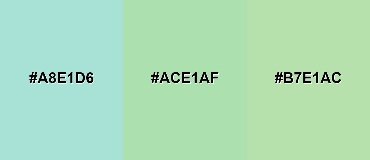
- Seafoam: #A8E1D6
- Celadon: #ACE1AF
- Soft Sage: #B7E1AC
A nature-inspired trio that moves from aqua to soft yellow-green, great for calm backgrounds and gentle gradients.
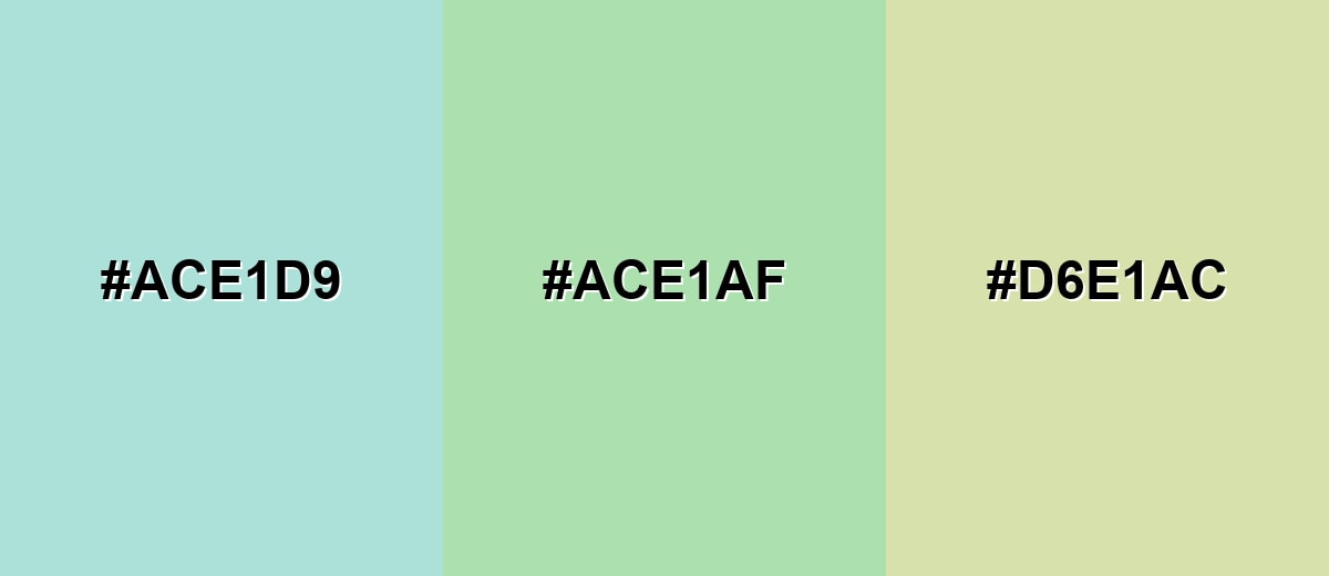
- Pale Aqua: #ACE1D9
- Celadon: #ACE1AF
- Misty Pistachio: #D6E1AC
Triadic & Tetradic Combinations
A triadic palette adds variety while keeping the overall look soft and friendly.
Pair celadon with a dusty periwinkle and a soft coral-rose to create balanced contrast for illustrations, UI accents, or brand systems.
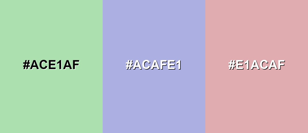
- Celadon: #ACE1AF
- Dusty Periwinkle: #ACAFE1
- Soft Coral Rose: #E1ACAF
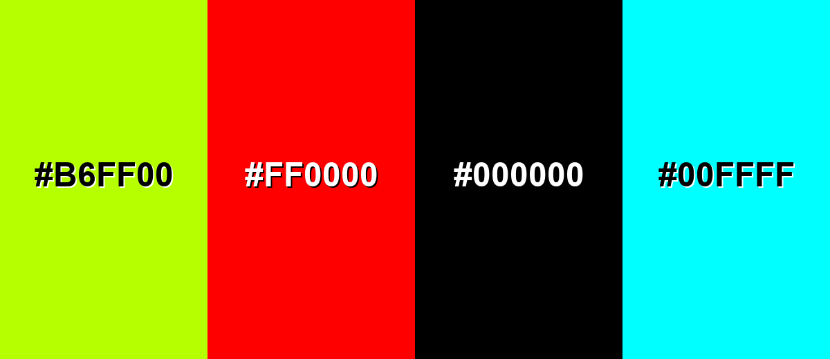
Colors to Avoid
While celadon color is remarkably versatile, certain combinations can create problematic visual effects:
- Neon Lime (#B6FF00) - The intensity overwhelms celadon’s muted character and can make the palette feel unbalanced.
- Pure Red (#FF0000) - The contrast is sharp and attention-grabbing, which can turn a calm scheme into visual tension.
- Jet Black (#000000) - It can feel heavy next to celadon and may create an overly stark, high-contrast look if used in large blocks.
- Bright Cyan (#00FFFF) - Its high saturation competes with celadon and can push the overall look toward a loud, digital feel.
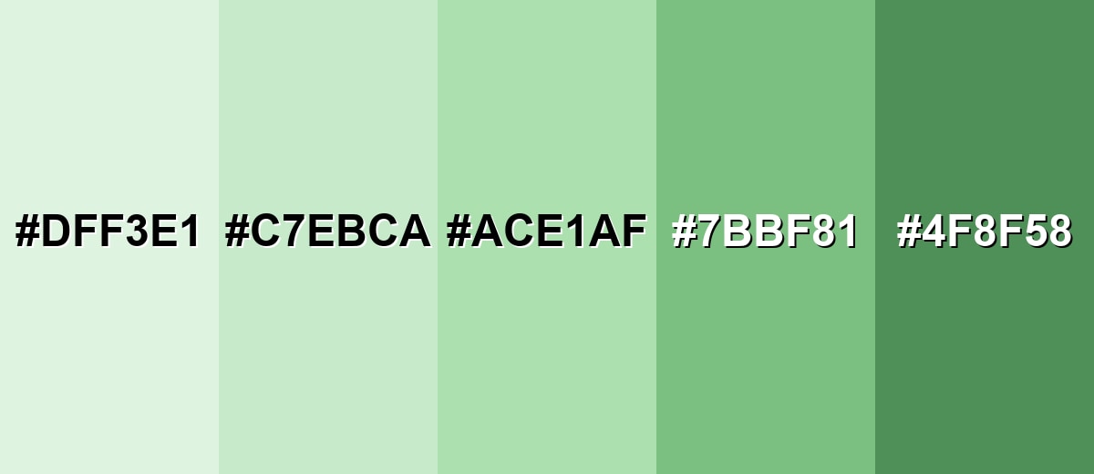
Shades, Tints & Variations of Celadon Color
Celadon isn’t just one shade—it ranges from airy, near-white tints to deeper botanical tones. Having a small celadon range makes it easier to build hierarchy in UI, add depth in branding, and keep interiors feeling cohesive.
- Celadon Mist (#DFF3E1) - A very light, airy tint that feels almost like a green-tinted off-white. It’s best used for Large backgrounds, spacious layouts, and soft negative space..
- Pale Celadon (#C7EBCA) - A gentle pastel with slightly more presence while staying calm and clean. It’s best used for Cards, sections, subtle fills, and light brand backdrops..
- Classic Celadon (#ACE1AF) - The balanced reference tone: muted green with a gray cast and a refined finish. It’s best used for Primary brand hue, supporting background, or calm accent elements..
- Deep Celadon (#7BBF81) - A mid-tone shade that reads more botanical and adds stronger structure. It’s best used for Buttons, icons, charts, and areas that need clearer contrast..
- Dark Celadon (#4F8F58) - A grounded, deeper green that keeps the celadon character but feels more anchored. It’s best used for Headings, navigation accents, outlines, and contrast anchors..
Industry Applications
Because celadon feels clean, soft, and natural, it appears across both digital products and physical spaces. These examples show where it tends to fit best and what it communicates at a glance.
Fashion & Beauty
- Skincare labels and cartons where "fresh and refined" matters more than loud color.
- Soft tailoring, knitwear, and accessories for spring/summer palettes with a calm mood.
- Beauty website sections and product pages that need a clean, breathable background.
- Pairing with warm neutrals to keep the look welcoming instead of cool or sterile.
Interior Design & Decor
- Bedrooms, bathrooms, and reading corners that benefit from a soothing, low-stimulation tone.
- Walls, cabinetry, and soft furnishings when you want gentle green without strong saturation.
- Layering with off-whites plus natural materials like wood and stone for an understated finish.
- Adding one darker anchor tone to keep the room from feeling overly pastel.
Branding & Marketing
- Wellness and self-care visuals that aim for calm, restorative energy.
- Sustainable or nature-adjacent branding that avoids the intensity of bright green.
- Minimal, craft, and boutique identities where texture and materials matter.
- Clean promotional graphics and packaging backgrounds that keep information easy to read.
Conclusion
Celadon stands out for its soft gray-green character that feels fresh without being loud, making it a reliable choice for backgrounds, supporting surfaces, and gentle accents in UI, branding, print, and interiors. Start with #ACE1AF, then build a practical system around it: add a darker anchor for readability and structure, and introduce one warm or cool accent to keep the palette lively without losing its calm. With its subtle nod to classic celadon ceramics and its modern, clean finish, celadon communicates ease, care, and quiet confidence when it’s used with intention.
Design Smarter with AI: Media.io is an online AI studio that empowers creators with advanced image generation and enhancement tools. From text-to-image and image-to-image creation to AI upscaling and color optimization, it enables fast, creative, and professional results—all in your browser.

Frequently Asked Questions About Celadon Color
Celadon is a light, muted green with a subtle gray undertone. It often resembles the soft green seen in traditional ceramic glazes and gentle foliage tones.
It reads as green first, but the gray cast is what makes it look refined and understated. That muted quality is also why it pairs well with both warm neutrals and cool accents.
Soft mauves, warm neutrals, powdery blues, and deep slate-like anchors all work well. These pairings keep the palette calm while adding enough contrast for structure.
They are similar, but sage is usually more earthy and gray-brown, while celadon tends to look lighter and cleaner. Celadon often feels more airy and ceramic-like compared to the more herbal feel of sage.
Use it for backgrounds, panels, and low-emphasis fills, then choose a darker anchor for text and key controls. Always check contrast ratios with your actual typography and component sizes before shipping.
It can do both, but it shines as a main supporting tone because it is easy on the eyes. If you use it as an accent, pair it with a deeper anchor so the accent still looks intentional and readable.


