

Sapphire blue color is a rich, jewel-like blue that sits between royal blue and deep azure, similar to the vivid look of a polished sapphire gemstone. Its signature hex code is #0F52BA.
Many people perceive it as confident, trustworthy, and refined, though it can read cool if used without warmer accents. This guide covers meaning, codes, combinations, shades, and practical ways to use it.
Sapphire Blue Color: Codes & Values
If you're building a palette, UI theme, or brand guide, these are the most practical specs to keep sapphire blue consistent across tools and platforms.
| Parameters | VALUE |
| HEX Code | #0F52BA |
| RGB DECIMAL | 15, 82, 186 |
| RGB PERCENTAGE | 5.9%, 32.2%, 72.9% |
| CMYK | 92%,56%,0%,27% |
| HSL | 217°, 85%, 39% |
| HSV (HSB) | 217°, 92%, 73% |
| Web Safe | #0066CC |
Key Color Space Explanations:
- HEX - HEX is the most common way to specify sapphire blue for web and UI work. Use it in CSS, design systems, and style guides for consistent rendering.
- RGB - RGB defines the amount of red, green, and blue light used on screens. It is the go-to format for digital visuals, video, and interactive interfaces.
- CMYK - CMYK is used for print production and describes ink percentages. Sapphire blue can shift in print, so a proof helps when accuracy matters.
- HSL - HSL describes hue, saturation, and lightness, making it easier to create tints, shades, and UI states. It is especially useful for building coherent palettes around sapphire blue.
- Web Safe - Web safe values are older, simplified screen-safe approximations. They are mainly helpful when you need a close fallback for legacy constraints.
For day-to-day design work, start with HEX (#0F52BA) for UI and branding, then switch to RGB for screen-based motion/graphics and CMYK when prepping print files.
Sapphire Blue Color Conversions
Need sapphire blue in a different format? Use the conversion table below to copy the value you need for your editor, dev handoff, or print workflow.
| Parameters | VALUE | CSS |
| HEX | #0f52ba | #0f52ba |
| RGB DECIMAL | 15, 82, 186 | rgb(15,82,186) |
| RGB PERCENTAGE | 5.9%, 32.2%, 72.9% | rgb(5.9%,32.2%,72.9%) |
| CMYK | 92%,56%,0%,27% | cmyk(92%,56%,0%,27%) |
| HSL | 217°, 85%, 39% | hsl(217°,85%,39%) |
| HSV (or HSB) | 217°, 92%, 73% | -- |
| Web Safe | 0066cc | #0066cc |
| CIE-LAB | 37.4, 21.0, -59.4 | -- |
| XYZ | 12.1, 9.7, 47.6 | -- |
| xyY | 0.174, 0.140, 9.7 | -- |
| CIE-LCH | 37.4, 63.0, 289.5° | -- |
| CIE-LUV | 37.4, -18.0, -86.4 | -- |
| Hunter-Lab | 31.1, 18.4, -54.2 | -- |
| Binary | 00001111 01010010 10111010 | -- |
Want to generate Sapphire Blue Color photos or posters? Try Media.io's AI Image Generator now!
Sapphire Blue Color Meaning & Symbolism
Sapphire blue is widely linked with trust, clarity, and dependable strength. Because it feels polished and jewel-like, it often reads as premium without being flashy in everyday visual choices. This sapphire blue color symbolism shows up in everything from app interfaces to formal invitations where a calm, credible tone matters.
Psychological Effects
In design, sapphire blue often supports a calm, organized, "you can trust this" feeling.
- Steady Mood - Sapphire blue tends to steady the mood and make layouts feel calmer and more controlled.
- Clear Structure - It helps information feel organized and intentional, especially in navigation and headings.
- Confident Presence - Used in branding, it can signal competence and quality without shouting for attention.
- Cool Temperature - As a deep blue, it can read cool and distant when it dominates the page or room.
- Needs Warm Balance - Pairing it with warm textures, lighting, or muted accents helps keep it welcoming.
Positive Associations
These are the "good signals" sapphire blue commonly sends in modern visuals.
- Trust - Often used to reinforce reliability in products, services, and interfaces.
- Clarity - The crisp, jewel-like tone supports a clean and focused presentation.
- Professionalism - Sapphire blue can make a brand feel polished and established.
- Refinement - Its gemstone inspiration gives it a premium edge without looking flashy.
- Strength - The depth reads as dependable and stable, especially as a base color.
Cultural Significance Across the World
Meanings shift by audience, but sapphire blue is widely recognized as a formal, "smart" blue.
- Loyalty - As a gemstone-inspired hue, sapphire blue is frequently tied to loyalty in jewelry traditions.
- Wisdom - It's also associated with wisdom and thoughtful decision-making in ceremonial design.
- Authority - In professional contexts, it can suggest leadership and credibility (depending on the setting).
- Premium Ceremony - The jewel connection often makes it a popular choice for formal invitations and elevated branding.
Design Applications
To use sapphire blue well, decide whether it should lead the design or support it—its depth is great for emphasis, but it looks best with breathing room and balanced supporting tones.
Graphic Design Tips
- Use sapphire blue as an anchor color for headers, key sections, or a strong brand stripe.
- Pair it with off-white backgrounds to keep the look premium and editorial.
- Add a warm accent (like amber or copper) to prevent a cold, overly corporate vibe.
- Keep saturated sapphire blue for the most important elements so the layout doesn't feel heavy.
- For UI states, build lighter tints for hover/focus to maintain hierarchy without changing hue.
Pro tip: treat sapphire blue like a "signature ink"—use it consistently for the same role (CTA, links, navigation) so users learn your interface faster.
Sapphire Blue Color in Photography & Video
- Use sapphire blue as a wardrobe or prop accent to add depth without going full black.
- In color grading, it works well in shadows and midtones for a clean, modern "night" feel.
- Balance it with warm skin tones or golden practical lights to avoid a chilly cast.
- For product shots, sapphire blue backgrounds can make metallics (gold/brass) look richer.
- When compressing for web, watch banding in gradients—add subtle noise if needed.
Recommended Tool for Image Enhancement: When incorporating sapphire blue color into your photography projects, Media.io's AI Image tools can help you achieve more refined results. With AI-powered color enhancement, photo colorization, image upscaling, and old photo restoration, you can easily enrich sapphire blue color tones, improve overall image quality, and highlight the color's elegant and sophisticated aesthetic.
Color Combinations
Sapphire blue becomes easier to style once you choose a harmony: complementary for energy, analogous for smooth gradients, or triadic and tetradic for lively palettes. The combinations below are practical starting points for digital design, branding, and décor planning.
Complementary Colors
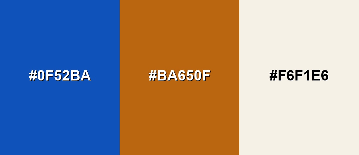
A complementary partner adds punch by sitting opposite sapphire blue on the color wheel. This contrast feels bold and modern, especially when one tone is used as the accent.
Complementary Palette Example: Use sapphire blue as the base, add burnt orange for highlights, and soften the look with a warm ivory neutral.
Analogous Color Schemes
Analogous colors sit adjacent to each other on the color wheel, creating harmonious, cohesive palettes with subtle variation.
For a smooth, ocean-to-night gradient, combine teal-leaning blue with sapphire and a deep indigo.
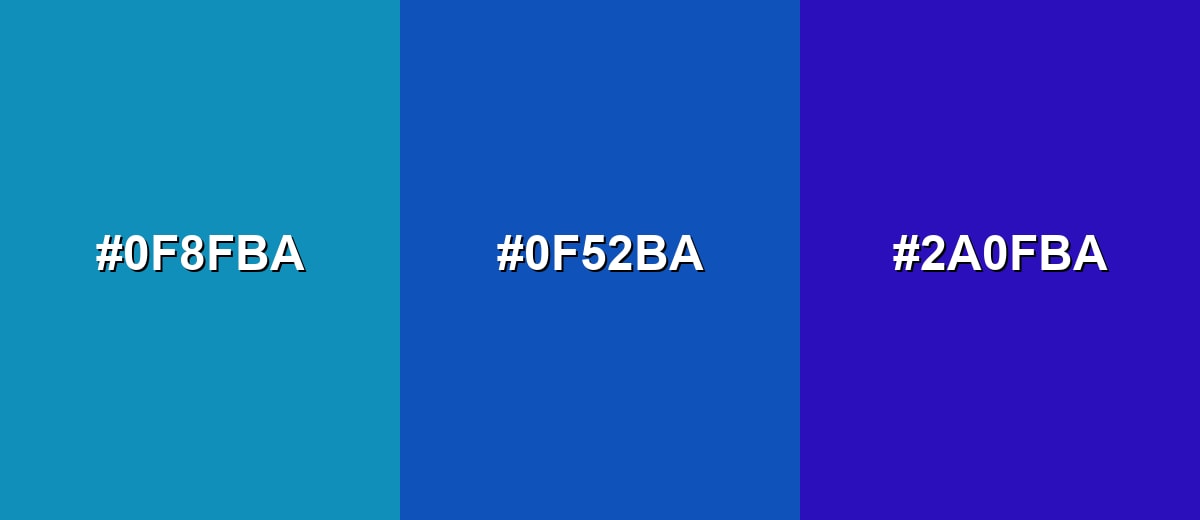
- Deep Teal Blue: #0F8FBA
- Sapphire Blue: #0F52BA
- Indigo Violet: #2A0FBA
For a cleaner, tech-forward palette, place sapphire between a dark navy and a brighter azure.
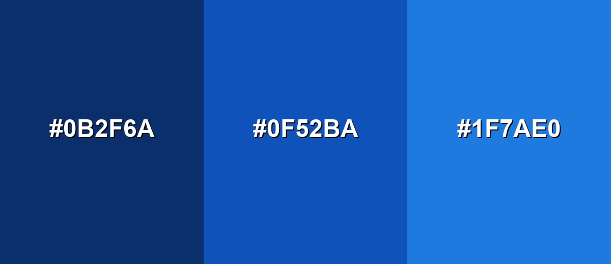
- Midnight Navy: #0B2F6A
- Sapphire Blue: #0F52BA
- Sky Azure: #1F7AE0
Triadic & Tetradic Combinations
A triadic set feels balanced and energetic because the hues are evenly spaced.
Keep sapphire blue dominant, then use leaf green and raspberry as controlled accents for calls-to-action and highlights.
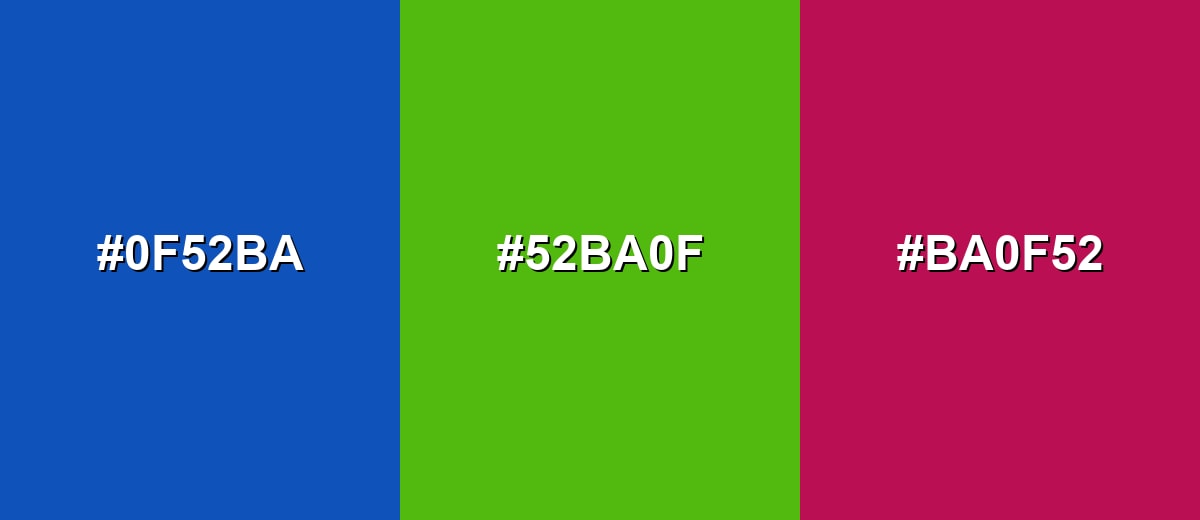
- Sapphire Blue: #0F52BA
- Leaf Green: #52BA0F
- Raspberry: #BA0F52
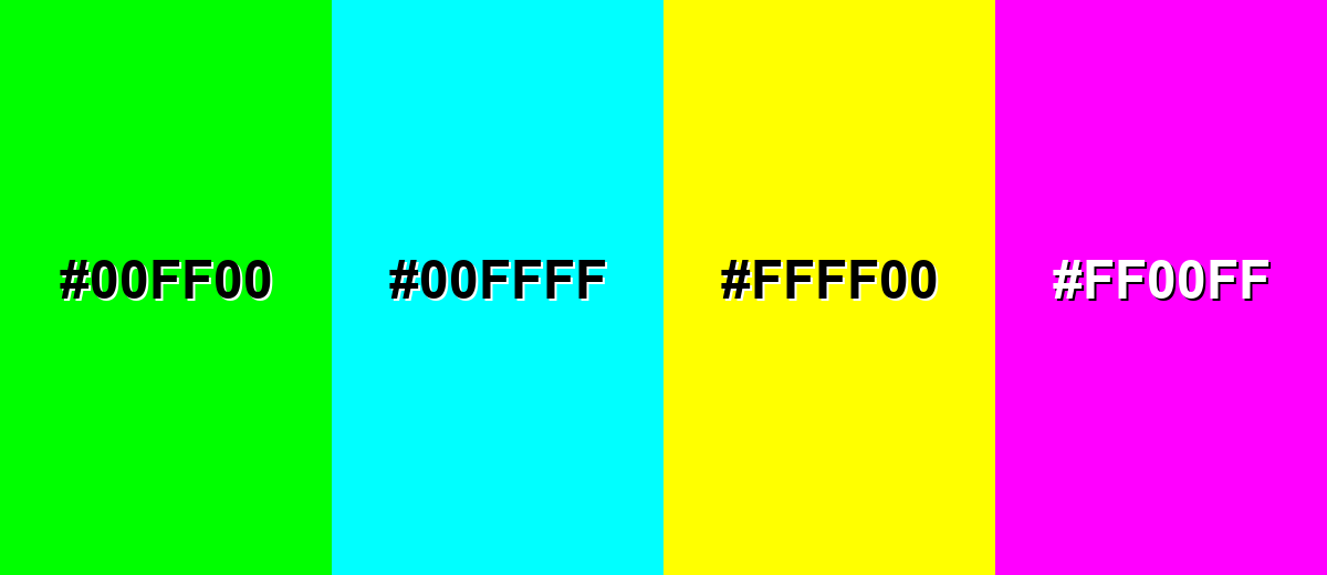
Colors to Avoid
While sapphire blue color is remarkably versatile, certain combinations can create problematic visual effects:
- Neon Lime (#00FF00) - Extremely high saturation competes with sapphire blue and can create harsh visual vibration on screens.
- Electric Cyan (#00FFFF) - The brightness is too close in cool temperature, making sapphire blue look dull and reducing hierarchy.
- Pure Yellow (#FFFF00) - The contrast is intense and attention-grabbing, which can feel noisy in UI and overwhelm refined layouts.
- Hot Magenta (#FF00FF) - Two strong jewel brights together can feel busy and reduce the premium, composed character sapphire blue usually conveys.
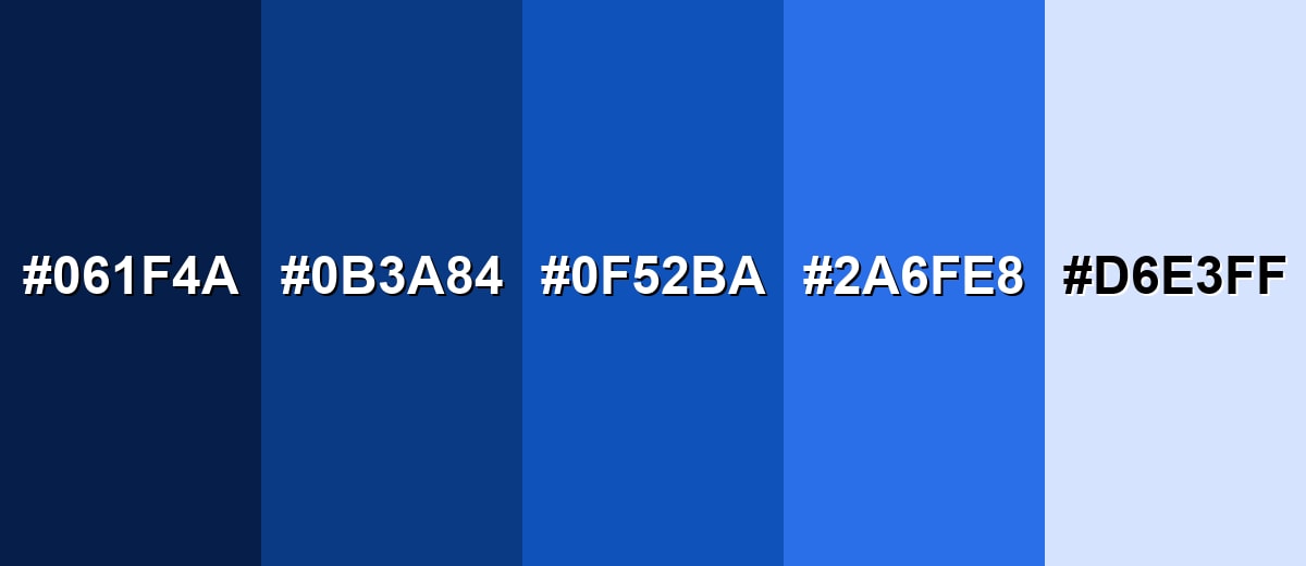
Shades, Tints & Variations of Sapphire Blue Color
From inky near-navy to airy tints, sapphire blue has a surprisingly usable range. These variations help you keep the same "blue identity" while adjusting mood, contrast, and readability across backgrounds, components, and materials.
- Midnight Sapphire (#061F4A) - A very dark, inky version that feels dramatic and grounded. It's best used for Backgrounds, headers, and high-end packaging where you want depth without pure black.
- Deep Sapphire (#0B3A84) - A darker, slightly muted tone that stays rich but feels more reserved. It's best used for Navigation bars, hero sections, and formal branding systems.
- Classic Sapphire (#0F52BA) - The core sapphire blue—bold, jewel-like, and confidently saturated. It's best used for Primary brand color, key UI actions, and statement accents.
- Bright Sapphire (#2A6FE8) - A more luminous take that feels energetic and modern. It's best used for CTAs, highlights, links, and gradients in digital products.
- Pale Sapphire (#D6E3FF) - A soft tint that keeps the hue while adding airiness and space. It's best used for Background fills, cards, charts, and gentle UI states such as hover or selected rows.
Industry Applications
Sapphire blue is flexible enough to fit conservative and creative contexts. It often succeeds where you need a steady tone, clear hierarchy, and a slightly premium finish without feeling overly trendy.
Fashion & Beauty
- Build jewel-toned seasonal palettes around sapphire blue for a richer, more editorial mood.
- Use it in premium packaging designs, especially when combined with metallic finishes.
- Pair it with warm neutrals for product photography that feels polished but approachable.
- Apply sapphire blue as a standout accent in lookbooks to guide attention without overpowering imagery.
Interior Design & Decor
- Use sapphire blue as an accent wall or cabinetry tone to add depth without going pure black.
- Balance it with warm wood, brass, beige textiles, or creamy whites for comfort.
- Choose matte finishes for a softer, modern look; glossy finishes lean more formal and dramatic.
- Bring it in through statement textiles (rugs, drapery, cushions) for a lower-commitment refresh.
Branding & Marketing
- Use sapphire blue as a logo or brand anchor when you want a confident, established impression.
- For technology and SaaS, it works well for navigation, dashboard highlights, and primary actions.
- In finance and fintech, sapphire blue supports trust-forward identity systems and report design.
- For print and packaging, pair with metallic foils for a jewel-box effect—then proof to control darkening.
Conclusion
Sapphire blue stands out for its jewel-like depth and the way it balances confidence with calm. In digital design, it supports strong hierarchy and legible contrast, while in branding it can signal quality and trust without feeling loud. It also pairs easily with warm accents and soft neutrals, making it versatile across modern palettes. If you need a dependable anchor hue, #0f52ba is a practical starting point that stays recognizable across screens and many print workflows. With the right pairings and shades, sapphire blue can elevate interfaces, layouts, and visual systems with a clean, composed finish.
Design Smarter with AI: Media.io is an online AI studio that empowers creators with advanced image generation and enhancement tools. From text-to-image and image-to-image creation to AI upscaling and color optimization, it enables fast, creative, and professional results—all in your browser.

Frequently Asked Questions About Sapphire Blue Color
A widely used hex value for sapphire blue is #0f52ba, which gives a deep, jewel-like blue suited to modern digital design.
It is commonly associated with trust, clarity, and confident stability. It can also feel refined and premium because of its gemstone connection.
Warm accents like burnt orange and copper create bold contrast, while neutrals such as ivory, light gray, and navy keep the look polished. Greens and pink-red accents can also work for lively palettes when used sparingly.
Sapphire blue is typically deeper and more jewel-toned, while royal blue often appears brighter and slightly more electric. Side by side, sapphire reads more refined and less neon.
Yes, it often provides strong contrast with white text and light backgrounds. For best results, avoid using black text on sapphire blue for small type and do not rely on hue alone to show status.
A common CMYK approximation is 92%,56%,0%,27%. Print outcomes vary by paper and press, so a proof is recommended when accuracy is critical.


