

 TL;DR:
Teal (HEX #008080) is a balanced medium blue-green that establishes a calm, modern aesthetic in digital interfaces, provided it is paired with warm accents like coral or terracotta to prevent the layout from feeling overly cold or clinical.
● Maximize typography legibility by using off-white text instead of pure white on teal elements, and avoid placing teal on mid-gray backgrounds or next to pure yellow (#FFEA00) which causes harsh visual vibration.
● Structure UI hierarchy by reserving the standard #008080 for primary actions, utilizing Deep Teal (#004C4C) exclusively for headers, and applying Pale Teal (#B2DFDB) for background panels to minimize visual fatigue.
● Always use a color proof when transitioning teal to CMYK printing workflows, as matte paper stocks will noticeably mute the color while glossy coatings will force it to appear brighter and cooler than intended.
Ask AI for a summary
 ChatGPT
 Perplexity
 Gemini
 Claude
 Grok
Grok
Teal is a medium blue-green that looks like deep ocean water or a rich green-blue dye. The standard teal hex code is #008080, a balanced mix of green and blue with no red.
It is often perceived as calm, refreshing, and quietly confident, sitting between the trust of blue and the renewal of green. This guide covers meaning, codes, combinations, shades, and practical uses.
Teal Color: Codes & Values
Use these standard teal color codes to keep your brand, UI, and print work consistent across tools and formats.
| Parameters | VALUE |
| HEX Code | #008080 |
| RGB DECIMAL | 0, 128, 128 |
| RGB PERCENTAGE | 0%, 50.2%, 50.2% |
| CMYK | 100%,0%,0%,50% |
| HSL | 180°, 100%, 25% |
| HSV (HSB) | 180°, 100%, 50% |
| Web Safe | #009999 |
Key Color Space Explanations:
- HEX - HEX is the most common web format for specifying teal in CSS and design tools, written as a six-digit code. It is ideal for consistent on-screen use across UI, web, and product mockups.
- RGB - RGB mixes red, green, and blue light to create teal on screens. It is useful for digital workflows, animations, and any context where you are working in a light-based system.
- CMYK - CMYK describes the ink mix used in printing teal on paper. Because inks and paper vary, a proof helps keep teal from drifting too blue or too green.
- HSL - HSL expresses teal as hue, saturation, and lightness, which is intuitive for building tints and shades. It is handy for UI theming when you want predictable light/dark variants.
- Web Safe - Web Safe is the closest legacy-safe approximation for older display constraints. It is mainly helpful for compatibility checks, not as a modern requirement.
Start with HEX (#008080) for UI and web, then switch to RGB/HSL when you need precise on-screen tuning or easier light/dark variants.
Want to generate teal color photos or posters? Try Media.io's AI Image Generator now!
Teal Color Conversions
If you're moving between design apps, browsers, and print workflows, these teal conversions help you keep the same visual tone.
| Parameters | VALUE | CSS |
| HEX | #008080 | #008080 |
| RGB DECIMAL | 0, 128, 128 | rgb(0,128,128) |
| RGB PERCENTAGE | 0%, 50.2%, 50.2% | rgb(0%,50.2%,50.2%) |
| CMYK | 100%,0%,0%,50% | cmyk(100%,0%,0%,50%) |
| HSL | 180°, 100%, 25% | hsl(180°, 100%, 25%) |
| HSV (or HSB) | 180°, 100%, 50% | -- |
| Web Safe | 009999 | #009999 |
| CIE-LAB | 48.5, -29.0, -8.8 | -- |
| XYZ | 11.78, 17.24, 23.43 | -- |
| xyY | 0.225, 0.329, 17.2 | -- |
| CIE-LCH | 48.5, 30.3, 196.8° | -- |
| CIE-LUV | 48.5, -37.5, -8.0 | -- |
| Hunter-Lab | 41.5, -20.5, -7.2 | -- |
| Binary | 00000000 10000000 10000000 | -- |
Teal Color Meaning & Symbolism
Teal is widely linked with balance, clarity, and calm confidence. Because it sits between blue and green, it often feels both trustworthy and refreshing in everyday visual communication.
Psychological Effects
Depending on how saturated and dark it is, teal can feel soothing, structured, or cool and clinical.
- Cooler, Cleaner, More Controlled - Teal can make spaces and screens feel cooler, cleaner, and more controlled, which is why it is common in dashboards, wellness visuals, and professional branding.
- Sense of Steadiness - It supports a sense of steadiness without the heaviness of very dark blues.
- Relaxing and Tidy - In interiors, teal often reads as relaxing and tidy, especially when paired with warm neutrals that add comfort.
- Highlight Interactive States - In UI, it can help highlight interactive states like buttons, toggles, and links while still feeling calm.
- Chilly or Distant - If used at full saturation everywhere, teal may feel chilly or distant, and it can reduce a sense of warmth in human-focused content.
Positive Associations
Teal is a flexible "modern calm" color that becomes more human when you balance it with warmth.
- Balance - Teal is widely linked with balance, clarity, and calm confidence.
- Trustworthy and Refreshing - Because it sits between blue and green, it often feels both trustworthy and refreshing in everyday visual communication.
- Freshness - Teal appears across modern design as a sign of freshness and contemporary taste.
- Water and Nature-Inspired Themes - It is often associated with water and nature-inspired themes.
- Calm, Modern Impression - For most audiences, teal works best when you want a calm, modern impression with a hint of energy, especially when paired with warm accents or soft neutrals.
Cultural Significance Across the World
Teal's "meaning" changes quickly based on context, so pairing choices and imagery do a lot of the storytelling.
- Modern Design - Teal appears across modern design as a sign of freshness and contemporary taste.
- Water - It is often associated with water and nature-inspired themes.
- Flexible Symbol - Meanings can vary by context, so it is best treated as a flexible symbol that shifts with typography, imagery, and supporting tones.
- Context - Meanings can vary by context.
Design Applications
Teal is a versatile blue-green that can act as either a main brand tone or a supporting accent, and small choices in contrast and surrounding neutrals change the whole mood.
Graphic Design Tips
- Use teal for primary actions when you want a calm alternative to bright blue, especially in productivity and wellness interfaces.
- Reserve full-strength teal for key elements and use lighter tints for backgrounds, panels, and hover states to reduce visual fatigue.
- Pair teal with a warm accent (coral, amber, terracotta) to keep the brand feeling approachable and human.
- For text on teal, off-white often reads softer than pure white while still staying legible in many layouts.
- Avoid using teal text on mid-gray backgrounds, where contrast can drop quickly and feel washed out.
A few small choices like saturation, contrast, and surrounding neutrals determine whether it feels cozy, clinical, playful, or premium.
Teal Color in Photography & Video
- Check CMYK proofs and adjust if teal turns too blue or too green under your printer profile.
- Matte stocks often mute teal; glossy coatings can make it appear brighter and slightly cooler.
- Use a neutral reference swatch to keep approvals consistent across batches.
- Differentiate states with more than hue alone (icons, underlines, weight changes) so links and statuses remain clear for more users.
- For text on teal, off-white often reads softer than pure white while still staying legible in many layouts.
Recommended Tool for Image Enhancement: When incorporating teal color into your photography projects, Media.io's AI Image tools can help you achieve more refined results. With AI-powered color enhancement, photo colorization, image upscaling, and old photo restoration, you can easily enrich teal color tones, improve overall image quality, and highlight the color's elegant and sophisticated aesthetic.
Color Combinations
Teal pairs easily because it bridges cool and warm moods. Use these teal color palettes as starting points, then adjust lightness to fit your layout and contrast needs.
Complementary Colors
A complementary pairing uses a warm opposite to make teal feel more vibrant and noticeable. This is useful for call-to-action elements, highlights, and visual hierarchy.
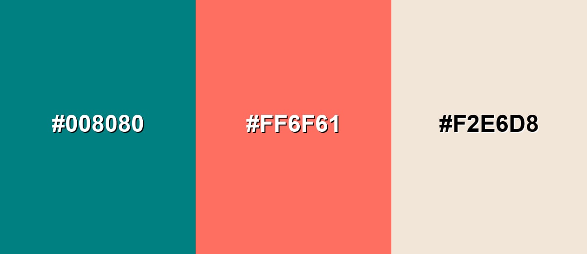
Complementary Palette Example: Pair teal with a coral accent and a soft neutral to keep the contrast bold but still easy to use.
Analogous Color Schemes
Analogous colors sit adjacent to each other on the color wheel, creating harmonious, cohesive palettes with subtle variation.
Ocean-leaning tones stay close to teal for a smooth, modern gradient feel.
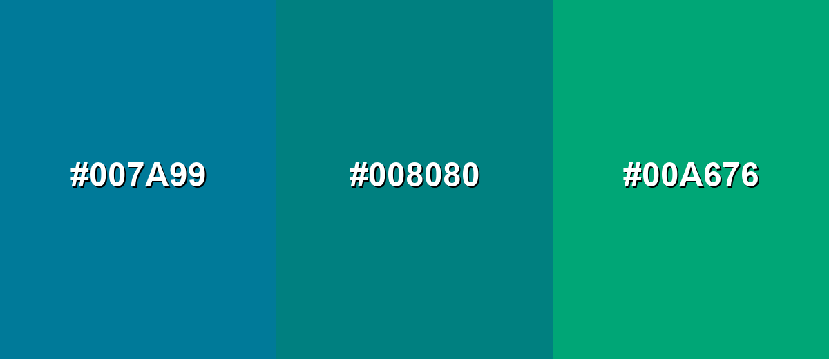
- Deep Cyan: #007A99
- Teal: #008080
- Sea Green: #00A676
A darker blue-green mix adds depth while keeping the palette calm and cohesive.
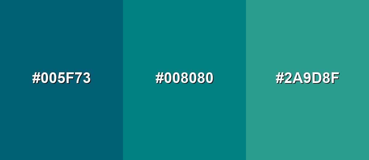
- Deep Teal: #005F73
- Teal: #008080
- Soft Aqua: #2A9D8F
Triadic & Tetradic Combinations
A triadic scheme balances teal with two evenly spaced accents for energetic but controlled contrast.
Use warm yellow for lift and magenta for punch, then keep neutrals simple.
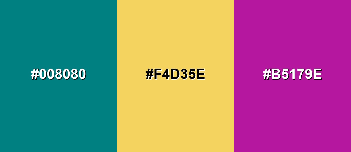
- Teal: #008080
- Golden Yellow: #F4D35E
- Magenta: #B5179E
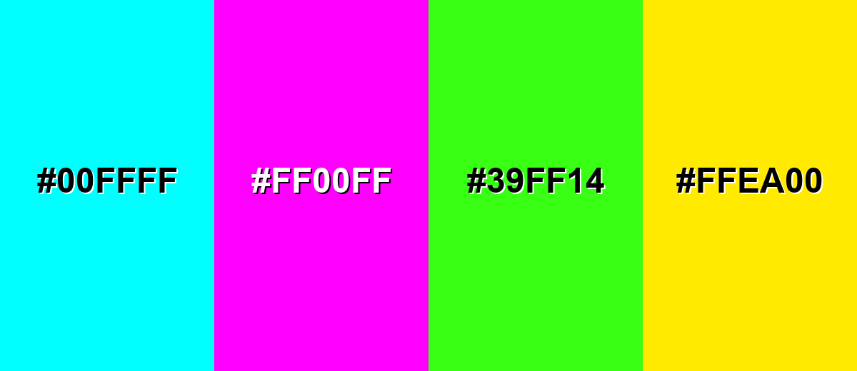
Colors to Avoid
While teal color is remarkably versatile, certain combinations can create problematic visual effects:
- Electric Cyan (#00FFFF) - Too close in hue but far more intense, which can cause a harsh glow effect and make teal look dull by comparison.
- Neon Magenta (#FF00FF) - Creates strong visual vibration next to teal and can feel chaotic in UI and branding.
- Neon Lime (#39FF14) - Overpowers teal and can make layouts look noisy, especially on bright screens.
- Pure Yellow (#FFEA00) - Extremely high brightness next to teal can reduce readability and make accents compete instead of guide attention.
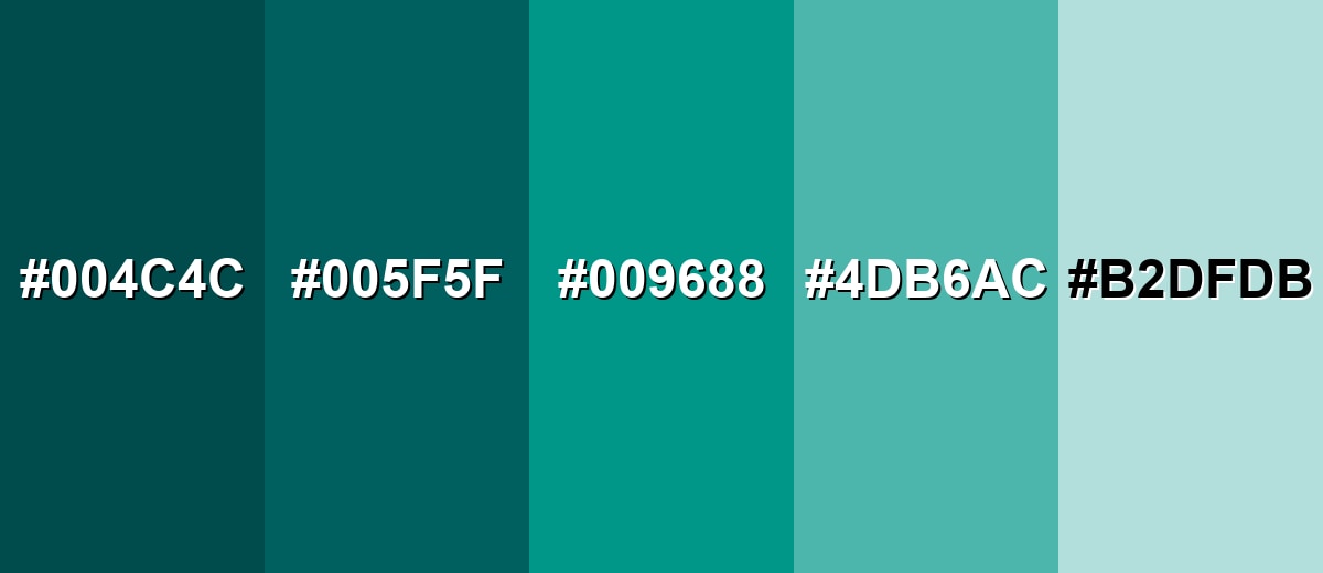
Shades, Tints & Variations of Teal Color
From deep, dramatic tones to airy tints, teal's range makes it easy to build a full palette for UI states, backgrounds, charts, and accents—without losing that clean blue-green identity.
- Deep Teal (#004C4C) - A darker, more dramatic teal with a refined look and strong contrast potential. It's best used for Headers, hero sections, navigation bars, and premium brand accents..
- Dark Teal (#005F5F) - A shadowed teal that keeps the blue-green identity but feels more grounded. It's best used for Textured backgrounds, charts, and UI surfaces where you want depth without pure black..
- Teal Green (#009688) - A slightly greener take that reads fresher and more lively than classic teal. It's best used for Buttons, status indicators, and wellness or eco-leaning visuals..
- Light Teal (#4DB6AC) - A softer, brighter version that stays friendly and airy. It's best used for Secondary UI elements, highlights, illustrations, and gentle backgrounds..
- Pale Teal (#B2DFDB) - A very light tint that feels clean and calm with minimal visual weight. It's best used for Panels, cards, form backgrounds, and spacious interior palettes..
Industry Applications
Teal shows up across industries because it feels modern and composed while still standing out from standard blues. It works especially well when you want clarity, cleanliness, and a calm sense of motion.
Fashion & Beauty
- Apply teal in backgrounds, gradients, and supportive accents, then add a warm accent for approachability.
- It reinforces calm and cleanliness without feeling overly clinical when balanced well.
- Teal can make spaces and screens feel cooler, cleaner, and more controlled.
- For most audiences, teal works best when you want a calm, modern impression with a hint of energy, especially when paired with warm accents or soft neutrals.
Interior Design & Decor
- In bright rooms, deeper teal reads sophisticated and grounded; in dim rooms, consider a lighter teal to avoid a heavy look.
- Combine with natural textures (wood, linen, stone) to add warmth and prevent a cold or overly sleek feel.
- Use teal as an accent wall or upholstery tone, then keep large surfaces neutral for balance.
- Feature teal in textiles, accent furniture, and statement walls, paired with warm woods and soft whites.
Branding & Marketing
- Use teal for primary actions, links, and product highlights, supported by neutral grays and clear typography.
- It reads trustworthy like blue, but feels fresher and less expected, helping interfaces look modern.
- Pair deeper teal with off-whites and muted neutrals for dashboards and data-heavy pages.
- It maintains a professional tone while adding a contemporary edge.
Conclusion
Teal stands out as a blue-green that feels both refreshing and dependable, making it easy to use across modern visual systems. Whether you are building a brand palette, designing an interface, or choosing an interior accent, teal can add calm structure without fading into the background. Its flexibility comes from how well it pairs with warm accents, clean neutrals, and nearby ocean-like hues. If you start with #008080 and adjust lightness for your layout, you can keep the teal color meaning consistent while improving readability and hierarchy. Used thoughtfully, teal delivers a balanced look that stays clear, contemporary, and easy to live with.
Design Smarter with AI: Media.io is an online AI studio that empowers creators with advanced image generation and enhancement tools. From text-to-image and image-to-image creation to AI upscaling and color optimization, it enables fast, creative, and professional results—all in your browser.

Frequently Asked Questions About Teal Color
Teal is a medium blue-green that sits between blue and green on the color wheel. It often resembles deep water and is commonly used to create a calm, modern look.
Teal can lean either way depending on the shade and lighting. Classic teal is balanced, but some versions shift bluer (cooler) while others shift greener (fresher).
Teal pairs well with warm accents like coral, terracotta, and golden yellow, plus neutrals like cream, gray, and warm beige. It also blends smoothly with nearby tones like cyan and sea green.
The complementary direction of teal is a warm red-orange family, often seen as coral or soft red accents. This pairing increases contrast and makes teal look more vivid.
Turquoise is usually lighter and brighter, often leaning more toward cyan, while teal is typically deeper and slightly more muted. In practice, the names overlap, so checking the actual hex or RGB values is the most reliable way to compare.
In digital tools, mix green and blue with little to no red until you reach the shade you want. With paint, start from a blue and add green gradually, then adjust with white to create lighter teal tints.


