

Olive green is a muted yellow-green that looks like the leaves and skin of ripe olives, landing right between earthy green and warm yellow. A common digital reference is #808000.
It's often seen as grounded, natural, and quietly confident, with a practical, utilitarian edge. Below you'll find olive green codes, conversions, color pairings, shade ideas, and real-world ways to use it.
Olive Green Color: Codes & Values
Here are the standard olive green color codes used across web, UI, and print workflows.
| Parameters | VALUE |
| HEX Code | #808000 |
| RGB DECIMAL | 128, 128, 0 |
| RGB PERCENTAGE | 50.2%, 50.2%, 0% |
| CMYK | 0%,0%,100%,50% |
| HSL | 60°, 100%, 25% |
| HSV (HSB) | 60°, 100%, 50% |
| Web Safe | #999900 |
Key Color Space Explanations:
- HEX - HEX is the most common way to specify olive green in web design and UI. Use #808000 for consistent results across modern browsers.
- RGB - RGB defines the on-screen mix of red, green, and blue light. Olive green uses equal red and green with no blue, creating a warm, subdued green.
- CMYK - CMYK is used for print and describes how inks combine on paper. Olive green relies heavily on yellow with added black for its muted, earthy tone.
- HSL - HSL describes hue, saturation, and lightness, which is useful when adjusting tints and shades. Olive green sits around 60° (yellow-green) with low lightness for a deeper look.
- Web Safe - Web safe values approximate a color using a limited legacy palette. The closest web safe match to olive green is #999900.
To use these values, plug HEX/RGB into CSS for screens, and use CMYK for print layouts (always proof before a final run).
Want to generate olive green color photos or posters? Try Media.io's AI Image Generator now!
Olive Green Color Conversions
This conversion chart helps you match olive green accurately across different software, devices, and production formats.
| Parameters | VALUE | CSS |
| HEX | #808000 | #808000 |
| RGB DECIMAL | 128, 128, 0 | rgb(128,128,0) |
| RGB PERCENTAGE | 50.2%, 50.2%, 0% | rgb(50.2%,50.2%,0%) |
| CMYK | 0%,0%,100%,50% | cmyk(0%,0%,100%,50%) |
| HSL | 60°, 100%, 25% | hsl(60°,100%,25%) |
| HSV (or HSB) | 60°, 100%, 50% | -- |
| Web Safe | 999900 | #999900 |
| CIE-LAB | 51.9, -13.0, 56.8 | -- |
| XYZ | 16.56, 19.95, 2.98 | -- |
| xyY | 0.419, 0.505, 19.95 | -- |
| CIE-LCH | 51.9, 58.3, 102.9° | -- |
| CIE-LUV | 51.9, 4.2, 57.0 | -- |
| Hunter-Lab | 44.7, -9.9, 27.0 | -- |
| Binary | 10000000 10000000 00000000 | -- |
Olive Green Meaning & Symbolism
Olive green is commonly linked with nature, endurance, and a calm sense of realism. It feels less decorative than brighter greens, so it often communicates practicality and steady reliability in everyday choices, from clothing to product design. When people search for olive green color meaning, they are usually looking for a tone that feels grounded rather than flashy.
Psychological Effects
Because it's muted, olive green tends to calm a design instead of energizing it.
- Grounding - Olive green can make a layout feel settled and steady, especially in content-heavy pages.
- Lower Visual Noise - Its subdued saturation helps reduce distraction in dashboards, forms, and long reads.
- Quiet Confidence - It communicates reliability without the “look at me” effect of brighter greens.
- Serious Tone - Used heavily, it can feel strict or utilitarian, so balance it with lighter surfaces.
- Heaviness Risk - In low light or ultra-matte finishes, olive can read muddy and make spaces feel smaller.
Positive Associations
Olive green is a practical color with a warm, organic personality.
- Nature - It mirrors leaves, plants, and natural pigments for an outdoorsy, authentic feel.
- Endurance - Often tied to durability and long-lasting materials, making it feel dependable.
- Calm - Works as a soothing alternative to bright greens that can feel “loud” on screen.
- Stability - Suggests structure and restraint, which can support trust-focused messaging.
- Harmony - Connects subtly to peace symbolism through the olive branch association.
Cultural Significance Across the World
Context matters: olive green can read peaceful, practical, or uniform-like depending on where and how it's used.
- Peace Symbolism - Olive branches are widely recognized as a sign of peace and reconciliation.
- Utility & Function - Common in outdoor gear and workwear, reinforcing a “made to last” impression.
- Uniform Associations - In some contexts, it can feel military-adjacent, signaling readiness and discipline.
- Earthy Heritage - Often used in heritage and craft aesthetics to suggest tradition and realism.
Design Applications
Olive green is easy to live with in design because it behaves like a near-neutral with character. It supports natural themes, heritage aesthetics, and modern minimal layouts when the surrounding palette is kept clean and intentional.
Graphic Design Tips
- Use olive green for secondary accents (navigation, tags, dividers) instead of your main CTA color.
- Pair it with off-white backgrounds to keep the page feeling light and modern.
- In branding, balance it with one brighter counter-tone so the system doesn't feel flat.
- For print, request a proof—CMYK mixes can shift olive toward brown or gray on different stocks.
- Test contrast early: olive green darkens quickly and may fail for small text on mid-tone surfaces.
Pro tip: Treat olive green like a “workhorse neutral.” Give it a clear role (accent, background, or label color), then build hierarchy with whitespace and one clean highlight color rather than piling on more earthy tones.
Olive Green in Photography & Video
- In outdoor scenes, olive green helps reinforce a natural mood without the artificial pop of neon greens.
- For product shots, olive backdrops work well with matte textures, kraft packaging, and warm lighting.
- In color grading, olive tones can add a cinematic, grounded look—especially in lifestyle footage.
- When skin tones are present, keep olive accents slightly desaturated to avoid a sallow cast.
- Use olive sparingly in overlays; add enough brightness contrast so text and icons stay readable.
Recommended Tool for Image Enhancement: When incorporating olive green into your photography projects, Media.io's AI Image tools can help you achieve more refined results. With AI-powered color enhancement, photo colorization, image upscaling, and old photo restoration, you can easily enrich olive green tones, improve overall image quality, and highlight the color's elegant and sophisticated aesthetic.
Color Combinations
Olive green has a built-in earthiness, so it pairs best with deep blues, warm neutrals, and softened warm accents. The palettes below show practical directions you can use for websites, branding systems, illustrations, and interiors.
Complementary Colors
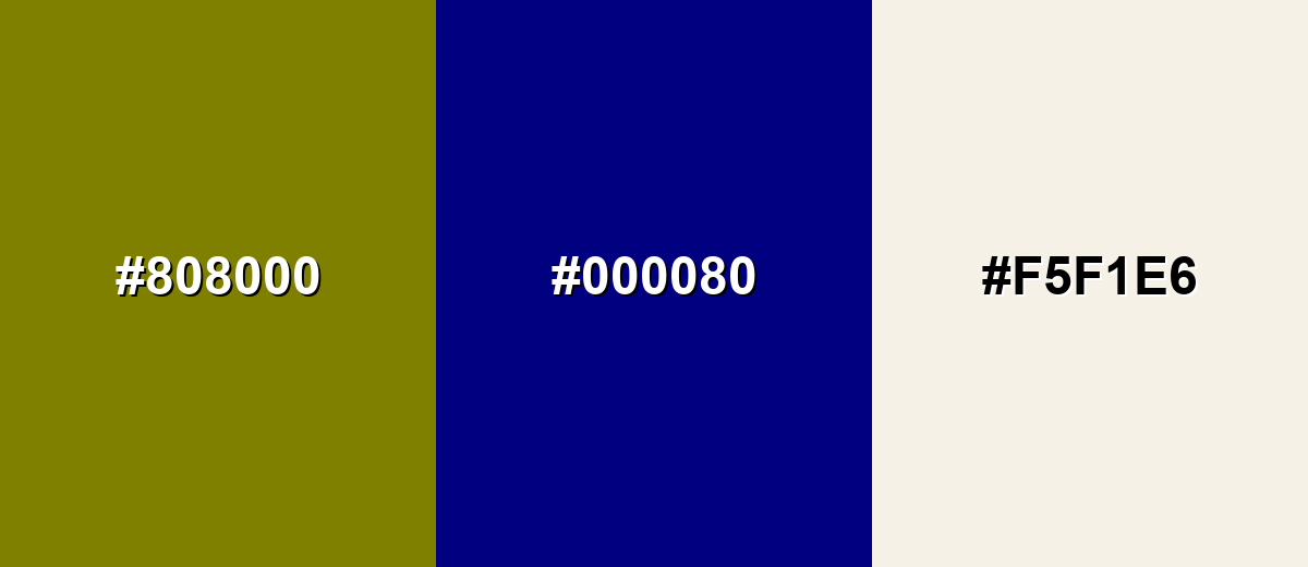
A complementary pairing places olive green against a blue family opposite on the color wheel, creating crisp contrast without looking harsh. This is a reliable approach for UI accents and hero sections because each side feels distinct.
Complementary Palette Example: Combine olive green with a deep navy and a soft off-white to keep the contrast clean and readable.
Analogous Color Schemes
Analogous colors sit adjacent to each other on the color wheel, creating harmonious, cohesive palettes with subtle variation.
For a warm, natural look, blend olive green with nearby yellow-olive and deeper moss tones.
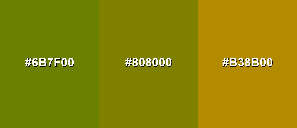
- Moss Green: #6B7F00
- Olive Green: #808000
- Golden Ochre: #B38B00
For calmer palettes, pair olive green with forest green and a light khaki to soften the overall feel.
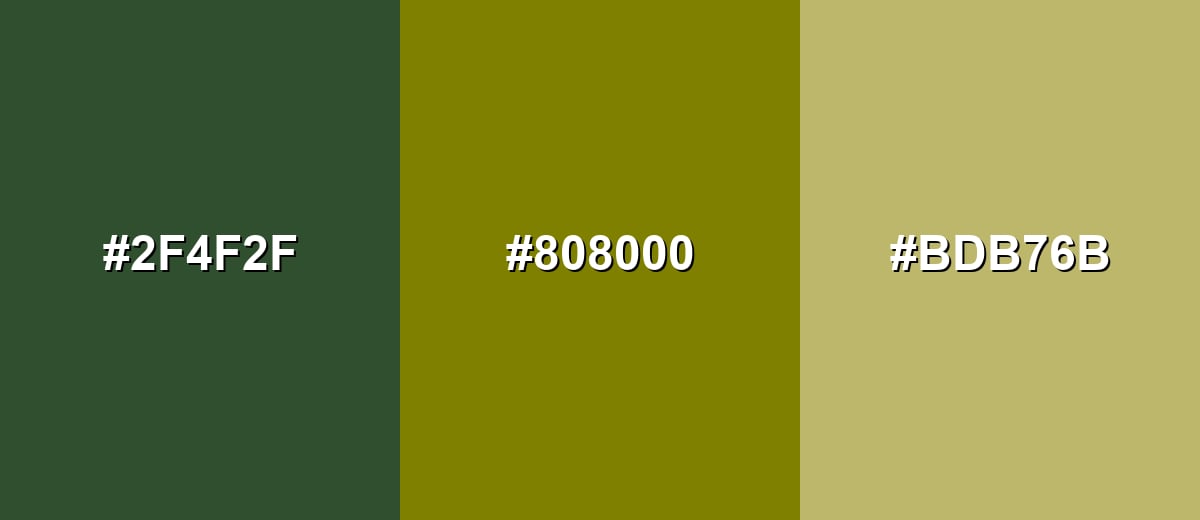
- Deep Forest: #2F4F2F
- Olive Green: #808000
- Khaki: #BDB76B
Triadic & Tetradic Combinations
A triadic scheme spreads hues evenly for energetic balance while keeping each tone distinct.
Olive green, teal, and purple make a bold trio for illustrations, sports-style branding, or accent-heavy UI sections.
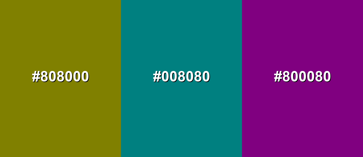
- Olive Green: #808000
- Teal: #008080
- Purple: #800080
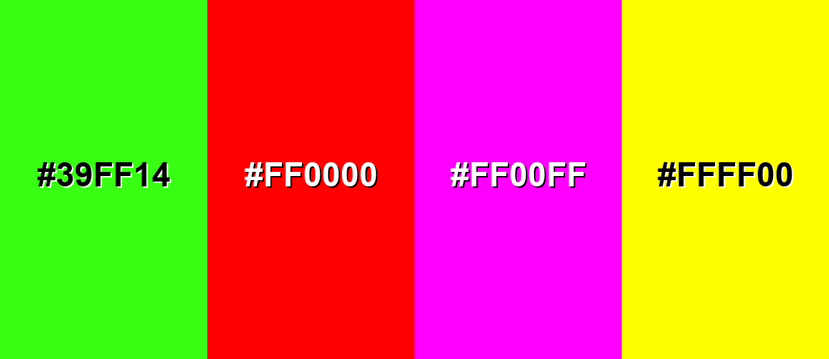
Colors to Avoid
While olive green is remarkably versatile, certain combinations can create problematic visual effects:
- Neon Green (#39FF14) - The neon intensity overwhelms olive green and makes the palette feel unbalanced and hard to look at for long.
- Pure Red (#FF0000) - Red can create a stop-and-go effect that fights olive green and may read as seasonal or overly aggressive in UI.
- Hot Magenta (#FF00FF) - Highly saturated magenta competes for attention and can make olive green appear muddy by comparison.
- Pure Yellow (#FFFF00) - Bright yellow pushes the palette toward glare and can reduce legibility, especially when used near olive green text or icons.
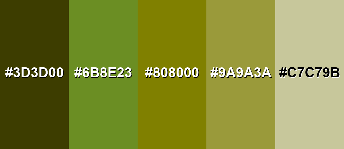
Shades, Tints & Variations of Olive Green
Olive green has a surprisingly flexible range—from deep, rugged dark olives to pale, airy tints that behave almost like warm neutrals. Using these variations makes it easier to build hierarchy (backgrounds, surfaces, accents, and text) without leaving the same color family.
- Dark Olive (#3D3D00) - A deeper, more subdued olive that feels rugged and earthy. It's best used for Headers, footers, overlays, and backgrounds where you want a strong, grounded base.
- Olive Drab (#6B8E23) - A greener, slightly livelier olive with a classic outdoors vibe. It's best used for Product surfaces, icons, badges, and nature-focused branding palettes.
- Classic Olive (#808000) - The well-known olive reference that sits between green and yellow. It's best used for Primary brand tone, navigation accents, and balanced palettes with neutrals.
- Soft Olive (#9A9A3A) - A lighter, friendlier olive that keeps warmth without looking too bright. It's best used for Secondary backgrounds, cards, infographics, and gentle section highlights.
- Pale Olive (#C7C79B) - A muted, airy olive tint that reads almost like a warm neutral. It's best used for Large background areas, subtle panels, and calming interior palettes.
Industry Applications
Because olive green feels both natural and practical, it shows up across industries that want to project durability, sustainability, or quiet confidence. It is especially effective when you need a mature palette that does not rely on high saturation.
Fashion & Beauty
- Use olive green in outdoor-inspired apparel lines to signal durability and everyday wearability.
- For wellness and personal care packaging, olive can feel calm and grounded without looking overly sweet.
- Pair olive tones with simple typography for a clean, ingredient-forward label style.
- In product UI (shade selectors, badges), olive works well for “natural,” “botanical,” or “earth-friendly” callouts.
Interior Design & Decor
- Olive green works as a timeless base for cabinetry, feature walls, textiles, and ceramics.
- Choose satin or eggshell finishes in dim rooms to keep olive from looking flat or muddy.
- Use pale olive-like tints for large surfaces when you want warmth without heavy color.
- Style olive decor with warm neutrals to keep the space cozy and lived-in.
Branding & Marketing
- For food and beverage, olive green supports organic, savory, artisanal positioning (especially on uncoated stocks).
- In tech and SaaS, it makes a steady secondary accent for dashboards, filters, and status chips.
- Balance olive-heavy palettes with one clean counter-accent to avoid a dated or overly military vibe.
- In packaging, proof CMYK carefully—added black can shift olive toward brown or gray if not controlled.
Conclusion
Olive green stands out for its muted balance between warm yellow and earthy green, which makes it feel natural, dependable, and easy to pair. With #808000 as a solid starting point, you can build modern palettes by adding deep blues for contrast or warm neutrals for a softer, organic look—then refine the mood using darker olives for depth and pale olives for breathing room. Whether you're designing a brand system, polishing a UI, printing packaging, or styling a space, olive green works best when you manage contrast carefully and give it a clear role in your hierarchy.
Design Smarter with AI: Media.io is an online AI studio that empowers creators with advanced image generation and enhancement tools. From text-to-image and image-to-image creation to AI upscaling and color optimization, it enables fast, creative, and professional results—all in your browser.

Frequently Asked Questions About Olive Green Color
Quick answers to the most common questions about olive green, from color codes to pairing advice.
Olive green is a muted yellow-green that resembles olive leaves and the skin of olives. It looks earthy and slightly brown-leaning compared with brighter, fresher greens.
A widely used hex reference for olive green is #808000. Some palettes also use nearby variants like olive drab for a greener look.
Olive green usually reads warm because it contains a strong yellow component. However, darker or grayer olives can feel cooler, especially next to warm creams and browns.
Deep navy, off-white, khaki, forest green, and warm browns pair well with olive green. For bolder palettes, teal and purple can add lively contrast without clashing.
Yes, it works well as a secondary accent, navigation highlight, or subtle background. The key is to keep plenty of whitespace and verify text contrast for accessibility.
Olive is typically the classic yellow-green reference, while olive drab is greener and often a bit darker or more muted. Olive drab can feel more outdoorsy and utilitarian.


