

Light turquoise color is a pale blue-green that looks like sunlit tropical water—cool, bright, and slightly minty in real life.
Its defining hex code is #7ee6e3, a balanced mix of blue and green with a light, airy finish that feels calming, clean, and friendly across modern visuals.
Light Turquoise Color: Codes & Values
If you want consistent light turquoise across screens and print, start with the core values below and build your palette from there.
| Parameters | VALUE |
| HEX Code | #7EE6E3 |
| RGB DECIMAL | 126, 230, 227 |
| RGB PERCENTAGE | 49.4%, 90.2%, 89.0% |
| CMYK | 45%,0%,1%,10% |
| HSL | 178°, 68%, 70% |
| HSV (HSB) | 178°, 45%, 90% |
| Web Safe | #66FFCC |
Key Color Space Explanations:
- HEX - HEX is the most common way to specify a digital shade in web and UI work. Use #7ee6e3 to get this exact light turquoise on screens.
- RGB - RGB mixes red, green, and blue light for displays. This shade uses a high green/blue level with moderate red, which keeps it bright but cool.
- CMYK - CMYK is used for printing with ink percentages. The low magenta and yellow values help keep it clean, while a small amount of black prevents it from looking washed out.
- HSL - HSL describes hue, saturation, and lightness in a way that is easy to tweak for palettes. Raising lightness gives a more airy tint; lowering it shifts toward teal.
- Web Safe - Web-safe values are an older standard based on a limited set of display colors. #66ffcc is the closest web-safe match if you need that constraint.
Use HEX for most web work, RGB/HSL when you're fine-tuning UI tones, and CMYK when you're preparing print files that need reliable proofs.
Light Turquoise Color Conversions
Here are the most common light turquoise conversions for design tools, CSS, and print workflows.
| Parameters | VALUE | CSS |
| HEX | #7ee6e3 | #7ee6e3 |
| RGB DECIMAL | 126, 230, 227 | rgb(126,230,227) |
| RGB PERCENTAGE | 49.4%, 90.2%, 89.0% | rgb(49.4%,90.2%,89.0%) |
| CMYK | 45%,0%,1%,10% | cmyk(45%,0%,1%,10%) |
| HSL | 178°, 68%, 70% | hsl(178°, 68%, 70%) |
| HSV (or HSB) | 178°, 45%, 90% | -- |
| Web Safe | 66ffcc | #66ffcc |
| CIE-LAB | 85.3, -30.5, -7.8 | -- |
| XYZ | 50.84, 66.69, 83.05 | -- |
| xyY | 0.253, 0.332, 66.69 | -- |
| CIE-LCH | 85.3, 31.5, 194.3 | -- |
| CIE-LUV | 85.3, -45.9, -7.5 | -- |
| Hunter-Lab | 81.6, -28.4, -8.2 | -- |
| Binary | 011111101110011011100011 | -- |
Want to generate Light Turquoise Color photos or posters? Try Media.io's AI Image Generator now!
Light Turquoise Color Meaning & Symbolism
Light turquoise is widely linked with freshness, clarity, and a calm, open feeling—like clean water and clear skies blended together. In everyday visuals, it often signals a soothing, tidy, and approachable vibe, which is why Light Turquoise Color meaning is commonly described as peaceful but upbeat.
Psychological Effects
This shade typically relaxes the eye while keeping layouts feeling bright and modern.
- Calm Focus - Helps reduce visual tension, making screens feel easier to scan.
- Breathable Space - Adds "air" to layouts, especially in dashboards, cards, and onboarding flows.
- Clean Impression - Supports a tidy, hygienic feel that works well for service and product UI.
- Friendly Tone - Comes across approachable rather than intense, so it's less likely to overwhelm.
- Cool Balance - Can feel slightly clinical if overused, so pairing with warm neutrals often improves comfort.
Positive Associations
Designers often use light turquoise when they want a fresh, trustworthy mood without loud saturation.
- Freshness - Echoes water-inspired clarity, ideal for "new" and "clean" messaging.
- Wellbeing - Fits wellness and self-care visuals that aim to feel soothing and simple.
- Clarity - Suggests organization and straightforwardness in information-heavy layouts.
- Modernity - Reads current and polished, especially when paired with crisp white or soft gray.
- Reassurance - Communicates care and gentleness, helpful for sensitive topics and services.
Cultural Significance Across the World
Turquoise has long been valued as a decorative stone and pigment, and lighter versions now lean heavily into wellness and water themes.
- Protection - Historically associated with protective symbolism through turquoise gemstones in multiple traditions.
- Renewal - Often connected to refreshment and a "new start" feeling, especially in nature-linked visuals.
- Water & Sky - Commonly used to evoke oceans and open skies in travel and lifestyle design.
- Wellbeing - In modern branding, it frequently signals cleanliness, care, and simplicity over formal symbolism.
Design Applications
Light turquoise is easiest to work with when you treat it like a bright, soft base and build contrast intentionally—either as a background wash, a highlight, or a supportive accent.
Graphic Design Tips
- Use it as a soft background for hero sections to make content feel light and welcoming.
- Pair it with crisp neutrals so typography and icons stay sharp and easy to read.
- Save deeper tones for CTAs and headings to keep a clear visual hierarchy.
- In charts, use light turquoise for secondary series or "success/positive" groupings, then increase contrast for key data.
- For print, proof in CMYK—on uncoated paper it can appear more muted than on screen.
Pro tip: if light turquoise is your main surface color, add a warm accent (like a soft coral) in small doses to prevent the overall look from feeling too cool or clinical.
Light Turquoise Color in Photography & Video
- Use light turquoise props or backdrops to create a clean, spa-like mood in product shots.
- Boost contrast carefully—over-saturating can push the tone toward neon and lose the "watery" softness.
- Balance skin tones with warm highlights so portraits don't look overly cool.
- In travel content, it's perfect for ocean/pool scenes; keep whites slightly warm to maintain a natural feel.
- For motion graphics, light turquoise works well in gradients with nearby blue-greens for smooth transitions.
Recommended Tool for Image Enhancement: When incorporating light turquoise color into your photography projects, Media.io's AI Image tools can help you achieve more refined results. With AI-powered color enhancement, photo colorization, image upscaling, and old photo restoration, you can easily enrich light turquoise color tones, improve overall image quality, and highlight the color's elegant and sophisticated aesthetic.
Color Combinations
Light turquoise pairs best with warm contrasts, soft neighbors, or balanced multi-color schemes that keep it looking clean. Use the palettes below as starting points, then adjust lightness to fit your layout and contrast needs.
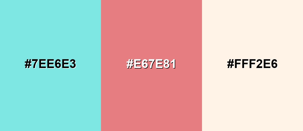
Complementary Colors
A warm coral accent balances the cool blue-green base, creating clear visual contrast without looking harsh. A light neutral helps the palette stay airy and usable across backgrounds.
Complementary Palette Example: Try Light Turquoise with Soft Coral and Warm Ivory for a fresh, friendly mix.
Analogous Color Schemes
Analogous colors sit adjacent to each other on the color wheel, creating harmonious, cohesive palettes with subtle variation.
Keep it calm with Aqua Mint, Light Turquoise, and Soft Cyan for smooth gradients and gentle sectioning.
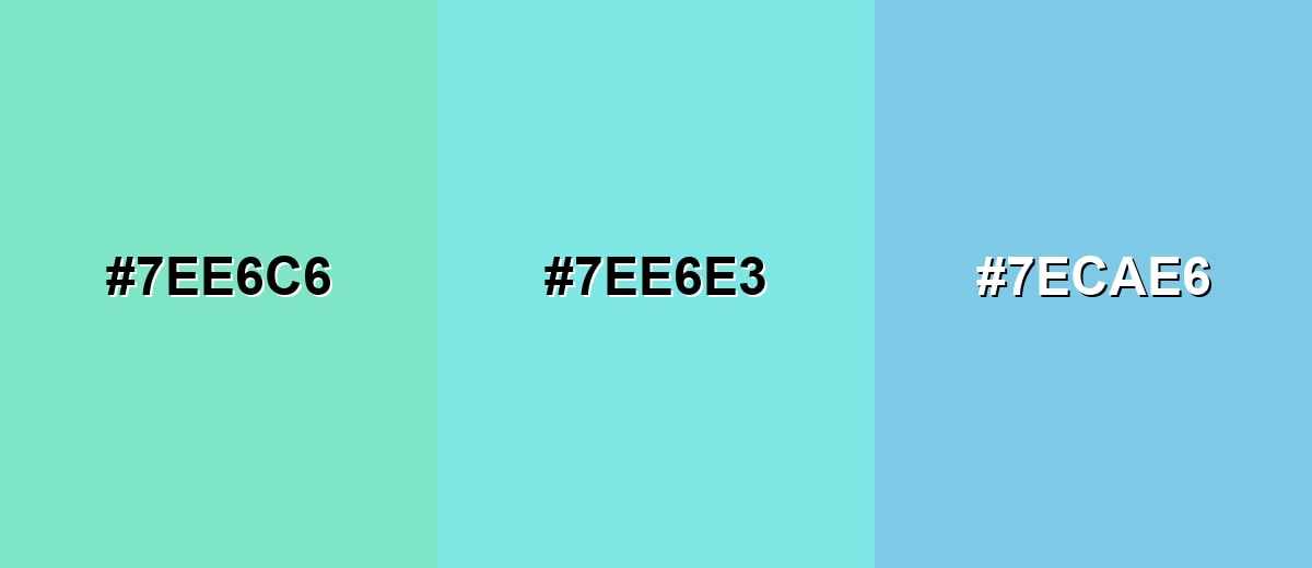
- Aqua Mint: #7EE6C6
- Light Turquoise: #7EE6E3
- Soft Cyan: #7ECAE6
For a fresher, greener feel, combine Mint Glow, Light Turquoise, and Airy Sky to stay bright but not neon.
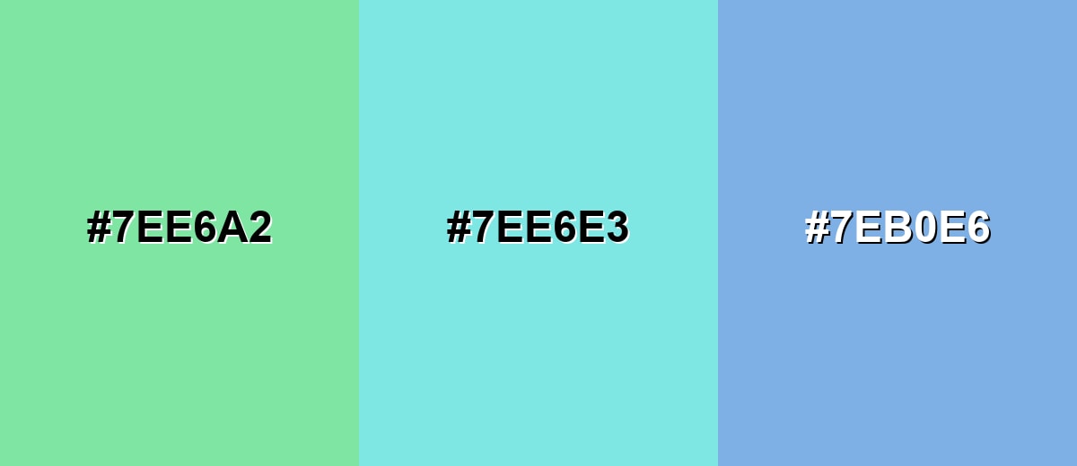
- Mint Glow: #7EE6A2
- Light Turquoise: #7EE6E3
- Airy Sky: #7EB0E6
Triadic & Tetradic Combinations
A triadic palette adds variety while keeping balance across warm and cool tones.
Use Light Turquoise with Lavender Bloom and Soft Lemon for playful, modern layouts that still feel light.
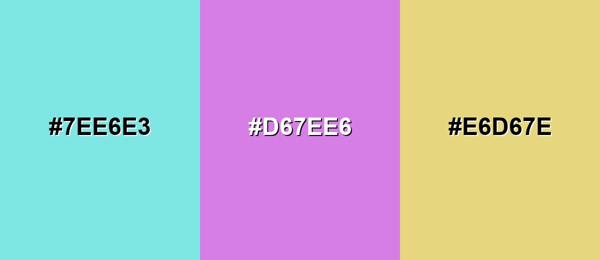
- Light Turquoise: #7EE6E3
- Lavender Bloom: #D67EE6
- Soft Lemon: #E6D67E
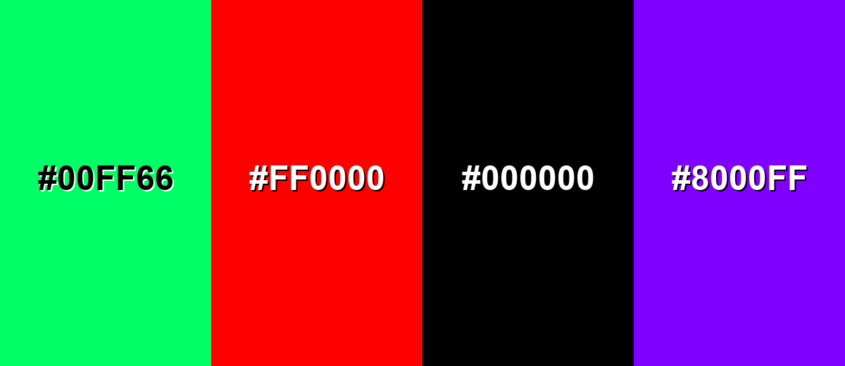
Colors to Avoid
While light turquoise color is remarkably versatile, certain combinations can create problematic visual effects:
- Neon Green (#00FF66) - The high intensity can overpower light turquoise and make layouts feel flashy instead of clean.
- Pure Red (#FF0000) - The contrast is extremely aggressive and can create visual vibration next to a light blue-green.
- Pure Black (#000000) - It can look too stark and heavy, making the overall palette feel abrupt rather than airy.
- Electric Purple (#8000FF) - Highly saturated purple can clash with this soft tone and steal attention from key UI elements.
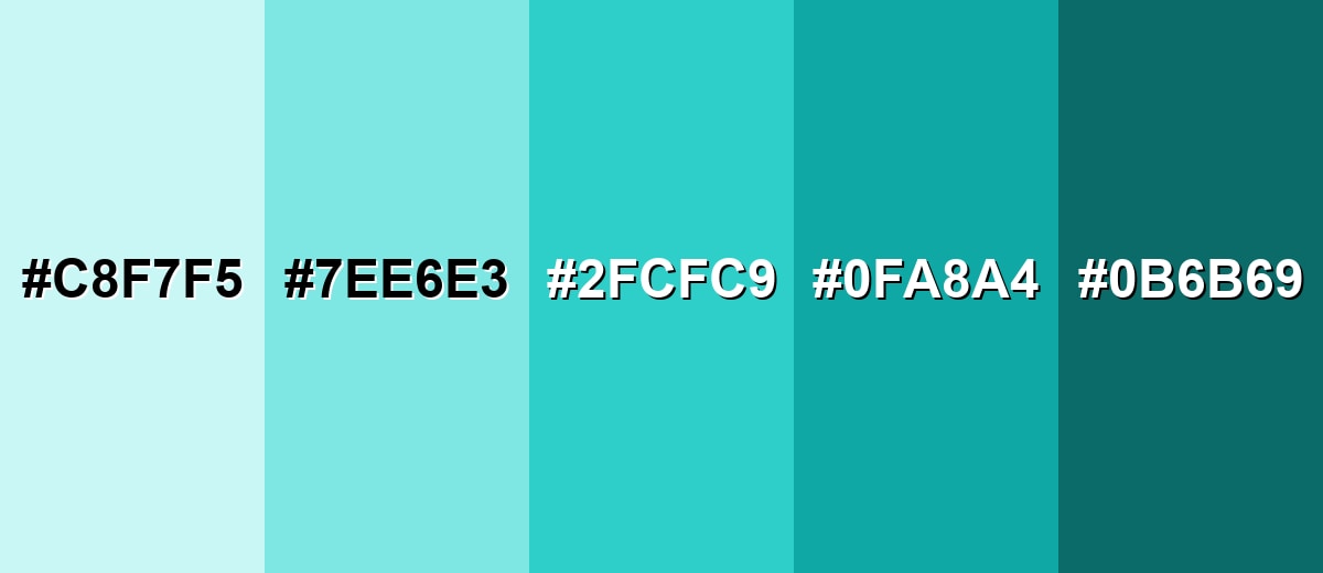
Shades, Tints & Variations of Light Turquoise Color
Light turquoise has a useful range—from icy, barely-there tints to deeper teal-leaning shades that add contrast. Mixing these variations helps you create hierarchy (backgrounds, surfaces, accents, and text) while keeping the overall look cohesive.
- Pale Turquoise (#C8F7F5) - A very light tint that feels almost icy and works as a gentle background. It's best used for Large page sections, subtle cards, soft gradients.
- Light Turquoise (#7EE6E3) - The main shade: bright, watery, and clean with a balanced blue-green look. It's best used for Highlights, brand support color, friendly UI surfaces.
- Bright Turquoise (#2FCFC9) - A more saturated version that reads bolder while staying fresh. It's best used for Icons, active states, small accents that need more punch.
- Deep Turquoise (#0FA8A4) - Darker and calmer, bringing more depth and stronger contrast. It's best used for Headers, buttons, data visualization emphasis.
- Dark Teal (#0B6B69) - A grounded, muted teal that pairs naturally with the lighter tones. It's best used for Text on light turquoise, navigation, high-contrast UI elements.
Industry Applications
This shade shows up across industries that benefit from a clean, calming, and modern look, helping designs feel fresh and clear without the intensity of neon accents.
Fashion & Beauty
- Skincare & Hydration Lines - Supports "fresh" and "clean" cues for cleansing and sensitive-skin messaging.
- Wellness Branding - Works as a calming support color for self-care visuals that feel approachable.
- Product Photography Styling - Adds an airy, water-inspired backdrop that keeps packaging looking bright.
- Soft Accent Systems - Pairs well with warm accents to create energy without losing a gentle tone.
Interior Design & Decor
- Space-Opening Walls - Reflects light easily, helping rooms feel larger and brighter.
- Textiles & Accessories - Great for pillows, throws, and ceramics when you want a clean pop of color.
- Natural Materials Pairing - Looks especially balanced with warm woods, stone-like neutrals, and soft whites.
- Depth via Teal Accents - Combine with deeper teal-like shades for definition in trim, cabinetry, or feature pieces.
Branding & Marketing
- Tech & SaaS UI - Useful for onboarding surfaces, empty states, and friendly dashboard backgrounds.
- Healthcare & Clinics - Creates a gentle, reassuring tone for informational pages and supportive UI.
- Travel & Hospitality - Fits beach/pool themes and airy promotional layouts that feel refreshing.
- Education & Kids Products - Reads playful and friendly when paired with soft, warm accents.
Conclusion
Light turquoise stands out for its bright, watery blue-green look that feels clean, calm, and easy to trust in modern design. With #7EE6E3 as a solid reference, you can use it as a soft UI surface, a brand support color, or an interior accent—then shape the mood with smart pairings: warm complements for energy, analogous neighbors for smooth harmony, and deeper teal variations for readable contrast. Keep hierarchy and accessibility in mind, and light turquoise becomes a versatile choice for polished, user-friendly visuals across digital, print, and real-world spaces.
Design Smarter with AI: Media.io is an online AI studio that empowers creators with advanced image generation and enhancement tools. From text-to-image and image-to-image creation to AI upscaling and color optimization, it enables fast, creative, and professional results—all in your browser.

Frequently Asked Questions About Light Turquoise Color
It is a pale blue-green with a watery, airy appearance. It often resembles clear tropical water or a soft minty cyan on screen.
A commonly used digital value for this shade is #7ee6e3. It produces a bright, light blue-green that stays soft rather than neon.
It is often associated with freshness, clarity, and calm. In visual communication, it can support clean, friendly, and wellness-oriented messages when paired with good contrast.
Warm accents like soft coral, light neutrals like warm ivory, and gentle neighbors like aqua mint or soft cyan pair smoothly. For multi-accent systems, triadic or tetradic palettes can add variety without losing balance.
Light turquoise typically sits between blue and green but stays lighter and softer than teal. Aqua often leans more toward cyan, while teal is usually darker and more muted.
Yes, it can work well for backgrounds because it feels light and clean, but readability depends on contrast. Use dark text, avoid thin low-contrast UI lines, and test contrast for small type and icons.


