

Sea green color is a medium green with a soft blue undertone, similar to clear coastal water. Its most common digital reference is hex #2E8B57.
Many people perceive it as refreshing, steady, and naturally calming. The name comes from nature-inspired descriptions, and the shade can read greener or bluer depending on lighting and nearby tones—this guide covers meaning, codes, combinations, shades, and practical uses.
Sea Green Color: Codes & Values
If you want sea green to look consistent across web, UI, and print workflows, start with these standard values.
| Parameters | VALUE |
| HEX Code | #2E8B57 |
| RGB DECIMAL | 46, 139, 87 |
| RGB PERCENTAGE | 18.0%, 54.5%, 34.1% |
| CMYK | 67%,0%,37%,46% |
| HSL | 147°, 50%, 36% |
| HSV (HSB) | 147°, 67%, 55% |
| Web Safe | #339966 |
Key Color Space Explanations:
- HEX - HEX is the most common way to specify sea green in web and UI design. It ensures consistent display across apps and browsers when color management is standard.
- RGB - RGB defines the red, green, and blue light values used on screens. It is helpful for digital design workflows, CSS, and motion graphics.
- CMYK - CMYK is used for ink-based printing and packaging. Values can vary by paper and press, so proofing is recommended for accurate results.
- HSL - HSL describes hue, saturation, and lightness in a way that is easy to adjust. It is practical for building tints, shades, and theme variants.
- Web Safe - Web safe is the closest legacy palette match intended for older displays. It is mainly useful when you need a simplified, highly compatible fallback.
For most design tasks, using HEX (#2E8B57) or RGB (46, 139, 87) will keep sea green consistent in apps, CSS, and exports—then convert to CMYK when you're heading to print.
Sea Green Color Conversions
Need sea green in a different color model? Use the conversion table below to copy the right value for your tool or pipeline.
| Parameters | VALUE | CSS |
| HEX | #2e8b57 | #2e8b57 |
| RGB DECIMAL | 46, 139, 87 | rgb(46,139,87) |
| RGB PERCENTAGE | 18.0%, 54.5%, 34.1% | rgb(18.0%,54.5%,34.1%) |
| CMYK | 67%,0%,37%,46% | cmyk(67%,0%,37%,46%) |
| HSL | 147°, 50%, 36% | hsl(147°, 50%, 36%) |
| HSV (or HSB) | 147°, 67%, 55% | -- |
| Web Safe | 339966 | #339966 |
| CIE-LAB | 51.7, -41.0, 20.4 | -- |
| XYZ | 12.08, 19.72, 12.20 | -- |
| xyY | 0.275, 0.448, 19.72 | -- |
| CIE-LCH | 51.7, 45.8, 153.5° | -- |
| CIE-LUV | 51.7, -38.7, 31.6 | -- |
| Hunter-Lab | 44.4, -27.7, 13.4 | -- |
| Binary | 00101110 10001011 01010111 | -- |
Want to generate Sea Green Color photos or posters? Try Media.io's AI Image Generator now!
Sea Green Color Meaning & Symbolism
Sea green is commonly linked with renewal, balance, and a sense of clean air and water. In everyday life, it often reads as grounded but uplifting, making it a popular choice for spaces and brands that want to feel calm and modern. This practical Sea Green Color meaning comes from its mix of green's natural stability and blue's clarity.
Psychological Effects
Because it sits between green and blue, sea green can shape how a design feels at first glance.
- Relaxed Mood - It supports a steady, calm atmosphere, which can make pages and screens feel easier to scan.
- Composed Energy - Compared with brighter greens, it feels less "hyper," helping designs look more balanced and controlled.
- Fresh Cleanliness - With white or soft neutrals, it often reads crisp and clean, which fits product visuals and dashboards.
- Trustworthy Tone - The blend of green stability and blue clarity can feel quietly confident without being overly formal.
- Coolness Risk - If the palette is too muted, sea green can feel distant; warmer accents help avoid a clinical vibe.
Positive Associations
In day-to-day design language, sea green is often chosen for cues that feel natural, clear, and reassuring.
- Renewal - It's commonly used to suggest a reset, recovery, or "fresh start" moment.
- Balance - As a bridge between warm and cool palettes, it helps compositions feel centered and stable.
- Nature & Water - It quickly signals coastal, botanical, and eco-friendly themes without going loud.
- Calm Confidence - It can communicate credibility in a softer way than very dark greens.
- Modern Clarity - Sea green pairs cleanly with minimal typography and simple layouts for a contemporary look.
Cultural Significance Across the World
Meanings vary by place and context, but these broad associations show up frequently in global design.
- Coastal Imagery - Often connected with oceans, shorelines, and travel visuals in many regions.
- Wellness Signals - Commonly used in spa, self-care, and health-adjacent branding to feel soothing and clean.
- Eco Messaging - Frequently appears in sustainability communication as a nature-forward alternative to bright green.
- Supportive UI Meaning - In digital products worldwide, green-blue tones are often read as safe, stable, and non-alarming.
Design Applications
Sea green is versatile: it can act as a calm foundation, a modern accent, or a bridging tone between warm and cool elements. The key is controlling contrast and saturation so it stays readable and intentional.
Graphic Design Tips
- Use sea green for primary or secondary buttons when you want a friendly, calm action color.
- Pair it with off-white backgrounds and dark gray text to keep layouts clean (and not overly harsh).
- Keep highly saturated accents small so sea green remains the restful anchor.
- For logos and small marks, consider a slightly deeper sea green for better reproduction at tiny sizes.
- Balance sea green with warm neutrals or natural textures so the overall brand doesn't feel too cool.
Pro tip: When sea green is your hero color, build a simple system around it—one tint for backgrounds, the classic shade for UI accents, and a deeper shade for headers. It keeps your design consistent without overusing a single tone.
Sea Green Color in Photography & Video
- Use sea green as a color-grade anchor for coastal, lifestyle, and wellness visuals where you want calm clarity.
- In product shots, pair sea green surfaces with off-white props to emphasize cleanliness and freshness.
- For portraits, keep sea green backgrounds slightly desaturated to avoid making skin tones look cool or flat.
- In video, sea green works well in midtones—protect highlights so the look stays airy rather than muddy.
- If sea green shifts too blue on camera, nudge the hue slightly greener and add a warm accent light for balance.
Recommended Tool for Image Enhancement: When incorporating sea green color into your photography projects, Media.io's AI Image tools can help you achieve more refined results. With AI-powered color enhancement, photo colorization, image upscaling, and old photo restoration, you can easily enrich sea green color tones, improve overall image quality, and highlight the color's elegant and sophisticated aesthetic.
Color Combinations
Sea green pairs easily with warm neutrals, deep blues, and muted reds. Use complementary schemes for energy, analogous palettes for harmony, and triadic or tetradic sets when you need a broader, more playful system.
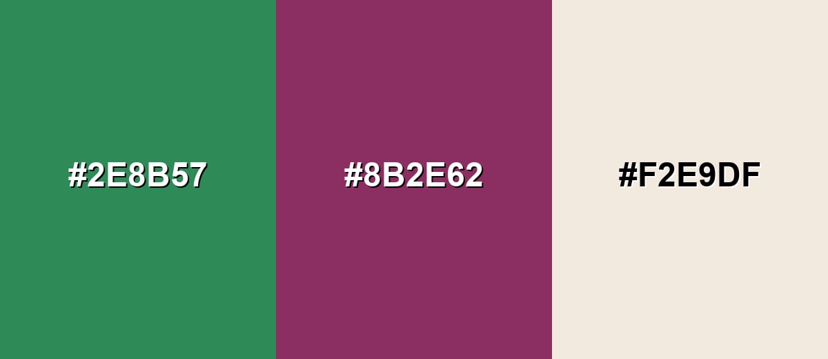
Complementary Colors
A complementary pairing balances sea green with a muted red-purple opposite, creating contrast without going neon. It works well for calls to action, highlights, and editorial layouts.
Complementary Palette Example: Use Sea Green with Dusty Berry and Soft Sand for a calm base plus a confident accent.
Analogous Color Schemes
Analogous colors sit adjacent to each other on the color wheel, creating harmonious, cohesive palettes with subtle variation.
Cool analogous: Sea Green with blue-leaning neighbors for a coastal, fluid feel.
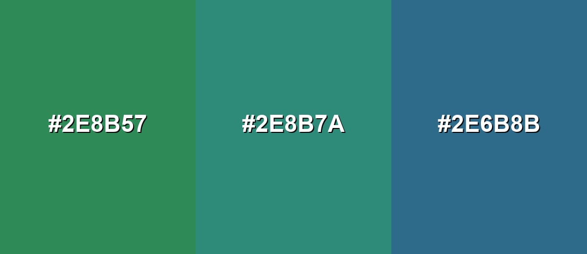
- Sea Green: #2E8B57
- Blue Green: #2E8B7A
- Deep Teal Blue: #2E6B8B
Warm analogous: Sea Green with yellow-green companions for an earthy, botanical direction.
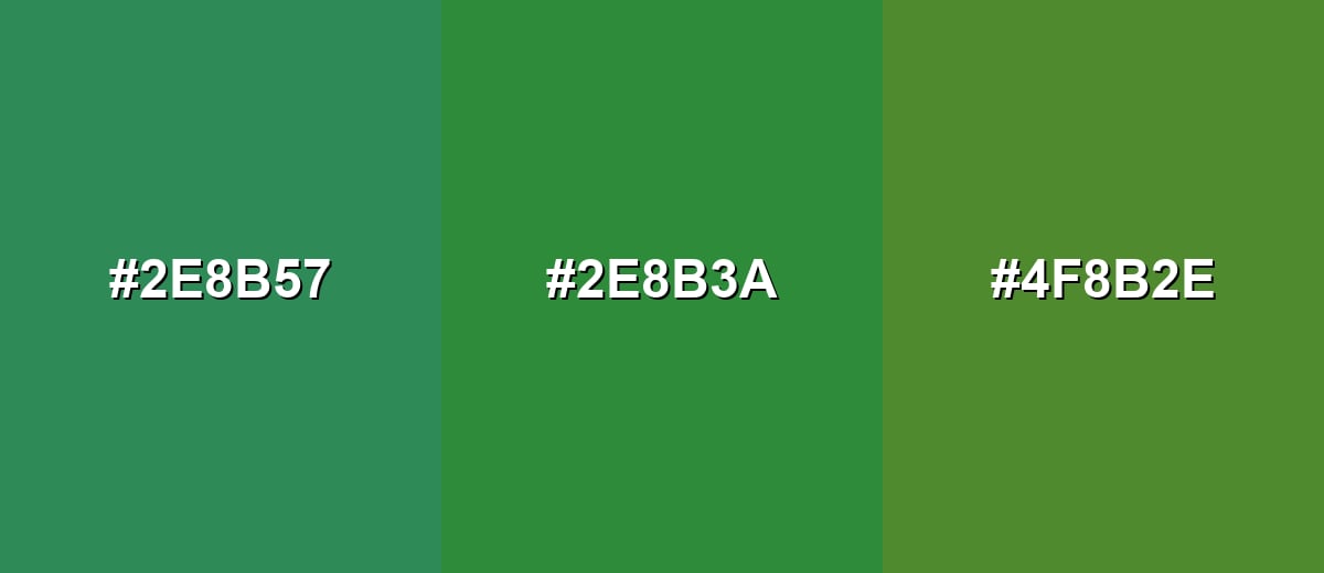
- Sea Green: #2E8B57
- Herb Green: #2E8B3A
- Olive Leaf: #4F8B2E
Triadic & Tetradic Combinations
A triadic palette uses three evenly spaced hues, giving you variety while staying balanced.
Triadic: Sea Green with Royal Violet and Warm Terracotta for a lively but controlled mix.
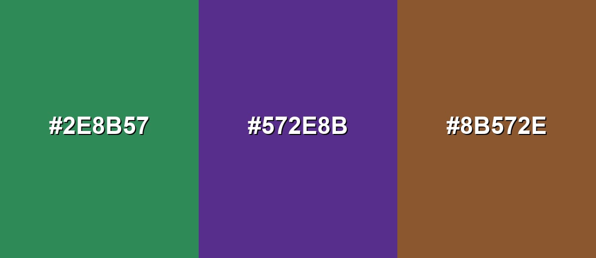
- Sea Green: #2E8B57
- Royal Violet: #572E8B
- Warm Terracotta: #8B572E
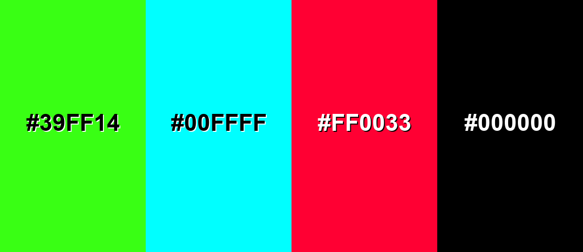
Colors to Avoid
While sea green color is remarkably versatile, certain combinations can create problematic visual effects:
- Neon Lime (#39FF14) - Overpowers sea green and can make layouts feel noisy and low-end, especially in large areas.
- Electric Cyan (#00FFFF) - Sits too close in temperature but far in saturation, creating a harsh, vibrating contrast.
- Pure Red (#FF0033) - Creates a strong holiday-like clash that can feel alarm-driven and distract from content.
- True Black (#000000) - Can look overly stark next to sea green, making the palette feel heavy unless softened with neutrals.
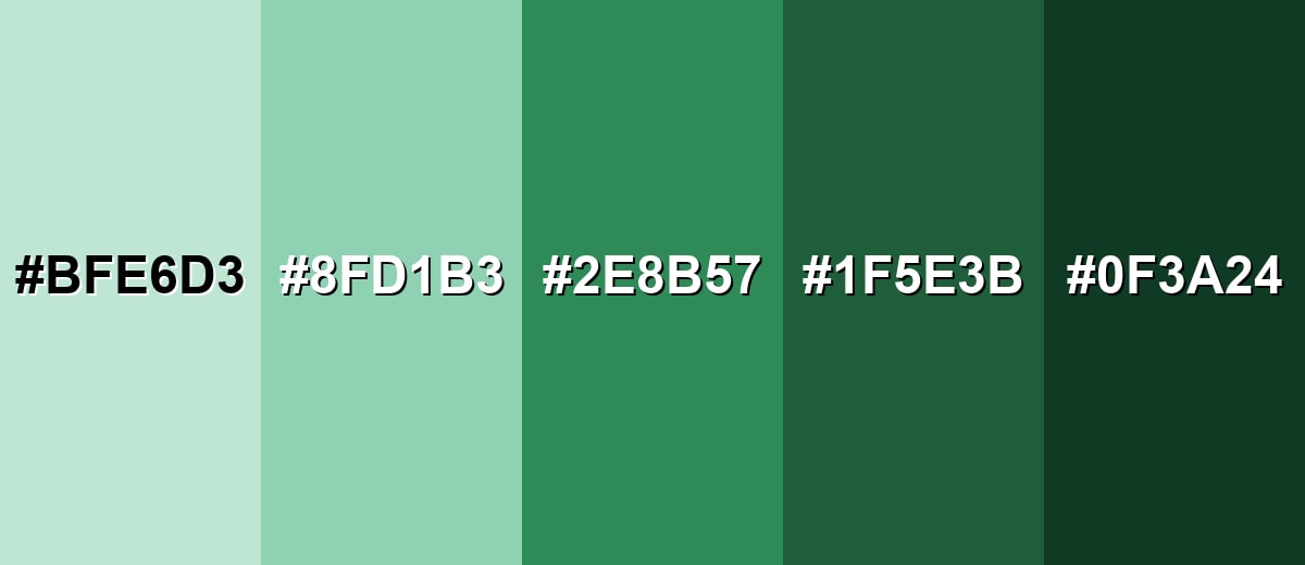
Shades, Tints & Variations of Sea Green Color
Sea green isn't just one fixed swatch—there's a useful range from airy, pastel tints to deep, dramatic greens. Having a few variations on hand makes it easier to design readable UI states, create depth in layouts, and keep branding consistent across backgrounds, accents, and text overlays.
- Pale Sea Green (#BFE6D3) - A light, airy tint that keeps the ocean-like feel while staying soft and open. It's best used for Backgrounds, large sections, and calm UI surfaces.
- Mist Sea Green (#8FD1B3) - A gentle mid-light option that feels fresh without becoming too bright. It's best used for Cards, highlights, and secondary UI accents.
- Classic Sea Green (#2E8B57) - The balanced reference shade with clear green depth and a subtle blue undertone. It's best used for Brand accents, buttons, icons, and key illustrations.
- Deep Sea Green (#1F5E3B) - A darker, more grounded take that looks sophisticated and stable. It's best used for Headers, navigation bars, and strong contrast accents.
- Dark Sea Green (#0F3A24) - A near-forest depth that keeps the sea-green direction but feels more dramatic. It's best used for Text overlays, hero sections, and premium packaging details.
Industry Applications
Sea green shows up across industries because it communicates clarity and balance without feeling sterile. It works as an identity shade, a background tone, or an accent depending on contrast and saturation choices.
Fashion & Beauty
- Clean, fresh packaging for skincare and personal care when paired with soft neutrals.
- Elegant accent color for labels, seals, and secondary brand marks.
- Seasonless styling in lookbooks—calm enough for minimal layouts, distinctive enough to stand out.
- Premium feel in darker sea green variants for small details and typography.
Interior Design & Decor
- Cabinetry, tiles, or a single accent wall for a natural, clean look.
- Works especially well with warm wood tones or brass to add comfort and warmth.
- Lighter tints help small rooms feel open while still adding personality.
- Pairs well with textured fabrics to keep the space from feeling slick or cold.
Branding & Marketing
- Wellness and self-care brands use it for calm, supportive interfaces and content themes.
- SaaS and productivity products often use it for success states and friendly highlights.
- Travel and hospitality visuals lean on sea green for coastal, welcoming energy.
- Eco and sustainability messaging uses it as a nature-forward alternative to loud greens.
Conclusion
Sea green stands out as a balanced green-blue shade that feels fresh, steady, and easy to live with in digital and physical design. Its strength is flexibility: it can be a calming base, a confident accent, or a bridge between warm and cool palettes. With hex #2E8B57 as a reliable reference, you can match it across UI, branding, and print workflows while keeping the same overall mood. Pair it with warm neutrals for comfort, deeper blues for sophistication, or muted berries for contrast that still feels refined—and always double-check contrast so the color stays as readable as it is stylish.
Design Smarter with AI: Media.io is an online AI studio that empowers creators with advanced image generation and enhancement tools. From text-to-image and image-to-image creation to AI upscaling and color optimization, it enables fast, creative, and professional results—all in your browser.

Frequently Asked Questions About Sea Green Color
Sea green is a medium green with a noticeable blue undertone, similar to the look of shallow ocean water. It usually feels calmer and more natural than bright greens.
A widely used hex value for sea green is #2e8b57. It matches the classic SeaGreen shade found in many digital design tools and CSS color lists.
It sits between green and teal, but most sea green shades lean a bit more green than typical teal. Teal usually looks more blue-forward, while sea green stays more botanical.
It pairs well with warm neutrals (sand, cream), deep blues, soft grays, and muted berry tones. For a bolder look, add terracotta or a controlled purple accent.
Sea green is generally cool because of its blue undertone. You can make it feel warmer by combining it with beige, tan, brass, or warm wood textures.
Use sea green as an accent for buttons, icons, or highlights, and keep text high-contrast against its background. If you place text on top of it, choose very light text and verify contrast with an accessibility checker.


