

Burnt umber color is a deep, earthy brown with a warm red undertone, similar to fired clay, dark cocoa, or dried autumn leaves. Its hex code is #8A3324, giving it a grounded look that feels natural and reliable.
Historically, the name comes from umber earth pigments that become richer and redder when heated, which is why it behaves so well in paint and print. Below, you'll find burnt umber color codes, conversions, pairing ideas, shade variations, and practical ways to use it in design.
Burnt Umber Color: Codes & Values
These are the most-used color values for burnt umber across web, UI, and print workflows.
| Parameters | VALUE |
| HEX Code | #8A3324 |
| RGB DECIMAL | 138, 51, 36 |
| RGB PERCENTAGE | 54.1%, 20%, 14.1% |
| CMYK | 0%,63%,74%,46% |
| HSL | 9°, 59%, 34% |
| HSV (HSB) | 9°, 74%, 54% |
| Web Safe | #993333 |
Key Color Space Explanations:
- HEX - HEX is the most common way to specify burnt umber for web and UI work using a six-digit code. Use #8a3324 in CSS, design tools, and style guides for consistent results.
- RGB - RGB describes the red, green, and blue light values used on screens. Burnt umber uses more red than green or blue, which creates its warm, earthy brown character.
- CMYK - CMYK is used for printing and describes ink percentages. For print workflows, the CMYK values help keep burnt umber looking rich rather than muddy.
- HSL - HSL expresses hue, saturation, and lightness, which is helpful for picking matching accents and creating tints and shades. Burnt umber sits in the red-orange hue range with mid saturation and low lightness.
- Web Safe - Web safe values are a legacy palette that can help approximate a tone on limited displays. The closest web safe match to burnt umber is #993333.
For consistent results, use the HEX code in digital design, RGB for screen-based tools, and CMYK when you're sending files to print.
Burnt Umber Color Conversions
If you're moving between design apps (or switching from screen to print), this conversion table helps you match burnt umber more accurately.
| Parameters | VALUE | CSS |
| HEX | #8a3324 | #8a3324 |
| RGB DECIMAL | 138, 51, 36 | rgb(138,51,36) |
| RGB PERCENTAGE | 54.1%, 20%, 14.1% | rgb(54.1%,20%,14.1%) |
| CMYK | 0%,63%,74%,46% | cmyk(0%,63%,74%,46%) |
| HSL | 9°, 59%, 34% | hsl(9°,59%,34%) |
| HSV (or HSB) | 9°, 74%, 54% | -- |
| Web Safe | 993333 | #993333 |
| CIE-LAB | 33.8, 36.0, 29.6 | -- |
| XYZ | 11.97, 7.89, 2.41 | -- |
| xyY | 0.537, 0.354, 7.89 | -- |
| CIE-LCH | 33.8, 46.6, 39.2° | -- |
| CIE-LUV | 33.8, 65.9, 20.9 | -- |
| Hunter-Lab | 28.1, 29.2, 14.1 | -- |
| Binary | 10001010 00110011 00100100 | -- |
Want to generate burnt umber color photos or posters? Try Media.io's AI Image Generator now!
Burnt Umber Meaning & Symbolism
Burnt umber commonly represents stability, craftsmanship, and a connection to the natural world. Because it resembles soil, wood, and weathered materials, it often feels practical and reassuring in everyday settings.
Psychological Effects
Because it's warm and dark, burnt umber can shape mood quickly—especially when used in large areas.
- Grounded Mood - Burnt umber tends to make spaces and layouts feel stable and anchored.
- Softens Bright Accents - It can reduce the harshness of vivid colors and bring a more settled tone.
- Cozy Atmosphere - Its warm depth can create an intimate, comfortable feeling in interiors or packaging.
- Quiet Sophistication - Used sparingly, it adds depth without feeling overly formal or cold.
- Risk of Heaviness - Overuse can make designs feel dull or old-fashioned, especially with low contrast.
Positive Associations
Burnt umber is often chosen when a brand or space needs warmth that still feels honest and practical.
- Stability - A steady, dependable impression that doesn't feel flashy.
- Craftsmanship - A handmade, workshop-like vibe tied to artisan materials.
- Natural Connection - Visual cues of soil, wood, and earth that feel familiar and calm.
- Tradition - A heritage-forward tone that works well for classic, time-tested themes.
- Premium Warmth - A rich, deep warmth that can feel elevated when paired with clean neutrals.
Cultural Significance Across the World
Across creative and historical contexts, umber tones have long been used to create believable depth and shadow.
- Painting History - Umber pigments are widely used in traditional art because they mix well and create natural shadows.
- Earth & Materiality - The color frequently signals soil, wood, clay, and weathered surfaces in everyday life.
- Tradition & Heritage - It's often tied to craft and timeless design rather than high-gloss modernity.
- Artisan Identity - In many brand and product settings, it supports "made with care" storytelling.
Design Applications
Burnt umber works best when you want warmth with restraint. It's a strong anchor shade that looks especially good when balanced with light backgrounds and clean spacing.
Graphic Design Tips
- Use it as an anchor color - Treat burnt umber like a softer alternative to black for logos, headers, or framing elements.
- Pair with warm neutrals - Creamy whites and sand tones keep the palette bright while letting the brown feel intentional.
- Save it for emphasis - Try it on badges, dividers, or small blocks of color instead of full-page fills.
- Watch contrast in type - Burnt umber text is most readable on light backgrounds; avoid long paragraphs on dark surfaces.
- Lean into texture - It looks great next to paper grain, leather, wood, and other natural materials in layouts.
Pro tip: If a layout feels too "heavy," swap one burnt umber block for a lighter neutral panel and keep burnt umber for buttons, icons, and key headings.
Burnt Umber in Photography & Video
- Enhance warm highlights - Burnt umber-like tones show up nicely in golden-hour scenes, wood interiors, and skin-adjacent shadows.
- Use for cinematic grading - It pairs naturally with muted teal shadows for a grounded, filmic look.
- Keep whites clean - Protect off-white surfaces from turning muddy by controlling warmth in midtones.
- Boost material realism - Great for emphasizing leather, chocolate, coffee, clay, and autumn textures.
- Avoid oversaturation - Too much contrast or saturation can push it toward "brick red" and reduce the earthy feel.
Recommended Tool for Image Enhancement: When incorporating burnt umber into your photography projects, Media.io's AI Image tools can help you achieve more refined results. With AI-powered color enhancement, photo colorization, image upscaling, and old photo restoration, you can easily enrich burnt umber tones, improve overall image quality, and highlight the color's elegant and sophisticated aesthetic.
Color Combinations
Burnt umber pairs naturally with warm neutrals and deep, muted accents. Use the palettes below to build contrast, find harmonious neighbors, or create bolder schemes for branding and visual layouts.
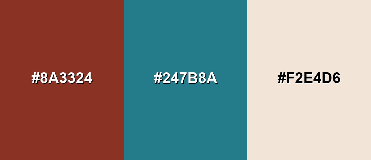
Complementary Colors
A complementary pairing puts burnt umber against a blue-green accent to create clear, balanced contrast. This is a reliable approach for call-to-action highlights, packaging accents, and editorial layouts where you want warmth plus freshness.
Complementary Palette Example: Try burnt umber with deep teal and warm sand for an earthy look that still feels crisp.
Analogous Color Schemes
Analogous colors sit adjacent to each other on the color wheel, creating harmonious, cohesive palettes with subtle variation.
Red-brown neighbors create a warm, cohesive palette for rustic or heritage-forward designs.
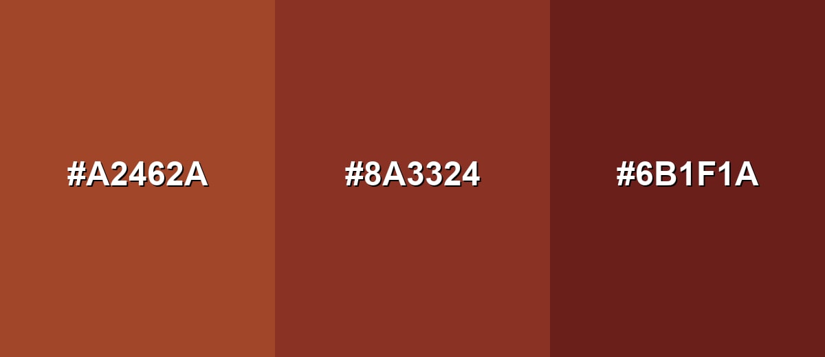
- Rust: #A2462A
- Burnt Umber: #8A3324
- Deep Mahogany: #6B1F1A
Earthy orange-to-olive tones keep the look natural while adding variety for accents and backgrounds.
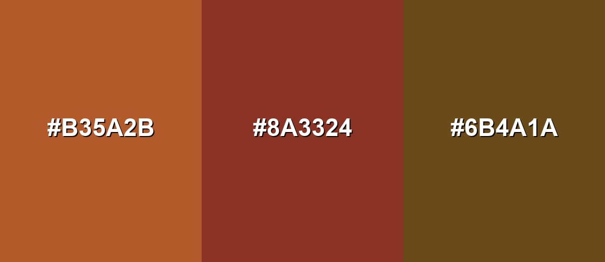
- Cinnamon: #B35A2B
- Burnt Umber: #8A3324
- Olive Brown: #6B4A1A
Triadic & Tetradic Combinations
A triadic scheme spreads hues evenly for a more energetic, modern mix.
Use burnt umber with a leafy green and a deep violet-blue to keep the palette bold but still grounded.
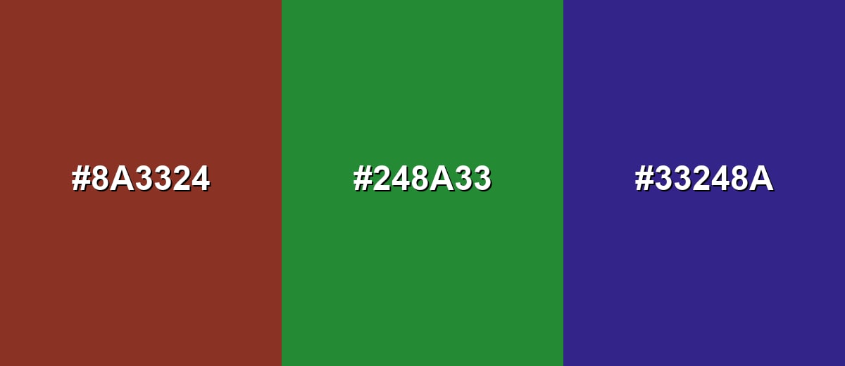
- Burnt Umber: #8A3324
- Leaf Green: #248A33
- Indigo Purple: #33248A
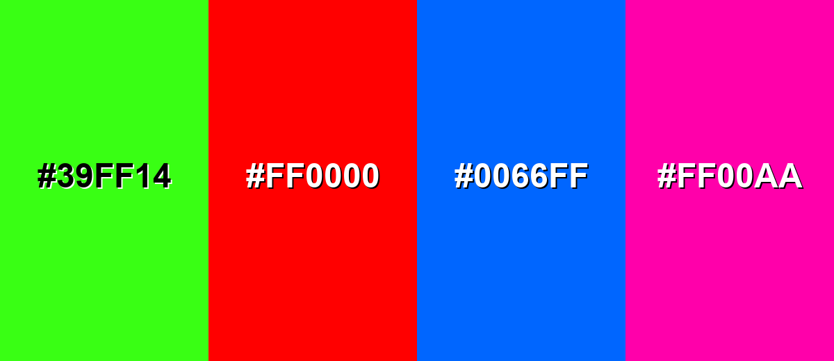
Colors to Avoid
While burnt umber is remarkably versatile, certain combinations can create problematic visual effects:
- Neon Green (#39FF14) - The neon intensity clashes with burnt umber's natural, muted character and can make layouts feel noisy.
- Pure Red (#FF0000) - Strong red beside burnt umber can look overly aggressive and can flatten the warm undertones into a single block.
- Electric Blue (#0066FF) - High-saturation blue creates harsh contrast that can feel disconnected from burnt umber's earthy tone.
- Hot Magenta (#FF00AA) - Magenta can push the palette into a synthetic look, reducing the grounded, crafted feel burnt umber usually provides.
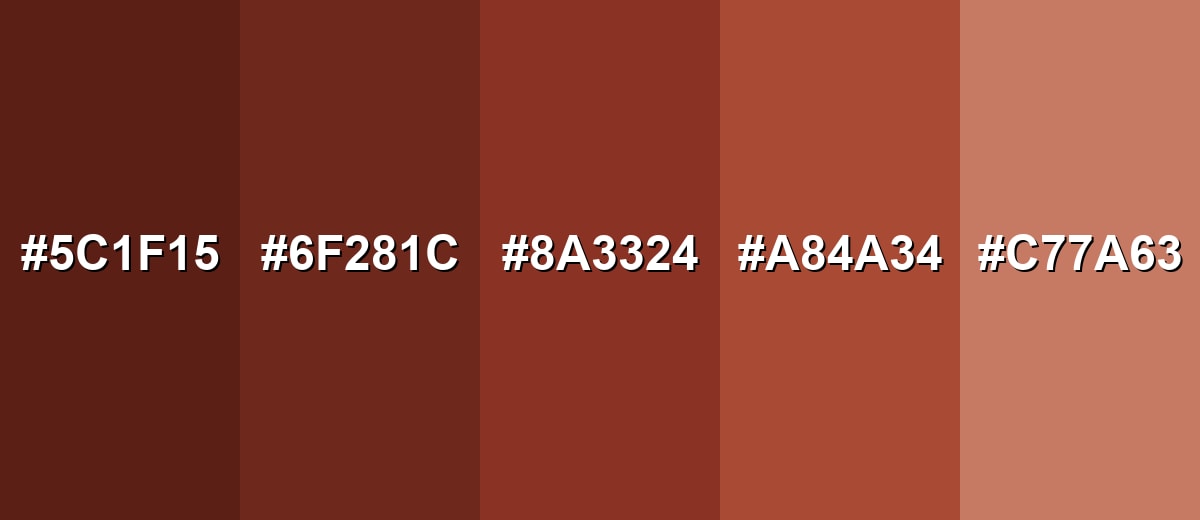
Shades, Tints & Variations of Burnt Umber
Burnt umber has a surprisingly usable range—from deep, shadowy browns to softer clay-like tints. Exploring these variations makes it easier to build hierarchy in UI, add depth to illustrations, or create a full brand palette without changing the "earthy" personality.
- Deep Burnt Umber (#5C1F15) - A darker, more shadowed take that reads almost like dark chocolate with a red-brown base.. It's best used for Use for dramatic headers, premium packaging details, or deep shadows in illustrations..
- Dark Umber (#6F281C) - A strong brown-red that keeps the earthy feel while staying slightly more legible than the deepest shade.. It's best used for Good for UI accents, icon fills, and typography on light backgrounds..
- Classic Burnt Umber (#8A3324) - The reference tone: warm, earthy, and solid with a noticeable red undertone.. It's best used for Ideal as a primary accent, brand anchor, or supporting neutral in warm palettes..
- Soft Umber (#A84A34) - A lighter, warmer variation that feels friendlier and less weighty.. It's best used for Works well for backgrounds, hover states, and gentle highlights in illustrations..
- Pale Umber (#C77A63) - A tinted version with a clay-like softness that keeps warmth without looking dark.. It's best used for Use for large surfaces, subtle panels, and secondary elements that need warmth without heaviness..
Industry Applications
Because burnt umber signals warmth, materiality, and durability, it's a natural fit for industries that want an authentic, crafted, and dependable tone.
Fashion & Beauty
- Leather & suede vibes - Works well for lookbooks and product shots that lean into texture and warmth.
- Earthy cosmetics branding - A strong match for "clean," natural, or artisan-style packaging aesthetics.
- Fall/winter palettes - Easy to pair with warm neutrals for seasonal campaigns and capsule collections.
- Premium minimal labels - Adds depth to simple typography without relying on pure black.
Interior Design & Decor
- Feature walls and cabinetry - Brings cozy warmth, especially in wood-forward spaces.
- Grounding accents - Ideal for leather chairs, rugs, throws, or decorative ceramics.
- Pairs with warm whites - Keeps rooms bright while still feeling grounded and natural.
- Great with matte metals - Complements understated finishes for a refined, lived-in look.
Branding & Marketing
- Craft and heritage positioning - Helps brands feel established, hands-on, and trustworthy.
- Food & beverage packaging - A strong fit for coffee, chocolate, spices, and baked goods storytelling.
- Editorial and portfolio layouts - Adds warmth to sections, dividers, and highlights on neutral backgrounds.
- Soft alternative to black - Keeps designs bold while feeling more human and less stark.
Conclusion
Burnt umber is a rich, earthy brown that brings warmth and credibility without the harshness of black. With #8A3324 as your base, you can build everything from calm neutral systems to higher-contrast palettes by leaning on teal, green, or violet accents—just be mindful of balance and legibility. Give it breathing room with light neutrals, use it where you want depth (headings, badges, packaging details), and you'll get a look that feels steady, crafted, and intentionally made.
Design Smarter with AI: Media.io is an online AI studio that empowers creators with advanced image generation and enhancement tools. From text-to-image and image-to-image creation to AI upscaling and color optimization, it enables fast, creative, and professional results—all in your browser.

Frequently Asked Questions About Burnt Umber Color
Burnt umber is a deep brown with warm red undertones. It often resembles dark clay, rich soil, or cocoa, and it tends to look natural rather than glossy or bright.
It is generally warm because of its red-orange undertone. However, it can appear more neutral or slightly subdued when paired with cool grays or deep blues.
For screens, burnt umber is RGB 138, 51, 36. For print, a common conversion is CMYK 0%,63%,74%,46%, though results can vary by paper and ink profile.
It pairs well with warm neutrals like ivory and sand, plus cooler accents like muted teal for contrast. For a more colorful palette, try olive greens, deep blues, or subdued violets.
Raw umber is typically cooler and more yellow-brown, while burnt umber is darker and redder. The burnt version gets its richer warmth from heating the original umber pigment.
Use it for small, high-impact elements like headings, icons, borders, and buttons, and keep the main background light. Pair it with warm off-whites and add one cool accent color to maintain clarity and contrast.


