

 TL;DR:
Cream (#FFFDD0) is a warm, light neutral with subtle golden undertones that serves as an inviting, less harsh alternative to pure white in digital and print design.
● Use HEX #FFFDD0 or RGB (255, 253, 208) for web and digital design to reduce screen glare, but switch to CMYK (0%,1%,18%,0%) for print to maintain consistency across paper stocks.
● Avoid pairing cream directly with pure white (#FFFFFF), as this can make the cream appear dirty or excessively yellow; similarly, neon yellow and bright red can overpower it or create jarring effects.
● Pair cream with charcoal or deep brown for smooth text contrast instead of stark black, or use complementary cool blue-violet tones (like Deep Indigo and Soft Lavender) for clean, high-impact palettes.
● When styling photography or video, be mindful of white balance, as cool lighting can push cream toward yellow, and pair it with deeper props to prevent a washed-out, low-contrast frame.
Ask AI for a summary
 ChatGPT
 Perplexity
 Gemini
 Claude
 Grok
Grok
Cream is a warm, light neutral that sits between white and pale yellow. It keeps the brightness of white, but feels softer and more welcoming thanks to its subtle golden undertone.
Whether you're choosing a background for a website, a wall color, or a product palette, cream is a reliable base that makes other colors look more refined.
Cream Color Color: Codes & Values
If you want a dependable "soft white" that still feels warm, these are the most-used technical values for cream in digital and print workflows.
| Parameters | VALUE |
| HEX Code | #FFFDD0 |
| RGB DECIMAL | 255, 253, 208 |
| RGB PERCENTAGE | 100%, 99.2%, 81.6% |
| CMYK | 0%,1%,18%,0% |
| HSL | 58°, 100%, 91% |
| HSV (HSB) | 58°, 18%, 100% |
| Web Safe | #FFFFCC |
Key Color Space Explanations:
- HEX - HEX is the most common format for web and UI color picking. Use it in CSS, design systems, and theme tokens.
- RGB - RGB represents how much red, green, and blue light makes the color on screens. It's ideal for digital design and video work.
- CMYK - CMYK is used for print because it describes ink percentages. It helps keep cream consistent across paper stocks and printers.
- HSL - HSL describes the color by hue, saturation, and lightness, making it easier to create lighter or deeper variations. It's useful when building ramps for UI backgrounds and surfaces.
- Web Safe - Web-safe values are legacy colors that were more consistent on older displays. Today they're mostly used for quick approximations and compatibility checks.
Use HEX/RGB for websites, apps, and video overlays, and switch to CMYK when you're preparing cream for packaging, print layouts, or proofs.
Want to generate cream color photos or posters? Try Media.io's AI Image Generator now!
Cream Color Conversions
Need cream color in a different color model? Here are common conversions you can copy into design tools, CSS, and print specs.
| Parameters | VALUE | CSS |
| HEX | #fffdd0 | #fffdd0 |
| RGB DECIMAL | 255, 253, 208 | rgb(255,253,208) |
| RGB PERCENTAGE | 100%, 99.2%, 81.6% | rgb(100%,99.2%,81.6%) |
| CMYK | 0%,1%,18%,0% | cmyk(0%,1%,18%,0%) |
| HSL | 58°, 100%, 91% | hsl(58°, 100%, 91%) |
| HSV (or HSB) | 58°, 18%, 100% | -- |
| Web Safe | ffffcc | #ffffcc |
| CIE-LAB | 98.4, -6.4, 21.1 | -- |
| XYZ | 87.8, 96.1, 73.7 | -- |
| xyY | 0.341, 0.373, 96.1 | -- |
| CIE-LCH | 98.4, 22.1, 106.7° | -- |
| CIE-LUV | 98.4, 3.7, 33.0 | -- |
| Hunter-Lab | 98.0, -6.6, 20.3 | -- |
| Binary | 11111111, 11111101, 11010000 | -- |
Cream Color Meaning & Symbolism
Cream communicates warmth without demanding attention, which is why it's used to soften modern palettes and add a natural, comforting feel.
Psychological Effects
Cream is bright enough to feel open, but gentle enough to avoid the starkness of pure white.
- Soft Warmth - The subtle golden undertone adds comfort without becoming loud or flashy.
- Reduced Harshness - Compared with pure white, cream can feel less clinical and more welcoming.
- Airy Openness - Its high lightness helps spaces and interfaces feel larger and easier to breathe in.
- Calmer Focus - As a quiet neutral, cream supports content and imagery instead of competing for attention.
- Undertone Sensitivity - Under cool lighting or lower-quality displays, it can drift more yellow, changing the mood.
Positive Associations
Because it reads clean but not cold, cream is often used when you want softness and polish at the same time.
- Comfort And Calm - Cream sets an easy, restful tone that feels lived-in and friendly.
- Soft Cleanliness - It signals cleanliness with a warmer edge than bright, icy white.
- Heritage And Craft - The paper-like warmth can hint at tradition, handmade quality, and timeless style.
- Simplicity And Approachability - It keeps palettes minimal while still feeling human and inviting.
- Quality And Care - In branding, cream can suggest thoughtful details and a premium-but-warm experience.
Cultural Significance Across the World
As a warm off-white, cream tends to carry "neutral" symbolism, so it adapts easily across audiences and aesthetics.
- Timeless Neutral - Cream often functions as a classic base that feels familiar and broadly acceptable.
- Craft And Tradition - Its resemblance to uncoated paper or vintage stock can evoke heritage-style design cues.
- Clean But Gentle - It's frequently chosen when pure white feels too stark for the intended message.
- Warm Minimalism - Cream supports "less but better" design while keeping the overall tone approachable.
Design Applications
Cream is easiest to use as a base color. It gives you the flexibility of white, while adding a subtle, welcoming tone.
Graphic Design Tips
- Cream can mimic uncoated paper or vintage stock, helping layouts feel crafted and editorial.
- Use it as a background to let product shots, typography, and illustrations look softer and more premium.
- Check proofs on the intended paper stock because cream can shift with paper warmth.
- When printing, keep an eye on ink coverage—cream works best with clean spacing and breathable margins.
- Avoid very light yellows next to cream unless you want a deliberate monochrome look.
If you're building a "paper" look for digital, try layering cream as the page base, then use brighter off-whites only for cards or highlights so the warmth stays intentional.
Cream Color in Photography & Video
- Use cream backdrops to soften skin tones and reduce the harsh, sterile feel of pure white sets.
- Pair cream with deeper anchors in styling and props to avoid a washed-out, low-contrast frame.
- Watch white balance: cool lighting can push cream toward yellow, so test under your real shooting conditions.
- In product videos, cream works well for "premium minimal" scenes where the item should stay the focus.
- For consistent results, keep your cream tones uniform across shots and correct in post before final grading.
Recommended Tool for Image Enhancement: When incorporating cream color into your photography projects, Media.io's AI Image tools can help you achieve more refined results. With AI-powered color enhancement, photo colorization, image upscaling, and old photo restoration, you can easily enrich cream color tones, improve overall image quality, and highlight the color's elegant and sophisticated aesthetic.
Color Combinations
Cream plays well with both warm and cool accents. Use these palettes as starting points, then adjust saturation to match your brand or space.
Complementary Colors
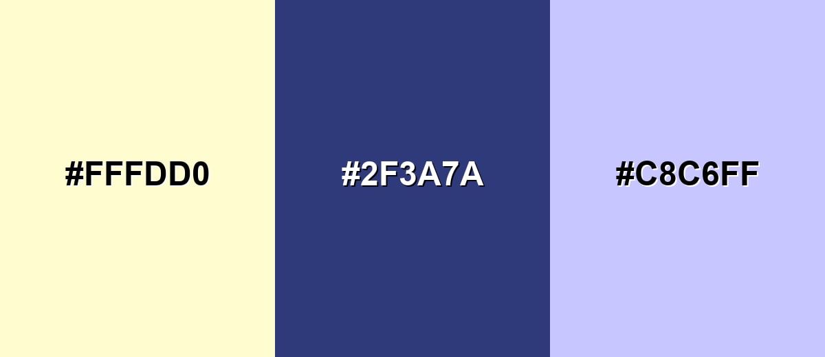
A complementary palette pairs cream's warm yellow undertone with a cool blue-violet family for clean, high-impact contrast.
Complementary Palette Example: Use Cream as the base, anchor it with Deep Indigo, and add Soft Lavender for a lighter cool accent.
Analogous Color Schemes
Analogous colors sit adjacent to each other on the color wheel, creating harmonious, cohesive palettes with subtle variation.
Warm analogous: Cream with buttery yellows and gentle beige for a cozy, sunlit palette.
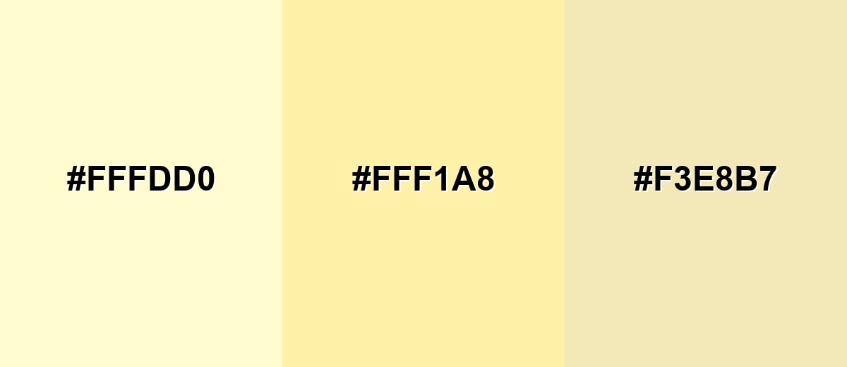
- Cream: #FFFDD0
- Pale Butter: #FFF1A8
- Warm Beige: #F3E8B7
Fresh analogous: Cream with soft greens for a calm, natural, botanical feel.
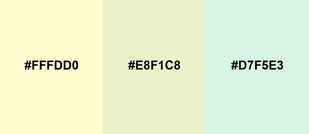
- Cream: #FFFDD0
- Pale Sage: #E8F1C8
- Soft Mint: #D7F5E3
Triadic & Tetradic Combinations
Triadic schemes keep balance by spacing colors evenly around the wheel, so you get variety without chaos.
Cream with Soft Coral and Powder Blue creates a friendly, modern palette that still feels light.
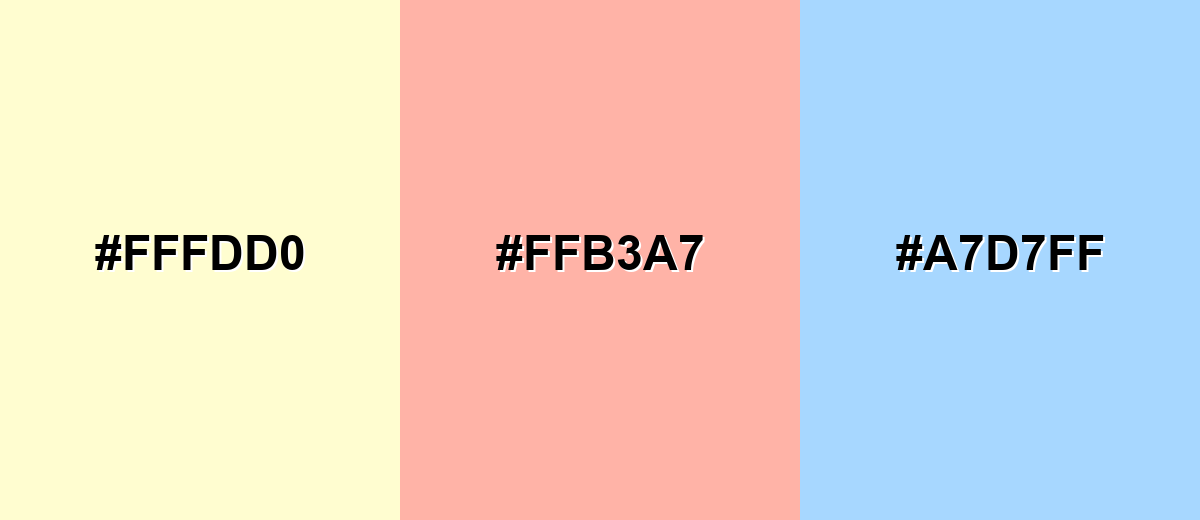
- Cream: #FFFDD0
- Soft Coral: #FFB3A7
- Powder Blue: #A7D7FF
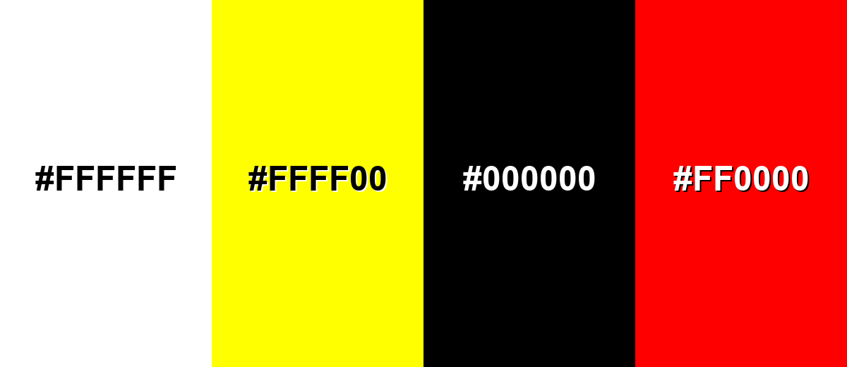
Colors to Avoid
While cream color is remarkably versatile, certain combinations can create problematic visual effects:
- Pure White (#FFFFFF) - Placed next to cream, pure white can make cream look dirty or overly yellow instead of intentionally warm.
- Neon Yellow (#FFFF00) - Neon yellow exaggerates cream's undertone and can make the combination feel unbalanced and glaring.
- Stark Black (#000000) - Maximum contrast can feel harsh with such a soft base; charcoal or deep brown usually looks smoother.
- Bright Red (#FF0000) - Highly saturated red can overpower cream and create a jarring, poster-like effect unless carefully controlled.
Shades, Tints & Variations of Cream Color
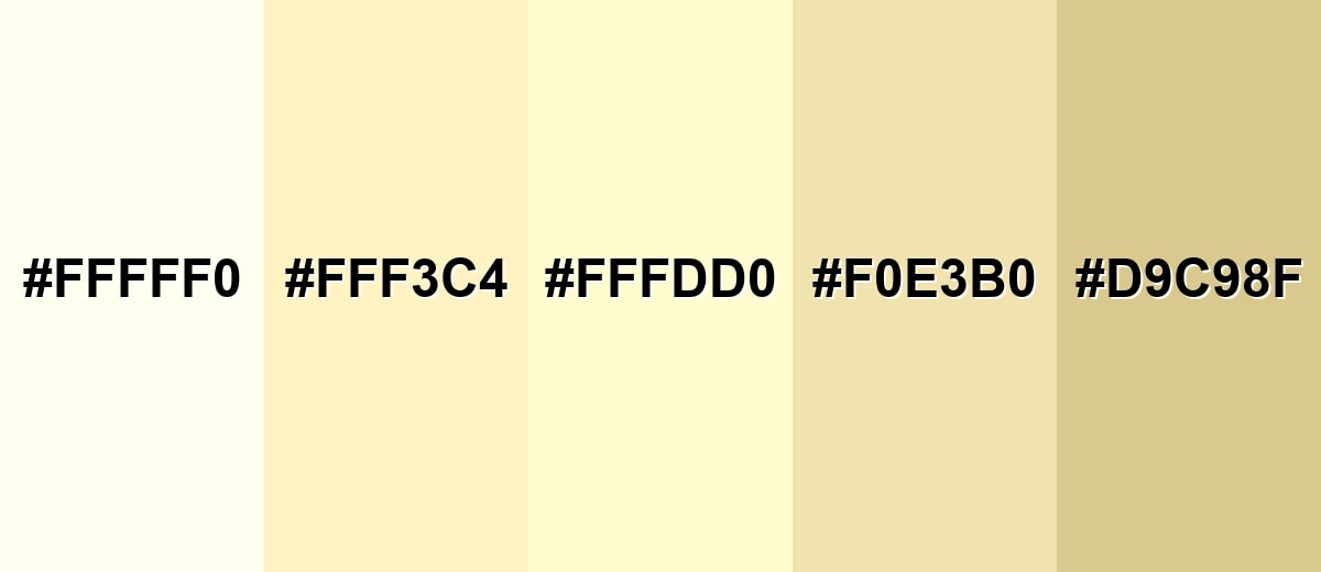
Cream isn't just one shade—there's a whole spectrum from near-white ivory to deeper, sandy neutrals. Knowing these variations makes it easier to build backgrounds, borders, and accent layers that still feel cohesive.
- Ivory (#FFFFF0) - A very light off-white with minimal warmth, often perceived as cleaner than cream. It's best used for Minimal UI backgrounds, wedding-style palettes, and soft highlights.
- Vanilla (#FFF3C4) - A sweeter, more yellow-leaning cream that feels sunny and playful without going neon. It's best used for Lifestyle branding, friendly packaging, and warm illustration fills.
- Classic Cream (#FFFDD0) - The balanced reference cream: light, warm, and versatile across digital and print contexts. It's best used for Primary background color, base surfaces, and neutral product backdrops.
- Light Beige (#F0E3B0) - A deeper, dustier variation that reads more earthy and grounded than classic cream. It's best used for Secondary panels, subtle dividers, and interior accents.
- Warm Sand (#D9C98F) - A muted sandy tone that keeps cream's warmth while adding noticeable depth and richness. It's best used for Footers, borders, textile-inspired themes, and warm neutral gradients.
Industry Applications
Cream appears across industries because it supports content, products, and imagery without competing for attention.
Fashion & Beauty
- Spa-like palettes with soft neutrals that feel calm and elevated.
- Skincare branding that wants gentle, clean cues without the harshness of pure white.
- Editorial-style layouts that feel airy and refined for lookbooks and campaigns.
- Versatile product tones that flatter finishes from matte packaging to glossy labels.
Interior Design & Decor
- Light walls that still feel warm, especially when you want brightness without sterility.
- Inviting hospitality spaces like cafes and dining rooms where warmth matters.
- Neutral tableware, signage, and surfaces that stay readable under varied lighting.
- Organic, textured styling when paired with natural wood, linen, and woven materials.
Branding & Marketing
- Readable landing page backgrounds and long-form reading experiences.
- Premium, minimalist product photography backdrops for ecommerce.
- Labels and boxes that imply craft and quality in packaging design.
- Dashboard and onboarding surfaces that feel friendly and reduce glare.
Conclusion
Cream is a warm off-white that brings softness, comfort, and a subtle premium feel to almost any palette. Start with #FFFDD0 as your base, keep text in darker, softer neutrals, and add contrast through cool accents or deeper anchors so everything stays crisp. Whether you're designing a website, planning an interior, or building packaging that feels crafted, cream helps your colors look calmer, cleaner, and more intentional.
Design Smarter with AI: Media.io is an online AI studio that empowers creators with advanced image generation and enhancement tools. From text-to-image and image-to-image creation to AI upscaling and color optimization, it enables fast, creative, and professional results—all in your browser.

Frequently Asked Questions About Cream Color Color
Cream is a very light warm neutral—an off-white with a noticeable yellow (sometimes slightly golden) undertone. It's softer than pure white and usually feels more inviting.
A commonly used cream HEX value is #fffdd0. It's a light, warm cream that works well for backgrounds and neutral palettes.
Not exactly. Cream is lighter and closer to white, while beige is typically deeper and more brown-leaning. Beige usually feels earthier; cream feels brighter and softer.
Cream pairs nicely with navy, charcoal, sage green, muted teal, dusty rose, and warm woods. For a clean look, combine it with cool grays and soft blues.
Yes. Cream backgrounds can reduce the harshness of pure white while staying bright and readable. Use a dark charcoal text color and check contrast ratios for accessibility.
Balance it with cool accents (slate, blue, teal) and avoid placing it directly beside pure white. Also test under different lighting or screens, since cream shifts more than neutral gray.


