

Jet black color is a deep, near-absolute black that looks dense and light-absorbing, with a slightly softer feel than pure black on many screens.
With HEX #0A0A0A, it's a popular choice for sleek interfaces, bold typography, and premium branding—powerful when used with clear contrast and spacing.
Jet Black Color: Codes & Values
If you want a rich black that avoids the harsh "full black" look, these are the most-used values for jet black across screen and print workflows.
| Parameters | VALUE |
| HEX Code | #0A0A0A |
| RGB DECIMAL | 10, 10, 10 |
| RGB PERCENTAGE | 3.9%, 3.9%, 3.9% |
| CMYK | 0%,0%,0%,96% |
| HSL | 0°, 0%, 4% |
| HSV (HSB) | 0°, 0%, 4% |
| Web Safe | #000000 |
Key Color Space Explanations:
- HEX - HEX is the most common way to specify jet black on the web and in design tools. It encodes the red, green, and blue channel values in a compact format.
- RGB - RGB describes jet black using red, green, and blue light values for screens. Equal low values create a neutral dark tone with no visible hue.
- CMYK - CMYK is used for printing and indicates how much cyan, magenta, yellow, and black ink to apply. Jet black relies heavily on the K channel for a deep result.
- HSL - HSL represents the same shade by hue, saturation, and lightness, which can be easier for adjusting tints and tones. With near-zero saturation, changes mainly come from lightness.
- Web Safe - Web Safe is the closest legacy-safe display approximation. For jet black, the nearest web-safe match is pure black, which can appear slightly harsher on some displays.
Use HEX/RGB for UI and digital design, and switch to CMYK for print prep—then proof your blacks to confirm depth and detail on the final material.
Jet Black Color Conversions
Need jet black in a different format for CSS, printing, or color-managed workflows? Here are the most common conversions in one place.
| Parameters | VALUE | CSS |
| HEX | #0a0a0a | #0a0a0a |
| RGB DECIMAL | 10, 10, 10 | rgb(10,10,10) |
| RGB PERCENTAGE | 3.9%, 3.9%, 3.9% | rgb(3.9%,3.9%,3.9%) |
| CMYK | 0%,0%,0%,96% | cmyk(0%,0%,0%,96%) |
| HSL | 0°, 0%, 4% | hsl(0°,0%,4%) |
| HSV | 0°, 0%, 4% | -- |
| Web Safe | 000000 | #000000 |
| CIE-LAB | 2.7, 0.0, 0.0 | -- |
| XYZ | 0.285, 0.300, 0.327 | -- |
| xyY | 0.312, 0.329, 0.300 | -- |
| CIE-LCH | 2.7, 0.0, 0° | -- |
| CIE-LUV | 2.7, 0.0, 0.0 | -- |
| Hunter-Lab | 5.5, 0.0, 0.0 | -- |
| Binary | 00001010 00001010 00001010 | -- |
Want to generate jet black color photos or posters? Try Media.io's AI Image Generator now!
Jet Black Meaning & Symbolism
Jet black is commonly associated with strength, authority, and elegance. Because it absorbs light and hides detail, it can also suggest privacy, restraint, and a sense of mystery in everyday visual communication. In practice, jet black color meaning often comes down to confidence and clarity: it sets a firm baseline that makes other elements feel more intentional.
Psychological Effects
In design, jet black tends to influence how "serious" and polished a layout feels at first glance.
- Premium Focus - Jet black often makes designs feel more focused and high-end, especially with crisp typography or a single accent color.
- Reduced Visual Noise - It can calm busy layouts by lowering background distraction, which is why it's common in media players and editing tools.
- Modern Discipline - Users frequently read it as modern and disciplined, helping content feel more intentional.
- Heavier Mood - Overuse can feel heavy, cold, or unwelcoming in content-rich pages and apps.
- Eye Fatigue Risk - If contrast and spacing aren't handled well, jet black can cause eye fatigue and make information feel compressed.
Positive Associations
When balanced with whitespace and hierarchy, jet black communicates clean confidence.
- Strength - A strong baseline that visually "anchors" layouts and helps other elements feel deliberate.
- Authority - Conveys a firm, serious tone that works well for professional and formal contexts.
- Elegance - Often reads as refined and timeless, especially in minimalist branding and packaging.
- Clarity - Supports high contrast, making typography, icons, and imagery stand out with confidence.
- Privacy - Suggests restraint and subtle mystery by absorbing light and hiding detail.
Cultural Significance Across the World
Black's symbolism changes by context, but it's consistently linked to formality and seriousness.
- Formality - Commonly tied to formal events and polished presentation in many settings.
- Seriousness - Frequently used to express professionalism and a no-nonsense attitude.
- Mourning - Widely used to communicate mourning or remembrance, depending on cultural norms.
- Minimalism - In fashion and product design, it often signals timeless style, minimalism, and professionalism.
Design Applications
Jet black is most useful when you need strong contrast, a premium baseline, or a background that lets other elements stand out with minimal distraction.
Graphic Design Tips
- Use jet black as a base surface to make images, video, and bright accents pop while keeping the layout quiet.
- On light surfaces, use jet black for typography to get a clean, decisive look—then balance it with line height and font weight.
- Choose jet black for borders and dividers when pure black feels too sharp; it creates softer separation.
- Lean into premium and minimalist branding by pairing jet black with high-contrast whitespace.
- Use a deep dark frame in covers or thumbnails to reduce edge distractions and focus attention on the subject.
Pro tip: For readable UI, prioritize contrast and avoid placing dark gray text on jet black—use generous spacing, clear hierarchy, and test with real content instead of placeholder text.
Jet Black in Photography & Video
- Use jet black backdrops or framing to keep attention on the subject and reduce visual clutter.
- For title cards and overlays, jet black helps bright elements read clearly without competing with the footage.
- In thumbnails and covers, a deep dark border can "contain" the composition and improve focus.
- For editing tools and dashboards, jet black supports a dark UI that feels modern and disciplined.
- When styling gear or set pieces, jet black finishes can look sleek and professional while staying unobtrusive on camera.
Recommended Tool for Image Enhancement: When incorporating jet black into your photography projects, Media.io's AI Image tools can help you achieve more refined results. With AI-powered color enhancement, photo colorization, image upscaling, and old photo restoration, you can easily enrich jet black tones, improve overall image quality, and highlight the color's elegant and sophisticated aesthetic.
Color Combinations
Jet black is a flexible neutral, so pairing is less about hue matching and more about contrast, temperature, and finish. The palettes below cover clean opposites, subtle near-black harmonies, and bolder accent-driven sets.
Complementary Colors
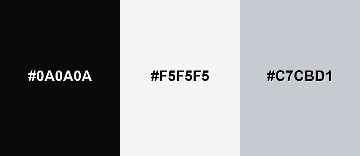
A light counterpart makes jet black look even richer and keeps layouts crisp. This pairing is ideal for editorial designs, product pages, and UI components where clarity matters most.
Complementary Palette Example: Combine Jet Black with Soft White and Cool Gray for sharp contrast that still feels refined.
Analogous Color Schemes
Analogous colors sit adjacent to each other on the color wheel, creating harmonious, cohesive palettes with subtle variation.
Jet Black with Charcoal Blue and Deep Brown adds warmth and depth without leaving the near-black family.
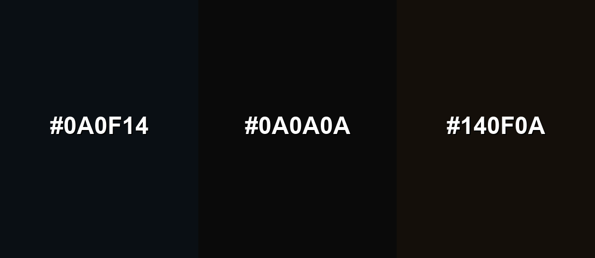
- Charcoal Blue: #0A0F14
- Jet Black: #0A0A0A
- Deep Brown: #140F0A
Jet Black with Black Plum and Black Forest feels modern and slightly atmospheric, useful for moody visuals.
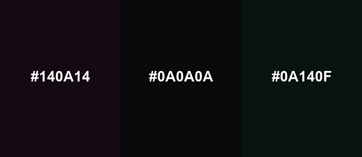
- Black Plum: #140A14
- Jet Black: #0A0A0A
- Black Forest: #0A140F
Triadic & Tetradic Combinations
A triadic approach works best when jet black acts as the base and the other two hues carry the energy.
Pair Jet Black with Electric Cyan and Vivid Amber for a high-contrast, modern set that reads well on screens.
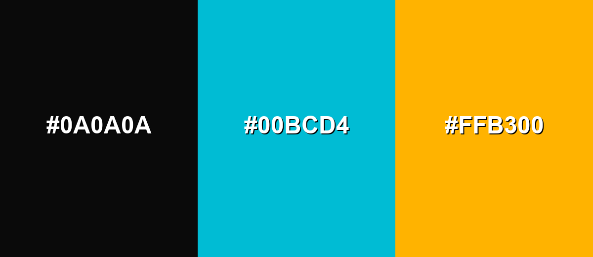
- Jet Black: #0A0A0A
- Electric Cyan: #00BCD4
- Vivid Amber: #FFB300
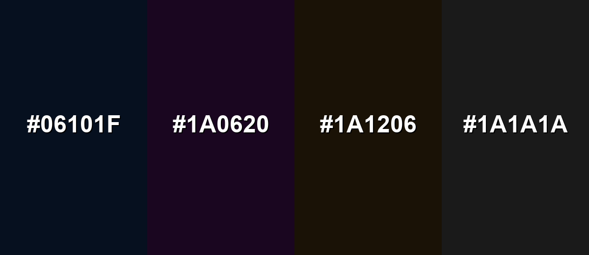
Colors to Avoid
While jet black is remarkably versatile, certain combinations can create problematic visual effects:
- Midnight Navy (#06101F) - Too close in value to jet black, so elements blend together and edges disappear.
- Deep Plum (#1A0620) - Creates a muddy, low-contrast mix that can make layouts look underlit, especially on screens.
- Dark Brown (#1A1206) - Reads as nearly black in many conditions, reducing clarity in typography and UI states.
- Charcoal Gray (#1A1A1A) - Produces weak separation for borders and text, which can hurt readability and accessibility.
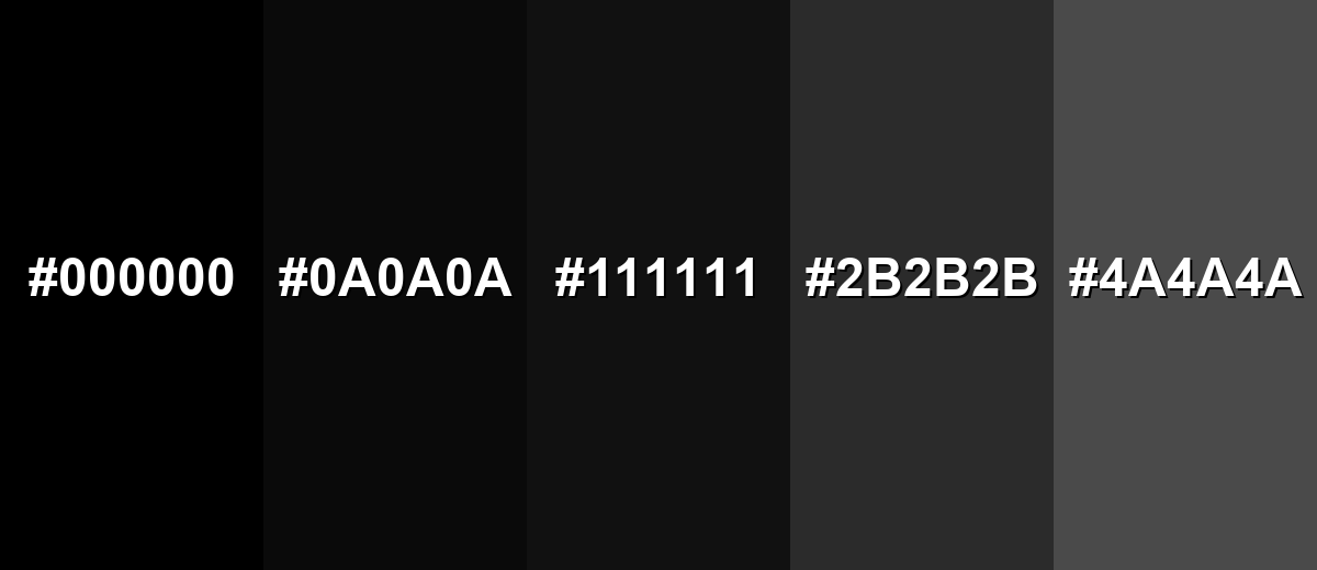
Shades, Tints & Variations of Jet Black
Jet black sits in a useful range of near-blacks and dark neutrals—from maximum-contrast black to lifted charcoal tones that reveal more detail. Knowing these variations helps you build dark themes with better hierarchy, depth, and readability.
- Pitch Black (#000000) - A true black with maximum depth and contrast. It's best used for pure silhouettes, strong type on light backgrounds, and maximum contrast moments.
- Jet Black (#0A0A0A) - A near-absolute black that feels slightly softer than pure black in many displays. It's best used for premium UI backgrounds, modern branding bases, and dark surfaces that still need subtle detail.
- Eerie Black (#111111) - A dark neutral that lifts the shadows slightly to reveal more detail. It's best used for dark mode surfaces where you want reduced glare and easier separation from pure black elements.
- Charcoal (#2B2B2B) - A balanced dark gray that keeps the mood while improving readability. It's best used for secondary surfaces, cards, and large text where pure black feels too intense.
- Graphite (#4A4A4A) - A medium-dark gray that pairs naturally with near-black palettes. It's best used for borders, UI outlines, captions, and subtle contrast layers in dark themes.
Industry Applications
Because it's neutral and high-impact, jet black fits industries where clarity, contrast, and a premium feel matter—from interfaces and packaging to interiors and accessories.
Fashion & Beauty
- Build timeless apparel palettes that feel minimal, professional, and easy to style.
- Use jet black to highlight metal hardware finishes for a clean, durable look.
- Create high-contrast styling by pairing dark bases with crisp light neutrals.
- Support a "premium" impression in accessories through restrained, minimalist color use.
Interior Design & Decor
- Choose matte or satin jet black hardware and fixtures for a modern look that hides fingerprints better than glossy surfaces.
- Use jet black accents as statement pieces to avoid a room feeling smaller or overly dim.
- Add depth with jet black interior details in a clean, durable style.
- Apply jet black to trim accents for sharp definition without relying on pure black contrast.
Branding & Marketing
- Design luxury-style labels and minimalist logos around a strong, confident dark baseline.
- Create premium boxes and high-contrast print layouts that feel polished and intentional.
- Use jet black framing in photography and video assets to keep attention on the subject.
- Support tech and editorial aesthetics with jet black as a consistent "anchor" across digital and print touchpoints.
Conclusion
Jet black (#0A0A0A) stands out for its dense, light-absorbing look that feels polished without always being as stark as pure black. It's a dependable base for building contrast in UI, branding, and media—helping typography, icons, and imagery read clearly while making accent colors feel more intentional. The key is restraint: pair it with strong contrast, subtle layering, and comfortable spacing so your design stays premium, readable, and balanced.
Design Smarter with AI: Media.io is an online AI studio that empowers creators with advanced image generation and enhancement tools. From text-to-image and image-to-image creation to AI upscaling and color optimization, it enables fast, creative, and professional results—all in your browser.

Frequently Asked Questions About Jet Black Color
Jet black is a very deep, near-absolute black that appears dense and light-absorbing. It is often chosen as a softer alternative to pure black for backgrounds, typography, and premium visual styles.
Not exactly. Pure black is typically #000000, while jet black is often a near-black like #0a0a0a that can feel slightly less harsh on screens and in certain finishes.
A common digital value is HEX #0a0a0a with RGB 10, 10, 10. For print workflows, it is commonly represented as a high K value in CMYK, depending on your press and paper.
High-contrast neutrals like soft white and cool gray create crisp, readable layouts, while bold accents such as cyan, amber, red, green, or blue can add energy. Choose pairings based on whether you want a calm premium look or a more vibrant, modern feel.
Use clear contrast for text and interactive states, increase spacing, and avoid stacking multiple near-black surfaces that blend together. Subtle grays for cards and dividers can help structure content on a jet black background.
It can, but results depend on ink coverage and paper. For large dark areas, designers often use rich black mixes in CMYK printing to avoid flat-looking blacks, and they test with proofs to confirm tone and detail.


