

 TL;DR:
Pure black (#000000) provides maximum contrast for primary text on light backgrounds, but successful digital and print design requires shifting to softer near-black shades or rich black ink mixes for large surface areas to prevent harsh glare or flat textures.
● In dark mode UI interfaces, avoid pure black backgrounds and utilize near-black shades like Ebony (#0B0B0B) or Charcoal (#1A1A1A) paired with off-white text to reduce eye strain and maintain visible depth for cards and elevation layers.
● For print workflows, standard CMYK pure black (0%,0%,0%,100%) often lacks depth on large fills, requiring you to request a "rich black" composite mix from your printer to ensure full opacity.
● Prevent muddy visuals and loss of element separation by avoiding low-contrast pairings like Midnight Navy (#0B132B) or Deep Purple (#1F102A), opting instead for crisp white, mid-gray, or a single vivid accent color.
Ask AI for a summary
 ChatGPT
 Perplexity
 Gemini
 Claude
 Grok
Grok
Black is the darkest tone you can see, like a deep shadow, ink, or a night sky with no visible light. In digital design it is most commonly represented as #000000.
Many people perceive it as powerful, elegant, and serious, though it can also feel heavy or distant. Because black behaves differently on screens vs. in print, this guide breaks down its meaning, codes, combinations, shades, and practical uses.
Black Color: Codes & Values
Use these standard values to apply black consistently across web, UI, and print workflows.
| Parameters | VALUE |
| HEX Code | #000000 |
| RGB DECIMAL | 0, 0, 0 |
| RGB PERCENTAGE | 0%, 0%, 0% |
| CMYK | 0%,0%,0%,100% |
| HSL | 0°, 0%, 0% |
| HSV (HSB) | 0°, 0%, 0% |
| Web Safe | #000000 |
Key Color Space Explanations:
- HEX - HEX is the most common web notation for black in UI and CSS. For pure black, the code is #000000, meaning no red, green, or blue light is emitted.
- RGB - RGB describes black as (0, 0, 0) in digital displays. Lower RGB values generally look darker, so true black is the zero point across all channels.
- CMYK - CMYK is used for printing and represents black with a strong K (key/black) component. Pure black is often shown as 0%,0%,0%,100%, though print workflows may use rich black mixes for deeper coverage.
- HSL - HSL separates hue, saturation, and lightness, making it easy to reason about neutrals. Black has 0% lightness, so hue and saturation don't meaningfully change its appearance.
- Web Safe - Web-safe colors are a legacy palette designed to render consistently on older displays. Black is already a web-safe value, so its closest web-safe match remains #000000.
If you're designing for screens, HEX and RGB are the quickest choices; for print files, keep CMYK in mind and confirm with your printer if you need deeper "rich black" coverage.
Black Color Conversions
These conversions help you translate black between common color models and coding formats without guesswork.
| Parameters | VALUE | CSS |
| HEX | #000000 | #000000 |
| RGB DECIMAL | 0, 0, 0 | rgb(0,0,0) |
| RGB PERCENTAGE | 0%, 0%, 0% | rgb(0%,0%,0%) |
| CMYK | 0%,0%,0%,100% | cmyk(0%,0%,0%,100%) |
| HSL | 0°, 0%, 0% | hsl(0°, 0%, 0%) |
| HSV (or HSB) | 0°, 0%, 0% | -- |
| Web Safe | 000000 | #000000 |
| CIE-LAB | 0, 0, 0 | -- |
| XYZ | 0, 0, 0 | -- |
| xyY | 0, 0, 0 | -- |
| CIE-LCH | 0, 0, 0 | -- |
| CIE-LUV | 0, 0, 0 | -- |
| Hunter-Lab | 0, 0, 0 | -- |
| Binary | 00000000 00000000 00000000 | -- |
Want to make black and white photos? Try Media.io's AI Image Generator now!
Black Color Meaning & Symbolism
Black is widely associated with authority, formality, strength, and sophistication. In everyday life it often signals seriousness, clarity, and emphasis—think classic clothing, premium packaging, and high-contrast interfaces. This is why Black Color meaning frequently overlaps with ideas of power and restraint, depending on context.
Psychological Effects
Black can be a clarity tool: it simplifies a scene and makes priorities obvious.
- Focus - Black reduces visual noise, helping layouts feel more intentional and easy to scan.
- Contrast - It makes nearby colors, shapes, and typography stand out more sharply.
- Confidence - In branding and UI, black often reads as mature, self-assured, and decisive.
- Structure - Used for grids, borders, and type systems, it adds order and hierarchy.
- Weight - Overuse can feel heavy or distant, especially without softer neutrals or texture.
Positive Associations
When balanced with space and a clear accent, black can feel premium rather than severe.
- Elegance - Black is a classic base for refined, minimalist visuals.
- Authority - It can signal leadership, professionalism, and clear decision-making.
- Timelessness - Black-and-white styling holds up across trends and seasons.
- Versatility - As a neutral, it supports almost any palette without clashing.
- Emphasis - It frames focal points well, making key elements look stronger and cleaner.
Cultural Significance Across the World
Black's symbolism changes by setting, tradition, and how it's paired with other colors.
- Formality - Often linked to ceremony and formal wear in events and public settings.
- Mourning - Commonly used to express grief or remembrance in some traditions.
- Protection - In some cultures and styles, black can represent strength and shielding.
- Modern Minimalism - Frequently tied to premium goods, editorial design, and contemporary branding.
Design Applications
Black is a workhorse for design because it anchors layouts and sharpens contrast. The key is choosing the right shade and pairing it with supportive neutrals or a single accent so it feels deliberate rather than heavy.
Graphic Design Tips
- Use black for primary text on light backgrounds when you want maximum readability and a neutral tone.
- For dark themes, switch large backgrounds to near-black so the UI feels deep without harsh glare.
- Keep a tight palette (black + neutrals + one accent) to avoid a busy or "muddy" look.
- In print, avoid relying on pure K for huge fills if you need richness—ask your printer about deeper black mixes.
- Check accessibility early: secondary labels, disabled states, and icons can lose clarity fast in dark layouts.
Pro tip: If pure black feels too sharp, keep #000000 for text and small UI elements, then use near-black surfaces for backgrounds and cards to create comfortable contrast and better depth.
Black Color in Photography & Video
- Protect shadow detail: deep blacks can crush texture if you push contrast too far.
- Use black backgrounds to make highlights and skin tones pop, especially in product shots.
- In video overlays, choose off-white text over near-black panels to reduce eye strain.
- Watch gradients and compression: banding is more visible near black in low-light footage.
- Mix finishes and lighting (matte vs. glossy) to keep black objects from blending into the scene.
Recommended Tool for Image Enhancement: When incorporating black color into your photography projects, Media.io's AI Image tools can help you achieve more refined results. With AI-powered color enhancement, photo colorization, image upscaling, and old photo restoration, you can easily enrich black color tones, improve overall image quality, and highlight the color's elegant and sophisticated aesthetic.
Color Combinations
Because black is neutral, it can support almost any palette. The most successful pairings usually balance contrast and temperature—soft neutrals for calm layouts, or one vivid accent for a bold focal point.
Complementary Colors
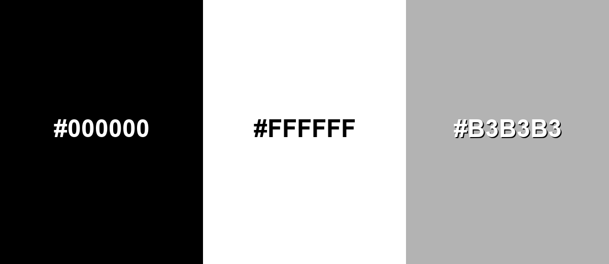
The strongest contrast with black is achieved with white, creating a crisp, timeless pairing. Add a mid-gray to soften transitions and improve readability in layered layouts.
Complementary Palette Example: Use Black with White and Mid Gray for clean contrast and flexible hierarchy.
Analogous Color Schemes
Analogous colors sit adjacent to each other on the color wheel, creating harmonious, cohesive palettes with subtle variation.
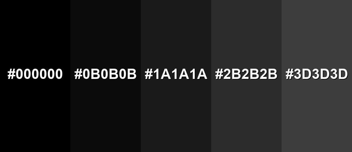
Near-black neutrals: Black, Ebony, and Charcoal for subtle depth without introducing strong hue.
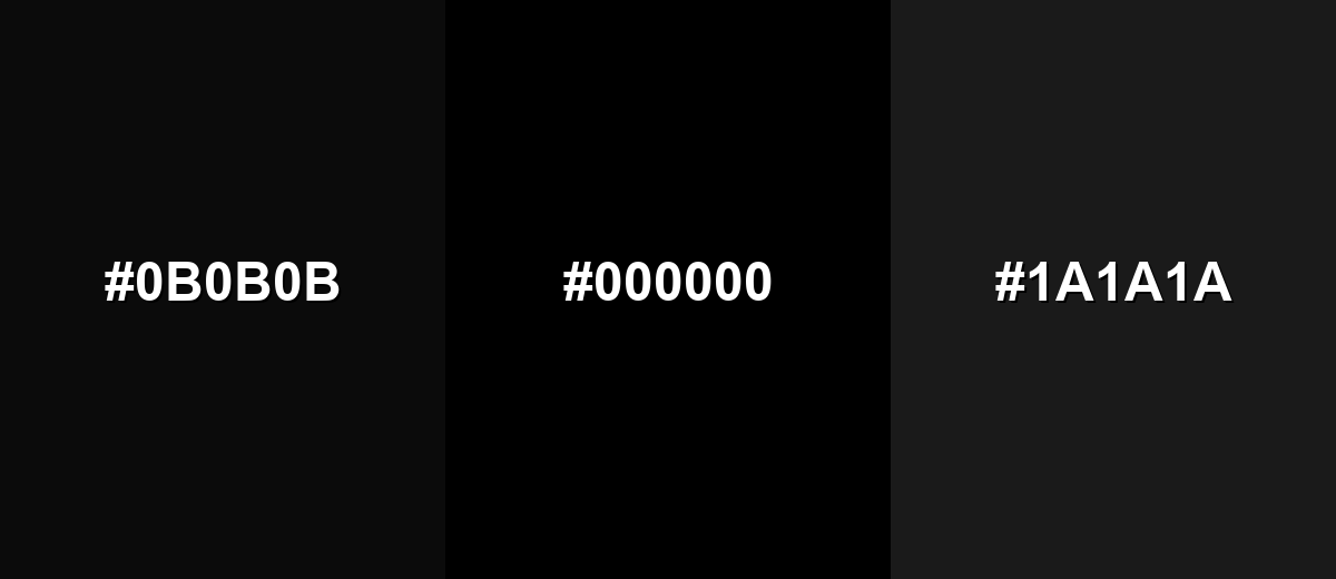
- Ebony: #0B0B0B
- Black: #000000
- Charcoal: #1A1A1A
Soft dark neutrals: Black, Graphite, and Dark Gray for calm interfaces and refined backgrounds.

- Black: #000000
- Graphite: #2B2B2B
- Dark Gray: #3D3D3D
Triadic & Tetradic Combinations
A neutral base like black makes triadic accents feel energetic without becoming chaotic.
Black with vivid Red and Blue builds a classic, high-impact triad for modern visuals.
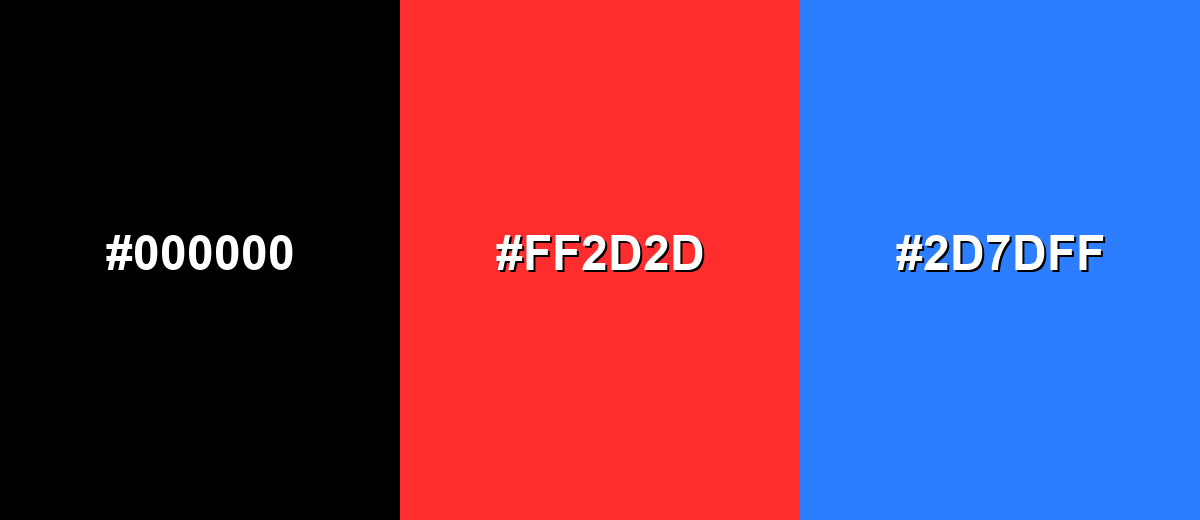
- Black: #000000
- Vivid Red: #FF2D2D
- Electric Blue: #2D7DFF
Colors to Avoid
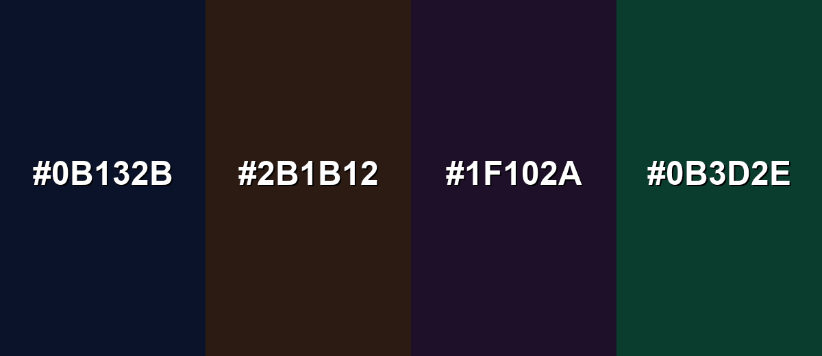
While black color is remarkably versatile, certain combinations can create problematic visual effects:
- Midnight Navy (#0B132B) - Too close in value to black, so elements can blend together and lose separation, especially in dark UI.
- Dark Chocolate (#2B1B12) - Low contrast with black can make text and icons hard to read unless you add lighter neutrals or stronger lighting.
- Deep Purple (#1F102A) - Both are very dark, so details disappear and the palette can feel muddy without a bright highlight.
- Forest Green (#0B3D2E) - This pairing can look heavy and under-saturated, and it often needs a light neutral to restore clarity.
Shades, Tints & Variations of Black Color
Black isn't just one value—its usable range runs from pure black to softened near-blacks that are easier on the eyes. These variations are especially helpful for dark UI layering, premium branding, and large background fills where #000000 can feel too intense.
- Pure Black (#000000) - The standard digital black with no visible light in RGB, creating maximum contrast against light backgrounds. It's best used for Body text on white backgrounds, icons, outlines, and strong typographic layouts..
- Ebony (#0B0B0B) - A near-black shade that still reads as black but adds a hint of softness compared to pure black. It's best used for Dark mode backgrounds and large fills where pure black would feel too sharp..
- Charcoal (#1A1A1A) - A deep gray-black that keeps a premium feel while improving depth and layering in UI. It's best used for Cards, panels, and elevation layers in dark themes..
- Graphite (#2B2B2B) - A balanced dark neutral that supports readable light text and reduces harsh contrast. It's best used for Secondary surfaces, footers, and subtle dividers in dark layouts..
- Dark Gray (#3D3D3D) - A softer variation that still feels grounded but is easier to blend with other neutrals. It's best used for Disabled states, supporting UI text, and background gradients approaching black..
Industry Applications
Black shows up across industries because it is dependable, legible, and easy to standardize across screens and materials. The most effective implementations usually pair it with careful spacing, clear hierarchy, and a single consistent accent.
Fashion & Beauty
- Minimal packaging that feels premium with matte, gloss, or spot finishes.
- Editorial-style layouts where black frames photography and typography.
- Monochrome logo systems that reproduce cleanly across materials.
- High-contrast product labels that stay readable at small sizes.
Interior Design & Decor
- Fixtures, frames, trim, and hardware that outline shapes and edges.
- Modern and industrial palettes anchored by black with warm neutrals.
- Accent cabinetry or walls balanced with soft lighting and texture.
- Metalwork and lighting details that add structure without extra hues.
Branding & Marketing
- Bold typography-led campaigns with clear hierarchy and strong contrast.
- Dark mode product pages and dashboards that feel focused and modern.
- Premium product variants where black signals "flagship" or "pro."
- Simple palettes (black + one accent) that stay consistent across channels.
Conclusion
Black is simple on paper, but incredibly expressive in real-world design: it anchors layouts, sharpens hierarchy, and makes accent colors look more vivid. From clean typography and minimalist branding to dark UI and premium packaging, #000000 is the reference point you can always build from. For the best results, balance black with thoughtful spacing, supportive neutrals, and near-black shades for large surfaces—so your work stays readable, comfortable, and intentionally styled.
Design Smarter with AI: Media.io is an online AI studio that empowers creators with advanced image generation and enhancement tools. From text-to-image and image-to-image creation to AI upscaling and color optimization, it enables fast, creative, and professional results—all in your browser.

Frequently Asked Questions About Black Color
The most common digital hex code for pure black is #000000. It represents zero red, green, and blue light in the RGB model.
In digital design, black is treated as a color value you can specify with codes like RGB or HEX. In terms of light, it is often described as the absence of visible light, while in pigments it can be created by dense mixtures or black ink.
Black is often used to suggest sophistication, authority, and simplicity. It can also signal seriousness and restraint, which makes it popular for premium branding, editorial layouts, and minimalist interfaces.
White and soft grays are the most reliable pairings for clean contrast and readable layouts. For a stronger look, add one accent such as teal, crimson, or electric blue to create a clear focal point.
Instead of using pure black everywhere, try near-black shades for large backgrounds and off-white text for reading comfort. This keeps contrast strong while reducing glare and making shadows and layers easier to see.
Screens create black by emitting less light, while print relies on ink coverage and paper. As a result, pure black ink (K) can look flatter on large areas, and some print workflows use rich black mixes to achieve deeper, fuller blacks.


