

 TL;DR:
Turquoise (HEX #40E0D0) is a dynamic blue-green color that blends the calming steadiness of blue with the energetic freshness of green, serving as an optimal accent for approachable CTAs and clean wellness branding.
● To prevent visual vibration in digital layouts, strictly avoid pairing turquoise with high-saturation colors like neon magenta (#FF00A8), neon yellow (#FFF200), or pure red (#FF0000).
● Rely on HEX or RGB (64, 224, 208) for on-screen accuracy, but require physical proofs when applying the CMYK profile (71%, 0%, 7%, 12%) for print, as paper coatings can unpredictably shift the final tone.
● Choose turquoise for a bright, airy, and lively visual presence, reserving the darker, more muted teal variations for projects that demand a serious or deeply grounded aesthetic.
Ask AI for a summary
 ChatGPT
 Perplexity
 Gemini
 Claude
 Grok
Grok
Turquoise is a vivid blue-green hue known for its clean, refreshing presence and confident character. The turquoise color meaning is often linked to clarity, balance, and a sense of open space—making it feel both calming and energizing at the same time.
Sitting between ocean blue and lively green on the color spectrum, turquoise offers versatility across digital design, branding systems, and interior palettes. It’s especially effective when you want visual energy without the sharpness of neon tones or the heaviness of deep blues—delivering a modern, approachable look that still feels distinctive.
In this article, you will learn everything about the turquoise color, from codes and values, color conversions, applications to combinations and more.
Turquoise Color: Codes & Values
If you're designing for screen or preparing assets for print, these turquoise color values help you match the shade accurately across tools and formats.
| Parameters | VALUE |
| HEX Code | #40E0D0 |
| RGB DECIMAL | 64, 224, 208 |
| RGB PERCENTAGE | 25%, 88%, 82% |
| CMYK | 71%,0%,7%,12% |
| HSL | 174°, 72%, 56% |
| HSV (HSB) | 174°, 71%, 88% |
| Web Safe | #33CCCC |
Key Color Space Explanations:
- HEX - HEX is the most common digital color format for websites and design tools. It encodes the red, green, and blue channels in a compact six-digit value.
- RGB - RGB defines the color by mixing red, green, and blue light. It's ideal for screens, video, and any color work meant to be displayed digitally.
- CMYK - CMYK is used for printing and describes how much cyan, magenta, yellow, and black ink to use. It helps you estimate how turquoise may shift when moving from screen to print.
- HSL - HSL describes a color by hue, saturation, and lightness, which many designers find intuitive. It's useful when you want to create lighter tints or deeper shades while keeping the same hue.
- Web Safe - Web Safe is the closest color from the legacy 216-color palette. It's mainly used for compatibility references and quick approximations.
Use HEX for web/UI styles, RGB for motion and on-screen design, and CMYK when you're preparing turquoise-heavy print work and want more predictable output.
Want to generate turquoise color photos or posters? Try Media.io's AI Image Generator now!
Turquoise Color Conversions
Need turquoise in a different color model? This conversion table makes it easy to copy the exact value into your workflow.
| Parameters | VALUE | CSS |
| HEX | #40e0d0 | #40e0d0 |
| RGB DECIMAL | 64, 224, 208 | rgb(64,224,208) |
| RGB PERCENTAGE | 25%, 88%, 82% | rgb(25%,88%,82%) |
| CMYK | 71%,0%,7%,12% | cmyk(71%,0%,7%,12%) |
| HSL | 174°, 72%, 56% | hsl(174°,72%,56%) |
| HSV (or HSB) | 174°, 71%, 88% | -- |
| Web Safe | 33cccc | #33cccc |
| CIE-LAB | 81.2, -43.5, -4.0 | -- |
| XYZ | 40.21, 59.04, 68.90 | -- |
| xyY | 0.239, 0.351, 59.04 | -- |
| CIE-LCH | 81.2, 43.7, 185.3° | -- |
| CIE-LUV | 81.2, -58.8, 1.0 | -- |
| Hunter-Lab | 76.8, -38.0, -3.9 | -- |
| Binary | 01000000, 11100000, 11010000 | -- |
Turquoise Color Meaning & Symbolism
Turquoise blends the steadiness of blue with the growth-oriented feel of green, so it often reads as both soothing and energizing. This balance is why it works in everything from wellness visuals to modern product interfaces.
Psychological Effects
Turquoise tends to feel "light" on the eyes while still bringing noticeable energy to a layout.
- Calm Focus - Its blue base supports steadiness, which can make busy screens feel more organized.
- Mental Freshness - The green influence gives a clean, reset-like feeling that helps visuals feel less heavy.
- Approachable Confidence - It can read trustworthy without the formal tone that deeper blues sometimes bring.
- Open Communication - Turquoise is often linked with clarity and expression, which is useful in "explain" moments like onboarding.
- Uplifting Energy - In accents, it adds a bright lift; in large blocks, it can feel very active, so balance matters.
Positive Associations
When used thoughtfully, turquoise sends modern, optimistic signals in both digital and physical design.
- Clarity And Communication - It supports messaging that feels straightforward, friendly, and easy to follow.
- Freshness And Cleanliness - Common in wellness and "clean product" design because it hints at water and air.
- Balance And Emotional Calm - The blue-green mix helps maintain an easygoing mood without feeling muted.
- Modern Optimism - Bright enough to feel contemporary and upbeat, especially paired with minimal typography.
- Innovative Friendliness - It suggests innovation without the aggressive edge of high-contrast neon tech palettes.
Cultural Significance Across the World
Turquoise meanings can shift by context, but it's widely recognized as a "water-and-sky" color with positive undertones.
- Water And Travel - Often tied to ocean imagery, resorts, and escape, making it a natural fit for tourism visuals.
- Clean Living - Frequently used in wellness and skincare to signal purity, refreshment, and breathable simplicity.
- Contemporary Technology - In product and UI design, it can imply smart, modern systems that feel human-centered.
- Friendly Trust - Many brands use turquoise to appear trustworthy while staying light, inviting, and non-corporate.
Design Applications
Turquoise is easy to apply once you decide whether it's your accent, your hero color, or part of a softer palette. Below are practical ways to use it across digital and physical design.
Graphic Design Tips
- Use turquoise for primary actions when you want a friendly, approachable CTA.
- Reserve it for highlights (badges, toggles, focus states) to keep interfaces clean.
- Pair with dark text or deep neutrals for legible dashboards and data-heavy screens.
- For a premium look, keep turquoise as an accent with restrained typography and generous white space.
- In print, proof turquoise-heavy pieces since paper and coating can slightly shift the final tone.
Pro tip: If turquoise starts to "glow" on screen, reduce saturation slightly or move it into smaller UI moments (icons, states, borders) and let neutrals do the heavy lifting.
Turquoise Color in Photography & Video
- Use turquoise in wardrobe or props to create a clean pop against warm skin tones.
- For travel and lifestyle shots, turquoise water/sky cues instantly add a fresh, open mood.
- In color grading, keep highlights neutral so turquoise doesn't overpower faces or product textures.
- Try turquoise as an accent light in studio setups for a modern, tech-forward feel.
- When compressing for social video, check banding in smooth turquoise gradients and add subtle grain if needed.
Recommended Tool for Image Enhancement: When incorporating turquoise color into your photography projects, Media.io's AI Image tools can help you achieve more refined results. With AI-powered color enhancement, photo colorization, image upscaling, and old photo restoration, you can easily enrich turquoise color tones, improve overall image quality, and highlight the color's elegant and sophisticated aesthetic.
Color Combinations
Turquoise pairs beautifully with warm complements, neighboring sea tones, and bold multi-color schemes. Use these palettes to build balanced layouts, brand systems, or illustration sets.
Complementary Colors
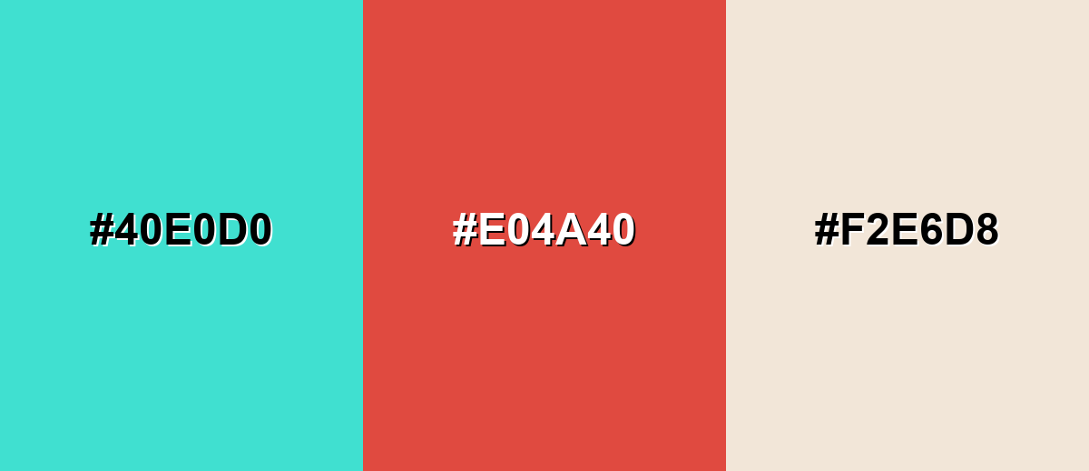
A complementary palette puts turquoise opposite a warm red-coral for maximum pop. Add a soft neutral to prevent the contrast from feeling too sharp.
Complementary Palette Example: Pair Turquoise with Coral Red and Warm Sand for energetic, balanced contrast.
Analogous Color Schemes
Analogous colors sit adjacent to each other on the color wheel, creating harmonious, cohesive palettes with subtle variation.
Sea Green, Turquoise, and Mint form a smooth, ocean-inspired gradient.
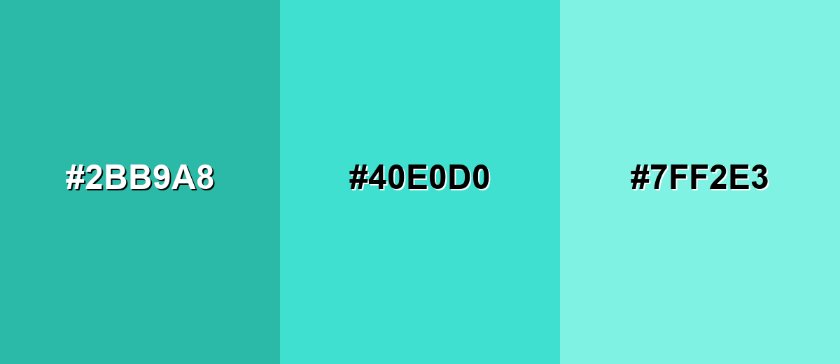
- Sea Green: #2BB9A8
- Turquoise: #40E0D0
- Mint: #7FF2E3
Teal Blue, Turquoise, and Spring Green feel fresh and modern for UI accents.
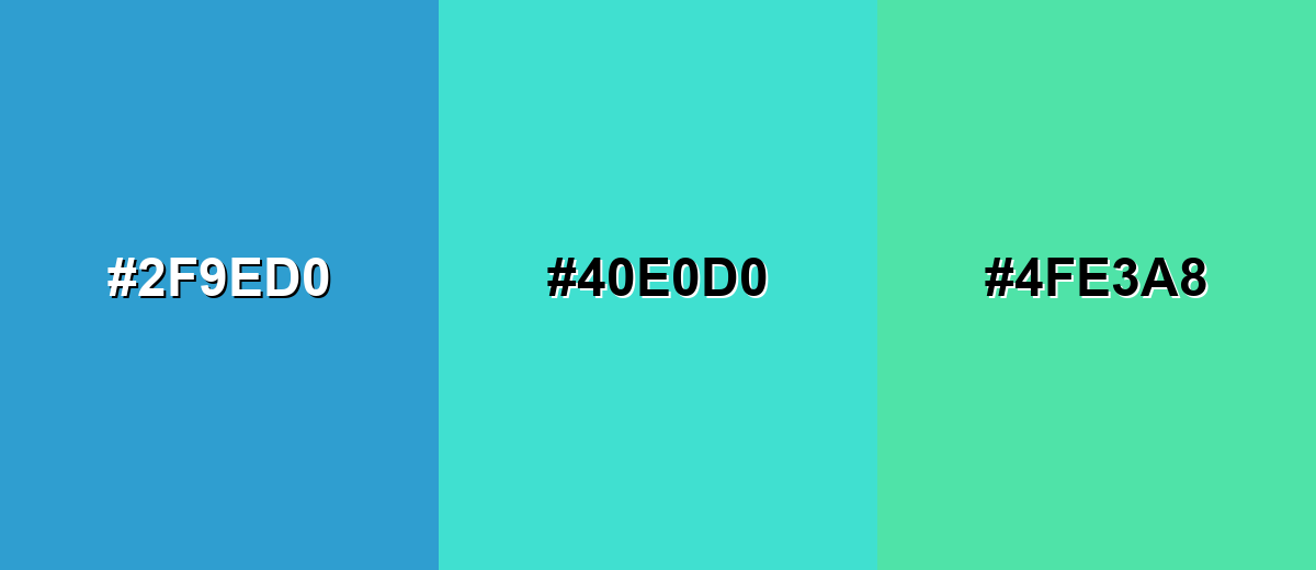
- Teal Blue: #2F9ED0
- Turquoise: #40E0D0
- Spring Green: #4FE3A8
Triadic & Tetradic Combinations
Triadic schemes keep contrast high while staying playful and balanced.
Turquoise, Soft Violet, and Sunflower create a bright, creative triad for modern visuals.
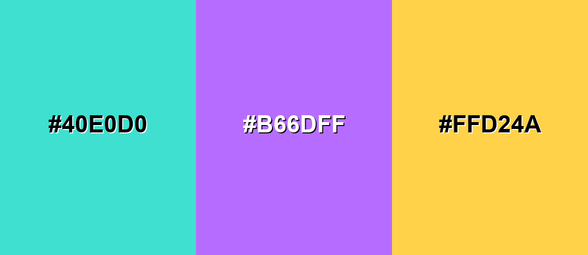
- Turquoise: #40E0D0
- Soft Violet: #B66DFF
- Sunflower: #FFD24A
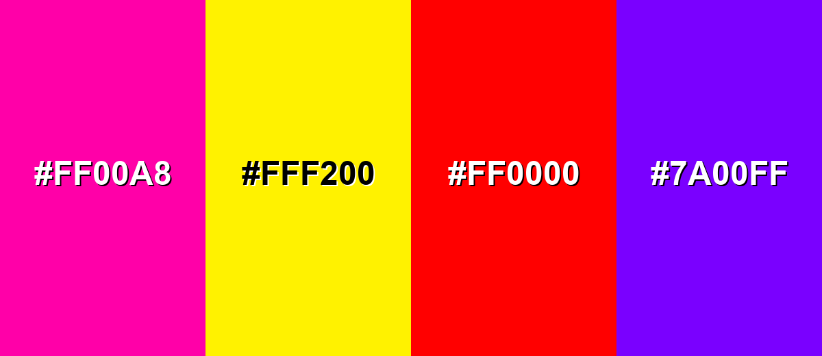
Colors to Avoid
While turquoise color is remarkably versatile, certain combinations can create problematic visual effects:
- Neon Magenta (#FF00A8) - Both are highly saturated, so the pairing can look harsh and distract from content.
- Neon Yellow (#FFF200) - The combination can create visual vibration, especially in UI elements and small text.
- Pure Red (#FF0000) - Extreme contrast can feel alarming and reduces the calm, clean quality turquoise typically conveys.
- Electric Purple (#7A00FF) - Saturated purple can overpower turquoise and make palettes feel noisy without careful balancing.
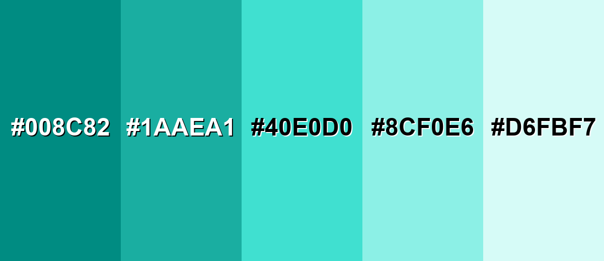
Shades, Tints & Variations of Turquoise Color
Turquoise isn't just one "ocean" shade—there's a full range from deep, grounded tones to pale, airy washes. Having these variations on hand makes it easier to build contrast, create hierarchy, and keep designs consistent across backgrounds, buttons, and accents.
- Deep Turquoise (#008C82) - A darker, more grounded turquoise that reads confident and steady. It's best used for Navigation bars, strong accents, and UI elements that need weight.
- Teal Turquoise (#1AAEA1) - A slightly muted turquoise with extra depth and a modern feel. It's best used for Brand systems, icons, and secondary buttons.
- Classic Turquoise (#40E0D0) - The bright, recognizable turquoise that feels fresh and energetic. It's best used for CTAs, highlights, hero graphics, and cheerful illustrations.
- Soft Turquoise (#8CF0E6) - A lighter tint that keeps the turquoise identity while feeling gentle. It's best used for Background panels, cards, and calming UI surfaces.
- Pale Turquoise (#D6FBF7) - A very light turquoise wash that looks airy and clean. It's best used for Large backgrounds, subtle section breaks, and minimalist layouts.
Industry Applications
Turquoise shows up across industries that want to communicate cleanliness, openness, and approachable innovation. It can be a core brand color or a sharp accent depending on the tone you need.
Fashion & Beauty
- Beauty and skincare brands use turquoise to signal fresh, "water-based" cues on labels and product pages.
- As an accent color, it makes packaging feel clean and modern without going fully clinical.
- In seasonal collections, turquoise works well for resort, swim, and summer-themed visuals.
- Pairing turquoise accents with minimal typography helps maintain a premium, polished look.
Interior Design & Decor
- Turquoise accents can brighten neutral rooms, especially in textiles, pillows, rugs, and decor pieces.
- For calmer spaces, lighter tints create an airy feel without making the room overly loud.
- In coastal-inspired interiors, turquoise layers naturally with nearby sea tones for a cohesive palette.
- If using large turquoise areas, add grounding neutrals to avoid a "glow" effect.
Branding & Marketing
- Tech and SaaS teams use turquoise for CTAs, onboarding highlights, and friendly dashboard accents.
- Health, wellness, and fitness brands lean on it for uplifting, clean visuals that feel approachable.
- Travel and hospitality marketing benefits from turquoise's ocean-and-resort associations.
- For campaigns, turquoise performs best when balanced with neutrals and used to guide attention.
Conclusion
Turquoise color (#40E0D0) is a bright blue-green that brings clarity, freshness, and modern optimism to almost any project. Whether you're building a UI system, planning brand visuals, or designing print and interiors, the key is balance: use turquoise boldly for CTAs and highlights, soften it with lighter tints for backgrounds, and lean on complementary or analogous palettes to keep the look clean, readable, and confident.
Design Smarter with AI: Media.io is an online AI studio that empowers creators with advanced image generation and enhancement tools. From text-to-image and image-to-image creation to AI upscaling and color optimization, it enables fast, creative, and professional results—all in your browser.

Frequently Asked Questions About Turquoise Color
Turquoise is a bright blue-green color positioned between cyan and green. It's commonly used to communicate freshness, clarity, and a modern, friendly mood.
Turquoise is a true mix of both, but most versions lean slightly blue-green depending on the shade. Lighter tints often feel greener, while deeper versions can feel more blue.
A widely used turquoise HEX code is #40e0d0. Designers may choose darker or lighter variations depending on contrast needs and brand tone.
Turquoise pairs well with warm coral tones for contrast, soft neutrals for balance, and nearby sea shades (teals and mints) for smooth gradients. Triadic palettes can also work when you want a lively, creative look.
Use turquoise as an accent for primary actions, highlights, and states rather than as the main background everywhere. Combine it with calm neutrals and test contrast to keep text and icons readable.
Turquoise is typically brighter and lighter, while teal is usually darker and more muted. Teal often feels more "serious," whereas turquoise reads more lively and airy.


