

Pastel red color is a softened, light red that looks rosy and airy rather than bold or intense. Its most recognized digital reference is hex #FF6961, a warm tint that sits between red and coral.
People often read it as affectionate, friendly, and approachable, with a gentle energy that feels less urgent than pure red. This guide covers meaning, codes, combinations, related shades, and practical ways to use it.
Pastel Red Color: Codes & Values
Use these standard values to keep pastel red consistent across UI, branding files, and print handoffs.
| Parameters | VALUE |
| HEX Code | #FF6961 |
| RGB DECIMAL | 255, 105, 97 |
| RGB PERCENTAGE | 100%, 41.18%, 38.04% |
| CMYK | 0%,59%,62%,0% |
| HSL | 3°, 100%, 69% |
| HSV (HSB) | 3°, 62%, 100% |
| Web Safe | #FF6666 |
Key Color Space Explanations:
- HEX - HEX is the most common web format for defining a specific tint in HTML and design tools. Pastel red is represented as #ff6961.
- RGB - RGB describes how much red, green, and blue light is used on screens. This tint uses high red with moderate green and blue for a warm, softened look.
- CMYK - CMYK is used for print, showing the ink mix needed to reproduce the tint. Because pastel red is light, the black (K) component is typically minimal or zero.
- HSL - HSL explains the tint by hue, saturation, and lightness, which is helpful for building matching palettes. Pastel red stays near red on the hue wheel while keeping lightness high.
- Web Safe - Web safe is the closest legacy browser-safe approximation. For pastel red, the nearest web-safe match is #ff6666.
For digital work, start with HEX (#FF6961). For print specs, translate it with CMYK and do a quick proof check to confirm it stays soft (not overly orange or too pink).
Pastel Red Color Conversions
Need pastel red color in a different color space? Use the pastel red conversion table below to copy-paste values into your preferred tool.
| Parameters | VALUE | CSS |
| HEX | #ff6961 | #ff6961 |
| RGB DECIMAL | 255, 105, 97 | rgb(255,105,97) |
| RGB PERCENTAGE | 100%, 41.18%, 38.04% | rgb(100%,41.18%,38.04%) |
| CMYK | 0%,59%,62%,0% | cmyk(0%,59%,62%,0%) |
| HSL | 3°, 100%, 69% | hsl(3°,100%,69%) |
| HSV (or HSB) | 3°, 62%, 100% | -- |
| Web Safe | ff6666 | #ff6666 |
| CIE-LAB | 68.3, 54.8, 31.2 | -- |
| XYZ | 52.9, 38.9, 16.7 | -- |
| xyY | 0.490, 0.360, 38.9 | -- |
| CIE-LCH | 68.3, 63.0, 29.6° | -- |
| CIE-LUV | 68.3, 92.0, 27.0 | -- |
| Hunter-Lab | 62.4, 48.1, 20.6 | -- |
| Binary | 11111111 01101001 01100001 | -- |
Want to generate pastel red color photos or posters? Try Media.io's AI Image Generator now!
Pastel Red Meaning & Symbolism
Pastel red is commonly linked with warmth, kindness, and gentle affection. Because it is lighter than classic red, it keeps the emotional openness without the urgent, stop-sign intensity. In everyday visuals, pastel red often reads as friendly, youthful, and reassuring, which is a big part of pastel red color meaning in modern design.
Psychological Effects
Used thoughtfully, pastel red draws attention without feeling loud.
- Warmth - Helps spaces and screens feel inviting, especially on light backgrounds.
- Gentle Emphasis - Highlights tags, badges, or prompts in a softer way than saturated reds.
- Subtle Energy - Keeps a hint of "red" activity while staying approachable and calm.
- Emotional Friendliness - Supports caring, personable brand tones without looking aggressive.
- Overuse Risk - Too much can feel overly sweet, childish, or visually busy unless balanced with deeper anchors.
Positive Associations
Pastel red tends to communicate warmth-first rather than urgency-first.
- Kindness - Reads as considerate and supportive in modern interfaces and packaging.
- Affection - Suggests love and tenderness with less intensity than classic red.
- Approachability - Makes brands and products feel more human and easy to engage with.
- Youthful Charm - Adds a light, playful mood without going neon.
- Reassurance - Creates a friendly visual cue for non-critical alerts and guidance moments.
Cultural Significance Across the World
Interpretations shift by context, so treat it as a flexible signal rather than a fixed symbol.
- Love & Celebration - In many settings, red connects to romance and festive energy, while pastel tints soften the message.
- Tenderness - Lighter reds often land closer to care, sweetness, and warmth than intensity.
- Modern Friendliness - In contemporary visuals, pastel red frequently signals a youthful, welcoming vibe.
- Context Matters - Meaning can change by culture and use-case, so align it with your audience and content.
Design Applications
Pastel red is easiest to work with when you treat it like a warm accent rather than a full-page base. It pairs naturally with creamy neutrals, gentle greens, and soft purples, and it can also modernize minimalist layouts by adding a human touch.
Graphic Design Tips
- Use pastel red for UI accents like highlights, tags, and subtle alerts instead of making it your main background color.
- Balance it with warm neutrals to keep layouts calm and avoid an overly "candy" look.
- Introduce cool contrast (like mint-leaning hues) when you want a fresh, modern split between warm and cool.
- Anchor it with deeper tones when you need a more premium, serious, or editorial feel.
- Prioritize readability: dark text generally performs better than white on pastel red backgrounds.
Pro tip: If you're using pastel red in buttons or badges, test contrast at the smallest size you plan to ship—light reds can look great in mockups and still fall short in real-world UI.
Pastel Red in Photography & Video
- Use pastel red props (florals, paper backdrops, packaging) for warm highlights that don't steal the whole frame.
- In portraits, pastel red clothing can add a friendly tone while staying softer than true red.
- For product shots, pair pastel red accents with creamy, neutral sets to keep materials looking premium.
- In video color grading, keep saturation controlled so pastel red stays rosy rather than pushing into neon.
- For social content, pastel red works well as a consistent "attention cue" for titles, stickers, and callouts.
Recommended Tool for Image Enhancement: When incorporating pastel red into your photography projects, Media.io's AI Image tools can help you achieve more refined results. With AI-powered color enhancement, photo colorization, image upscaling, and old photo restoration, you can easily enrich pastel red tones, improve overall image quality, and highlight the color's elegant and sophisticated aesthetic.
Color Combinations
Pastel red plays well with both warm and cool partners, depending on whether you want a cozy look or a crisp contrast. Use the palettes below as starting points, then adjust lightness to fit your layout and readability needs.
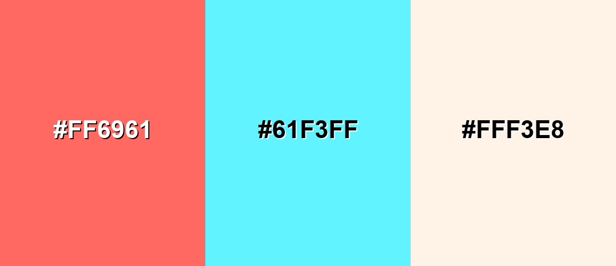
Complementary Colors
A complementary match pairs pastel red with a soft cyan-leaning tint to create clean contrast without harshness. This is a strong option for modern UI, playful branding, and hero sections where you want energy that still feels light.
Complementary Palette Example: Try pastel red with pastel cyan and a creamy white to keep the palette bright, friendly, and balanced.
Analogous Color Schemes
Analogous colors sit adjacent to each other on the color wheel, creating harmonious, cohesive palettes with subtle variation.
For a warm, sunset-leaning palette, combine pastel red with peach and soft magenta for smooth transitions and a cheerful vibe.
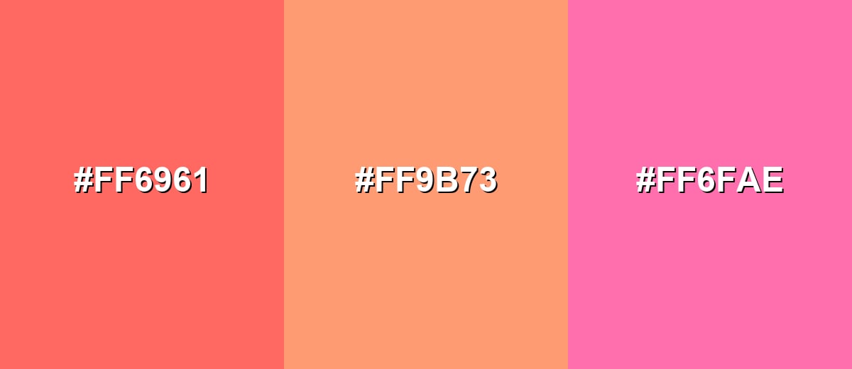
- Pastel Red: #FF6961
- Pastel Peach: #FF9B73
- Soft Magenta: #FF6FAE
For a calmer, romantic palette, pair pastel red with blush pink and light coral to keep everything cohesive and gentle.
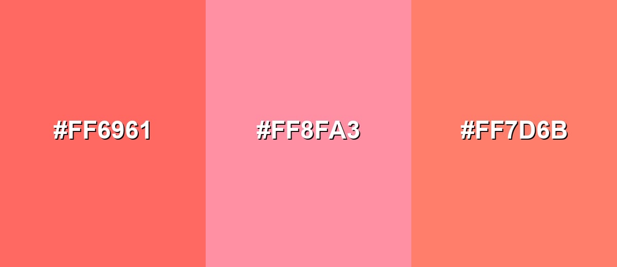
- Pastel Red: #FF6961
- Blush Pink: #FF8FA3
- Light Coral: #FF7D6B
Triadic & Tetradic Combinations
A triadic scheme adds variety while staying balanced, making it useful for dashboards, illustrations, and multi-section layouts.
Use pastel red with mint green and lavender to create a playful, modern triad with clear separation between elements.
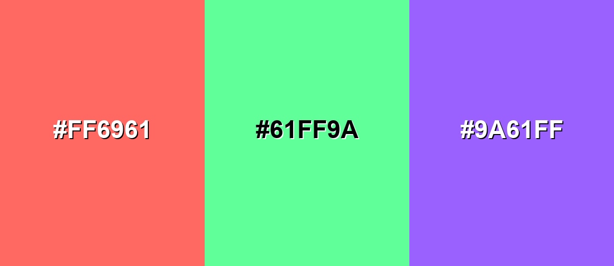
- Pastel Red: #FF6961
- Mint Green: #61FF9A
- Lavender: #9A61FF
Colors to Avoid
While pastel red is remarkably versatile, certain combinations can create problematic visual effects:
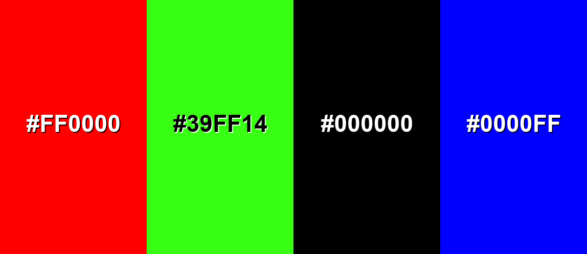
- Pure Red (#FF0000) - It can overpower pastel red and make the overall look feel harsh rather than soft.
- Neon Green (#39FF14) - The neon intensity clashes with pastel red and creates an unbalanced, high-noise palette.
- Pure Black (#000000) - The jump in contrast can feel too severe and can make pastel red look washed out or overly sweet.
- Pure Blue (#0000FF) - A fully saturated blue can fight for attention and reduce the gentle, warm character of pastel red.
Shades, Tints & Variations of Pastel Red
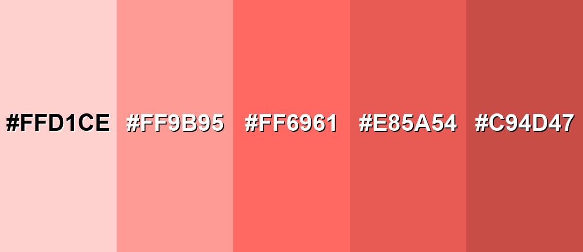
Pastel red isn't just one swatch—there's a useful range from barely-there rosy tints to deeper, dustier reds that feel more grounded. Having a few coordinated variations makes it easier to design hierarchy (backgrounds, cards, buttons, highlights) without changing the overall mood.
- Misty Pastel Red (#FFD1CE) - A very light tint that reads as soft warmth with minimal intensity. It's best used for Large backgrounds, gentle panels, and airy editorial blocks..
- Blush Red (#FF9B95) - A balanced blush that stays warm while looking more defined than very pale tints. It's best used for Cards, product highlights, and supportive UI accents..
- Pastel Red (#FF6961) - The base pastel red shade with a rosy coral lean and clear warmth. It's best used for Badges, icons, brand accents, and friendly callouts..
- Warm Rose Red (#E85A54) - A slightly deeper, sturdier version that keeps the warmth but adds weight. It's best used for Buttons, headings, and elements that need stronger emphasis..
- Dusty Brick (#C94D47) - A muted, darker take that feels grounded and less playful. It's best used for Outlines, charts, typography accents, and more mature branding..
Industry Applications
Pastel red is flexible across industries because it signals warmth without feeling loud. It works best when you want friendliness, care, or lighthearted energy while keeping the overall design easy on the eyes.
Fashion & Beauty
- Use it in packaging and label accents to create a soft, modern, personable feel.
- Works well for campaign visuals that want warmth without the "hard sell" of strong red.
- Pairs nicely with creamy neutrals for skincare and lifestyle styling.
- Great for seasonal drops where classic red would look too intense.
Interior Design & Decor
- Best as an accent (cushions, artwork, small décor) to add warmth without dominating a room.
- Use lighter tints for airy walls or panels when you want a gentle rosy glow.
- Balance with deeper anchors in furniture or frames to avoid a washed-out look.
- Fits cozy, welcoming spaces where bold reds feel too urgent.
Branding & Marketing
- Add it as an accent hue in brand systems to signal approachability and friendliness.
- Effective for onboarding screens and non-critical highlights in product design.
- In editorial layouts, it works as a section marker or pull-quote background.
- Ideal for lifestyle goods, events, and celebrations when you want warmth without shouting.
Conclusion
Pastel red stands out for its soft warmth: it keeps the emotional pull of red while staying light, modern, and easy to pair. With #FF6961 as a reliable reference, you can build consistent palettes across screens and print workflows—using it for friendly accents in UI, branding, packaging, and interiors. Keep it readable with dark text, lean on creamy neutrals for comfort, add mint/cyan for freshness, and introduce deeper anchors when you need more authority. Used in moderation, pastel red adds personality without making a design feel loud or stressful.
Design Smarter with AI: Media.io is an online AI studio that empowers creators with advanced image generation and enhancement tools. From text-to-image and image-to-image creation to AI upscaling and color optimization, it enables fast, creative, and professional results—all in your browser.

Frequently Asked Questions About Pastel Red Color
Pastel red is a light, softened red with a rosy or coral tint. It is created by increasing lightness, often similar to mixing red with white in paint or reducing saturation in digital design.
A commonly used hex code for pastel red is #ff6961. It is a warm, gentle red that reads softer than pure red on most screens.
It is often associated with warmth, kindness, affection, and friendliness. Compared with stronger reds, it typically feels more approachable and less urgent.
Creamy whites, warm beiges, soft grays, mint greens, and lavender are reliable choices. For stronger contrast, pair it with a pastel cyan or cool teal-leaning tint while keeping the overall palette light.
Yes, especially for accents like badges, illustrations, and supportive highlights. For text and buttons, check contrast carefully because light reds can lose readability against white backgrounds.
Start with a red hue, then raise the lightness and lower the saturation until it looks airy and soft. You can also blend toward white or a warm neutral to keep it from turning neon or overly pink.


