

Teal sits right between blue and green, so it naturally balances “calm” with “fresh.” That makes a teal color palette easy to use for interfaces, brands, and spaces that need clarity without feeling cold.
Below are 20 curated teal color combinations with HEX codes, plus quick guidance on pairing teal with neutrals, metals, and warm accents for modern, readable designs.
In this article
Why Teal Palettes Work So Well
Teal is flexible: it can read as clean and modern in UI, or rich and premium in branding, depending on whether you push it toward cyan (brighter) or green (deeper).
It also plays nicely with contrast. Deep teals pair well with off-whites for editorial layouts, while lighter seafoam tones make friendly backgrounds for cards, forms, and onboarding screens.
Finally, teal bridges warm and cool accents. It can support energetic pops like coral or gold without feeling chaotic, which is why teal color schemes often look “designed” even with minimal effort.
20+ Teal Color Palette Ideas (with HEX Codes)
1) Lagoon Breeze
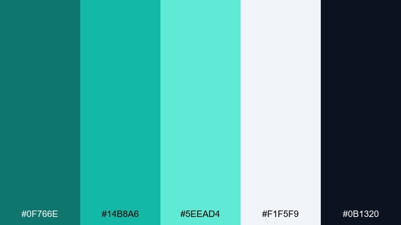
HEX: #0f766e #14b8a6 #5eead4 #f1f5f9 #0b1320
Mood: calm, coastal, fresh
Best for: wellness app UI
Calm lagoon tones feel like clear water and a cool morning breeze. They work beautifully for wellness dashboards, habit trackers, and clean onboarding screens where clarity matters. Pair the bright aqua with slate or near-black text for readability, and reserve the light mint for cards and subtle highlights. Usage tip: keep the darkest shade for headers and navigation so the lighter accents stay airy.
Image example of lagoon breeze generated using media.io
Media.io is an online AI studio for creating and editing video, image, and audio in your browser.

2) Deep Harbor
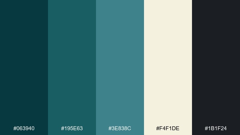
HEX: #063940 #195e63 #3e838c #f4f1de #1b1f24
Mood: nautical, refined, moody
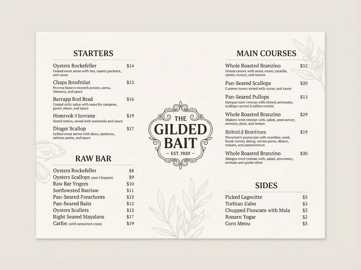
Best for: seafood restaurant menu design
Deep harbor hues evoke dockside evenings, salted air, and polished wood. They suit restaurant menus and brand systems that want to feel premium without looking flashy. Pair the darker teal with warm off-white and let the muted blue-green handle section dividers and icons. Usage tip: use the cream tone for generous negative space so the typography feels upscale and legible.
Image example of deep harbor generated using media.io
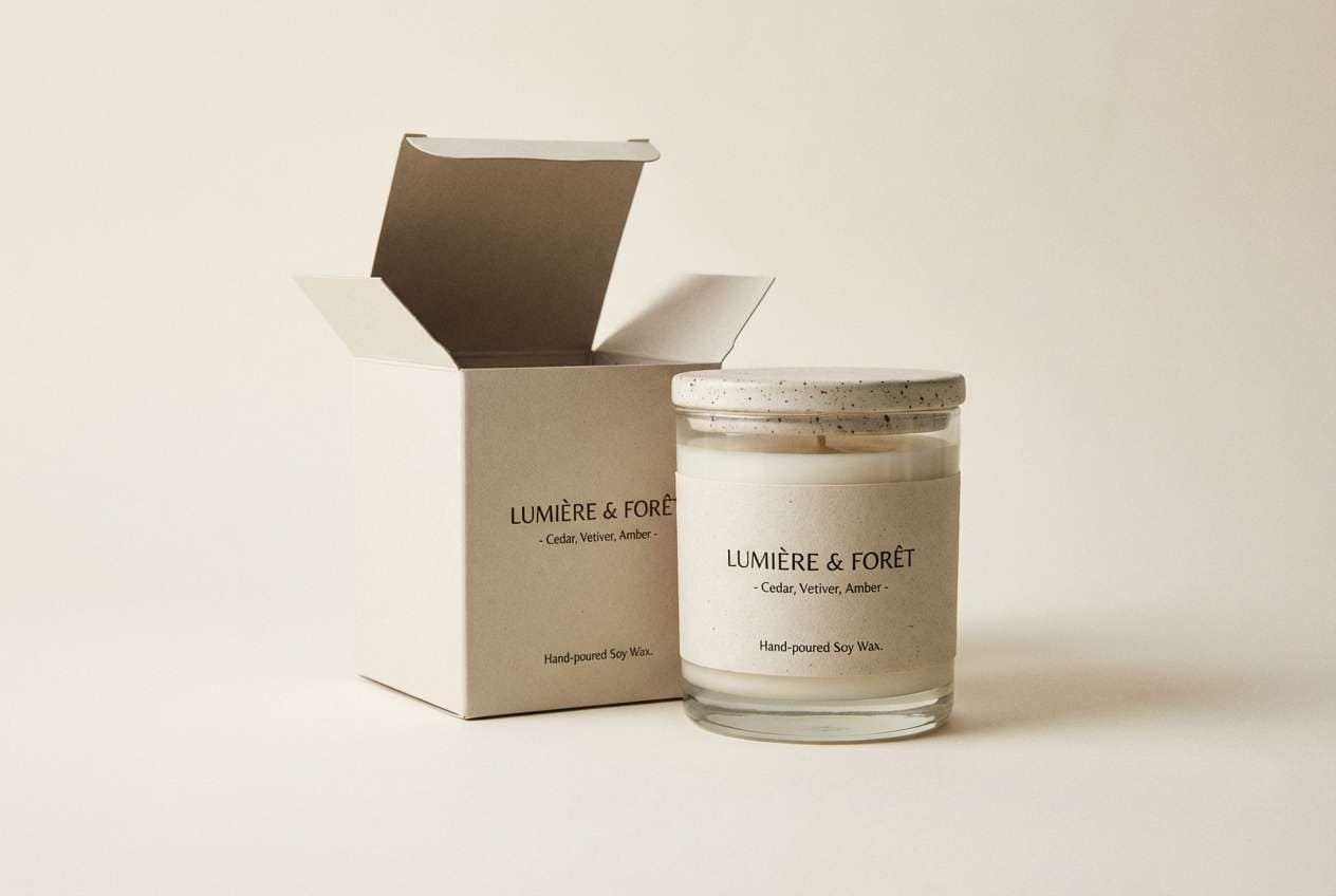
3) Copper Tide
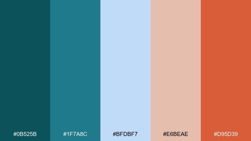
HEX: #0b525b #1f7a8c #bfdbf7 #e6beae #d95d39
Mood: warm, artisanal, inviting
Best for: scented candle packaging
Warm copper and watery teal feel like sunlit waves hitting weathered metal. These teal color combinations are ideal for candle labels, craft packaging, and boutique product launches that want a hand-finished vibe. Pair the rust accent with the paler blue for balance, and keep the strongest teal for brand marks and borders. Usage tip: use copper sparingly as a focal point so the palette stays calm, not crowded.
Image example of copper tide generated using media.io
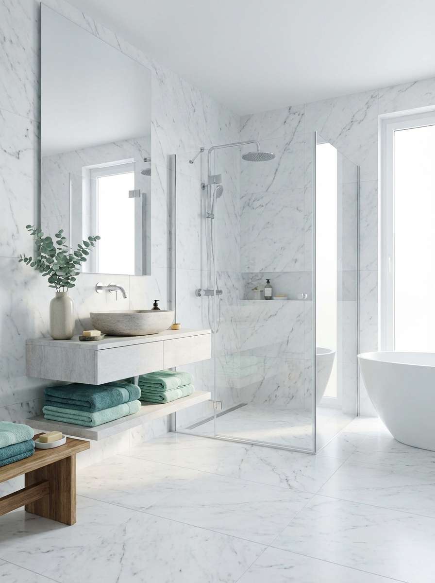
4) Minted Marble
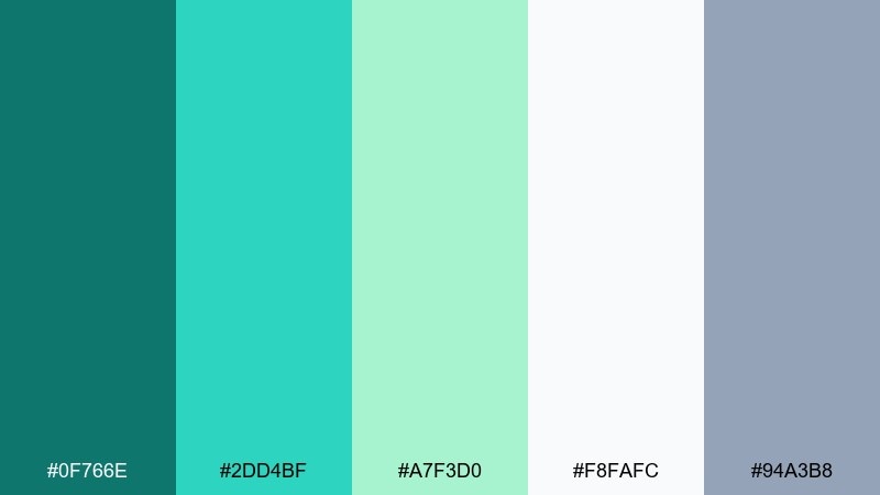
HEX: #0f766e #2dd4bf #a7f3d0 #f8fafc #94a3b8
Mood: spa-like, bright, modern
Best for: bathroom interior mood board
Mint and soft teal evoke polished stone, steam, and a quiet spa. They fit bathrooms, powder rooms, and minimal kitchens where you want cleanliness without starkness. Pair the cool greens with light gray fixtures, pale wood, and brushed nickel for a calm, contemporary finish. Usage tip: repeat the darkest teal in small details like towels or grout lines to make the space feel intentional.
Image example of minted marble generated using media.io
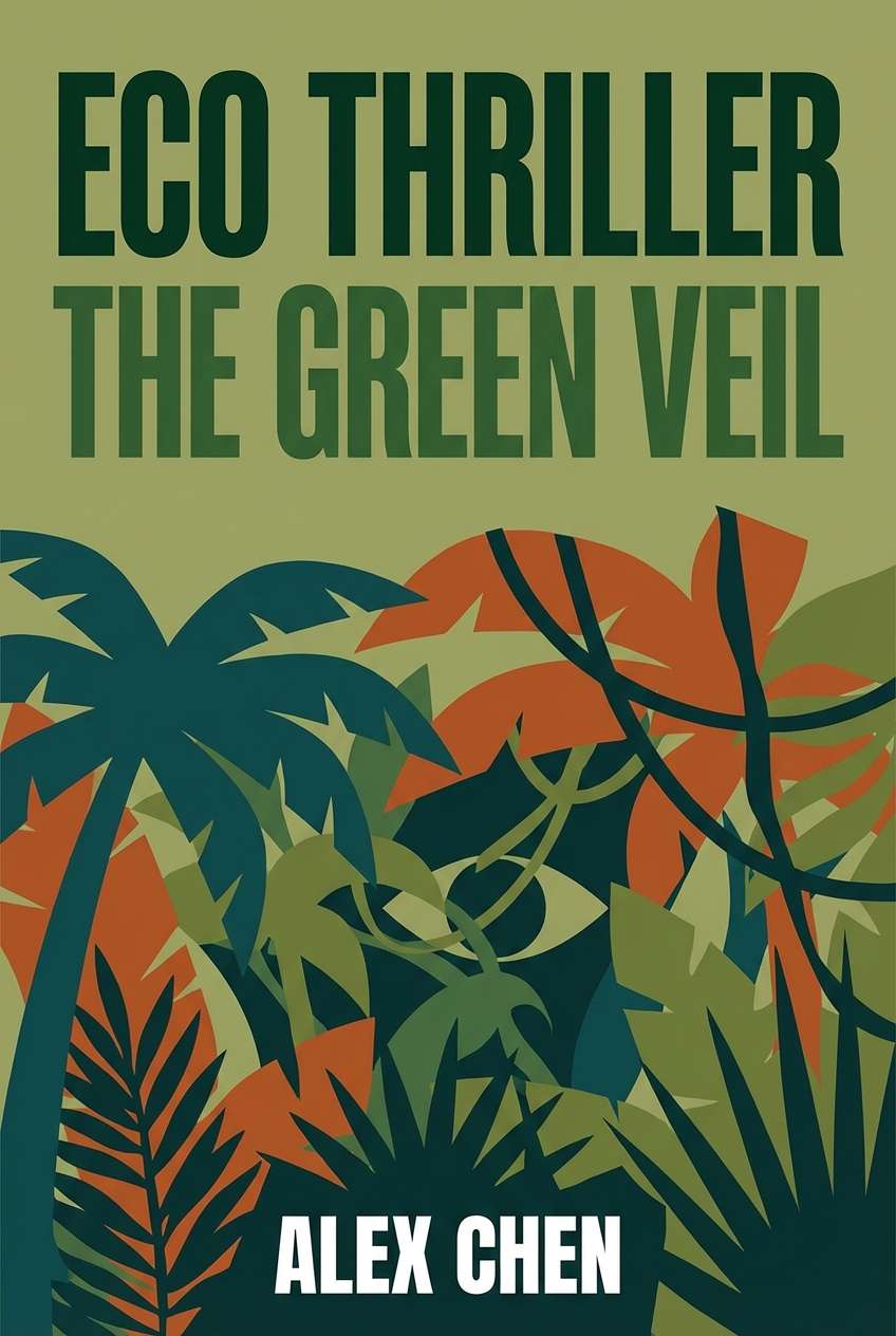
5) Rainforest Ink
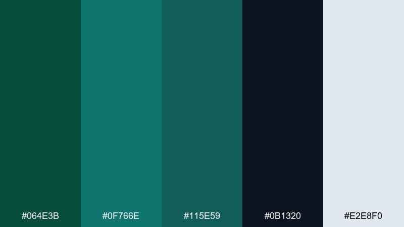
HEX: #064e3b #0f766e #115e59 #0b1320 #e2e8f0
Mood: lush, dramatic, cinematic
Best for: eco thriller book cover
Inky greens and deep teal feel like dense rainforest shadows and hidden trails. They work well for suspenseful book covers, documentary key art, and environmental campaigns that need gravity. Pair the near-black with pale gray type, then use teal sparingly as a glowing accent for titles or badges. Usage tip: keep contrast high on the cover so the design stays readable at thumbnail size.
Image example of rainforest ink generated using media.io
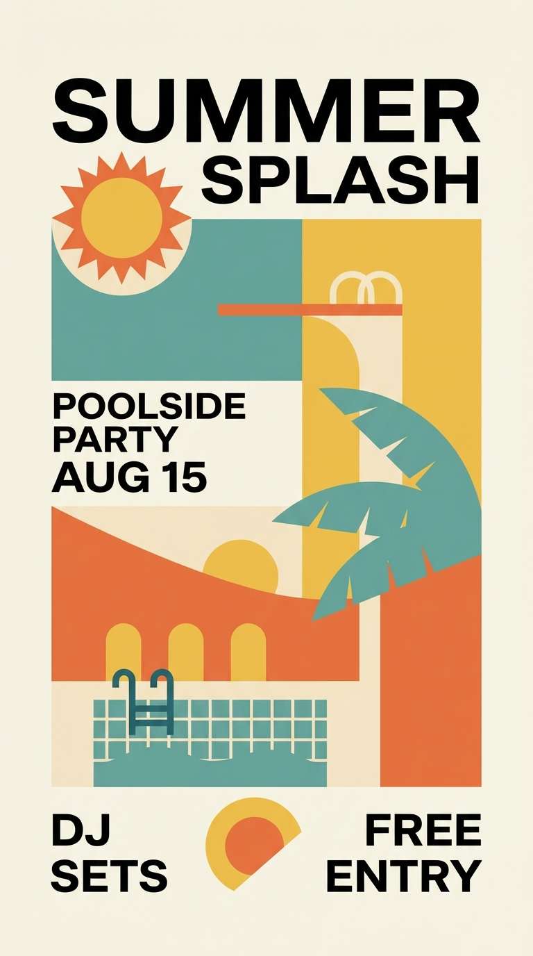
6) Retro Poolside
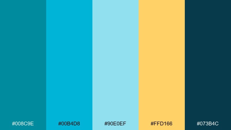
HEX: #008c9e #00b4d8 #90e0ef #ffd166 #073b4c
Mood: playful, sunny, nostalgic
Best for: summer event flyer
Bright pool blues with a punch of citrus yellow bring back roadside motels and vinyl lounge chairs. They are perfect for summer flyers, pop-up events, and energetic promo graphics that need instant cheer. Pair the yellow with the darkest navy for strong headlines and use the pale aqua as a breathable background. Usage tip: limit gradients and keep shapes bold to maintain the retro feel.
Image example of retro poolside generated using media.io
7) Desert Oasis
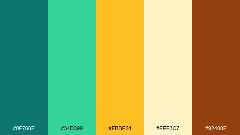
HEX: #0f766e #34d399 #fbbf24 #fef3c7 #92400e
Mood: sunlit, adventurous, welcoming
Best for: travel blog hero banner
Teal and cactus green look like a shaded oasis against warm desert sand. This mix suits travel blogs, itinerary pages, and guide templates where you want energy without neon intensity. Pair the golden tone with teal buttons, and keep the cream as the main canvas for photos and headlines. Usage tip: use the brown for small dividers and captions to keep the palette grounded.
Image example of desert oasis generated using media.io

8) Slate and Seafoam
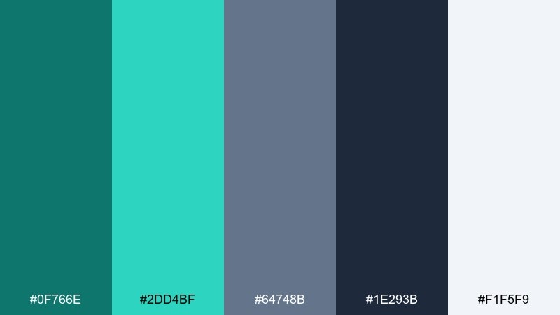
HEX: #0f766e #2dd4bf #64748b #1e293b #f1f5f9
Mood: modern, confident, clean
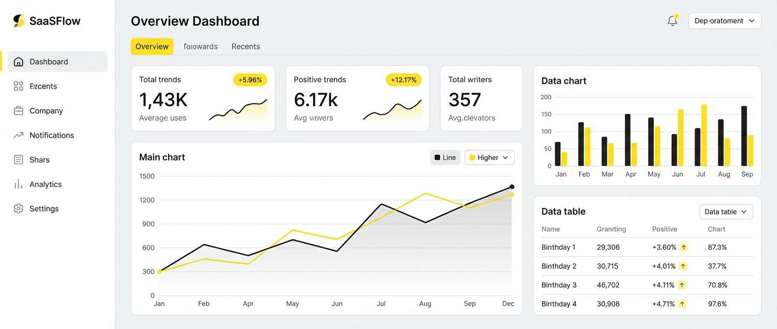
Best for: SaaS dashboard UI
Cool seafoam against slate gray feels like glass architecture and crisp morning air. A teal color palette like this works well for SaaS dashboards, analytics views, and admin panels where hierarchy is everything. Pair slate typography with seafoam highlights for states, tags, and active navigation. Usage tip: keep the brightest mint for success or selected states so the interface stays consistent.
Image example of slate and seafoam generated using media.io
9) Coral Current
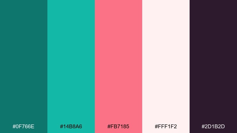
HEX: #0f766e #14b8a6 #fb7185 #fff1f2 #2d1b2d
Mood: lively, trendy, social
Best for: beauty brand social posts
Vivid coral with clean teal feels like pop art makeup swatches and glossy packaging. It is a strong choice for social templates, launch announcements, and creator kits where you need fast attention. Pair coral headlines with deep plum text for contrast, and let the pale blush handle backgrounds. Usage tip: use coral only for one or two key elements per post to keep the feed cohesive.
Image example of coral current generated using media.io
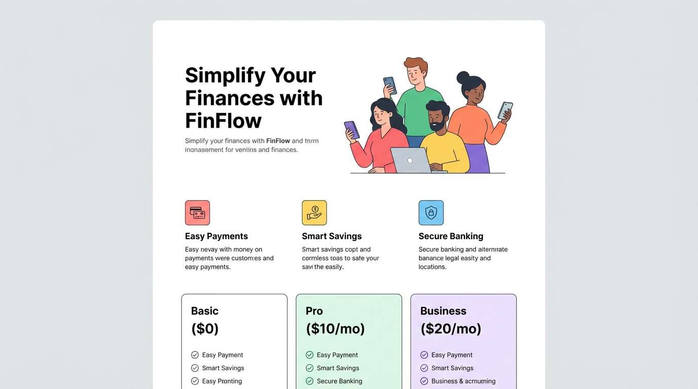
10) Nordic Teal Neutral
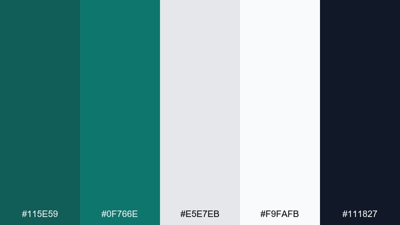
HEX: #115e59 #0f766e #e5e7eb #f9fafb #111827
Mood: minimal, practical, calm
Best for: ecommerce product page UI
Muted teal with soft grays feels like Scandinavian textiles and tidy shelves. It fits product pages and checkout flows that should feel trustworthy and uncluttered. Pair the dark ink tone with light backgrounds, then use teal for links, toggles, and price highlights. Usage tip: reserve the strongest teal for primary buttons so conversion actions stand out.
Image example of nordic teal neutral generated using media.io
11) Electric Peacock
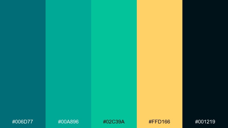
HEX: #006d77 #00a896 #02c39a #ffd166 #001219
Mood: bold, festive, high-energy
Best for: music festival poster
Peacock teal and neon mint feel like stage lights cutting through night air. This palette suits festival posters, nightlife promos, and high-impact announcements that need punchy contrast. Pair the bright greens with deep black for typography, and use the yellow as a spotlight accent behind key acts. Usage tip: keep type large and simple so the saturated colors do not compete with readability.
Image example of electric peacock generated using media.io
12) Vintage Apothecary
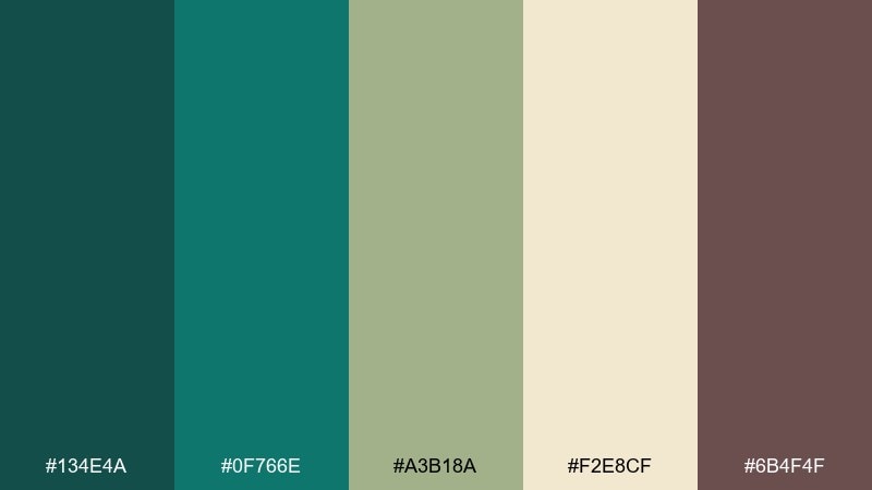
HEX: #134e4a #0f766e #a3b18a #f2e8cf #6b4f4f
Mood: earthy, nostalgic, handcrafted
Best for: herbal tonic bottle packaging
Earthy teal with sage and parchment tones feels like old labels, glass bottles, and dried botanicals. It works for apothecary-inspired packaging, small-batch food brands, and farmers market signage. Pair the parchment with deep teal for a classic label contrast, and use the muted brown for vintage borders. Usage tip: add subtle paper texture and keep the palette matte to sell the handcrafted story.
Image example of vintage apothecary generated using media.io
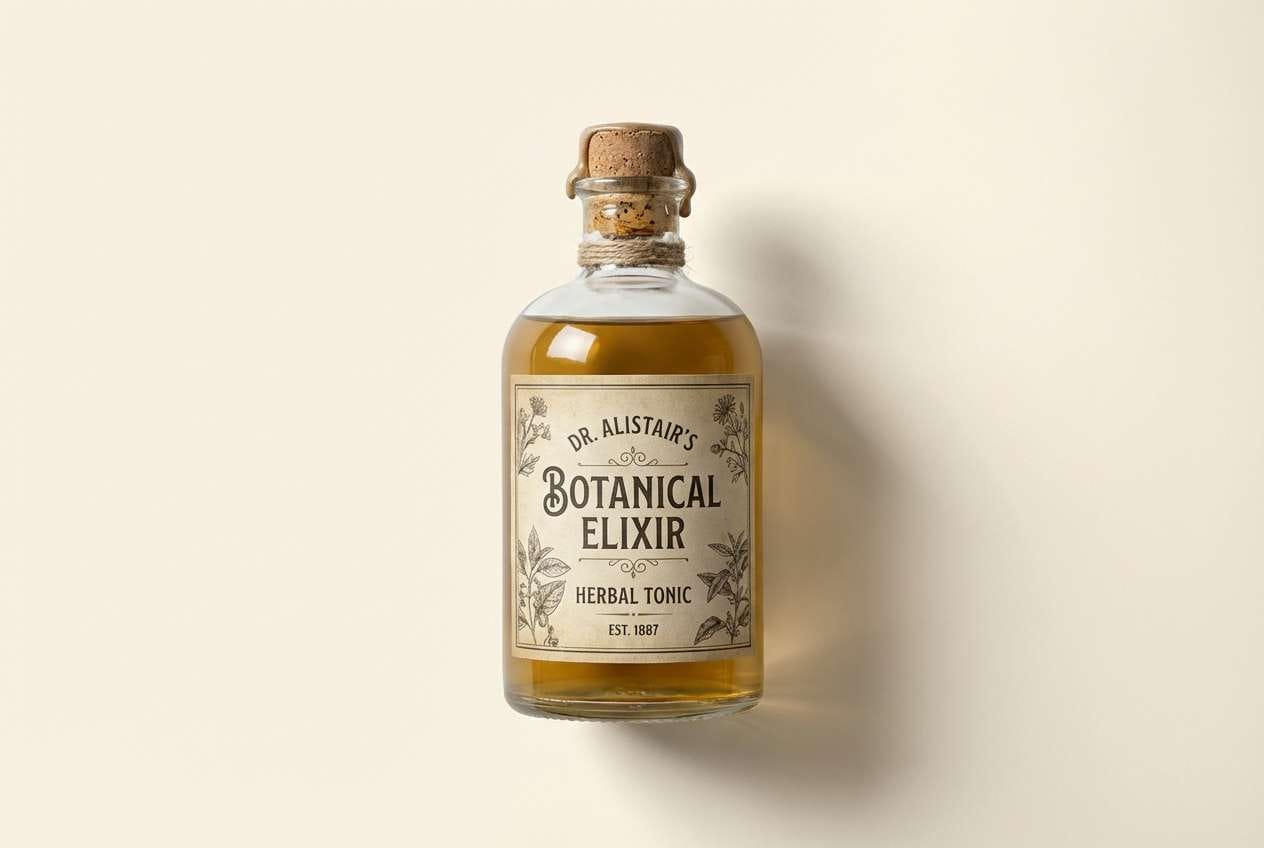
13) Arctic Fjord
HEX: #0e7490 #22d3ee #a5f3fc #e0f2fe #0f172a
Mood: crisp, icy, precise
Best for: fintech landing page UI
Icy blues and teal read like glacial water and sharp winter light. They are great for fintech landing pages and product screens that need to feel fast, clean, and secure. Pair the dark navy with bright cyan for CTAs, then use the palest tint for sections and cards. Usage tip: keep icons monochrome and let one accent color do the heavy lifting for focus.
Image example of arctic fjord generated using media.io
14) Blush Lagoon
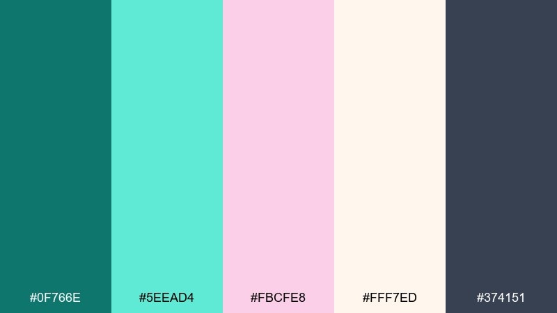
HEX: #0f766e #5eead4 #fbcfe8 #fff7ed #374151
Mood: soft, romantic, airy
Best for: wedding invitation set
Soft blush with watery teal feels like sea glass, silk ribbons, and spring florals. It is ideal for wedding stationery, bridal shower invites, and elegant RSVP cards with a light touch. Pair charcoal text with blush backgrounds, and use teal sparingly for monograms or small illustrations. Usage tip: choose one dominant pastel and keep the other as an accent to avoid a candy look.
Image example of blush lagoon generated using media.io
15) Charcoal Reef
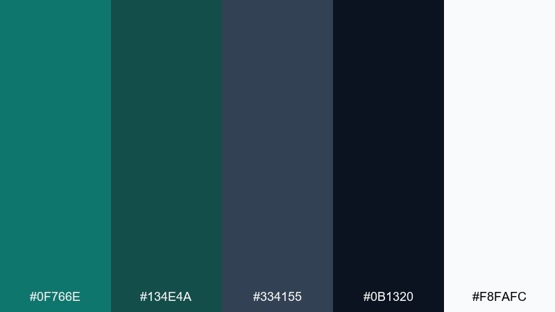
HEX: #0f766e #134e4a #334155 #0b1320 #f8fafc
Mood: sleek, techy, premium
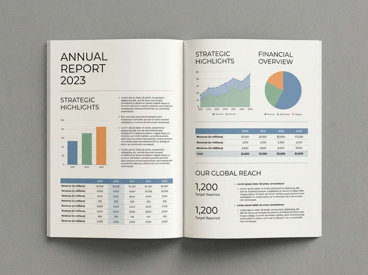
Best for: annual report editorial layout
Dark reef tones feel like deep water with clean, modern edges. This mix shines in editorial layouts, annual reports, and pitch decks that need a sophisticated tone. Try these teal color combinations with plenty of white space, thin rules, and crisp charts for a polished finish. Usage tip: keep body copy on white and use the darker shades for sidebars and section openers.
Image example of charcoal reef generated using media.io
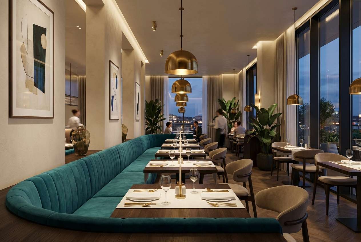
16) Golden Kelp
HEX: #0f766e #14b8a6 #f59e0b #fef3c7 #3f2d20
Mood: luxe, coastal, warm
Best for: restaurant interior accent plan
Golden highlights against teal feel like kelp drifting in sunlit water. It works for hospitality interiors, bar concepts, and dining spaces that want warmth without losing freshness. Pair teal upholstery with brass fixtures and creamy walls, then add the deep brown for wood and leather notes. Usage tip: echo the gold tone in lighting to make the palette glow at night.
Image example of golden kelp generated using media.io
17) Stormy Bay
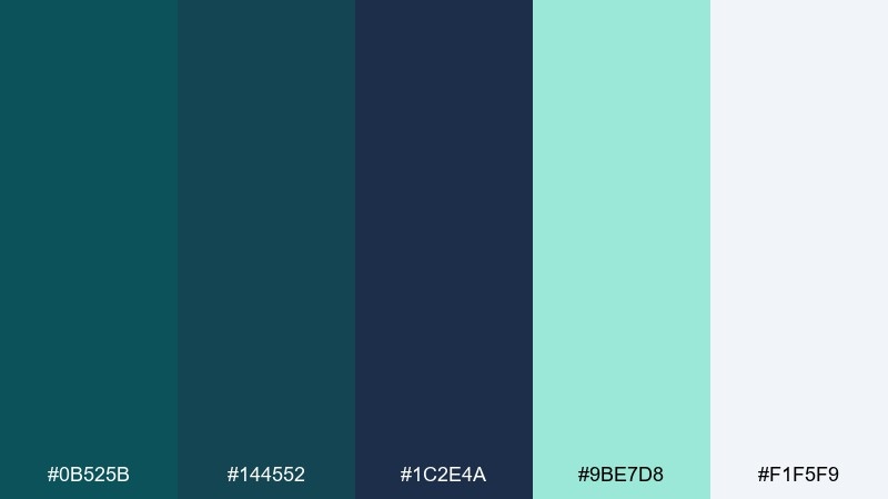
HEX: #0b525b #144552 #1c2e4a #9be7d8 #f1f5f9
Mood: stormy, focused, professional
Best for: presentation slide deck theme
Stormy bay tones feel like rain over the ocean, steady and serious. They are a strong fit for slide decks, client presentations, and keynote themes where you want calm authority. Pair the deep navy with light backgrounds, then use the pale mint for callouts and data highlights. Usage tip: keep charts mostly monochrome and use one accent shade to guide the audience.
Image example of stormy bay generated using media.io
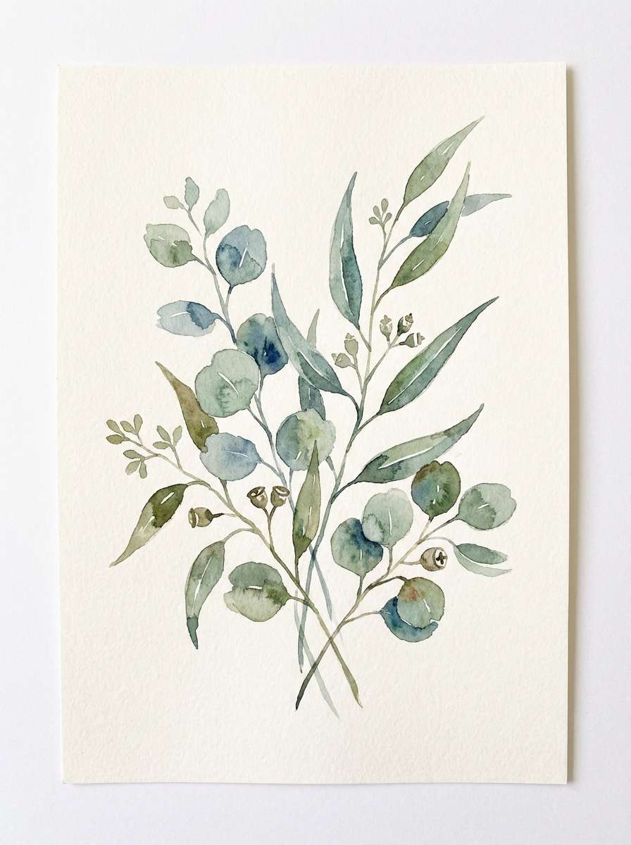
18) Spring Eucalyptus
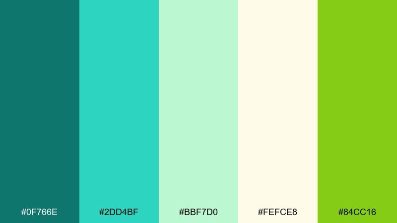
HEX: #0f766e #2dd4bf #bbf7d0 #fefce8 #84cc16
Mood: fresh, botanical, optimistic
Best for: watercolor botanical illustration
Fresh greens with soft teal feel like eucalyptus leaves drying in the sun. They are perfect for botanical labels, gentle social graphics, and seasonal campaigns with an organic tone. Pair the butter-yellow with light mint washes, and keep the strongest green for stems and focal leaves. Usage tip: add lots of white space around the illustration to keep the palette light and breathable.
Image example of spring eucalyptus generated using media.io
19) Neon Aquarium
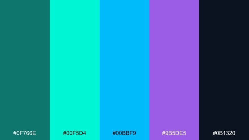
HEX: #0f766e #00f5d4 #00bbf9 #9b5de5 #0b1320
Mood: futuristic, energetic, neon
Best for: gaming stream overlay UI
Neon aqua and violet feel like glowing coral in a midnight aquarium. It suits stream overlays, esports graphics, and bold UI skins where contrast and personality matter. Pair the dark base with bright accents for panels and alerts, and keep the purple for secondary emphasis like labels or timers. Usage tip: avoid using all neon shades at once; choose one main accent and one supporting accent for clarity.
Image example of neon aquarium generated using media.io
20) Classic Teal and Tan
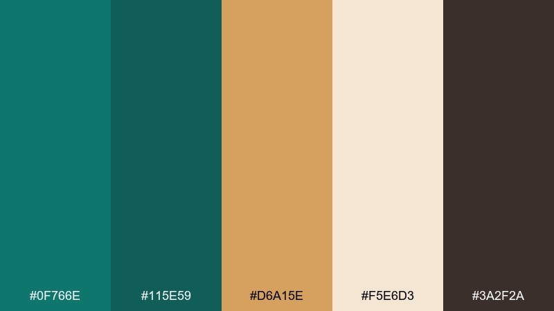
HEX: #0f766e #115e59 #d6a15e #f5e6d3 #3a2f2a
Mood: timeless, warm, editorial
Best for: fashion lookbook editorial spread
Classic teal with tan and cream feels like tailored coats, leather accessories, and museum lighting. A teal color palette like this works for fashion lookbooks, lifestyle editorials, and premium catalogs. Pair tan blocks with deep teal headlines, and use cream to keep product photos feeling bright and true. Usage tip: repeat the brown tone in small details like page numbers and rules for a cohesive, print-ready finish.
Image example of classic teal and tan generated using media.io
What Colors Go Well with Teal?
Teal pairs effortlessly with crisp neutrals like white, ivory, and light gray for a clean, modern look. For depth and readability, combine teal with charcoal, slate, or near-black for text and headers.
For warm contrast, try coral, terracotta, tan, or golden yellow—these bring energy to teal without fighting it. If you want a premium feel, mix teal with metallics like brass/gold or brushed nickel depending on whether you want warmth or coolness.
For a more tonal teal color scheme, layer teal with navy and blue-greens. This keeps the palette sophisticated and is especially effective for dashboards, reports, and editorial layouts.
How to Use a Teal Color Palette in Real Designs
Start with roles: pick one dark teal or navy for structure (headers, navigation), a mid teal for brand identity, and a pale tint for backgrounds and cards. This keeps hierarchy consistent across screens or pages.
Keep contrast in mind. If teal is your background, use off-white or very dark text; if teal is an accent, let it highlight only key UI states (active, selected, success) so users learn the system quickly.
For print and interiors, repeat teal in small, intentional places—rules, icons, towels, trim—then let neutrals carry most of the space. A single warm accent (gold, tan, coral) can act as the focal point.
Create Teal Palette Visuals with AI
If you want to see these teal palette ideas applied to real designs, generate mockups from prompts in seconds. It’s a fast way to test mood, contrast, and accent balance before you commit to a full layout.
Try creating multiple variations by swapping just one accent (coral vs. gold vs. tan) while keeping your teal base consistent. You’ll quickly find which teal color combinations fit your brand voice or UI tone.
With Media.io, you can turn a short description into polished visuals for posters, UI screens, packaging, or interior mood boards—right in your browser.
Teal Color Palette FAQs
-
What HEX code is considered “teal”?
There isn’t one single teal HEX code, but common teal values sit between blue and green (for example #0f766e or #006d77). Use a darker teal for structure and a lighter teal/seafoam for backgrounds and highlights. -
Is teal a warm or cool color?
Teal is generally cool, but it can lean warmer when it shifts greener. Pairing teal with warm accents (coral, tan, gold) adds warmth without losing teal’s clarity. -
What colors go best with teal for modern UI?
For UI, teal works best with neutrals (white, light gray) and deep text colors (charcoal, navy). Keep teal for CTAs, active states, and small highlights to maintain a clean hierarchy. -
Does teal work well with gold?
Yes—teal and gold is a classic luxe pairing. Use teal as the main color and gold/brass as an accent for badges, icons, or key focal elements so it feels premium, not overpowering. -
How do I keep teal and coral from looking too loud?
Use one dominant color and one accent color. A practical approach is teal for the base (backgrounds, buttons, navigation) and coral only for 1–2 focal elements like headlines, sale tags, or highlights. -
What’s the best background color to use with teal text?
Use very light neutrals like off-white (#f8fafc, #f1f5f9) or soft cream for comfortable reading. For accessibility, avoid mid-tone backgrounds that reduce contrast with teal. -
Can teal palettes feel professional for business designs?
Absolutely. Pair teal with slate, navy, and plenty of white space for a confident, professional look—great for reports, decks, fintech pages, and SaaS dashboards.
Next: Blue Color Palette


