

 TL;DR:
Pure white (#FFFFFF) serves as a crisp structural foundation for UI backgrounds and product photography, but large digital surfaces should utilize off-whites to reduce screen glare and prevent clinical aesthetics.
● Use HEX #FFFFFF or RGB 255, 255, 255 for screen-based applications, but strictly apply CMYK 0%,0%,0%,0% for print workflows to ensure no ink is applied and the physical paper acts as the white base.
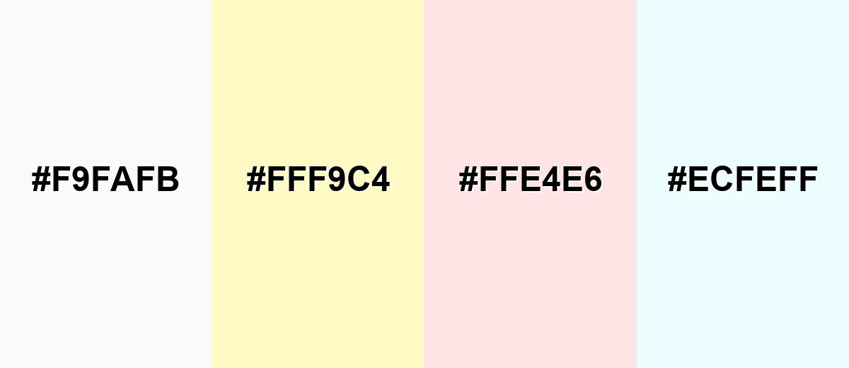
● Avoid pairing pure white with near-whites (#F9FAFB), pale yellow (#FFF9C4), or blush pink (#FFE4E6), as these combinations eliminate visual boundaries, cause delicate UI elements to wash out, and increase glare.
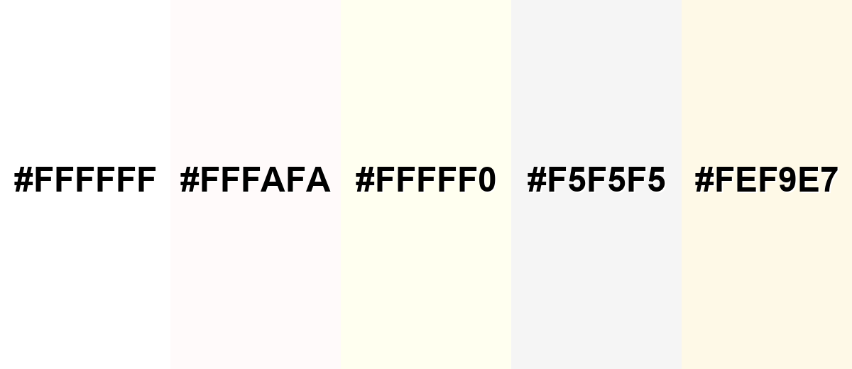
● Substitute pure white with Ivory (#FFFFF0) for hospitality and lifestyle branding to add warmth, or use White Smoke (#F5F5F5) for secondary dashboard cards to separate surfaces without requiring heavy borders.
Ask AI for a summary
 ChatGPT
 Perplexity
 Gemini
 Claude
 Grok
Grok
White represents the full combination of red, green, and blue light in the RGB color model, making it the brightest value on the digital spectrum. The white color meaning is often associated with simplicity, clarity, cleanliness, and new beginnings. Unlike most hues, white functions less as a focal color and more as a structural foundation in design systems.
In this guide, you'll explore white color codes and values, conversions for digital and print, symbolism and psychology, practical design applications, complementary color pairings, shades and variations, and real-world industry uses.
White Color: Codes & Values
To ensure consistent white color reproduction across web UI, branding systems, and print workflows, start with the standardized color values below. These HEX, RGB, CMYK, and HSL specifications help you define pure white and common white variations accurately in design tools, CSS, and production files. Using the correct white color codes is especially important for maintaining clean backgrounds, precise contrast, and reliable output across screens and paper stocks.
| Parameters | VALUE |
| HEX Code | #FFFFFF |
| RGB DECIMAL | 255, 255, 255 |
| RGB PERCENTAGE | 100%, 100%, 100% |
| CMYK | 0%,0%,0%,0% |
| HSL | 0°, 0%, 100% |
| HSV (HSB) | 0°, 0%, 100% |
| Web Safe | #FFFFFF |
Key Color Space Explanations:
- HEX - HEX is the most common web notation for color, written as #rrggbb. White is #ffffff because each channel is at its maximum.
- RGB - RGB describes how much red, green, and blue light a display emits. White is 255,255,255 (or 100%,100%,100%) for full intensity across all channels.
- CMYK - CMYK is used for print and represents ink percentages. Pure white is typically 0%,0%,0%,0%, meaning no ink (the paper shows through).
- HSL - HSL expresses hue, saturation, and lightness. White has 0% saturation and 100% lightness, so hue is effectively irrelevant.
- Web Safe - Web-safe colors are a legacy palette designed to render consistently on older displays. White is web-safe already, so it maps to #ffffff.
For most projects, use HEX for UI, RGB for screen-based apps, and CMYK when preparing files for print—then test on real devices or paper to confirm the "white" you see matches the one you expect.
Want to generate white background photos or posters? Try Media.io's AI Image Generator now!
White Color Conversions
If you're moving between design tools, web specs, and print settings, these conversions help keep white consistent.
| Parameters | VALUE | CSS |
| HEX | #ffffff | #ffffff |
| RGB DECIMAL | 255, 255, 255 | rgb(255,255,255) |
| RGB PERCENTAGE | 100%, 100%, 100% | rgb(100%,100%,100%) |
| CMYK | 0%,0%,0%,0% | cmyk(0%,0%,0%,0%) |
| HSL | 0°, 0%, 100% | hsl(0°, 0%, 100%) |
| HSV (or HSB) | 0°, 0%, 100% | -- |
| Web Safe | ffffff | #ffffff |
| CIE-LAB | 100, 0, 0 | -- |
| XYZ | 95.047, 100.000, 108.883 | -- |
| xyY | 0.3127, 0.3290, 100.000 | -- |
| CIE-LCH | 100, 0, 0 | -- |
| CIE-LUV | 100, 0, 0 | -- |
| Hunter-Lab | 100, 0, 0 | -- |
| Binary | 11111111, 11111111, 11111111 | -- |
White Color Meaning & Symbolism
White is widely associated with simplicity and openness, but its impact changes depending on contrast, lighting, and surrounding colors.
Psychological Effects
In most interfaces, white reduces visual noise and helps users focus on what matters.
- Clarity - White space makes layouts feel easier to scan and understand.
- Calm - Minimal visual clutter can create a quieter, less stressful experience.
- Perceived Speed - Clean white-heavy UIs often feel "faster" because content is easier to find.
- Glare Risk - On screens, pure white can cause glare—soft off-whites can feel more comfortable.
- Sterile Feeling - Used without enough contrast, white can feel clinical or make content harder to see.
Positive Associations
These are common reasons brands lean on white as a primary background or supporting neutral.
- Cleanliness And Hygiene - Signals freshness and care, especially in health, beauty, and home categories.
- Clarity And Honesty - Suggests transparency and straightforward communication.
- Minimalism And Modernity - Creates a contemporary look that lets typography and imagery lead.
- Peace And Calm - Feels quiet and balanced when paired with gentle neutrals.
- New Beginnings - Often used to represent a "blank slate," simplicity, or a fresh start.
Cultural Significance Across the World
Context matters: the same white can read differently based on local traditions and visual norms.
- Weddings - In many Western contexts, white is tied to ceremonies, formality, and tradition.
- Remembrance - In some cultures, white is connected to mourning and memorial practices.
- Spirituality - White frequently symbolizes purity, simplicity, and sacred spaces.
- Professional Cleanliness - Globally, it's linked with hospitals, labs, and hygiene-forward environments.
Design Applications
White is a foundation color: it supports typography, helps color accents pop, and creates breathing room in crowded layouts.
Graphic Design Tips
- Start With Hierarchy - White backgrounds work best when headings, body text, and spacing clearly guide the eye.
- Use Strong Text Contrast - Avoid low-contrast light text on white; aim for strong contrast for body copy.
- Separate Sections Subtly - Use borders, shadows, or gentle tints instead of white-on-white panels that blend together.
- Let Accents Do The Talking - Keep most surfaces white and introduce one "hero" color for buttons and highlights.
- Reduce Harshness With Off-Whites - For large areas, a soft tint (like #f5f5f5) can feel more comfortable than pure white.
If pure white feels too bright, switch large surfaces to an off-white (like #f5f5f5) and keep #ffffff for cards, highlights, or negative space.
White Color in Photography & Video
- Use White Backdrops For Accuracy - A clean background helps products look true-to-color and more premium.
- Watch Exposure Carefully - Protect highlight detail so whites don't clip into flat, textureless areas.
- Balance White Temperature - Different lighting can push white warm or cool, so set white balance deliberately.
- Add Separation With Shadows - Soft shadows and gentle gradients prevent subjects from "floating" on pure white.
- Keep UI Overlays Readable - In video titles or captions, use dark neutrals and safe padding to maintain contrast.
Recommended Tool for Image Enhancement: When incorporating white color into your photography projects, Media.io's AI Image tools can help you achieve more refined results. With AI-powered color enhancement, photo colorization, image upscaling, and old photo restoration, you can easily enrich white color tones, improve overall image quality, and highlight the color's elegant and sophisticated aesthetic.
Color Combinations
Once you know where white fits in your layout, pairing becomes the next lever for personality and readability. Good white Color combinations balance harmony (soft neutrals and tints) with contrast (deep text and confident accents) so the page feels intentional rather than empty.
Complementary Colors
Because white is neutral, its strongest "complementary" role is contrast-driven: it makes dark tones feel sharper and accent colors feel cleaner—an approach that anchors many white Color combinations in editorial and product design.
Complementary Palette Example: Use a crisp white base, a deep neutral for text, and one saturated accent for focus.
Analogous Color Schemes
Analogous colors sit adjacent to each other on the color wheel, creating harmonious, cohesive palettes with subtle variation.
Cool neutrals keep the layout airy while staying crisp and modern.
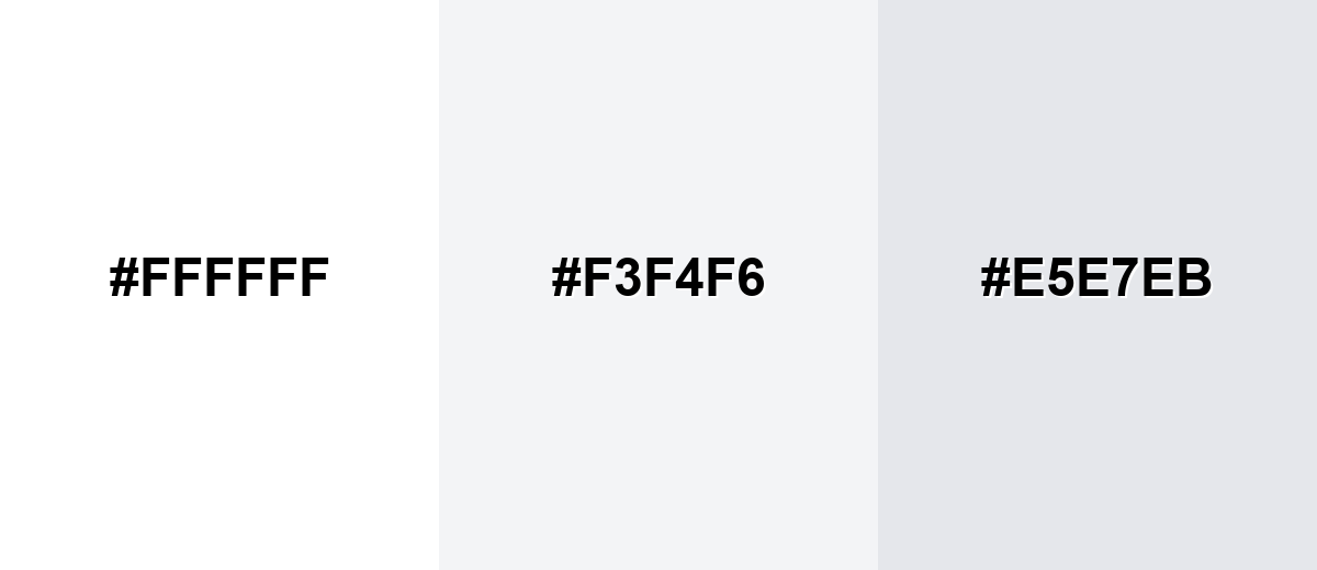
- Pure White: #FFFFFF
- Mist Gray: #F3F4F6
- Cool Gray: #E5E7EB
Warm off-whites add softness and comfort without losing clarity.
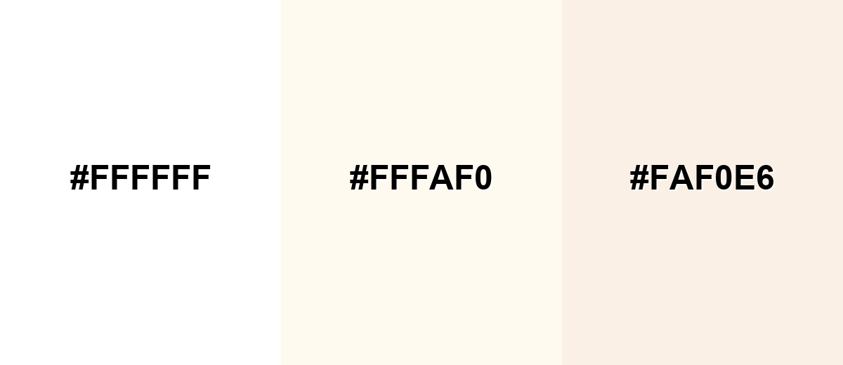
- Pure White: #FFFFFF
- Floral White: #FFFAF0
- Linen: #FAF0E6
Triadic & Tetradic Combinations
For more energy, a triad gives balanced variety while white keeps the system organized—ideal when exploring white color in branding.
White + blue + amber creates a clean, confident palette with strong focal points.
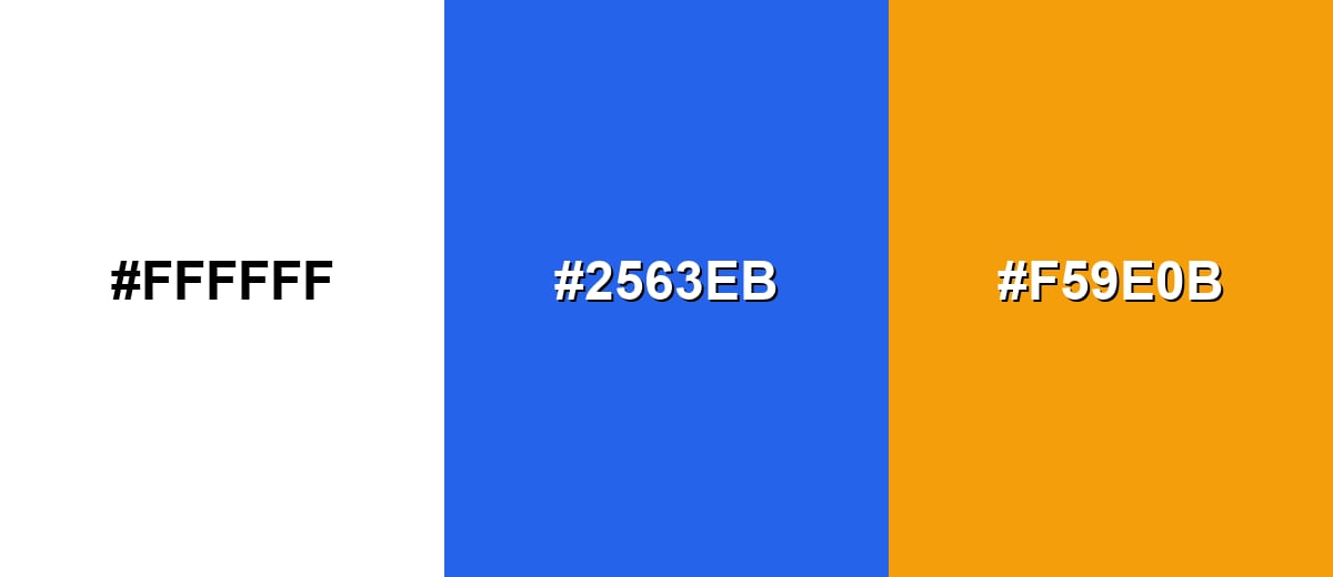
- Pure White: #FFFFFF
- Royal Blue: #2563EB
- Amber: #F59E0B
Colors to Avoid
While white color is remarkably versatile, certain combinations can create problematic visual effects:
- Almost White (#F9FAFB) - Too close to white, so boundaries disappear and cards/sections can look unfinished without borders or shadows.
- Pale Yellow (#FFF9C4) - Reads as glare-prone next to pure white and can make white look dingy or tinted by comparison.
- Blush Pink (#FFE4E6) - Low contrast against white; delicate UI elements may lose definition and feel washed out.
- Ice Cyan (#ECFEFF) - Can create a cold, clinical cast and makes subtle dividers harder to see on white backgrounds.
Shades, Tints & Variations of White Color
White isn't just one setting—its range runs from crisp, bright whites to warmer, creamier off-whites and gentle gray-whites. Knowing these options helps you control glare, separate surfaces without heavy borders, and match the tone of your brand or space.
- Pure White (#FFFFFF) - The brightest reference white; crisp and neutral, but can feel stark in large reading areas. It's best used for UI backgrounds, clean product shots, and strong contrast layouts.
- Snow (#FFFAFA) - A very slight warm lift that softens harshness without looking colored. It's best used for long-form pages where you want a gentler white without losing the clean feel.
- Ivory (#FFFFF0) - Warm, creamy white that feels natural and less clinical than pure white. It's best used for hospitality, lifestyle branding, and warm editorial palettes.
- White Smoke (#F5F5F5) - A light gray-white that creates separation between surfaces while staying subtle. It's best used for cards, panels, and secondary backgrounds in apps and dashboards.
- Eggshell (#FEF9E7) - A soft, warm tint with a gentle yellow undertone that adds comfort. It's best used for packaging, interiors mockups, and brand systems that need warmth.
Industry Applications
Because white is a flexible neutral, it adapts to many industries—either as a clean canvas or as a signal of precision. The best results come from choosing the right white color shades and tints and defining clear contrast rules for text, icons, and imagery.
Fashion & Beauty
- Use minimalist, white-heavy compositions to create a premium feel with refined typography and subtle texture.
- Choose warm off-whites (like ivory) for softer, lifestyle-driven looks that feel less clinical than pure white.
- Keep the palette restrained so product colors and key accents carry the emotional tone.
- Protect legibility with strong hierarchy and reliable contrast for labels, packaging copy, and UI overlays.
Interior Design & Decor
- Test white samples in daylight and artificial light—undertones can swing warmer or cooler throughout the day.
- Use matte whites for a softer, modern finish; glossy whites can look crisp but emphasize reflections and imperfections.
- Layer near-whites and light gray-whites to separate surfaces without heavy borders.
- Pair with materials thoughtfully so the space feels intentional rather than sterile.
Branding & Marketing
- Build white-forward systems around photography to keep products true-to-tone and reduce visual noise.
- Anchor layouts with a deep neutral for text, then add one saturated accent for focus and CTAs.
- Use negative space to improve readability and scanning speed across landing pages and campaigns.
- Define contrast rules for every UI state (default, hover, disabled) before shipping.
Conclusion
White is more than a default background—it's a deliberate choice that shapes clarity, mood, and perceived quality. Use #ffffff when you need a crisp baseline, then switch to warmer or cooler off-whites to manage glare and tone. With thoughtful contrast and well-defined white Color combinations, white becomes one of the most powerful tools in your palette.
Design Smarter with AI: Media.io is an online AI studio that empowers creators with advanced image generation and enhancement tools. From text-to-image and image-to-image creation to AI upscaling and color optimization, it enables fast, creative, and professional results—all in your browser.

Frequently Asked Questions About White Color
The standard digital reference for pure white is #ffffff. It maps to RGB 255, 255, 255, meaning each light channel is at full intensity.
In light-based systems (like screens), white is the result of combining red, green, and blue at full intensity. In pigment and materials, "white" often depends on the substrate or pigment mix, so different whites can look warmer, cooler, or grayer.
White picks up undertones from surrounding colors, lighting temperature, and materials. Cool lighting can push white toward blue-gray, while warm lighting and certain papers can make it look creamy or slightly yellow.
Use pure white when you want maximum crispness and contrast, especially for product UI and sharp photography. Choose off-whites for long reading sessions, softer brand moods, or when you need surfaces to separate without heavy borders.
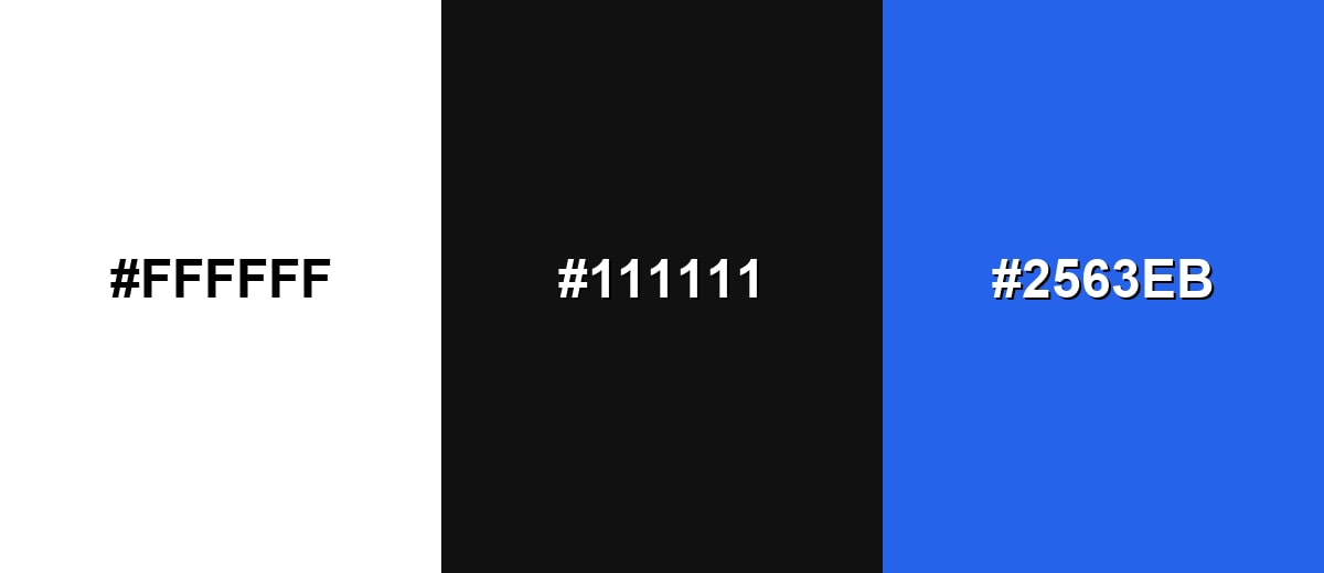
Near-black neutrals provide the cleanest readability, while saturated accents (blue, green, red, or amber) create strong focal points. Soft grays and warm off-whites work well when you want harmony with less visual tension.
Check contrast ratios for text, icons, and interactive states instead of relying on what "looks fine." Avoid using only color to show focus or selection, and consider slightly softer whites to reduce glare while keeping strong contrast.
