

Burgundy brings depth, warmth, and instant polish—making it a go-to for premium branding, romantic events, and editorial-style layouts.
Below are 20+ burgundy color palette ideas with HEX codes, plus practical tips on balancing dark reds with light neutrals (and when to add contrast colors like orange or green).
In this article
- Why Burgundy Palettes Work So Well
-
- velvet merlot
- rosewood & cream
- bordeaux night
- autumn wine
- berry blush
- garnet gold luxe
- mulberry sage
- cranberry coastal
- plum smoke
- rustic cellar
- cherry mocha
- cabernet neon
- vintage library
- winter cranberry
- terracotta merlot
- dusty mauve
- berry & denim
- orchid burgundy
- minimal wine
- festive pomegranate
- charred cherry & stone
- berry clay pairing
- What Colors Go Well with Burgundy?
- How to Use a Burgundy Color Palette in Real Designs
- Create Burgundy Palette Visuals with AI
Why Burgundy Palettes Work So Well
Burgundy sits in a sweet spot between red and purple, so it feels emotional and bold without the intensity of pure red. It can read romantic, classic, or modern depending on what you pair it with.
Because it’s naturally dark, burgundy also builds instant hierarchy. Use it for headlines, navigation, or CTA accents while letting lighter neutrals handle background and spacing.
Finally, burgundy plays well across seasons and industries—weddings, beauty, food, editorial, and product UI—especially when you balance it with cream, warm gray, or cool blue-greens.
20+ Burgundy Color Palette Ideas (with HEX Codes)
1) Velvet Merlot
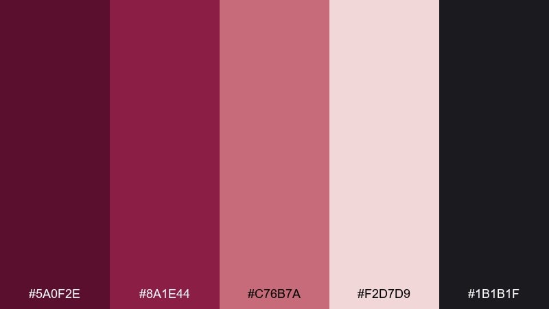
HEX: #5A0F2E #8A1E44 #C76B7A #F2D7D9 #1B1B1F
Mood: luxe, dramatic, romantic
Best for: beauty branding and premium landing pages
Luxe and candlelit, these tones feel like velvet drapery and a glass of merlot at night. Use the deep wine shade for headers and hero blocks, then soften the layout with blush and powdery pink. Charcoal works as a modern alternative to pure black for typography. Tip: keep pinks in larger fields and reserve the darkest tone for buttons to avoid a heavy page.
Image example of velvet merlot generated using media.io
Media.io is an online AI studio for creating and editing video, image, and audio in your browser.

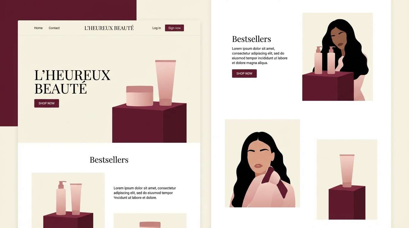
2) Rosewood & Cream
HEX: #64152F #9B3A4A #D9B7A3 #F6EFE7 #2E2A2B
Mood: warm, welcoming, timeless
Best for: wedding stationery and RSVP cards
Warm and nostalgic, it reads like rosewood furniture, soft candlelight, and cream paper. This burgundy color palette shines on invitations where contrast needs to feel elegant rather than harsh. Pair the wine tones with creamy backgrounds and let the tan act as a bridge for names, borders, and icons. Tip: print the darkest shade as small text only if you choose an uncoated stock to keep edges crisp.
Image example of rosewood & cream generated using media.io
3) Bordeaux Night
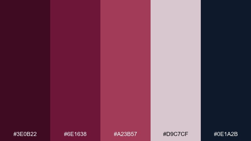
HEX: #3E0B22 #6E1638 #A23B57 #D9C7CF #0E1A2B
Mood: moody, sleek, cinematic
Best for: editorial layouts and album covers
Moody and cinematic, it feels like city lights reflected on dark glass. Use the inky navy as your base for spreads, then bring in wine reds for pull quotes and section markers. The pale mauve keeps negative space breathable without turning sterile. Tip: set body text in the lightest shade and reserve the mid red for callouts to maintain readability.
Image example of bordeaux night generated using media.io

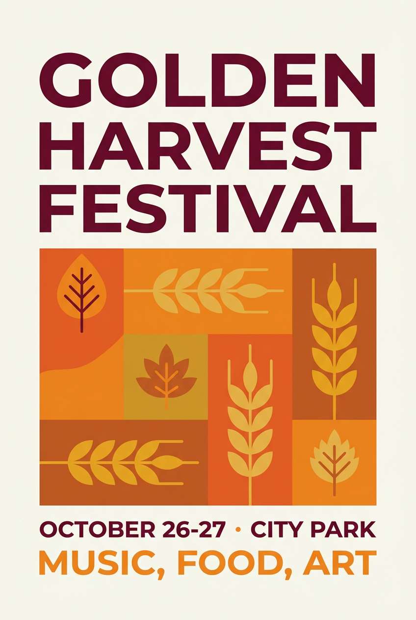
4) Autumn Wine
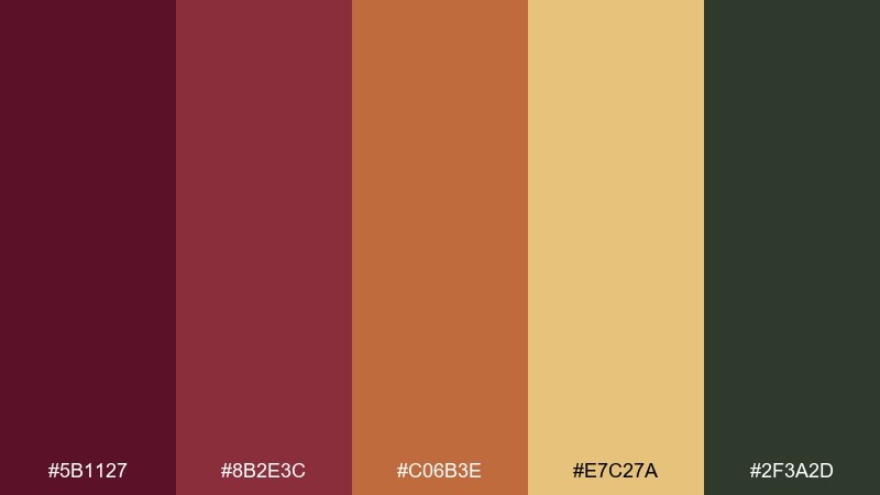
HEX: #5B1127 #8B2E3C #C06B3E #E7C27A #2F3A2D
Mood: earthy, rustic, cozy
Best for: fall event posters and farmers market promos
Earthy and cozy, it evokes fallen leaves, mulled cider, and woodsmoke. The warm orange and wheat tones keep the reds from feeling too formal, making it ideal for seasonal promos. Pair the forest green as a grounding accent for icons and small shapes. Tip: use the wheat shade as a background to make burgundy headlines pop without needing pure white.
Image example of autumn wine generated using media.io
5) Berry Blush
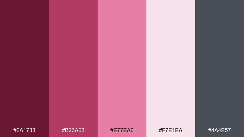
HEX: #6A1733 #B23A63 #E77EA6 #F7E1EA #4A4E57
Mood: playful, romantic, modern
Best for: cosmetics social ads and creator branding
Playful and romantic, these shades feel like berry sorbet and satin lipstick. Use the brighter magenta as a sparing accent for stickers, badges, and links while keeping blush as the main background. Slate gray balances the sweetness and helps your typography stay sharp. Tip: limit the two brightest colors to no more than 10–15% of the layout for a premium look.
Image example of berry blush generated using media.io
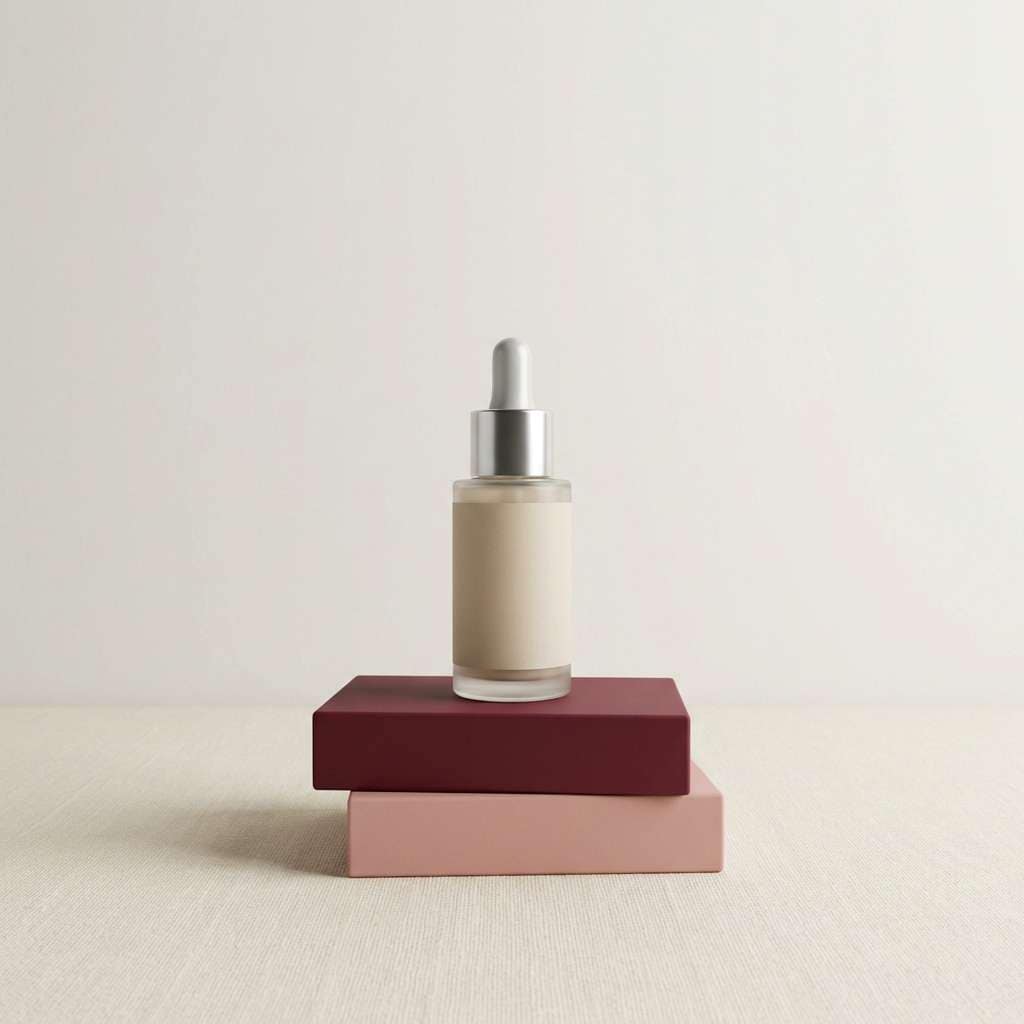
6) Garnet Gold Luxe
HEX: #4F0C22 #7D1A3A #B08D57 #F1E6D2 #1C1A18
Mood: opulent, formal, celebratory
Best for: luxury packaging and holiday gift sets
Opulent and celebratory, it calls to mind garnet jewelry, brushed brass, and black-tie evenings. These burgundy color combinations work best when gold is treated like a highlight—foiling, thin lines, or a single emblem. Cream keeps the composition refined and prevents the palette from turning too dark. Tip: use the near-black for small copy only, and let cream carry most of the negative space.
Image example of garnet gold luxe generated using media.io
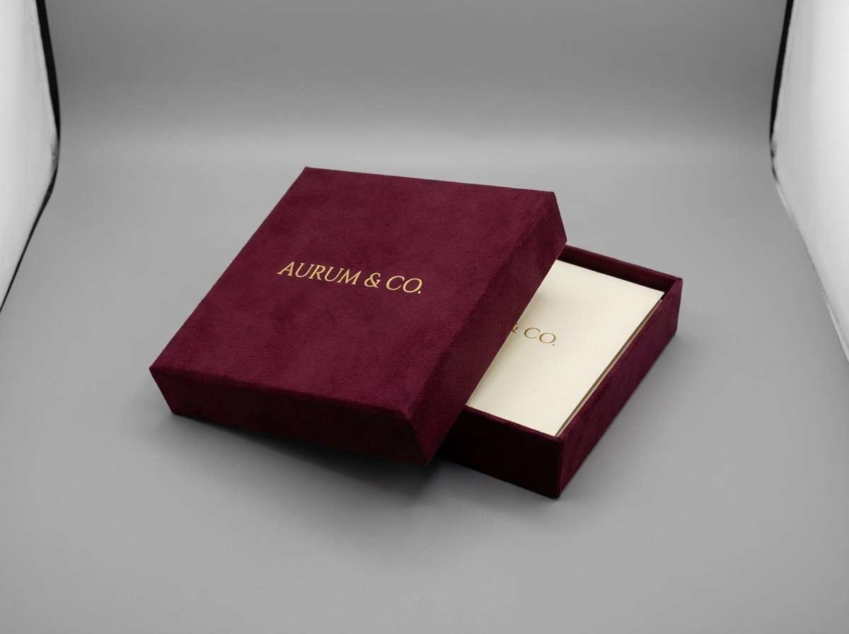
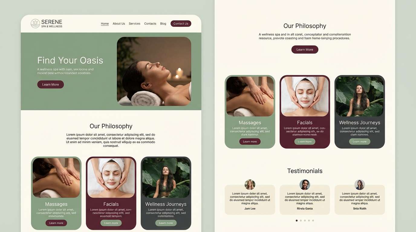
7) Mulberry Sage
HEX: #5C1230 #8E2F4A #BFA5A9 #9DAA8D #F4F0EA
Mood: calm, organic, refined
Best for: wellness brands and spa websites
Calm and organic, it feels like dried mulberries, herbal tea, and linen robes. Sage green cools the reds and makes the overall mix more restorative than romantic. Use off-white as your base and bring in burgundy for navigation, section titles, and subtle dividers. Tip: keep the muted mauve as a transitional shade for cards so the jump from sage to burgundy feels seamless.
Image example of mulberry sage generated using media.io
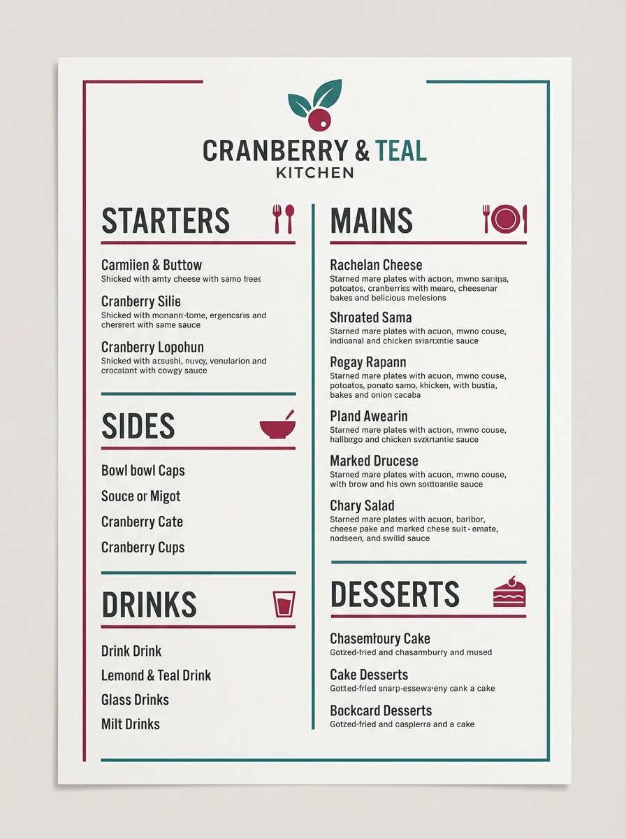
8) Cranberry Coastal
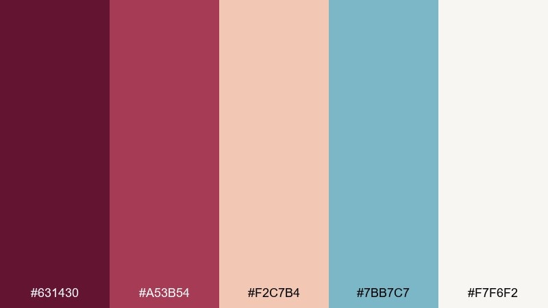
HEX: #631430 #A53B54 #F2C7B4 #7BB7C7 #F7F6F2
Mood: fresh, breezy, upbeat
Best for: summer menus and cafe branding
Fresh and breezy, it suggests cranberry spritzers by the sea and sun-washed awnings. The light teal brings a surprising cool contrast that keeps the reds feeling modern. Use cream for menus and let peach handle secondary sections like sides and notes. Tip: set prices or key calls-to-action in the darker wine shade to anchor the playful colors.
Image example of cranberry coastal generated using media.io
9) Plum Smoke
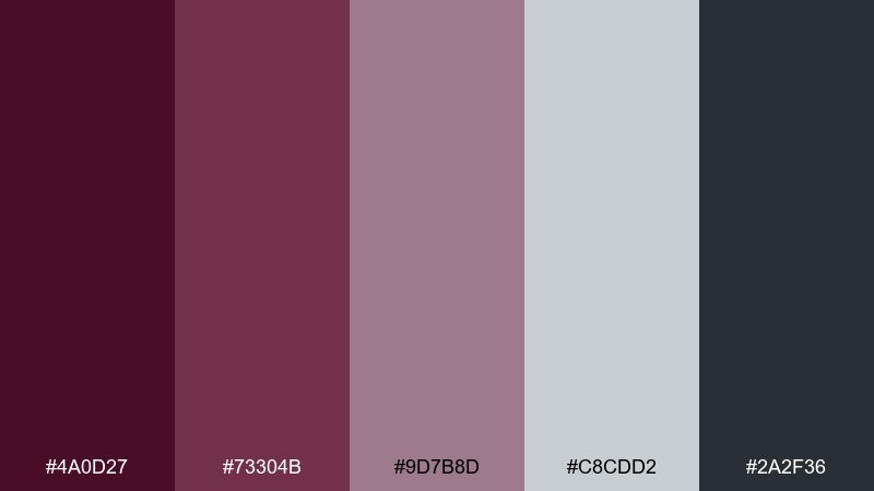
HEX: #4A0D27 #73304B #9D7B8D #C8CDD2 #2A2F36
Mood: minimal, cool, sophisticated
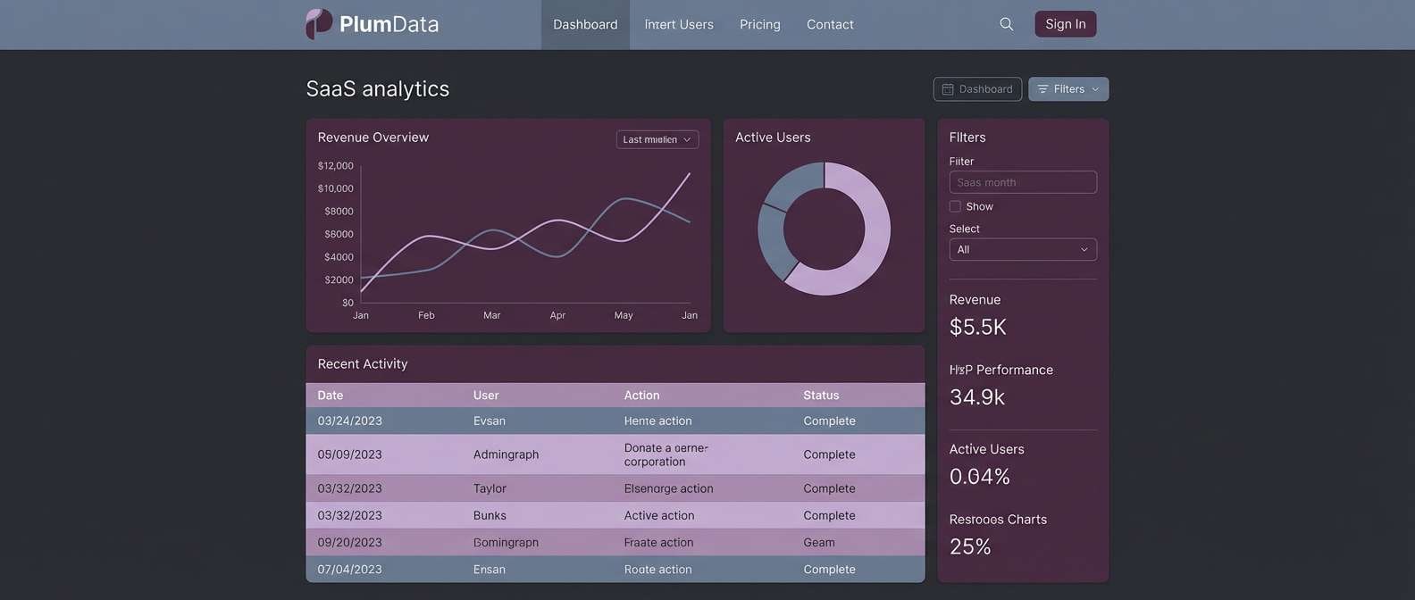
Best for: SaaS dashboards and data-heavy UI
Cool and sophisticated, it feels like plum smoke drifting over brushed metal. Use the gray-blue range to structure charts and tables, then add the darker wine shade for active states and key metrics. The dusty mauve softens panels so the dashboard doesn’t look clinical. Tip: keep burgundy as a single “status” color and rely on neutrals for everything else to protect accessibility.
Image example of plum smoke generated using media.io
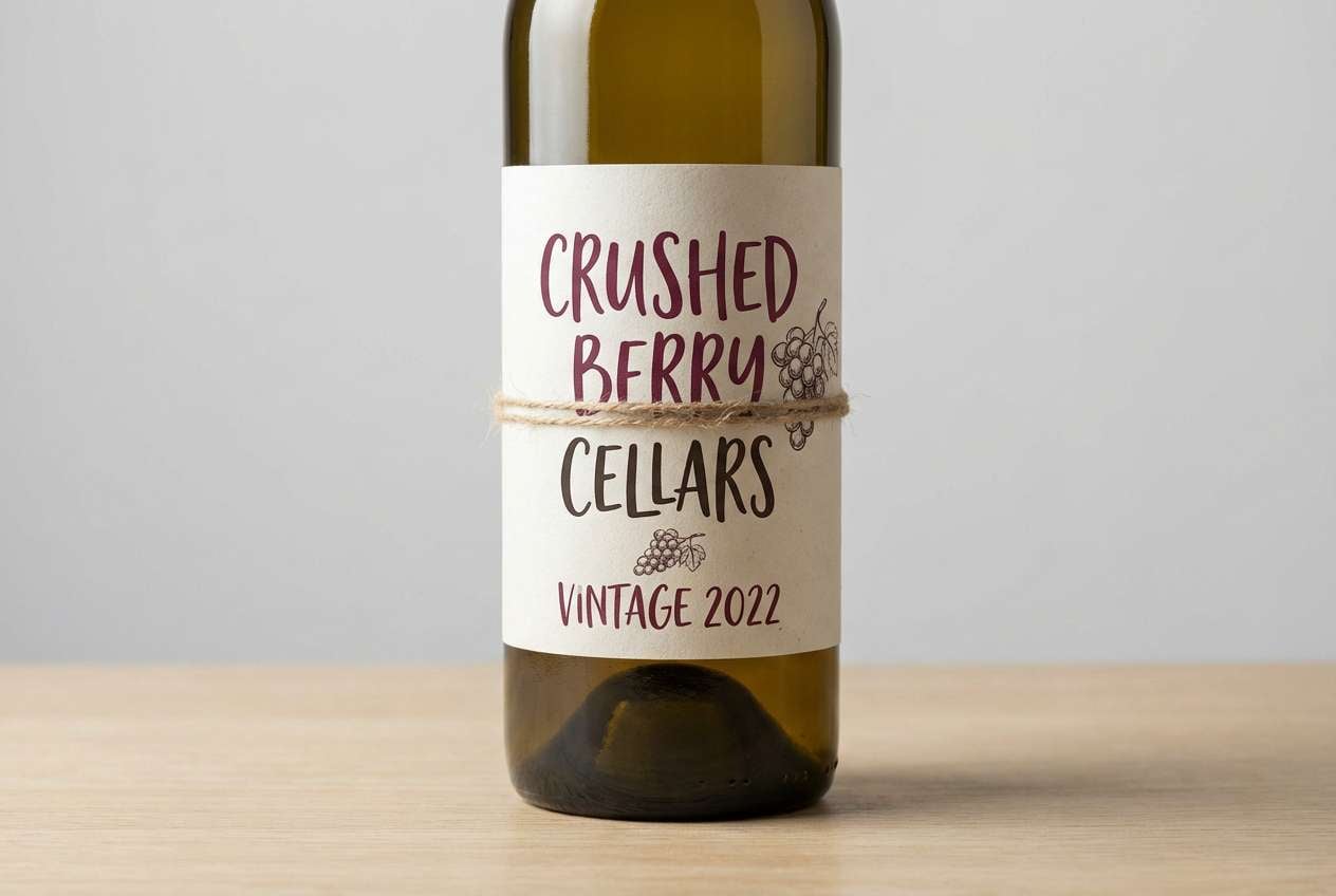
10) Rustic Cellar
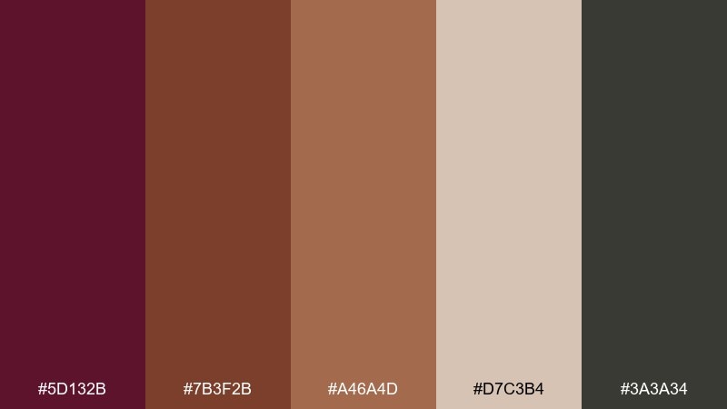
HEX: #5D132B #7B3F2B #A46A4D #D7C3B4 #3A3A34
Mood: artisan, grounded, vintage
Best for: wine labels and craft food packaging
Grounded and artisan, it evokes oak barrels, aged leather, and hand-stamped paper. Use the warm browns to create a vintage frame around a bold wine center color. The pale sand tone works well as label stock, letting typography feel tactile and classic. Tip: try a two-ink approach—deep wine plus dark brown—to keep printing costs low while staying premium.
Image example of rustic cellar generated using media.io
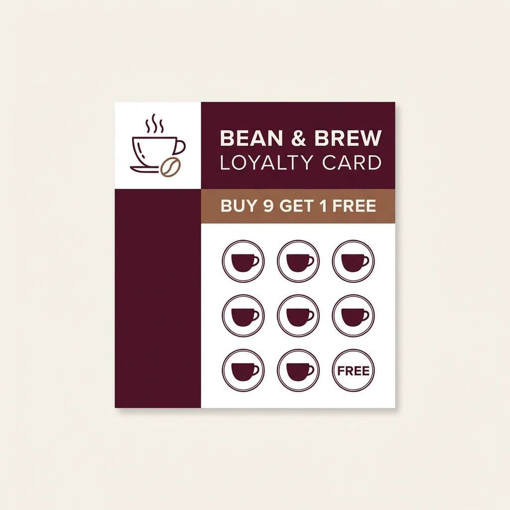
11) Cherry Mocha
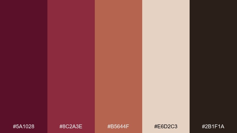
HEX: #5A1028 #8C2A3E #B5644F #E6D2C3 #2B1F1A
Mood: cozy, tasty, inviting
Best for: coffee shop branding and loyalty cards
Cozy and tasty, it reads like cherry syrup, mocha foam, and warm pastry crumbs. The creamy beige makes an easy background for menus, stamps, and loyalty cards. Use the deep espresso-brown for type, and keep the wine tones for logos and feature highlights. Tip: if you photograph products, match props to the beige and mocha shades so the reds don’t overpower the scene.
Image example of cherry mocha generated using media.io
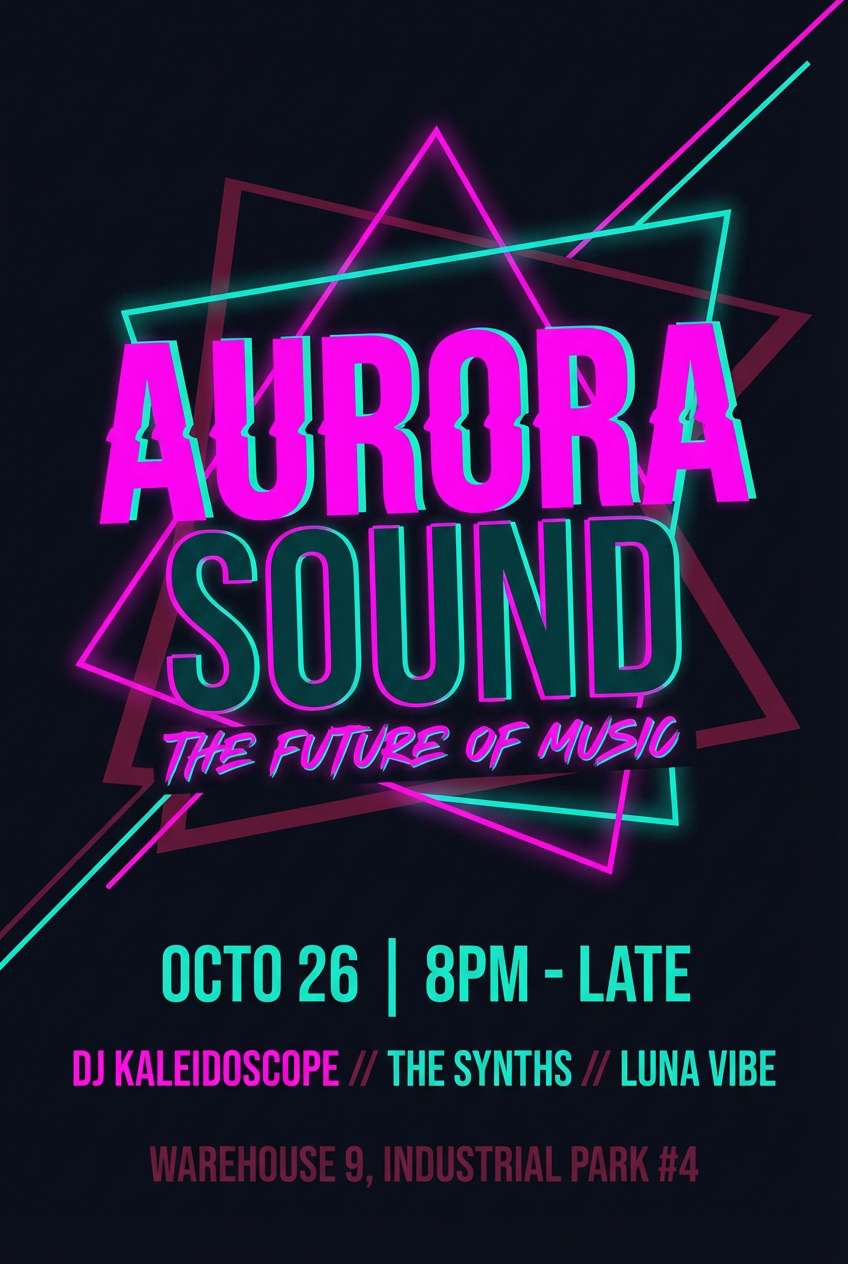
12) Cabernet Neon
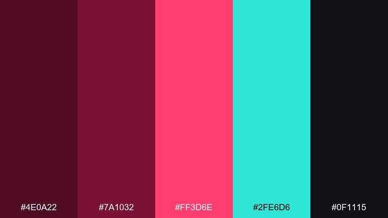
HEX: #4E0A22 #7A1032 #FF3D6E #2FE6D6 #0F1115
Mood: bold, nightlife, energetic
Best for: music event flyers and nightlife promos
Bold and electric, it feels like neon signage against a late-night street. This burgundy color palette turns modern when paired with hot pink and a sharp teal for high-contrast accents. Use the near-black as the main field and layer bright colors in geometric shapes behind type. Tip: keep body copy in a light tint or white to avoid the neon tones vibrating on small text.
Image example of cabernet neon generated using media.io
13) Vintage Library
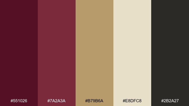
HEX: #551026 #7A2A3A #B79B6A #E8DFC8 #2B2A27
Mood: academic, classic, bookish
Best for: publisher branding and book cover design
Classic and bookish, it brings to mind worn spines, gilt lettering, and quiet reading rooms. Use the parchment shade for background space and the brass-like tan for rules, ornaments, and small badges. Deep wine works best on titles, while the dark neutral keeps subtitles readable. Tip: add subtle texture to the cream area to mimic paper without competing with your typography.
Image example of vintage library generated using media.io
14) Winter Cranberry
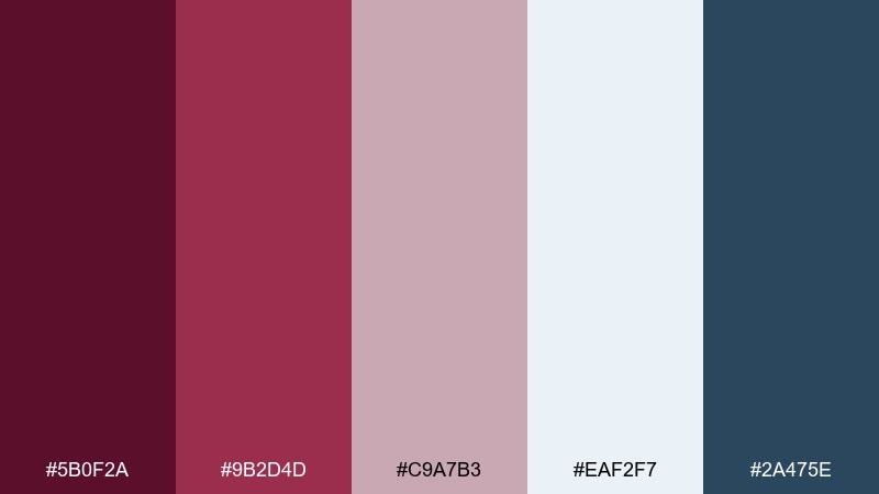
HEX: #5B0F2A #9B2D4D #C9A7B3 #EAF2F7 #2A475E
Mood: crisp, festive, airy
Best for: holiday email headers and seasonal banners
Crisp and airy, it suggests frosted berries, cold skies, and winter morning light. The pale ice tone keeps the reds feeling fresh instead of heavy, especially for seasonal marketing. Use the slate-blue for links and small UI elements to add cool contrast. Tip: reserve the deepest wine shade for your logo or CTA so it stands out against the icy background.
Image example of winter cranberry generated using media.io
15) Terracotta Merlot
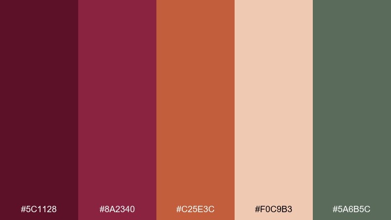
HEX: #5C1128 #8A2340 #C25E3C #F0C9B3 #5A6B5C
Mood: sunbaked, Mediterranean, relaxed
Best for: boutique hotel branding and travel brochures
Sunbaked and relaxed, it feels like terracotta tiles, vineyard afternoons, and olive branches. Use the warm clay and blush shades to create large background areas that look natural and inviting. The muted green works as a calm counterpoint for icons, maps, and small highlights. Tip: keep the darkest tone for headlines and use the mid red for subheads to maintain an easy reading rhythm.
Image example of terracotta merlot generated using media.io
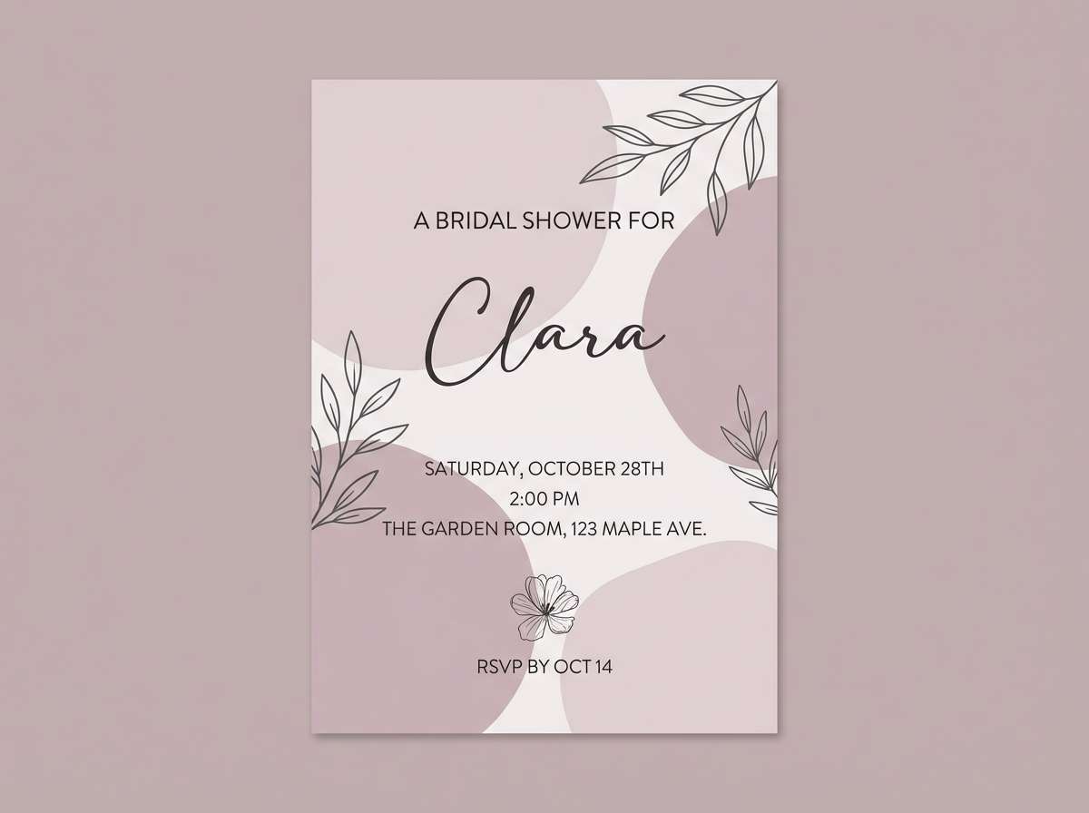
16) Dusty Mauve
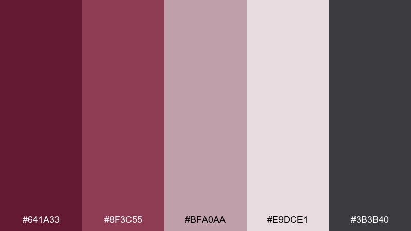
HEX: #641A33 #8F3C55 #BFA0AA #E9DCE1 #3B3B40
Mood: soft, romantic, understated
Best for: bridal showers and minimalist invites
Soft and understated, it evokes dried roses, silk ribbons, and a gentle blush haze. Layer the pale mauves as backgrounds and keep the deepest shade for monograms, dates, and focal text. Charcoal offers a clean, modern alternative when you need higher contrast for details. Tip: add a thin border in the mid mauve to frame the layout without making it feel busy.
Image example of dusty mauve generated using media.io
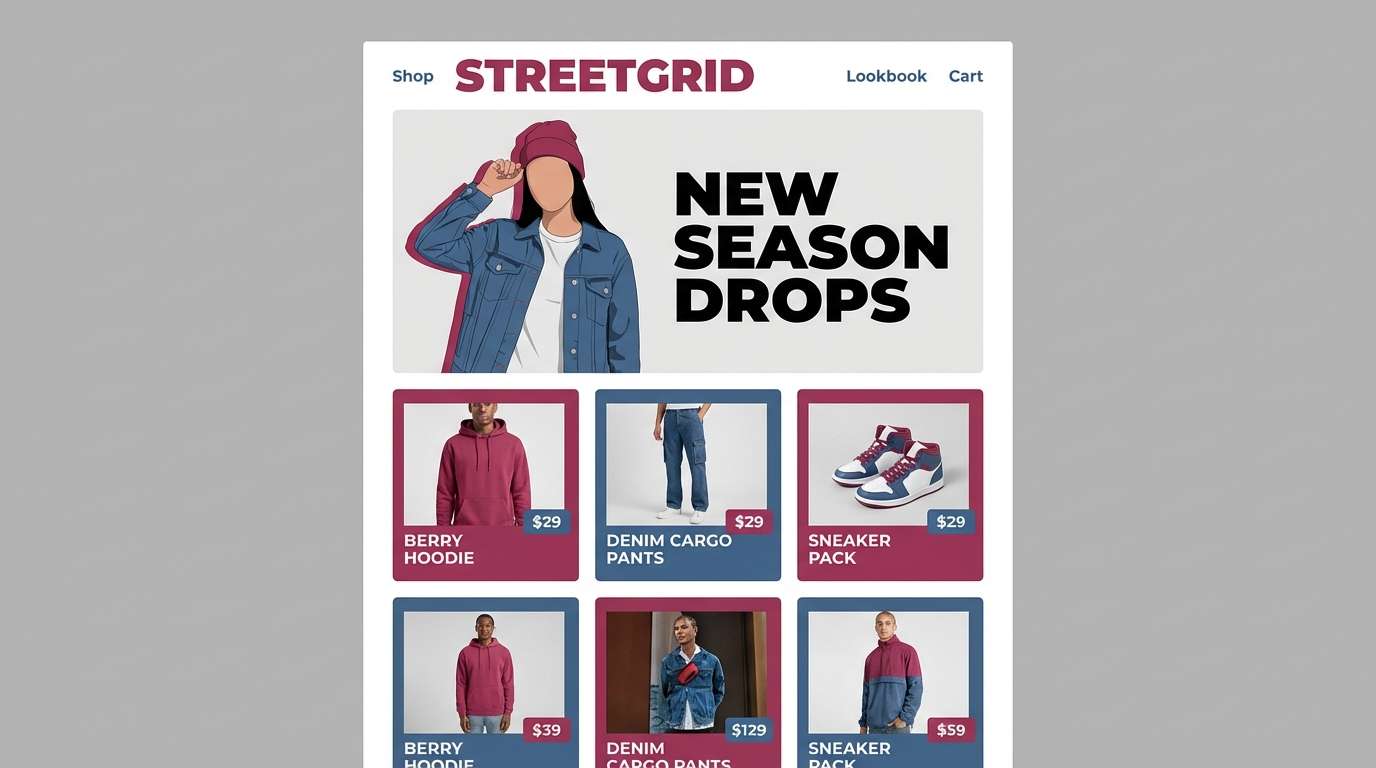
17) Berry & Denim
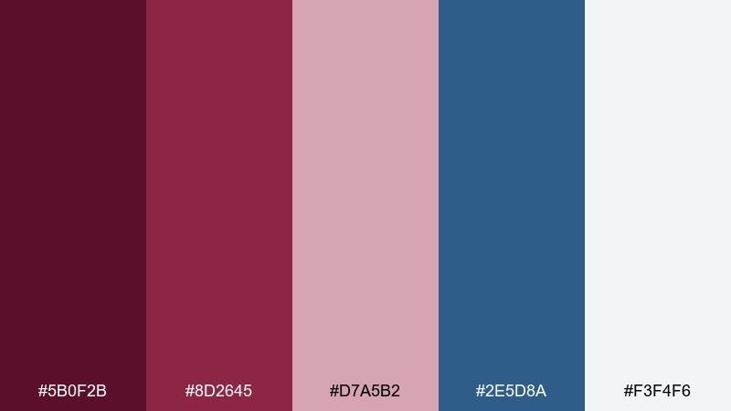
HEX: #5B0F2B #8D2645 #D7A5B2 #2E5D8A #F3F4F6
Mood: casual, modern, youthful
Best for: streetwear lookbooks and eCommerce banners
Casual and modern, it feels like berry stains on a favorite denim jacket. The blue brings an everyday coolness that keeps the reds from reading too formal. Use light gray as your site background and apply the wine shade to navigation and promo badges. Tip: keep denim blue for secondary buttons so your main CTA can stay in the deeper red.
Image example of berry & denim generated using media.io
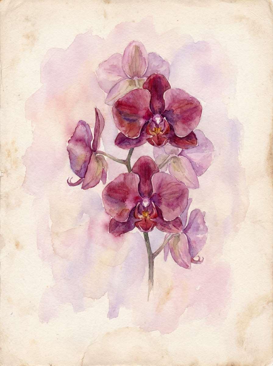
18) Orchid Burgundy
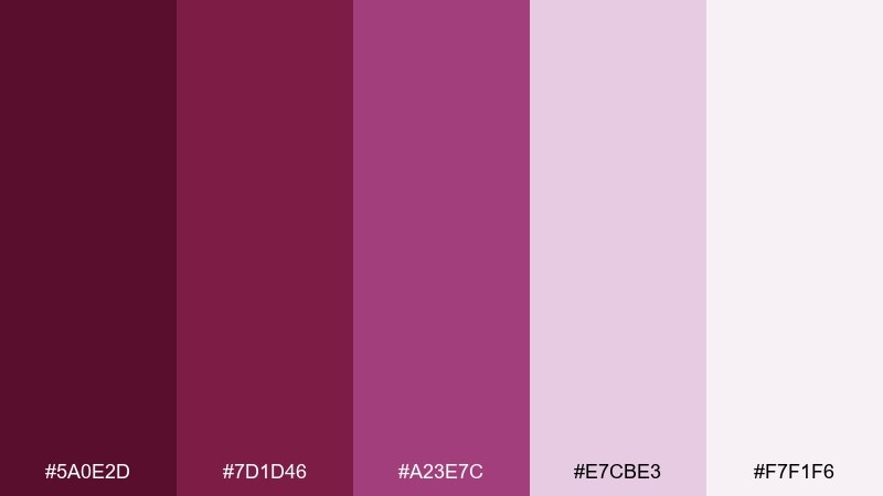
HEX: #5A0E2D #7D1D46 #A23E7C #E7CBE3 #F7F1F6
Mood: floral, dreamy, expressive
Best for: beauty launches and botanical illustrations
Dreamy and floral, it evokes orchids in a greenhouse and soft perfume notes. The purple-leaning accent adds artistry, especially for launch graphics and packaging sleeves. Use the pale lilac and off-white for airy space, then punctuate with the darkest shade for logo marks. Tip: if you’re mixing typography, pair a delicate serif with a clean sans to match the botanical feel.
Image example of orchid burgundy generated using media.io
19) Minimal Wine
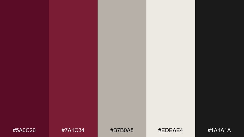
HEX: #5A0C26 #7A1C34 #B7B0A8 #EDEAE4 #1A1A1A
Mood: clean, modern, editorial
Best for: brand guidelines and pitch decks
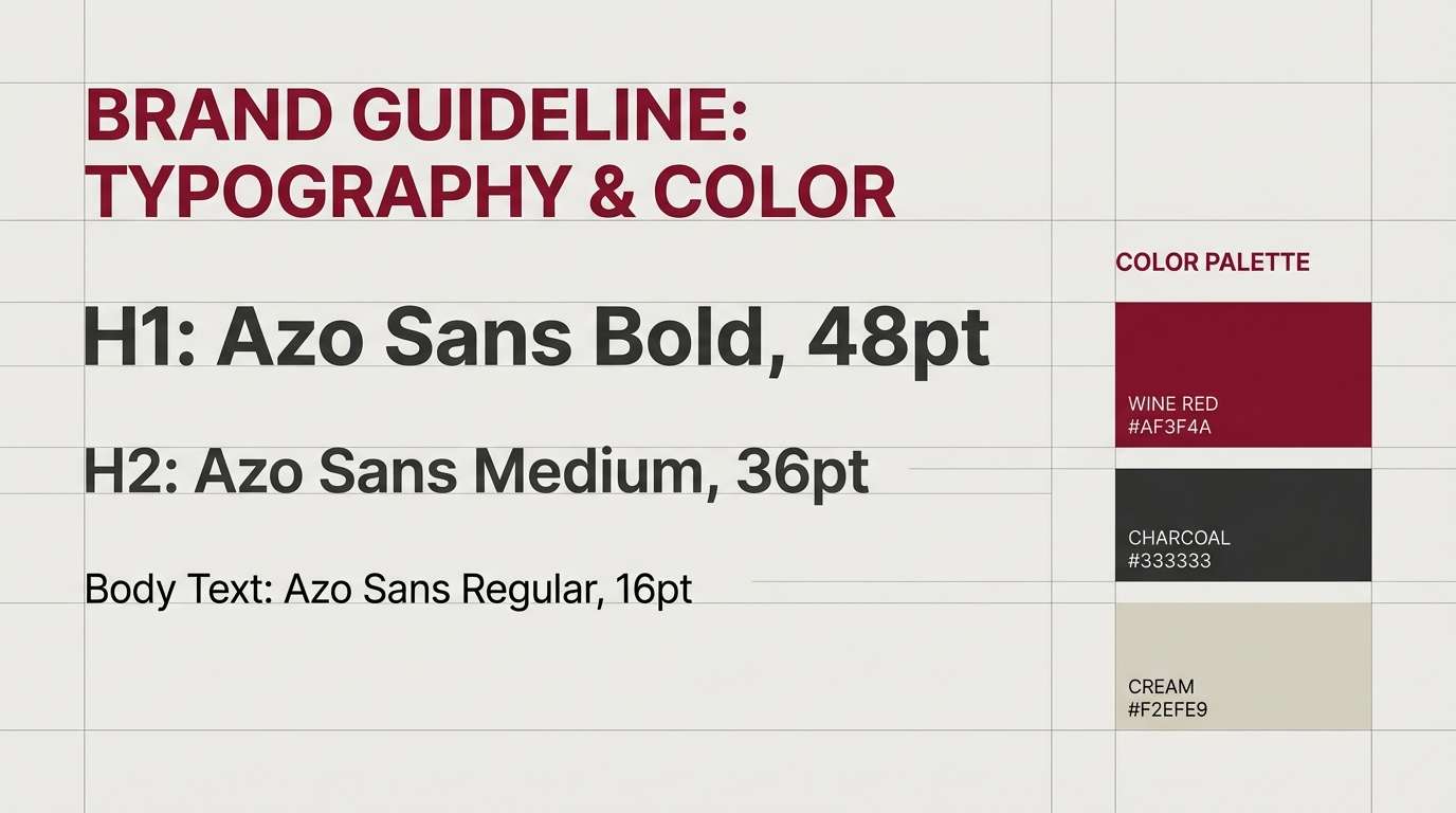
Clean and editorial, it feels like matte ink on warm paper with crisp black type. This set is ideal when you want a minimal system that still has personality. Use the warm gray for charts and dividers, and keep wine red for emphasis moments like section headers or key numbers. Tip: in decks, repeat the red only once per slide to maintain a polished rhythm.
Image example of minimal wine generated using media.io
20) Festive Pomegranate
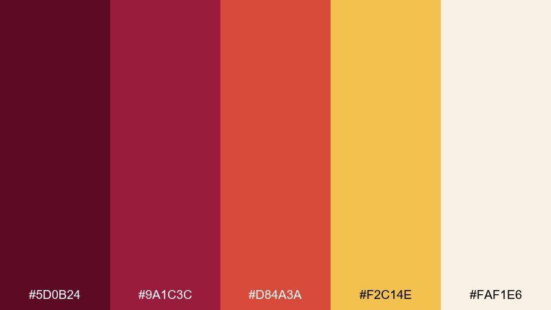
HEX: #5D0B24 #9A1C3C #D84A3A #F2C14E #FAF1E6
Mood: bright, festive, joyful
Best for: party invitations and seasonal promos
Joyful and bright, it brings pomegranate seeds, spiced punch, and confetti to mind. If you’re exploring burgundy color combinations for celebrations, the warm red-orange and golden yellow keep the energy high. Use the cream as a clean base so the saturated accents stay readable. Tip: put the yellow behind small text only in short bursts—like date blocks or labels—so it doesn’t overwhelm.
Image example of festive pomegranate generated using media.io

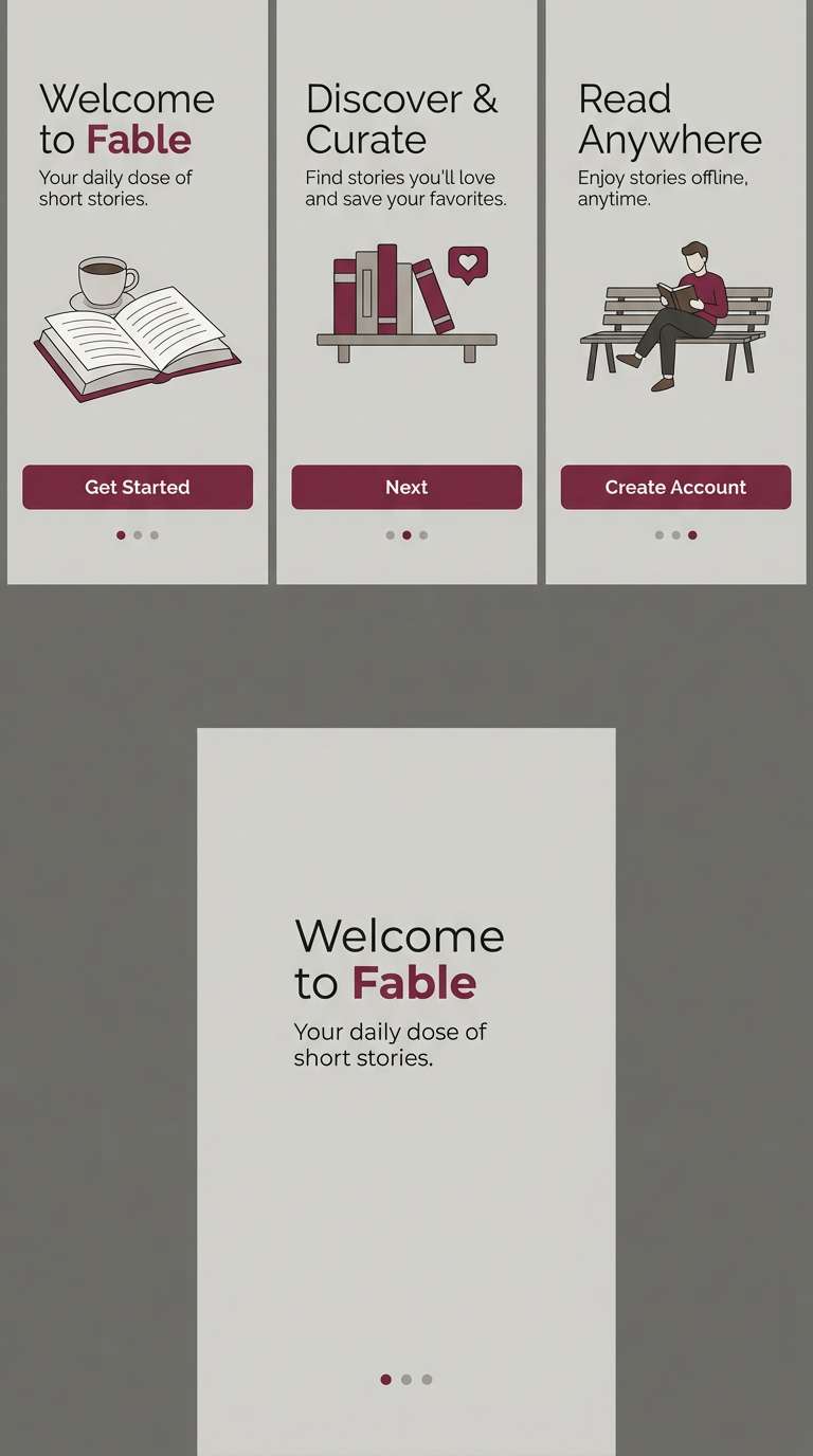
21) Charred Cherry & Stone
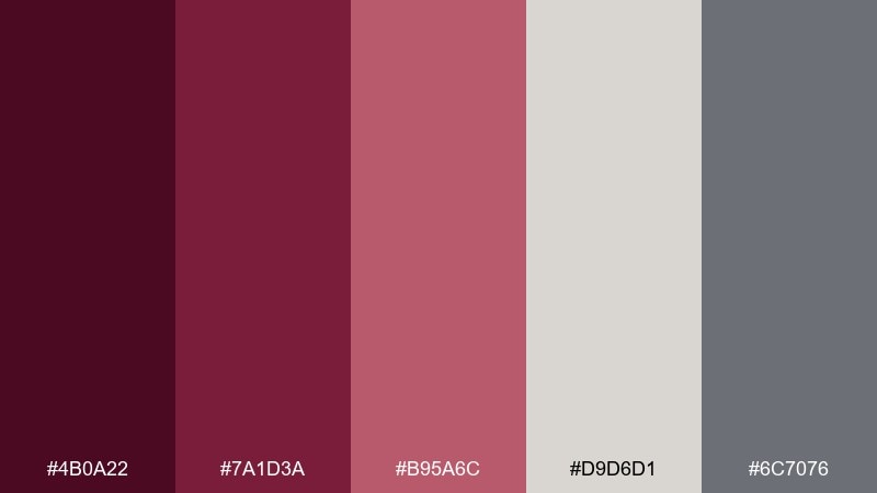
HEX: #4B0A22 #7A1D3A #B95A6C #D9D6D1 #6C7076
Mood: urban, balanced, professional
Best for: corporate rebrands and app onboarding
Urban and balanced, it feels like charred cherry wood against smooth concrete. The stone neutrals make the reds feel more professional and less ornate, especially for product UI and onboarding screens. Use the light warm gray for backgrounds and the slate tone for supporting text. Tip: set only one primary action in the deepest red, and let the mid pink handle secondary highlights.
Image example of charred cherry & stone generated using media.io
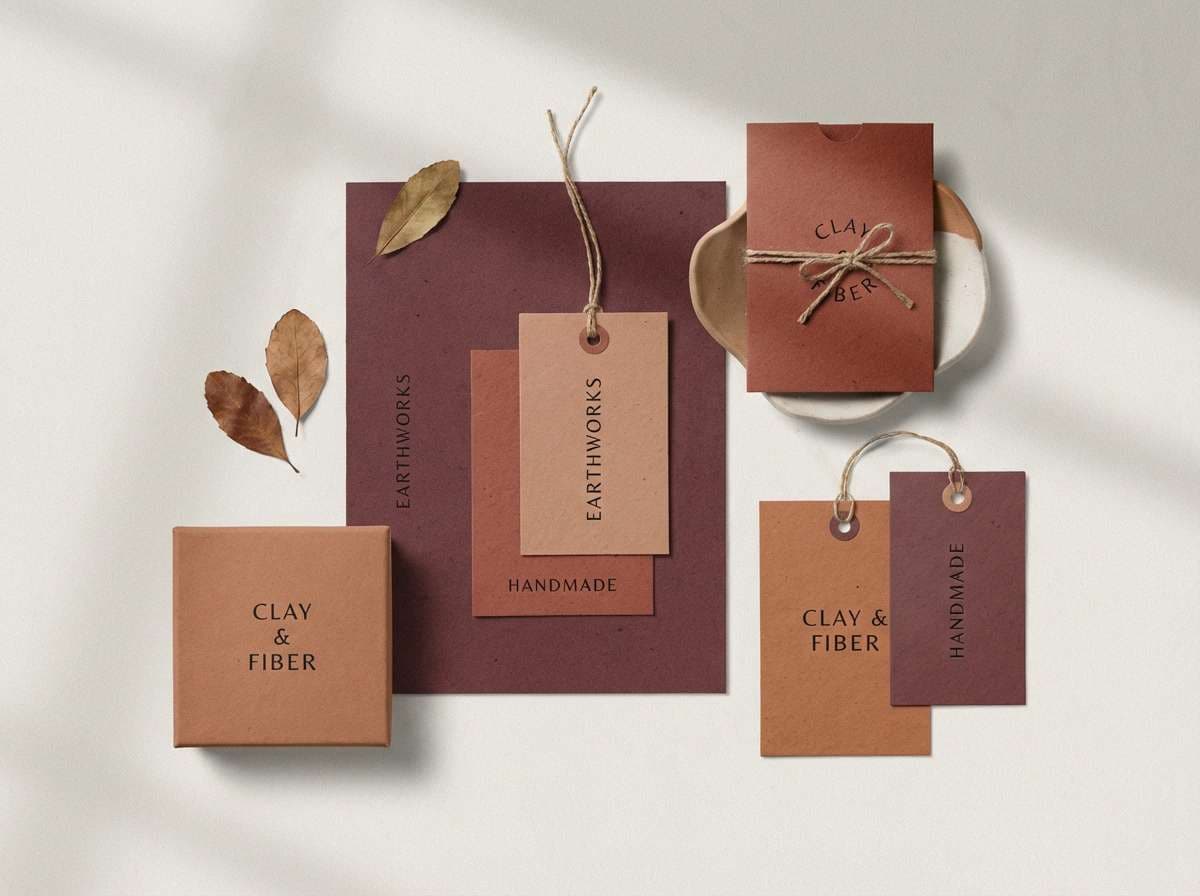
22) Berry Clay Pairing
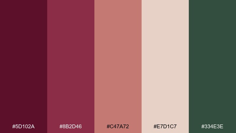
HEX: #5D102A #8B2D46 #C47A72 #E7D1C7 #334E3E
Mood: handmade, earthy, creative
Best for: ceramics brands and artisan product tags
Handmade and earthy, it evokes clay dust, berry glaze, and studio shelves. This burgundy color combination works beautifully on product tags where you want warmth without looking rustic. Pair the creamy tint for the base, then use green sparingly for eco cues like “recycled” or “hand-thrown.” Tip: try a small stamp-style mark in the darkest tone for a crafted, tactile finish.
Image example of berry clay pairing generated using media.io
What Colors Go Well with Burgundy?
Neutrals are burgundy’s best friend: cream, off-white, warm gray, and charcoal make dark reds feel intentional and readable. If you want a softer, romantic look, reach for blush, mauve, and dusty pinks.
For contrast, cool tones like sage, teal, denim blue, or slate-blue modernize burgundy fast—great for UI and brand systems. Warm accents like terracotta, wheat, brass, and gold push it toward cozy or luxury depending on saturation and texture.
If your design feels heavy, lighten your backgrounds first (cream/ice/very light gray), then use burgundy as an accent for hierarchy—buttons, headings, dividers, and small badges.
How to Use a Burgundy Color Palette in Real Designs
Start with role assignment: pick one burgundy as the primary (headers/CTA), one mid-tone as the secondary (cards/highlights), and keep your lightest neutral for large background areas. This prevents the palette from turning into a dark wall of red.
In digital layouts, test contrast early—burgundy can swallow thin type on dark backgrounds. If you’re using a moody base (navy/near-black), keep body text in a light neutral and reserve saturated accents for large shapes, icons, and buttons.
For print (invitations, packaging, labels), paper and finish matter. Uncoated stocks soften burgundy beautifully, while foil or spot accents can add “luxe” without needing extra bright colors.
Create Burgundy Palette Visuals with AI
If you already have HEX codes, you can turn them into on-brand mockups quickly by generating sample visuals (menus, UI screens, posters, packaging) in a consistent style. This helps you validate contrast, mood, and hierarchy before committing to a full design.
With Media.io’s text-to-image, you can paste a prompt like the examples above, specify layout style (2D, clean grid, flat lay), and iterate until the burgundy balance feels right for your project.
Once you find a direction you like, reuse the same prompt structure across assets to keep your campaign looking cohesive.
Burgundy Color Palette FAQs
-
What HEX code is burgundy?
Burgundy doesn’t have a single HEX value, but common burgundy shades include deep wine reds like #5A0F2E, #5B0F2A, and #4F0C22. Pick the exact tone based on whether you want more red (warmer) or more purple (cooler). -
Is burgundy the same as maroon or wine red?
They’re related, but not identical. Maroon usually leans browner and heavier, while burgundy often has a wine-like depth with a slight purple cast. “Wine red” is a broad label that can include many burgundy shades. -
What colors pair best with burgundy for a modern look?
Try cool contrasts and clean neutrals: slate gray, denim blue, teal, sage, and off-white. Palettes like Plum Smoke or Berry & Denim keep burgundy feeling current and UI-friendly. -
What colors go well with burgundy for weddings?
Cream, blush, dusty mauve, parchment, and soft gold are classic wedding pairings. For a softer feel, keep burgundy as an accent and let light neutrals dominate the stationery background. -
How do I keep a burgundy palette from looking too dark?
Increase the proportion of light neutrals (cream/off-white/ice) and use burgundy mainly for focal points like headings and buttons. Also consider adding a mid-tone bridge color (tan, dusty pink, warm gray) to reduce harsh jumps. -
Can burgundy work in UI design and dashboards?
Yes—use it as a controlled accent (active state, key metric, primary CTA) and rely on grays for structure. Palettes like Plum Smoke and Charred Cherry & Stone are designed for readability and balance. -
What is a good accent color for burgundy?
Sage green and teal are top picks for contrast, while gold/brass adds a luxury accent. For energetic designs, hot pink or a red-orange can create a bold nightlife-style palette.


