

Slate gray color is a cool, mid-tone gray with a subtle blue undertone, often chosen for modern interfaces, interiors, and understated branding.
Its widely used hex code is #708090, landing right between true gray and muted blue—calm, mature, and reliable, but best balanced with warmth so it doesn't feel too reserved.
Slate Gray Color: Codes & Values
If you're building a palette or styling a UI, these slate gray values help you stay consistent across screens and print.
| Parameters | VALUE |
| HEX Code | #708090 |
| RGB DECIMAL | 112, 128, 144 |
| RGB PERCENTAGE | 43.9%, 50.2%, 56.5% |
| CMYK | 22%,11%,0%,44% |
| HSL | 210°, 13%, 50% |
| HSV (HSB) | 210°, 22%, 56% |
| Web Safe | #669999 |
Key Color Space Explanations:
- HEX - HEX is the most common way to specify slate gray in web and UI work. Use it in CSS, design tools, and brand guidelines for consistent rendering.
- RGB - RGB describes the red, green, and blue light values that create slate gray on screens. It is useful for digital design systems, video graphics, and UI components.
- CMYK - CMYK is used for ink-based printing and helps approximate slate gray on paper. Because print varies by stock and profile, always proof for accurate results.
- HSL - HSL frames slate gray by hue, saturation, and lightness, making it easier to adjust tones while keeping the same overall feel. It is handy when creating lighter or darker UI states.
- Web Safe - Web safe is the closest legacy palette match, useful when you need a simplified fallback. Modern displays support full HEX values, but this can help in constrained environments.
Use HEX/RGB for web and product UI, switch to HSL when you need lighter/darker states, and rely on CMYK (with proofs) for print assets.
Slate Gray Color Conversions
Need slate gray in a different format? Here are the most common conversions designers and developers use.
| Parameters | VALUE | CSS |
| HEX | #708090 | #708090 |
| RGB DECIMAL | 112, 128, 144 | rgb(112,128,144) |
| RGB PERCENTAGE | 43.9%, 50.2%, 56.5% | rgb(43.9%,50.2%,56.5%) |
| CMYK | 22%,11%,0%,44% | cmyk(22%,11%,0%,44%) |
| HSL | 210°, 13%, 50% | hsl(210°,13%,50%) |
| HSV (or HSB) | 210°, 22%, 56% | -- |
| Web Safe | 669999 | #669999 |
| CIE-LAB | 52.8, -2.0, -10.6 | -- |
| XYZ | 19.4, 20.9, 29.4 | -- |
| xyY | 0.279, 0.300, 20.9 | -- |
| CIE-LCH | 52.8, 10.8, 259° | -- |
| CIE-LUV | 52.8, -9.1, -14.9 | -- |
| Hunter-Lab | 45.7, -1.8, -9.3 | -- |
| Binary | 01110000 10000000 10010000 | -- |
Want to generate slate gray color photos or posters? Try Media.io's AI Image Generator now!
Slate Gray Meaning & Symbolism
Slate gray is commonly associated with steadiness, restraint, and quiet confidence. Because it has a subtle blue undertone, it often feels more modern and composed than a plain neutral. In everyday life, it shows up where you want things to look trustworthy and uncluttered, without drawing too much attention.
Psychological Effects
Because it sits in the mid-tone range, slate gray shapes mood and contrast more than many people expect.
- Calm Focus - Helps reduce visual noise, making layouts feel more organized and easier to scan.
- Professional Tone - Communicates stability and competence, especially in product UI and corporate design.
- Quiet Authority - Feels confident without being showy, which can support premium positioning.
- Cool Distance - Overuse can feel cold or detached, particularly in large flat backgrounds.
- Contrast Sensitivity - As a mid-tone, it can weaken small text readability unless you deepen the shade or adjust typography.
Positive Associations
When balanced with warm textures or a clean accent, slate gray reads as refined and dependable.
- Reliability - Suggests trust and consistency, ideal for systems that need to feel solid.
- Modern Minimalism - Supports clean, uncluttered design styles without the harshness of pure black.
- Composure - Adds a steady, grounded feeling that helps louder elements feel intentional.
- Technical Precision - Pairs well with data visuals and structured layouts where clarity matters.
- Understated Luxury - Feels premium in a subtle way, especially with matte finishes and minimal typography.
Cultural Significance Across the World
Its meaning is often practical rather than symbolic, shaped by materials and modern design culture.
- Stone & Architecture - Ties back to slate rock used in building, giving it a durable, grounded character.
- Writing Surfaces - Historically linked to slate boards, suggesting utility, learning, and simplicity.
- Contemporary Design - Common in minimal, tech-forward aesthetics that emphasize function and clarity.
- Neutral Versatility - Across markets, it's widely treated as a dependable base tone rather than a statement color.
Design Applications
Slate gray works best when you need a stable base that supports other elements. Use it as a grounding tone, then layer in lighter neutrals for clarity or warmer accents for energy.
Graphic Design Tips
- Use it for structure first - Apply slate gray to navigation, dividers, and secondary panels to create hierarchy.
- Pair with a warm counter-tone - Add taupe, clay, or off-white to keep designs from feeling overly cool.
- Mind mid-tone contrast - For body text, test white vs near-black and don't rely on "it looks fine" at a glance.
- Layer tints for depth - Combine lighter and darker slate variations for cards, states, and subtle elevation.
- Keep accents deliberate - One strong accent color often looks more premium than multiple competing highlights.
Pro tip: If slate gray is your main UI surface, choose a darker slate for the header/footer and a paler slate for cards—your content will feel clearer without needing high-saturation colors everywhere.
Slate Gray in Photography & Video
- Great for moody backdrops - Slate gray backgrounds make skin tones and product highlights pop without harsh contrast.
- Watch blue shifts - Mixed lighting can push slate gray more blue; correct with white balance before heavy grading.
- Use as a neutral anchor - In color grading, slate gray can stabilize scenes while letting hero colors stand out.
- Protect detail in shadows - Dark slate looks premium, but crushed blacks can hide texture in fabric, metal, and hair.
- Match graphics to footage - For lower-thirds and UI overlays, pick a slate shade that complements the scene's exposure level.
Recommended Tool for Image Enhancement: When incorporating slate gray into your photography projects, Media.io's AI Image tools can help you achieve more refined results. With AI-powered color enhancement, photo colorization, image upscaling, and old photo restoration, you can easily enrich slate gray tones, improve overall image quality, and highlight the color's elegant and sophisticated aesthetic.
Color Combinations
Slate gray pairs easily because it behaves like a neutral with a cool bias. The schemes below show dependable ways to add warmth, create harmony, or build bolder contrast without losing its calm character.
Complementary Colors
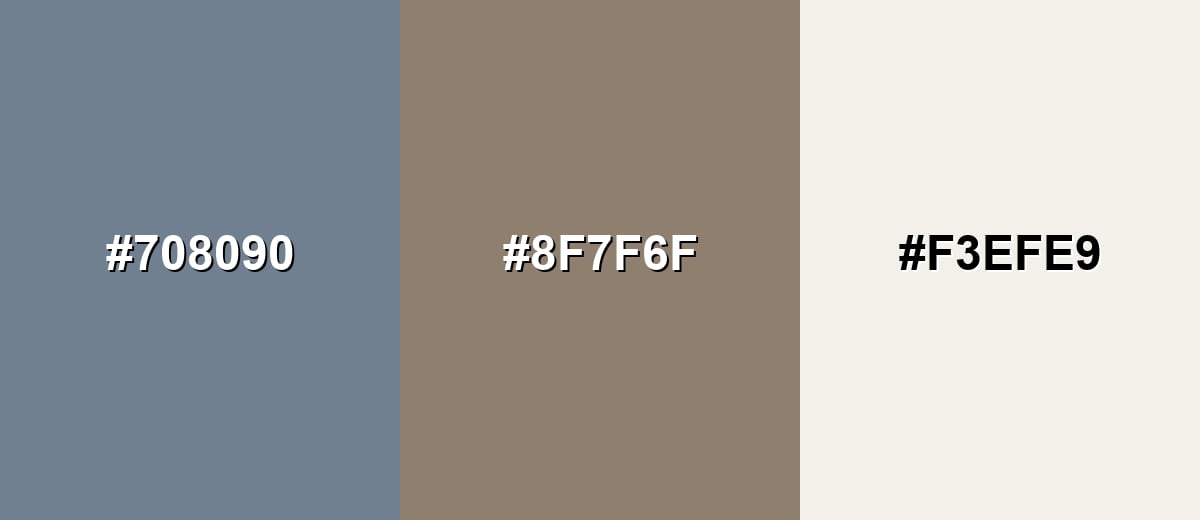
A warm, earthy complement offsets the cool undertone and makes slate gray feel more inviting. This pairing is useful when you want balanced contrast without neon intensity.
Complementary Palette Example: Use slate gray as the base, warm taupe for soft contrast, and ivory to keep the layout bright and readable.
Analogous Color Schemes
Analogous colors sit adjacent to each other on the color wheel, creating harmonious, cohesive palettes with subtle variation.
A blue-leaning set that feels calm and technical, ideal for UI panels and charts.
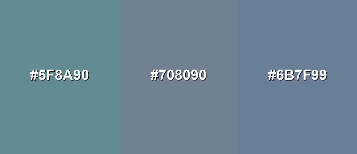
- Deep Teal Gray: #5F8A90
- Slate Gray: #708090
- Blue Gray: #6B7F99
A slightly cooler, more atmospheric run that suits editorial layouts and modern interiors.
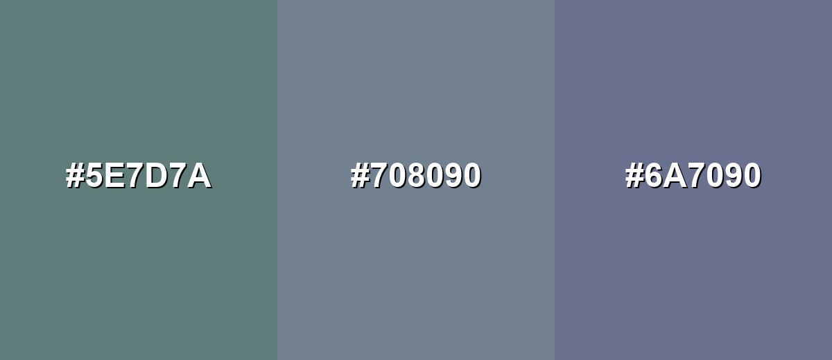
- Blue Spruce: #5E7D7A
- Slate Gray: #708090
- Indigo Gray: #6A7090
Triadic & Tetradic Combinations
A triadic palette adds variety while staying muted and wearable.
Combine slate gray with dusty rose and olive gray for a balanced mix of cool, warm, and earthy notes.
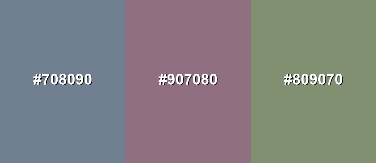
- Slate Gray: #708090
- Dusty Rose: #907080
- Olive Gray: #809070
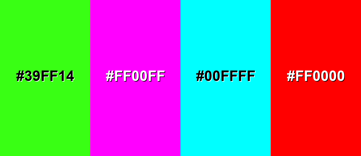
Colors to Avoid
While slate gray is remarkably versatile, certain combinations can create problematic visual effects:
- Neon Green (#39FF14) - The intensity can overpower slate gray and create a harsh, vibrating edge on screens.
- Hot Magenta (#FF00FF) - This combination feels loud and can look dated, especially in professional UI or branding.
- Pure Cyan (#00FFFF) - The high saturation clashes with slate gray's muted tone and can distract from content hierarchy.
- Bright Red (#FF0000) - Strong red can read as error-only next to slate gray, making interfaces feel tense or overly alarm-driven.
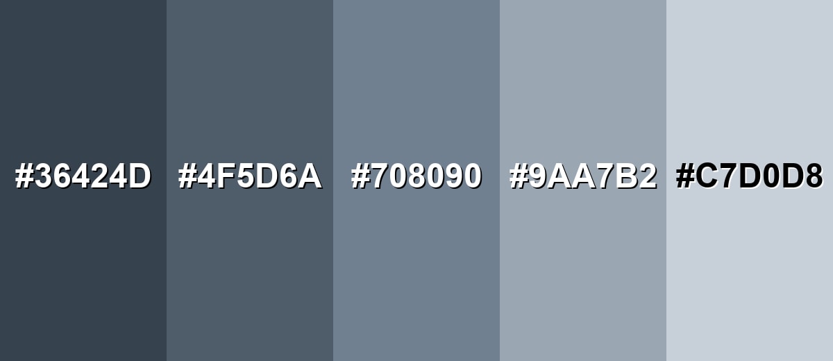
Shades, Tints & Variations of Slate Gray
Slate gray has a surprisingly flexible range—from deep, dramatic slates to pale, airy tints. Using a few related variations helps you build depth, readable contrast, and consistent UI states without introducing new hues.
- Deep Slate (#36424D) - A darker, more dramatic take that leans into the blue undertone while increasing contrast. It's best used for Headers, footers, hero backgrounds, and high-contrast UI surfaces..
- Dark Slate Gray (#4F5D6A) - A strong, practical shade that still feels softer than near-black. It's best used for Body text alternatives, outlines, icons, and navigation bars..
- Classic Slate Gray (#708090) - The standard mid-tone version with a balanced gray base and cool blue cast. It's best used for Primary neutrals in design systems, product surfaces, and understated brand palettes..
- Light Slate Gray (#9AA7B2) - A lighter, airier tone that reads clean and modern without feeling stark. It's best used for Cards, secondary backgrounds, subtle borders, and large interior surfaces..
- Pale Slate (#C7D0D8) - A soft, near-neutral tint that keeps a hint of coolness in bright layouts. It's best used for Background fills, disabled states, and gentle contrast behind dark typography..
Industry Applications
Because slate gray is steady and adaptable, it shows up across industries that need clarity and trust. It is especially useful where readability, structure, and a modern tone matter more than loud attention.
Fashion & Beauty
- Wardrobe staple - Works as a base neutral that pairs easily with both warm and cool colors.
- Premium finish - Looks polished in matte fabrics, leather, and hardware details.
- Wear-resistant appeal - Helps hide scuffs and everyday wear in shoes, bags, and accessories.
- Softens bold accents - Balances brighter tones so outfits and packaging feel intentional, not loud.
Interior Design & Decor
- Modern wall color - Creates a calm, contemporary feel, especially with warm whites and natural wood.
- Cabinetry & built-ins - Reads clean and tailored without the heaviness of near-black finishes.
- Metal fixtures - Complements steel, concrete, and stone textures for a refined industrial look.
- Layering-friendly - Pairs well with soft textiles and warm lighting to prevent spaces from feeling cold.
Branding & Marketing
- Trust-forward identity - Supports dependable brand positioning for tech, finance, and services.
- Clean product staging - Makes photography and hero visuals stand out without competing for attention.
- Strong typographic base - A practical alternative to black for editorial layouts, charts, and UI frameworks.
- Accent-ready - Works best with one signature highlight color for buttons, labels, or campaign moments.
Conclusion
Slate gray color stands out as a cool, stone-inspired neutral that feels modern, composed, and easy to build around. With the standard HEX value #708090, it's a reliable choice for UI structure, understated branding, and clean interior palettes—especially when you balance it with warmer neutrals or a single muted accent to keep the look inviting. Use its darker and lighter variations to control hierarchy and readability, and you'll get a palette that stays calm, professional, and consistently on-brand.
Design Smarter with AI: Media.io is an online AI studio that empowers creators with advanced image generation and enhancement tools. From text-to-image and image-to-image creation to AI upscaling and color optimization, it enables fast, creative, and professional results—all in your browser.

Frequently Asked Questions About Slate Gray Color
Slate gray is a medium gray with a noticeable cool, blue undertone. In real materials it often resembles weathered slate stone, brushed metal, or soft steel.
A widely used digital reference for slate gray is #708090. It is also a common named value in many design tools and CSS palettes.
Slate gray is generally considered cool because it leans toward blue. It can appear slightly warmer or cooler depending on nearby hues and lighting conditions.
It pairs well with warm neutrals like taupe and ivory, muted greens like sage, and soft accents like dusty rose. Warm oranges and clay tones are great for contrast without looking harsh.
Use it for structure such as navigation, cards, or secondary surfaces, then test contrast for text and icons. If small white text looks weak, switch to darker text, increase font weight, or use a darker slate shade for the background.
Slate gray is typically lighter and has a blue undertone, while charcoal is darker and closer to neutral black. Charcoal feels heavier and more dramatic; slate gray feels airier and more modern.


