
Run this test before you call a batch of AI product images consistent: place the real packshot beside every campaign image and look for anything that would make a shopper think it is a different SKU.
| Lock across every image | Safe to vary by campaign |
|---|---|
| Product geometry and proportions | Background and location |
| Logo, label, hardware, closures | Camera angle and crop |
| Brand color and core materials | Lighting mood and props |
| Scale relative to people and objects | Season, styling, and supporting talent |
The rest of this guide turns that simple comparison into a repeatable production system: build an identity sheet, separate invariants from variables, start from a clean packshot, control one change at a time, protect text and materials, keep scale believable, and review the full set on a contact sheet before publishing.
In this article
- Build a Product Identity Sheet First
- Separate Product Invariants From Campaign Variables
- Use Real Product References for Shape, Not Only Style
- Generate the Clean Packshot Before Lifestyle Variations
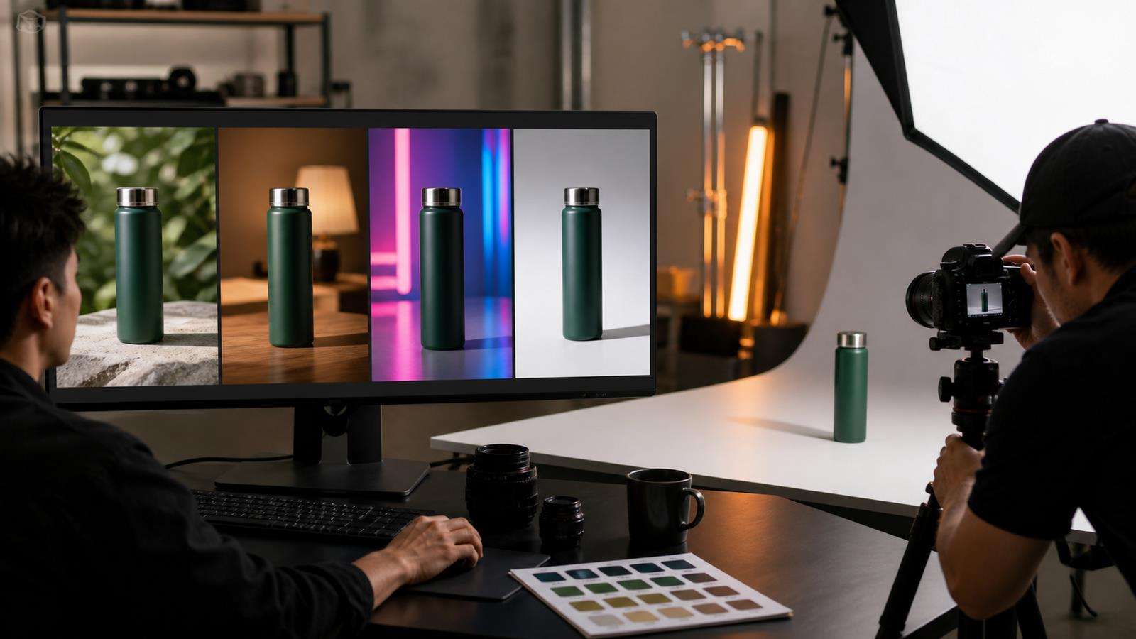
- Change One Visual Variable at a Time
- Keep Logos and Printed Text in Safe Views
- Lock Color and Material Before You Explore Mood
- Keep Model and Product Scale Consistent
- Build Reusable Scene Families Instead of Random Prompts
- Use a Contact Sheet for Final Brand QA
- Create Consistent Product Variations With Media.io
- Product Image Consistency Checklist
- Version the Reference Set When the Real Product Changes
- FAQs About Consistent AI Product Images
Build a Product Identity Sheet First
Before generating campaign scenes, document what makes the product recognizable.
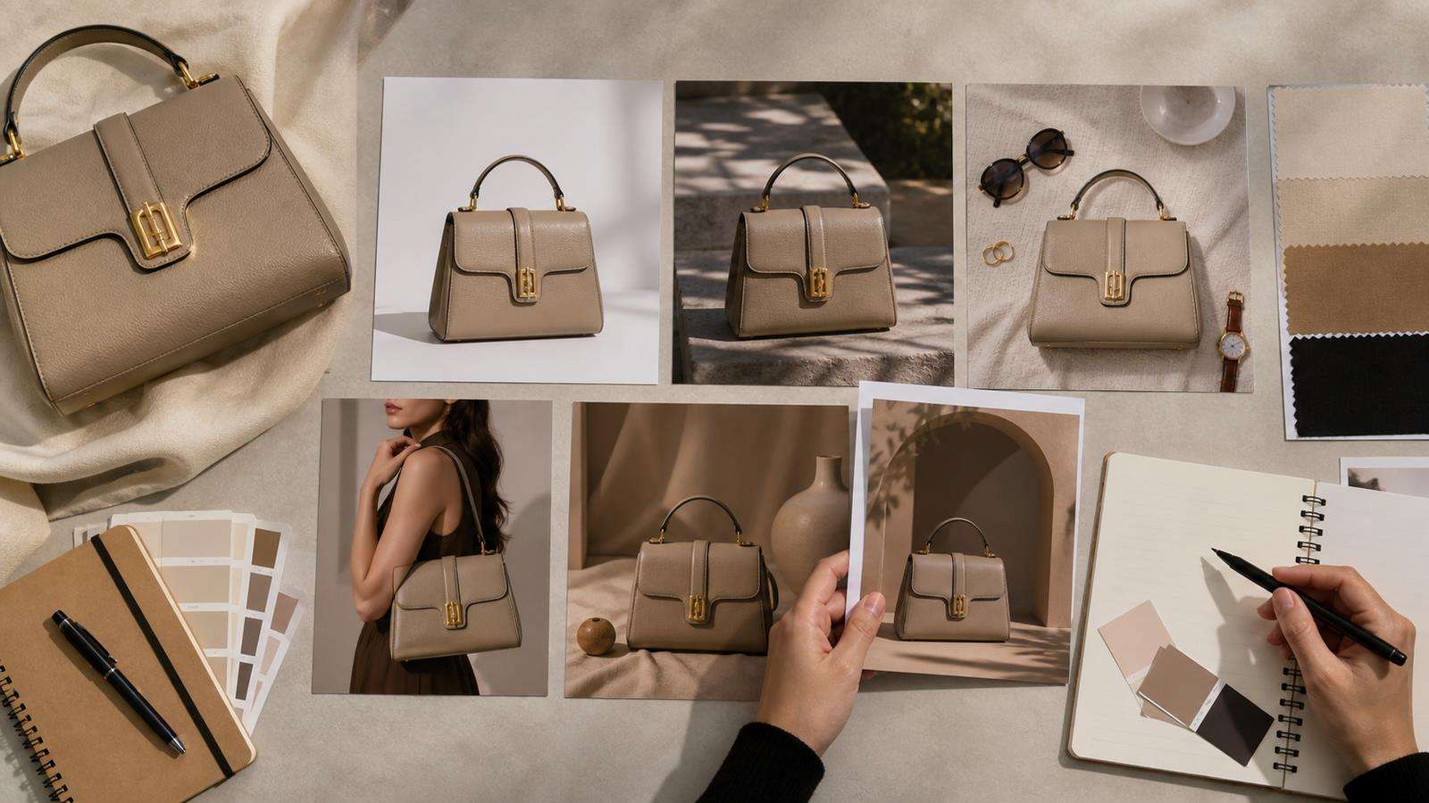
Your identity sheet should include:
- Front and three-quarter packshots.
- Side or back view when shape matters.
- Close-up of logo and label placement.
- Hardware, closure, texture, seams, or material detail.
- Exact brand color reference.
- Approximate physical proportions.
- Approved product name and variant.
- Details that must never appear, such as the wrong cap or extra pocket.
For a handbag, the identity sheet might lock the body shape, handle length, number of buckles, stitch pattern, logo location, zipper color, and leather finish. For a beverage can, it might lock the can proportions, logo, main color blocks, tab color, and exact label hierarchy.
This sheet is the visual equivalent of a brand glossary. Every generation should be judged against it.
Separate Product Invariants From Campaign Variables
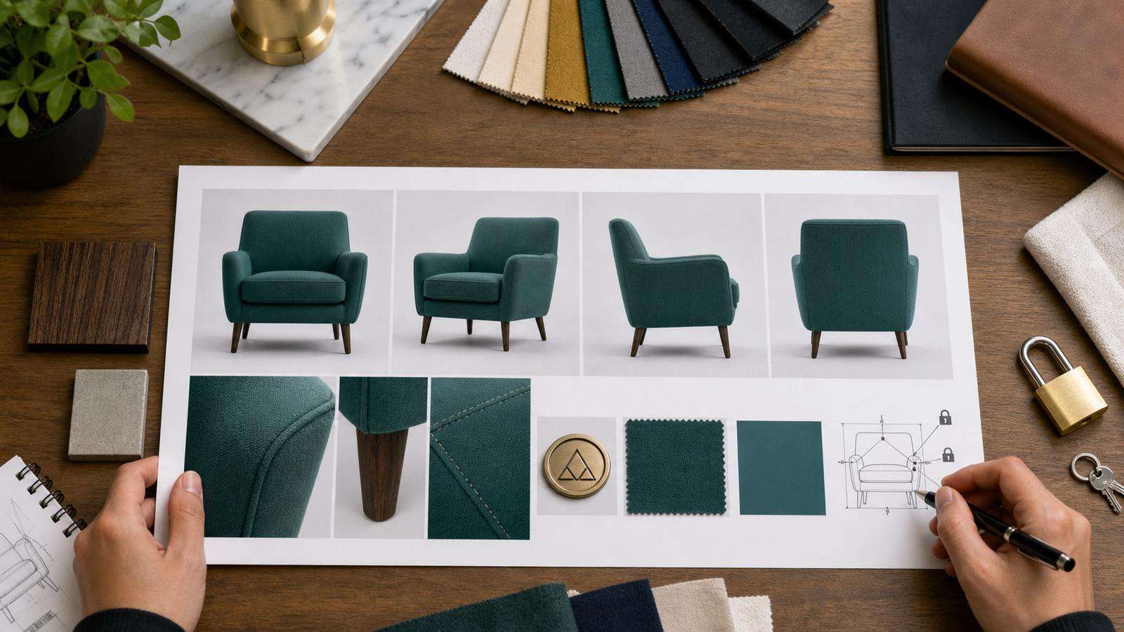
Consistency becomes easier when prompts distinguish what is fixed from what is allowed to change.
Product invariants include:
- Geometry.
- Brand colors.
- Material.
- Logo and label placement.
- Hardware and closures.
- Proportions.
- Important printed details.
Campaign variables include:
- Background.
- Model or hand.
- Camera angle within safe limits.
- Lighting style.
- Props.
- Season.
- Mood.
- Ad format.
For example, instead of writing a completely new prompt for every scene, keep one product identity block and change only the environment block.
"Use the exact same ivory leather shoulder bag from the reference, crescent body, one short strap, brushed gold buckle on the left, small centered wordmark, smooth matte leather. Place it on a warm travertine table beside sunglasses in late-afternoon Mediterranean light."
The next prompt can preserve the entire first sentence and change only the scene.
Use Real Product References for Shape, Not Only Style
A style reference tells the generator about visual language such as color, texture, lighting, and mood. A product reference needs to do more: it must preserve subject identity.
Adobe Firefly distinguishes style references from composition and object references in different workflows. Photoshop's reference-image generative fill can target an object or whole image. Firefly composition reference focuses on outline and depth. This distinction is useful even outside Adobe products because it reminds you to ask what each reference is controlling.
For product campaigns, upload a clean product image whenever the generation system supports subject or image references. If the product is small in the reference, crop closer. If the label is the critical detail, include a label-safe reference. Do not expect a mood board alone to preserve packaging geometry.
Media.io's Image AI provides a direct image-generation and transformation path when you want to work from existing visual assets rather than start from only text.
Generate the Clean Packshot Before Lifestyle Variations
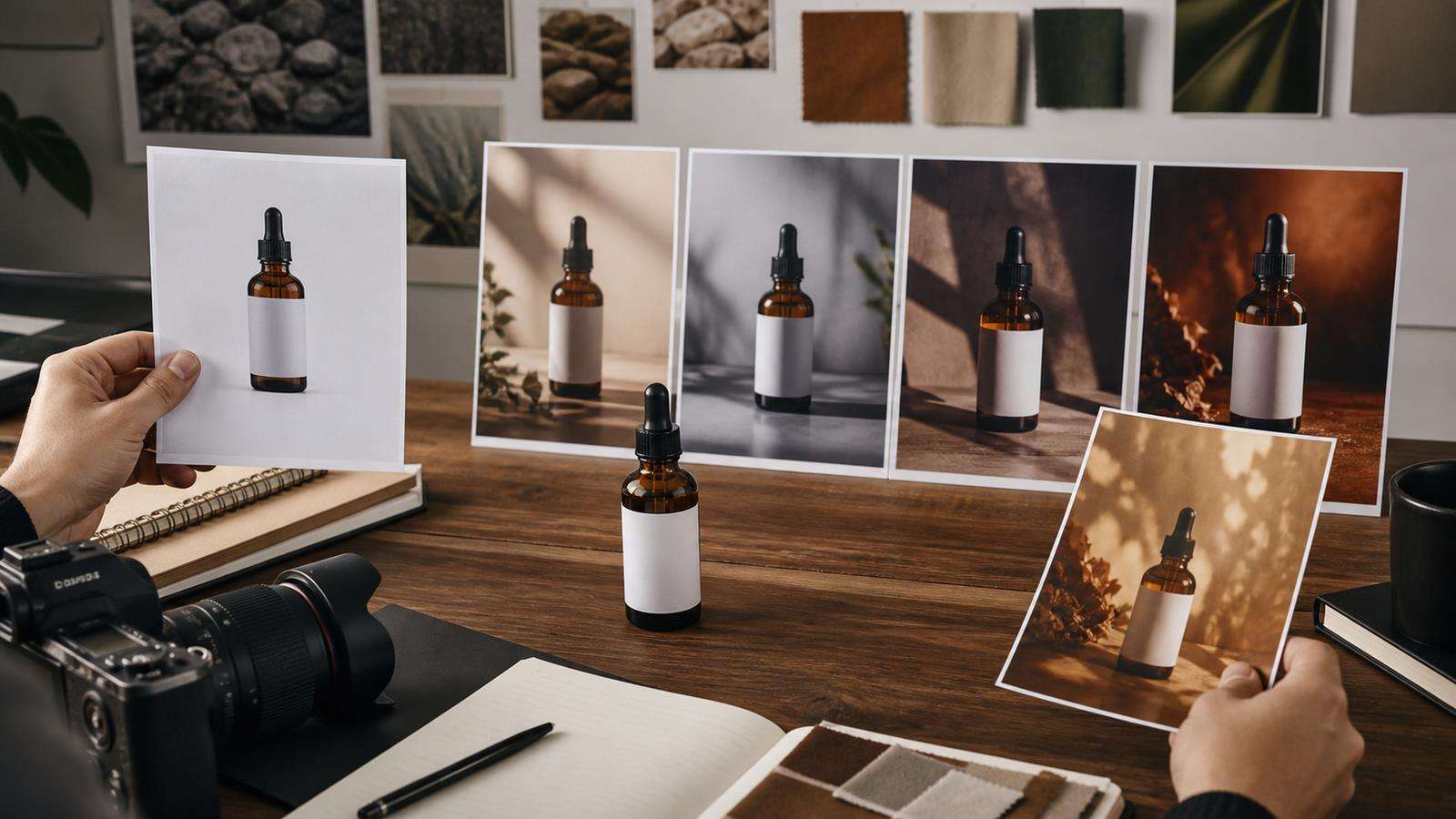
A reliable campaign workflow moves from controlled to complex.
Start with the cleanest product image. Confirm that the product is correct. Then create a simple studio variation. After that, move into lifestyle scenes, model-led images, seasonal campaigns, and more complex ad concepts.
Why this order works: every approved step gives you a stronger reference for the next one. If the product is wrong in the studio image, do not carry that error into ten lifestyle generations.
Media.io has dedicated product photography directions such as Lifestyle Product Photography. Use these scenarios after the product identity is already verified, not as the first place where the generator has to decide what the product looks like.
Change One Visual Variable at a Time
When you need a family of images, avoid changing model, background, camera, lighting, product angle, color palette, and composition simultaneously.
A controlled sequence might be:
- Same product and camera, new background.
- Same product and background, new lighting.
- Same product and lighting, add a model.
- Same product and model, new pose.
- Same identity package, adapt to a new aspect ratio.
This gives you a clear reference trail. If the product starts drifting at step three, you know the model interaction is the new risk.
It also creates better campaign consistency. Viewers see intentional variation around one stable brand object rather than a set of unrelated AI interpretations.
Keep Logos and Printed Text in Safe Views
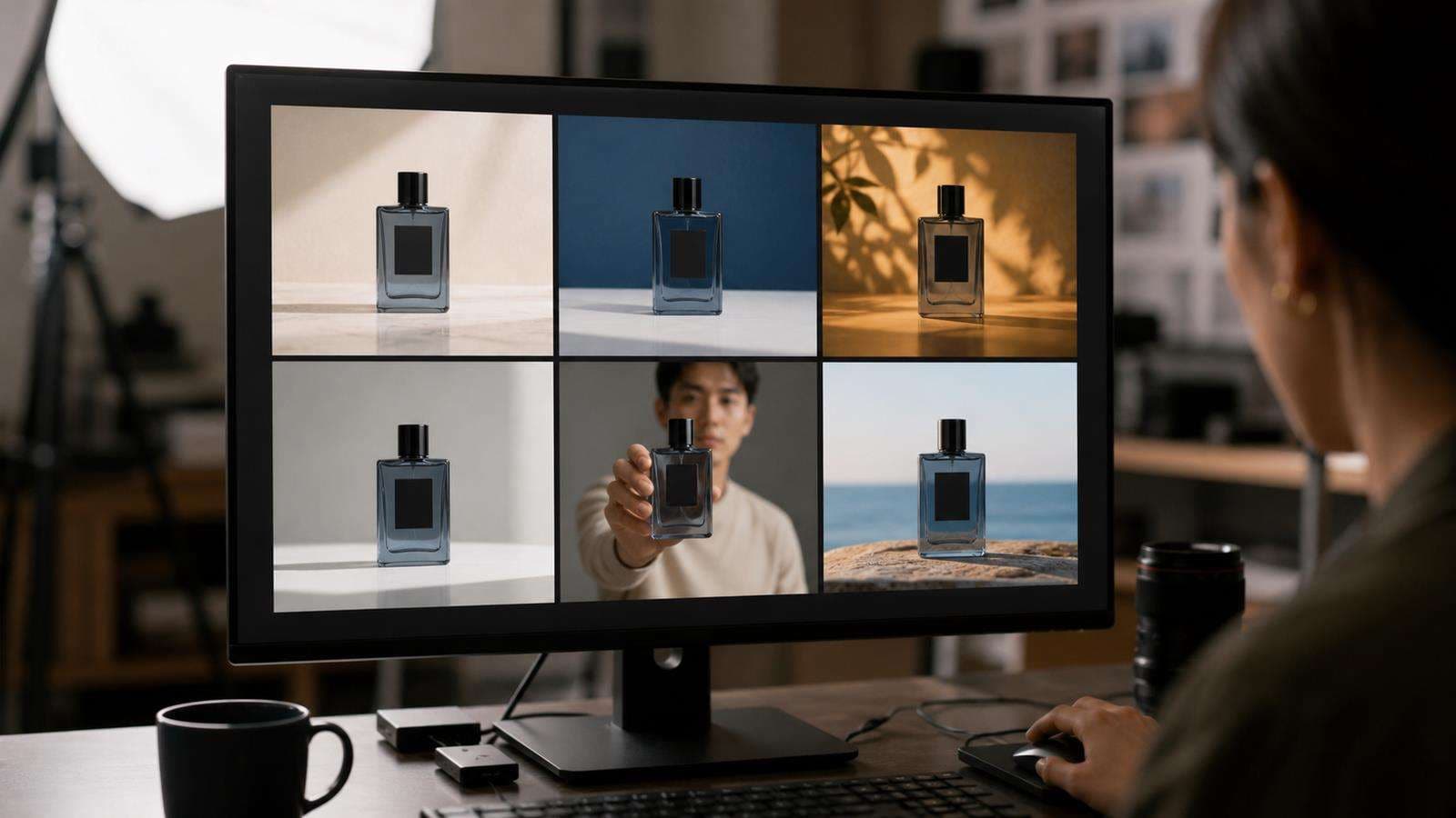
Small text remains one of the hardest brand details in generative imagery. If the front label is important, do not force it through extreme perspective, heavy depth of field, reflective glare, or partial occlusion in every image.
Use a few label-safe compositions where the branded face is large and readable. Other images can show side angles, model interaction, or more atmospheric framing after the campaign has already established the product identity.

Media.io's AI product photography prompt guide can help with scene and camera language, but visual product references should remain the source of truth for brand-sensitive details.
Lock Color and Material Before You Explore Mood
A product can drift without changing shape. Color temperature can push a blue package toward teal. Warm lighting can turn neutral white into yellow. Glossy plastic can become matte ceramic. Leather can become velvet.
Write material and color as physical properties, not only adjectives. For example:
"Deep cobalt blue anodized aluminum with a fine satin finish" is clearer than "premium blue product."
When the scene lighting is warm, tell the model to preserve the product's actual brand color. Use neutral packshots as reference so the campaign lighting does not become the new definition of the product.
For reflective materials, check highlight behavior. A mirror-like surface can hide logo details or create false edges. Create separate images for product truth and dramatic mood when necessary.
Keep Model and Product Scale Consistent
When a person enters the scene, scale becomes another identity cue. A handbag should not shrink between a flat lay and model shot. A watch should not become too large for the wrist. A skincare bottle should fit the hand the same way across images.
Use a real product-in-hand or product-on-body reference when scale is critical. If none exists, choose one generated image as the approved scale reference and keep it in the set.
Check contact points too. Straps should rest on shoulders. Shoes should match feet. Rings should wrap fingers. Objects should sit on surfaces with believable shadows. Physical contact problems can make a correct product look synthetic.
Build Reusable Scene Families Instead of Random Prompts
Campaign production gets faster when you define scene families.
For example, a skincare brand might use:
- Clean studio packshot.
- Bathroom shelf lifestyle.
- Product-in-hand creator shot.
- Ingredient or texture macro.
- Morning routine model shot.
- Minimal ad layout with text-safe space.
Each family has its own composition and purpose, but all share the same identity rules. This is more scalable than asking a generator for "another creative idea" each time.
Media.io's AI Ad Generator includes preset product scenes and custom prompts, which can be used as campaign branches after you have prepared consistent product assets.
Use a Contact Sheet for Final Brand QA
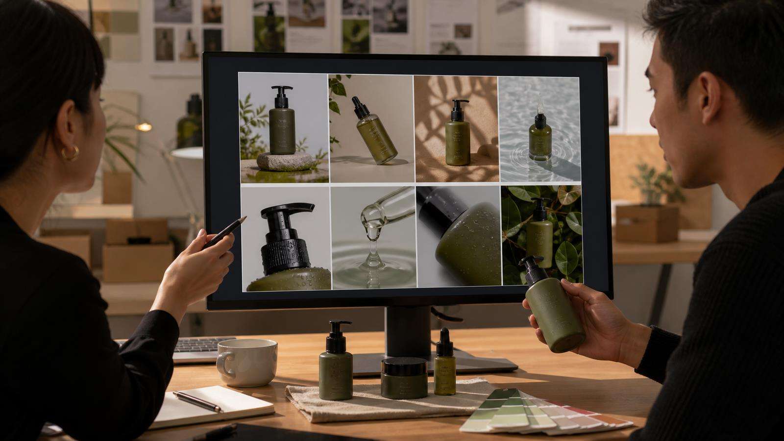
Do not approve images one by one. Put the full set on one page and compare them side by side. Product drift that is hard to notice in individual files becomes obvious in a contact sheet.
Check:
- Product width and height.
- Logo size and location.
- Color and material.
- Handle, cap, buckle, zipper, or closure details.
- Label hierarchy.
- Scale relative to people and props.
- Lighting consistency within the campaign.
- Background and styling that fit the brand.
Mark one packshot as the master reference and compare every campaign image against it.
Create Consistent Product Variations With Media.io
Start from your strongest real product photo. Use Media.io Image AI or a product photography workflow to create controlled variations. Keep the approved product reference attached to the project and change the scene deliberately rather than rewriting the identity each time.
For advertising, move the approved still set into AI Ad Generator so video and image variants begin from consistent product assets. This reduces the chance that different campaign branches start with different versions of the product.
Product Image Consistency Checklist
Before you export a campaign set, confirm:
- Every image matches the same approved product identity sheet.
- Shape and proportions are stable.
- Brand colors remain correct under different lighting.
- Materials and textures stay physically consistent.
- Logos and labels are correct in brand-sensitive frames.
- Hardware, closures, seams, and other details do not appear or disappear.
- Product scale is consistent across model and lifestyle shots.
- Contact shadows and physical placement look believable.
- The images feel like one campaign even when compositions differ.
Consistency does not mean every image should look the same. The goal is to keep the product fixed while the story, environment, model, and media format can change.
Version the Reference Set When the Real Product Changes
Consistency can become a problem when the actual product receives a packaging update. Do not quietly mix old and new references in the same generation library. Create a new reference version and mark the effective date, market, and SKU.
For example, if the brand changes the cap from white to silver or updates the front label, archive the old identity sheet and create a new one. Campaigns that still promote remaining inventory may need the old package, while new launches need the updated version. Without version control, AI can blend both designs and create a product that never existed.
The same rule applies to regional packaging, seasonal editions, and size variants. Give each version a clear file name and reference folder. Product consistency is not only visual quality; it is also catalog accuracy.
FAQs About Consistent AI Product Images
-
Why does my product change between AI images?
Each generation can reinterpret small geometry, labels, materials, and color unless the system has a strong reference. A stable identity sheet and repeated approved references reduce that freedom.
-
How many product reference images should I use?
Use enough to explain the product clearly without adding conflicting versions. A front or three-quarter packshot, side view, and important detail close-up are often a strong starting set.
-
Can a style reference keep the product itself consistent?
A style reference is best for look and feel. Product identity needs a subject or product reference, plus explicit locked properties. Do not rely on style alone for exact packaging.
-
How do I keep a logo readable in AI product photos?
Use label-safe angles, keep the branded surface large enough, avoid strong glare and heavy occlusion, and compare the generated logo with the real packshot. Composite the real label when exact text is required.
-
Should I use the same prompt for every product image?
Reuse the product identity block, but vary the scene section intentionally. This keeps invariants stable while allowing different backgrounds, models, lighting, and campaign formats.
-
What is the best way to review a large set of AI product images?
Create a contact sheet and compare all outputs with one approved master packshot. Side-by-side review makes shape, color, label, and scale drift much easier to detect.


