

Earthy color palettes blend grounded neutrals with warm, natural accents—think clay, sand, olive, bark, and espresso. They’re a modern go-to for brands and layouts that want to feel calm, trustworthy, and tactile.
Below are 20+ curated earth tone color palette ideas with HEX codes, plus practical tips for pairing and using them across branding, interiors, packaging, and social content.
In this article
- Why Earth Tone Color Palettes Work So Well
-
- clay and cream
- forest floor
- desert sage
- terracotta dusk
- cedar cabin
- harvest market
- mossy stone
- canyon trail
- linen and leather
- coffee soil
- olive grove
- copper patina
- prairie sunrise
- riverbank neutral
- spice route
- quiet ceramic
- smoky timber
- sunbaked adobe
- stoneware kitchen
- golden lichen
- sienna orchard
- bark and basil
- What Colors Go Well with Earthy Colors?
- How to Use an Earth Tone Color Palette in Real Designs
Why Earth Tone Color Palettes Work So Well
Earthy tones feel familiar because they mirror materials we see every day—wood, stone, clay, linen, foliage, and soil. That natural reference makes designs feel approachable and “real,” even when the layout is clean and modern.
They’re also easy on the eyes. Most earthy color palettes sit in mid-to-low saturation ranges, which helps reduce visual fatigue and makes long-form reading, product browsing, and calm branding experiences feel more comfortable.
Finally, earthy color schemes are versatile: they can lean minimal (greige + charcoal), warm and artisanal (terracotta + cream), or botanical (olive + sand). With the right contrast choices, they work across print and digital without looking trendy for just one season.
20+ Earthy Color Palette Ideas (with HEX Codes)
1) Clay and Cream

HEX: #E7D8C9 #C8A07A #8F6B4F #6C7A4A #2F2A24
Mood: soft, grounded, refined
Best for: minimalist brand identity
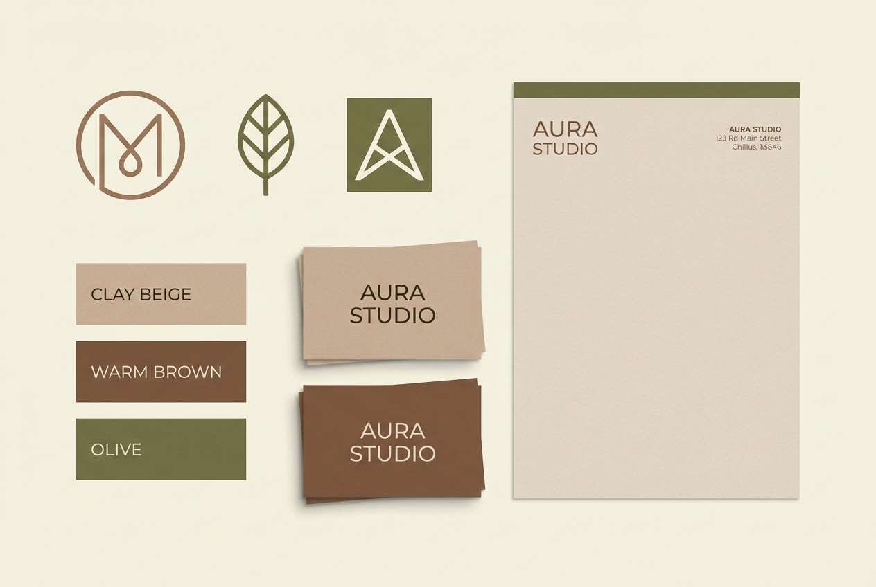
Soft clay neutrals and creamy highlights feel like sunlit pottery on a studio shelf. Use this earth tone palette for logos, packaging systems, and calm landing pages where you want warmth without looking rustic. Pair the deep charcoal with plenty of cream space to keep the layout airy, and let olive act as a quiet accent. Tip: reserve the darkest tone for type and icons to preserve contrast.
Image example of clay and cream generated using media.io
Media.io is an online AI studio for creating and editing video, image, and audio in your browser.

2) Forest Floor
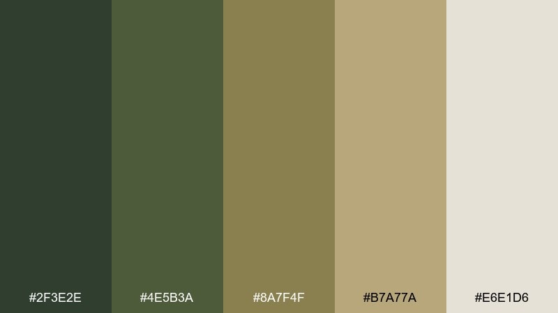
HEX: #2F3E2E #4E5B3A #8A7F4F #B7A77A #E6E1D6
Mood: woodland, calm, natural
Best for: eco product packaging
Deep greens and muted khaki evoke pine shade, moss, and dry leaves underfoot. These earthy tones suit sustainable packaging, outdoor goods, and labels that need an organic feel. Keep the cream as the main background and use the darkest green for stamps or seals. Tip: a subtle recycled paper texture works beautifully with these colors without adding extra hues.
Image example of forest floor generated using media.io
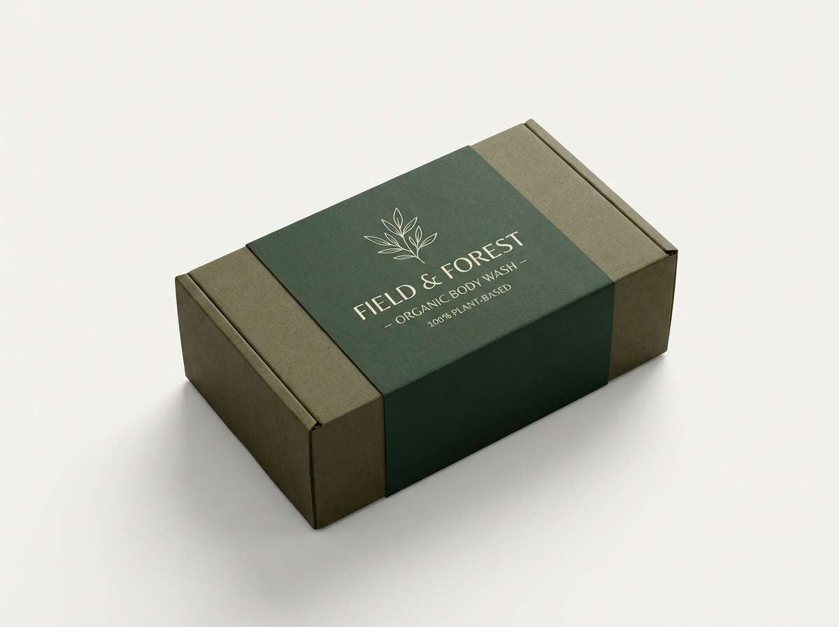
3) Desert Sage
HEX: #DCC9A1 #B8B08D #7E8A6A #A45D3D #3B332D
Mood: dusty, modern, sun-warmed
Best for: website UI for wellness
Dusty sage and sand feel like a quiet desert morning with warm light on stone. For a wellness UI, use sand as the base, sage for panels, and terracotta for primary buttons so calls to action feel inviting. The espresso brown keeps headings readable and grounded. Tip: limit terracotta to key actions and badges to avoid visual heat overload.
Image example of desert sage generated using media.io
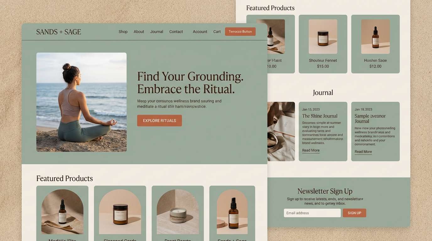
4) Terracotta Dusk
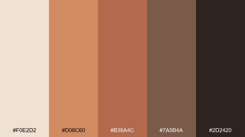
HEX: #F0E2D2 #D08C60 #B36A4C #7A5B4A #2D2420
Mood: cozy, romantic, artisanal
Best for: wedding invitation set
Warm terracotta and toasted browns suggest evening light on clay walls. This earth tone color scheme works beautifully for invitation suites, menus, and signage where you want a handcrafted vibe that still feels polished. Pair the pale cream with delicate serif type, and use the darkest brown for names and key details. Tip: add a thin terracotta border to frame the layout without heavy fills.
Image example of terracotta dusk generated using media.io
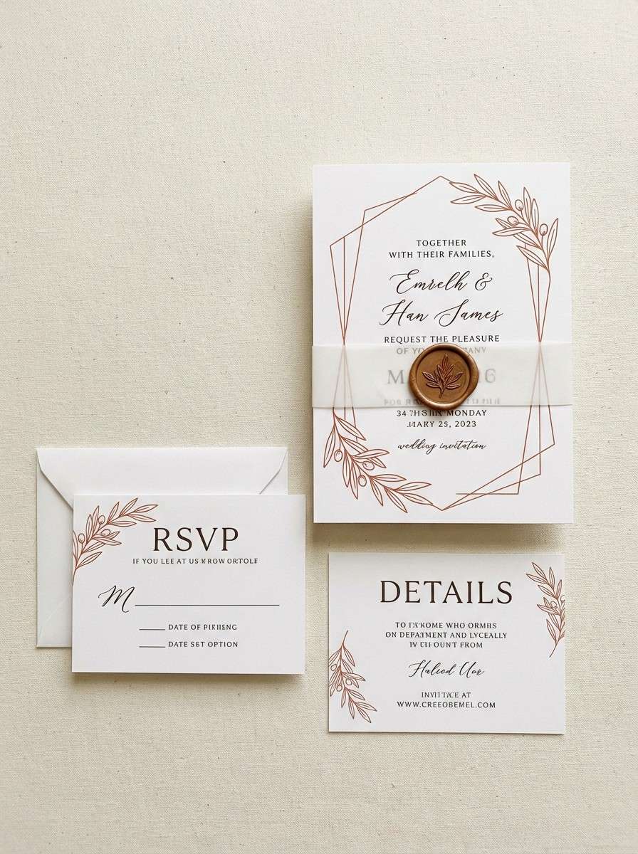
5) Cedar Cabin
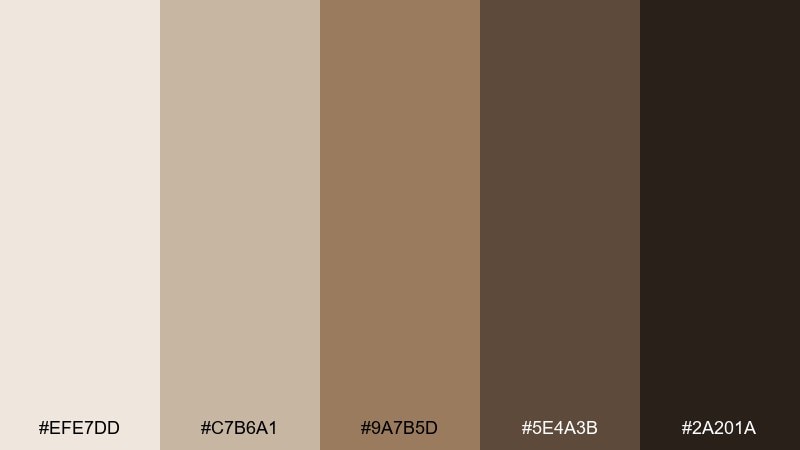
HEX: #EFE7DD #C7B6A1 #9A7B5D #5E4A3B #2A201A
Mood: rustic, cozy, timeless
Best for: interior moodboard
Cedar wood browns and creamy linen tones feel like a quiet cabin with soft light through curtains. Use the lightest shades for walls and large surfaces, then layer mid browns in furniture and textiles for depth. The near-black is perfect for metal fixtures or bold headings on moodboards. Tip: keep finishes matte so the palette stays calm and natural.
Image example of cedar cabin generated using media.io
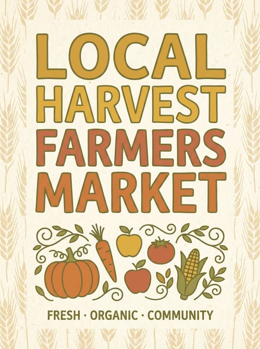
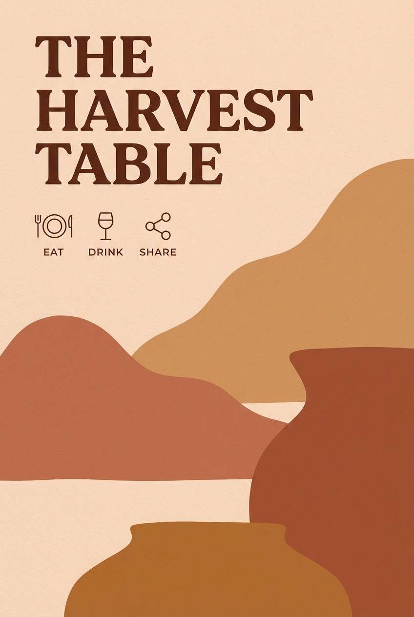
6) Harvest Market
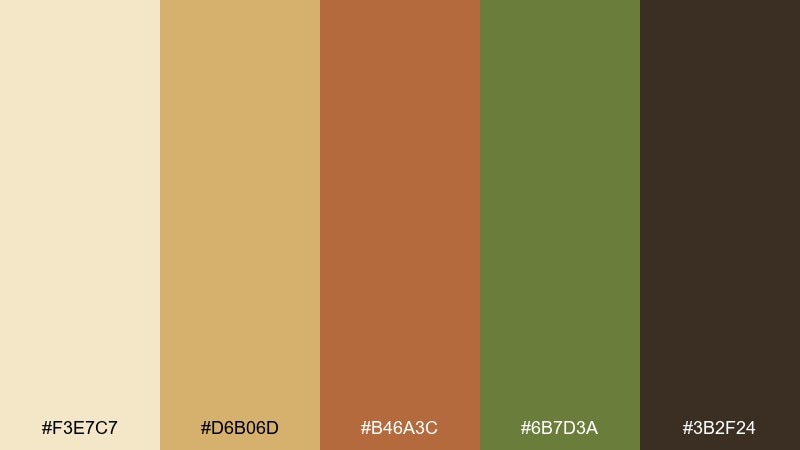
HEX: #F3E7C7 #D6B06D #B46A3C #6B7D3A #3B2F24
Mood: hearty, nostalgic, lively
Best for: farmers market poster
Golden grain, pumpkin spice, and leafy olive bring the energy of a busy weekend market. These earth color combinations pop on posters and flyers while still feeling wholesome and handmade. Use the pale wheat as the background, then alternate green and terracotta for headers and callouts. Tip: keep body copy in deep brown to avoid muddy contrast on warm paper tones.
Image example of harvest market generated using media.io
7) Mossy Stone
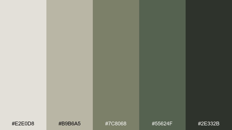
HEX: #E2E0D8 #B9B6A5 #7C8068 #55624F #2E332B
Mood: quiet, misty, balanced
Best for: editorial magazine layout
Cool greige and mossy greens feel like lichen on stone after a light rain. The earthy color palette suits editorial spreads, architecture features, and minimal print layouts where texture matters more than saturation. Use the lightest gray as negative space and reserve the deepest green-black for headlines. Tip: add one small block of the mid moss tone to guide the eye between sections.
Image example of mossy stone generated using media.io
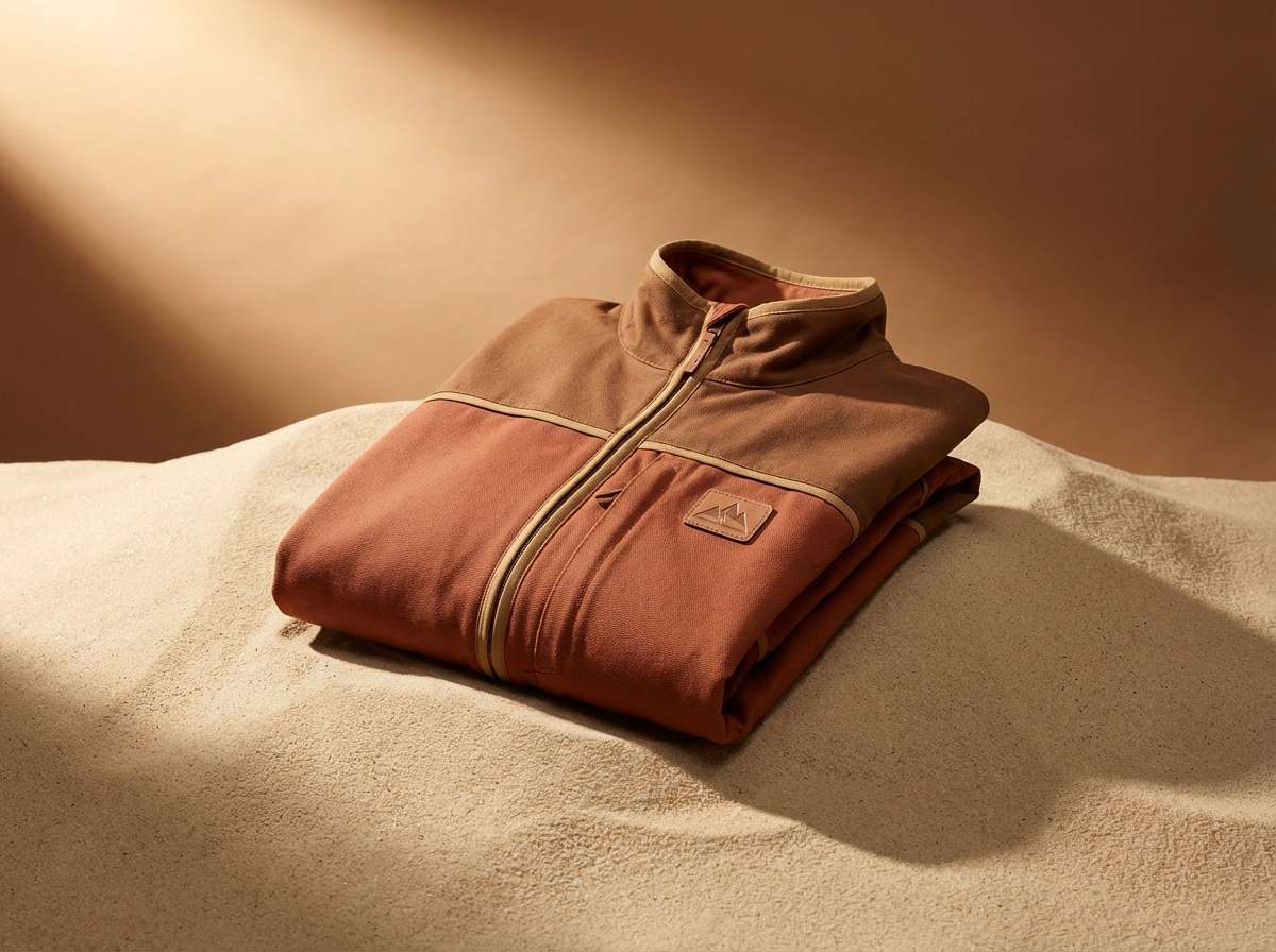
8) Canyon Trail
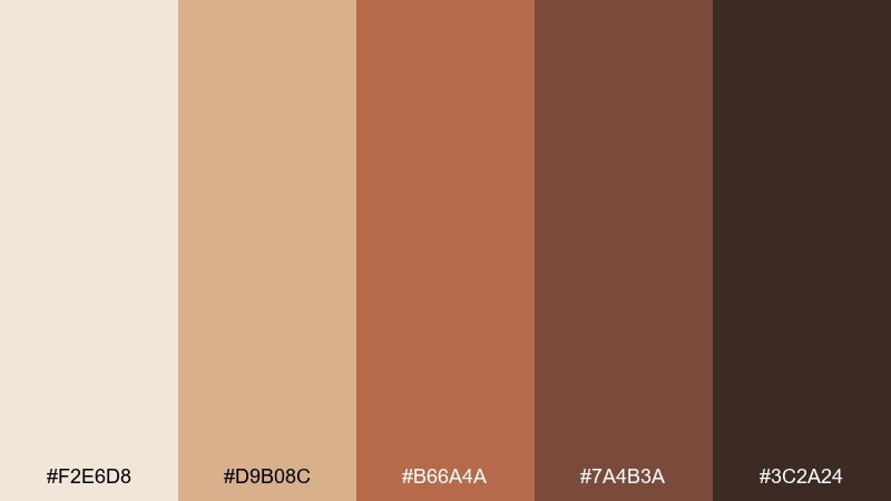
HEX: #F2E6D8 #D9B08C #B66A4A #7A4B3A #3C2A24
Mood: adventurous, warm, rugged
Best for: outdoor apparel product ad
Sunbaked canyon tones and dark leather browns feel rugged and dependable. Use these earthy colors in an outdoor product ad where warmth signals durability and comfort. Let the pale sand background keep the shot clean, then use the terracotta and deep brown for product accents and copy. Tip: keep the color grading warm and consistent so the browns do not drift into red.
Image example of canyon trail generated using media.io
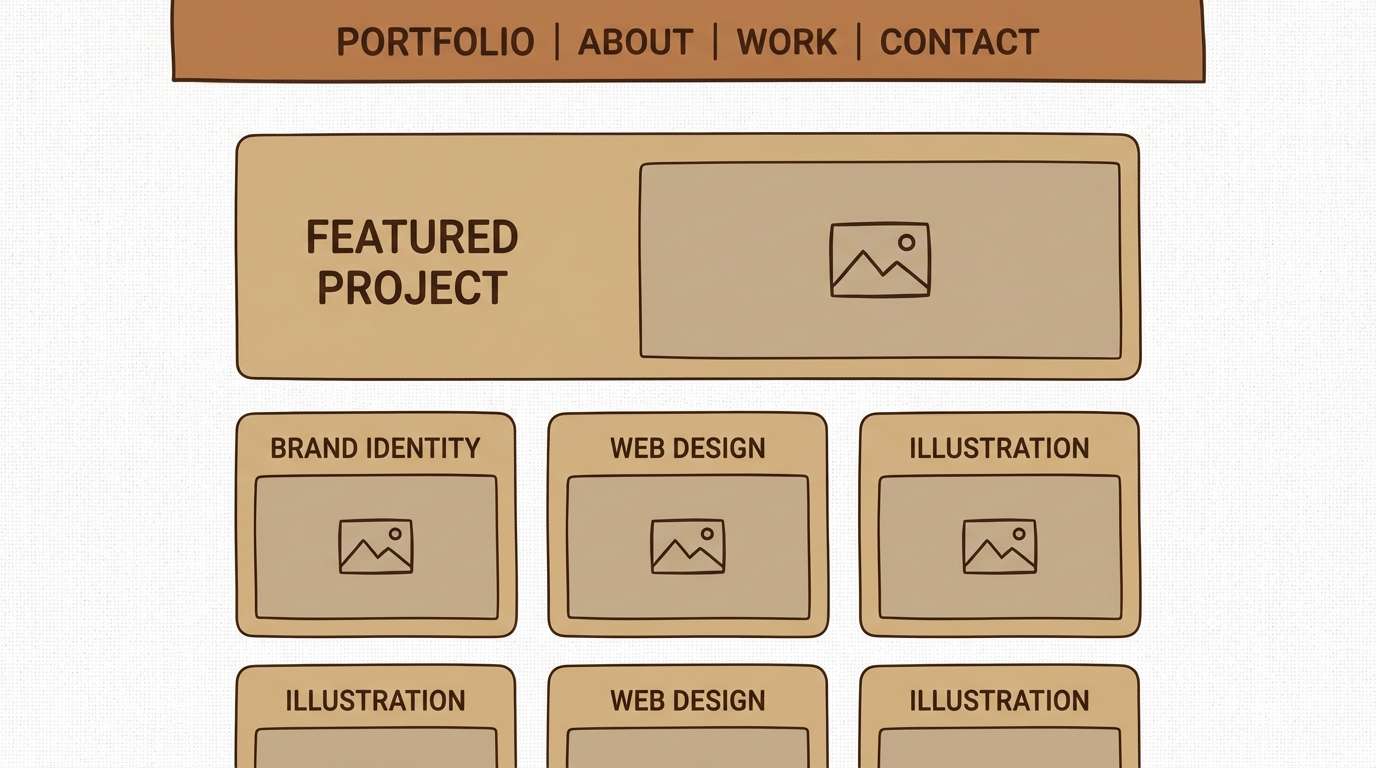
9) Linen and Leather
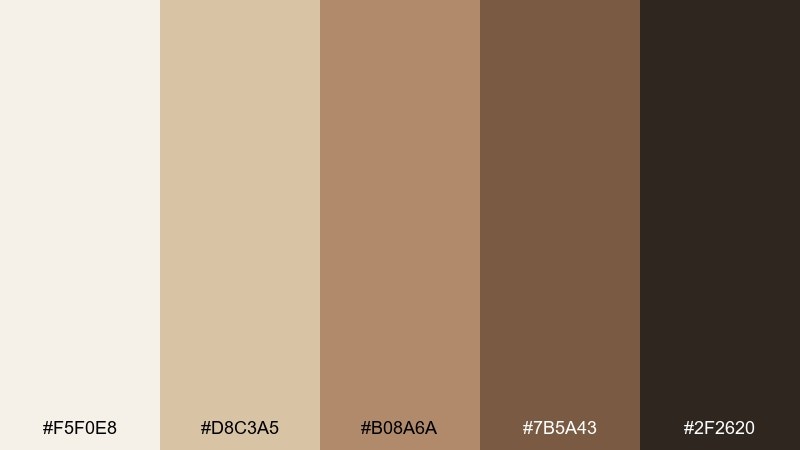
HEX: #F5F0E8 #D8C3A5 #B08A6A #7B5A43 #2F2620
Mood: classic, warm, upscale
Best for: portfolio website UI
Creamy linen and rich leather browns create a polished, tactile feel. These earth tones work well for portfolio UI where you want images to stand out while the interface stays quietly premium. Use linen as the canvas, tan for cards, and dark brown for navigation and text. Tip: keep shadows soft and low-contrast so the design feels natural rather than glossy.
Image example of linen and leather generated using media.io
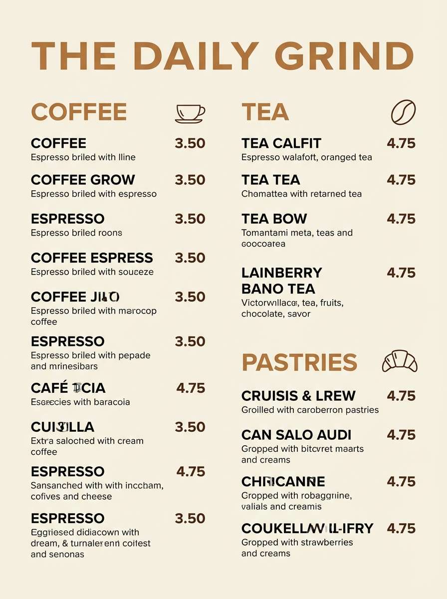
10) Coffee Soil
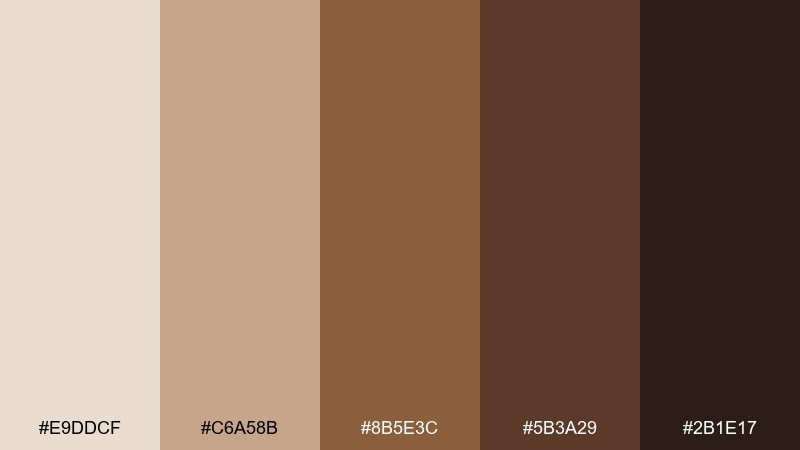
HEX: #E9DDCF #C6A58B #8B5E3C #5B3A29 #2B1E17
Mood: rich, cozy, grounded
Best for: cafe menu design
Roasty browns and creamy foam tones evoke a fresh pour-over on a rainy day. Use the light cream for menu backgrounds, then build hierarchy with caramel and espresso for headings and prices. This mix reads well in print and on digital signage without feeling harsh. Tip: use the darkest shade sparingly as a divider line and body text for clean legibility.
Image example of coffee soil generated using media.io
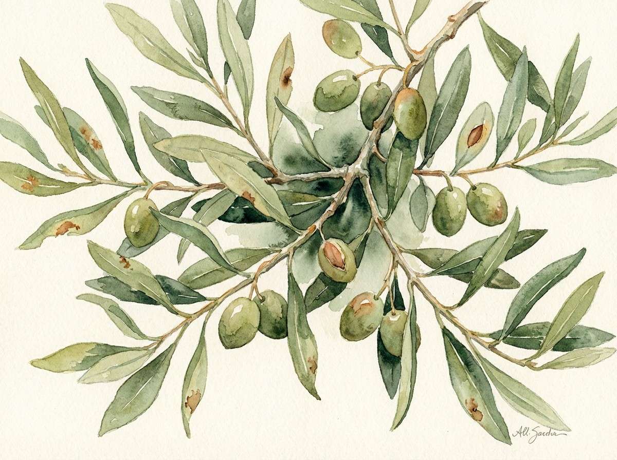
11) Olive Grove
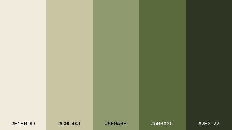
HEX: #F1EBDD #C9C4A1 #8F9A6E #5B6A3C #2E3522
Mood: fresh, botanical, calm
Best for: botanical watercolor illustration
Soft olive greens with creamy highlights feel like leaves catching late afternoon sun. Use these earth tone colors for botanical illustrations, stationery accents, or gentle social graphics where nature is the hero. Keep the mid olive as the dominant wash and ground the composition with the deep green in stems and shadows. Tip: leave paper-white areas so the greens stay airy rather than heavy.
Image example of olive grove generated using media.io
12) Copper Patina
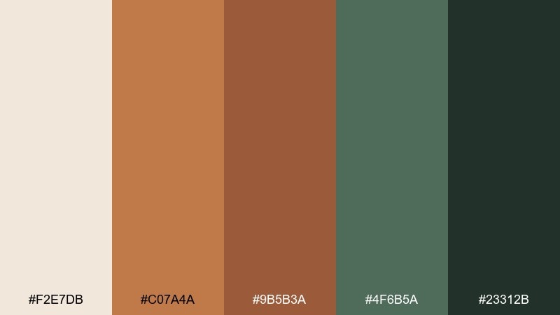
HEX: #F2E7DB #C07A4A #9B5B3A #4F6B5A #23312B
Mood: crafted, vintage, moody
Best for: craft beverage label
Burnished copper and muted patina green feel like aged metal in an old workshop. These earth tone color schemes are ideal for beverage labels, apothecary-style branding, and limited-edition drops. Let cream carry most of the label space, then use copper for the brand mark and patina for secondary stamps. Tip: add fine linework in the dark teal-black to keep details crisp.
Image example of copper patina generated using media.io
13) Prairie Sunrise
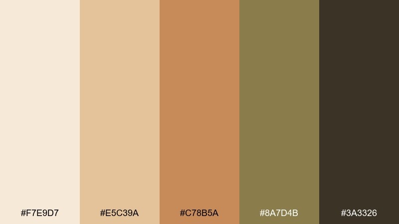
HEX: #F7E9D7 #E5C39A #C78B5A #8A7D4B #3A3326
Mood: gentle, hopeful, warm
Best for: social media carousel
Soft sunrise golds and dry grass browns feel open, calm, and optimistic. Use this earth tone color palette for a social carousel where you want warmth without loud saturation, especially for lifestyle tips or mindful quotes. Pair the pale peachy cream with dark brown text, and use the olive-khaki for subtle tags or section headers. Tip: repeat one golden accent shape across slides to build cohesion.
Image example of prairie sunrise generated using media.io
14) Riverbank Neutral
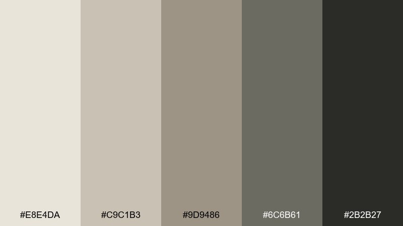
HEX: #E8E4DA #C9C1B3 #9D9486 #6C6B61 #2B2B27
Mood: minimal, cool, steady
Best for: mobile app UI
Smooth pebbles and wet sand come to mind with these quiet riverbank neutrals. They are great for utility apps, dashboards, and reading experiences where comfort matters more than color. Use the lightest gray-beige for screens, mid tones for cards, and near-black for text and icons. Tip: introduce one small warm accent from your brand elsewhere rather than forcing it into this set.
Image example of riverbank neutral generated using media.io
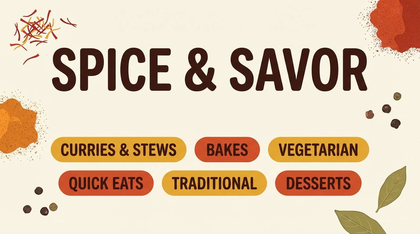
15) Spice Route
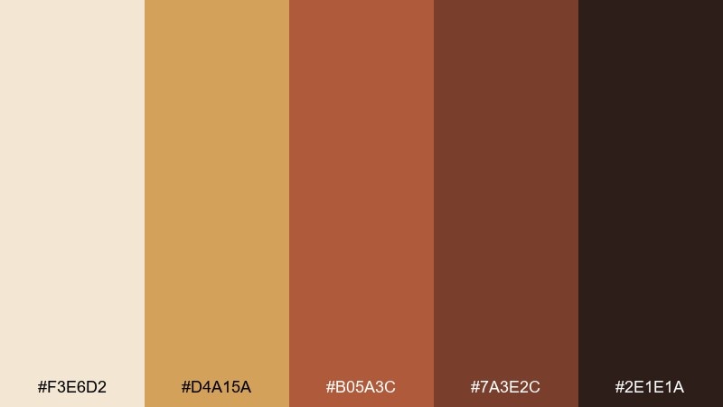
HEX: #F3E6D2 #D4A15A #B05A3C #7A3E2C #2E1E1A
Mood: bold, warm, flavorful
Best for: food blog header
Toasted saffron and paprika reds feel like spice jars lined up in a sunny kitchen. Use this earthy color palette for food blog headers, recipe cards, and hero banners where appetite and warmth matter. Pair cream with deep brown for typography, and use the brighter spice tones for badges like new or spicy. Tip: keep photo overlays subtle so the warm colors do not overpower the dish imagery.
Image example of spice route generated using media.io
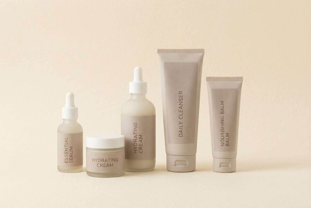
16) Quiet Ceramic
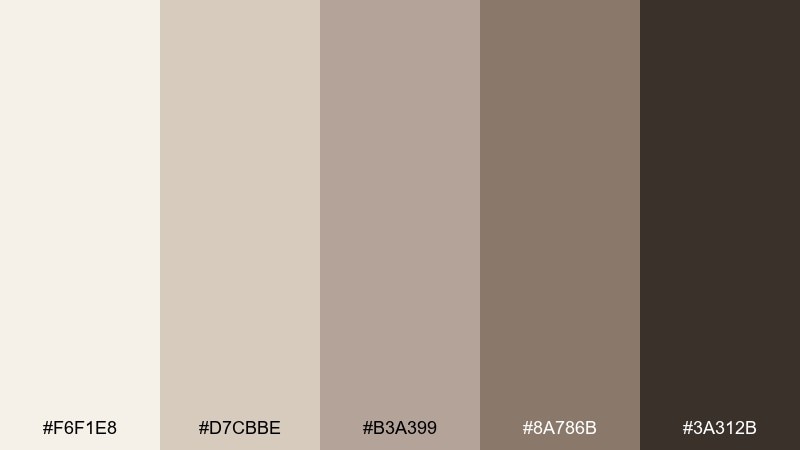
HEX: #F6F1E8 #D7CBBE #B3A399 #8A786B #3A312B
Mood: soft, elegant, calm
Best for: skincare packaging set
Powdery neutrals and warm taupe feel like matte ceramic pieces on a clean shelf. The earth tone color palette is ideal for skincare packaging where you want gentle sophistication and easy readability. Keep the light cream as the base, then use taupe for type and the darker brown for ingredient highlights. Tip: choose uncoated or soft-touch finishes to match the quiet mood.
Image example of quiet ceramic generated using media.io
17) Smoky Timber
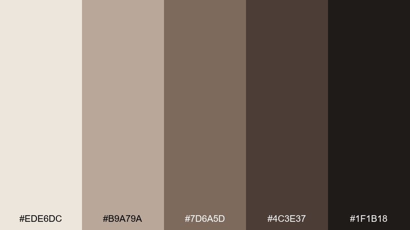
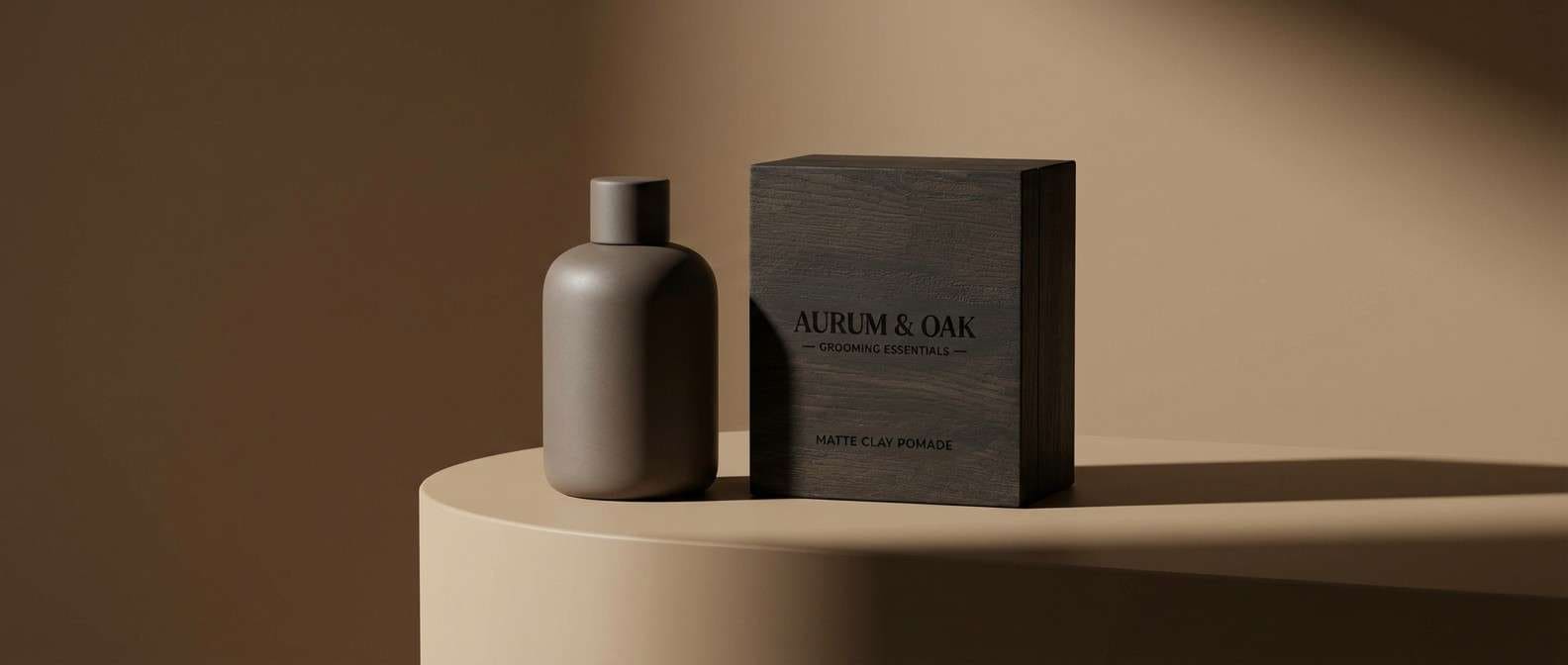
HEX: #EDE6DC #B9A79A #7D6A5D #4C3E37 #1F1B18
Mood: moody, masculine, refined
Best for: mens grooming product ad
Smoky taupes and dark timber browns feel like cedar and charcoal near a fireplace. Use the mid tones for background blocks and the near-black for bold copy in grooming ads or premium landing pages. The lighter beige keeps the overall look from getting too heavy. Tip: use high-contrast lighting in the product shot to preserve separation between similar browns.
Image example of smoky timber generated using media.io
18) Sunbaked Adobe
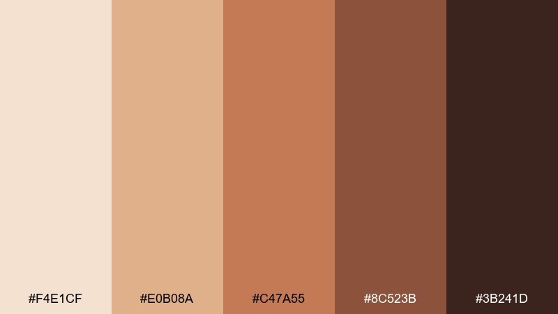
HEX: #F4E1CF #E0B08A #C47A55 #8C523B #3B241D
Mood: sun-warmed, rustic, inviting
Best for: restaurant menu cover
Adobe walls and baked clay tones make the palette feel welcoming and full of heat. It fits menu covers, signage, and restaurant branding where you want warmth that still reads premium. Use the pale peach as a background, then place titles in deep brown and highlight specials with the caramel clay. Tip: keep icons and dividers thin so the heavy warm tones do not crowd the layout.
Image example of sunbaked adobe generated using media.io
19) Stoneware Kitchen
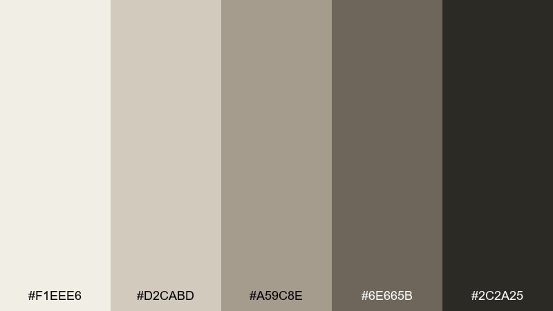
HEX: #F1EEE6 #D2CABD #A59C8E #6E665B #2C2A25
Mood: clean, homey, neutral
Best for: recipe card template
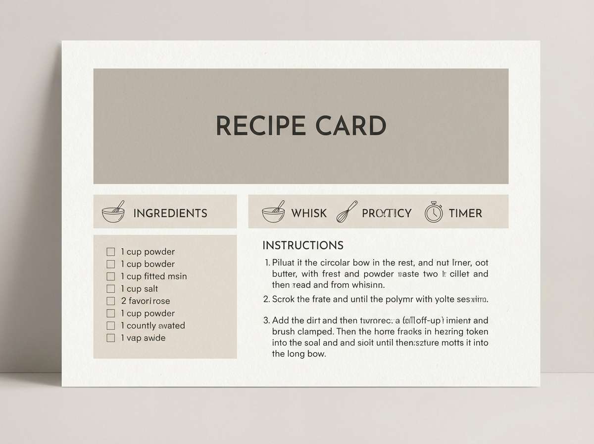
Stoneware grays and warm putty tones feel like a tidy kitchen counter with handmade dishes. Use this earthy set for printable recipe cards and food newsletter templates where clarity is key. Keep the off-white dominant, then use mid gray-beige for section labels and the deep charcoal for body text. Tip: add one small accent banner in the putty tone to make titles stand out without introducing new colors.
Image example of stoneware kitchen generated using media.io
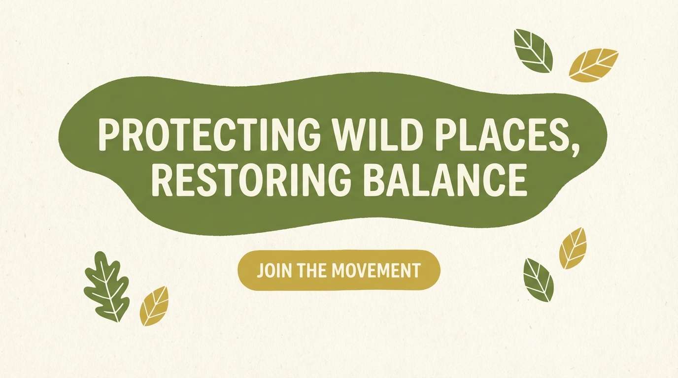
20) Golden Lichen
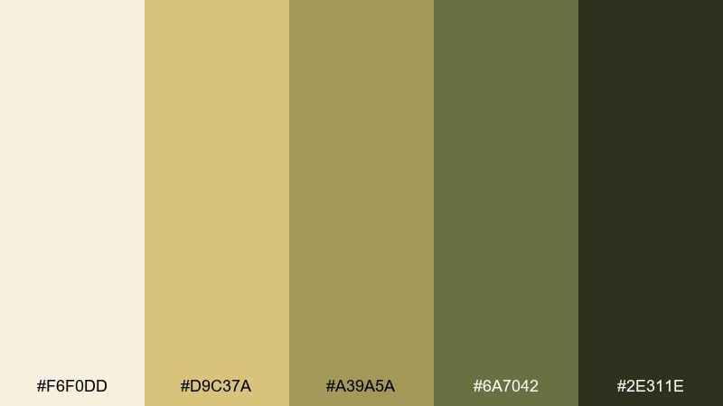
HEX: #F6F0DD #D9C37A #A39A5A #6A7042 #2E311E
Mood: fresh, earthy, modern
Best for: nature nonprofit website hero
Golden lichen and mossy greens feel bright, hopeful, and quietly wild. These earth color combinations work well for nonprofit web heroes, donation sections, and report covers that need optimism without neon. Use the light cream for generous space, then set key buttons in lichen gold with deep green text for contrast. Tip: keep supporting illustrations simple so the greens stay clean and readable.
Image example of golden lichen generated using media.io
21) Sienna Orchard
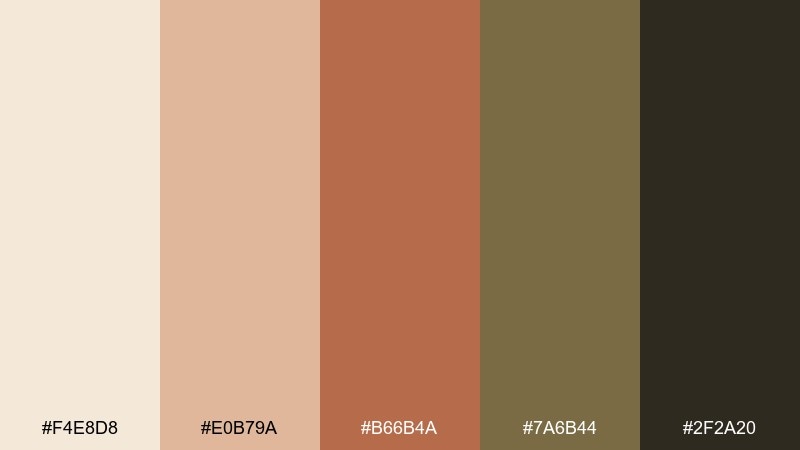
HEX: #F4E8D8 #E0B79A #B66B4A #7A6B44 #2F2A20
Mood: wholesome, warm, rustic
Best for: artisan jam label
Sunlit fruit skins, baked earth, and olive stems give this earth tone mix a farmhouse charm. It is a strong choice for artisan food labels, especially when you want the product to feel hand-packed and seasonal. Keep the light cream as label stock, then use sienna for the brand mark and olive-brown for flavor names. Tip: print small batches with a slightly textured paper to amplify the handcrafted feel.
Image example of sienna orchard generated using media.io
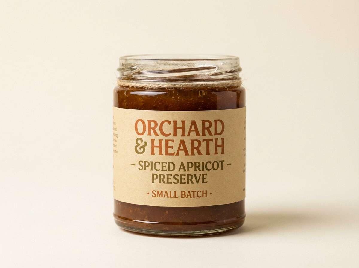
22) Bark and Basil
HEX: #EEE6D9 #CDBB9A #8C8A5E #5A5E36 #2B2E1E
Mood: herbal, grounded, calm
Best for: kitchen brand packaging
Herbal basil greens against bark-like neutrals feel practical and comforting. Use this earth tone color palette on spice packaging, pantry labels, or kitchen brands that lean natural and minimal. Keep the lightest neutral dominant, then use basil green for key panels and the dark green-black for typography. Tip: stick to one green shade per panel to avoid a busy, camo-like look.
Image example of bark and basil generated using media.io
What Colors Go Well with Earthy Colors?
Earthy palettes pair best with “quiet” neutrals and natural materials: warm whites, linen creams, soft greiges, charcoal browns, and muted greens. These supports keep the palette cohesive and help the warmer tones (terracotta, caramel, copper) feel intentional rather than loud.
For contrast, add near-black (espresso, deep olive-black) for typography and UI elements. If you want a more modern edge, introduce a cool counterbalance like muted slate, dusty teal, or stone gray—just keep saturation controlled so it still reads earthy.
For a small pop, use one accent that still feels organic: lichen gold, rust, or a desaturated clay red. The key is limiting the accent area so your design stays grounded, not rainbow-toned.
How to Use an Earth Tone Color Palette in Real Designs
Start by assigning roles: one light neutral for backgrounds, one mid-tone for surfaces (cards, panels, packaging fields), one dark for text, and one accent for calls to action or highlights. Earthy palettes look best when the light neutral takes up most of the space.
Watch contrast carefully—many earthy colors sit close in value, so headings and body text should lean darker than you think. In print, test on the actual paper stock (kraft and cream papers can reduce perceived contrast).
Finally, match texture and finish to the palette. Matte, uncoated, recycled, and soft-touch finishes amplify earthy tones, while glossy finishes can make warm browns look redder and less natural.
Create Earthy Palette Visuals with AI
If you already have HEX codes, you can generate quick concept visuals—brand boards, menu covers, UI hero sections, labels, and posters—without building full mockups by hand. This is especially useful when you need to compare several earth color combinations side by side.
In Media.io, you can paste a prompt (and reference your palette colors) to create consistent, on-theme images for presentations, moodboards, or social posts. Iterate by changing just one element—like “more cream background” or “add olive accents”—to keep results cohesive.
When you find a direction you like, generate a few variants (different ratios and layouts) so your palette is tested across real use cases, not just swatches.
Earthy Color Palette FAQs
-
What is an earthy color palette?
An earthy color palette is a set of colors inspired by nature and natural materials—cream, sand, clay, terracotta, olive, moss, bark, and deep browns—usually with low-to-medium saturation for a grounded feel. -
Are earth tones warm or cool?
Earth tones can be warm or cool. Warm earth tones include terracotta, caramel, rust, and adobe. Cool earth tones include greige, stone, muted olive, and mossy green—often paired with charcoal or near-black for contrast. -
What are the best earthy colors for branding?
For branding, start with a light neutral (cream/linen), a readable dark (espresso/charcoal), and one signature accent (olive, terracotta, or lichen gold). This gives you flexibility across logos, packaging, and web UI while keeping the brand consistent. -
How do I keep an earthy palette from looking muddy?
Use more light background space, choose a clearly darker color for text, and limit mid-tone-on-mid-tone combinations. Also avoid adding too many similar browns and olives in the same area—pick one dominant mid tone and one accent. -
What font colors work best on earthy backgrounds?
Deep espresso, charcoal, and green-black tones tend to read best. On dark earthy backgrounds, switch to warm cream/off-white instead of pure white to keep the look natural and reduce harsh contrast. -
Can earthy palettes work for modern UI design?
Yes. Use a light neutral as the main canvas, apply mid tones for cards and sections, and reserve terracotta/gold accents for primary buttons or key states. Keep components minimal so the palette feels modern rather than rustic. -
How can I generate earthy palette mockups quickly?
Use an AI text-to-image tool like Media.io: describe the design (label, brand board, hero section, invitation) and include your earthy colors in the prompt so the output stays consistent with your palette.
Next: Fiesta Color Palette


