


 ChatGPT
 Perplexity
 Gemini
 Claude
 Grok
Grok
Green palettes are widely used in branding and design because they can feel natural, modern, and reliable. In this guide, you’ll get 20+ Green Color Palette Ideas (with HEX Codes), plus practical pairing advice and ready-to-use prompts for creating matching visuals.
In this article
-
Why Green Palettes Work So Well
-
20+ Green Color Palette Ideas (with HEX Codes)
- Sage Green Minimal Palette
- Mint & White Fresh Palette
- Dark Forest Luxury Palette
- Olive Earthy Palette
- Pastel Green Dream Palette
- Emerald Gold Classic Palette
- Teal Green Modern Palette
- Lime Pop Palette
- Gray-Green Neutral Palette
- Botanical Garden Palette
- Pine & Snow Palette
- Matcha Latte Palette
- Tropical Green Paradise Palette
- Deep Green Editorial Palette
- Green & Blush Romance Palette
- Vintage Green Retro Palette
- Neon Green Cyber Palette
- Green & Navy Professional Palette
- Spring Meadow Soft Palette
- Green Monochrome UI Palette
- What Colors Go Well with Green?
- How to Use a Green Color Palette in Real Designs
- Green Color Palette FAQ
Why Green Palettes Work So Well
Green is linked with nature, balance, and growth, which makes it a strong choice across many industries. It also comes in a wide range of tones—from soft sage to deep forest—so it can match different styles without losing clarity.
Green works especially well because:
- It creates a calm and steady mood for wellness, education, and lifestyle brands.
- It can look premium when paired with cream, beige, or gold accents.
- It stays flexible in digital design, where you often need clean contrast for text and buttons.
20+ Green Color Palette Ideas (with HEX Codes)
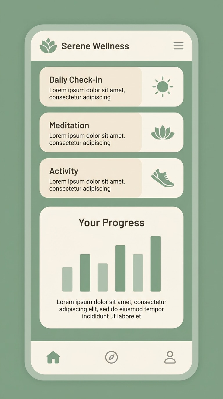
1) Sage Green Minimal Palette
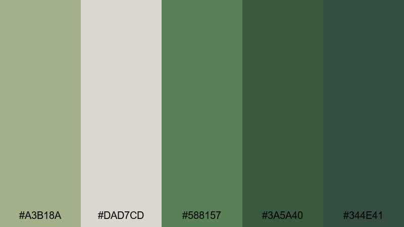
HEX: #A3B18A #DAD7CD #588157 #3A5A40 #344E41
Mood: clean, calm, modern
Best for: wellness brands, UI design, packaging
This palette is a strong fit for minimal layouts that still feel warm and high-quality. Use the light beige as the background, sage as the main accent, and the deeper greens for headings, icons, and primary buttons to keep the design clear.
Image example of sage green minimal palette generated using media.io
Create palette-perfect visuals with Media.io. Powered by Wan 2.7 Image, it helps you generate and edit images with precise color control, consistent tones, and ready-to-use styles in your browser.

2) Mint & White Fresh Palette
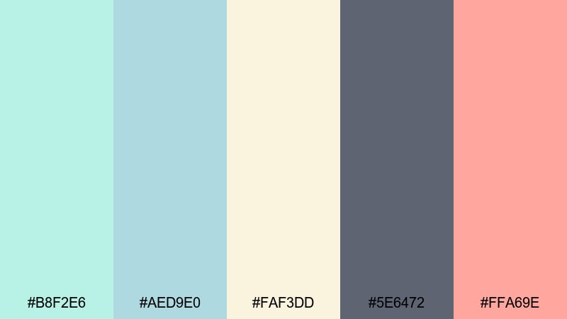
HEX: #B8F2E6 #AED9E0 #FAF3DD #5E6472 #FFA69E
Mood: fresh, airy, youthful
Best for: skincare promos, social posts, light branding
Mint green helps designs feel clean and light. Use cream white for space and clarity, keep text in muted gray, and add a small peach accent for highlights like price tags, labels, or icons.
Image example of mint & white fresh palette generated using media.io

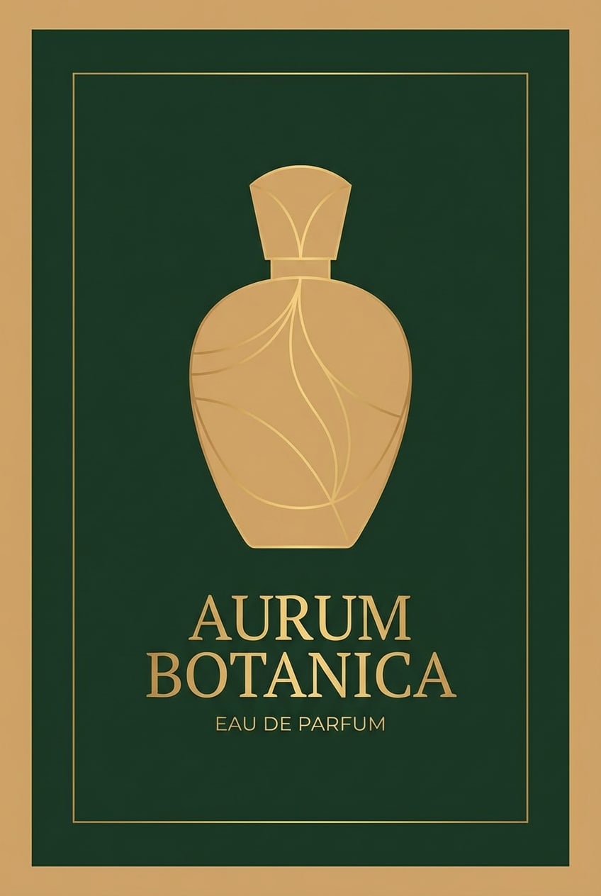
3) Dark Forest Luxury Palette
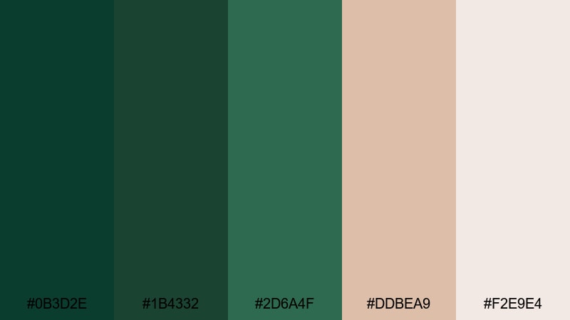
HEX: #0B3D2E #1B4332 #2D6A4F #DDBEA9 #F2E9E4
Mood: elegant, premium, timeless
Best for: luxury branding, fashion, jewelry
Deep greens are a reliable option for luxury design. Use forest green as the main base, then add warm beige tones for balance. This approach works well for packaging, campaign banners, and brand covers.
Image example of dark forest luxury palette generated using media.io
4) Olive Earthy Palette
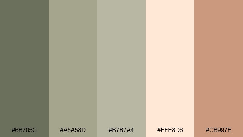
HEX: #6B705C #A5A58D #B7B7A4 #FFE8D6 #CB997E
Mood: grounded, warm, organic
Best for: eco brands, lifestyle design, outdoor content
Olive green feels natural and steady. Pair it with warm beige and clay tones to create a friendly, earthy look that suits sustainable products, outdoor brands, and lifestyle content.
Image example of olive earthy palette generated using media.io
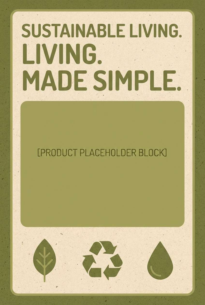
5) Pastel Green Dream Palette
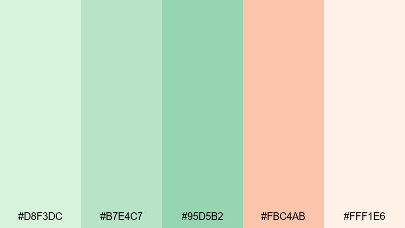
HEX: #D8F3DC #B7E4C7 #95D5B2 #FBC4AB #FFF1E6
Mood: soft, sweet, gentle
Best for: wedding invites, stationery, cute social posts
Pastel green is a good choice when you want a calm and friendly mood. Cream tones keep the design light, while the blush accent can be used for dates, headings, or small decorative details.
Image example of pastel green dream palette generated using media.io
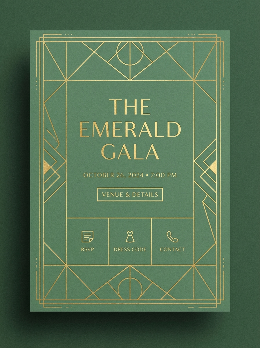
6) Emerald Gold Classic Palette
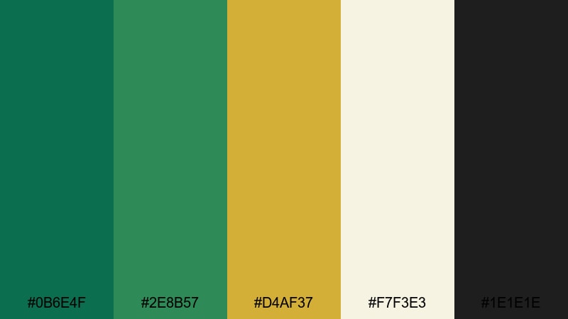
HEX: #0B6E4F #2E8B57 #D4AF37 #F7F3E3 #1E1E1E
Mood: rich, classic, confident
Best for: premium marketing, events, upscale packaging
Emerald green can look formal and expensive with a gold accent. Keep gold limited to lines, icons, or a single highlight area, and use off-white to prevent the design from feeling too heavy.
Image example of emerald gold classic palette generated using media.io
7) Teal Green Modern Palette
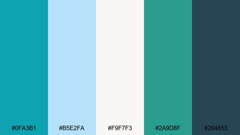
HEX: #0FA3B1 #B5E2FA #F9F7F3 #2A9D8F #264653
Mood: modern, clear, energetic
Best for: tech startups, UI design, YouTube thumbnails
Teal green sits between green and blue, which makes it feel modern and digital. Use the light blue tone for background space, and keep the darkest shade for text and key UI elements.
Image example of teal green modern palette generated using media.io
8) Lime Pop Palette
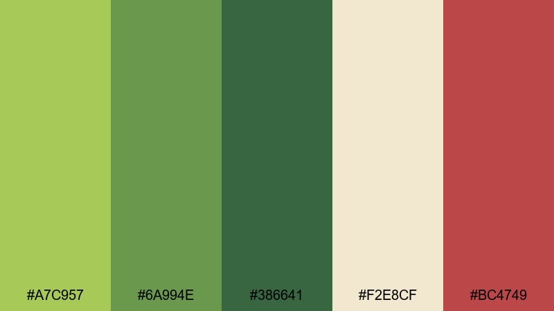
HEX: #A7C957 #6A994E #386641 #F2E8CF #BC4749
Mood: playful, bold, high-impact
Best for: sporty visuals, product launches, promo banners
Lime green grabs attention quickly, so it works well for promotions. Use cream to keep the layout breathable and use dark green for structure. The red accent is best for small callouts like badges or discount labels.
Image example of lime pop palette generated using media.io

9) Gray-Green Neutral Palette
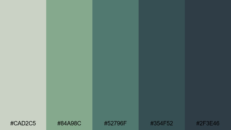
HEX: #CAD2C5 #84A98C #52796F #354F52 #2F3E46
Mood: neutral, mature, minimal
Best for: websites, editorial layouts, presentations
Gray-green tones work well when you want a calm, professional look. They are also easy on the eyes for text-heavy pages or slides, which makes this palette useful for reports, decks, and simple website layouts.
Image example of gray-green neutral palette generated using media.io
10) Botanical Garden Palette
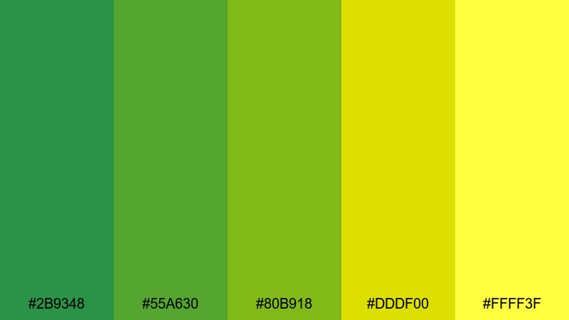
HEX: #2B9348 #55A630 #80B918 #DDDF00 #FFFF3F
Mood: bright, lively, outdoorsy
Best for: nature content, spring campaigns, eco events
This palette feels active and positive, like a sunny day outdoors. Use the brighter yellow-greens in small areas to highlight key text, and keep the deeper greens as the base for balance.
Image example of botanical garden palette generated using media.io
11) Pine & Snow Palette
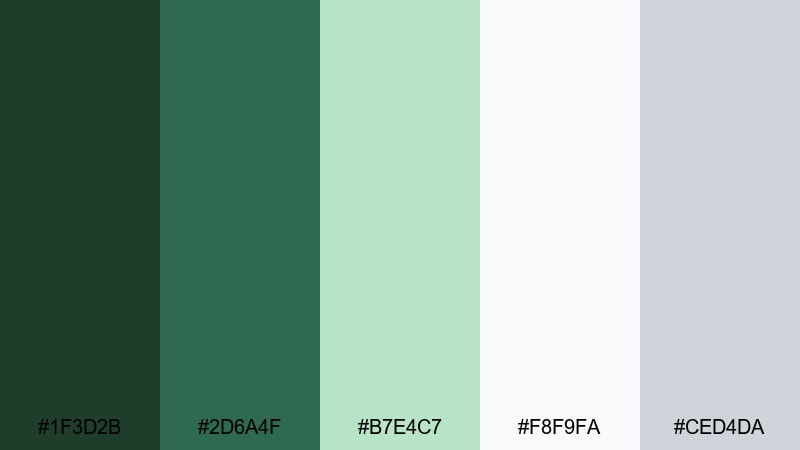
HEX: #1F3D2B #2D6A4F #B7E4C7 #F8F9FA #CED4DA
Mood: crisp, clean, seasonal
Best for: holiday promos, clean branding, winter content
Pine green with soft whites gives a winter feel without looking crowded. Use white for breathing space and keep pine green for headings and frames. This works well for seasonal landing pages and product banners.
Image example of pine & snow palette generated using media.io
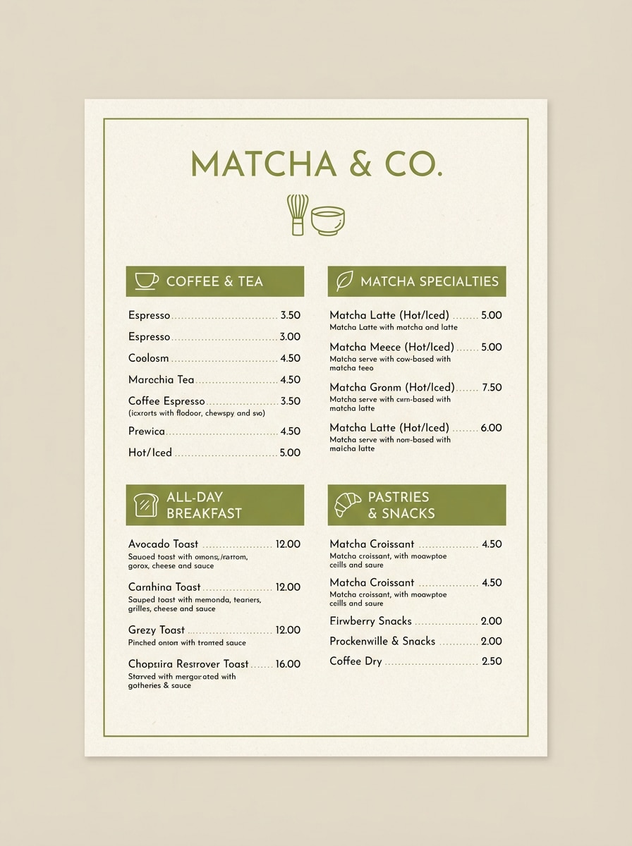
12) Matcha Latte Palette
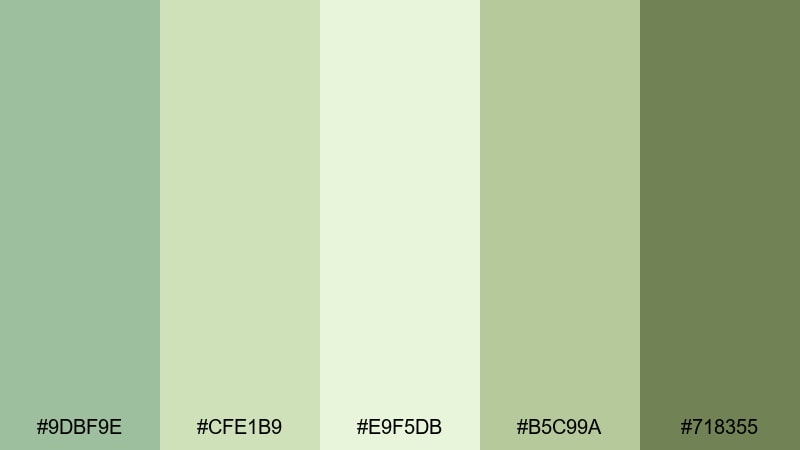
HEX: #9DBF9E #CFE1B9 #E9F5DB #B5C99A #718355
Mood: cozy, soft, modern
Best for: cafe branding, lifestyle posts, cozy content
Matcha green is popular in lifestyle design because it feels calm and warm at the same time. Use cream tones for background and keep the darker green for text or small UI parts to make the layout clear.
Image example of matcha latte palette generated using media.io
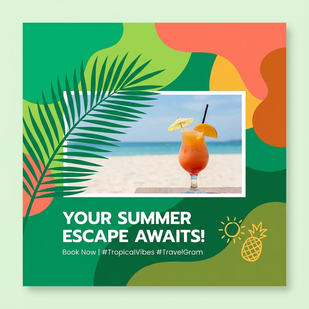
13) Tropical Green Paradise Palette
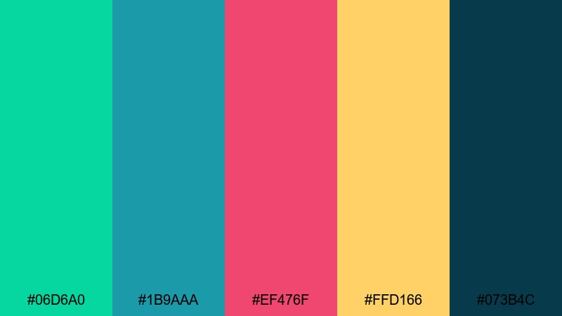
HEX: #06D6A0 #1B9AAA #EF476F #FFD166 #073B4C
Mood: fun, bright, summer-ready
Best for: travel content, summer campaigns, social graphics
This palette is designed for high energy and strong contrast, which makes it a good fit for social posts. Keep the darker blue-green as your base and use the warm colors for small highlights and labels.
Image example of tropical green paradise palette generated using media.io
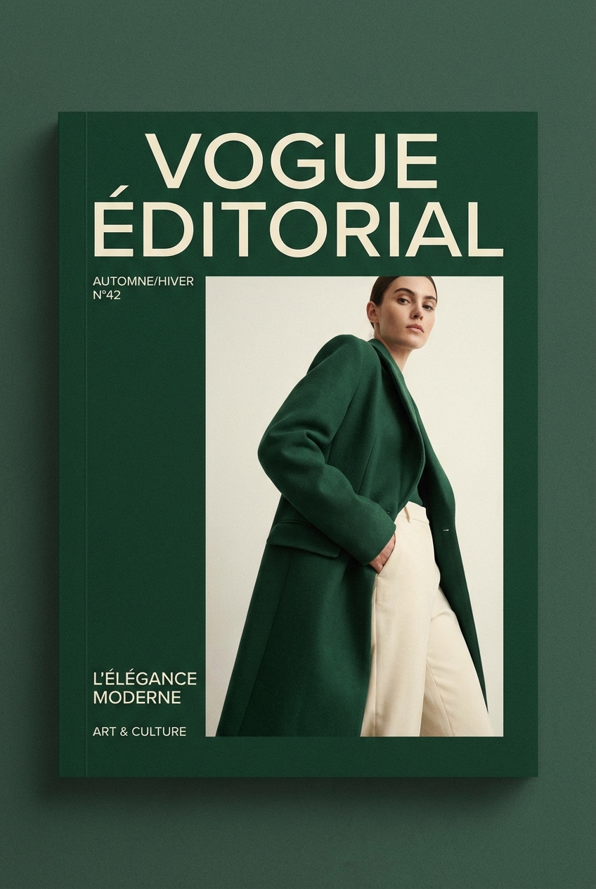
14) Deep Green Editorial Palette
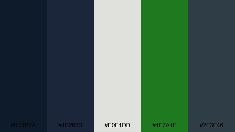
HEX: #0D1B2A #1B263B #E0E1DD #1F7A1F #2F3E46
Mood: refined, calm, editorial
Best for: magazine layouts, premium storytelling, portfolios
If you want a quiet, premium look, this palette is a solid choice. Use cream for readability and reserve the deep tones for headings and key blocks. It works well for long-form design where structure matters.
Image example of deep green editorial palette generated using media.io
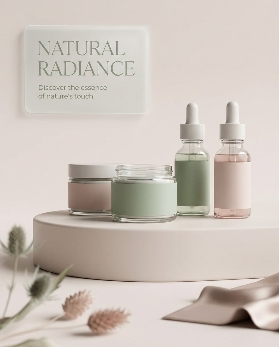
15) Green & Blush Romance Palette
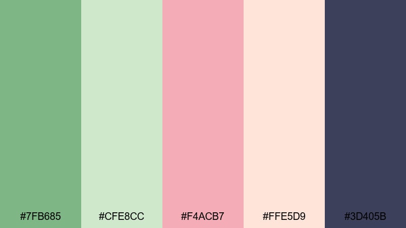
HEX: #7FB685 #CFE8CC #F4ACB7 #FFE5D9 #3D405B
Mood: romantic, soft, balanced
Best for: wedding branding, beauty content, invitations
Green and blush is a practical mix when you want softness without going too sweet. Let green lead the layout, and use blush in small areas like borders, labels, or decorative shapes.
Image example of green & blush romance palette generated using media.io
16) Vintage Green Retro Palette
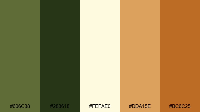
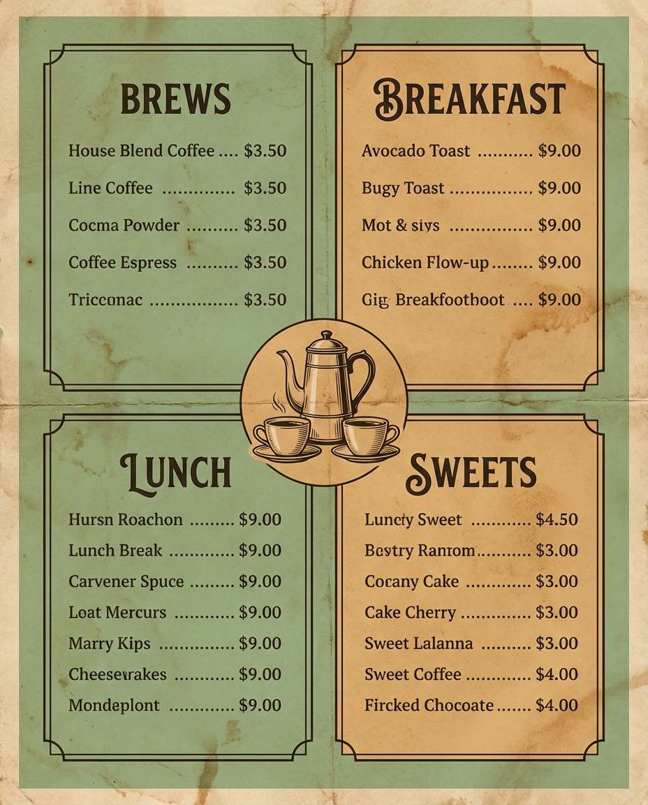
HEX: #606C38 #283618 #FEFAE0 #DDA15E #BC6C25
Mood: nostalgic, warm, retro
Best for: retro posters, cafe menus, vintage branding
This palette feels classic and handmade. The warm brown-orange shades work well for headings and highlights, while the greens keep the design grounded. It’s a good fit for menus, posters, and packaging.
Image example of vintage green retro palette generated using media.io
17) Neon Green Cyber Palette
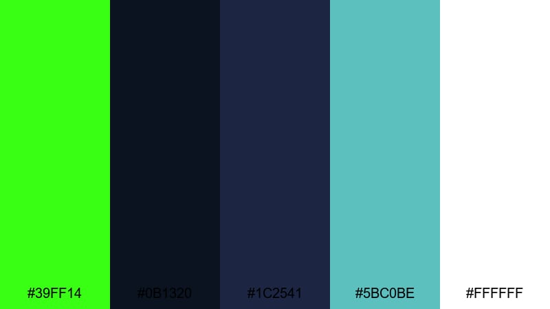
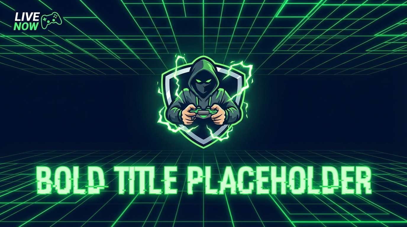
HEX: #39FF14 #0B1320 #1C2541 #5BC0BE #FFFFFF
Mood: futuristic, high-contrast, bold
Best for: gaming visuals, tech promos, bold thumbnails
Neon green is best used with a dark background so the contrast stays clean. Keep neon areas limited to key lines, icons, or short text. This keeps the style sharp rather than messy.
Image example of neon green cyber palette generated using media.io
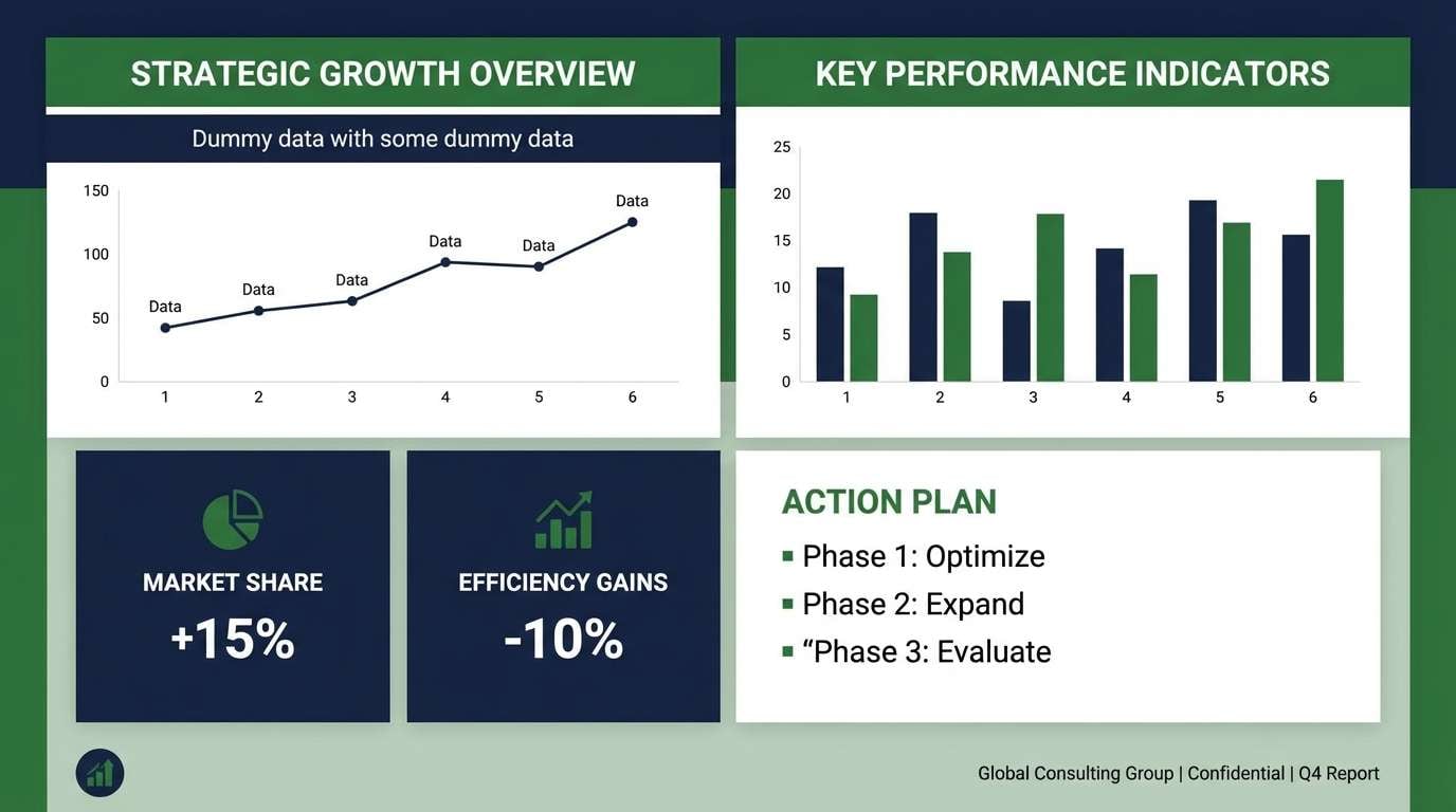
18) Green & Navy Professional Palette
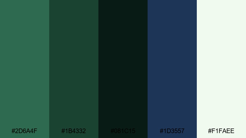
HEX: #2D6A4F #1B4332 #081C15 #1D3557 #F1FAEE
Mood: professional, reliable, structured
Best for: business decks, fintech, corporate websites
This palette suits industries that need to communicate trust. Use navy for headers and structure, keep green for accents and buttons, and rely on the off-white background for clarity across screens and slides.
Image example of green & navy professional palette generated using media.io
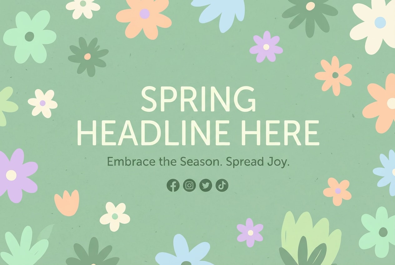
19) Spring Meadow Soft Palette
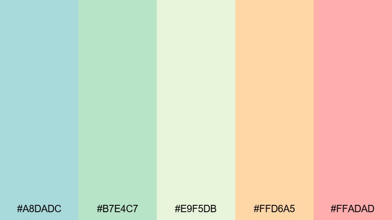
HEX: #A8DADC #B7E4C7 #E9F5DB #FFD6A5 #FFADAD
Mood: cheerful, friendly, light
Best for: seasonal campaigns, cute graphics, social content
This palette is useful for spring campaigns because it feels light and positive. Keep the greens as your base and use the warm pastel accents for small details like badges, stickers, or short callouts.
Image example of spring meadow soft palette generated using media.io
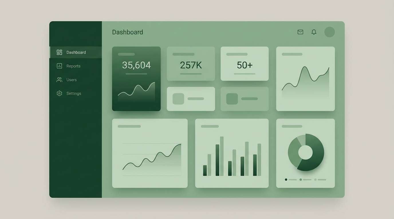
20) Green Monochrome UI Palette
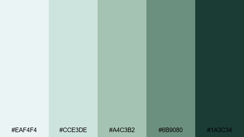
HEX: #EAF4F4 #CCE3DE #A4C3B2 #6B9080 #1A3C34
Mood: sleek, consistent, modern
Best for: modern UI systems, dashboards, app design
Monochrome green is a practical choice for UI systems because it supports consistent hierarchy. Use the lighter tones for containers and backgrounds, and reserve the darkest green for buttons, navigation, and key status labels.
Image example of green monochrome UI palette generated using media.io
What Colors Go Well with Green?
Green can lean warm (olive, moss) or cool (mint, teal), so the best pairings depend on the tone. These combinations are widely used because they balance contrast and mood:
- Green + Beige: calm, premium, easy for branding
- Green + Gold: formal, classic, good for premium products and events
- Green + White: clean, modern, useful for UI and minimal layouts
- Green + Pink/Blush: soft contrast, common in beauty and wedding designs
- Green + Brown/Terracotta: earthy, warm, works well for lifestyle and outdoor brands
- Green + Navy: structured and professional, often used in business design
How to Use a Green Color Palette in Real Designs
Make text readable on green backgrounds
- For a dark green background, use white text for clear contrast.
- For a light green background, use deep gray text instead of pure black for a softer look.
Keep green from looking dull in photos and videos
Green can look muddy when it mixes with certain lighting or backgrounds. To keep it clean:
- Choose low-saturation greens like sage or gray-green for large background areas.
- Add a cream or beige overlay when you need a softer, cleaner tone.
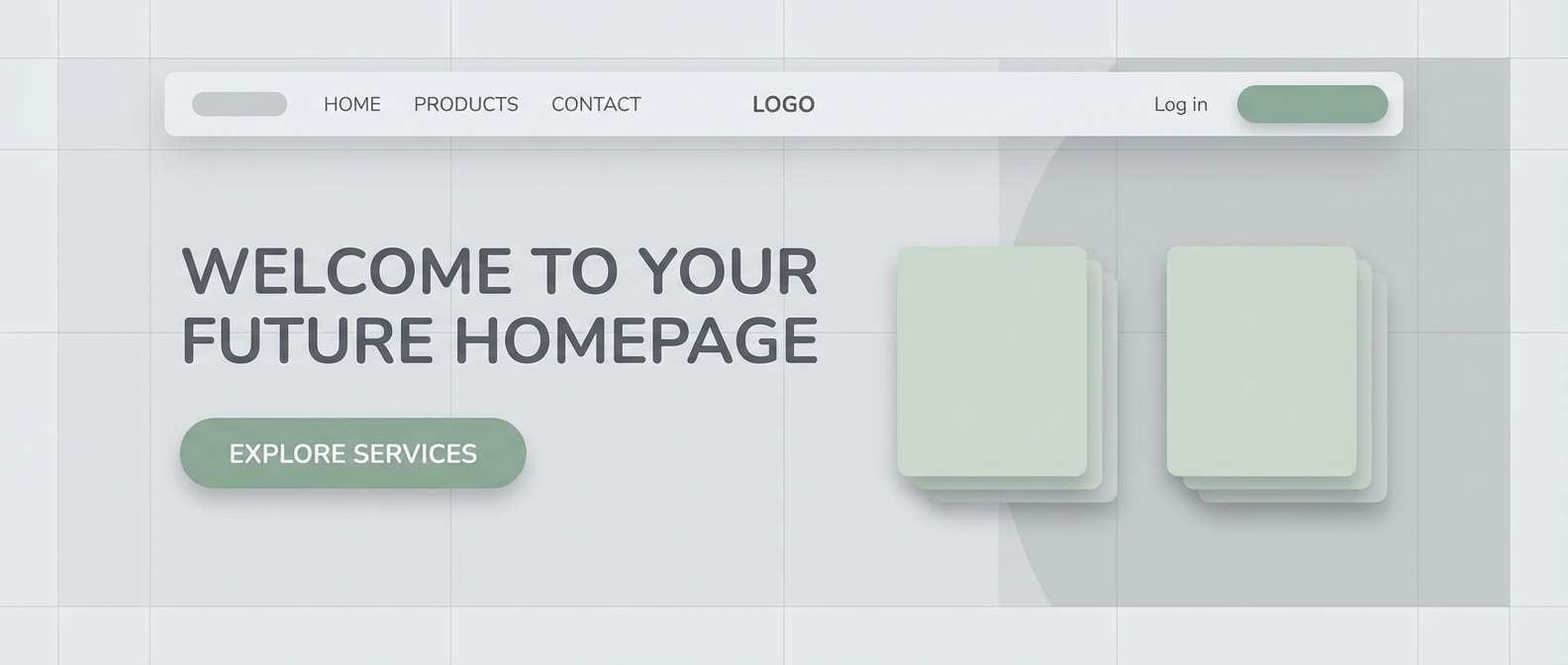
Use Media.io to create social post backgrounds, YouTube thumbnails, or product promo graphics in minutes — just pick a palette and start designing.
Green Color Palette FAQ
-
What is a green color palette?
A green color palette is a set of green shades and supporting colors used together in a design. It often includes light, mid, and dark greens, plus neutrals or accents to help with contrast and balance. -
What green color is best for branding?
Sage and olive green are common for wellness and lifestyle brands because they feel calm and natural. Emerald green can work well for premium branding, while teal green is often used in modern digital products. -
What colors match sage green best?
Sage green pairs well with beige, cream, warm white, and soft gray. If you want more contrast, add charcoal or deep forest green for headings and buttons. -
Is green a warm or cool color?
Green can be warm or cool depending on its undertone. Greens that lean toward yellow (olive, moss) feel warmer, while greens that lean toward blue (mint, teal) feel cooler. -
How do you make green look premium?
Use deep shades like forest or emerald, pair them with cream or beige, and keep the layout clean. If you add gold, use it in small amounts so it stays refined. -
What is the best green palette for UI design?
Monochrome green palettes and sage-based neutrals work well for UI because they support consistent hierarchy. Use light tones for backgrounds and darker greens for actions and navigation.
Next: Pink Color Palette


