

If you want warm energy without losing a modern feel, orange pink color palettes are a reliable choice. This orange and pink palette guide includes 20 ready-to-use options with HEX codes, plus practical usage tips for UI, print, and branding. You will also get copyable AI image prompts you can run in Media.io to generate posters, mockups, and layout ideas that match your orange pink color scheme.
In this article
- Why Orange Pink Palettes Work So Well
-
- Sunset Sorbet
- Citrus Blush Dashboard
- Peach Rose Wedding
- Coral Apricot Beauty
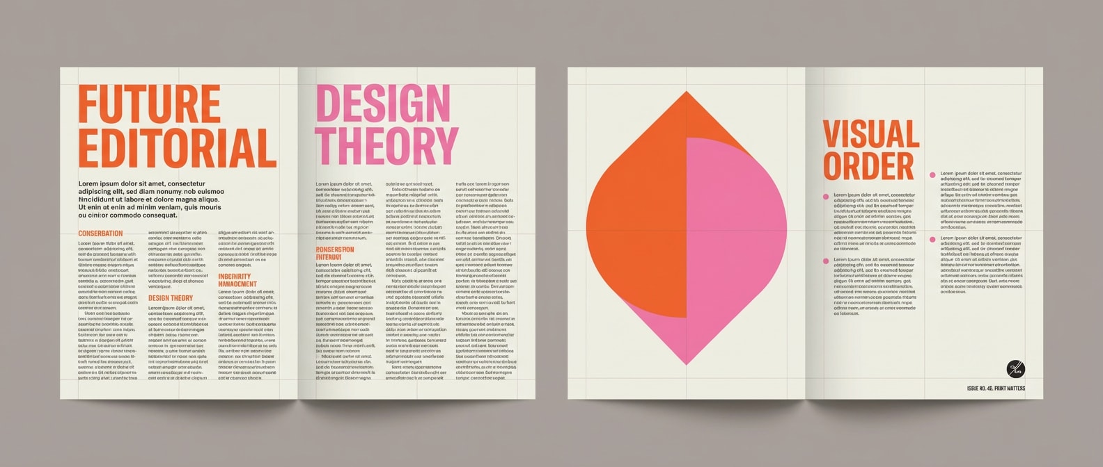
- Tangerine Orchid Editorial
- Mango Bloom Botanicals
- Warm Pop Onboarding
- Clay Pink Moodboard
- Neon Papaya Night
- Soft Melon Baby Shower
- Desert Coral Landing
- Persimmon Petal Menu
- Sherbet Streetwear
- Sunrise Gelato Logo
- Flamingo Mandarin Commerce
- Coral Champagne Bridal
- Apricot Fuchsia Podcast
- Orange Blossom Stationery
- Peachy Sunset Brochure
- Electric Coral UI Kit
- What Colors Go Well with Orange Pink?
- How to Use a Orange Pink Color Palette in Real Designs
- Create Orange Pink Palette Visuals with AI
Why Orange Pink Palettes Work So Well
Orange pink tones sit in the warm family, so they feel friendly and attention-grabbing, but they can still look clean and professional when you control contrast. These orange pink color combinations work across digital products and print because you can scale them from soft peach backgrounds to high-impact neon accents.
- Fast hierarchy: orange pulls focus for CTAs, while pink works well for highlights, tags, and secondary actions.
- Flexible warmth: peach and blush can act like neutrals, making this orange pink color scheme easy to extend.
- Modern contrast options: pair with charcoal or navy for readable UI and sharp editorial layouts.
- Seasonal range: it can feel summery (sorbet) or premium (champagne and cocoa) depending on saturation.
20+ Orange Pink Color Palette Ideas (with HEX Codes)
Below are 20 orange pink palettes with HEX codes you can copy into Figma, Illustrator, Canva, or your CSS variables. Each set includes a suggested layout role (background, main, text, buttons, highlights) plus a Media.io prompt to generate matching visuals.
1) Sunset Sorbet
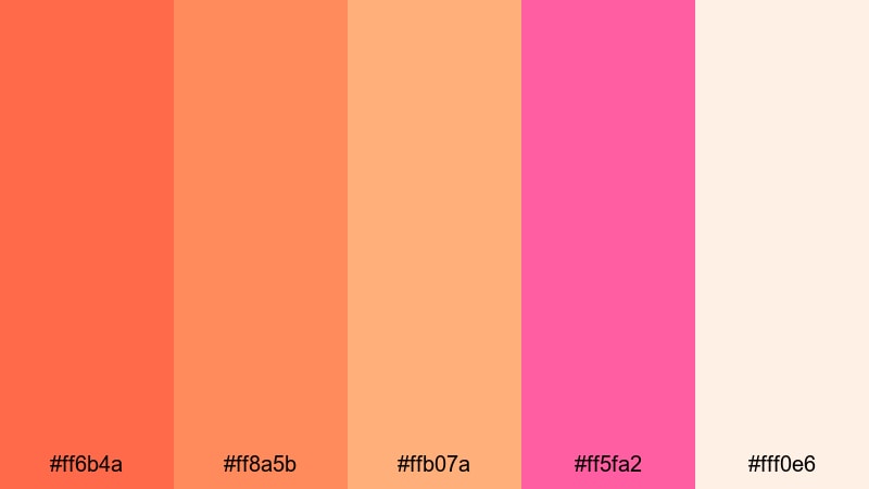
HEX: #ff6b4a #ff8a5b #ffb07a #ff5fa2 #fff0e6
Mood: cheerful, summery, energetic
Best for: instagram promo posters
Use the warm cream as the background, then build the main headline in the saturated orange for strong readability. Put the hot pink on the primary button or price tag to create a single high-impact focal point, and use peach tones for supporting shapes and secondary sections so the orange pink palette for posters stays balanced.
Image example of sunset sorbet generated using media.io

Media.io is an online AI studio for creating and editing video, image, and audio in your browser.

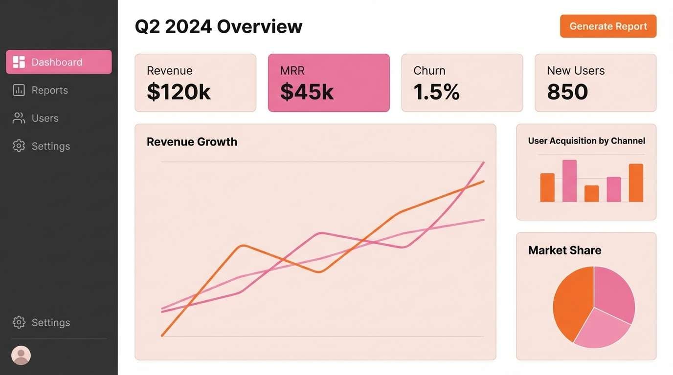
2) Citrus Blush Dashboard
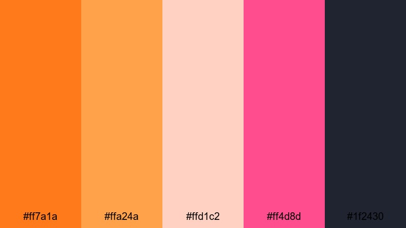
HEX: #ff7a1a #ffa24a #ffd1c2 #ff4d8d #1f2430
Mood: modern, confident, high-contrast
Best for: saas dashboard UI
For an orange pink palette for UI, set the deep charcoal as navigation and primary text, then assign orange to your main buttons and selected tabs. Keep blush for card surfaces and table rows, and reserve pink for alerts, active states, or KPI highlights so users notice changes quickly without constant visual noise.
Image example of citrus blush dashboard generated using media.io
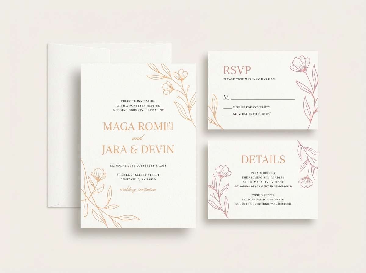
3) Peach Rose Wedding
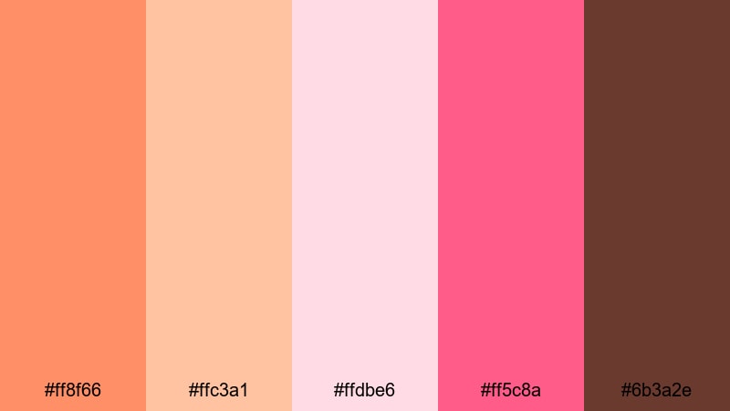
HEX: #ff8f66 #ffc3a1 #ffdbe6 #ff5c8a #6b3a2e
Mood: romantic, warm, elegant
Best for: wedding invitation suite
Use blush and soft peach as the main paper-like background, then apply rose pink for monograms, borders, and RSVP accents. Keep the deep brown for names and details to protect legibility on print, and use the orange tone only for small headings or separators to maintain a refined orange and pink palette for wedding invitations.
Image example of peach rose wedding generated using media.io
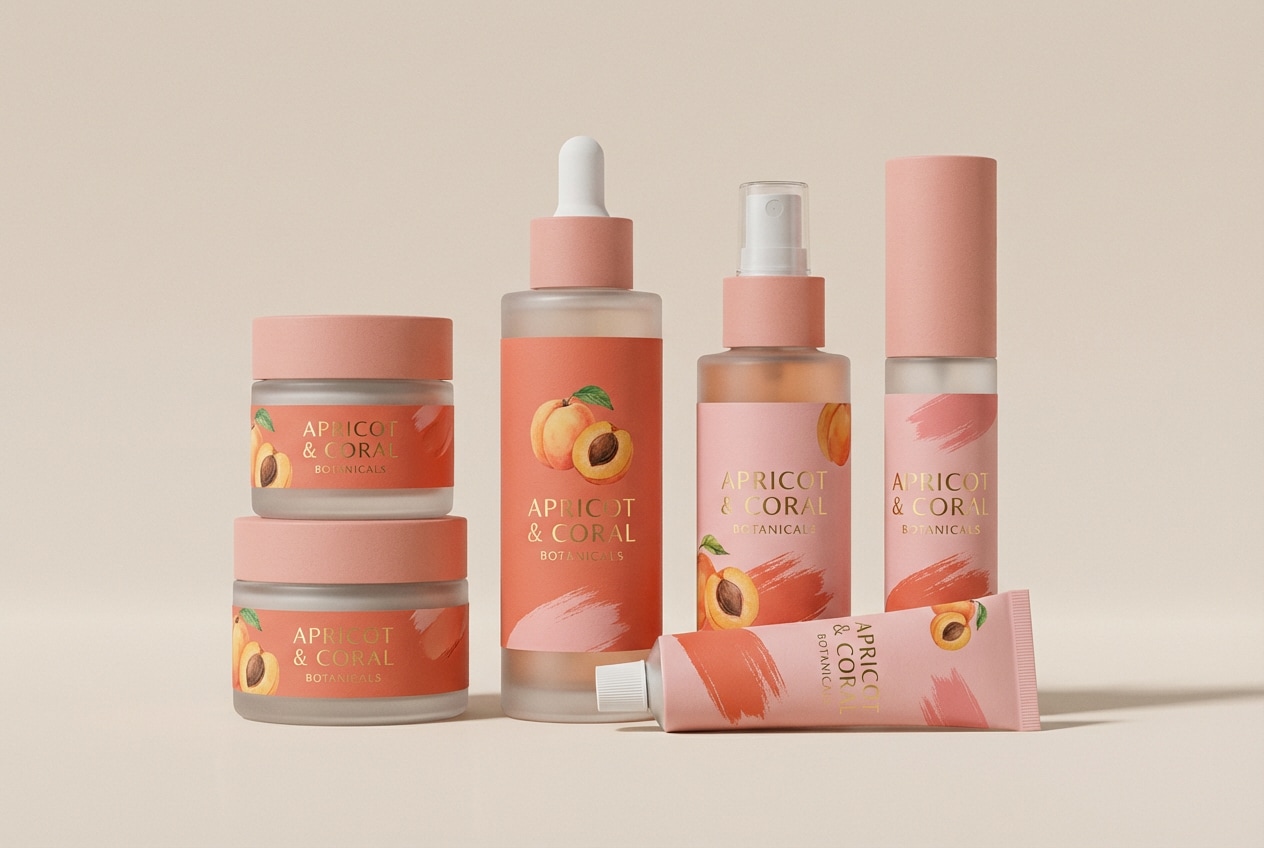
4) Coral Apricot Beauty
HEX: #ff5a3d #ff8e72 #ffbfa8 #ff4fa1 #f7f7f5
Mood: fresh, glossy, playful
Best for: cosmetic packaging and product ads
Let near-white handle the background so product shots and type feel clean, then combine coral and pink for the brand stamp and key claims. Use apricot for secondary panels (ingredients, directions) and keep the strongest pink for a single highlight area like a badge, so the orange pink tones read premium rather than loud.
Image example of coral apricot beauty generated using media.io
5) Tangerine Orchid Editorial
HEX: #ff6f2c #ffa35d #ffd7c1 #ff3f87 #2a2a2a
Mood: editorial, stylish, bold
Best for: fashion magazine spread
Use near-black for body copy, captions, and grid lines, then apply tangerine for section headers and page numbers. Bring orchid pink into pull quotes or small accent blocks, and use blush as negative-space panels behind captions to make the editorial layout feel structured while keeping the orange pink color scheme lively.
Image example of tangerine orchid editorial generated using media.io
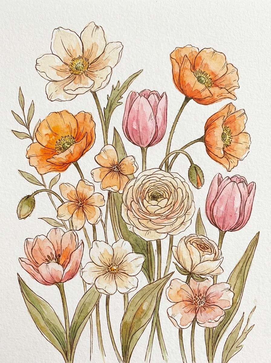
6) Mango Bloom Botanicals
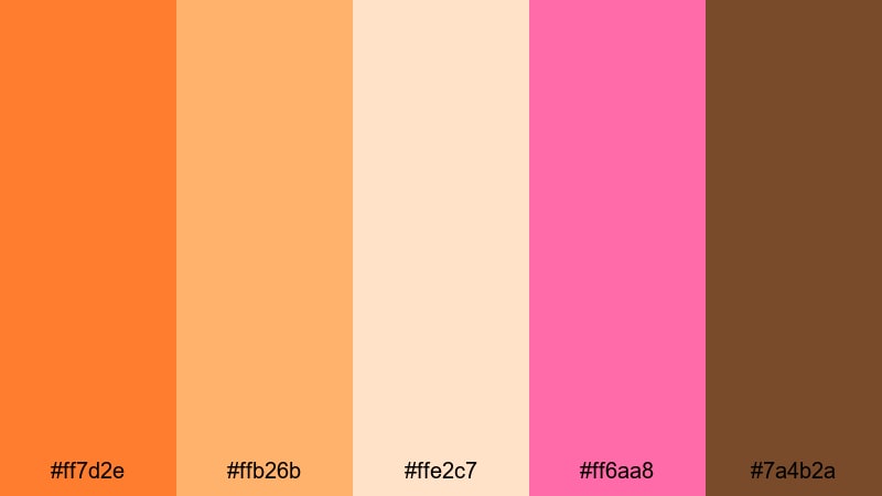
HEX: #ff7d2e #ffb26b #ffe2c7 #ff6aa8 #7a4b2a
Mood: bright, organic, uplifting
Best for: spring botanical illustration prints
Use the pale cream as the paper wash and background, then paint focal petals with mango orange and bright pink to create depth. Reserve the warm brown for stems and fine outlines so the composition stays light. This orange pink palette works especially well when you keep most areas soft and let one bloom carry the strongest saturation.
Image example of mango bloom botanicals generated using media.io
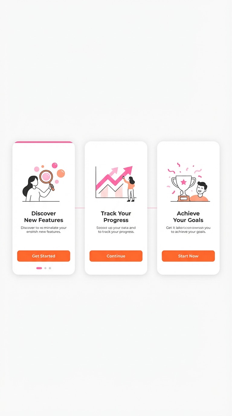
7) Warm Pop Onboarding
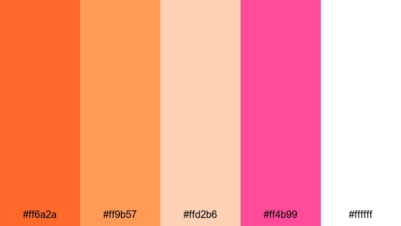
HEX: #ff6a2a #ff9b57 #ffd2b6 #ff4b99 #ffffff
Mood: friendly, optimistic, clean
Best for: app onboarding screens
Set white and pale peach as your screen base, then use orange for the primary CTA and progress indicators. Add pink as a micro-accent for toggles, success states, or small illustrations. This orange pink palette for UI stays readable when you keep text mostly dark and limit saturated color to one main component per screen.
Image example of warm pop onboarding generated using media.io
8) Clay Pink Moodboard
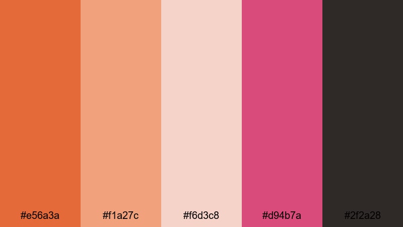
HEX: #e56a3a #f1a27c #f6d3c8 #d94b7a #2f2a28
Mood: cozy, earthy, design-led
Best for: interior moodboards and paint matching
Use charcoal for labels, measurements, and small captions, then place clay orange and dusty pink as the main paint swatches. Keep the blush as a background card color to unify samples like fabric and wood. This set is great when you want orange pink tones that feel mature and grounded rather than neon.
Image example of clay pink moodboard generated using media.io
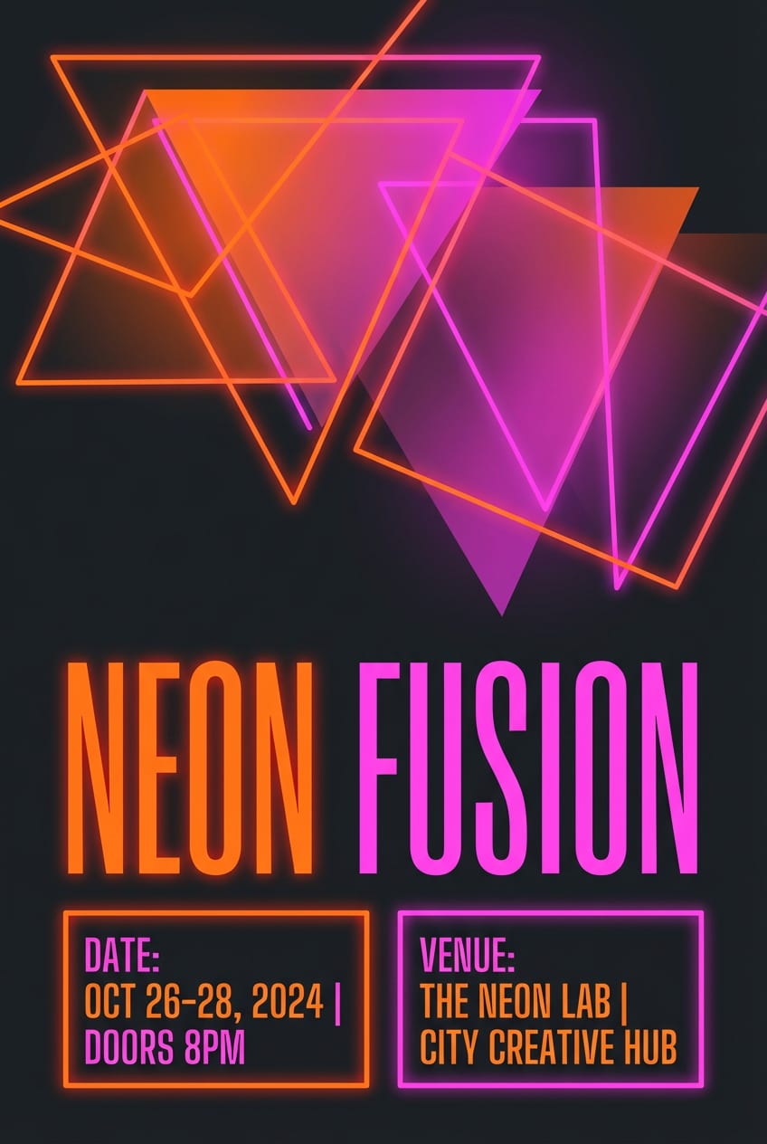
9) Neon Papaya Night
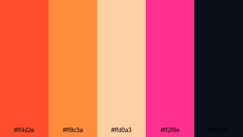
HEX: #ff4d2e #ff8c3a #ffd0a3 #ff2f8e #0b0f1a
Mood: electric, nightlife, high-energy
Best for: event posters
Use midnight navy as the full background to push contrast, then set the headline in either neon pink or papaya orange (not both). Apply the other neon to key info like date and venue, and use the pale peach for supporting blocks so small text stays readable. This orange and pink palette for posters works best with bold type and simple shapes.
Image example of neon papaya night generated using media.io
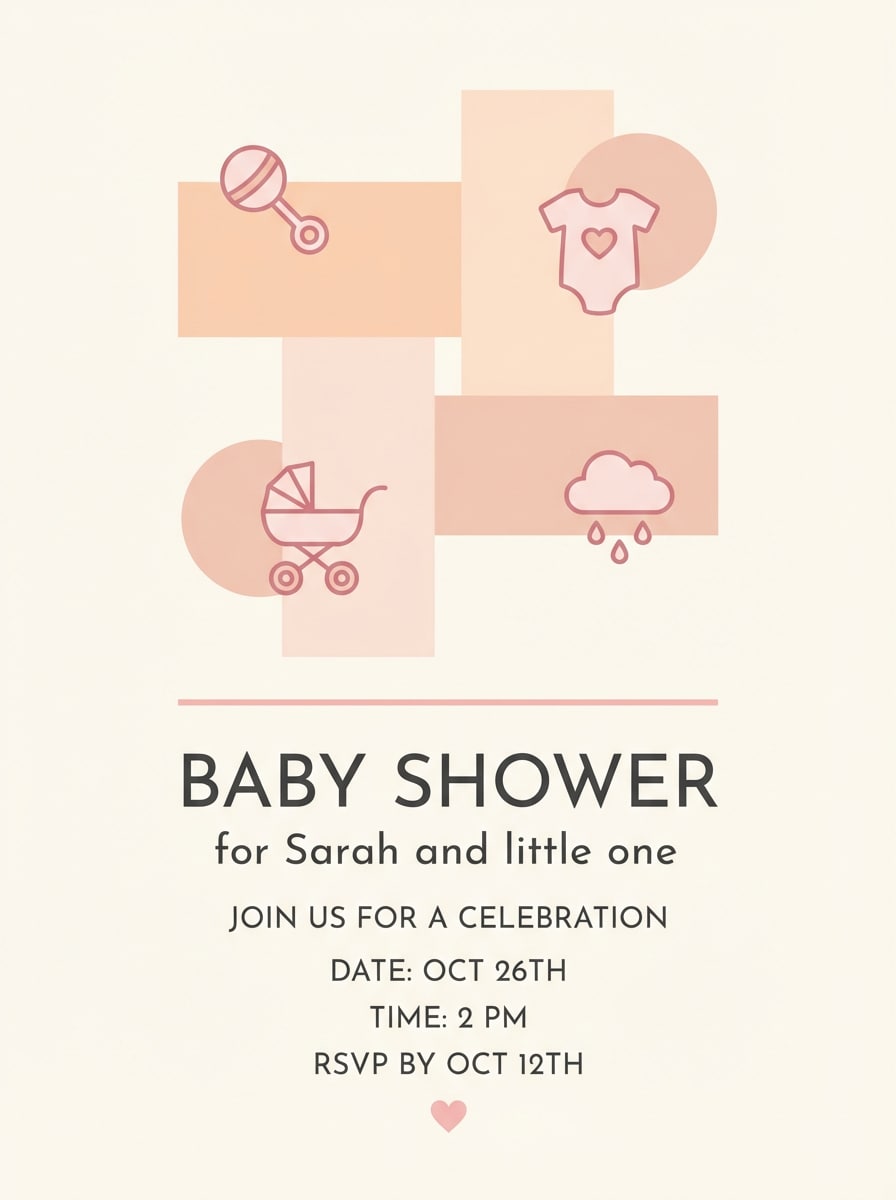
10) Soft Melon Baby Shower
HEX: #ff8a6a #ffb8a2 #ffe3d9 #ff79b0 #ffffff
Mood: sweet, gentle, welcoming
Best for: baby shower invitations
Let the blush and white carry the background and margins, then use melon orange for headings and section dividers. Apply pink to small icons, confetti dots, and RSVP highlights, keeping it minimal so the card stays soft. These orange pink color combinations look best when typography remains simple and high-contrast.
Image example of soft melon baby shower generated using media.io
11) Desert Coral Landing
HEX: #ff6c3b #ffa06e #ffd9c6 #ff5b95 #121826
Mood: premium, bold, tech-forward
Best for: landing page hero UI
Use deep navy for navigation, headings, and body text, then set coral-orange as the main CTA button so the eye lands there first. Apply pink to secondary actions and small trust badges, and keep pale peach as a hero panel background to reduce glare. This orange pink color scheme for landing pages works well with simple gradients and clear spacing.
Image example of desert coral landing generated using media.io

12) Persimmon Petal Menu
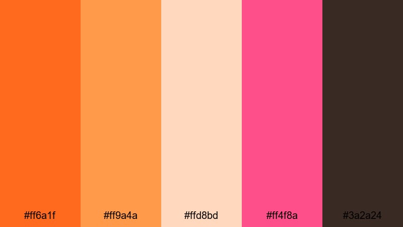
HEX: #ff6a1f #ff9a4a #ffd8bd #ff4f8a #3a2a24
Mood: inviting, tasty, friendly
Best for: cafe menu flyers
Use cocoa brown for menu items and prices to ensure print clarity, then organize sections with pale peach panels. Add persimmon orange for highlight boxes (specials, combos) and use pink as a stamp-like accent for limited items. This orange pink palette stays readable when you keep most text in the dark neutral.
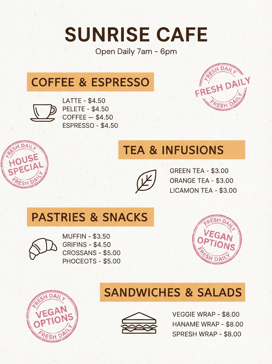
Image example of persimmon petal menu generated using media.io
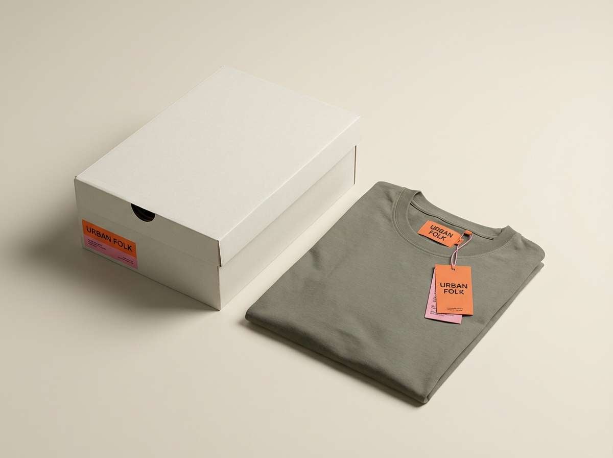
13) Sherbet Streetwear
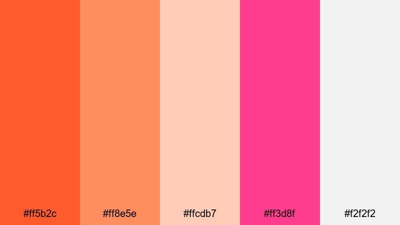
HEX: #ff5b2c #ff8e5e #ffcdb7 #ff3d8f #f2f2f2
Mood: bold, youthful, trendy
Best for: streetwear product ads
Use the light neutral as a clean background so graphics pop on apparel, tags, and packaging. Build the main logo lockup in orange, then reserve pink for secondary marks, stickers, or drop announcements. Keep peach as a supporting tint for patterns, so your orange pink tones feel consistent across different materials.
Image example of sherbet streetwear generated using media.io
14) Sunrise Gelato Logo
HEX: #ff6f3a #ff9d6a #ffd7c4 #ff5aa7 #2b2b2b
Mood: playful, polished, brand-ready
Best for: logo and brand identity
For an orange pink palette for branding, make orange the primary brand color for the logo and hero graphics, then use pink as a flexible accent (dot, underline, badge). Keep charcoal for wordmarks and long-form copy, and use blush for backgrounds in brand guidelines, pitch decks, and social templates.
Image example of sunrise gelato logo generated using media.io
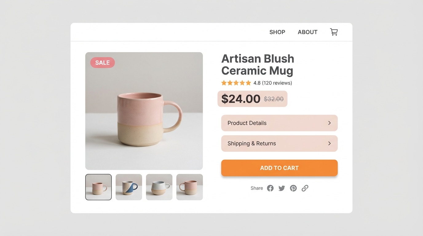
15) Flamingo Mandarin Commerce
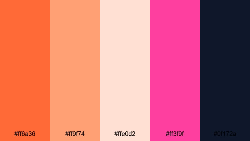
HEX: #ff6a36 #ff9f74 #ffe0d2 #ff3f9f #0f172a
Mood: punchy, conversion-focused, clean
Best for: e-commerce product page UI
Use navy for navigation and pricing so key details stay readable, then set mandarin orange as the Add to Cart color for consistent conversion cues. Apply pink to sale chips, wishlist states, and limited-time labels, while blush supports feature callouts. This orange pink palette with HEX codes is a strong option when you need warmth without sacrificing clarity.
Image example of flamingo mandarin commerce generated using media.io
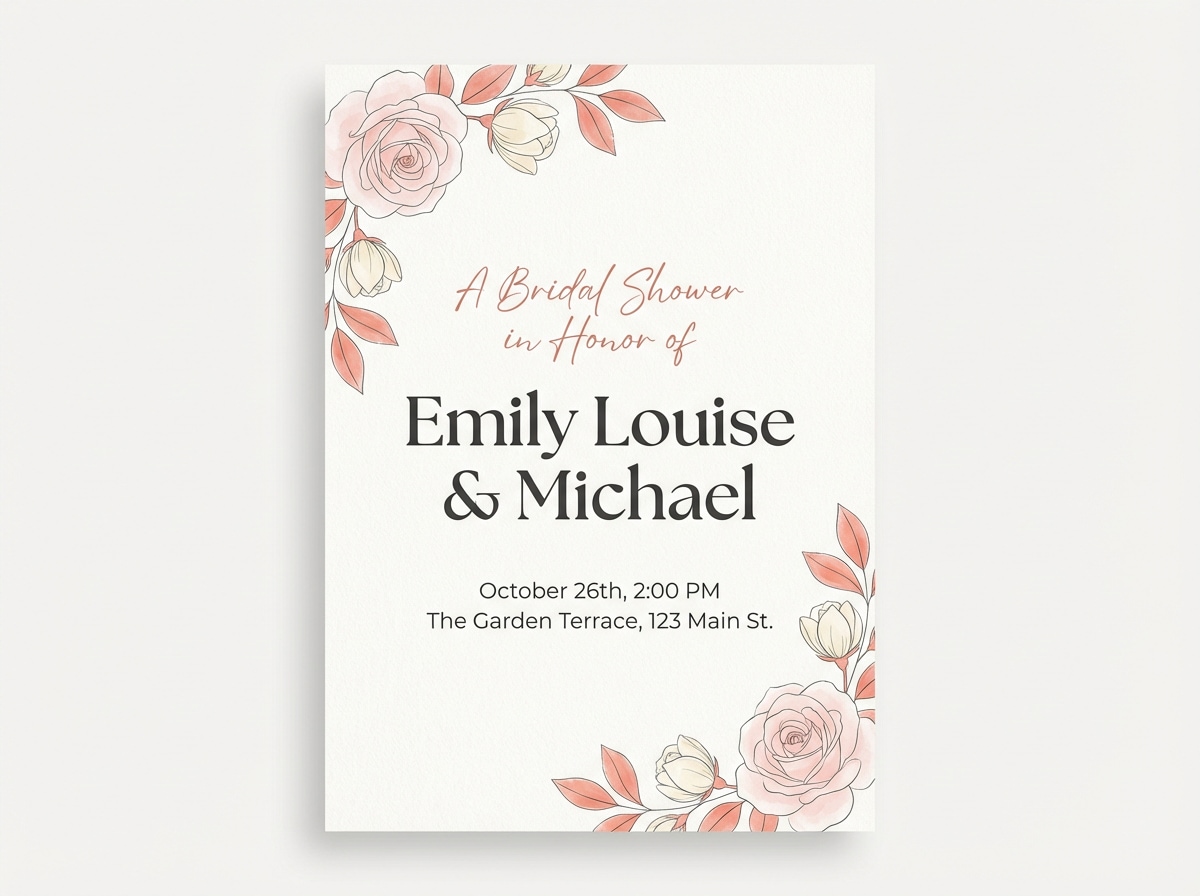
16) Coral Champagne Bridal
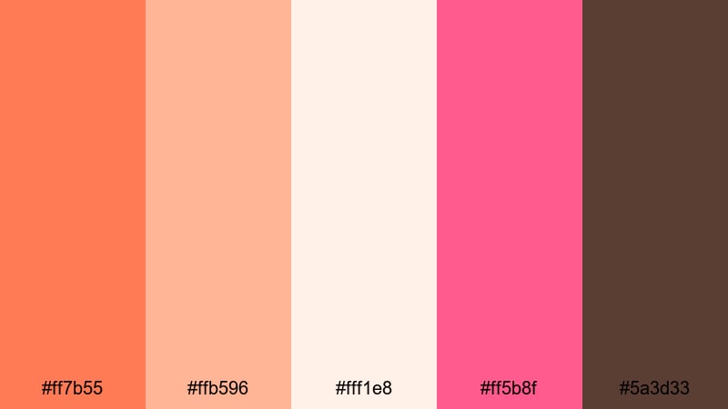
HEX: #ff7b55 #ffb596 #fff1e8 #ff5b8f #5a3d33
Mood: festive, elegant, romantic
Best for: bridal shower invitations
Use champagne cream as the base background to keep the invitation airy, then apply coral for headings and dividers. Bring pink in for small floral accents, icons, or RSVP emphasis, and use warm brown for details so everything prints cleanly. These orange pink color combinations feel festive when you keep saturation focused on just one or two elements.
Image example of coral champagne bridal generated using media.io
17) Apricot Fuchsia Podcast
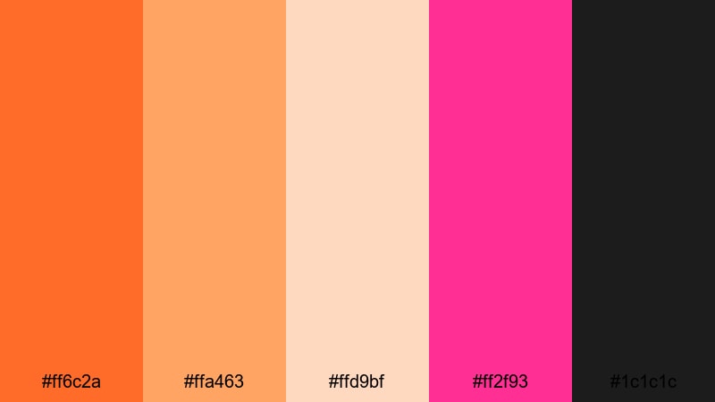
HEX: #ff6c2a #ffa463 #ffd9bf #ff2f93 #1c1c1c
Mood: bold, expressive, attention-grabbing
Best for: podcast cover art
Use near-black as the main background to keep the cover readable at thumbnail size, then place the title in fuchsia for maximum pop. Apply apricot and soft peach as blocks behind secondary text or episode labels, and use orange for small accents or separators. This orange pink color scheme works well when you keep letterforms large and spacing generous.
Image example of apricot fuchsia podcast generated using media.io

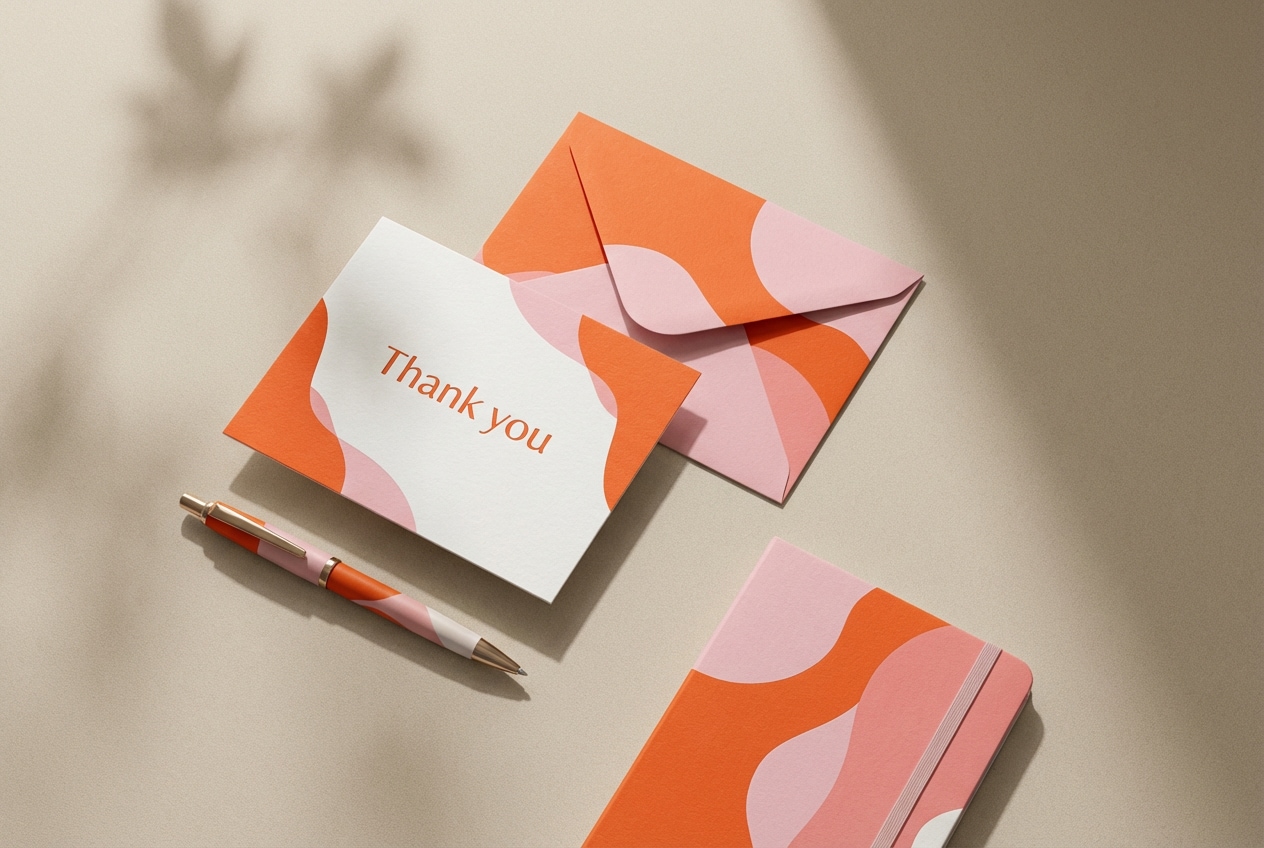
18) Orange Blossom Stationery
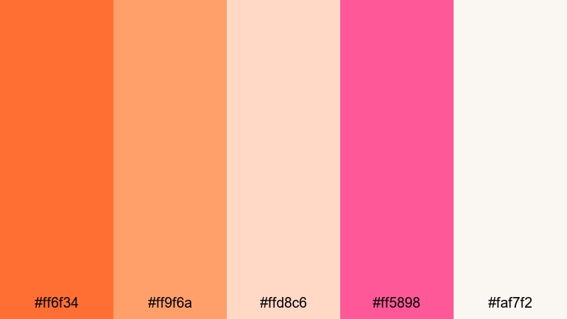
HEX: #ff6f34 #ff9f6a #ffd8c6 #ff5898 #faf7f2
Mood: clean, boutique, handcrafted
Use warm off-white as the main paper base, then print the logo in orange for a friendly first impression. Apply pink on seals, small motifs, or return-address stamps, and use pale peach for envelope liners and light patterns. This orange pink palette for branding is especially effective when most elements stay minimal and the accent color appears in small bursts.
Image example of orange blossom stationery generated using media.io
19) Peachy Sunset Brochure
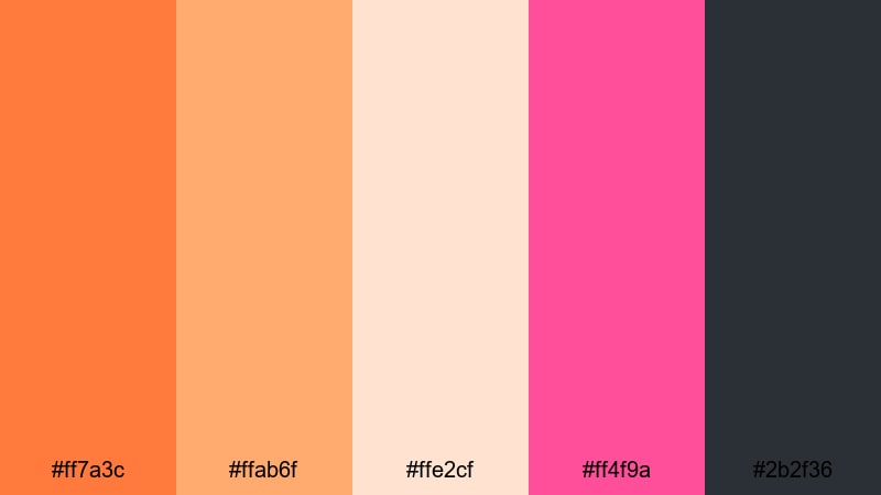
HEX: #ff7a3c #ffab6f #ffe2cf #ff4f9a #2b2f36
Mood: adventurous, warm, editorial
Best for: travel brochure layouts
Use charcoal for body copy, map labels, and fine icons, then place orange on section headers and wayfinding elements like arrows and tabs. Add pink for featured experiences and price callouts, and keep pale peach as large background panels to suggest warm light. These orange pink tones are ideal when you need an editorial feel without heavy imagery.
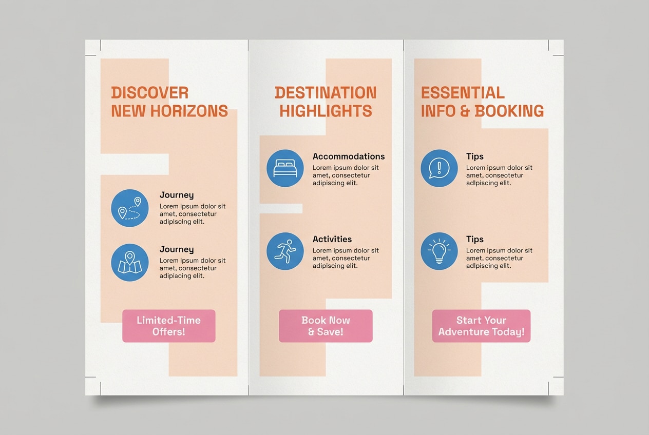
Image example of peachy sunset brochure generated using media.io
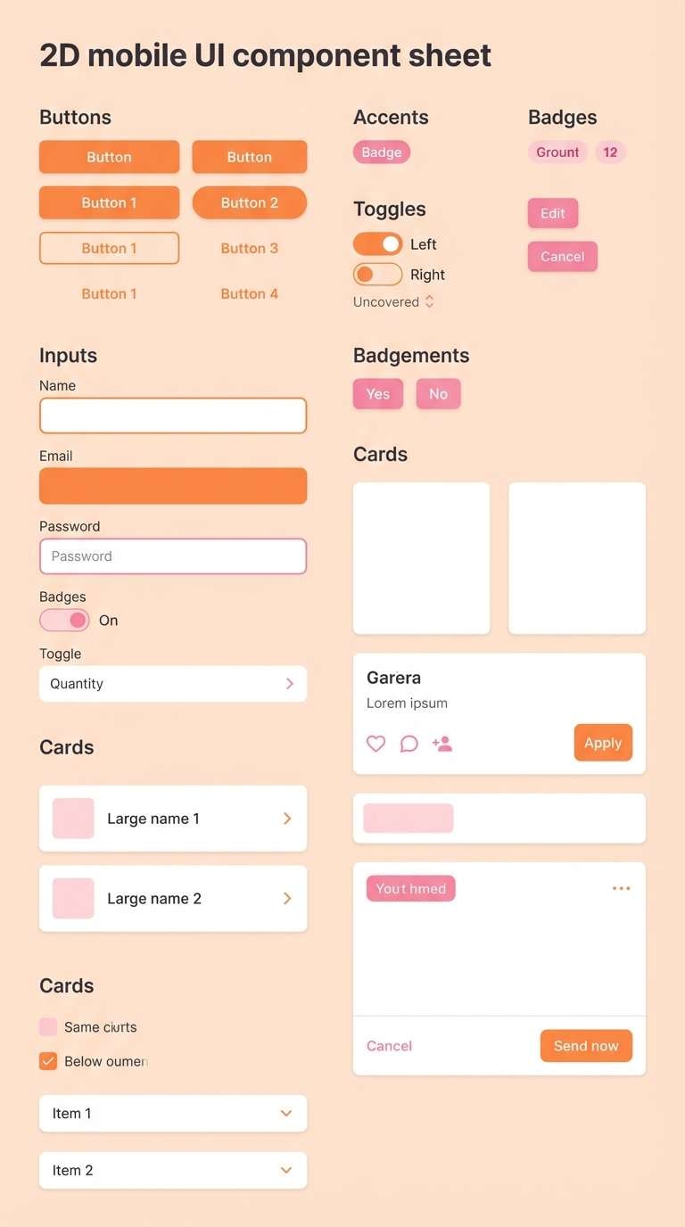
20) Electric Coral UI Kit
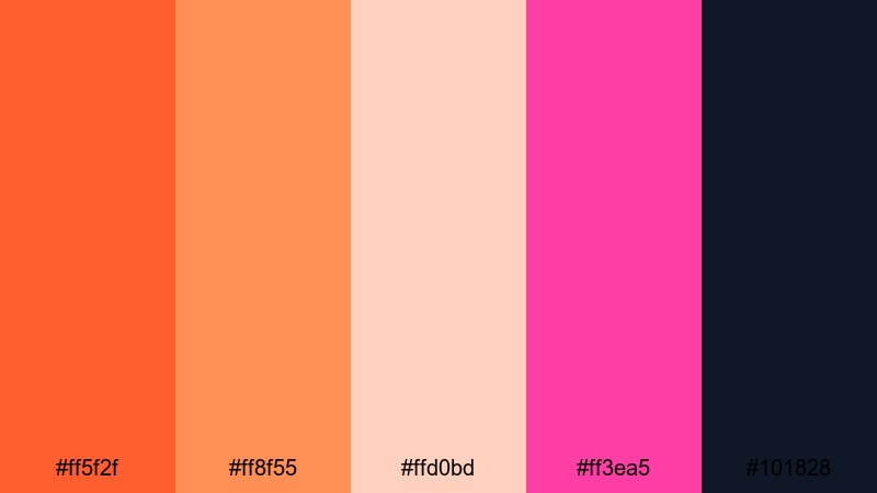
HEX: #ff5f2f #ff8f55 #ffd0bd #ff3ea5 #101828
Mood: dynamic, crisp, product-led
Best for: mobile UI kit components
Use the dark base for app bars, headings, and primary text to keep contrast consistent. Standardize orange as the primary component state (buttons, tabs, active toggles) and reserve pink for badges, notifications, and selected chips. Keep soft peach as card backgrounds to separate modules without heavy borders, making this orange pink palette with HEX codes easy to scale across a design system.
Image example of electric coral ui kit generated using media.io
What Colors Go Well with Orange Pink?
To extend orange pink tones, add one neutral anchor and one cool counterbalance. Here are practical pairings that keep your orange pink color scheme readable and versatile.
- Pairing: charcoal or near-black; boosts contrast for dashboards, app UI, and editorial typography.
- Pairing: deep navy; makes neon orange and pink feel sharper for landing pages and event posters.
- Pairing: warm off-white or cream; keeps an orange and pink palette print-friendly for stationery and packaging.
- Pairing: cocoa brown; adds a handcrafted feel for menus, invitations, and lifestyle branding.
- Pairing: soft blush/peach neutrals; reduces saturation so you can use orange pink color combinations in large backgrounds.
- Pairing: muted teal or cool gray-blue; adds balance for product UI and modern brand systems.
How to Use a Orange Pink Color Palette in Real Designs
- Pick one hero accent: In most layouts, choose either orange or pink as the main CTA color and keep the other for secondary emphasis (badges, highlights, selected states). This prevents the design from competing for attention.
- Use peach as your "soft neutral": Many orange pink palettes include a pale peach or blush. Treat it like a background or card surface color so you can keep plenty of warmth without losing readability.
- Protect contrast early: For UI, set text and icons in a dark neutral (charcoal/navy), then test buttons in both orange and pink. If the pink fails contrast on light backgrounds, move it to borders, chips, or icons instead of body text.
- Print planning: For invitations and flyers, keep large areas in cream/blush and reserve saturated orange pink tones for headings and small graphics. It improves legibility and reduces ink-heavy blocks.
Create Orange Pink Palette Visuals with AI
If you need fast concept images for a moodboard, an orange pink palette for UI mockups, or an orange and pink palette for posters, you can generate consistent visuals using Media.io text-to-image. Copy any prompt from the palettes above, swap the format (poster, dashboard, invitation), and keep the same orange pink color scheme to iterate quickly.
Media.io is an online AI studio for creating and editing video, image, and audio in your browser.
Orange Pink Color Palette FAQs
-
What is an orange pink color palette?
An orange pink color palette is a set of warm hues (orange, peach, coral, pink) often balanced with a light neutral and a dark text color for contrast. -
Which orange pink tones work best for UI design?
Use a dark neutral for text (charcoal or navy), a mid-to-saturated orange for primary buttons, and pink for badges, alerts, and selected states. -
How do I keep orange and pink from looking too loud?
Increase the amount of cream, blush, or off-white, and limit saturated orange/pink to one main element per section (CTA, badge, or header). -
What are safe text colors on orange pink backgrounds?
Charcoal, near-black, and deep navy are the safest. On pale peach or cream, dark text is usually more readable than white. -
Is an orange pink palette good for branding?
Yes. Orange signals warmth and energy, while pink adds personality. Pair them with a stable neutral to keep the brand system flexible. -
How can I generate images that match my orange pink palette?
Use Media.io text-to-image prompts that mention "orange and pink color scheme" plus your design type (dashboard, invitation, poster), then iterate with the same HEX-inspired tones.


