

A strong birthday color palette does more than look cute—it sets the vibe instantly, makes photos feel cohesive, and helps every design element (invites, balloons, signage, social posts) match without effort.
Below are modern, playful, and photo-ready birthday color combinations with HEX codes you can copy, plus tips to use them across real party assets.
In this article
- Why Birthday Palettes Work So Well
-
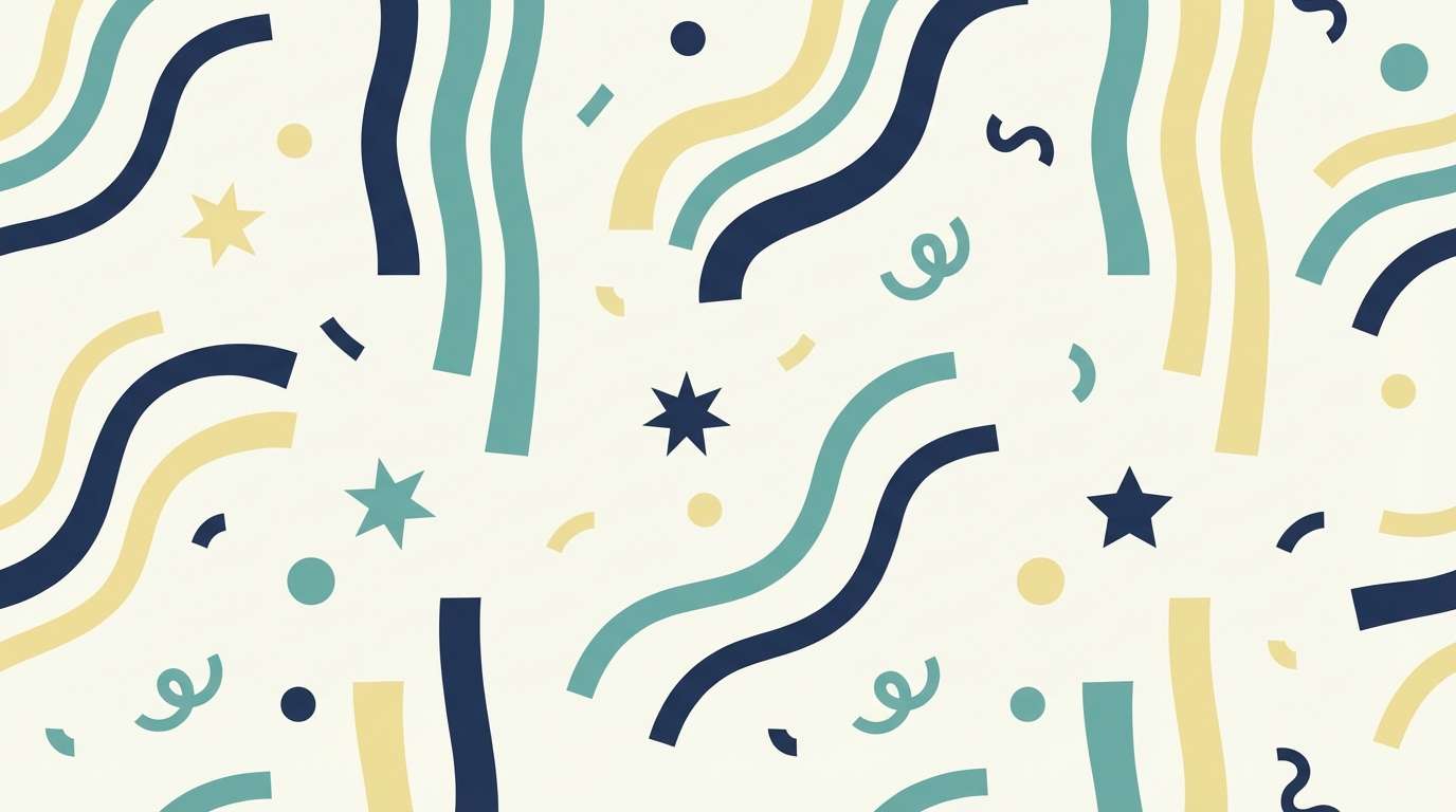
- confetti pastels
- neon frosting
- berry champagne
- citrus pop
- retro party stripe
- midnight sparkler
- cotton candy cloud
- garden brunch
- carnival lights
- minimal candlelight
- mermaid dessert bar
- boho picnic
- luxe gold ribbon
- playroom primary
- disco lavender
- sunset balloon arch
- winter party pearl
- tropical sorbet
- storybook tea party
- monochrome sprinkle
- What Colors Go Well with Birthday?
- How to Use a Birthday Color Palette in Real Designs
- Create Birthday Palette Visuals with AI
Why Birthday Palettes Work So Well
Birthdays come with lots of moving pieces—invites, outfits, table decor, balloons, and digital posts. A clear birthday color scheme gives everything a shared “thread,” so the event looks intentional instead of random.
Color also acts like a shortcut for mood: pastels feel soft and sweet, neons feel loud and nightlife-ready, and deep tones with gold feel premium. When you pick a palette first, all other choices (fonts, icons, backdrops, and even cake styling) get easier.
Finally, consistent party colors make content more shareable. Photos, Reels, and Stories look cleaner when backgrounds, props, and overlays sit in the same color family.
20+ Birthday Color Palette Ideas (with HEX Codes)
1) Confetti Pastels
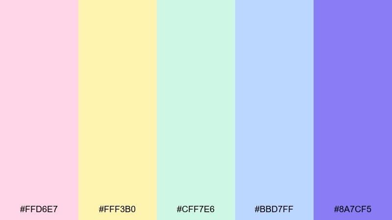
HEX: #FFD6E7 #FFF3B0 #CFF7E6 #BBD7FF #8A7CF5
Mood: light, playful, airy
Best for: kids party invitations, sticker sheets, goodie-bag tags
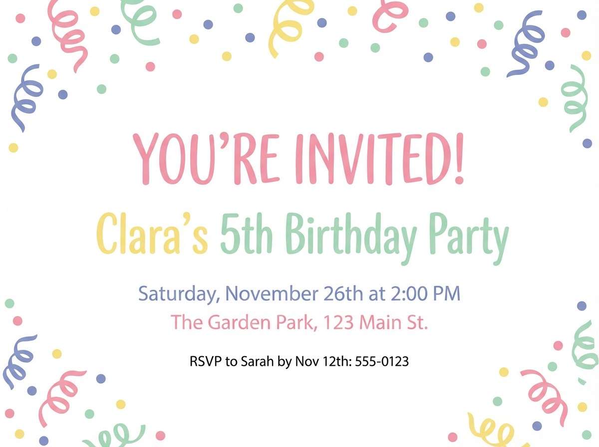
Light and airy like paper confetti drifting through sunshine, these pastels feel instantly cheerful. This birthday color palette works best with lots of white space and rounded typography to keep it sweet, not sugary. Pair it with simple line icons, starbursts, and soft gradients for depth. Usage tip: pick one hero pastel and let the others appear as small sprinkles for balance.
Image example of confetti pastels generated using media.io
Media.io is an online AI studio for creating and editing video, image, and audio in your browser.

2) Neon Frosting
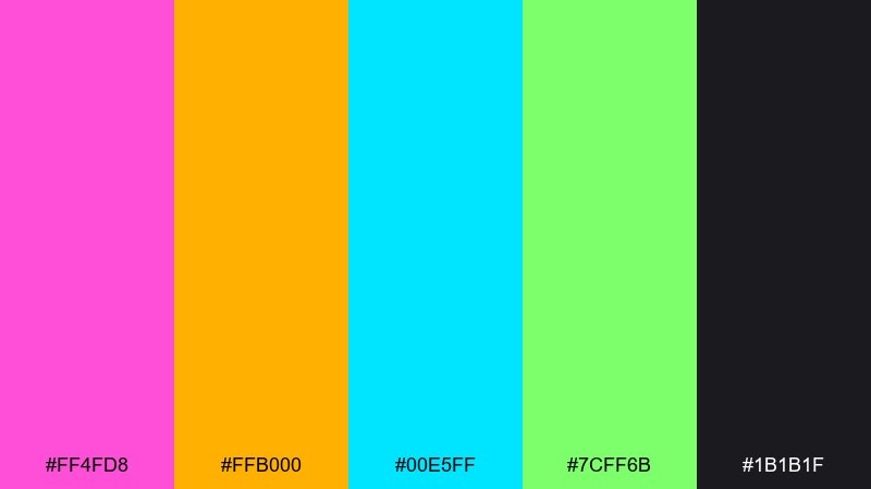
HEX: #FF4FD8 #FFB000 #00E5FF #7CFF6B #1B1B1F
Mood: electric, high-energy, bold
Best for: night-out flyers, DJ party posters, LED screen graphics
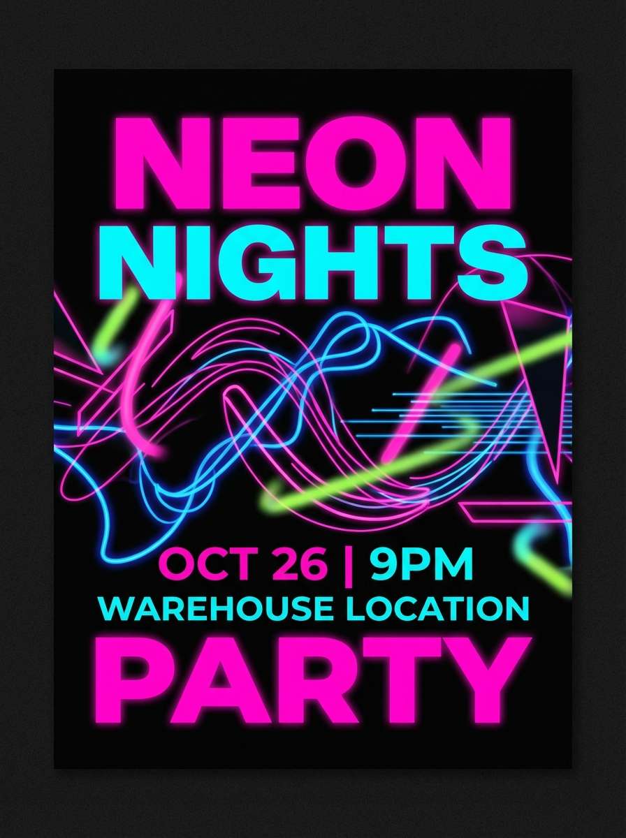
Electric and glossy like neon icing under club lights, this mix is made to grab attention fast. Keep backgrounds dark so the brights glow, and use chunky type or condensed headlines for impact. Pair with simple geometric shapes and a subtle grain to avoid harsh edges. Usage tip: limit yourself to two neon primaries per layout, then rotate accents for variety across assets.
Image example of neon frosting generated using media.io
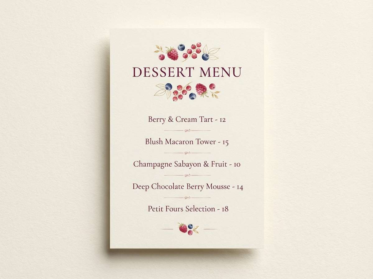
3) Berry Champagne
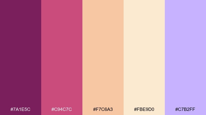
HEX: #7A1E5C #C94C7C #F7C6A3 #FBE9D0 #C7B2FF
Mood: romantic, sparkling, elegant
Best for: dessert table menus, bridal-style birthdays, event signage
Romantic and fizzy like berry champagne, these tones feel grown-up without turning formal. Use the deep berry as your anchor, then let peach and cream soften the overall look. These birthday color combinations pair beautifully with serif headlines, gold foil textures, and blush florals. Usage tip: keep the lavender as a small highlight on icons or dividers so it reads as a luxe surprise.
Image example of berry champagne generated using media.io
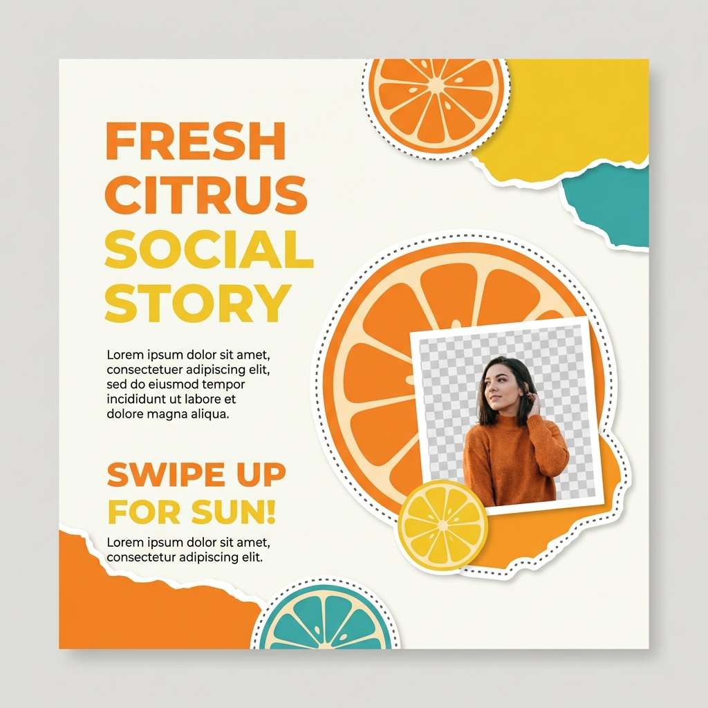
4) Citrus Pop
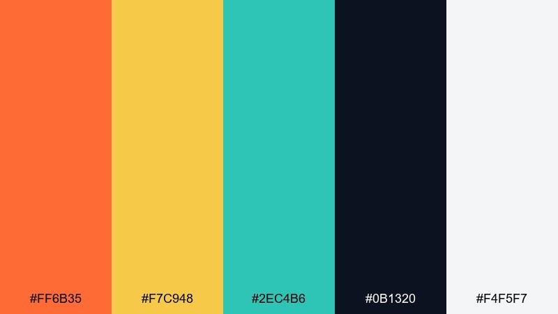
HEX: #FF6B35 #F7C948 #2EC4B6 #0B1320 #F4F5F7
Mood: sunny, zesty, energetic
Best for: social story templates, countdown posts, party reminders
Sunny and zesty like sliced oranges on a picnic table, this palette feels upbeat and modern. Let orange and yellow lead, and use teal as a crisp counterpoint for buttons, stickers, and highlights. Pair with bold sans-serif type and playful arrows to amplify motion. Usage tip: use the near-black for text only, keeping large areas light for a clean, fresh finish.
Image example of citrus pop generated using media.io
5) Retro Party Stripe
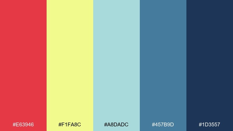
HEX: #E63946 #F1FA8C #A8DADC #457B9D #1D3557
Mood: nostalgic, graphic, upbeat
Best for: wrapping paper patterns, banners, party hats
Nostalgic and graphic like vintage streamers, these colors feel classic but still punchy. Use stripes, checkerboards, or scalloped borders to lean into the retro vibe without clutter. Pair the pale yellow with the navy for legible copy, and save the red for key moments like names or dates. Usage tip: repeat one motif across pieces so the set feels coordinated even with bold contrasts.
Image example of retro party stripe generated using media.io
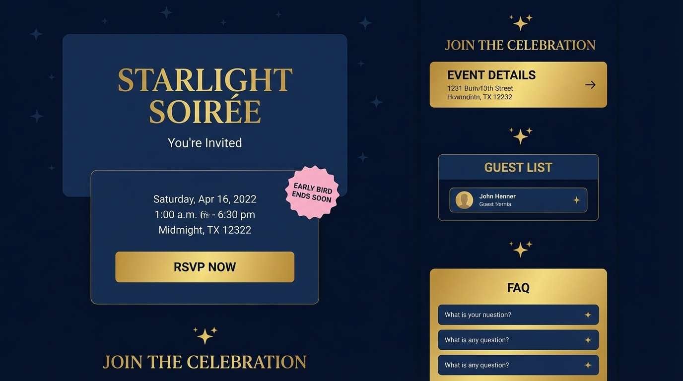
6) Midnight Sparkler
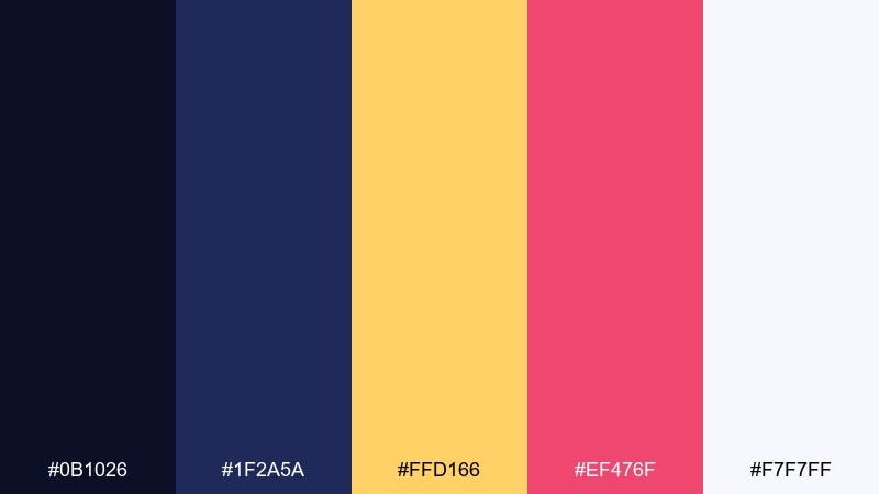
HEX: #0B1026 #1F2A5A #FFD166 #EF476F #F7F7FF
Mood: dramatic, celebratory, glittery
Best for: evening event landing pages, RSVP UI, countdown widgets
Dramatic and celebratory like sparklers against a night sky, these tones feel instantly festive. Use the deep blues for panels and headers, then pop in gold and hot pink for CTAs and badges. As a birthday color scheme, it reads especially well with subtle star patterns and soft glow effects. Usage tip: keep text mostly white and reserve the gold for interactive highlights to improve accessibility.
Image example of midnight sparkler generated using media.io
7) Cotton Candy Cloud
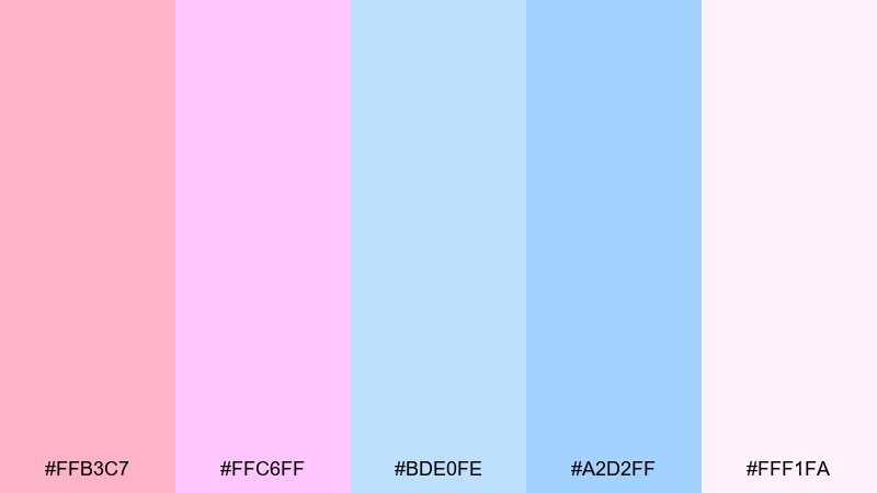
HEX: #FFB3C7 #FFC6FF #BDE0FE #A2D2FF #FFF1FA
Mood: dreamy, sweet, soft
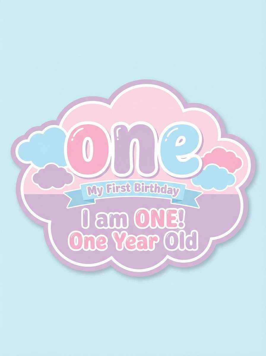
Best for: first birthday photo props, baby shower style parties, signage
Dreamy and sweet like cotton candy clouds, these pastels feel gentle and photo-friendly. Keep contrast soft by using the cream-pink as your base and layering blue tints in larger shapes. Pair with hand-lettered scripts or rounded sans fonts for a friendly mood. Usage tip: add a faint gradient between the pink and lavender to make large backgrounds feel less flat.
Image example of cotton candy cloud generated using media.io
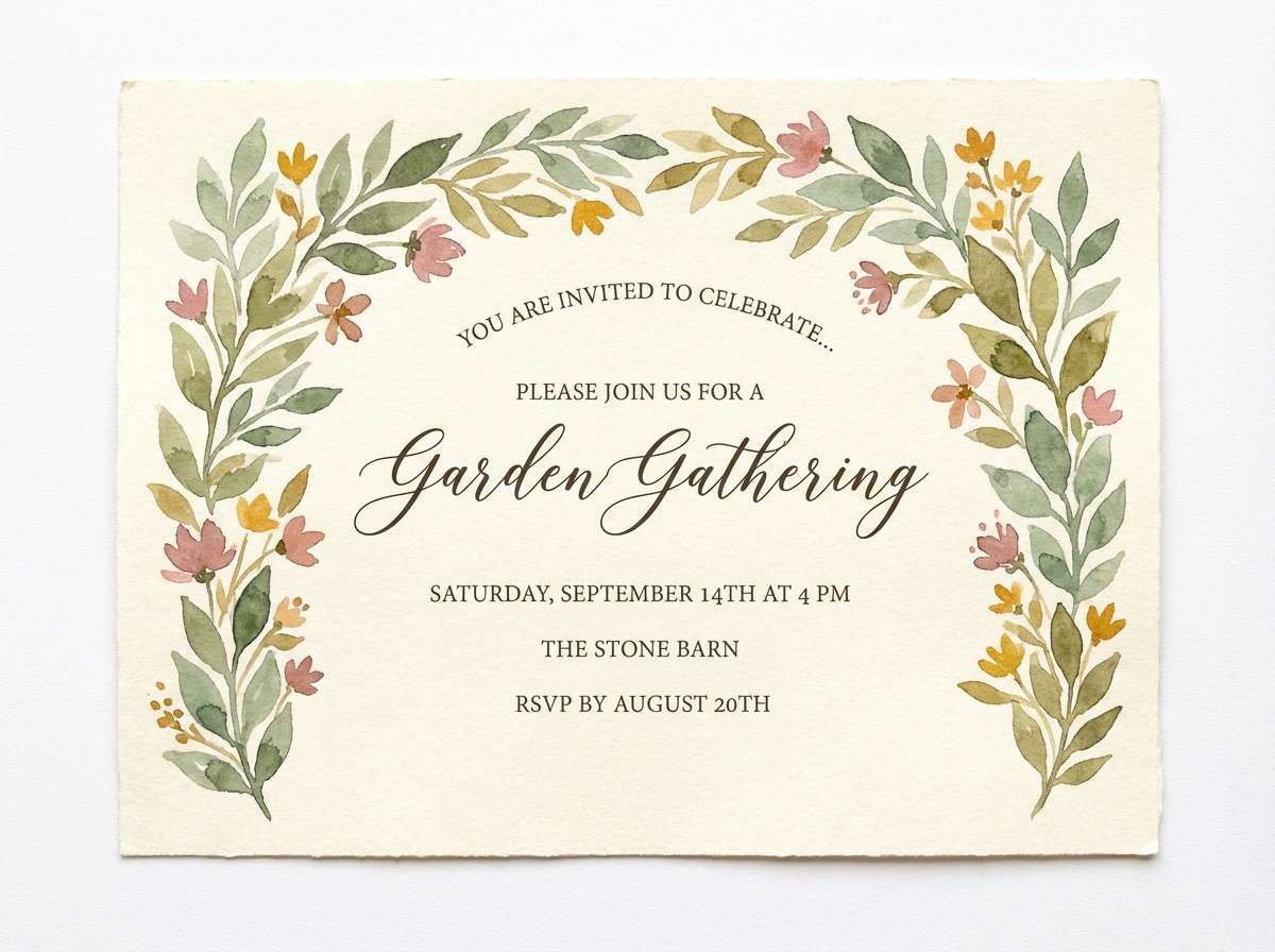
8) Garden Brunch
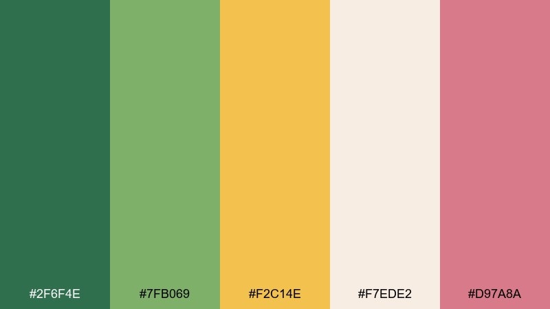
HEX: #2F6F4E #7FB069 #F2C14E #F7EDE2 #D97A8A
Mood: fresh, botanical, relaxed
Best for: watercolor invitations, spring birthdays, outdoor brunch decor
Fresh and botanical like a brunch table surrounded by herbs and blooms, these tones feel welcoming and natural. Let the cream act as paper, then layer greens for foliage and structure. The warm yellow and dusty rose are perfect for highlights like date blocks, seals, or small illustrations. Usage tip: keep the rose slightly muted in large areas so the greens stay calm and grounded.
Image example of garden brunch generated using media.io
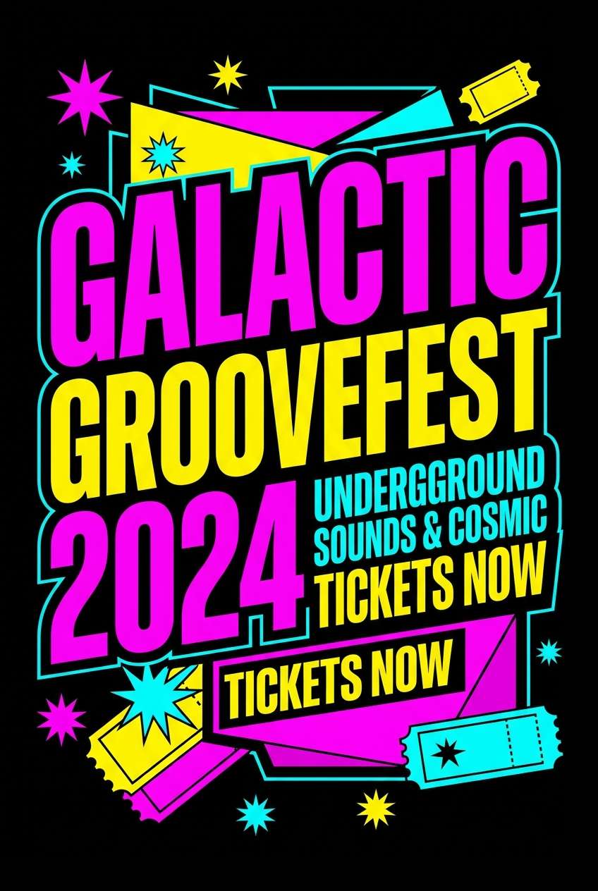
9) Carnival Lights
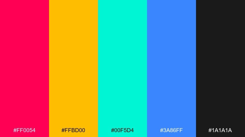
HEX: #FF0054 #FFBD00 #00F5D4 #3A86FF #1A1A1A
Mood: loud, fun, high-contrast
Best for: event posters, stage screens, big headline graphics
Loud and thrilling like carnival lights at dusk, this set thrives on contrast and big shapes. Use black as the stage, then layer saturated color blocks for headlines and ticket info. Pair with chunky display fonts and simple icons like stars, tickets, and arrows. Usage tip: add extra spacing around text so the bright colors do not compete with readability.
Image example of carnival lights generated using media.io
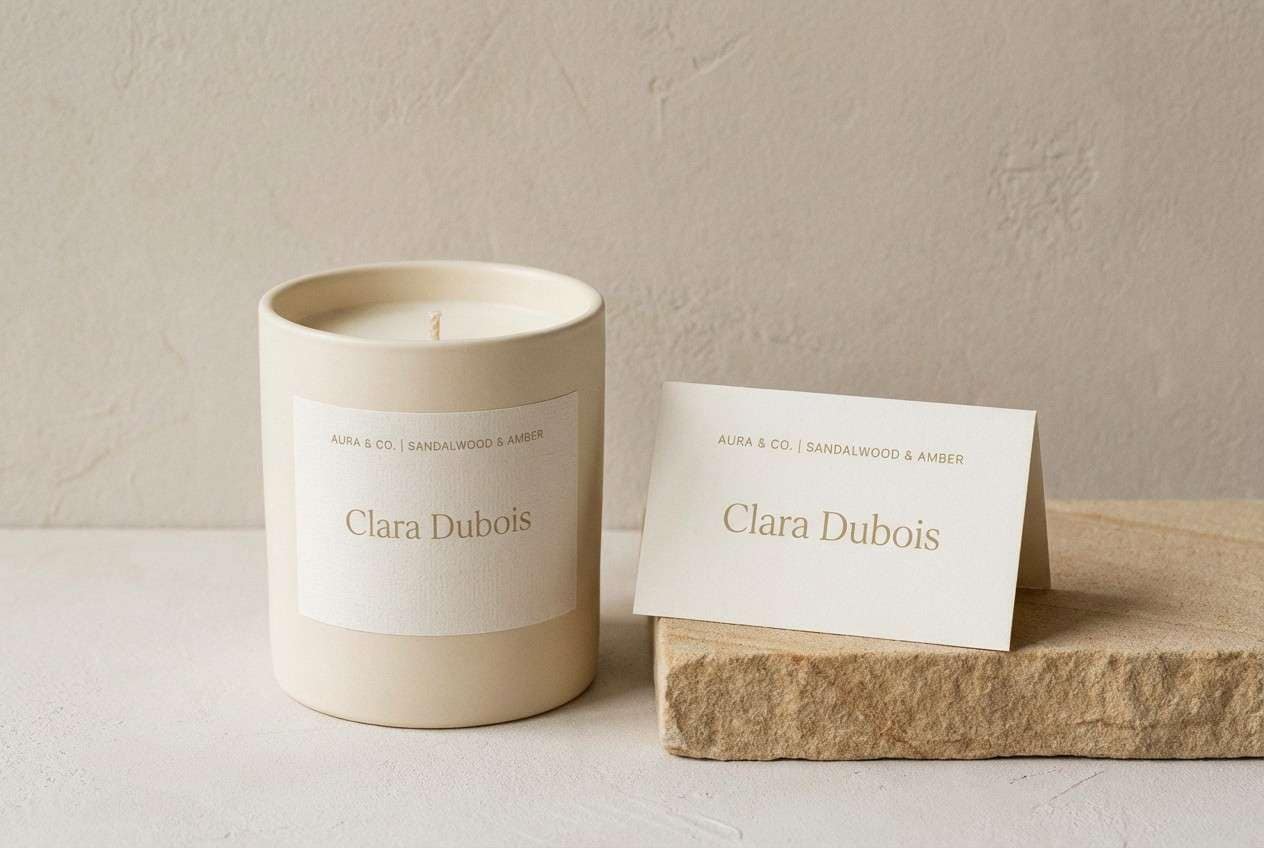
10) Minimal Candlelight
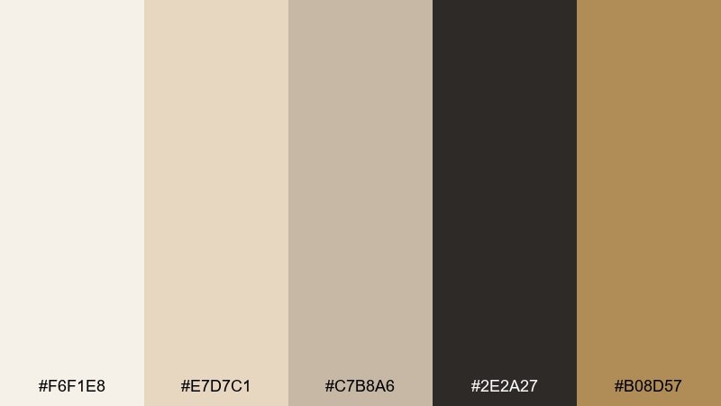
HEX: #F6F1E8 #E7D7C1 #C7B8A6 #2E2A27 #B08D57
Mood: warm, intimate, understated
Best for: minimal candle labels, place cards, sophisticated dinner parties
Warm and intimate like candlelight on linen, these neutrals feel calm and elevated. Use the cream and sand tones for large surfaces, and rely on the charcoal for crisp typography. The muted gold reads beautifully as a small accent on borders, icons, or foil-like details. Usage tip: keep finishes matte in your designs so the palette stays soft and tactile.
Image example of minimal candlelight generated using media.io
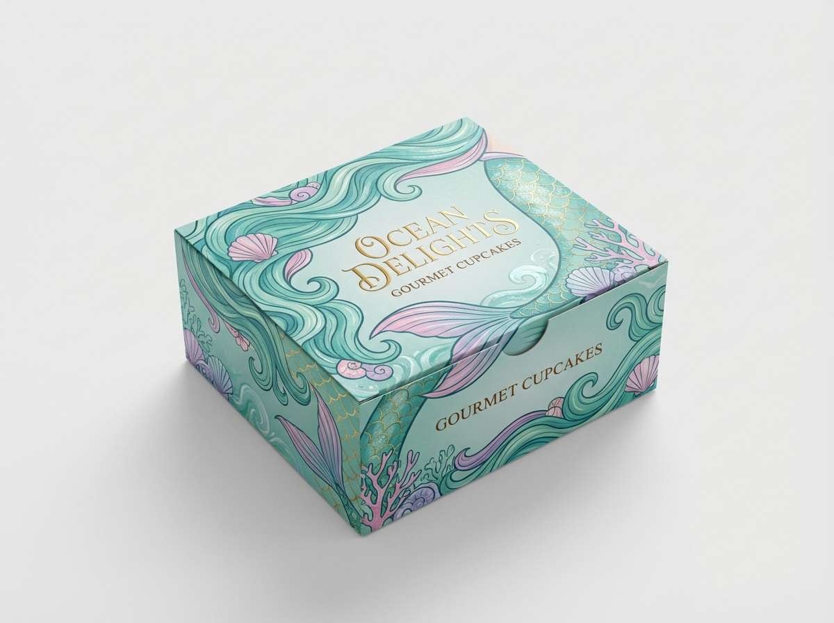
11) Mermaid Dessert Bar
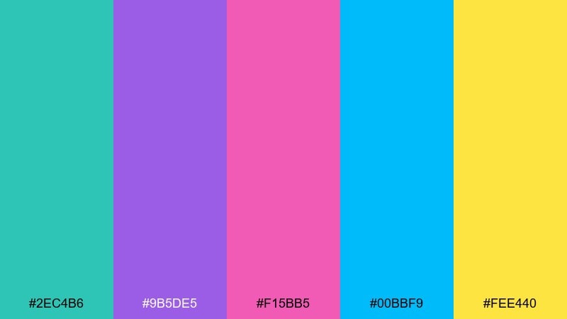
HEX: #2EC4B6 #9B5DE5 #F15BB5 #00BBF9 #FEE440
Mood: playful, magical, glossy
Best for: cupcake box packaging, candy stickers, dessert bar signage
Playful and magical like a mermaid dessert table, these bright tones feel glossy and sweet. Keep teal and aqua as the base, then sprinkle in pink and purple for whimsical contrast. Pair with scallop shapes, bubbles, and iridescent textures to push the theme without going kitschy. Usage tip: use the sunny yellow as a small highlight on price tags or icons to guide the eye.
Image example of mermaid dessert bar generated using media.io
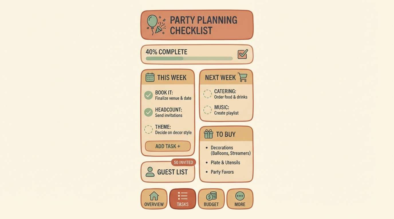
12) Boho Picnic
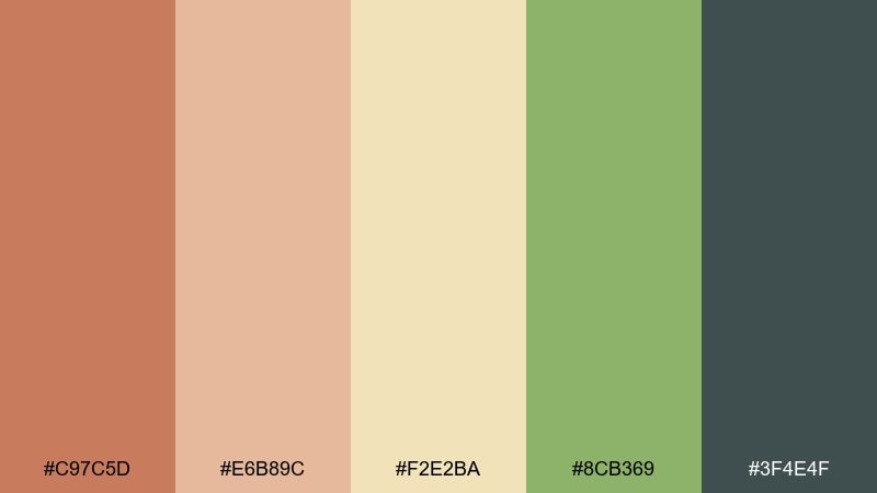
HEX: #C97C5D #E6B89C #F2E2BA #8CB369 #3F4E4F
Mood: earthy, relaxed, handmade
Best for: party planning app UI, checklist pages, printable planners
Earthy and relaxed like a boho picnic blanket, these tones feel grounded and friendly. Use the cream and tan shades for backgrounds and cards, and keep the deep slate for text and icons. Green works well for progress states and subtle success cues without looking corporate. Usage tip: add small hand-drawn dividers and keep shadows soft to match the handmade vibe.
Image example of boho picnic generated using media.io
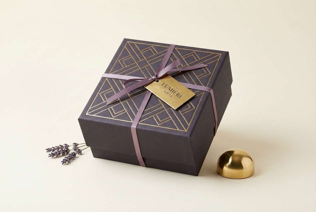
13) Luxe Gold Ribbon
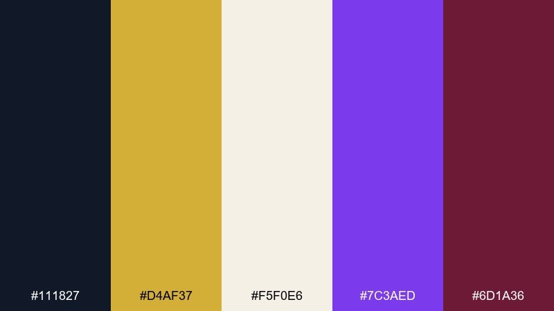
HEX: #111827 #D4AF37 #F5F0E6 #7C3AED #6D1A36
Mood: premium, dramatic, celebratory
Best for: luxury gift boxes, VIP invites, premium product ads
Premium and dramatic like a gold ribbon on a midnight gift box, this palette feels instantly upscale. Keep the black and cream as your foundation, then use gold for highlights and edges that mimic foil. Purple and deep wine add richness for monograms, seals, or small floral accents. Usage tip: treat gold as a 10 percent color so it stays special and does not flatten into yellow.
Image example of luxe gold ribbon generated using media.io
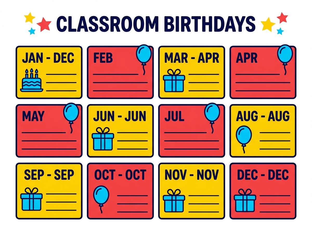
14) Playroom Primary
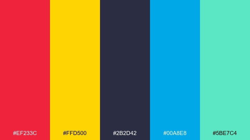
HEX: #EF233C #FFD500 #2B2D42 #00A8E8 #5BE7C4
Mood: bold, kidlike, confident
Best for: classroom birthday charts, kid party banners, activity sheets
Bold and kidlike like a playroom wall of toys, these primaries feel confident and clear. Use navy for structure and readability, then let red and yellow carry the excitement in headers and icons. The bright blue and mint work well for sections, badges, and playful illustrations. Usage tip: keep shapes simple and chunky so the colors do the heavy lifting.
Image example of playroom primary generated using media.io
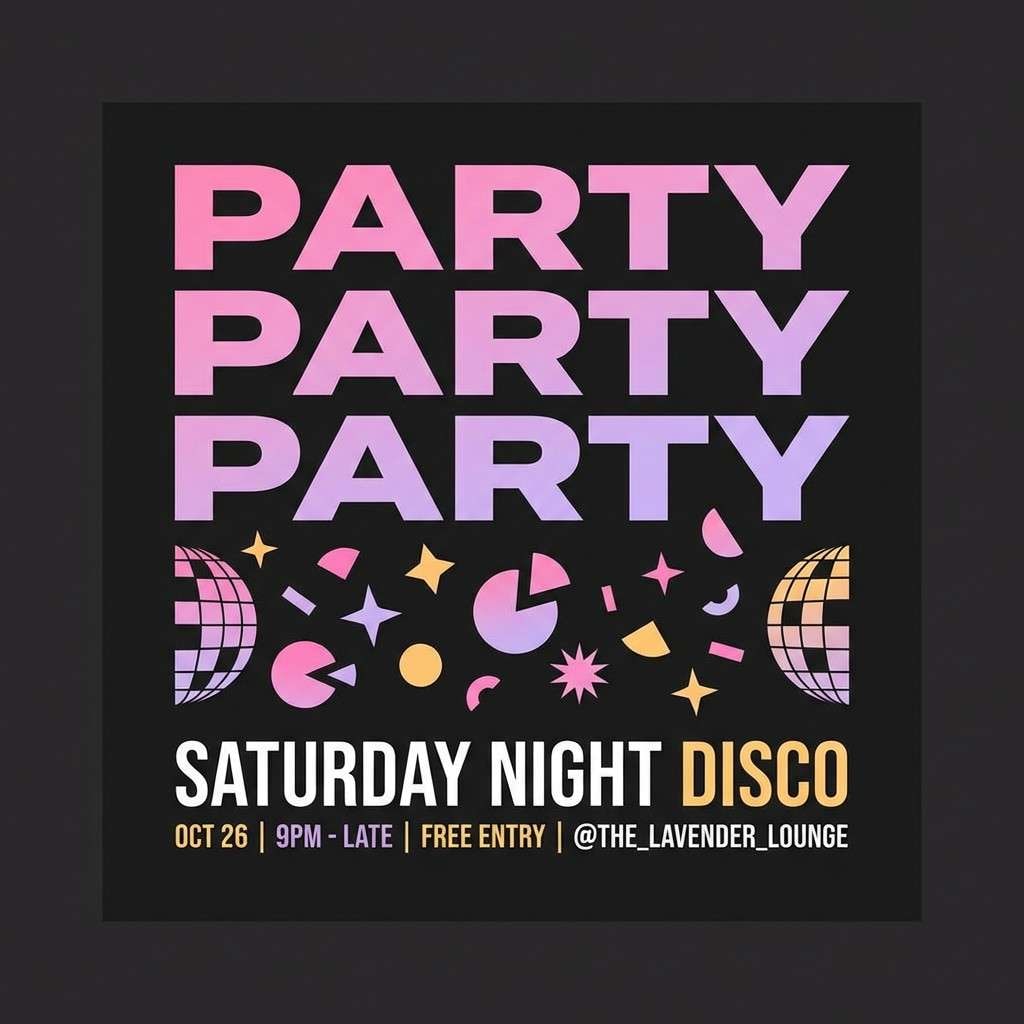
15) Disco Lavender
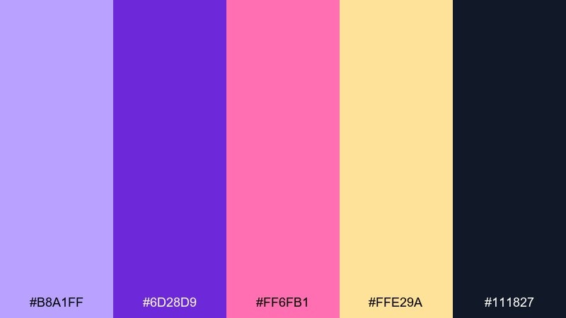
HEX: #B8A1FF #6D28D9 #FF6FB1 #FFE29A #111827
Mood: modern, fun, dance-floor
Best for: playlist covers, social posts, party announcements
Modern and fun like a disco ball reflecting lavender light, these tones feel lively but curated. Use the deep violet for type and framing, then layer lavender and pink in gradients for motion. The warm pastel yellow is a great accent for small badges, dates, or sticker shapes. Usage tip: add a subtle halftone texture to backgrounds to give the brights a print-inspired edge.
Image example of disco lavender generated using media.io
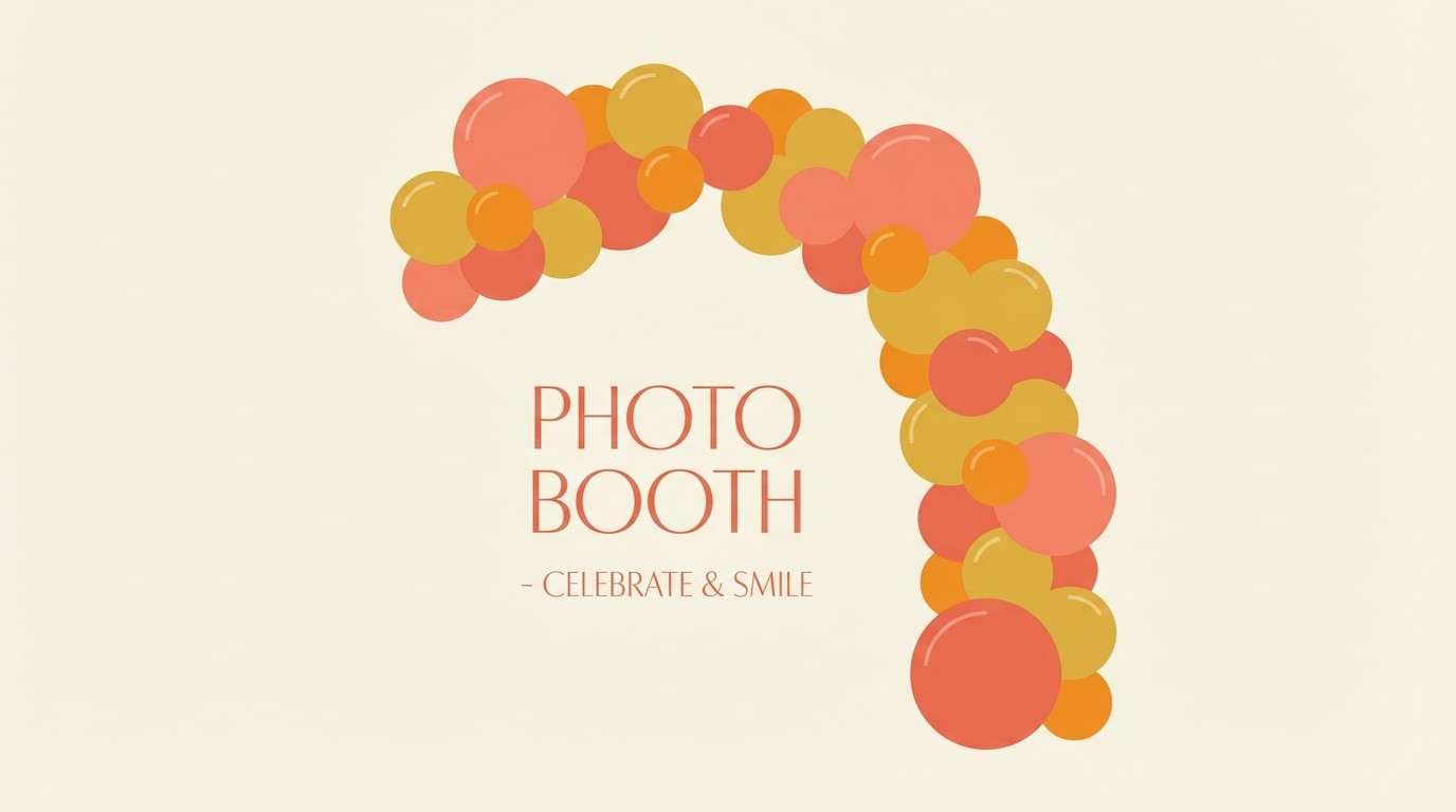
16) Sunset Balloon Arch
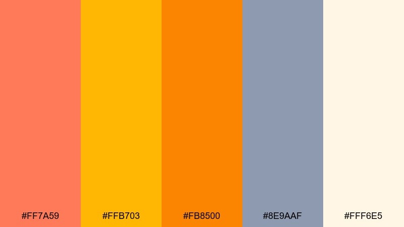
HEX: #FF7A59 #FFB703 #FB8500 #8E9AAF #FFF6E5
Mood: golden, optimistic, photo-ready
Best for: balloon arch mockups, backdrop designs, photo booth signage
Golden and optimistic like a sunset balloon arch, these colors glow in photos. Keep the cream as your base and layer warm oranges in big, confident shapes for a celebratory feel. The cool gray-lavender adds a modern twist, especially for type and minimal line art. Usage tip: test the oranges at small sizes and add a thin dark outline if you need sharper legibility on cream.
Image example of sunset balloon arch generated using media.io
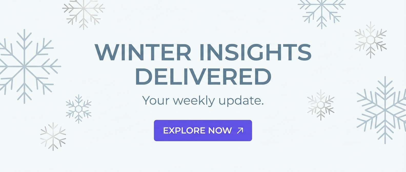
17) Winter Party Pearl
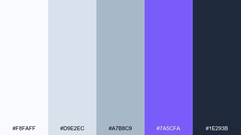
HEX: #F8FAFF #D9E2EC #A7B8C9 #7A5CFA #1E293B
Mood: crisp, cool, polished
Best for: winter birthday email headers, digital invites, clean banners
Crisp and polished like pearl shimmer on fresh snow, these cool tones feel clean and modern. Use the icy whites for breathing room, then anchor layouts with the deep slate for text and navigation. Violet works best as a confident accent for buttons, highlights, or a single statement shape. Usage tip: add subtle gradients between the pale blues to create depth without adding clutter.
Image example of winter party pearl generated using media.io
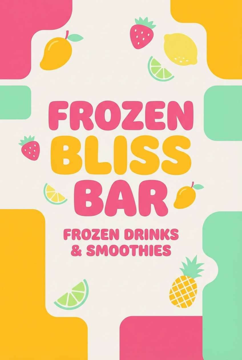
18) Tropical Sorbet
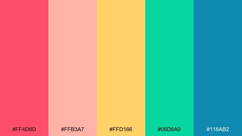
HEX: #FF4D6D #FFB3A7 #FFD166 #06D6A0 #118AB2
Mood: juicy, sunny, vacation-like
Best for: frozen drink bar posters, pool party invites, menu boards
Juicy and sunny like tropical sorbet, this palette feels like a vacation in one glance. Use pink and mango yellow as your main duo, then bring in mint green for freshness. The blue works best for small contrasts like prices, icons, or dividers so the warm tones stay dominant. Usage tip: keep backgrounds light and use bold shadowless type for a clean summer look.
Image example of tropical sorbet generated using media.io
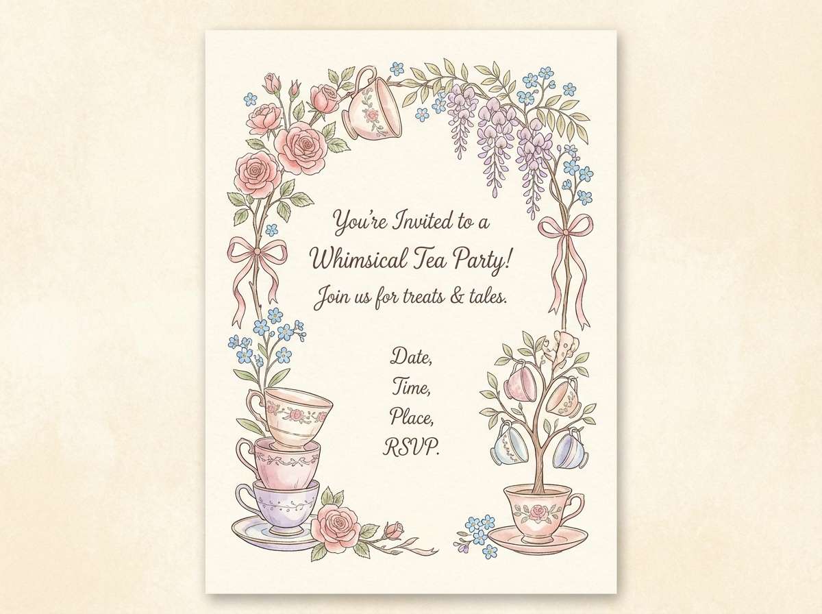
19) Storybook Tea Party
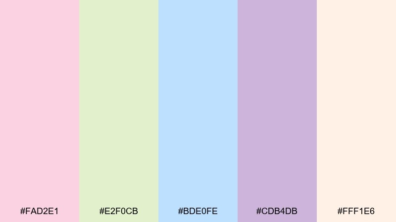
HEX: #FAD2E1 #E2F0CB #BDE0FE #CDB4DB #FFF1E6
Mood: whimsical, gentle, charming
Best for: tea party invitations, place cards, illustrated menus
Whimsical and gentle like a storybook tea set, these colors feel charming and calm. Let the warm cream set the tone, then layer blush and lavender for a soft, festive mood. Pair with delicate floral illustrations and classic serif titles for a vintage touch. Usage tip: keep outlines light and avoid heavy black so the palette stays airy.
Image example of storybook tea party generated using media.io
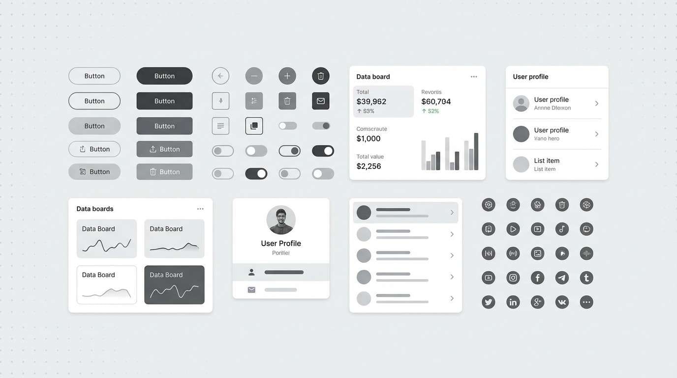
20) Monochrome Sprinkle
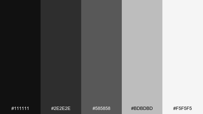
HEX: #111111 #2E2E2E #585858 #BDBDBD #F5F5F5
Mood: clean, modern, design-forward
Best for: monochrome UI kits, icon sets, minimalist brand assets
Clean and design-forward like a minimalist bakery box, this grayscale mix feels timeless. Use the near-black for hierarchy and the light grays for spacious sections and card surfaces. Pair with a single pattern, like tiny sprinkles or dots, to keep it festive without adding color. Usage tip: check contrast ratios and reserve the mid-gray for secondary text only.
Image example of monochrome sprinkle generated using media.io
What Colors Go Well with Birthday?
Most birthday color combinations work best when you mix one “hero” color (the main vibe) with one supporting color and a clean neutral. Neutrals like white, cream, charcoal, or near-black help text stay readable and keep photos from looking overly busy.
If you want modern party colors, try pairing warm brights (coral, mango, magenta) with a cool counterpoint (teal, periwinkle, violet). For a more elegant birthday color scheme, deep berry or navy with champagne/gold accents creates instant “special occasion” energy.
When in doubt, keep saturation consistent: either go soft (pastel-on-pastel) or bold (neon-on-dark). Mixing pastel with neon can work, but it’s harder to balance across invites, balloons, and digital graphics.
How to Use a Birthday Color Palette in Real Designs
Start by assigning roles to your five colors: background, surface/card, text, primary accent (CTA or name), and secondary accent (icons, dividers, confetti). This prevents every element from fighting for attention.
For invitations and flyers, prioritize readability: put text on the lightest neutral (or the darkest anchor) and keep bright colors for borders, stickers, and key details like date/time. For balloon colors and decor, choose 2–3 main shades and use the remaining colors as small “sprinkle” accents.
For social graphics, reuse the same layout with rotating accent colors. That way your countdown posts, reminders, and stories look like a coordinated set—even if each design feels fresh.
Create Birthday Palette Visuals with AI
If you already have HEX codes, you can turn them into invite mockups, poster concepts, and social templates quickly with AI. The fastest workflow is to pick one palette, decide the vibe (cute, luxe, neon, minimalist), and generate a few variations until the layout matches your event.
Try prompting for your specific asset (invitation, menu, RSVP page, backdrop) and include a simple style direction like “flat vector,” “minimal,” or “premium studio shot.” Then keep what works and regenerate the parts that don’t.
Once you have a consistent look, reuse the same palette and prompt style across all your birthday visuals so everything feels intentional from the first invite to the final thank-you post.
Birthday Color Palette FAQs
-
What is the best birthday color palette for photos?
Photo-friendly birthday palettes usually include a light base (white or cream) plus 2–3 mid-tone accents. Sets like Confetti Pastels, Cotton Candy Cloud, and Sunset Balloon Arch keep skin tones natural while still looking festive. -
How many colors should a birthday color scheme use?
For most parties, use 2–3 main colors and 1–2 neutrals. Even if your palette has five HEX codes, keep two shades dominant and let the rest appear as small accents (confetti, icons, borders, ribbons). -
What colors feel “grown-up” for an adult birthday?
Deep anchors like navy, charcoal, or berry paired with cream and metallic-style accents (gold tones) read more elevated. Try Berry Champagne, Midnight Sparkler, or Luxe Gold Ribbon for a modern adult vibe. -
Which birthday colors work best for kids?
High-contrast, clear colors are easiest for kid-themed designs and signage. Playroom Primary is great for banners and activity sheets, while Confetti Pastels is a softer option for younger ages. -
How do I choose balloon colors from a palette?
Select 2–3 balloon colors from the palette that are similar in saturation (all pastel or all bold), then use the darkest shade for tiny details only (text, ties, or small printed elements). This keeps the balloon cluster cohesive. -
Can I use a monochrome birthday palette and still make it feel festive?
Yes. Use pattern and texture (sprinkles, dots, starbursts) plus strong type hierarchy. Monochrome Sprinkle works especially well for minimalist invites, modern UI assets, and design-forward parties. -
What’s a quick way to generate matching birthday invite and social post designs?
Use one palette and one consistent style prompt (for example, “flat vector invitation” or “bold poster on dark background”), then generate variations for each asset. Keeping the same background color and headline font style ties the whole set together.


