Spring green sits between neon energy and natural freshness, which makes spring green color palettes useful for both digital UI and print. In this guide you will get 20 ready-to-use sets with HEX codes, quick usage notes, and prompts you can run in Media.io to generate matching visuals. If you are building spring green color combinations for branding, posters, or a product interface, these ideas keep contrast and hierarchy clear.
In this article
Why Spring Green Palettes Work So Well
A spring green color scheme reads as growth, health, and momentum. Because spring green tones are naturally attention-grabbing, they are excellent for emphasis while still feeling friendly.
- High visibility: spring green holds attention fast, which helps CTAs, toggles, and success states in UI.
- Nature association: these spring green color combinations fit eco, wellness, food, and outdoor themes without extra visuals.
- Flexible contrast: it pairs well with deep slates/navies for readable text, plus soft off-whites for clean layouts.
- Modern by default: a small amount of spring green can make neutral designs feel current (especially in SaaS and packaging).
20+ Spring Green Color Palette Ideas (with HEX Codes)
Below are 20 spring green color palettes with HEX codes. Each set includes a suggested use case and a ready prompt you can paste into Media.io to generate visuals that match the same spring green tones.
1) Fresh Sprout
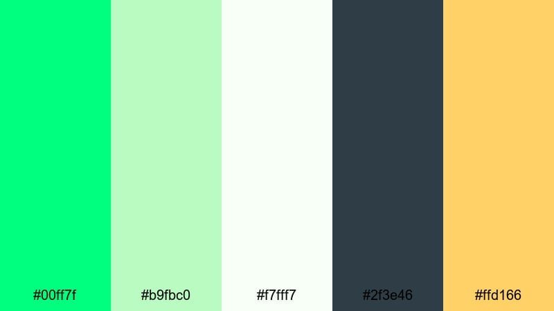
HEX: #00ff7f #b9fbc0 #f7fff7 #2f3e46 #ffd166
Mood: crisp, optimistic, clean
Best for: SaaS dashboard UI
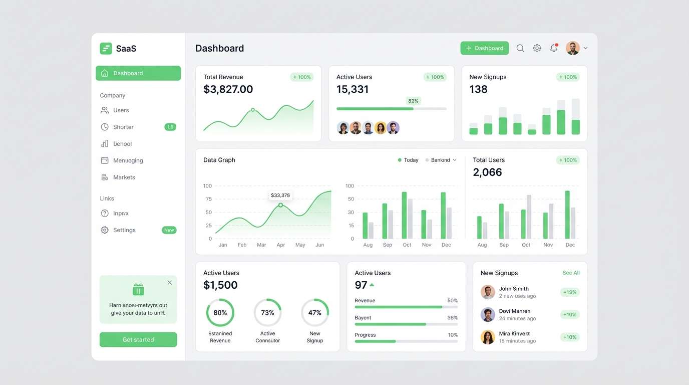
Use spring green as the main accent for primary buttons and key states (success, active filters, selected rows). Keep the off-white as the dominant background so charts and cards breathe. Put the deep slate on navigation and text for reliable contrast, and use the warm yellow only for alerts or secondary highlights to avoid competing accents.
Image example of fresh sprout generated using media.io
Media.io is an online AI studio for creating and editing video, image, and audio in your browser.

2) Mint Meadow
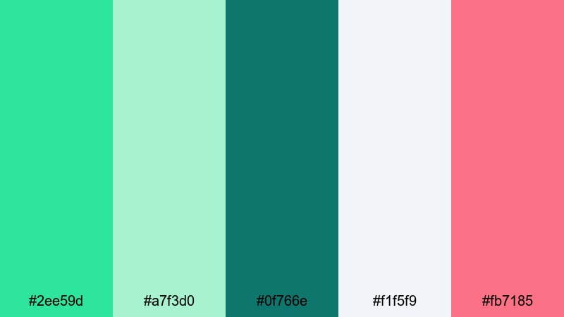
HEX: #2ee59d #a7f3d0 #0f766e #f1f5f9 #fb7185
Mood: friendly, fresh, modern
Best for: Brand identity
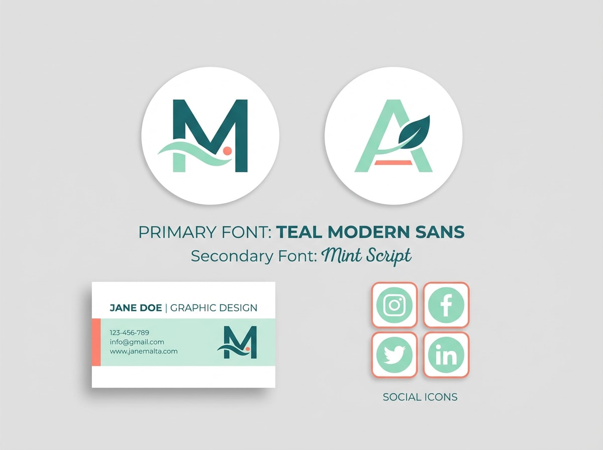
Build the brand base with teal for logos and headline typography, then use the minty spring green for accents like badges, icons, and social highlights. Let the cool gray-white carry large areas (stationery, backgrounds, guidelines) so the system stays clean. Use coral as a small, memorable punch for CTAs or seals, not as a second main color.
Image example of mint meadow generated using media.io
3) Dewy Garden
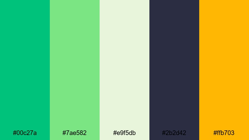
HEX: #00c27a #7ae582 #e9f5db #2b2d42 #ffb703
Mood: uplifting, grounded, sunny
Best for: Event poster
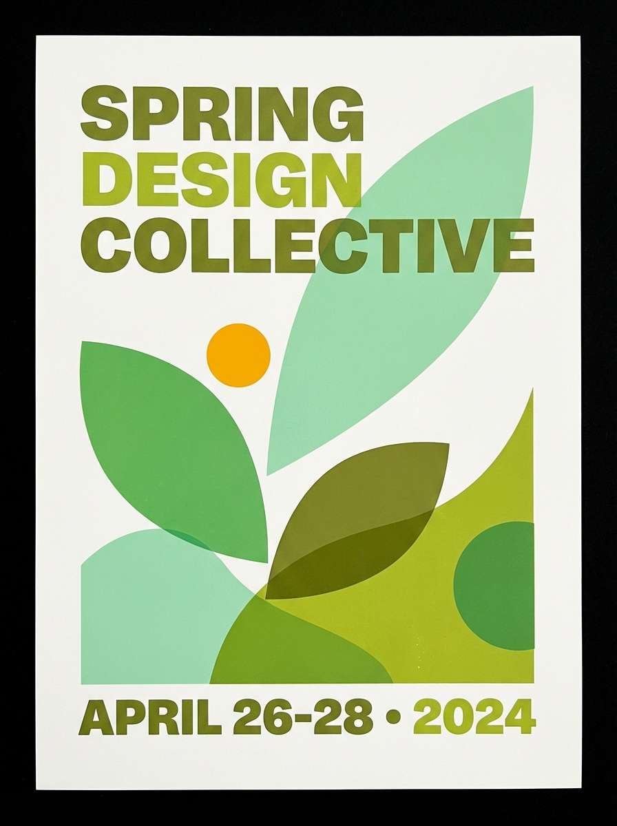
Use the deep spring green for the headline and core layout elements (grid, key shapes) so the poster feels structured. Layer the lighter greens for leaf-like graphics or gradient blocks, then keep the pale cream as the main negative space for readability. Add amber only to highlight the date, venue, or a single callout so the hierarchy stays strong.
Image example of dewy garden generated using media.io
4) Lime Ribbon
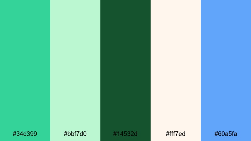
HEX: #34d399 #bbf7d0 #14532d #fff7ed #60a5fa
Mood: playful, airy, contemporary
Best for: App onboarding UI
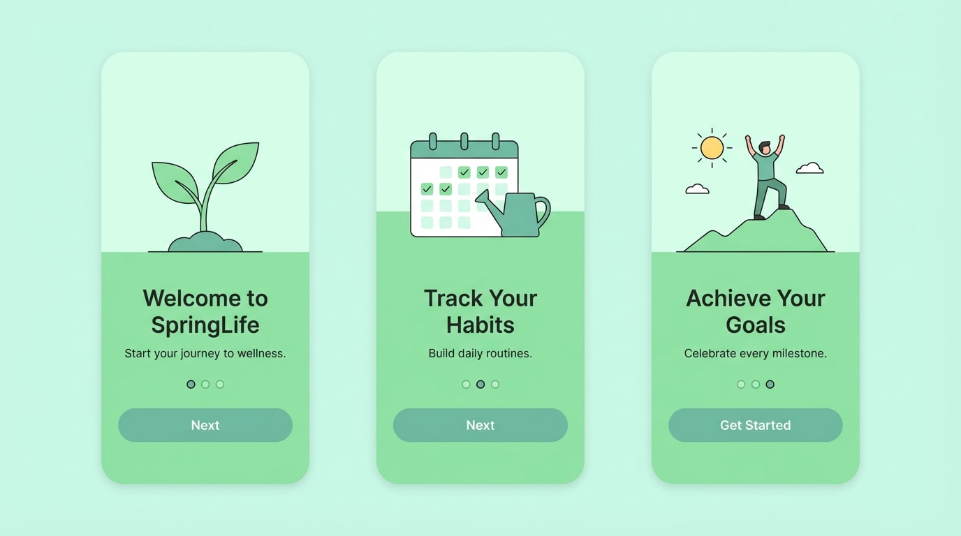
Assign the bright spring green to step indicators, progress bars, and the main "Next" button so onboarding feels guided. Use the soft mint for panels and illustration backgrounds to reduce contrast fatigue. Keep the deep forest for body text and icons. Add blue only for secondary actions (Skip, Learn more) so users always spot the primary path.
Image example of lime ribbon generated using media.io
5) Spring Tonic
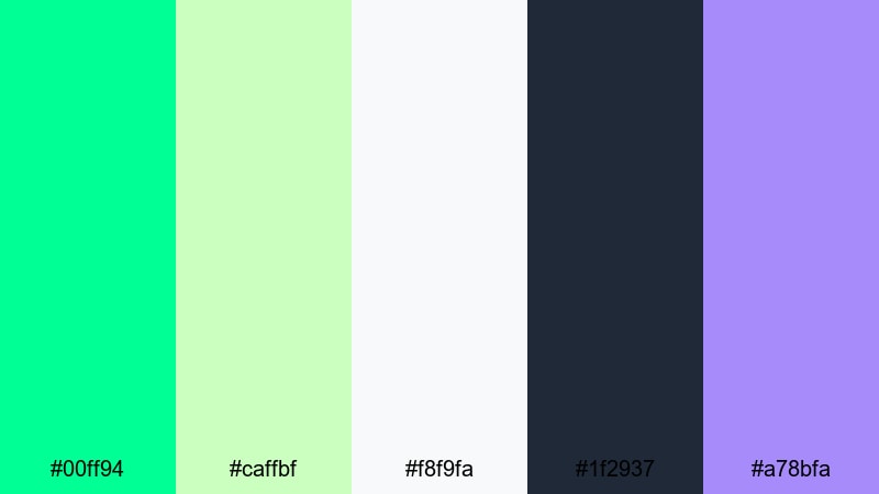
HEX: #00ff94 #caffbf #f8f9fa #1f2937 #a78bfa
Mood: energizing, minimal, techy
Best for: Landing page UI
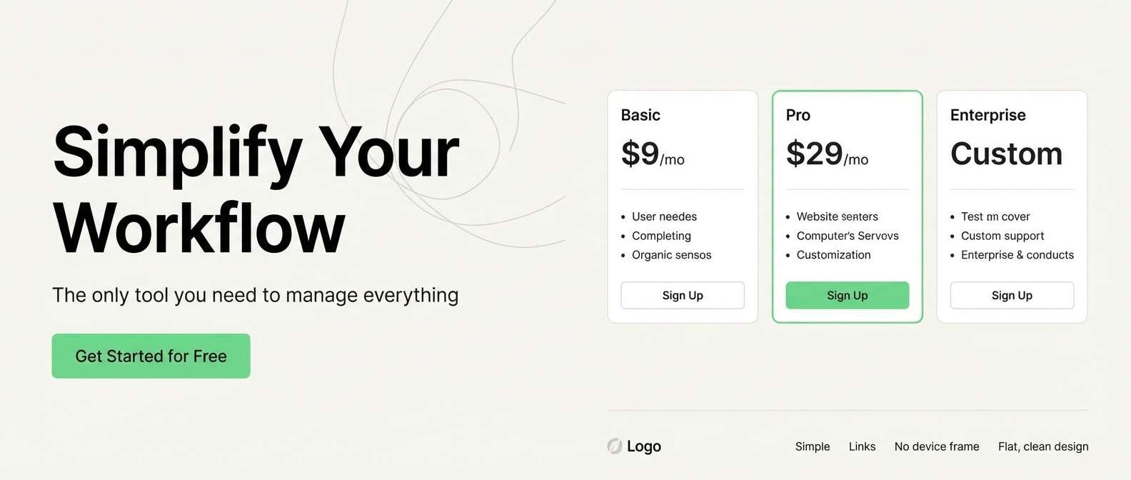
Let the neon spring green do one job: the primary CTA and one or two key icons in the hero section. Use near-white for most surfaces and spacing, so the page stays minimal and fast to scan. Put charcoal on headings, body text, and nav to meet contrast needs. Use violet for premium accents like feature badges or small highlights, not large sections.
Image example of spring tonic generated using media.io
6) Clover & Cream
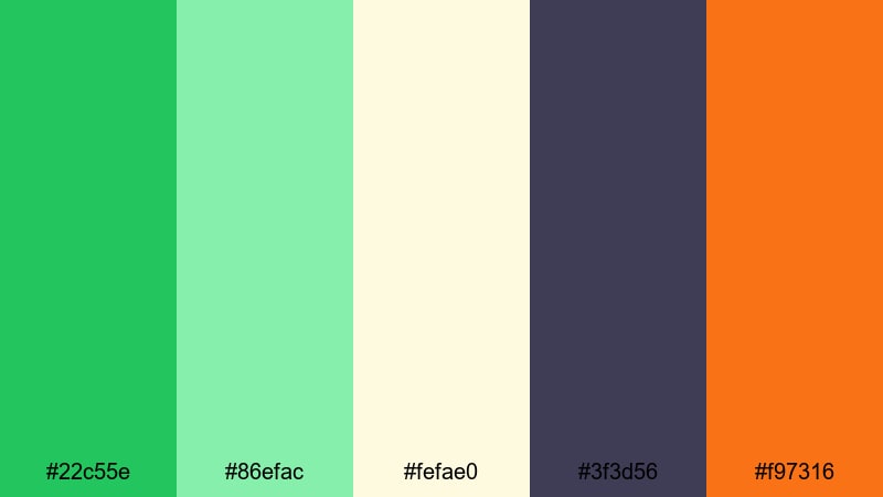
HEX: #22c55e #86efac #fefae0 #3f3d56 #f97316
Mood: wholesome, warm, approachable
Best for: Cafe menu design
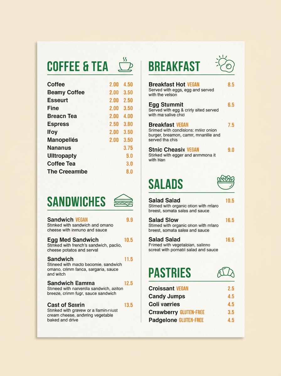
Use the creamy tone as the menu background for easy reading under different lighting. Place the dark neutral on item names and prices to keep hierarchy stable in print. Add clover greens for section headers, lines, and small icons. Use orange to spotlight specials or limited offers; it works best in small blocks so the spring green tones remain the main identity cue.
Image example of clover & cream generated using media.io
7) Rainwashed Fern
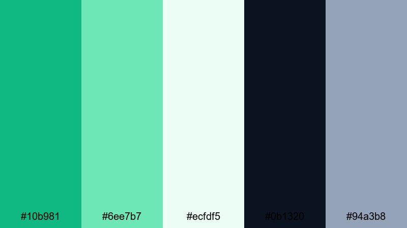
HEX: #10b981 #6ee7b7 #ecfdf5 #0b1320 #94a3b8
Mood: calm, fresh, professional
Best for: Data visualization
Use the darker fern spring green for the primary data series and important KPI indicators. Assign the mint to secondary series or comparison lines so the chart still reads as one system. Keep the pale mint-white as the chart canvas for a light, modern look. Use near-black for labels and axes, and the cool gray for gridlines so the focus stays on the data.
Image example of rainwashed fern generated using media.io

8) Pea Shoot Pastels
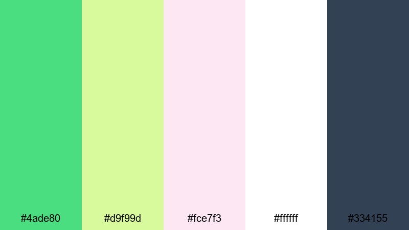
HEX: #4ade80 #d9f99d #fce7f3 #ffffff #334155
Mood: soft, cheerful, youthful
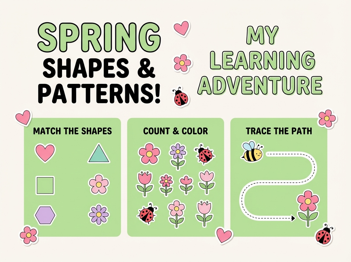
Best for: Kids learning worksheet
Keep white as the main background for print clarity and ink savings. Use the bright spring green for headings, page markers, and check icons to guide attention. Apply the gentle lime to activity boxes so sections feel friendly but still organized. Use slate for instructions and answers for readability, and reserve pink for reward badges or small sticker shapes.
Image example of pea shoot pastels generated using media.io
9) Bamboo Breeze
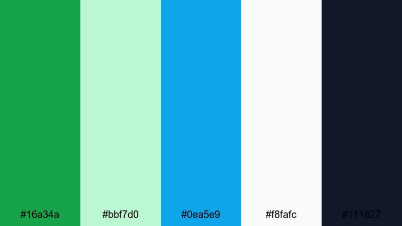
HEX: #16a34a #bbf7d0 #0ea5e9 #f8fafc #111827
Mood: active, clean, outdoorsy
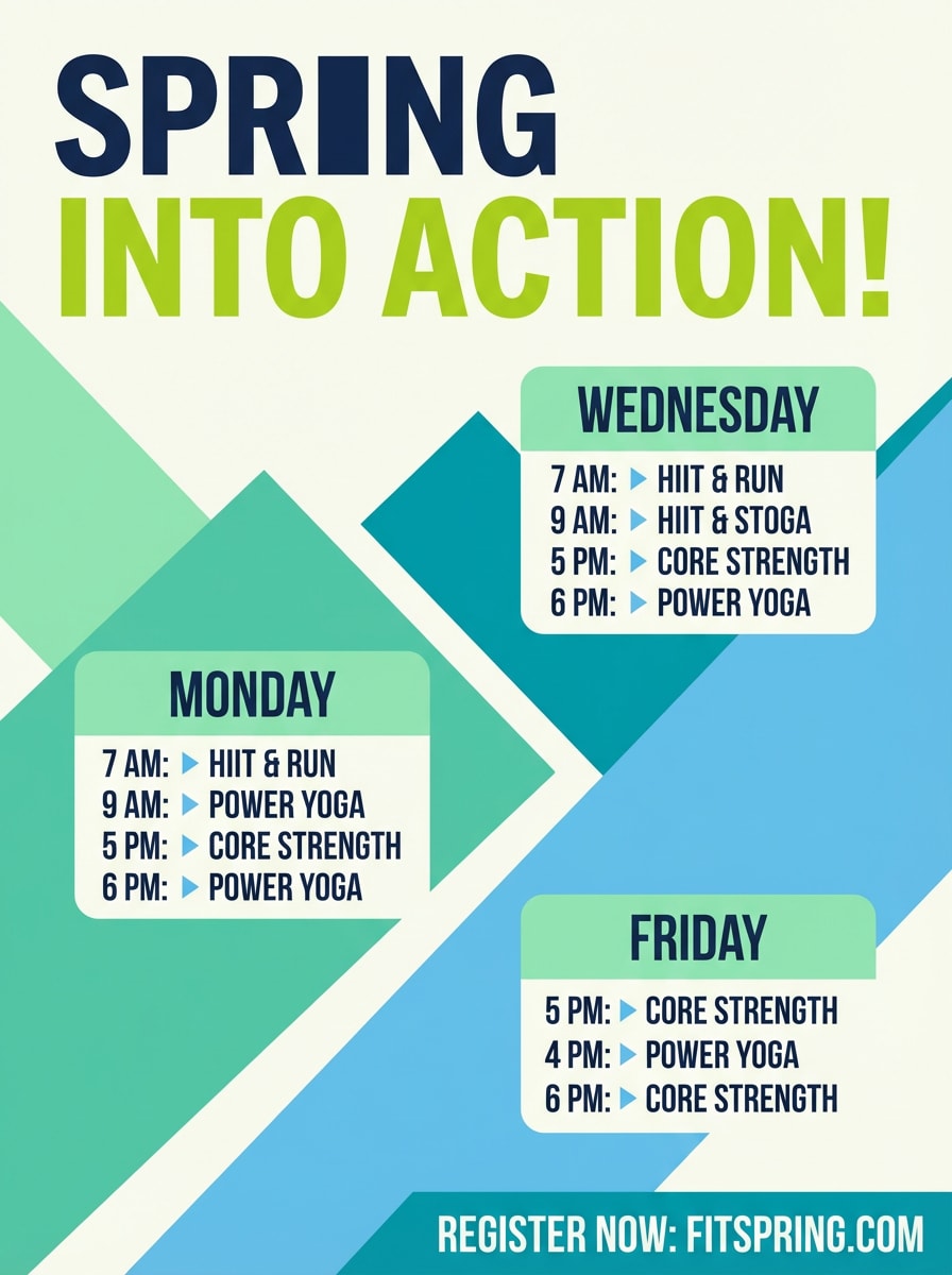
Best for: Fitness flyer
Lead with the bold green in the headline and key offer blocks so the flyer feels energetic. Use mint for large shapes behind schedule sections, keeping edges clean and modern. Add sky blue to label class types or difficulty levels without creating a second competing "main" color. Set body text in near-black for strong readability on print and small sizes.
Image example of bamboo breeze generated using media.io
10) Matcha Marble
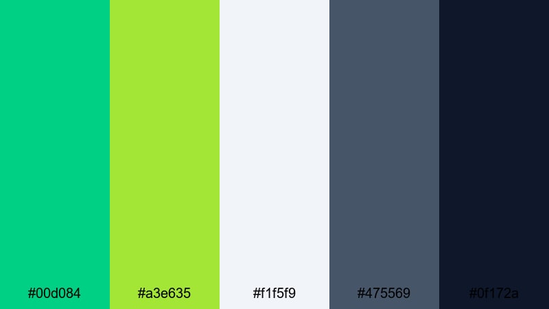
HEX: #00d084 #a3e635 #f1f5f9 #475569 #0f172a
Mood: sleek, modern, editorial
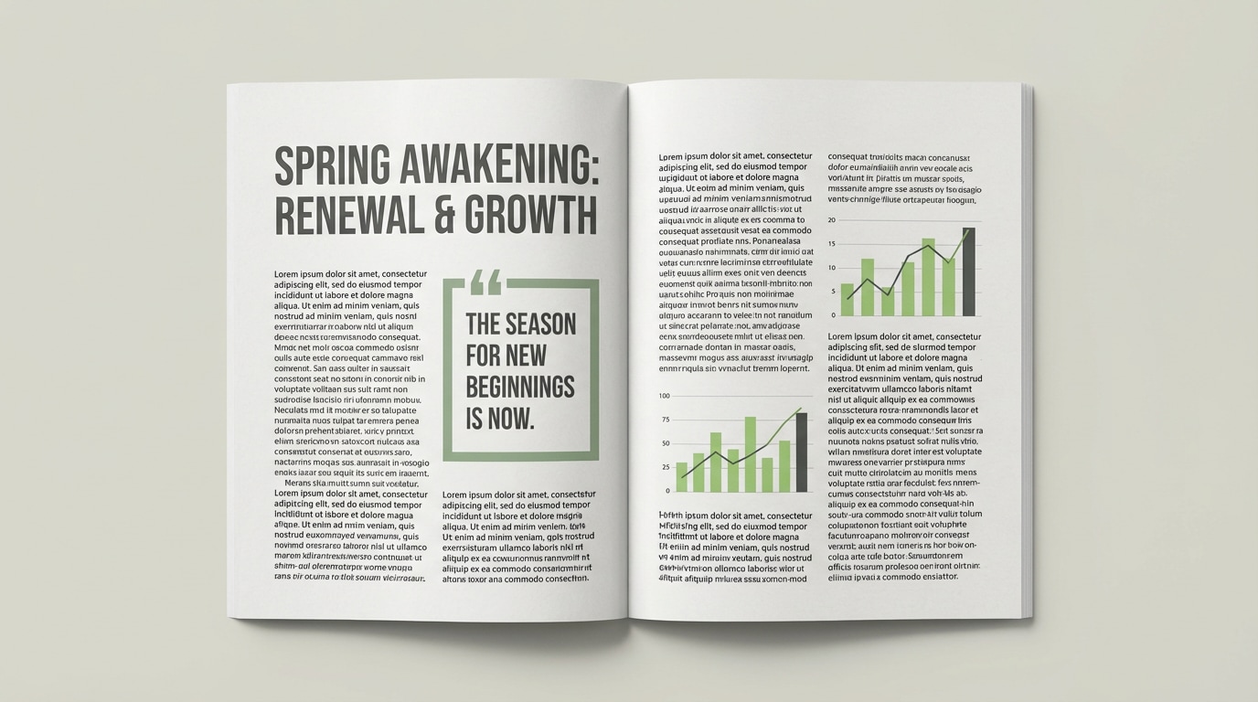
Best for: Magazine layout
Use the dark navy and slate for typography, grid structure, and captions to keep the editorial voice mature. Bring spring green in as a directional accent: section markers, pull quotes, or small rules. Use the lime to highlight infographics or a single data color in charts. Keep the light gray background subtle so images and text remain the focus.
Image example of matcha marble generated using media.io
11) Greenhouse Glow
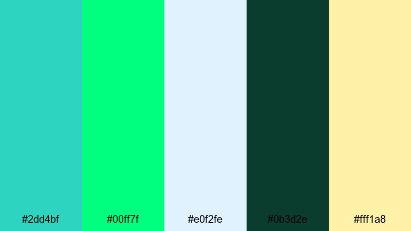
HEX: #2dd4bf #00ff7f #e0f2fe #0b3d2e #fff1a8
Mood: bright, botanical, sunny
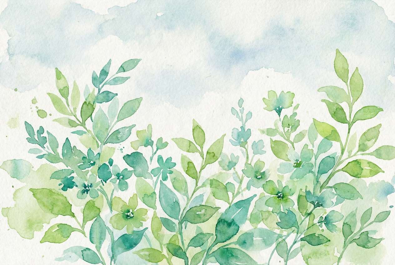
Best for: Watercolor spring illustration
Blend spring green with teal as your main leaf range: spring green for fresh light areas, teal for shadows and depth. Use the pale sky tint as the background wash so the composition stays airy. Add the deep green as a grounding tone for stems or darker clusters. Use soft yellow only at highlight points like flower centers or sunlit edges.
Image example of greenhouse glow generated using media.io
12) Citrus Grove
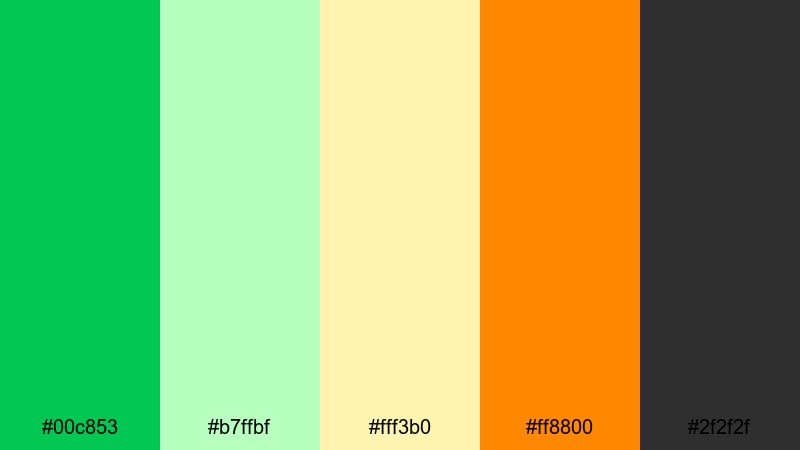
HEX: #00c853 #b7ffbf #fff3b0 #ff8800 #2f2f2f
Mood: zesty, bold, approachable
Best for: Product ad
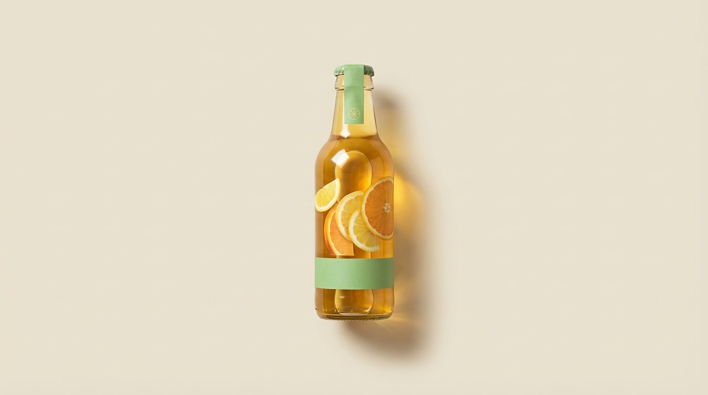
Use spring green as the hero cue for freshness, especially on labels, headline bars, or key ingredient claims. Keep the pale mint for background fields so you can place product photos and pricing without clutter. Use warm yellow and orange to drive appetite and urgency in small accents (limited edition, new flavor). Keep typography in charcoal for clear contrast across formats.
Image example of citrus grove generated using media.io
13) Eucalyptus Mist
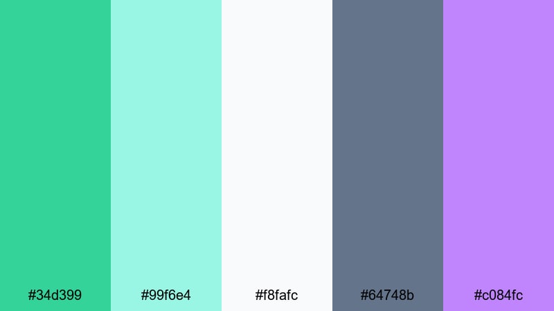
HEX: #34d399 #99f6e4 #f8fafc #64748b #c084fc
Mood: spa-like, gentle, premium
Best for: Skincare packaging
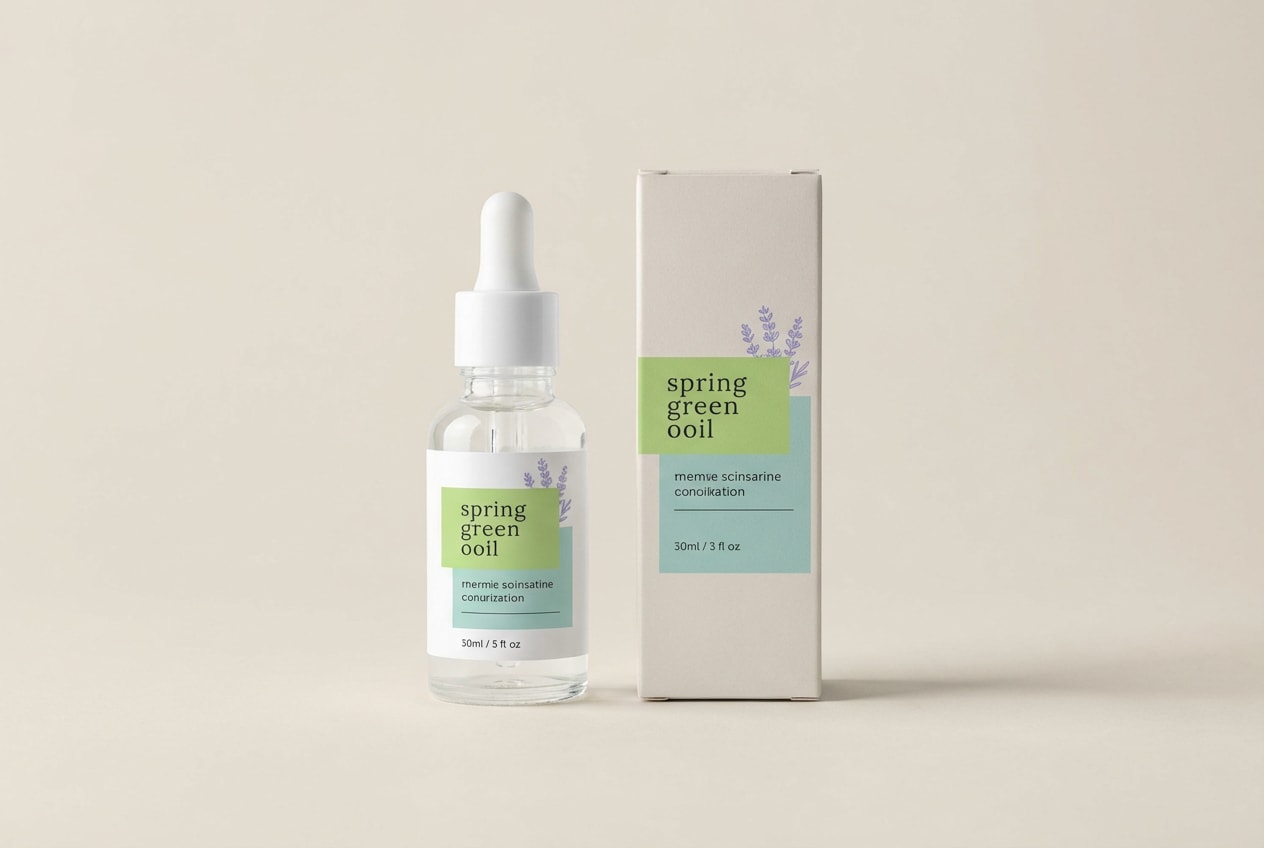
Keep off-white as the main packaging base for a premium, minimal look. Use spring green for the product name, seals, and small line art so the identity feels clean and botanical. Put ingredient lists and instructions in the gray-blue to stay soft but readable. Use lavender as a restrained differentiator for scent or product line, ideally as a thin band or small mark.
Image example of eucalyptus mist generated using media.io
14) Herbarium Notes
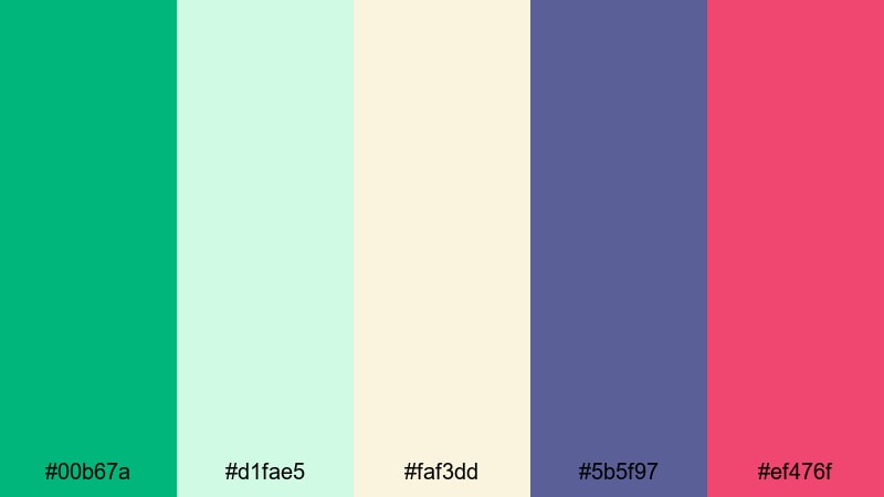
HEX: #00b67a #d1fae5 #faf3dd #5b5f97 #ef476f
Mood: crafty, charming, vintage-modern
Best for: Email newsletter design
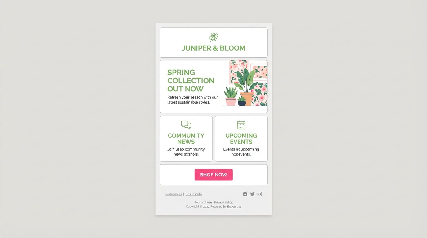
Use spring green for section headers, link color, and small icons to create consistent scanning cues. Apply pale mint to content blocks so modules are clear without hard borders. Use warm cream as the main background to avoid the sterile feel of pure white. Add muted purple for dividers and small illustration accents, then save pink for a single primary CTA button to focus clicks.
Image example of herbarium notes generated using media.io
15) Lucky Pebble
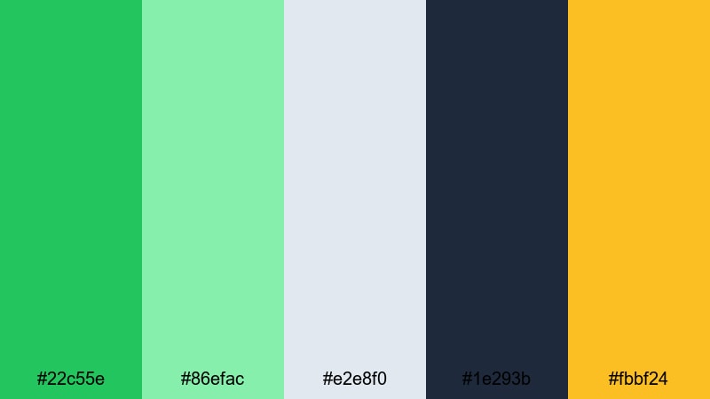
HEX: #22c55e #86efac #e2e8f0 #1e293b #fbbf24
Mood: balanced, confident, accessible
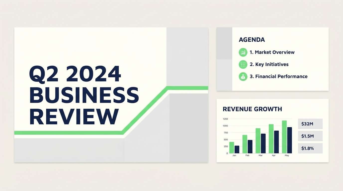
Best for: Presentation slides
Use the cool gray as the default slide background to keep decks consistent and easy to read on projectors. Add spring green to section dividers, icons, and callout panels so key points are visible at a distance. Use deep navy for titles and body text for strong contrast. Add gold only for numbers, targets, or one highlight element per slide to avoid a noisy palette.
Image example of lucky pebble generated using media.io
16) Orchard Blossom
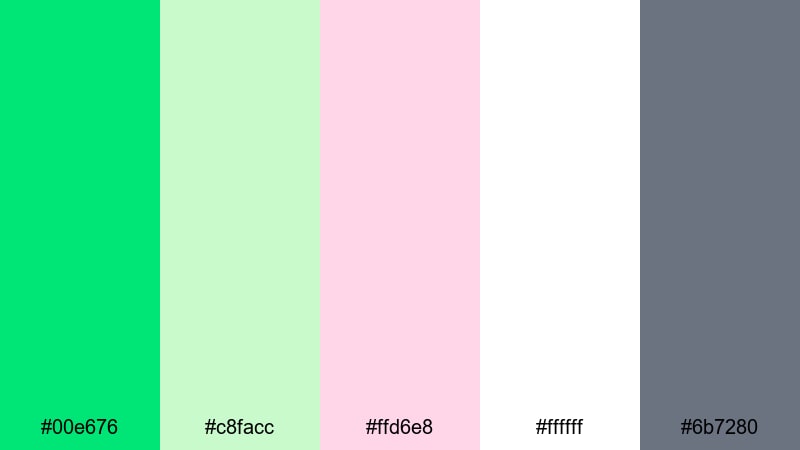
HEX: #00e676 #c8facc #ffd6e8 #ffffff #6b7280
Mood: romantic, fresh, light
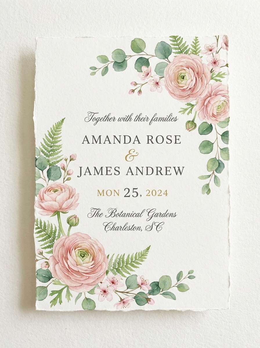
Best for: Wedding invitation
Keep white as the main space for an elegant invitation feel. Use blush pink for floral accents and secondary typography, while spring green supports leaf motifs, borders, or a monogram mark. The lighter green can be used as a soft background block behind details. Use gray for practical information like date, time, and address so everything stays readable in print.
Image example of orchard blossom generated using media.io
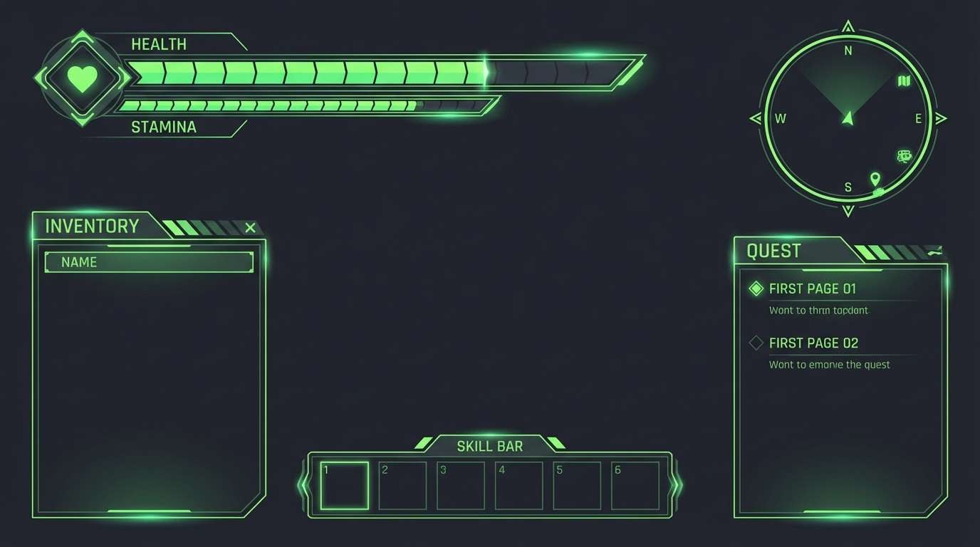
17) Neon Canopy
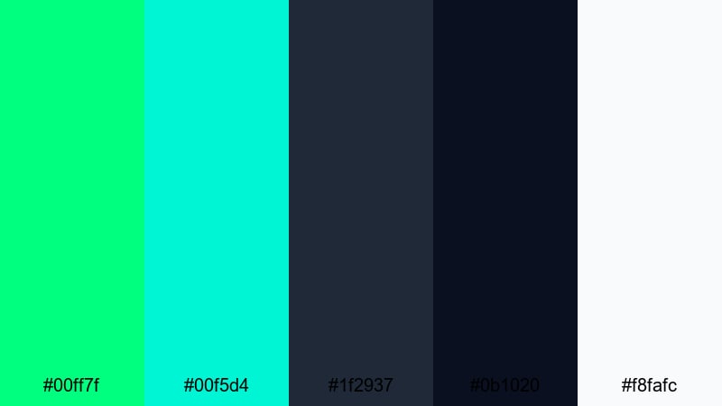
HEX: #00ff7f #00f5d4 #1f2937 #0b1020 #f8fafc
Mood: futuristic, high-contrast, bold
Best for: Gaming UI overlay
Use neon spring green as the priority highlight for active states, status indicators, and important meters. Apply teal to secondary meters or hover states so the overlay remains cohesive. Keep surfaces dark to reduce eye strain and increase perceived brightness of the accents. Reserve white for critical labels, numbers, and small UI details that must be readable during fast gameplay.
Image example of neon canopy generated using media.io
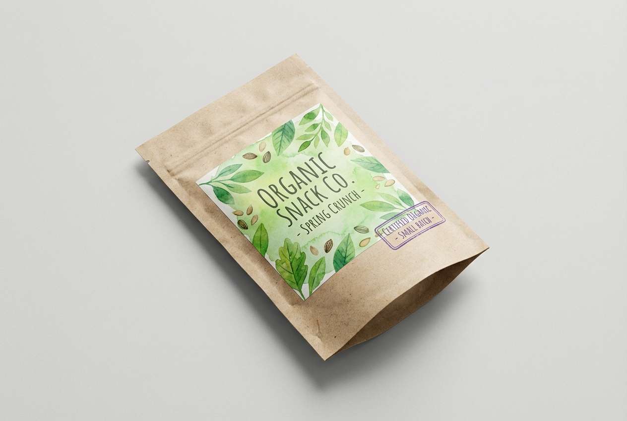
18) Eco Market
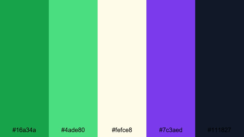
HEX: #16a34a #4ade80 #fefce8 #7c3aed #111827
Mood: natural, bold, trustworthy
Best for: Packaging label
Use the darker green for the brand mark and the brighter spring green for ingredient panels, patterns, or secondary badges to create depth without adding more colors. Keep the warm light tone as the label background so it feels like paper stock. Use near-black for legible nutrition and legal text. Add purple only as a small stamp, flavor tag, or SKU marker to differentiate variants.
Image example of eco market generated using media.io
19) Seaside Sprout
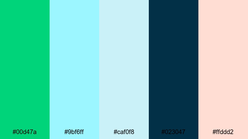
HEX: #00d47a #9bf6ff #caf0f8 #023047 #ffddd2
Mood: breezy, light, refreshing
Best for: Social media post template
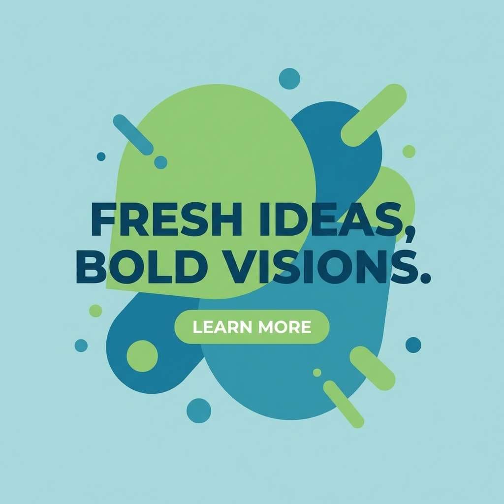
Use spring green as the main highlight band and the CTA button so the post reads clearly in a fast scroll. Apply ocean blues to backgrounds and rounded shapes to keep the layout light and airy. Use deep navy for headlines and body copy to ensure contrast on mobile screens. Keep peach as a small sticker or emphasis word so it adds warmth without taking over the scheme.
Image example of seaside sprout generated using media.io
20) Verdant Studio
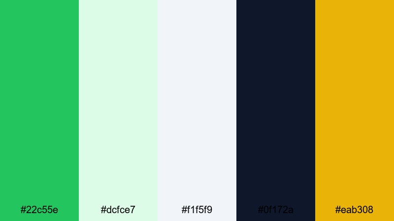
HEX: #22c55e #dcfce7 #f1f5f9 #0f172a #eab308
Mood: tidy, modern, homey
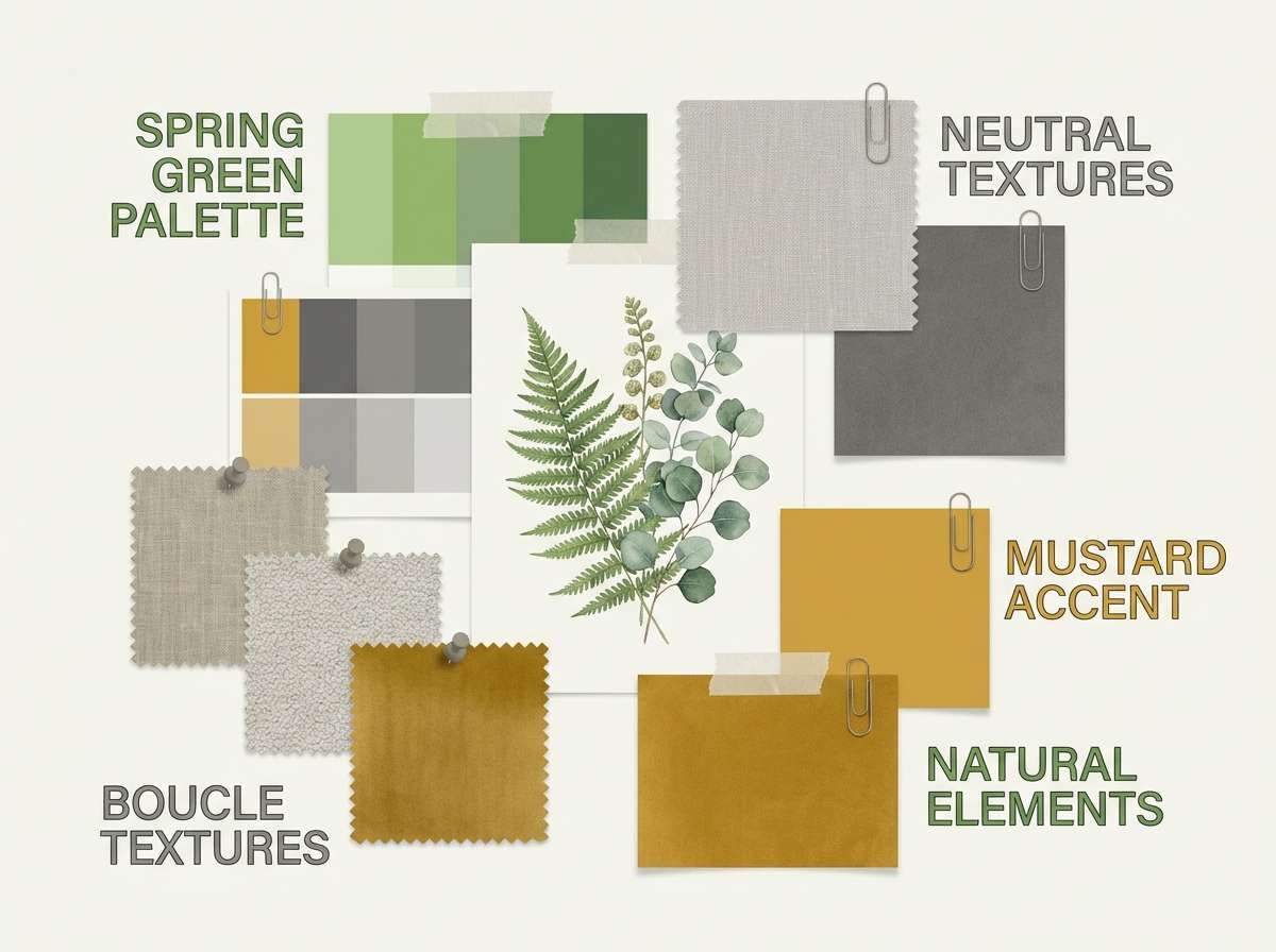
Best for: Interior mood board
Use spring green as the accent tag color for plants, textiles, and small decor notes, while keeping most surfaces in light neutrals to feel calm. Apply dark navy for labels and headings so swatches remain readable. Use pale green for soft blocks behind material samples. Add mustard as a warm cue for wood tones, brass details, or lighting notes so the board does not feel cold.
Image example of verdant studio generated using media.io
What Colors Go Well with Spring Green?
- Pairing: Spring green + deep navy/charcoal creates crisp contrast for readable UI text and navigation (great for a spring green palette for UI).
- Pairing: Spring green + off-white/cream feels clean and light for landing pages, editorial layouts, and print systems.
- Pairing: Spring green + teal shifts the mood toward wellness and tech; useful for dashboards, data viz, and modern branding.
- Pairing: Spring green + coral/pink adds personality and warmth; best for CTA buttons, stickers, and social graphics.
- Pairing: Spring green + amber/yellow brings friendly energy for alerts, promos, and event info in a spring green palette for posters.
- Pairing: Spring green + lavender/violet reads more premium and contemporary; use for badges, product lines, or hero highlights in branding.
How to Use a Spring Green Color Palette in Real Designs
- Limit spring green to "meaningful" UI roles: use it for primary actions, success states, and selected items. When everything is spring green, nothing looks important.
- Pick one warm accent at most: amber or coral works well, but keep it to notifications, promo tags, or one CTA variant. This keeps these spring green tones from turning into a traffic-light interface.
- Support readability with deep neutrals: pair your spring green color scheme with navy/charcoal for text and icons. Avoid setting long paragraphs in bright green.
- Make print safer: for menus, flyers, and a spring green palette with HEX codes used in print, shift large green backgrounds toward pale mint and keep bright spring green for headings and markers.
Create Spring Green Palette Visuals with AI
If you need fast mockups for a spring green palette for branding, UI, packaging, or social posts, generate consistent visuals with Media.io. Use the prompts above as-is, then iterate by changing the subject (dashboard, poster, invitation) while keeping the same spring green color combinations. For tighter control, ask for "flat vector, plain background" or "studio shot, soft shadow" depending on the style.
Spring Green Color Palette FAQs
-
What is the HEX code for spring green?
A common reference is #00FF7F, but spring green tones can vary from softer mint-leaning greens to brighter neon-leaning greens depending on the palette. -
Is spring green good for UI design?
Yes, it works well as an accent for CTAs, success states, and active navigation. Pair it with dark neutrals for text to maintain contrast and accessibility. -
What colors balance a spring green color scheme?
Deep navy/charcoal, off-white, and cool grays balance the brightness. For accents, coral, amber, teal, or violet can work if used sparingly. -
How many accent colors should I use with spring green?
Usually one accent plus neutrals is enough. Spring green is already strong, so adding multiple warm accents can make layouts feel busy. -
Can I use a spring green palette for posters and print?
Yes. For print, use pale mint as large background areas and reserve bright spring green for headlines, icons, or callouts to reduce oversaturation. -
How do I keep spring green from looking too neon?
Reduce its surface area, surround it with off-white or light gray, and shift supporting greens toward softer mint. Dark neutrals also help the color feel more intentional.
Next: Silver Color Palette


