

Planning seasonal visuals is easier when you start with consistent Valentine's Day color palettes that already work together. Below you will find 20 ready-to-use Valentine's Day color combinations with HEX codes, practical usage notes, and AI prompts you can run in Media.io to generate matching posters, UI mockups, packaging, and social graphics. Use these Valentine's Day tones to keep contrast readable while still feeling romantic and on-theme.
In this article
Why Valentines Day Palettes Work So Well
A Valentine's Day color scheme works because it is built on clear emotional cues (love, warmth, celebration) and strong contrast options (deep wine vs blush, neon vs navy). When you apply these Valentine's Day tones consistently, even simple layouts feel intentional across social, print, and UI.
- They create instant recognition: reds, pinks, and creams signal the holiday in seconds.
- They support strong hierarchy: deep shades for headlines/CTAs, tints for backgrounds and spacing.
- They photograph and print well: warm neutrals reduce harshness and keep skin/product shots flattering.
- They scale across formats: from a Valentine's Day palette for branding to a Valentine's Day palette for posters and short-form video graphics.
20+ Valentines Day Color Palette Ideas (with HEX Codes)
Each option below is a Valentine's Day palette with HEX codes plus guidance for backgrounds, text, buttons, and accents. Mix-and-match only if you keep contrast predictable and limit hero colors to one main and one accent.
1) Rose Kiss
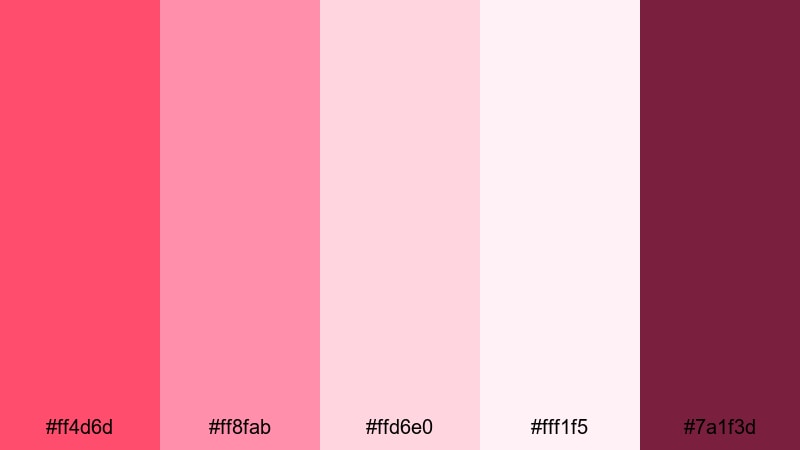
HEX: #ff4d6d #ff8fab #ffd6e0 #fff1f5 #7a1f3d
Mood: romantic, bright, sweet
Best for: Instagram post graphics
Use the saturated rose as your main headline color and for heart icons, then place content on blush tints to keep the composition light. Reserve the deep wine for CTA buttons, small labels, and key dividers so text stays readable on mobile while still feeling like a classic Valentine's Day color scheme.
Image example of rose kiss generated using media.io

Media.io is an online AI studio for creating and editing video, image, and audio in your browser.

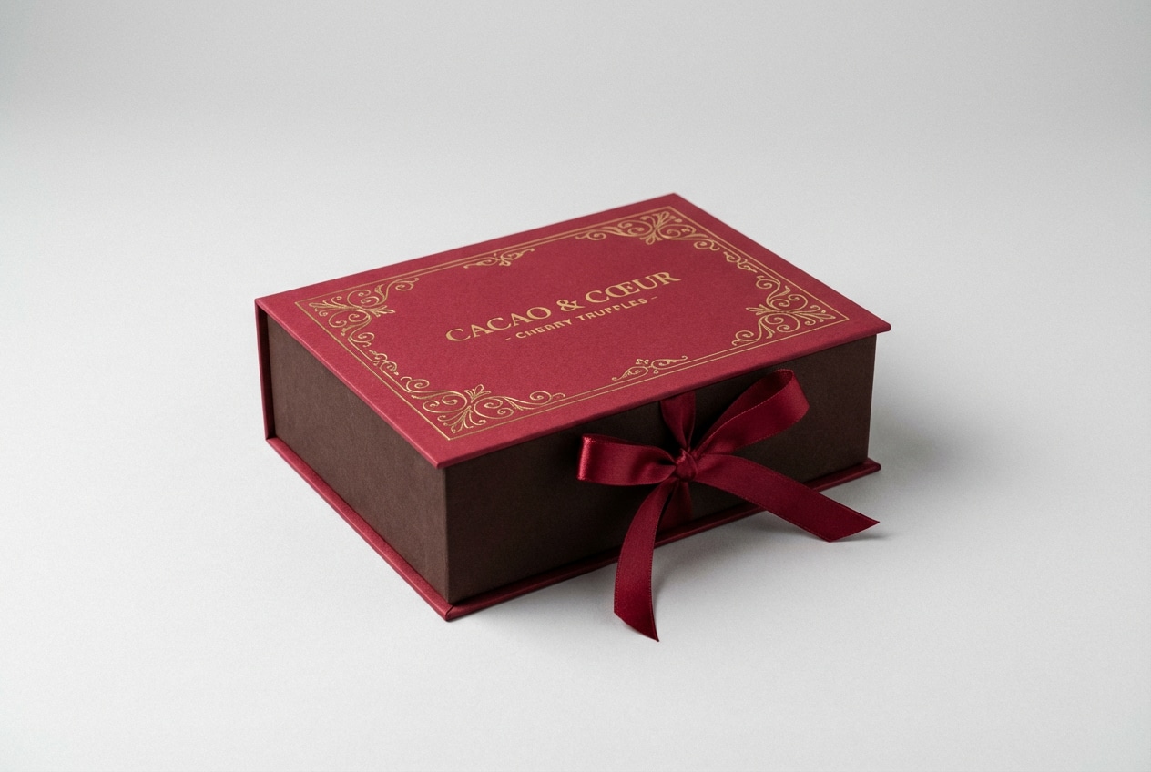
2) Cherry Truffle
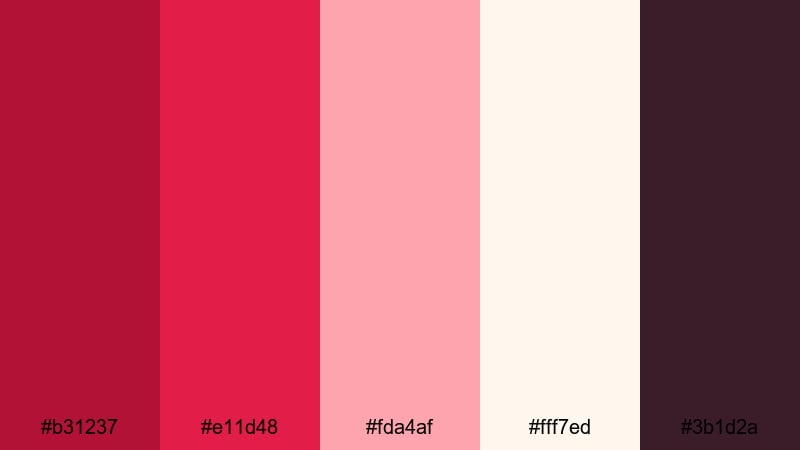
HEX: #b31237 #e11d48 #fda4af #fff7ed #3b1d2a
Mood: luxe, cozy, dramatic
Best for: Chocolate packaging design
Let the cocoa-wine shades carry the background and key panels, with cherry red reserved for the product name and premium highlights. Use cream as negative space for ingredients and barcode areas, and keep pink for small flavor callouts so these Valentine's Day color combinations feel rich rather than overly sweet.
Image example of cherry truffle generated using media.io
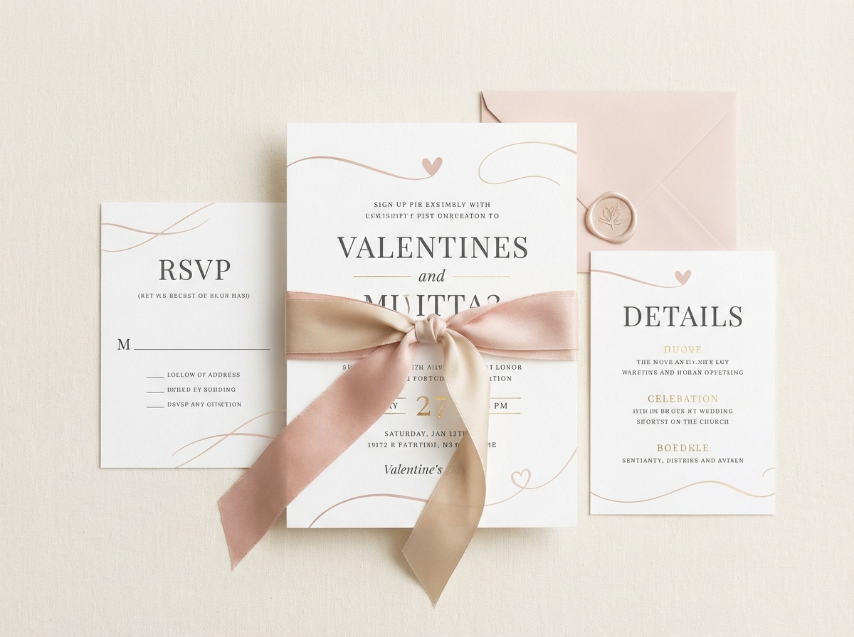
3) Blush & Champagne
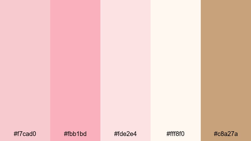
HEX: #f7cad0 #fbb1bd #fde2e4 #fff8f0 #c8a27a
Mood: soft, elegant, airy
Best for: Wedding invitation suite
Use warm white as the main paper-like background, then layer blush tints for frames and section blocks. Apply champagne gold only to small details (rules, monograms, seals) so the invitation stays readable and refined; this Valentine's Day color scheme works best when gold is an accent, not a fill.
Image example of blush & champagne generated using media.io
4) Cupid Neon
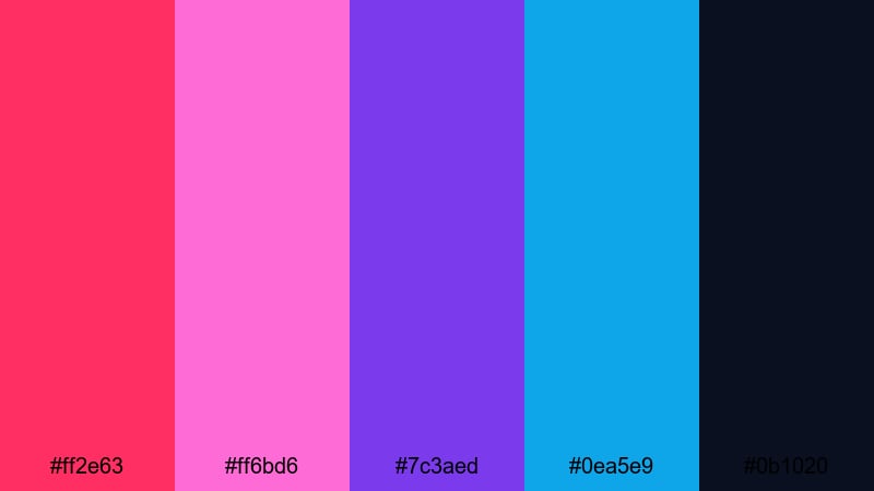
HEX: #ff2e63 #ff6bd6 #7c3aed #0ea5e9 #0b1020
Mood: playful, modern, nightlife
Best for: Event poster design
Start with the dark navy as a full-bleed background to control the intensity of neon hues. Use neon pink for the main title and violet for secondary typography, then add cyan for date/location and small graphic accents. This Valentine's Day palette for posters stays legible when you keep neon areas tight and high-contrast.
Image example of cupid neon generated using media.io
5) Strawberry Milk
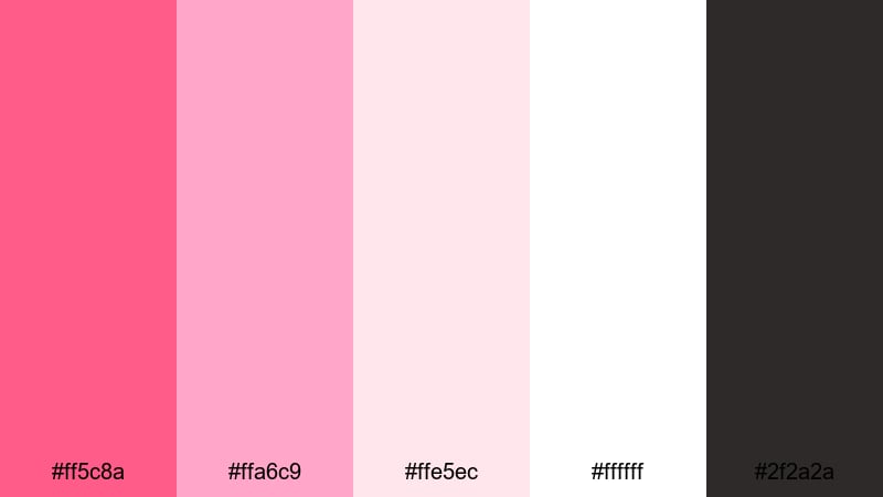
HEX: #ff5c8a #ffa6c9 #ffe5ec #ffffff #2f2a2a
Mood: cute, friendly, clean
Best for: Mobile app UI theme
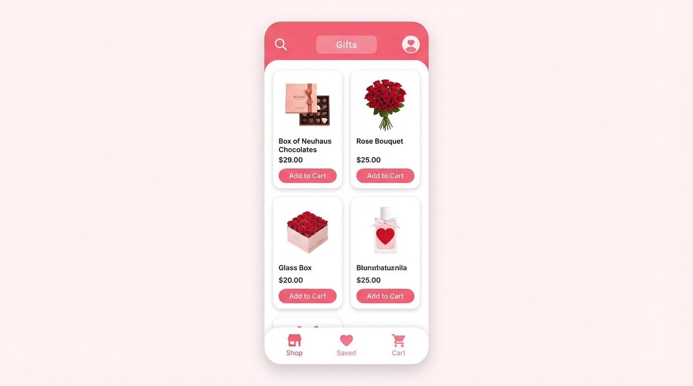
Keep white as the main surface and use the light pink tint for section backgrounds and inactive components. Reserve strawberry pink for primary buttons, toggles, and selected states so the UI feels seasonal without losing clarity. Use charcoal for text to meet accessibility needs in a Valentine's Day palette for UI.
Image example of strawberry milk generated using media.io
6) Rosewood & Cream
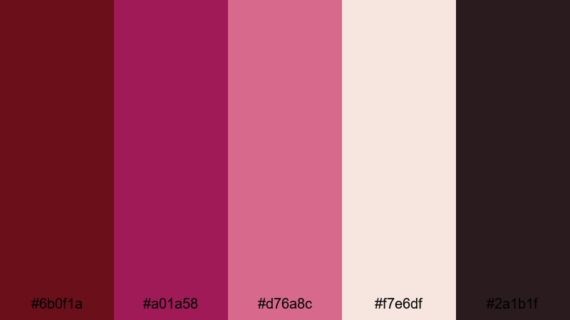
HEX: #6b0f1a #a01a58 #d76a8c #f7e6df #2a1b1f
Mood: vintage, warm, intimate
Best for: Brand identity for a florist
Use rosewood for the logo, headline typography, and key brand stamps to anchor the identity. Keep cream as the primary background across web and print, and bring in muted pink for patterns, ribbons, and supporting graphics. The dark accent is best for fine print and contrast lines within these Valentine's Day tones.
Image example of rosewood & cream generated using media.io
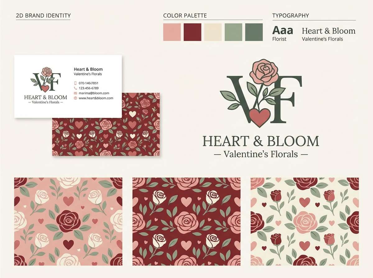
7) Peony Pastels
HEX: #ffb3c6 #ffd6e0 #cdb4db #bde0fe #fff1e6
Mood: dreamy, gentle, romantic
Best for: Watercolor floral illustration
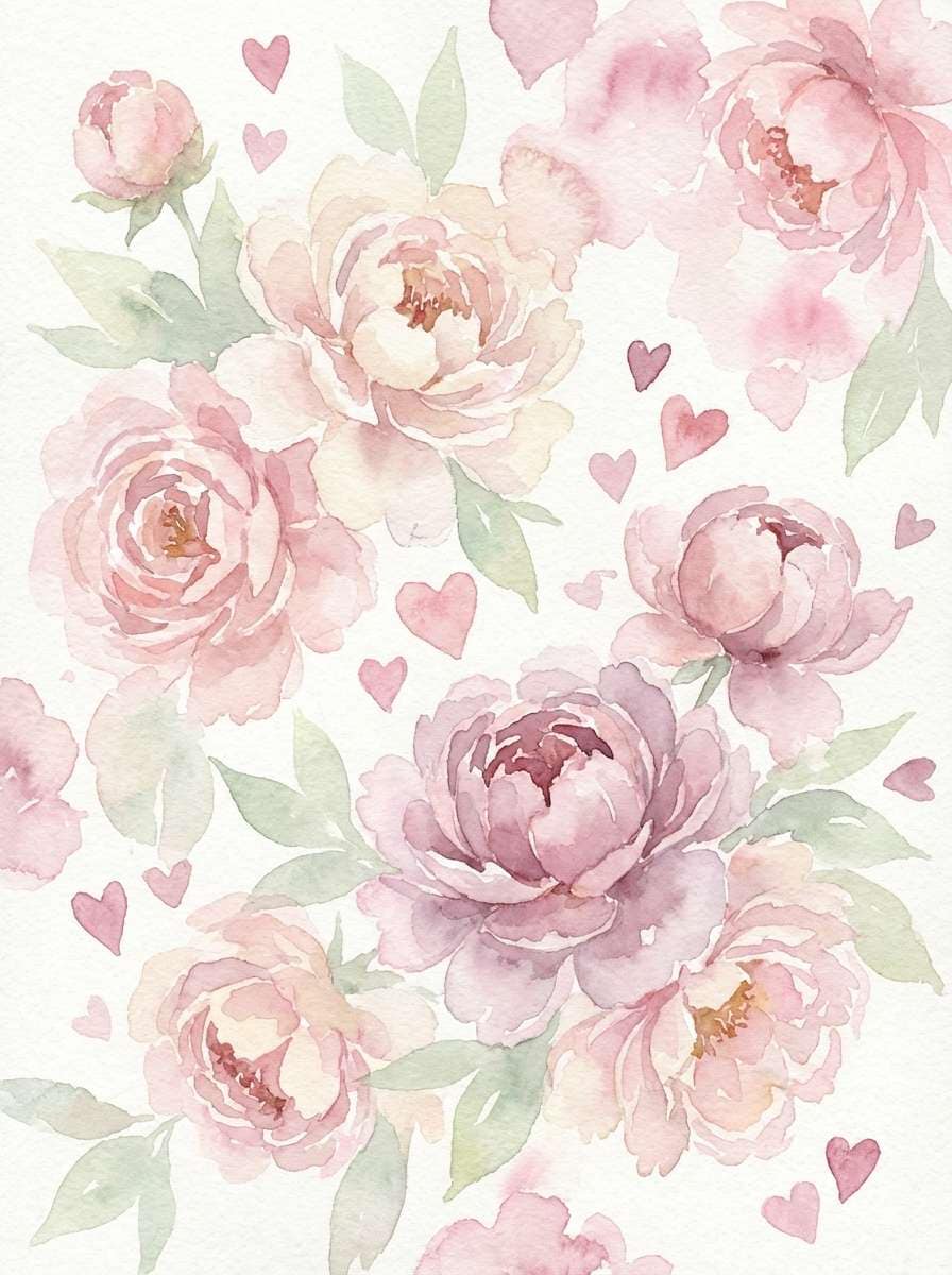
Use the peachy cream as your paper tone and build petals with the pink and blush layers for soft depth. Add lilac for cool shadow areas, and use the pale blue only in small amounts to separate elements without stealing focus. This Valentine's Day color scheme is ideal when you want low-contrast, calm visuals.
Image example of peony pastels generated using media.io
8) Love Letter
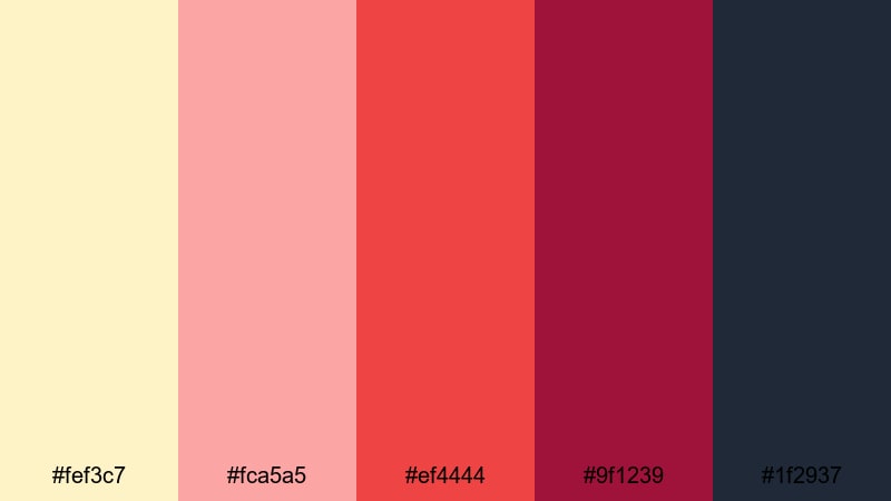
HEX: #fef3c7 #fca5a5 #ef4444 #9f1239 #1f2937
Mood: nostalgic, bold, classic
Best for: Email newsletter header
Use the warm paper tone as the header background and set body text in slate for strong readability. Let deep wine handle the main message and brand mark, then use red for one clear CTA button. Keep the soft pink limited to stamps, icons, or small bands to avoid muddy contrast in email clients.
Image example of love letter generated using media.io

9) Ruby & Lace
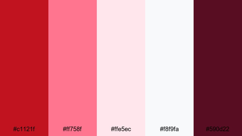
HEX: #c1121f #ff758f #ffe5ec #f8f9fa #590d22
Mood: romantic, refined, feminine
Best for: Boutique product ad
Place the product on a pale pink or off-white background to keep it clean and premium, then use ruby for the logo, price, and key credibility details. The brighter pink is best for callouts like limited edition or free gift. Use the deep accent for thin text and dividers to sharpen this Valentine's Day color scheme.
Image example of ruby & lace generated using media.io
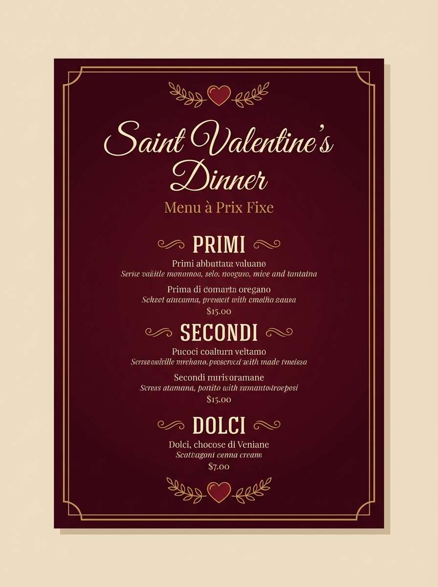
10) Garnet Night
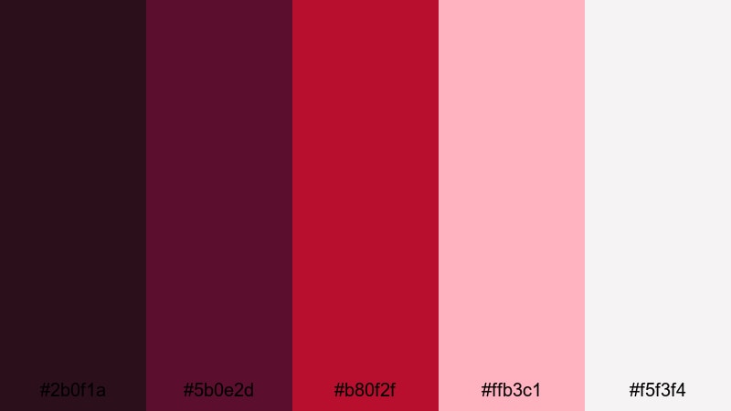
HEX: #2b0f1a #5b0e2d #b80f2f #ffb3c1 #f5f3f4
Mood: moody, upscale, cinematic
Best for: Restaurant menu design
Use the near-black garnet as the base and set most text in off-white for easy reading in dim environments. Apply bold red for section headers and key callouts like chef specials. Keep blush for subtle separators, icons, or small highlights so the menu stays elegant rather than loud.
Image example of garnet night generated using media.io
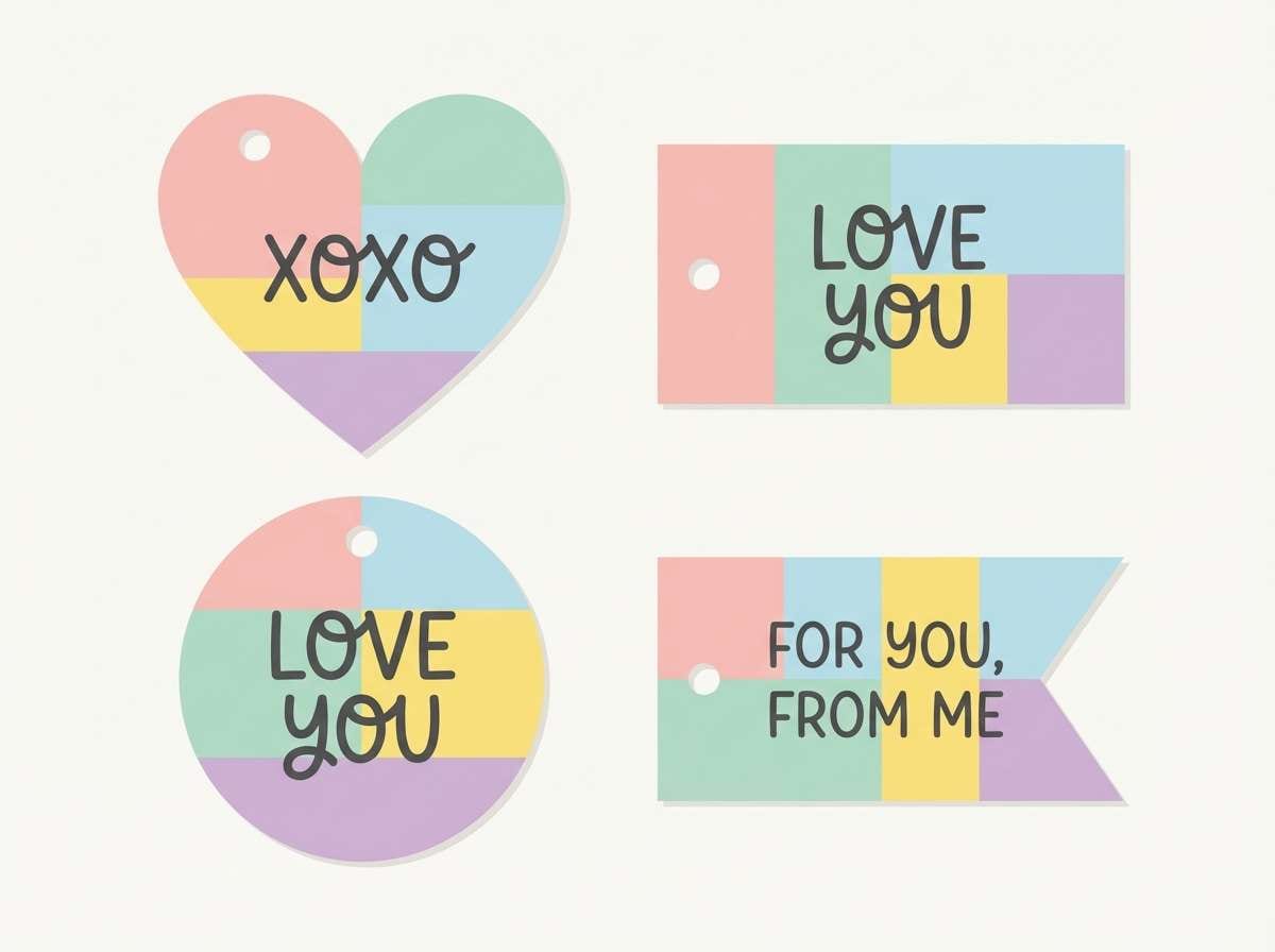
11) Pink Macaron
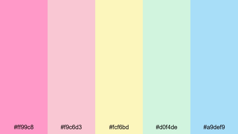
HEX: #ff99c8 #f9c6d3 #fcf6bd #d0f4de #a9def9
Mood: sweet, cheerful, youthful
Best for: Gift tag set
Rotate the pastels so each tag uses one dominant background color, then keep typography consistent with a single dark ink color for readability. Use the candy pink for the main tag title, and reserve mint or sky for secondary shapes and borders. This Valentine's Day palette prints best when you avoid gradients and keep color blocks clean.
Image example of pink macaron generated using media.io
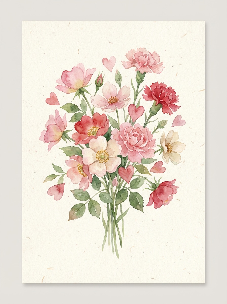
12) Bouquet Fresh
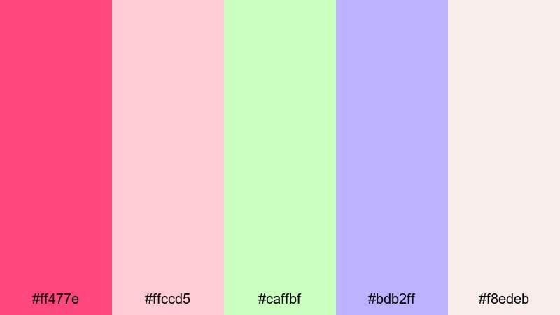
HEX: #ff477e #ffccd5 #caffbf #bdb2ff #f8edeb
Mood: fresh, springy, romantic
Best for: Botanical greeting card illustration
Use pale blush or off-white as the card base, then place hot pink on focal blooms and heart details. Add mint and lilac for greenery and supporting flowers to expand the illustration without making it heavy. Keep your darkest elements minimal (thin outlines or small text) to maintain a light, airy Valentine's Day color scheme.
Image example of bouquet fresh generated using media.io
13) Rose Gold Glow
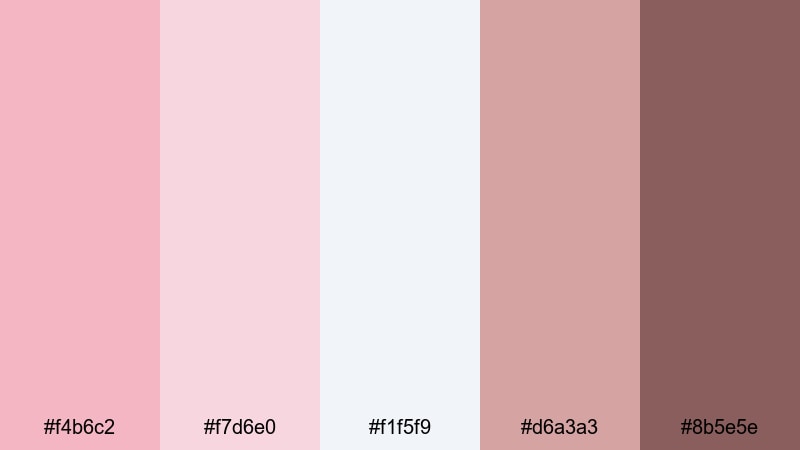
HEX: #f4b6c2 #f7d6e0 #f1f5f9 #d6a3a3 #8b5e5e
Mood: glowy, chic, minimal
Best for: Jewelry product packaging
Use the cool off-white for most surfaces to keep packaging crisp, then layer light blush for inner panels or tissue paper. Treat the rose-gold tones as foil accents (lines, logos, seals) and apply warm taupe for readable text like care notes and legal copy. This Valentine's Day palette for branding feels premium when accents stay small.
Image example of rose gold glow generated using media.io

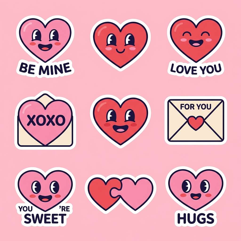
14) Candy Hearts
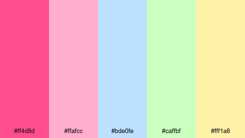
HEX: #ff4d8d #ffafcc #bde0fe #caffbf #fff1a8
Mood: fun, pop, nostalgic
Best for: Sticker pack design
Assign each color to a sticker type (message hearts, stars, small icons) so the set feels organized and easy to scan. Use a consistent outline color and keep fills flat to improve print results and on-screen clarity. These Valentine's Day color combinations work best with generous spacing and a limited shadow style.
Image example of candy hearts generated using media.io
15) Velvet Rose
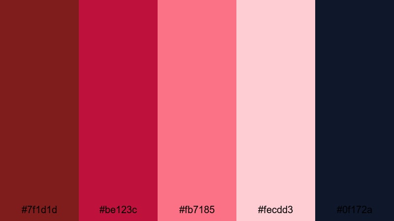
HEX: #7f1d1d #be123c #fb7185 #fecdd3 #0f172a
Mood: dramatic, modern, passionate
Best for: Landing page hero UI
Use midnight blue as the hero background to create depth, then place your main CTA button in bright rose so it is immediately visible. Keep supporting modules in pale pink to reduce fatigue and maintain contrast for longer reading. Apply deep reds for headings and badges, and reserve the brightest pink only for interactive elements.
Image example of velvet rose generated using media.io

16) Lilac Crush
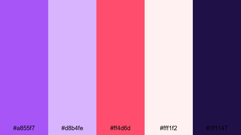
HEX: #a855f7 #d8b4fe #ff4d6d #fff1f2 #1f1147
Mood: flirty, trendy, vibrant
Best for: YouTube thumbnail design
Build a strong title block using the deep violet, and highlight key words with hot pink to increase readability at small sizes. Keep most of the background pale blush so the text stays crisp, and use lilac as a secondary shape color for balance. This Valentine's Day palette for posters and thumbnails works best with large type and simple icons.
Image example of lilac crush generated using media.io

17) Cranberry Soda
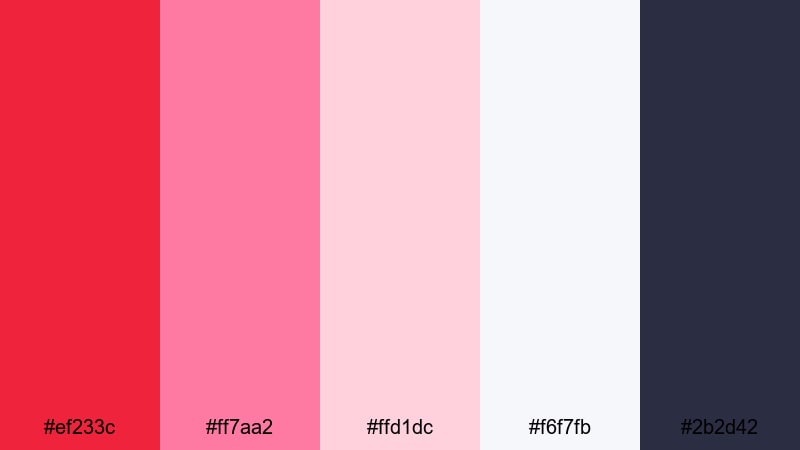
HEX: #ef233c #ff7aa2 #ffd1dc #f6f7fb #2b2d42
Mood: energetic, clean, contemporary
Best for: Promo flyer design
Use cranberry red for the main offer and price, then build sections with pale neutrals so the flyer reads fast. Add pink for icons, highlights, and secondary panels to keep the layout friendly and seasonal. Use the deep slate for body text and fine print; it prevents the design from looking washed out when printed.
Image example of cranberry soda generated using media.io

18) Sweet Minimal
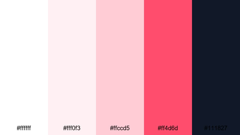
HEX: #ffffff #fff0f3 #ffccd5 #ff4d6d #111827
Mood: minimal, modern, friendly
Best for: Website UI kit
Make white and near-white pink your default surfaces, then apply the mid blush for borders, inputs, and disabled states. Use vivid pink only for primary CTAs and key highlights so the interface stays calm and usable. Keep all text in charcoal for consistent contrast; this Valentine's Day palette for UI is built for clean component systems.
Image example of sweet minimal generated using media.io
19) Vintage Valentine
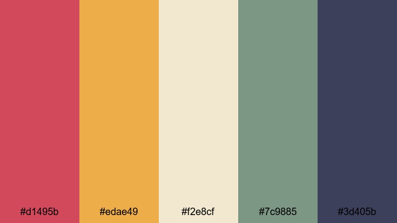
HEX: #d1495b #edae49 #f2e8cf #7c9885 #3d405b
Mood: retro, cozy, artsy
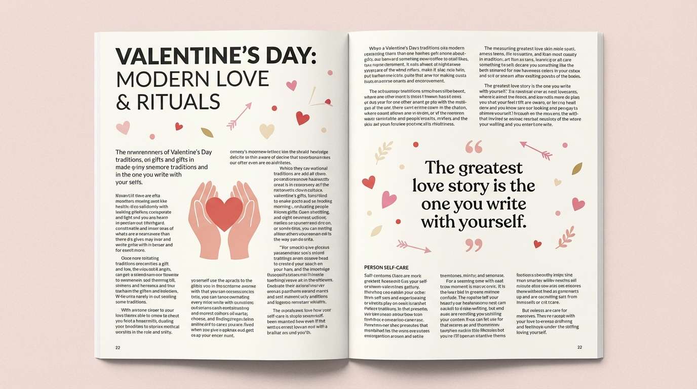
Best for: Editorial magazine spread
Use cream as the page base and set most long-form text in slate-blue for comfortable reading. Bring muted red and mustard into headers, pull quotes, and small illustration accents to create a retro rhythm. Use green for subtle highlights (captions, rules, icons) so this Valentine's Day color scheme feels printed and balanced.
Image example of vintage valentine generated using media.io
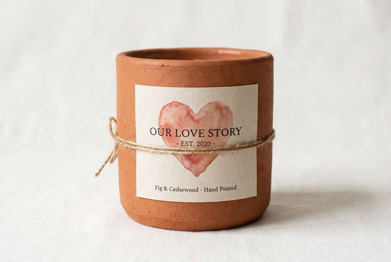
20) Heartfelt Clay
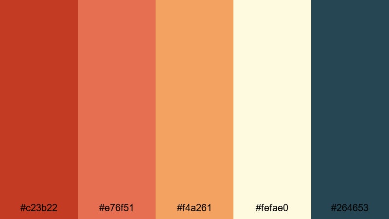
HEX: #c23b22 #e76f51 #f4a261 #fefae0 #264653
Mood: earthy, warm, handcrafted
Best for: Handmade candle label design
Use cream as the label background and set the product name in clay red for a handmade, bold look. Apply terracotta and warm orange for scent notes and small icons to keep the label warm and cohesive. Use teal sparingly for batch details or a small stamp mark to add contrast without breaking the earthy Valentine's Day tones.
Image example of heartfelt clay generated using media.io
What Colors Go Well with Valentines Day?
- Pairing: deep wine + blush creates strong hierarchy; use it for invitations, menus, and premium packaging.
- Pairing: hot pink + warm white feels modern and clean; use it for a Valentine's Day palette for UI and landing pages.
- Pairing: red + cream + charcoal improves readability; use it for email headers, flyers, and text-heavy layouts.
- Pairing: neon pink + navy gives a nightlife vibe; use it for event posters and social promos.
- Pairing: pink + lilac adds a trendy, playful twist; use it for thumbnails, stickers, and youth-focused branding.
- Pairing: terracotta + cream + teal feels handcrafted; use it for candles, coffee shops, and artisan gift labels.
How to Use a Valentines Day Color Palette in Real Designs
- Pick one hero and one CTA color: In most Valentine's Day color combinations, use a single saturated pink/red for headlines and a darker shade (wine, navy, charcoal) for CTAs or key UI states. This prevents a flat, overly sweet look.
- Control contrast with neutrals: If your palette includes multiple pinks, put long text on warm white or off-white, and use dark text (charcoal, deep violet). This is the quickest way to keep a Valentine's Day color scheme accessible.
- Use tints for layout structure: Reserve light pinks for cards, sections, and spacing rather than for important text. This makes a Valentine's Day palette for branding feel more consistent across web, print, and social templates.
- Plan print first if you need packaging: For labels and boxes, avoid using the brightest hue as a full background; use cream/off-white as the base and keep saturated colors for logos and stamps. It reduces ink coverage and keeps details crisp.
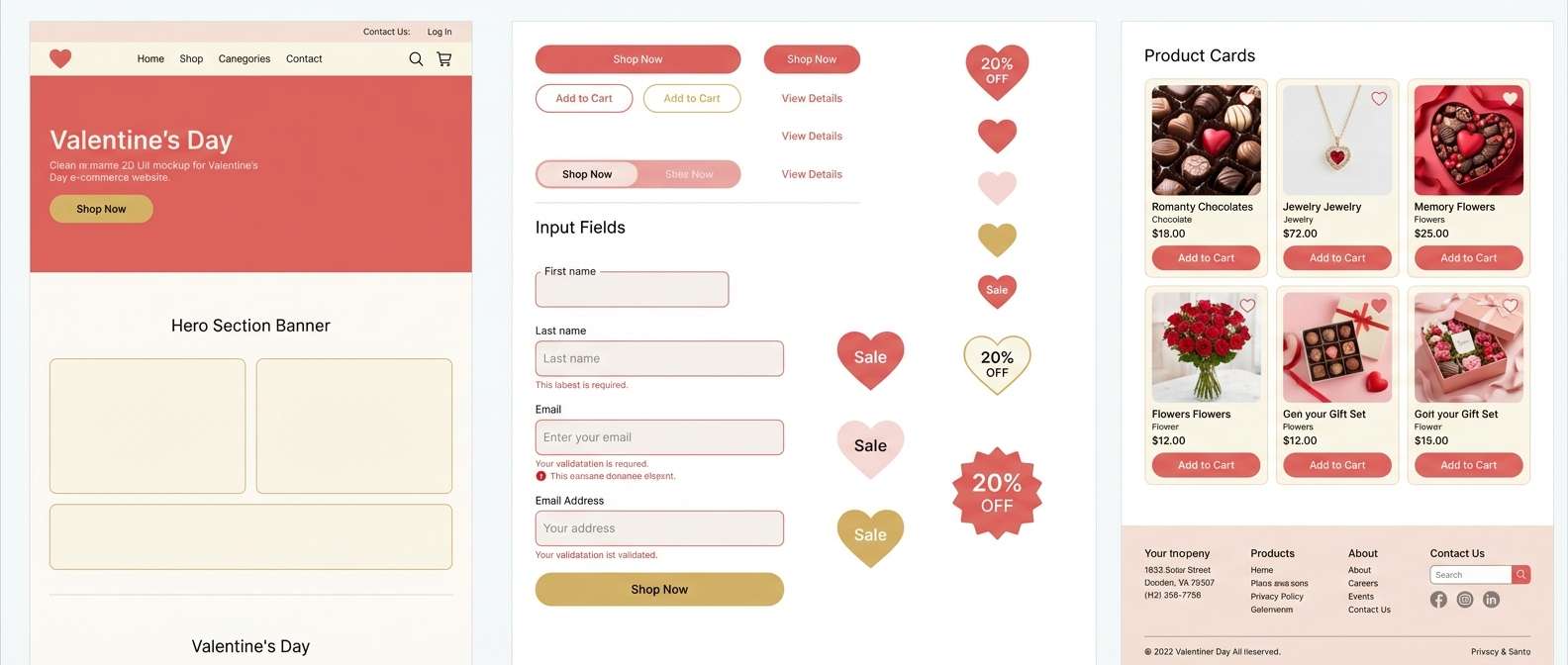
Create Valentines Day Palette Visuals with AI
Once you choose a Valentine's Day color palette, generate matching assets fast using Media.io text-to-image. Start with one prompt per format (poster, UI, label, invitation), keep the aspect ratio consistent, and reuse the same style words so your outputs look like a single campaign.
- For UI: describe components (cards, buttons, inputs), spacing, and a clean background to get usable layout ideas.
- For posters and flyers: specify a grid, bold typography, and "flat 2d" if you want print-ready shapes.
- For packaging: ask for a realistic studio shot, seamless background, and soft studio lighting for clean mockups.
Media.io is an online AI studio for creating and editing video, image, and audio in your browser.
Valentines Day Color Palette FAQs
-
What is the best Valentine's Day color palette for modern designs?
Try a minimal Valentine's Day color scheme with white, blush, and one vivid pink for CTAs, plus charcoal for text. It feels seasonal without looking busy. -
Can I use purple or blue in Valentine's Day colors?
Yes. Violet, lilac, and navy pair well with pink and red, adding contrast for posters, thumbnails, and nightlife-themed campaigns. -
How do I make Valentine's Day tones accessible for UI?
Use dark text (charcoal, deep violet, navy) on light backgrounds, and test button contrast. Keep saturated pinks for interactive states, not body copy. -
What is a safe background color for valentines graphics?
Warm white, cream, or very light blush are the safest. They keep readability high and let reds and pinks work as accents. -
Where can I get a Valentine's Day palette with HEX codes?
This page includes 20 Valentine's Day color combinations with HEX values you can copy directly into Figma, Photoshop, Canva, or CSS. -
How many colors should I use from a Valentine's Day color palette?
In most designs, use 3 to 4 actively (background, text, hero, CTA) and keep the remaining shades for tints, borders, and small highlights.
Next: Easter Color Palette


