

A sunrise color palette blends warm oranges, blush pinks, and soft yellows to recreate that first-light glow. It’s a reliable way to make visuals feel welcoming, hopeful, and energetic without looking harsh.
Below are 20 curated sunrise color combinations with HEX color codes, plus quick tips for pairing them in branding, UI, posters, and prints.
In this article
Why Sunrise Palettes Work So Well
Sunrise colors naturally balance warmth and softness, which helps designs feel approachable while still looking polished. That mix is especially useful for landing pages, posters, and social graphics that need quick emotional impact.
These palettes also create an easy sense of depth: light creams act as atmosphere, oranges provide energy, and blues or deep navies add structure. With the right contrast, you can keep the glow while staying readable.
Because sunrise hues are common in nature, they tend to feel “right” across cultures and industries. From wellness to travel to entertainment, dawn tones can signal freshness, optimism, and momentum.
20+ Sunrise Color Palette Ideas (with HEX Codes)
1) Dawn Blush
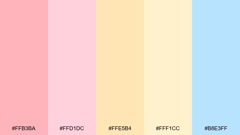
HEX: #FFB3BA #FFD1DC #FFE5B4 #FFF1CC #B8E3FF
Mood: soft, romantic, airy
Best for: wedding invitations and gentle skincare branding
Soft and romantic, these tones feel like first light on petals and linen. Use them for invitations, beauty labels, and calm landing pages where warmth matters more than contrast. Pair with thin serif typography, off-white space, and a muted navy for legibility. Tip: keep the blue as a small accent for links or seals so the blush stays in control.
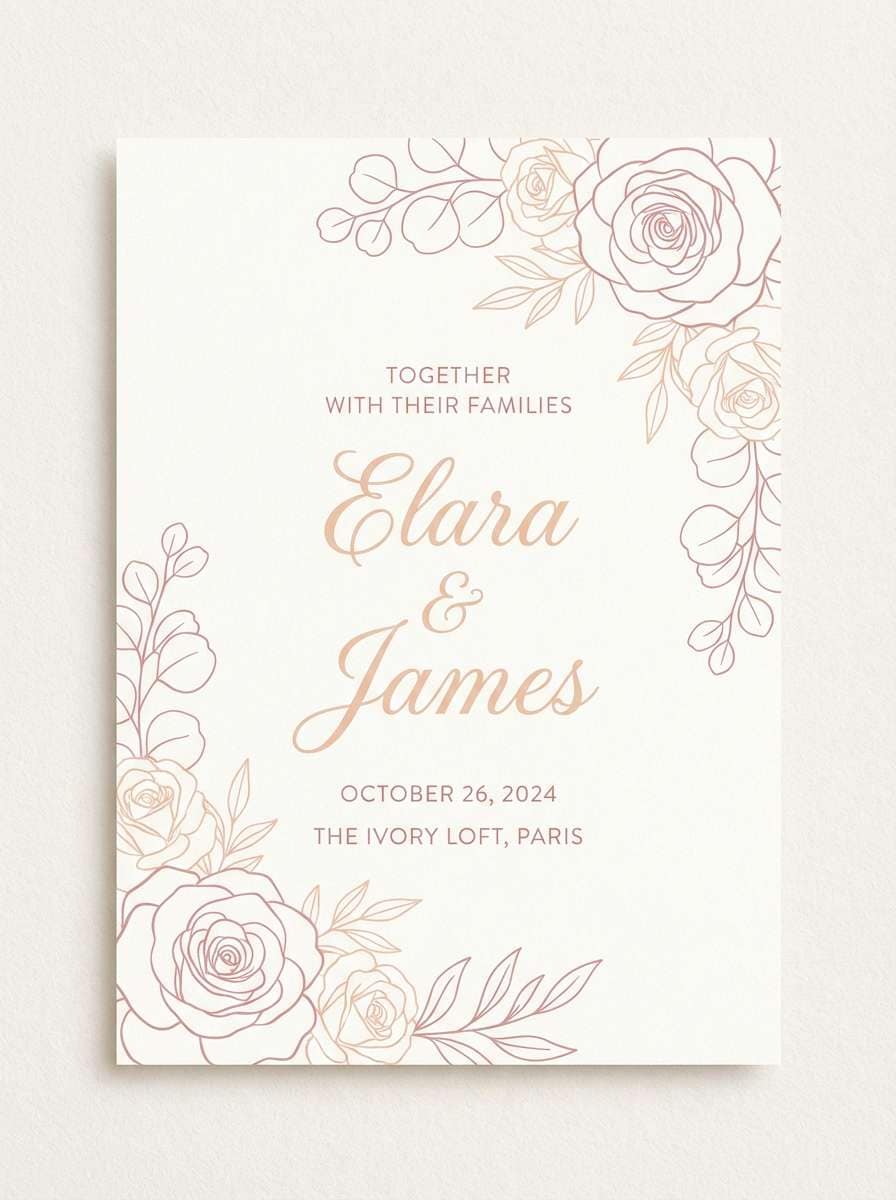
Image example of dawn blush generated using media.io
Media.io is an online AI studio for creating and editing video, image, and audio in your browser.

2) Golden Horizon
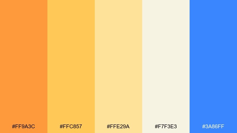
HEX: #FF9A3C #FFC857 #FFE29A #F7F3E3 #3A86FF
Mood: optimistic, bright, modern
Best for: travel hero banners and campaign headers
Optimistic and sunlit, it reads like a clear horizon with a bold pop of sky. This sunrise color palette works best for travel promos, event headers, and energetic brand moments that need a clean focal point. Pair the warm golds with plenty of cream whitespace and reserve the blue for CTAs or icons. Tip: set large titles in charcoal instead of pure black to keep the glow feeling natural.
Image example of golden horizon generated using media.io

3) Coral Cloud
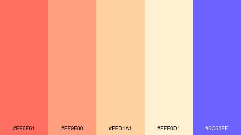
HEX: #FF6F61 #FF9F80 #FFD1A1 #FFF0D1 #6C63FF
Mood: playful, friendly, upbeat
Best for: social ads and summer sale graphics
Playful and candy-warm, it evokes cottony clouds with a cheeky coral glow. Use it in social ads, promo tiles, and creator thumbnails where you want instant friendliness. Pair with bold rounded type and a neutral background to prevent the coral from overpowering. Tip: use the violet as a tight accent for price tags and key buttons.
Image example of coral cloud generated using media.io
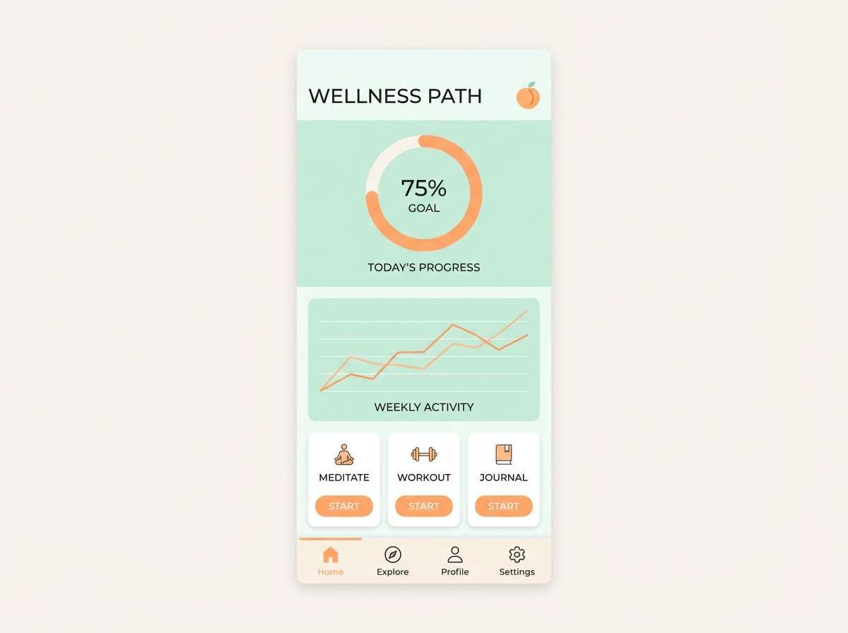
4) Apricot Mist
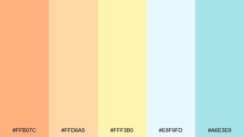
HEX: #FFB07C #FFD6A5 #FFF3B0 #E8F9FD #A6E3E9
Mood: fresh, breathable, soothing
Best for: wellness app UI and email newsletters
Fresh and breathable, these shades feel like a quiet morning haze drifting over warm stone. They are ideal for wellness UI, email sections, and lightweight dashboards that need calm hierarchy. Pair with soft gray typography and simple line icons to keep the interface crisp. Tip: limit the apricot to highlights and let the cool mints carry the background.
Image example of apricot mist generated using media.io
5) Pink Sandstone
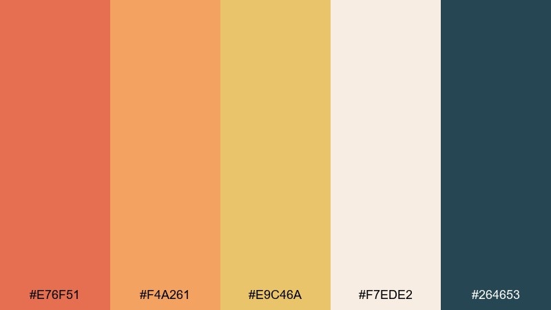
HEX: #E76F51 #F4A261 #E9C46A #F7EDE2 #264653
Mood: grounded, rustic, confident
Best for: cafe menus and artisan branding
Grounded and earthy, it brings to mind sun-warmed sandstone and hand-thrown clay. Use it for cafe menus, craft packaging, and maker brands that want warmth without looking overly sweet. Pair with textured paper, dark teal type, and a simple stamp-like icon set. Tip: keep the deepest teal for headings only to maintain a cozy feel.
Image example of pink sandstone generated using media.io
6) Saffron Beam
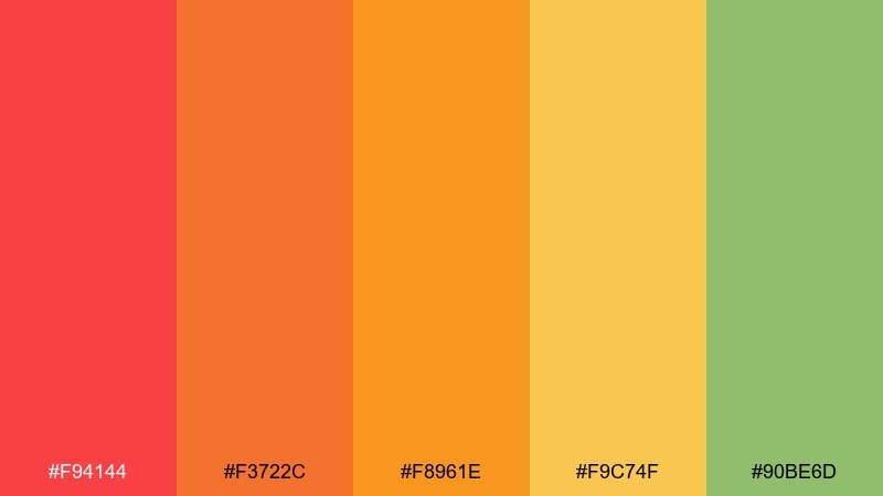
HEX: #F94144 #F3722C #F8961E #F9C74F #90BE6D
Mood: energetic, sporty, bold
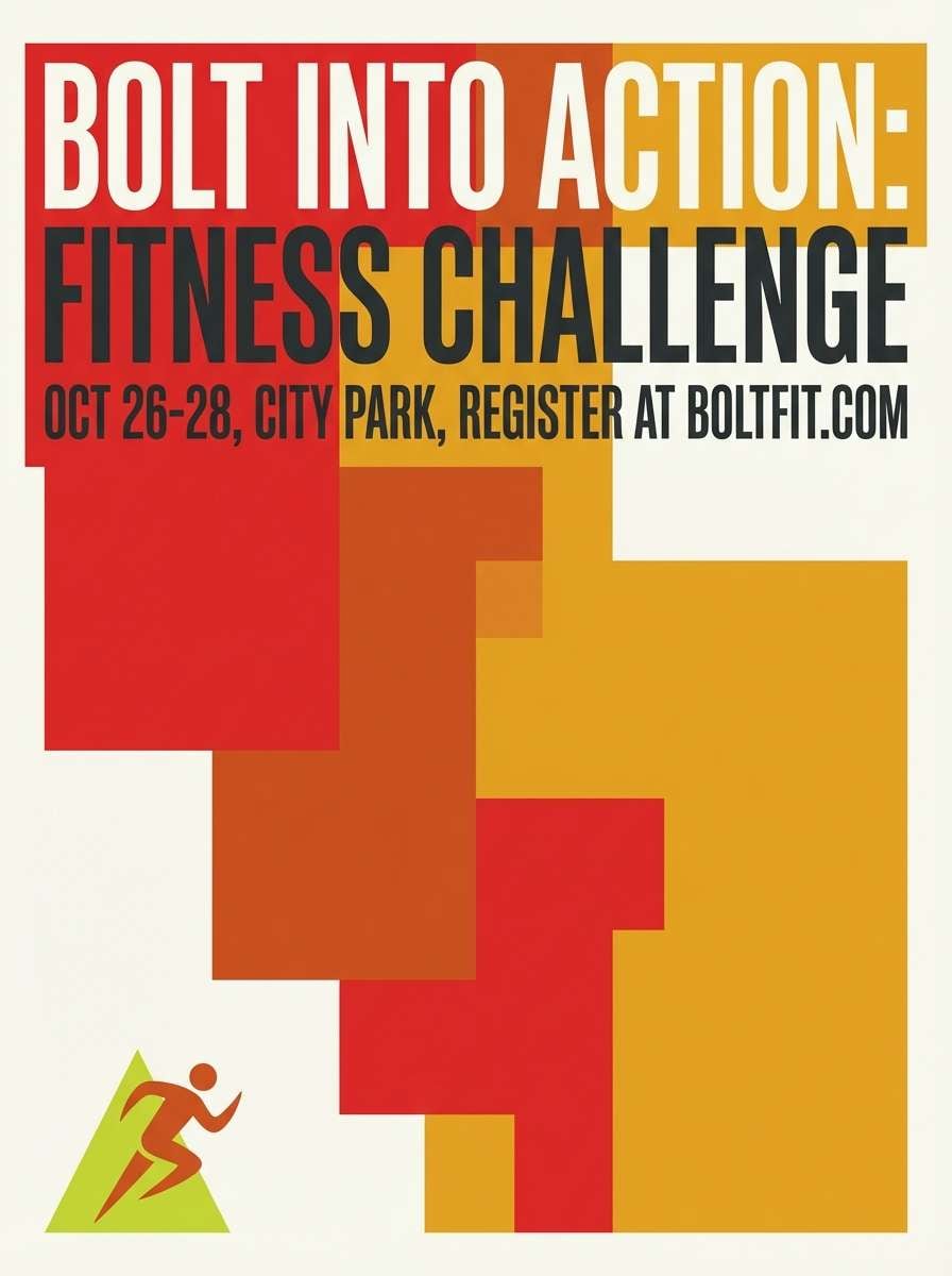
Best for: race posters and fitness promotions
Energetic and punchy, it looks like hot light cutting through the first minutes of day. These hues fit fitness promos, race posters, and punchy highlight banners where movement is the point. Pair with strong condensed type and plenty of negative space so the reds do not feel chaotic. Tip: use the green sparingly as a progress cue or checkmark for a clean finish.
Image example of saffron beam generated using media.io
7) Lavender Morning
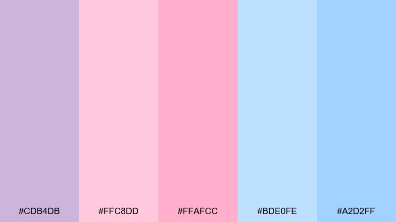
HEX: #CDB4DB #FFC8DD #FFAFCC #BDE0FE #A2D2FF
Mood: dreamy, gentle, youthful
Best for: kids illustrations and pastel web headers
Dreamy and gentle, it feels like a quiet sky shifting from lavender to soft pink. Great for kids illustrations, pastel headers, and playful brand moments that should stay light and friendly. Pair with white space and minimal outlines so the pastels do not turn muddy. Tip: keep text in a deep slate and use the brightest pink only for micro accents.
Image example of lavender morning generated using media.io
8) Skyfire Gradient
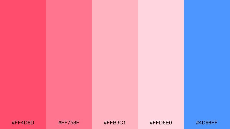
HEX: #FF4D6D #FF758F #FFB3C1 #FFD6E0 #4D96FF
Mood: bold, glossy, expressive
Best for: music drops and pop campaign art
Bold and glossy, it suggests neon-tinted clouds with one crisp hit of sky blue. Use it for music announcements, pop campaign art, and punchy story covers that need personality fast. Pair with a black or deep plum base to amplify the pinks without losing readability. Tip: apply the lightest blush as a soft glow behind the headline instead of a full background.
Image example of skyfire gradient generated using media.io
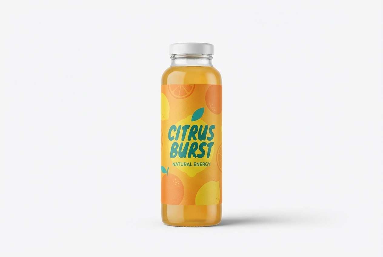
9) Citrus Glow
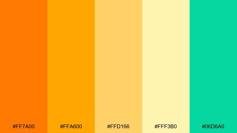
HEX: #FF7A00 #FFA600 #FFD166 #FFF3B0 #06D6A0
Mood: zesty, sunny, clean
Best for: food packaging and seasonal promos
Zesty and sunlit, it feels like fresh citrus on a bright counter. These sunrise color combinations work beautifully on food packaging, juice labels, and seasonal promo tiles where appetite and clarity matter. Pair with simple white backgrounds and a clean sans font to keep the colors tasting crisp. Tip: use the teal as a quality stamp or flavor indicator rather than a large block.
Image example of citrus glow generated using media.io
10) Rose Quartz Rise
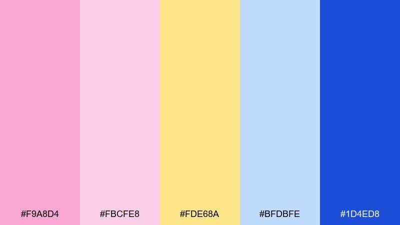
HEX: #F9A8D4 #FBCFE8 #FDE68A #BFDBFE #1D4ED8
Mood: polished, elegant, optimistic
Best for: beauty editorials and boutique lookbooks
Polished and airy, it evokes rose quartz shimmer with a clean blue edge. Use it for beauty editorials, boutique lookbooks, and premium promo layouts that need softness with structure. Pair with plenty of margin, thin rules, and one deep blue for anchors like buttons or page numbers. Tip: keep the yellow as a subtle highlight bar behind key phrases, not a full panel.
Image example of rose quartz rise generated using media.io
11) Terracotta Dawn
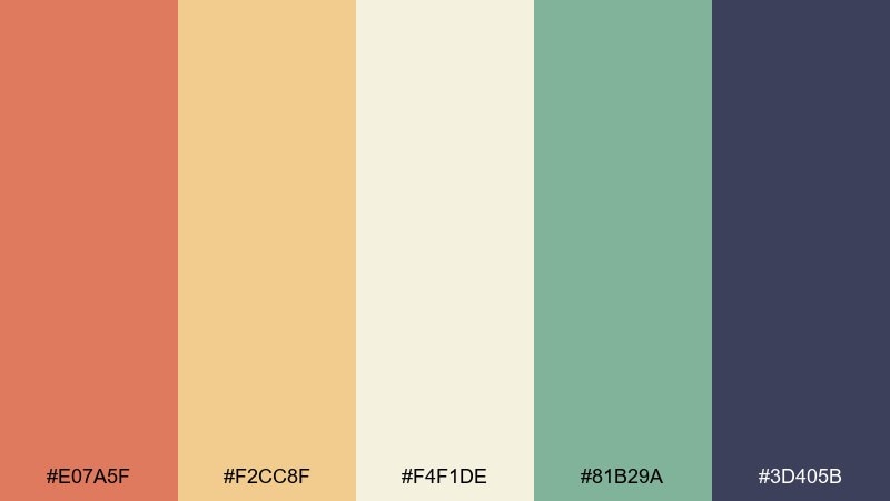
HEX: #E07A5F #F2CC8F #F4F1DE #81B29A #3D405B
Mood: earthy, calm, sophisticated
Best for: interior mood boards and home decor branding
Earthy and calm, it feels like clay walls catching light beside cool plants. It suits interior mood boards, home decor branding, and editorial blog headers where warmth should stay sophisticated. Pair with natural textures like linen or paper grain and use the navy for type and dividers. Tip: place terracotta only in key shapes or icons so the palette stays breathable.
Image example of terracotta dawn generated using media.io
12) Peachy Pastel
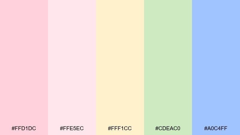
HEX: #FFD1DC #FFE5EC #FFF1CC #CDEAC0 #A0C4FF
Mood: cute, tender, calming
Best for: baby shower invites and nursery prints
Cute and tender, it reads like cotton blankets and warm morning milk light. Perfect for baby shower invites, nursery prints, and gentle announcement cards. Pair with simple illustrations, rounded corners, and a warm gray for body text. Tip: keep blue and green as small supporting blocks so the peach stays the hero.
Image example of peachy pastel generated using media.io
13) Ember Sunrise
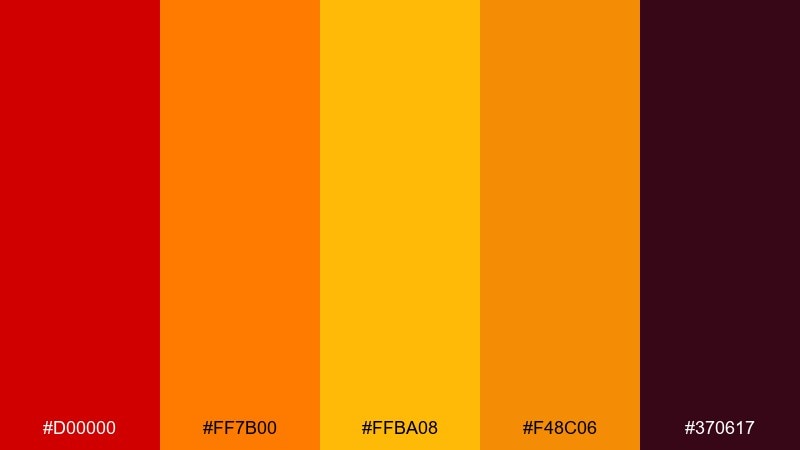
HEX: #D00000 #FF7B00 #FFBA08 #F48C06 #370617
Mood: dramatic, cinematic, intense
Best for: video thumbnails and cinematic posters
Dramatic and cinematic, it feels like embers flaring at the edge of night. Use it for video thumbnails, trailer posters, and bold announcements that need instant contrast. Pair with heavy type, sharp angles, and plenty of dark negative space for impact. Tip: treat yellow as a spotlight accent and keep large fields in deep maroon-like shadow tones.
Image example of ember sunrise generated using media.io
14) Seaside Daybreak
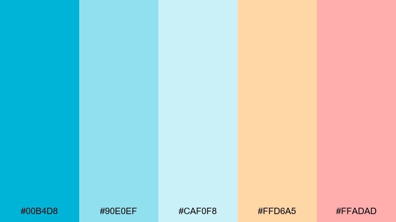
HEX: #00B4D8 #90E0EF #CAF0F8 #FFD6A5 #FFADAD
Mood: fresh, coastal, relaxed
Best for: beach resort landing pages and brochures
Fresh and coastal, it suggests cool water under a peachy sky. Great for resort landing pages, brochures, and travel emails that should feel airy and inviting. Pair with clean photography, light borders, and a dark teal for accessible text. Tip: use peach as the primary button color to keep the interface warm against the blues.
Image example of seaside daybreak generated using media.io
15) Honeyed Light
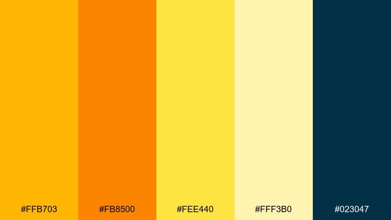
HEX: #FFB703 #FB8500 #FEE440 #FFF3B0 #023047
Mood: luxe, warm, confident
Best for: premium product packaging and label systems
Luxe and honey-warm, it feels like golden light on glass and foil. Use it for premium packaging, label systems, and product pages where warmth needs a crisp outline. Pair with deep navy typography and minimal linework to keep it upscale. Tip: let the pale cream carry big backgrounds and save the saturated orange for seals or calls to action.
Image example of honeyed light generated using media.io
16) Mulberry Dawn
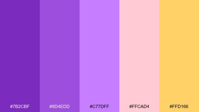
HEX: #7B2CBF #9D4EDD #C77DFF #FFCAD4 #FFD166
Mood: moody, artistic, modern
Best for: album covers and creative studio branding
Moody and artistic, it brings mulberry shadows into soft blush and warm gold. Use it for album covers, creative studio branding, and gallery posters where you want depth without going fully dark. Pair with matte textures and a neutral off-white to balance the saturated purples. Tip: set gradients only within the purple range and keep blush as a flat block for clarity.
Image example of mulberry dawn generated using media.io
17) Soft Neon Dawn
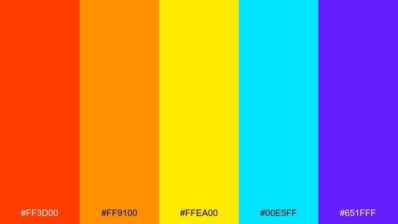
HEX: #FF3D00 #FF9100 #FFEA00 #00E5FF #651FFF
Mood: electric, playful, techy
Best for: gaming UI highlights and promo banners
Electric and playful, it feels like neon signage fading into early light. Use it for gaming UI highlights, promo banners, and splash screens where you need quick energy cues. Pair with a near-black base and keep surfaces simple so the brights do not fight each other. Tip: reserve yellow for the highest priority state, like rewards or level-up moments.
Image example of soft neon dawn generated using media.io
18) Desert Sunrise
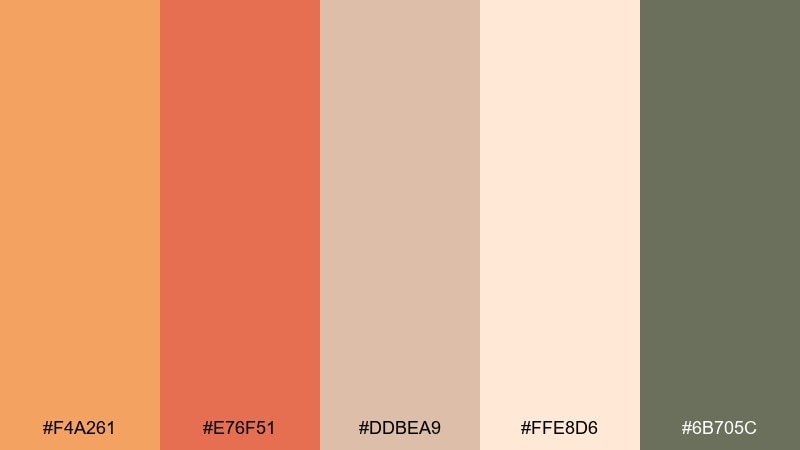
HEX: #F4A261 #E76F51 #DDBEA9 #FFE8D6 #6B705C
Mood: warm, natural, adventurous
Best for: outdoor apparel ads and adventure posters
Warm and natural, it evokes desert trails, dusty boots, and a peach sky over sage shrubs. Use it for outdoor apparel ads, adventure posters, and lifestyle headers with a grounded feel. Pair with bold sans type and a lot of cream to keep the earthy mid-tones from getting heavy. Tip: use the sage gray for secondary text and navigation so the warm hues stay expressive.
Image example of desert sunrise generated using media.io
19) Misty Summit
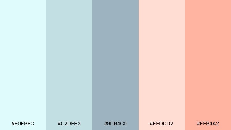
HEX: #E0FBFC #C2DFE3 #9DB4C0 #FFDDD2 #FFB4A2
Mood: cool, quiet, minimal
Best for: minimal website backgrounds and presentation decks
Cool and quiet, it reads like fog lifting to reveal a soft peach glow. Use it for minimalist websites, pitch decks, and calm data slides where readability is key. Pair with dark slate type and simple charts that rely on tint differences rather than harsh contrast. Tip: keep the peach only for highlights and keep most surfaces in the misty blues for a clean rhythm.
Image example of misty summit generated using media.io

20) Coastal Sunrise
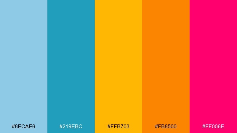
HEX: #8ECAE6 #219EBC #FFB703 #FB8500 #FF006E
Mood: vibrant, youthful, confident
Best for: startup branding kits and app onboarding screens
Vibrant and youthful, it feels like a bright pier morning with a punchy pink accent. Use it for startup branding kits, onboarding screens, and icon sets that should feel upbeat and decisive. Pair with white space and keep the hot pink as a deliberate signal color, not a background. Tip: use the two blues for structure and let the oranges carry emotion in headlines and illustrations.
Image example of coastal sunrise generated using media.io
What Colors Go Well with Sunrise?
Sunrise palettes pair best with grounded neutrals and deep anchors. Try warm off-whites, sand, light stone grays, and charcoal to keep the look airy while protecting readability.
For contrast, add a cool counterpoint like sky blue, denim, teal, or muted mint. This pushes the warm dawn tones forward and helps CTAs, icons, and navigation feel intentional.
If you want a more cinematic sunrise scheme, introduce deep shades like navy, plum, or maroon as a base. Dark anchors make oranges and pinks feel richer and more premium.
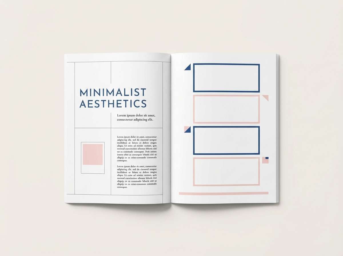
How to Use a Sunrise Color Palette in Real Designs
Start by assigning roles: use cream or pale peach for backgrounds, mid oranges/pinks for primary sections, and one deep tone (navy/teal/plum) for text and dividers. This keeps the “glow” while preventing a washed-out interface.
In UI, limit saturated accents to interactive elements (buttons, toggles, badges) and keep large areas light. In posters and thumbnails, invert that approach: use a dark base and place sunrise hues as gradients, highlights, and headline blocks.
When printing, test the warmest oranges and reds early—those are most likely to shift. Slightly desaturating the brightest tones can preserve the sunrise feel across paper types and finishes.
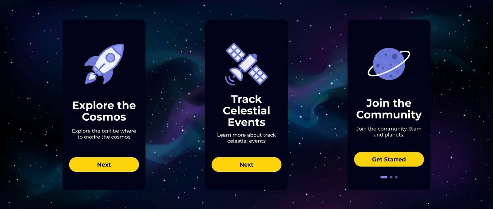
Create Sunrise Palette Visuals with AI
If you have HEX codes but need actual visuals (posters, hero banners, packaging mockups, or UI screens), generate concept images quickly with AI. This helps you validate contrast, mood, and composition before committing to a full design system.
With Media.io Text-to-Image, you can paste a prompt, describe the style (flat vector, editorial layout, 3D mockup), and iterate until the sunrise gradient and accents feel right. Save variants to compare which sunrise color combinations perform best.
Sunrise Color Palette FAQs
-
What is a sunrise color palette?
A sunrise color palette is a set of warm, early-morning inspired hues—typically peach, coral, orange, soft yellow, and sometimes sky blue—used to recreate the look and mood of dawn in design. -
Which sunrise colors work best for branding?
For branding, start with a warm hero (peach/orange), add a light neutral (cream), then include one dark anchor (navy/charcoal) for legible text and logos. A small blue or teal accent is great for CTAs. -
How do I keep sunrise palettes readable in UI?
Use pale tones for backgrounds, reserve saturated orange/pink for highlights, and choose a dark text color like deep slate or navy. Avoid placing small white text on bright orange without testing contrast. -
What’s the best accent color for an orange-pink sunrise scheme?
Sky blue, teal, and muted navy are the most reliable accents because they balance warm hues and create clear hierarchy for buttons, links, and icons. -
Are sunrise color combinations good for posters and thumbnails?
Yes—sunrise colors grab attention quickly. For maximum impact, use a darker base (plum, maroon, or near-black) and treat yellows as spotlight accents so the composition doesn’t feel overly bright. -
How can I make a sunrise gradient look modern?
Limit the gradient to 2–3 adjacent hues (like coral → peach → pale yellow), then add one solid contrasting accent (blue or deep plum). Pair with clean typography and generous spacing. -
Can I generate sunrise palette visuals from a text prompt?
Yes. With a text-to-image tool like Media.io, you can describe the layout (UI, poster, packaging), specify a sunrise mood, and iterate quickly to match your preferred dawn tones and contrast.
Next: Maroon Color Palette


