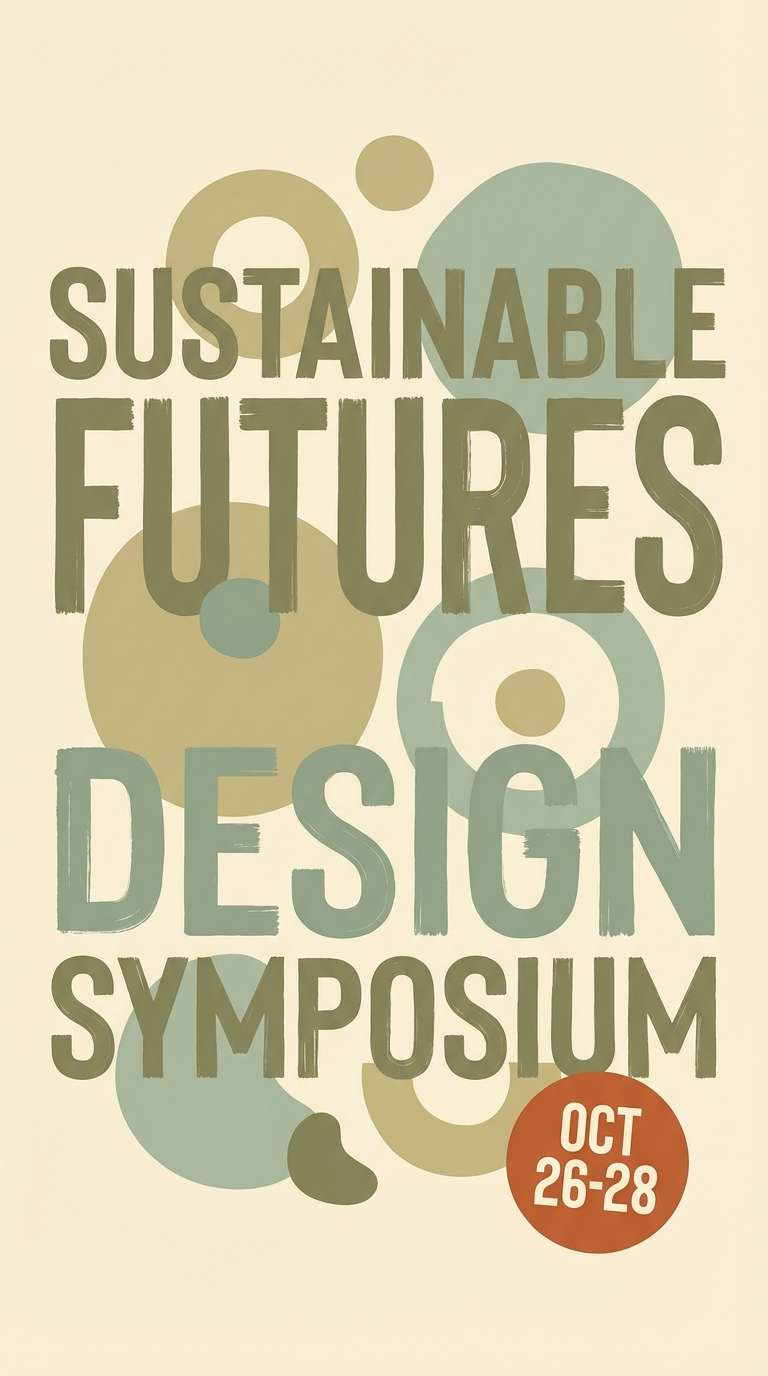
Green khaki sits in the sweet spot between olive and sage—earthy enough to feel grounded, but soft enough to look modern in digital and print.
Below are 20+ green khaki color combinations with HEX codes, plus practical guidance for using these tones in branding, interiors, and UI design.
In this article
Why Green Khaki Palettes Work So Well
Green khaki palettes feel naturally balanced because they mix muted greens with sand, cream, and charcoal—colors that already coexist in nature. That makes them easy on the eyes and reliable across many design styles.
They also read as trustworthy and practical. Compared with bright greens, khaki greens feel calmer and more “grown-up,” which is why they work in B2B branding, wellness, editorial layouts, and product packaging.
Finally, green khaki is flexible with contrast: you can keep things airy with warm off-whites, or add authority using deep olives and near-black accents for text and UI hierarchy.
20+ Green Khaki Color Palette Ideas (with HEX Codes)
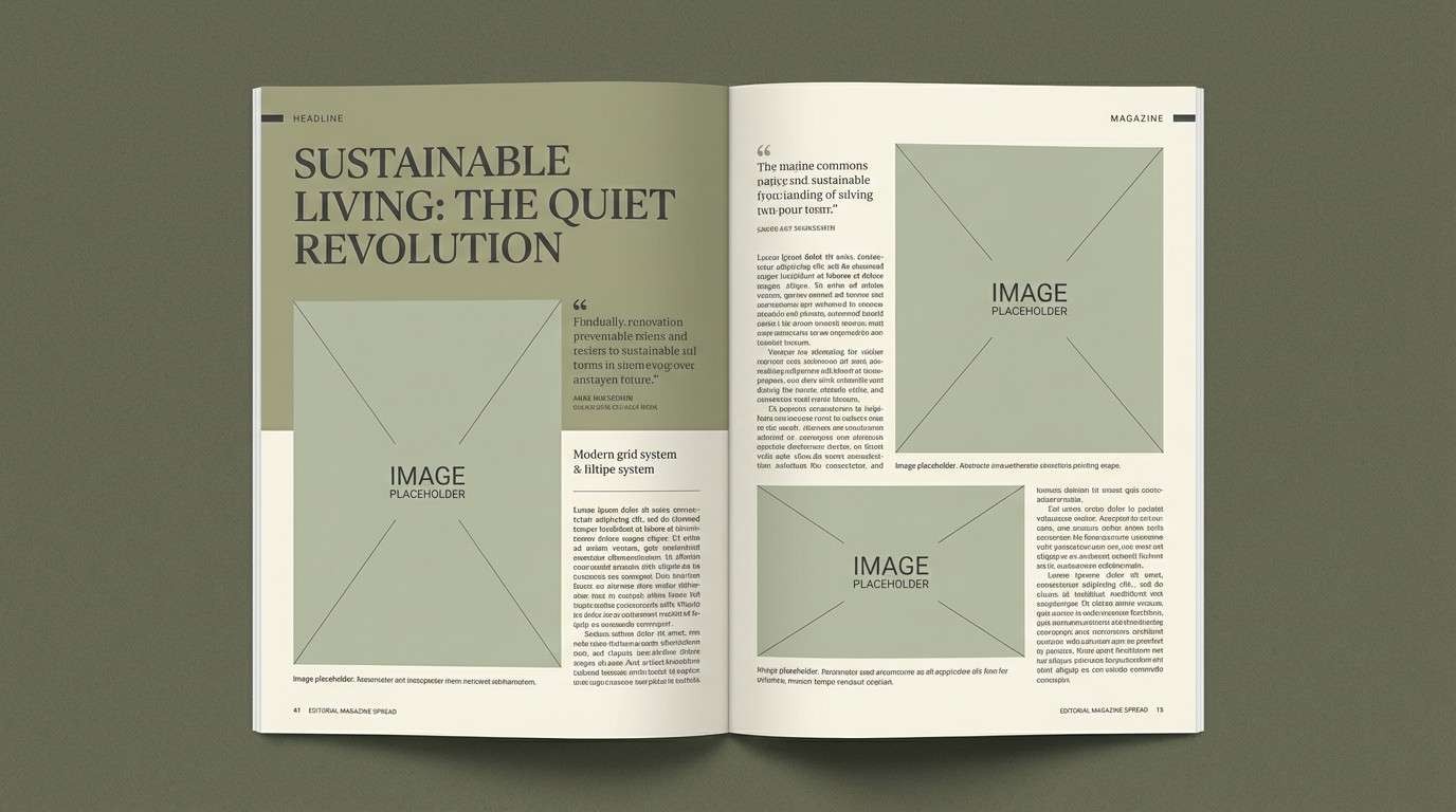
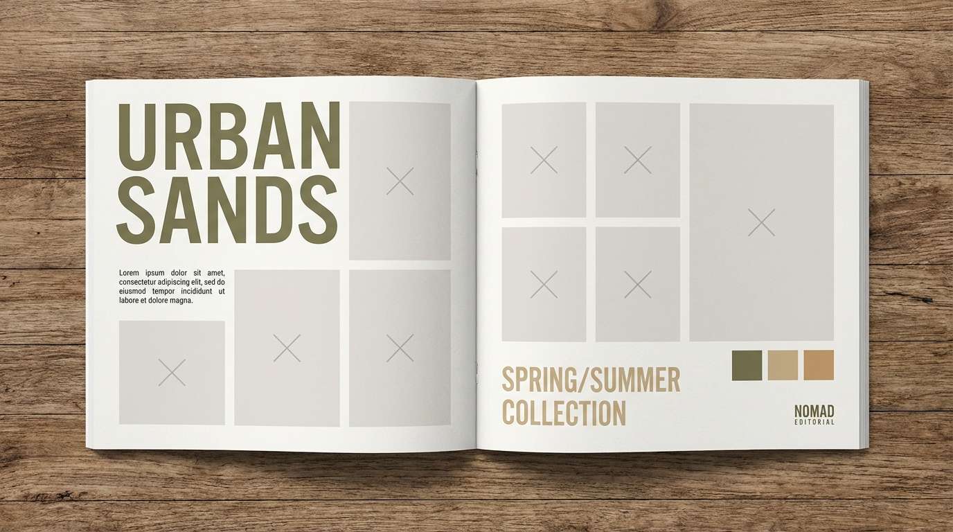
1) Field Journal
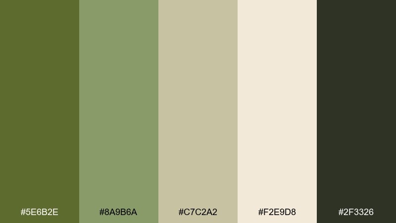
HEX: #5E6B2E #8A9B6A #C7C2A2 #F2E9D8 #2F3326
Mood: grounded, outdoorsy, calm
Best for: editorial magazine spread
Grounded and outdoorsy, these tones feel like worn canvas, pressed leaves, and a pencil-sketch margin. Use them for calm editorial layouts where readability matters and the color supports the story. Pair the cream and pale khaki as page space, then anchor headlines with the deep charcoal. Tip: keep photography warm and muted so the greens stay natural rather than fluorescent.
Image example of field journal generated using media.io
Media.io is an online AI studio for creating and editing video, image, and audio in your browser.

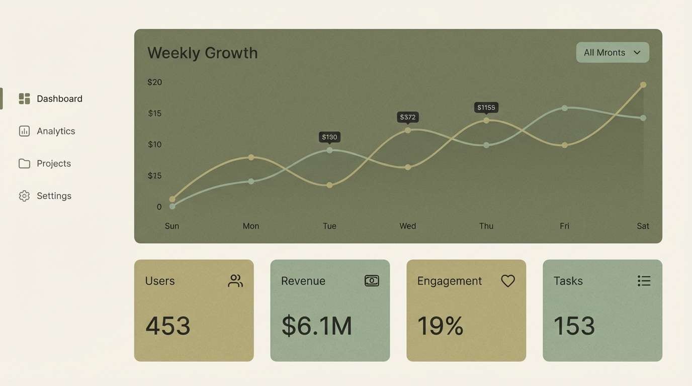
2) Sage Concrete
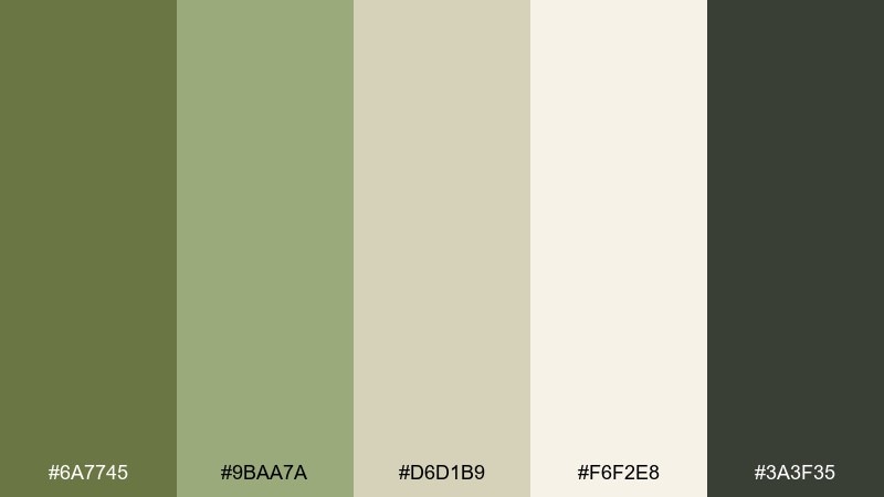
HEX: #6A7745 #9BAA7A #D6D1B9 #F6F2E8 #3A3F35
Mood: clean, modern, balanced
Best for: ui dashboard
Clean and balanced, this mix evokes sage paint against brushed concrete. It works especially well for analytics dashboards, admin panels, and data-heavy screens that need calm contrast. Use the cream for backgrounds, the mid sage for surfaces, and the dark gray for text and icons. Tip: reserve the deepest green for primary buttons to keep hierarchy crisp.
Image example of sage concrete generated using media.io
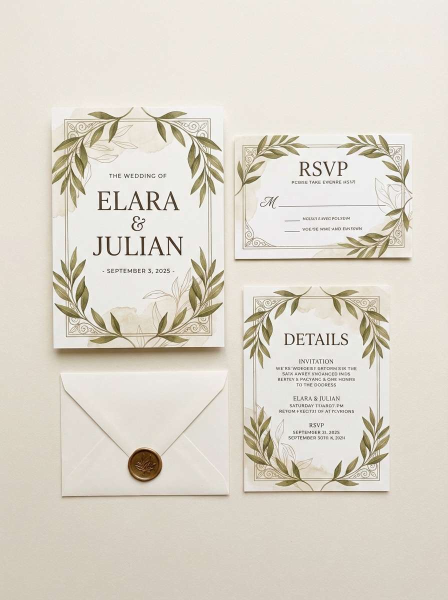
3) Olive Linen
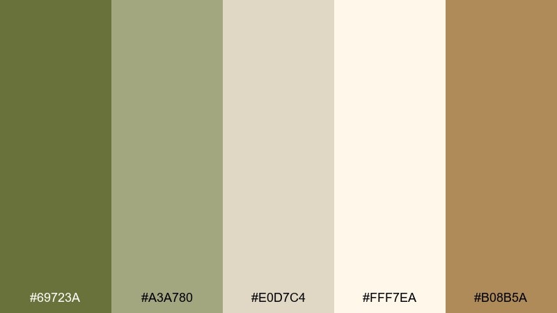
HEX: #69723A #A3A780 #E0D7C4 #FFF7EA #B08B5A
Mood: soft, romantic, natural
Best for: wedding invitation suite
Soft and romantic, it feels like olive sprigs laid on sun-warmed linen. The palette suits invitations, save-the-dates, and day-of stationery when you want earthy elegance without going rustic. Let the light cream carry the layout, then bring in khaki green for borders and monograms. Tip: use the warm tan sparingly as a wax-seal or RSVP accent color.
Image example of olive linen generated using media.io
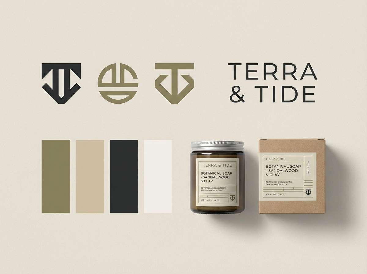
4) Ranger Modernism
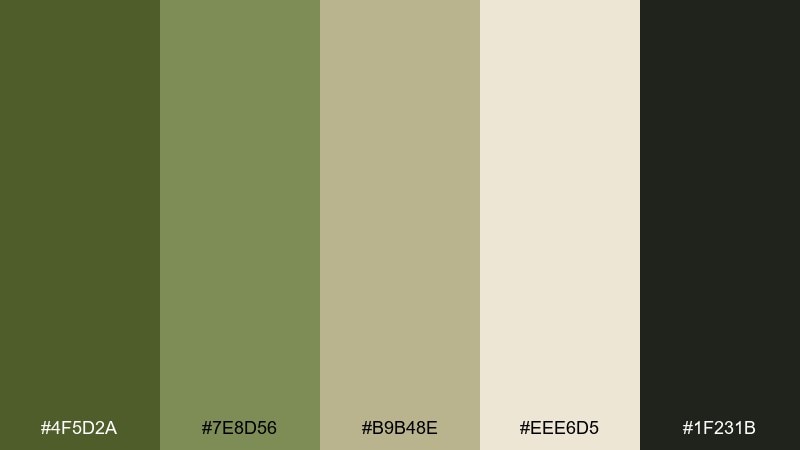
HEX: #4F5D2A #7E8D56 #B9B48E #EEE6D5 #1F231B
Mood: confident, structured, timeless
Best for: brand identity system
Confident and structured, it calls to mind a tailored field jacket with modern typography. This green khaki color palette fits heritage-inspired branding for outdoor goods, coffee, or menswear. Pair the deep green with the soft sand for logo lockups, then use the mid khaki for secondary badges and patterns. Tip: keep one solid dark tone for consistent iconography across touchpoints.
Image example of ranger modernism generated using media.io
5) Woodland Cafe
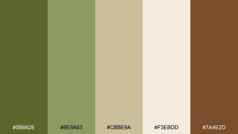
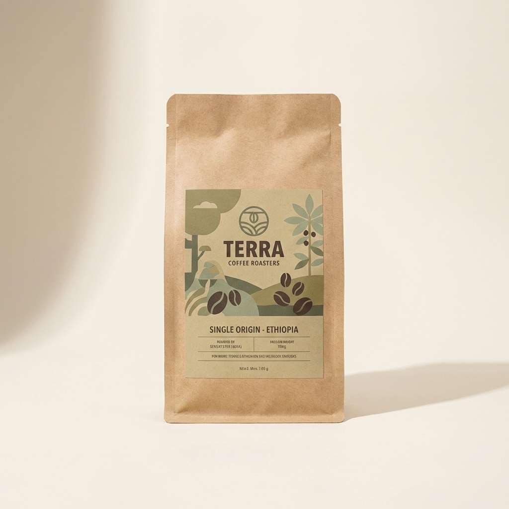
HEX: #5B662E #8E9A63 #CBBE9A #F3EBDD #7A4E2D
Mood: warm, cozy, artisanal
Best for: coffee bag packaging
Warm and cozy, these shades feel like roasted beans, paper labels, and a fern on the window sill. They are ideal for artisanal food packaging where you want a natural cue without looking overly organic. Use khaki greens for the main panel, then bring in the brown as a flavor marker or roast level. Tip: add subtle texture to the cream areas to mimic uncoated stock.
Image example of woodland cafe generated using media.io
6) Dusty Trail
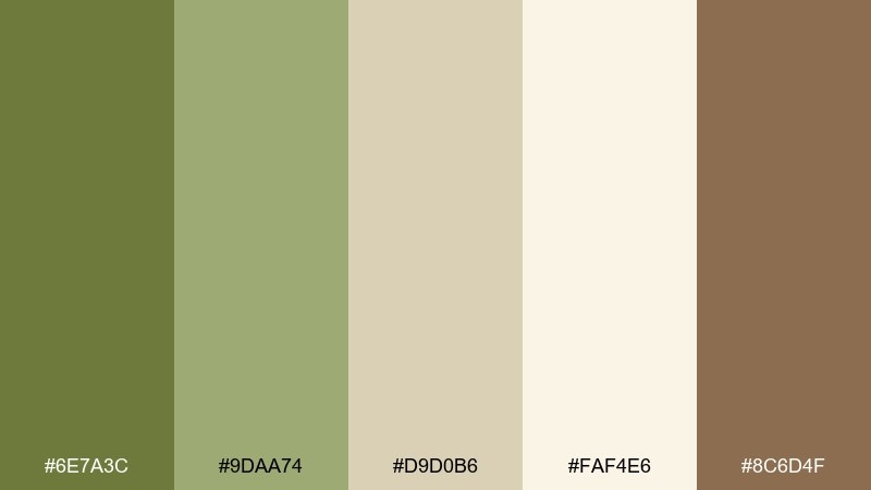
HEX: #6E7A3C #9DAA74 #D9D0B6 #FAF4E6 #8C6D4F
Mood: relaxed, sun-faded, inviting
Best for: living room interior styling
Relaxed and sun-faded, it evokes a dusty trail, woven rugs, and late-afternoon light. Use these tones for living rooms and entryways where you want warmth without heavy saturation. Pair the creamy off-white with khaki green textiles, then ground the space with the tan-brown in wood or leather. Tip: repeat the mid sage twice across the room to make the palette feel intentional.
Image example of dusty trail generated using media.io

7) Eucalyptus Studio
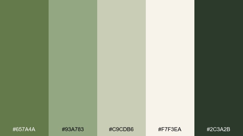
HEX: #657A4A #93A783 #C9CDB6 #F7F3EA #2C3A2B
Mood: fresh, minimal, professional
Best for: wellness brand landing page
Fresh and minimal, it feels like eucalyptus stems against a clean studio wall. These tones fit wellness websites, spa branding, and calm product pages that need gentle contrast. Use the pale background for breathing room and the deeper green for CTAs and section headers. Tip: keep illustrations line-based and dark green to avoid visual clutter.
Image example of eucalyptus studio generated using media.io
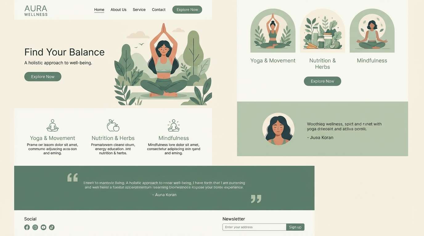
8) Khaki Coastline
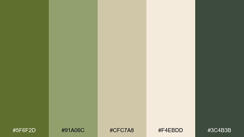
HEX: #5F6F2D #91A06C #CFC7A8 #F4EBDD #3C4B3B
Mood: airy, coastal, understated
Best for: travel blog header design
Airy and understated, it suggests dune grass, weathered stone, and salt-softened light. This green khaki color combination works nicely for travel headers and blog graphics that need earthy color without heavy mood. Pair the light sand with the mid khaki for large blocks, and use the deeper green for nav and links. Tip: keep imagery slightly desaturated so the palette reads cohesive across posts.
Image example of khaki coastline generated using media.io
9) Antique Herbarium
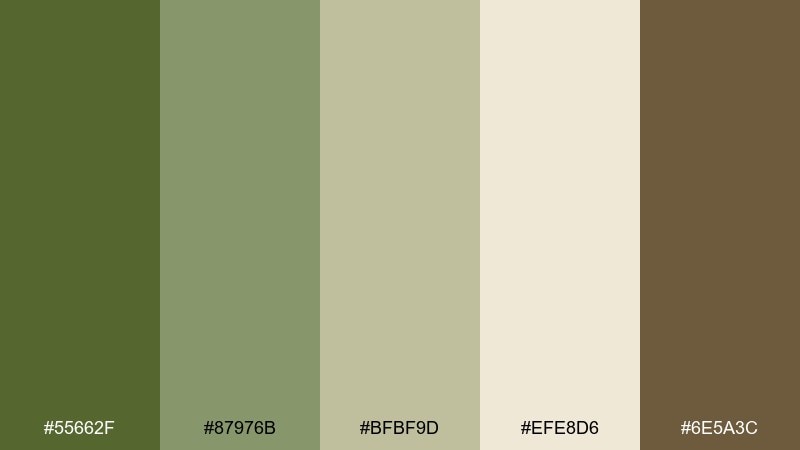
HEX: #55662F #87976B #BFBF9D #EFE8D6 #6E5A3C
Mood: vintage, botanical, gentle
Best for: watercolor botanical illustration
Vintage and gentle, these hues feel like a pressed-leaf page in an old herbarium. They suit botanical prints, labels, and nature-themed illustrations where the greens need to stay soft. Use the cream as paper tone, then layer the mid sage for leaves and the brown for stems and shadows. Tip: add light grain to mimic watercolor paper texture.
Image example of antique herbarium generated using media.io
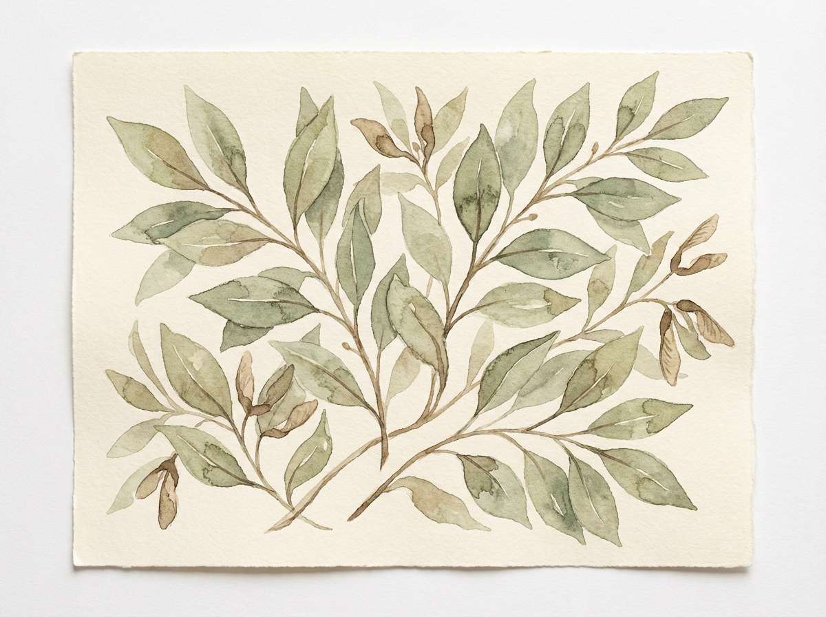
10) Minimal Camp
HEX: #4C5A26 #7F8E57 #B6B18B #F0E8D8 #2A2E24
Mood: utilitarian, minimalist, steady
Best for: outdoor gear product ad
Utilitarian and steady, it brings to mind clean gear labels and matte metal finishes. Use it for product ads where clarity and rugged confidence matter more than loud color. Let the sand tone carry the background, then use the deep green for the product name and key callouts. Tip: keep the composition sparse so the darker tones feel premium, not heavy.
Image example of minimal camp generated using media.io
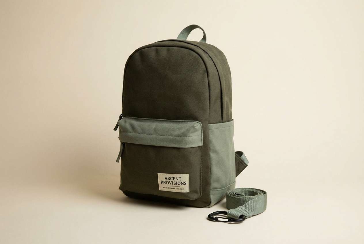
11) Autumn Lichen
HEX: #657136 #9EAA6B #D7CFAE #FFF3E1 #A46B3E
Mood: seasonal, earthy, artistic
Best for: event poster design
Seasonal and earthy, it feels like lichen on bark and late harvest light. These tones are great for event posters that want an organic vibe without turning muddy. Use the warm cream for negative space, then stack khaki and sage shapes behind bold type. Tip: keep the orange-brown as a small highlight for dates or tickets to guide the eye.
Image example of autumn lichen generated using media.io
12) Soft Utility
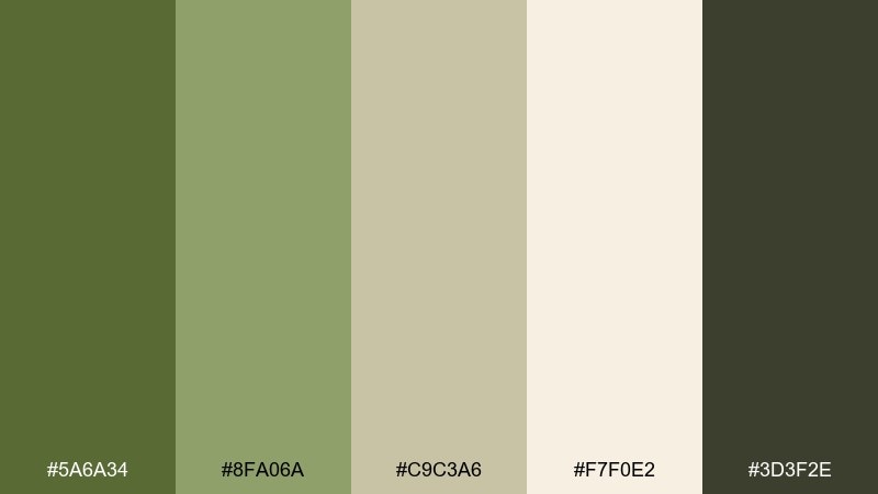
HEX: #5A6A34 #8FA06A #C9C3A6 #F7F0E2 #3D3F2E
Mood: practical, calm, contemporary
Best for: app onboarding screens
Practical and calm, it looks like a modern utility jacket softened by warm light. These green khaki color combinations are ideal for onboarding flows where you want trust and clarity over hype. Use the warm off-white for screen backgrounds, then assign the deep olive to primary actions and progress indicators. Tip: keep illustration fills to two greens max so the UI stays clean.
Image example of soft utility generated using media.io
13) Forest Chalk
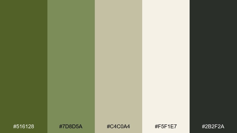
HEX: #516128 #7D8D5A #C4C0A4 #F5F1E7 #2B2F2A
Mood: academic, quiet, focused
Best for: presentation slide deck
Quiet and focused, it recalls a forest-edge chalkboard and clean notebook paper. It works well for slide decks that need a serious tone but still feel approachable. Use the lightest shade for slides, the mid khaki for section dividers, and the dark gray for text. Tip: apply the deepest green only to key charts and callouts to avoid visual fatigue.
Image example of forest chalk generated using media.io
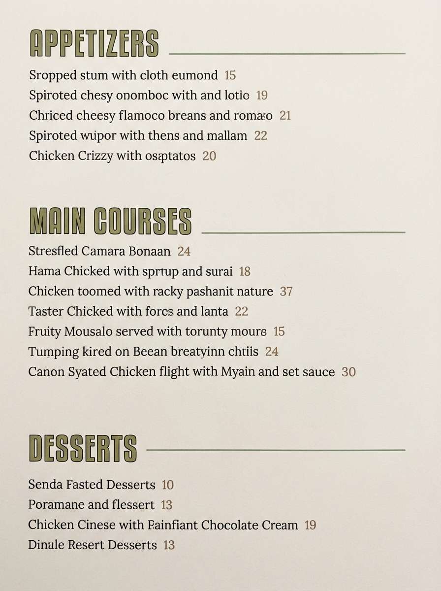
14) Garden Terrace
HEX: #687A3B #95A874 #D7D2B8 #FCF6EA #6C5B41
Mood: relaxed, appetizing, natural
Best for: restaurant menu design
Relaxed and natural, it brings up patio herbs, stone planters, and a linen napkin. Use it for menus where you want an upscale-but-welcoming feel. Keep the background bright, then use khaki green for category headers and the brown for prices or small icons. Tip: introduce thin rules in the mid sage to organize sections without heavy boxes.
Image example of garden terrace generated using media.io
15) Vintage Safari
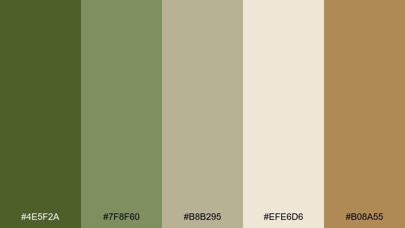
HEX: #4E5F2A #7F8F60 #B8B295 #EFE6D6 #B08A55
Mood: adventurous, nostalgic, warm
Best for: fashion lookbook spread
Adventurous and nostalgic, these tones feel like sun-bleached canvas and well-traveled leather. They are a strong fit for fashion lookbooks that lean classic and understated. Use the pale sand as generous margin space, then build typography in deep olive for a confident editorial voice. Tip: keep accent tan limited to small tags or page numbers to avoid a sepia cast.
Image example of vintage safari generated using media.io
16) Calm Command
HEX: #57662D #859766 #BFC2A6 #F4F0E4 #22261F
Mood: authoritative, calm, premium
Best for: B2B SaaS marketing page
Authoritative but calm, it evokes a disciplined workspace with natural materials. This green khaki color palette is great for B2B SaaS pages that want credibility without the typical cold blues. Use the off-white for long-form sections, then apply the deep near-black for headlines and the olive for buttons. Tip: keep badges and chips in the pale khaki to maintain a soft, premium feel.
Image example of calm command generated using media.io
17) Clay and Moss

HEX: #5E6E33 #8FA06F #D2C6AE #FAF1E3 #C07A4C
Mood: handmade, warm, organic
Best for: ceramic product packaging
Handmade and warm, it feels like moss beside fresh-thrown clay. Use it for ceramic packaging, artisan labels, or small-batch product lines that need a tactile story. Pair the soft cream with khaki greens for the main label, then bring in the clay tone as a signature stamp. Tip: choose matte finishes so the colors stay earthy and true.
Image example of clay and moss generated using media.io
18) Misty Canopy
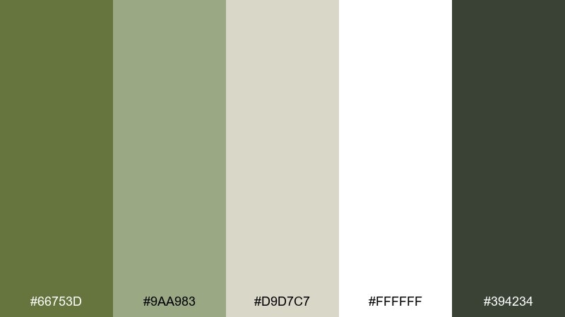
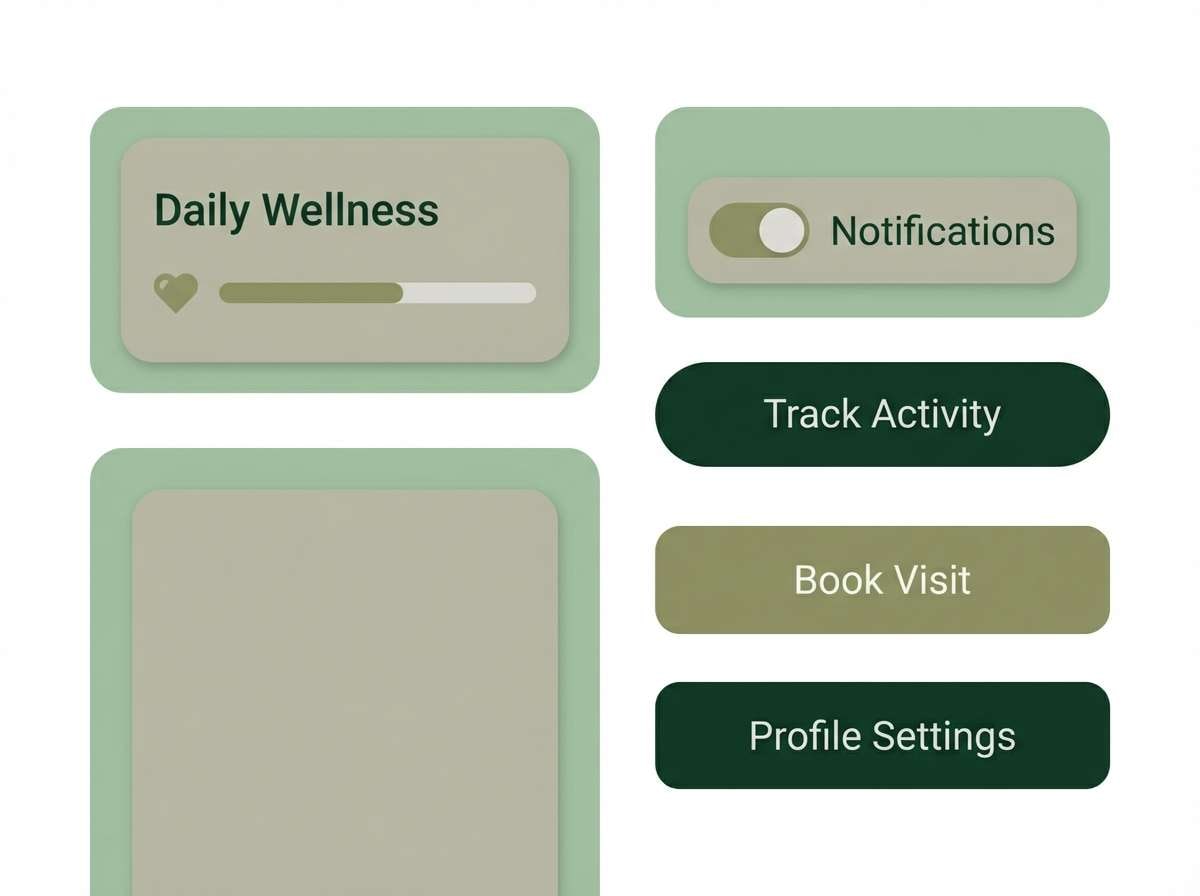
HEX: #66753D #9AA983 #D9D7C7 #FFFFFF #394234
Mood: light, airy, soothing
Best for: health app ui kit
Light and soothing, it suggests a misty canopy with soft light filtering through leaves. These shades work well for a health or meditation UI kit where calm navigation is the priority. Use white and pale gray-khaki for breathing room, then apply the darker green to tabs, toggles, and focus states. Tip: keep graphs simple and rely on one mid green for data to reduce noise.
Image example of misty canopy generated using media.io
19) Sunset Khaki
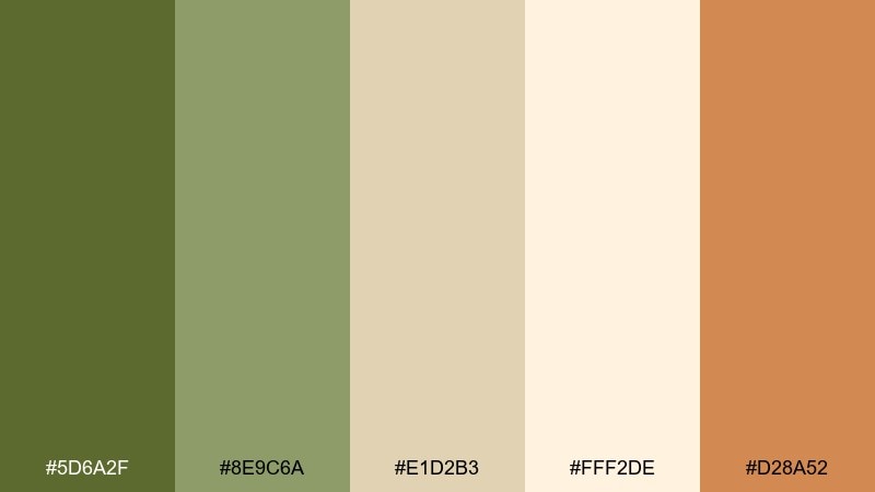
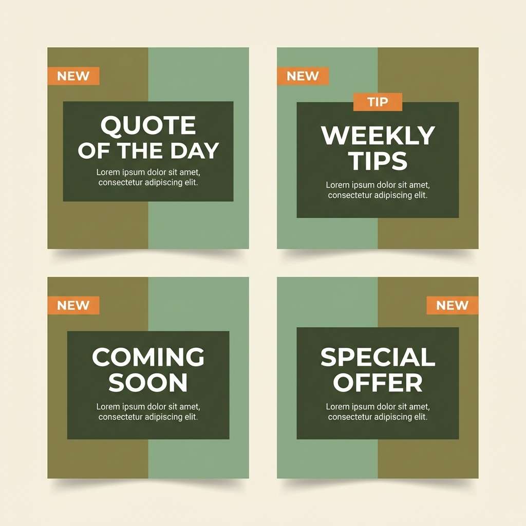
HEX: #5D6A2F #8E9C6A #E1D2B3 #FFF2DE #D28A52
Mood: uplifting, warm, modern
Best for: social media post templates
Uplifting and warm, it feels like sunset hitting dry grass and sandy paths. Use it for social templates when you want earthy tones with a small spark of energy. Let the cream background keep posts bright, then use the orange accent for stickers, promo tags, or key metrics. Tip: limit the orange to one element per layout so it reads as intentional, not seasonal.
Image example of sunset khaki generated using media.io
20) Riverstone Camo
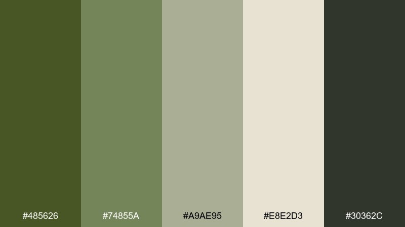
HEX: #485626 #74855A #A9AE95 #E8E2D3 #30362C
Mood: rugged, muted, confident
Best for: outdoor brand website hero
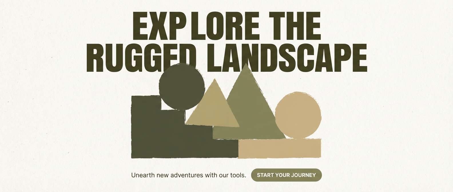
Rugged and muted, it evokes river stones, mossy bark, and technical fabric. This mix fits outdoor website heroes and campaign headers where you want strength without loud contrast. Use the light sand for spacious type areas, then layer olive blocks behind key messaging. Tip: keep icons and strokes in the near-black so accessibility stays strong on mid greens.
Image example of riverstone camo generated using media.io
21) Paper Bark
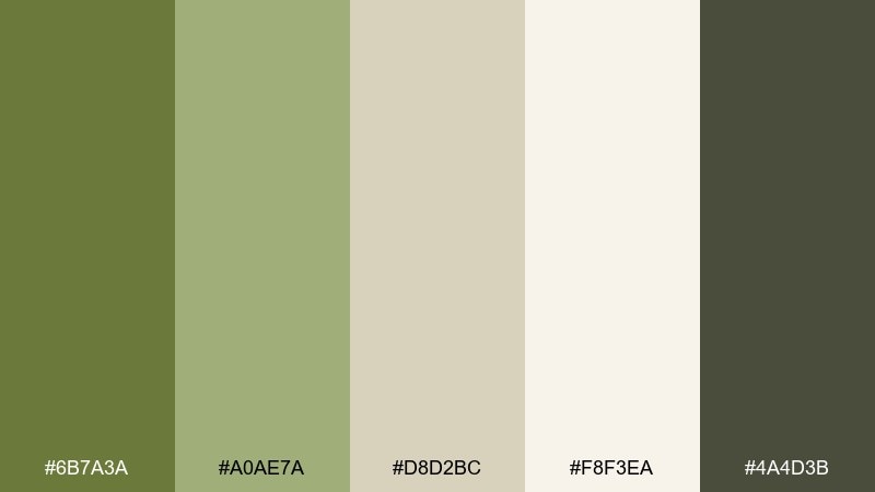
HEX: #6B7A3A #A0AE7A #D8D2BC #F8F3EA #4A4D3B
Mood: natural, understated, tidy
Best for: book cover design
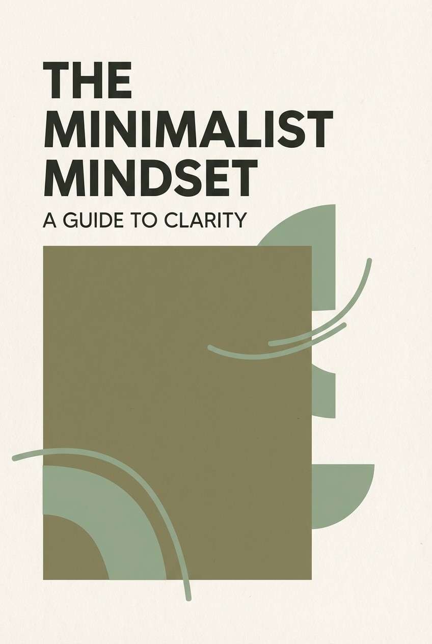
Natural and tidy, it feels like paper bark and fresh ink on a warm page. Use it for book covers or ebooks where you want subtle nature cues without illustration overload. Pair the mid khaki with the off-white for the title area, then use the dark olive for author name and spine details. Tip: add a small block of flat color behind the title to keep type crisp in thumbnails.
Image example of paper bark generated using media.io
What Colors Go Well with Green Khaki?
Green khaki pairs beautifully with warm neutrals like cream, ivory, sand, and oatmeal because they keep the palette airy and natural. These combinations are especially strong for backgrounds, packaging, and editorial layouts.
For contrast, use deep charcoals, near-black greens, or slate grays—ideal for typography, icons, and UI navigation. This keeps readability strong while preserving the calm, muted vibe.
If you want a modern pop, add a restrained accent such as clay orange, warm tan, or muted rust. Use accents sparingly (badges, highlights, small UI states) so the palette stays grounded rather than seasonal.
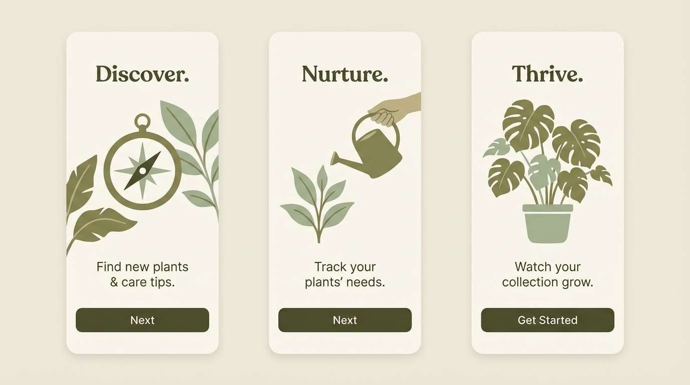
How to Use a Green Khaki Color Palette in Real Designs
In branding, green khaki works best when you separate roles: a light cream for background, a mid sage/khaki for surfaces and shapes, and a deep olive/charcoal for logos and text. This creates a premium, heritage feel without looking dated.
For interiors, treat khaki green as a “soft anchor” on textiles (pillows, rugs, upholstery) and keep walls warm off-white for light. Then repeat one mid-tone green in multiple places to make the room feel intentional.
In UI, use khaki greens as supportive surfaces rather than overwhelming fills. Reserve the darkest green for CTAs and focus states, and keep body text in charcoal to maintain accessibility and reduce eye fatigue.
Create Green Khaki Palette Visuals with AI
Need quick mockups for a brand board, landing page, menu, or social template? You can generate consistent visuals by describing layout, mood, and materials—then locking your palette with khaki greens, warm creams, and a single accent.
To keep results cohesive, mention lighting (soft daylight, studio shot), texture (uncoated paper, linen, concrete), and a clean background. Then reuse the same prompt structure across formats like square posts, wide hero banners, and print spreads.
Try Media.io Text to Image to create green khaki palette visuals in seconds, then refine the prompt until the tones match your design system.
Green Khaki Color Palette FAQs
-
What is a green khaki color?
Green khaki is a muted yellow-green that sits between olive and sage. It feels earthy and practical, often associated with natural materials, outdoor styling, and modern utility aesthetics. -
Is khaki green the same as olive green?
Not exactly. Olive green is typically deeper and more saturated, while khaki green is usually lighter, dustier, and more neutral—often with a stronger warm/yellow undertone. -
What neutral colors match a green khaki palette best?
Warm off-whites (cream, ivory), sand, beige, and oatmeal pair best because they keep the overall look soft and grounded. Charcoal or near-black works well for typography and contrast. -
What accent colors work with green khaki?
Muted clay, terracotta, tan, and rust add warmth and energy without clashing. Use accents in small doses (labels, buttons, dates, icons) to keep the palette calm. -
Is green khaki good for UI design?
Yes—especially for dashboards, wellness apps, and B2B pages that need calm contrast. Use off-white for backgrounds, mid khaki for surfaces, and deep olive/charcoal for text and primary actions. -
How do I keep green khaki from looking muddy?
Increase separation with lighter backgrounds, add one strong dark anchor for text, and avoid stacking too many mid-tones together. A small warm accent (tan or clay) can also improve clarity and hierarchy. -
Can green khaki work for wedding or editorial designs?
Absolutely. Pair it with warm cream and soft sand for an elegant base, then use deeper olive for monograms, headings, or borders. Keeping imagery warm and slightly muted helps everything feel cohesive.
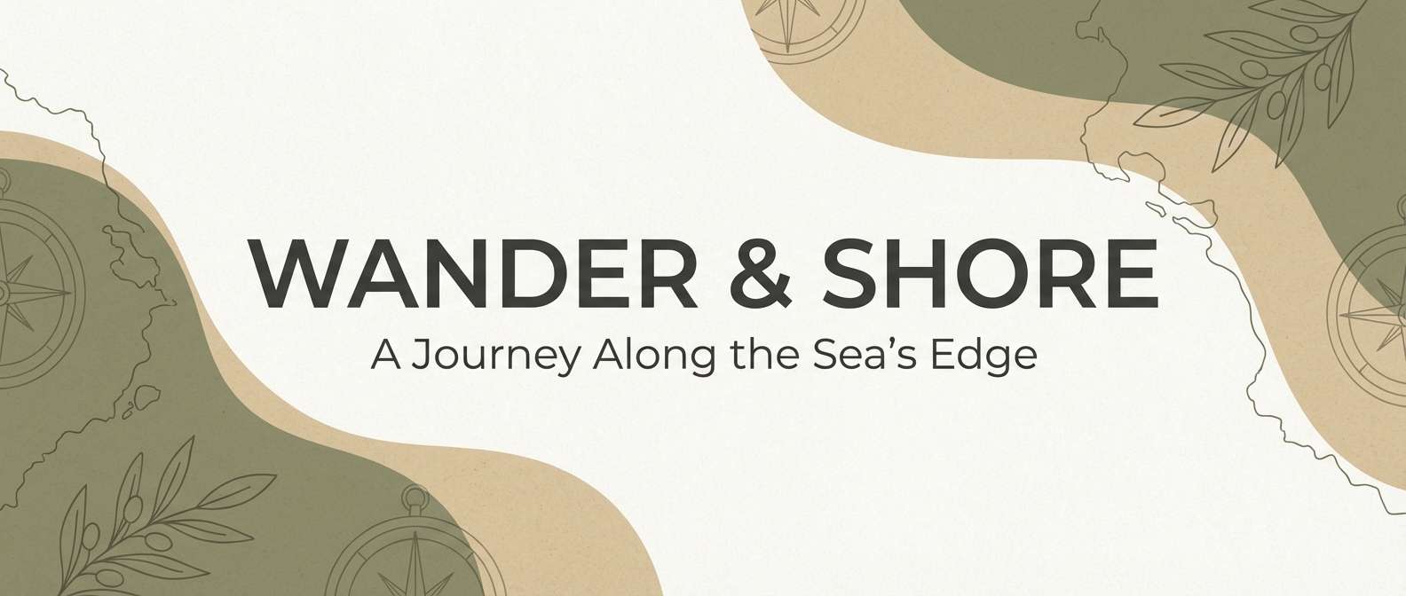
Next: Mountain Color Palette