

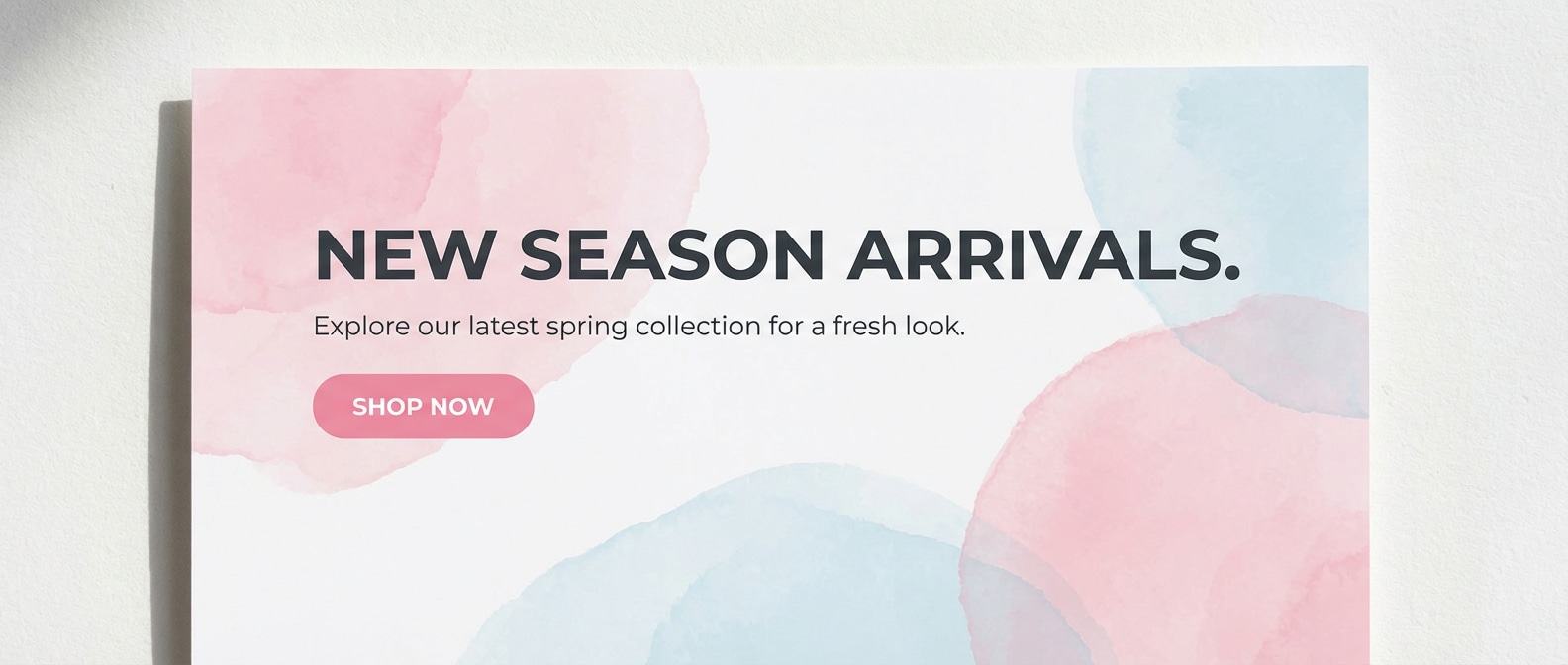
Pink can feel soft, bold, modern, or nostalgic depending on the mix of neutrals, dark anchors, and accent hues. In this guide, you will get 20 ready-to-use pink color palettes with HEX codes, practical usage tips for real layouts, and AI prompts you can run in Media.io to generate matching visuals. Use these pink color combinations for branding, UI, posters, packaging, and social posts without guesswork.
In this article
- Why Pink Palettes Work So Well
-
- Blush Rose Cream
- Cotton Candy Pop
- Modern Rose Gray
- Fuchsia Neon Night
- Peony Garden Watercolor
- Dusty Mauve Editorial
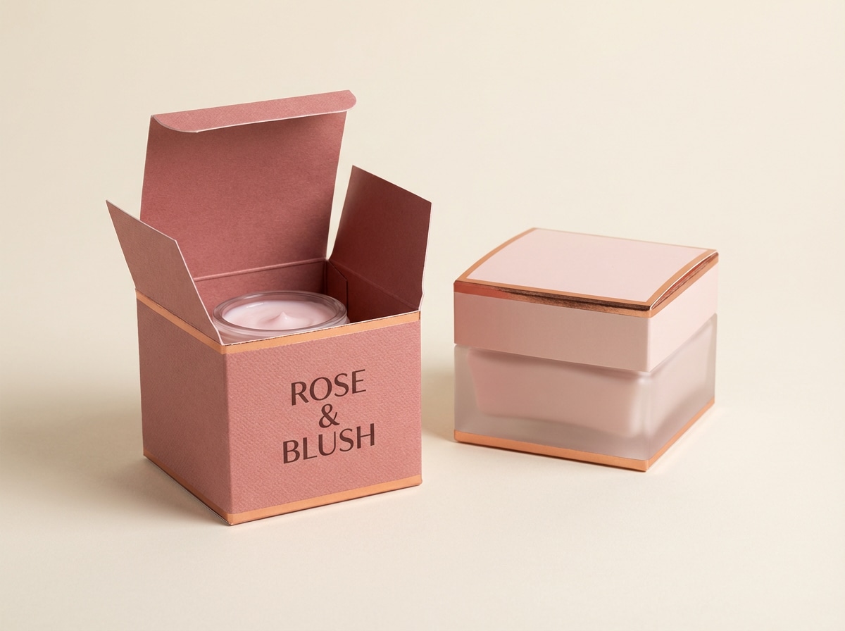
- Rose Gold Luxe
- Strawberry Milkshake
- Cherry Blossom Sky
- Raspberry Chocolate
- Pink Lemonade Fresh
- Ballet Slipper Neutral
- Orchid Violet Blend
- Coral Pink Sunset
- Pink Granite Minimal
- Flamingo Teal Punch
- Soft Pink Nursery
- Hot Pink Streetwear
- Vintage Rose Sepia
- Pink Clay Terracotta
- What Colors Go Well with Pink?
- How to Use a Pink Color Palette in Real Designs
- Create Pink Palette Visuals with AI
Why Pink Palettes Work So Well
A pink color scheme is flexible: it can read calming in blush tones, premium with dark anchors, or energetic when pushed into fuchsia and neon. That range makes pink tones useful across digital products and print, as long as contrast and saturation are controlled.
- Wide mood range: from gentle pastels to high-energy hot pink, you can match nearly any brand voice.
- Easy to structure: pink works well with a neutral background plus a dark text color for clear hierarchy.
- Strong focal power: saturated pink pulls attention fast, ideal for buttons, badges, and promo headlines.
- Pairs well with trends: pink and gray for modern UI, pink and gold for premium packaging, pink and teal for playful campaigns.
20+ Pink Color Palette Ideas (with HEX Codes)
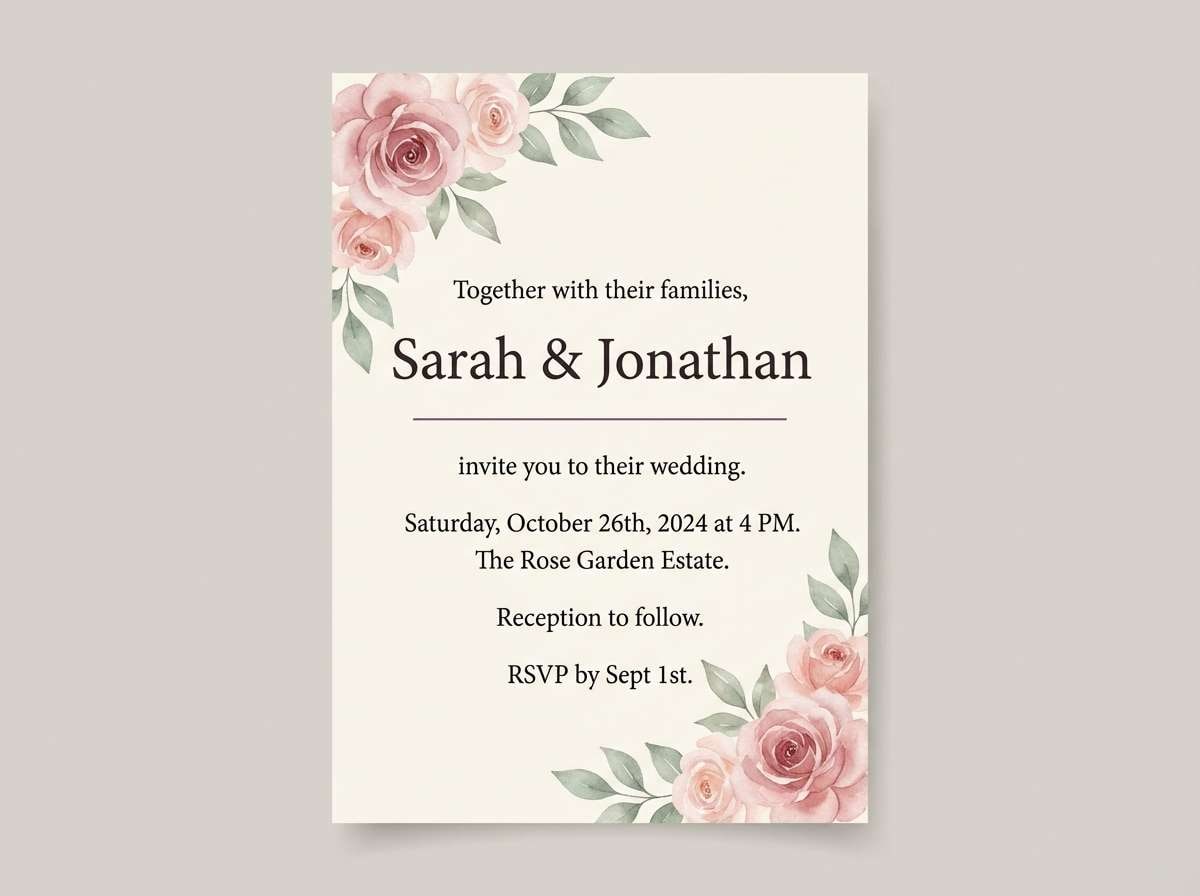
1) Blush Rose Cream
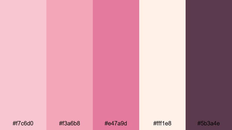
HEX: #f7c6d0 #f3a6b8 #e47a9d #fff1e8 #5b3a4e
Mood: soft, romantic, comforting
Best for: wedding invitation
Use the cream as the main background to keep long copy readable, then layer blush and rose for floral elements, borders, or section panels. Place the deeper rose on small highlights like monograms or RSVP buttons. Keep the plum for all body text, dividers, and key details so the print contrast stays crisp.
Image example of blush rose cream generated using media.io
Media.io is an online AI studio for creating and editing video, image, and audio in your browser.

2) Cotton Candy Pop
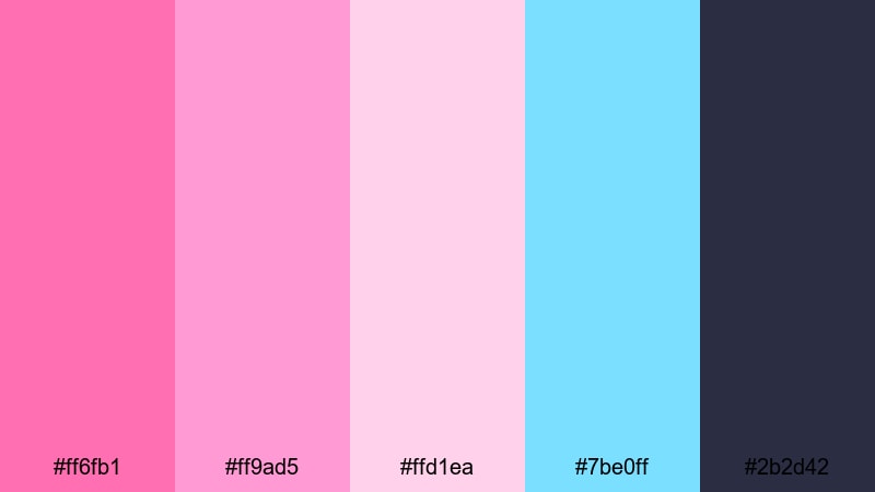
HEX: #ff6fb1 #ff9ad5 #ffd1ea #7be0ff #2b2d42
Mood: playful, youthful, energetic
Best for: social media post
Use hot pink for the headline or main sticker shape, then support it with bubblegum pink for secondary badges and UI-like chips. Keep the pale pink for background and spacing so the layout does not feel crowded. Add sky blue in small accents for contrast, and set all captions in charcoal for clean readability on mobile.
Image example of cotton candy pop generated using media.io

3) Modern Rose Gray
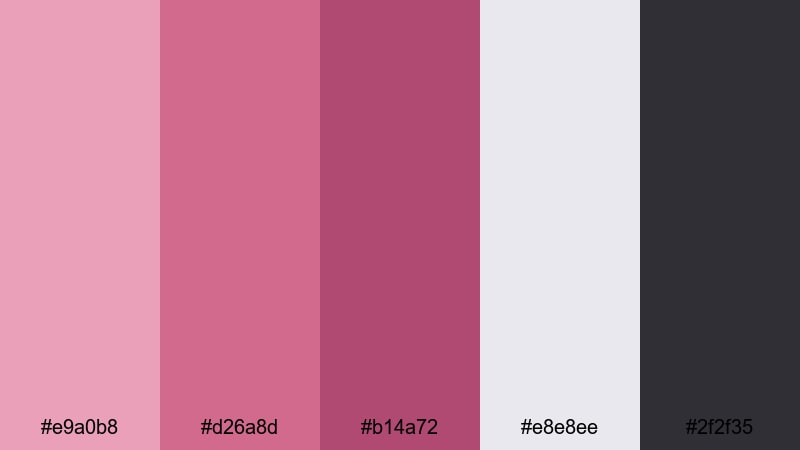
HEX: #e9a0b8 #d26a8d #b14a72 #e8e8ee #2f2f35
Mood: modern, balanced, professional
Best for: ui landing page
Start with light gray as the page base, then use dusty rose for cards, section backgrounds, and soft gradients. Reserve the deeper rose tones for primary actions like buttons and selected states to keep the UI clear. Keep near-black for body text and navigation so contrast is predictable, making this a reliable pink palette for UI components and landing pages.
Image example of modern rose gray generated using media.io
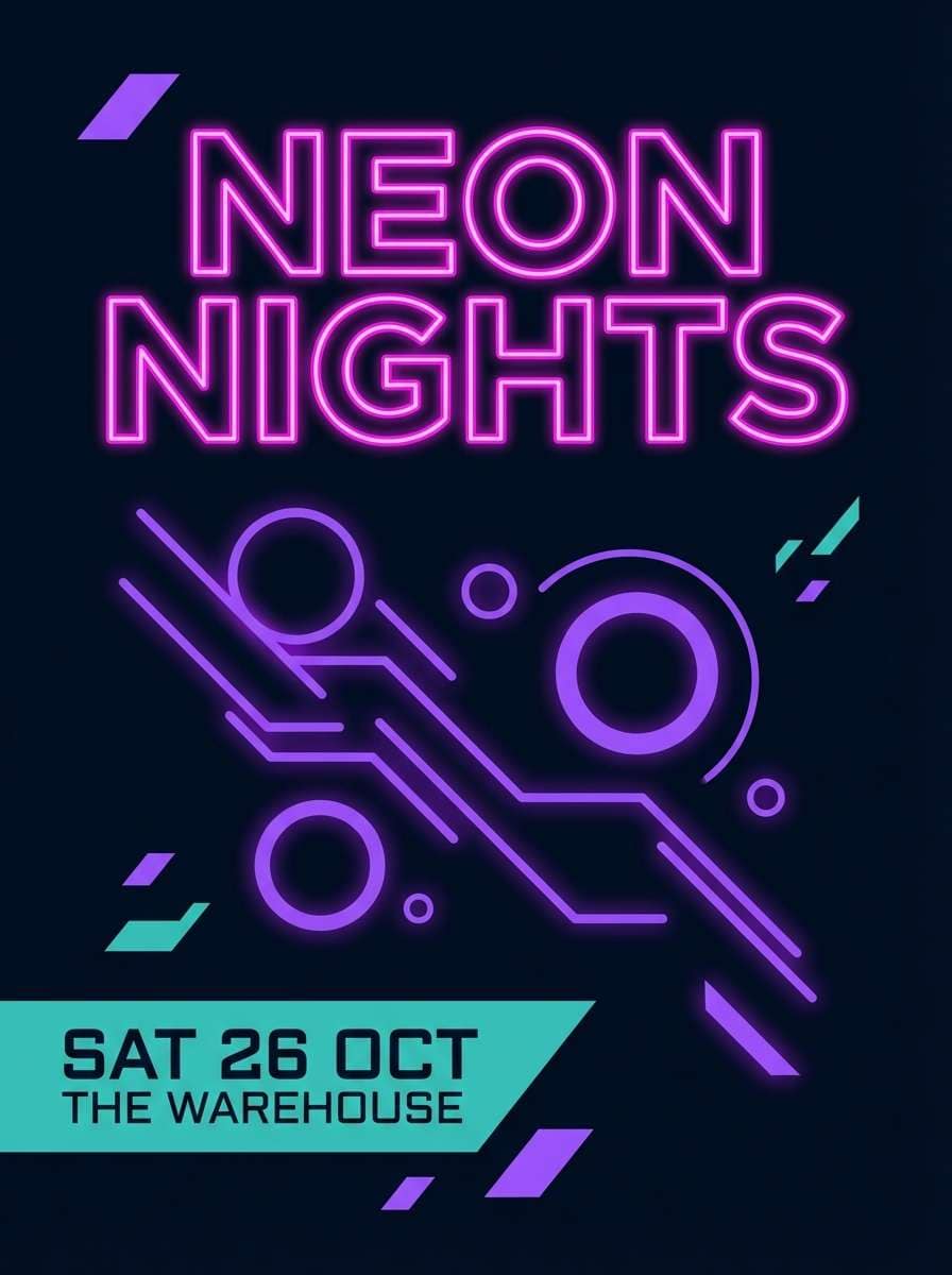
4) Fuchsia Neon Night
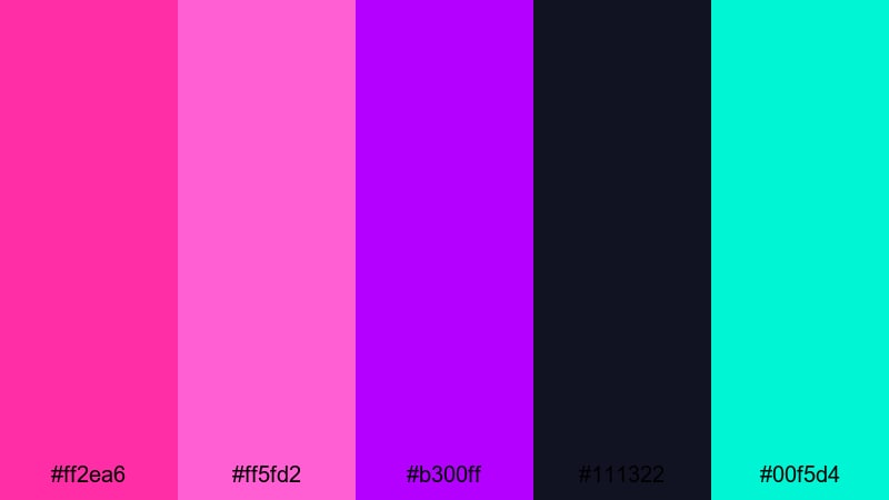
HEX: #ff2ea6 #ff5fd2 #b300ff #111322 #00f5d4
Mood: bold, futuristic, nightlife
Best for: event poster
Use the near-black as the full background so neon pink and violet can glow without washing out. Put fuchsia on the headline and key shapes, then use violet for gradients, shadows, and secondary titles. Add teal only for important details like date, venue, and QR cues, so your poster stays high-contrast and easy to scan at a distance.
Image example of fuchsia neon night generated using media.io
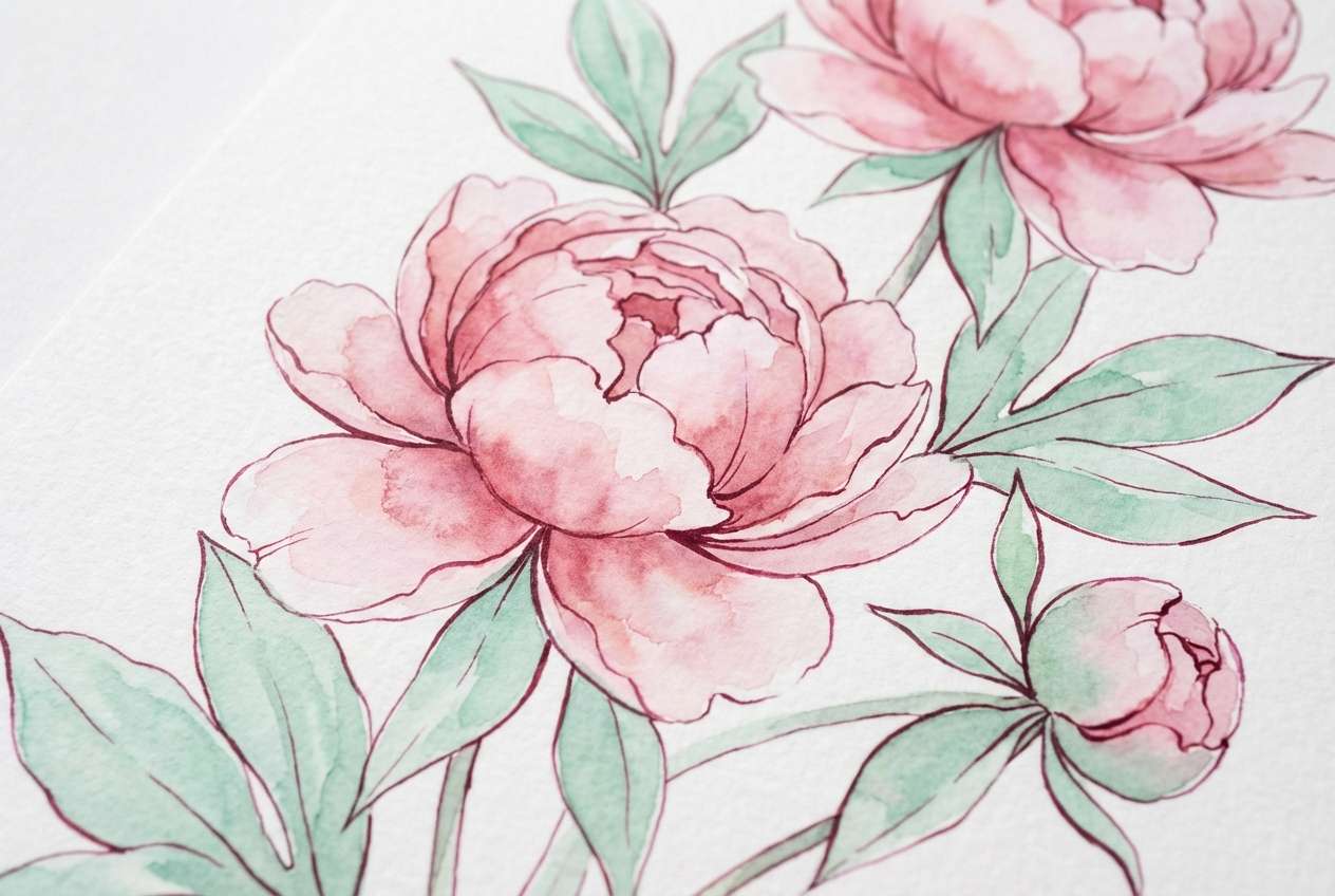
5) Peony Garden Watercolor
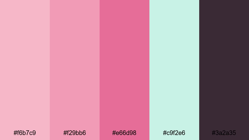
HEX: #f6b7c9 #f29bb6 #e66d98 #c9f2e6 #3a2a35
Mood: fresh, floral, springtime
Best for: botanical illustration
Build petals using blush and rose as the primary paint range, then soften edges with lighter washes so the illustration stays airy. Use mint for leaves, background haze, or small framing elements to keep the pink tones from feeling too warm. Save the deep berry for fine linework, labels, or small text where you need definition.
Image example of peony garden watercolor generated using media.io
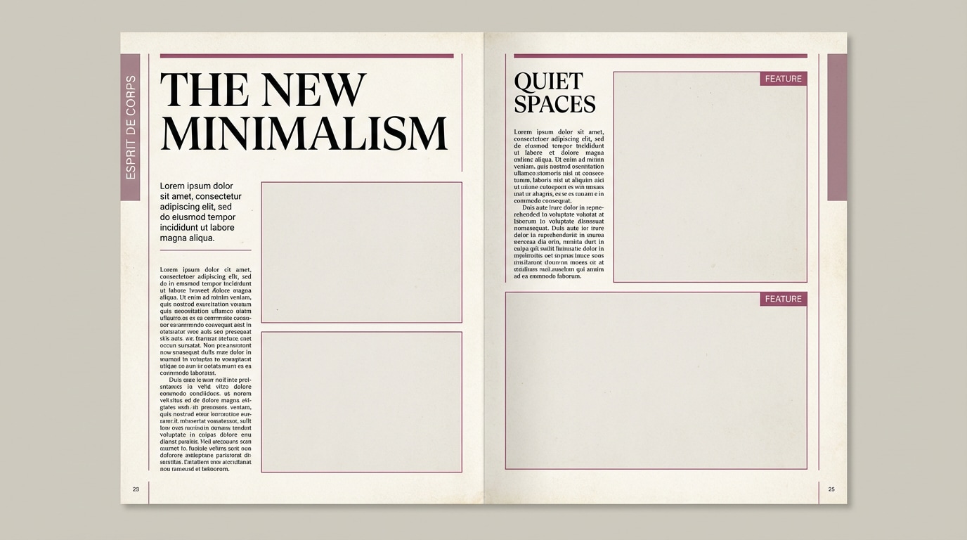
6) Dusty Mauve Editorial
HEX: #d9a4b4 #c07a97 #8a4b66 #f6f1f4 #1f1b1d
Mood: elegant, editorial, mature
Best for: magazine layout
Use off-white as the page base and keep most negative space clean for a premium feel. Set section headers and pull quotes in mauve, then use berry for thin rules, category tags, and small emphasis. Anchor the entire typographic system with near-black for body copy and captions to keep the layout readable in both print and PDF.
Image example of dusty mauve editorial generated using media.io
7) Rose Gold Luxe
HEX: #f4b6c2 #e79aa7 #c97c7a #f7efe9 #3d2b2f
Mood: luxurious, warm, refined
Best for: product packaging
Use warm cream as the main packaging base, then apply blush and rose for panels, seals, or wrap patterns. The coppery shade works best in small accents to imitate rose-gold foil or emboss details without overpowering the design. Keep deep brown for ingredient lists, legal lines, and barcodes so this pink palette for packaging stays practical.
Image example of rose gold luxe generated using media.io
8) Strawberry Milkshake
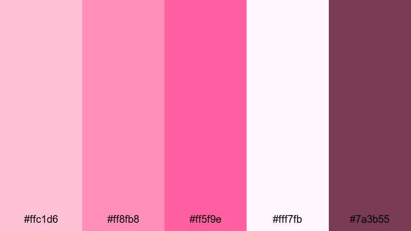
HEX: #ffc1d6 #ff8fb8 #ff5f9e #fff7fb #7a3b55
Mood: sweet, friendly, cheerful
Best for: cafe menu flyer
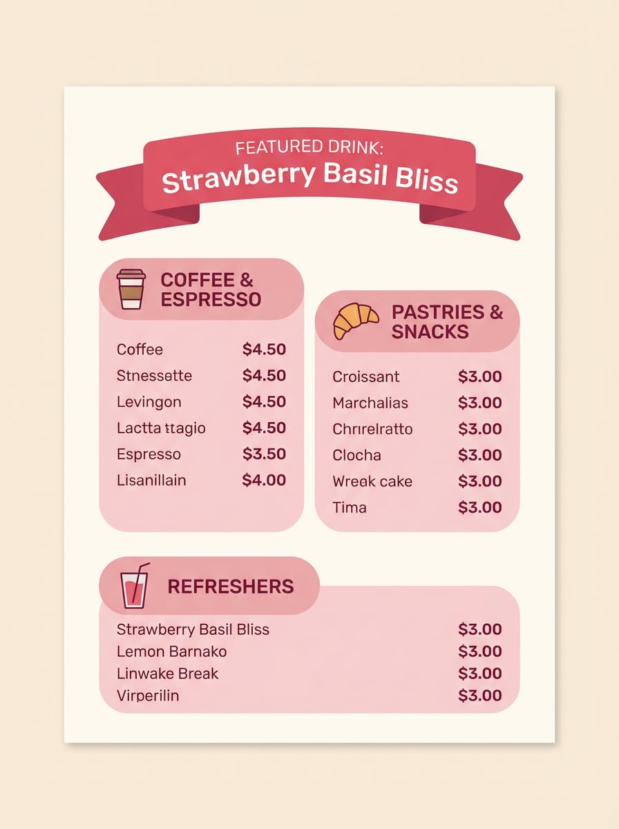
Use the near-white as the menu background so item lists stay clean and readable. Build sections with soft pink blocks, then highlight featured drinks or limited offers with the brighter strawberry pink. Use the berry tone for prices, descriptions, and icons so the information hierarchy remains strong, making this a solid pink palette for posters and flyers.
Image example of strawberry milkshake generated using media.io
9) Cherry Blossom Sky
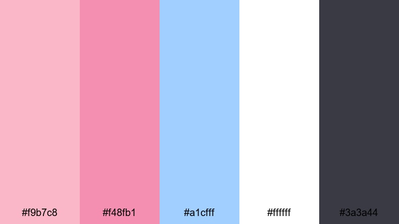
HEX: #f9b7c8 #f48fb1 #a1cfff #ffffff #3a3a44
Mood: airy, serene, optimistic
Best for: website hero banner
Use white as the main hero background, then add soft abstract shapes in pink and sky blue behind the headline for depth. Keep charcoal for all text to ensure contrast over light areas. Use the medium pink for the primary call-to-action button and key links, making this a clean pink palette for branding and homepage UI.
Image example of cherry blossom sky generated using media.io
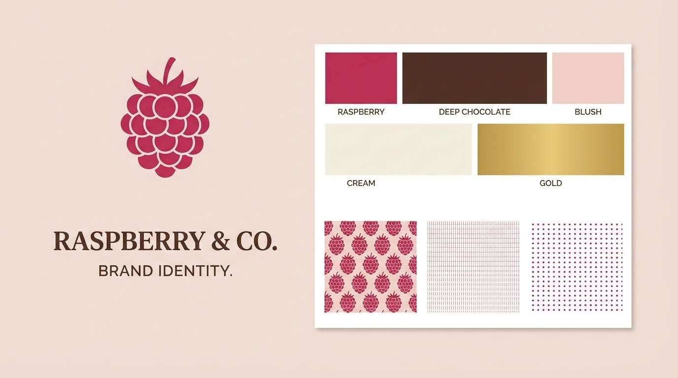
10) Raspberry Chocolate
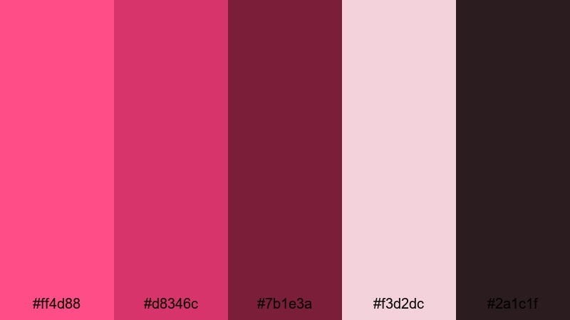
HEX: #ff4d88 #d8346c #7b1e3a #f3d2dc #2a1c1f
Mood: rich, indulgent, dramatic
Best for: brand identity
Use raspberry as the signature brand highlight for logos, social accents, and key UI states. Keep pale blush for stationery, backgrounds, and presentation slides so the system has breathing room. Use chocolate tones for typography, icons, and secondary marks to ground the palette and avoid an overly sweet look, especially in a pink palette with HEX codes for brand guidelines.
Image example of raspberry chocolate generated using media.io
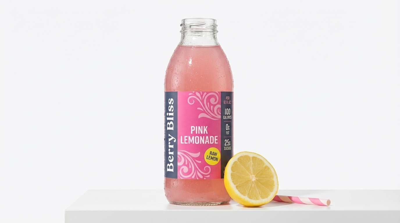
11) Pink Lemonade Fresh
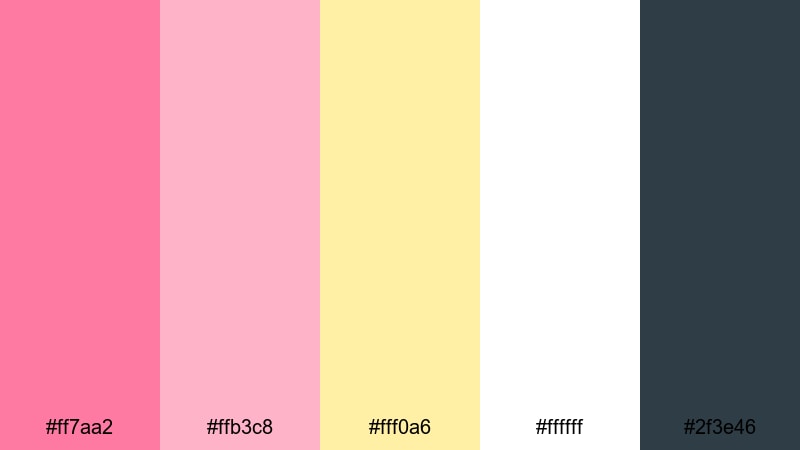
HEX: #ff7aa2 #ffb3c8 #fff0a6 #ffffff #2f3e46
Mood: fresh, sunny, upbeat
Best for: product ad
Use white as the main ad background for a bright, clean look. Make the stronger pink the hero color for the label or headline, then use the softer pink for supporting shapes and gradients. Add lemon yellow only in small bursts like badges or discount tags, while deep slate handles claims and fine print for readability.
Image example of pink lemonade fresh generated using media.io
12) Ballet Slipper Neutral
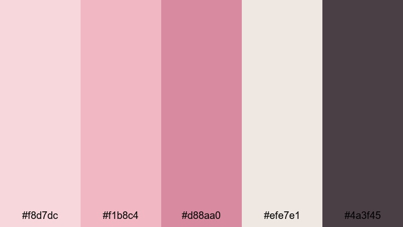
HEX: #f8d7dc #f1b8c4 #d88aa0 #efe7e1 #4a3f45
Mood: gentle, minimal, refined
Best for: portfolio website
Use the warm neutral as the site canvas and keep blush for section backgrounds, hover states, and soft dividers. Bring in the mid pink sparingly for links, tags, and small callouts so the site remains minimal. Set headings and body copy in deep taupe for consistent contrast, making this a reliable blush pink palette for portfolios.
Image example of ballet slipper neutral generated using media.io
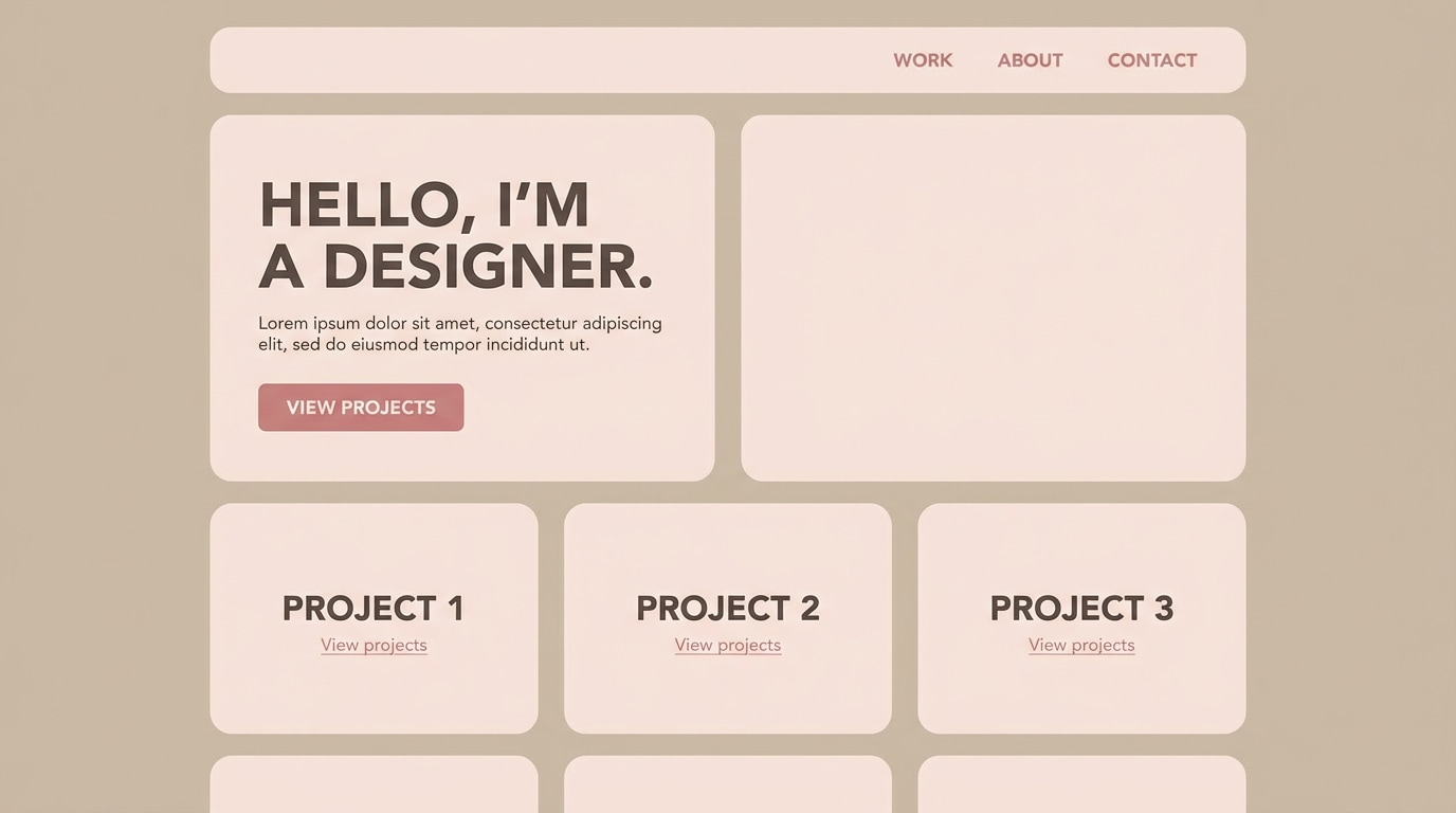
13) Orchid Violet Blend
HEX: #ff86c8 #d66efd #9a4dff #f6f0ff #2b193f
Mood: creative, expressive, dreamy
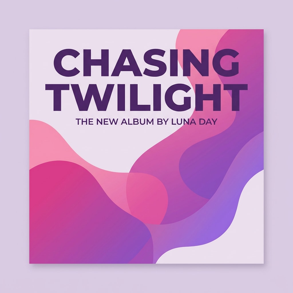
Best for: album cover
Use pale lavender as the base to keep the cover light and printable. Build a gradient from pink into violet for the main shapes or background art, then place titles in deep purple for sharp contrast. Keep bright accents limited to one focal point, so the composition stays readable as a thumbnail.
Image example of orchid violet blend generated using media.io
14) Coral Pink Sunset
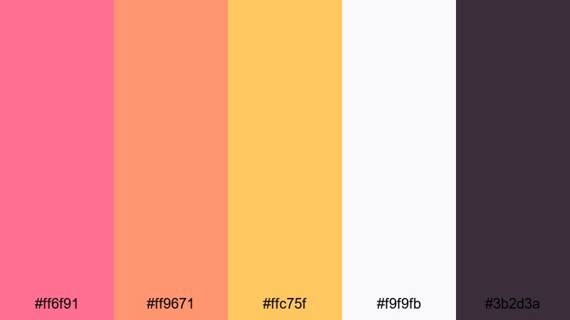
HEX: #ff6f91 #ff9671 #ffc75f #f9f9fb #3b2d3a
Mood: warm, optimistic, lively
Best for: travel poster
Use off-white as the base so your travel details stay readable. Create bold coral-to-orange blocks for the hero area, then add golden yellow for small highlights like stamps, rating badges, or limited-time callouts. Keep deep plum for body copy and icons so the poster keeps structure even with warm, bright pink tones.
Image example of coral pink sunset generated using media.io
15) Pink Granite Minimal
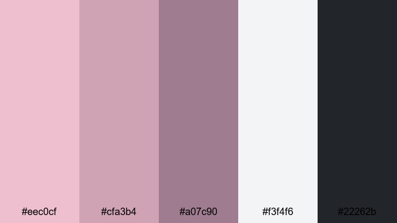
HEX: #eec0cf #cfa3b4 #a07c90 #f3f4f6 #22262b
Mood: calm, understated, contemporary
Best for: dashboard ui
Use the cool light gray as the dashboard canvas and apply muted pinks to separate cards, filters, and chart series without visual noise. Keep the darkest pink for selected states or one key metric, not everything. Use near-black for all text, axes, and numbers to support quick scanning, making this a practical pink palette for UI and analytics.
Image example of pink granite minimal generated using media.io
16) Flamingo Teal Punch
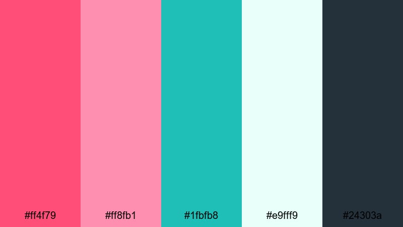
HEX: #ff4f79 #ff8fb1 #1fbfb8 #e9fff9 #24303a
Mood: tropical, vibrant, fun
Best for: summer flyer
Use the light mint as the background to cool down the pink tones and keep the flyer breathable. Place flamingo pink in the headline and main shapes, then use teal for secondary callouts like RSVP, location, or ticket info. Keep dark slate for small text so the details stay readable under bright, energetic colors.
Image example of flamingo teal punch generated using media.io

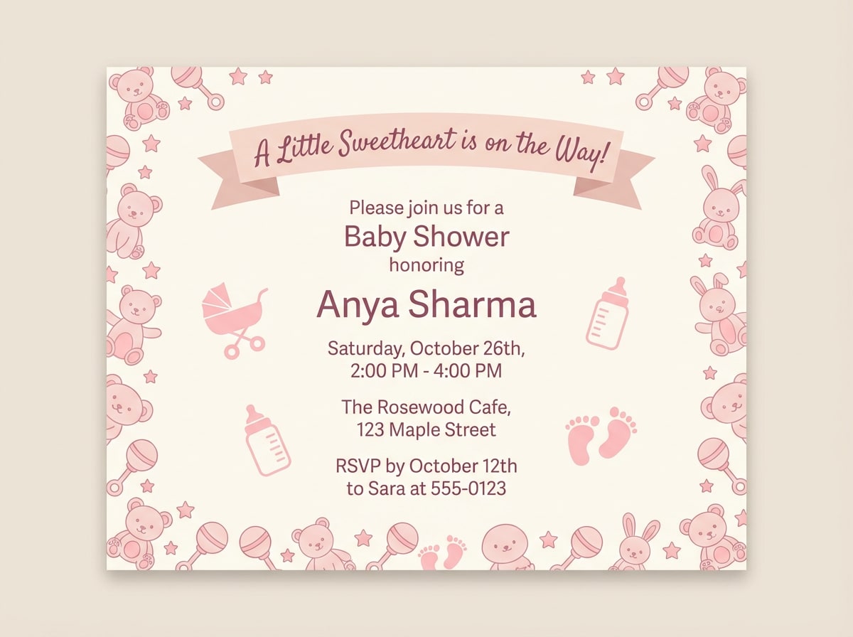
17) Soft Pink Nursery
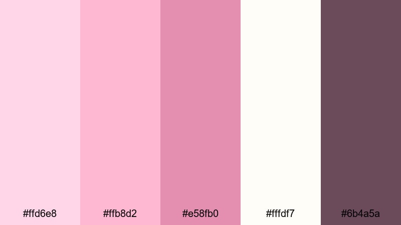
HEX: #ffd6e8 #ffb8d2 #e58fb0 #fffdf7 #6b4a5a
Mood: cozy, nurturing, calm
Best for: baby shower invitation
Use the warm off-white as the card base, then apply the palest pink for borders and large background areas to keep the invitation soft. Use mid pink for icons, headings, and small illustrations so they still show up after printing. Set all essential details in muted berry to maintain legibility on textured paper.
Image example of soft pink nursery generated using media.io
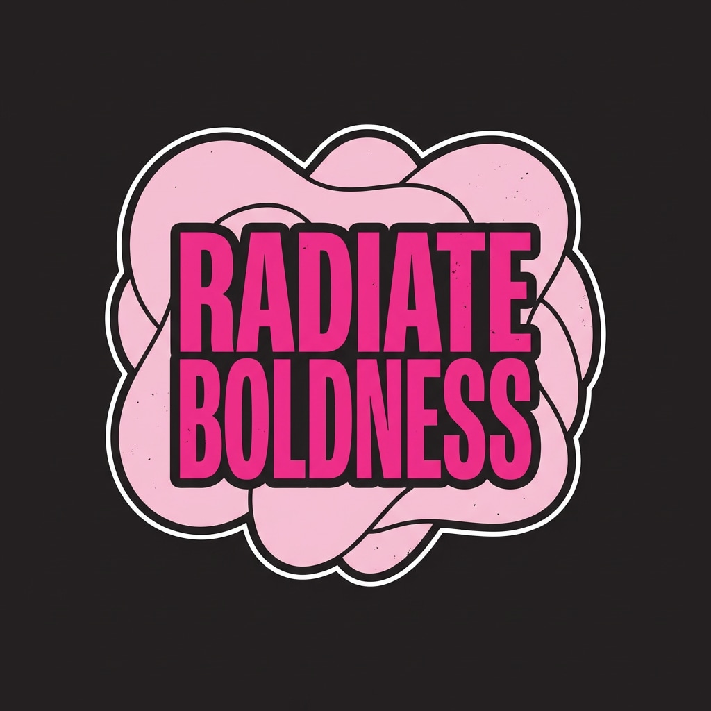
18) Hot Pink Streetwear
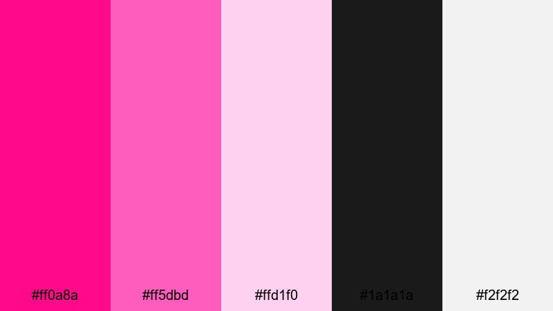
HEX: #ff0a8a #ff5dbd #ffd1f0 #1a1a1a #f2f2f2
Mood: edgy, trendy, high-contrast
Best for: t-shirt graphic
Use black as the base and place hot pink as the main typographic mark for maximum contrast. Use the lighter pink for supporting shapes, background bursts, or secondary lettering. Keep white for outlines and small text to preserve legibility from a distance, especially for screen print or embroidery placements.
Image example of hot pink streetwear generated using media.io
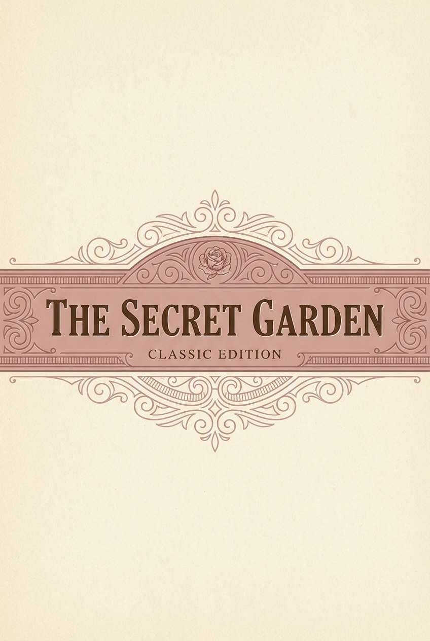
19) Vintage Rose Sepia
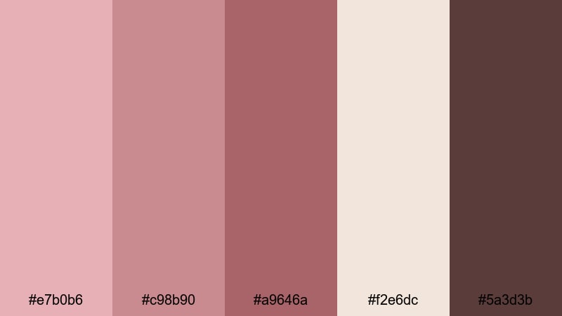
HEX: #e7b0b6 #c98b90 #a9646a #f2e6dc #5a3d3b
Mood: nostalgic, warm, classic
Best for: book cover
Use sepia cream as the cover background to create an aged-paper feel. Apply vintage rose for a large title band or framing block, then use deeper rose for subtitles or small ornaments. Keep deep brown for author name and body text so the hierarchy is clear, making this a strong rose color palette for publishing.
Image example of vintage rose sepia generated using media.io
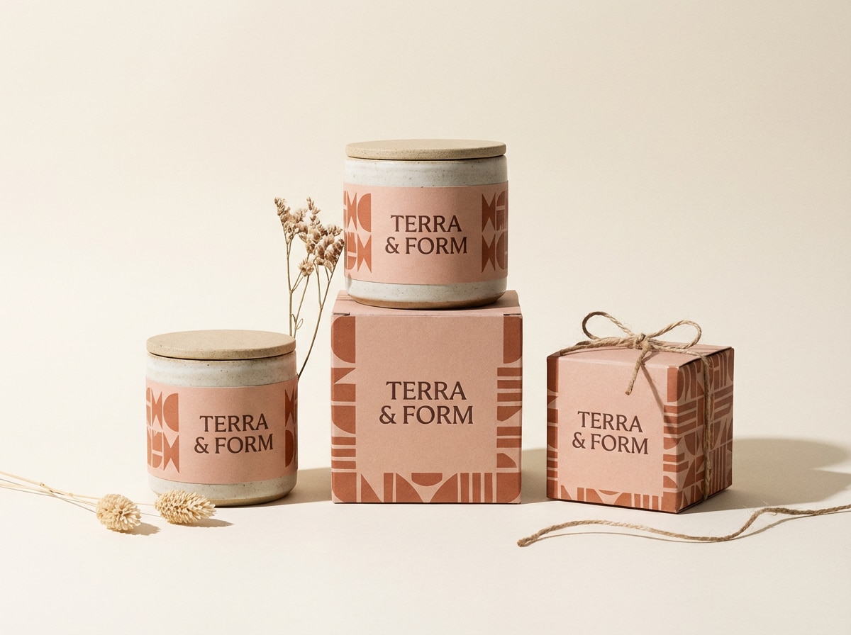
20) Pink Clay Terracotta
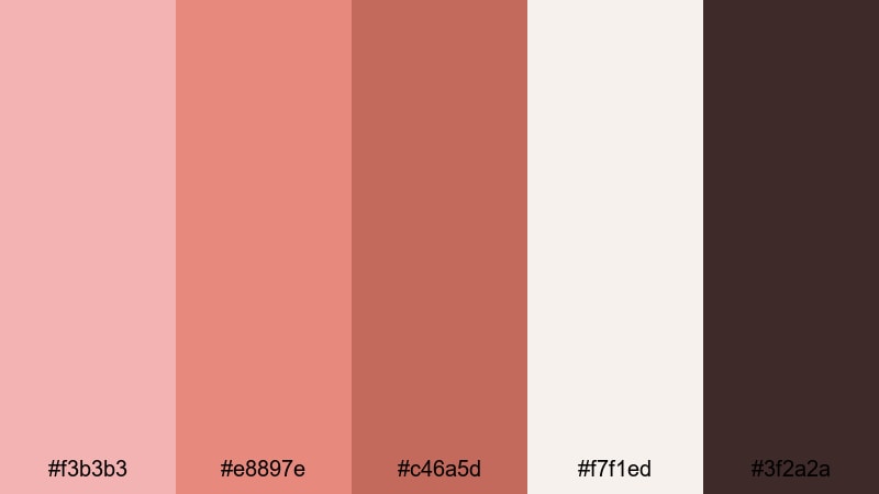
HEX: #f3b3b3 #e8897e #c46a5d #f7f1ed #3f2a2a
Mood: earthy, grounded, artisanal
Best for: ceramic brand packaging
Use warm off-white as the label base, then build a tonal system with clay pink and terracotta for patterns, borders, and category bands. Keep terracotta for larger areas and the deeper brown for product names and essential details so the packaging reads clearly on shelves. This pink color palette works especially well on matte paper with minimal line icons.
Image example of pink clay terracotta generated using media.io
What Colors Go Well with Pink?
- Pairing: pink + charcoal or near-black creates strong contrast for text-heavy layouts; use it for dashboards, landing pages, and accessibility-focused UI.
- Pairing: pink + warm cream feels soft and premium; use it for packaging, invitations, and editorial layouts.
- Pairing: pink + cool gray reads modern and balanced; use it as a safe default for a pink palette for UI systems.
- Pairing: pink + teal adds a fresh complementary pop; use it for flyers, social campaigns, and playful branding.
- Pairing: pink + sky blue feels airy and optimistic; use it for hero banners, beauty brands, and spring seasonal content.
- Pairing: pink + violet pushes creative and expressive energy; use it for album covers, nightlife posters, and bold digital art.
How to Use a Pink Color Palette in Real Designs
- Pick a dark anchor early: for most pink color combinations, choose a near-black, deep plum, or deep brown for body text and icons, then keep pink tones for emphasis. This prevents low-contrast pastel-on-pastel UI.
- Control saturation by role: reserve hot pink or fuchsia for actions (primary buttons, badges, key headers). Use blush or dusty rose for backgrounds, cards, and large surfaces so the page does not feel loud.
- Use neutrals to make pink feel premium: warm creams and off-whites make pink tones look more refined, especially for packaging and editorial. Cool grays make the same pink color scheme feel more product-driven and modern.
- Test pink in small text sizes: if you must use pink for text, keep it on light backgrounds and increase weight. For dark backgrounds, switch to white text and keep pink as outlines, dividers, or highlights.
Create Pink Palette Visuals with AI
If you need fast mockups for a pink palette for branding, a pink palette for posters, or a pink palette for UI, generate visuals from the prompts above and match them to your HEX codes. In Media.io, you can iterate quickly by changing one variable at a time (background, lighting, typography, or art style) while keeping the same pink color scheme consistent.
Media.io is an online AI studio for creating and editing video, image, and audio in your browser.
Pink Color Palette FAQs
-
What is a good neutral to pair with pink?
Warm cream and cool light gray are the easiest neutrals. Cream feels soft and premium, while gray feels modern and UI-friendly. -
Which pink works best for professional designs?
Dusty rose and muted mauve tend to look more professional than neon pink. Add a dark anchor (charcoal or deep plum) for contrast. -
How do I keep a pink color scheme from feeling childish?
Lower saturation, add gray or brown tones, and use pink mainly as an accent. Avoid using multiple bright pinks at the same time. -
What colors go well with hot pink?
Near-black, white, and small teal accents work well. Use hot pink for focal elements and keep the rest minimal. -
Can I use pink for UI buttons?
Yes. Use a deeper pink for primary buttons and keep text near-black or white depending on contrast. Always check readability for hover and disabled states. -
How many colors should a pink palette include?
Five is a practical set: 1 background, 1 surface, 1 primary pink, 1 accent color, and 1 dark text color. -
Where can I get a pink palette with HEX codes?
This page includes 20 pink palettes with HEX codes. You can also generate matching visuals in Media.io using the prompts under each palette.


