


 ChatGPT
 Perplexity
 Gemini
 Claude
 Grok
Grok
Planning spring visuals that feel fresh but still readable? These easter color palettes mix soft pastels, playful brights, and modern neutrals into practical easter color combinations you can use for invites, UI, packaging, and posts. Below you get 20 palettes with HEX codes, quick usage guidance for backgrounds and buttons, plus AI image prompts you can run in Media.io to generate matching mockups fast.
In this article
- Why Easter Palettes Work So Well
-
- Soft Egg Pastels
- Bunny Blush & Mint
- Lavender Meadow
- Jellybean Brights
- Pastel Picnic
- Spring Candlelight
- Robin Egg Blue
- Tulip & Cream
- Speckled Egg Neutrals
- Carrot Patch Pop
- Cotton Candy Sunrise
- Church Sunday Calm
- Chocolate Bunny
- Easter Basket Weave
- Peeps Marshmallow
- Garden Party Pastels
- Spring Market Fresh
- Easter Night Glow
- Vintage Egg Dye
- Daffodil & Sky
- What Colors Go Well with Easter?
- How to Use a Easter Color Palette in Real Designs
- Create Easter Palette Visuals with AI

Why Easter Palettes Work So Well
An easter color scheme is flexible: it can read soft and traditional, or modern and high-contrast. Designers like these easter tones because they quickly signal spring without needing heavy illustration.
- Instant season cue: pastels and warm creams reference eggs, flowers, and daylight.
- Easy hierarchy: light backgrounds let a single accent color carry CTAs and highlights.
- Cross-format friendly: works for print (invites, packaging) and digital (UI, social posts) with minimal changes.
- Brand-safe options: neutrals and muted pastels support a modern easter palette for branding.
20+ Easter Color Palette Ideas (with HEX Codes)
Use the sets below as ready-made easter color combinations. Each easter palette with HEX codes includes a quick layout approach plus an AI prompt for generating matching visuals.
1) Soft Egg Pastels
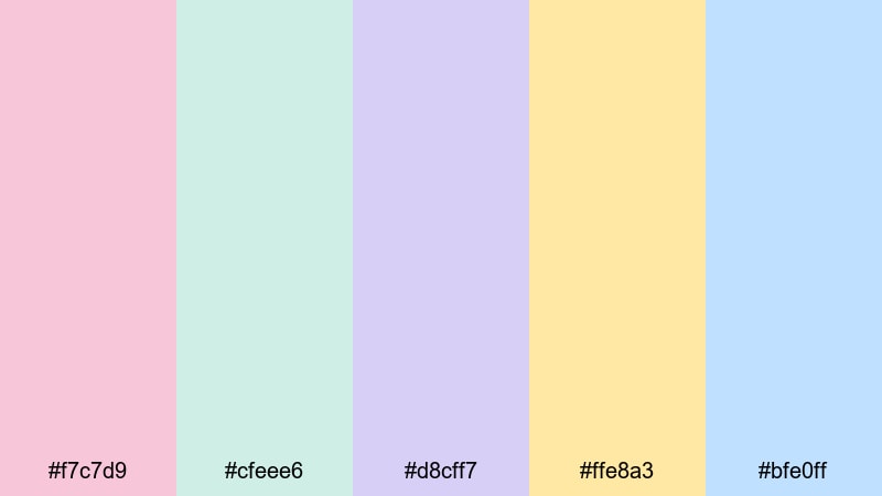
HEX: #f7c7d9 #cfeee6 #d8cff7 #ffe8a3 #bfe0ff
Mood: gentle, cheerful, airy
Best for: Invitation design
For an easter invitation, keep #bfe0ff or #cfeee6 as the background, use #f7c7d9 for the headline, and set body text in a darker tint of #d8cff7 for a soft-but-readable feel. Use #ffe8a3 as the button or RSVP highlight so the key action stands out without breaking the pastel vibe.
Image example of soft egg pastels generated using media.io
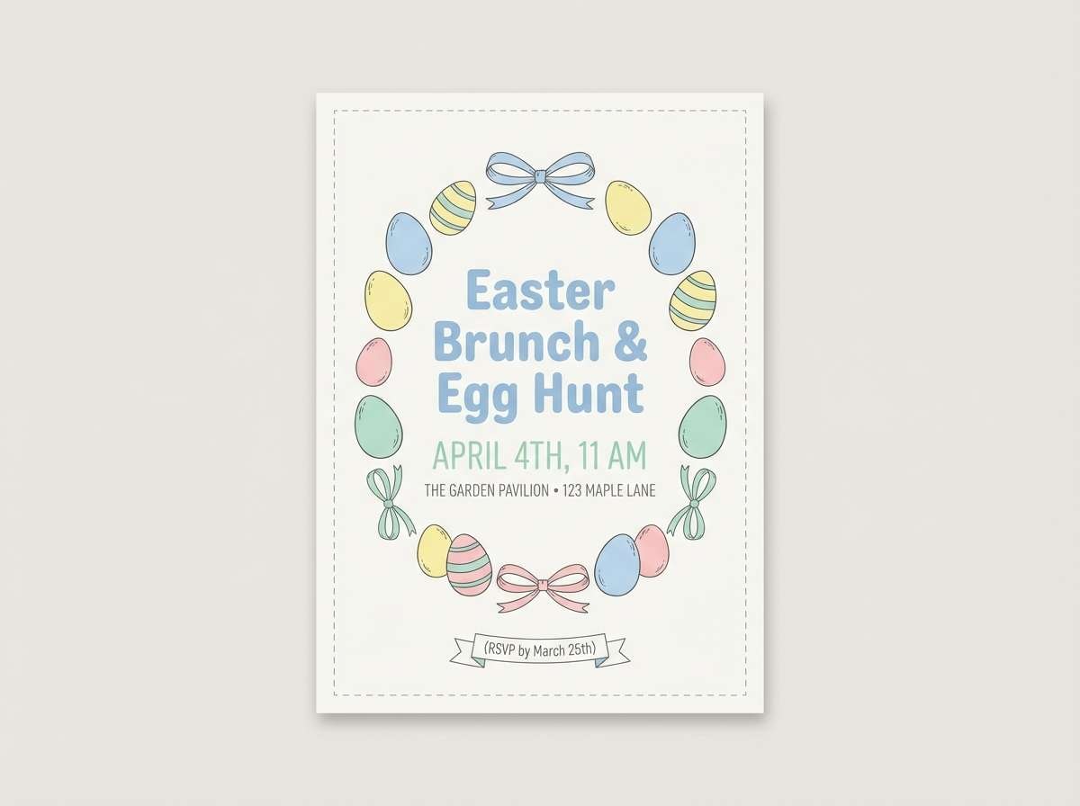
Create palette-perfect visuals with Media.io. Powered by Wan 2.7 Image, it helps you generate and edit images with precise color control, consistent tones, and ready-to-use styles in your browser.

2) Bunny Blush & Mint
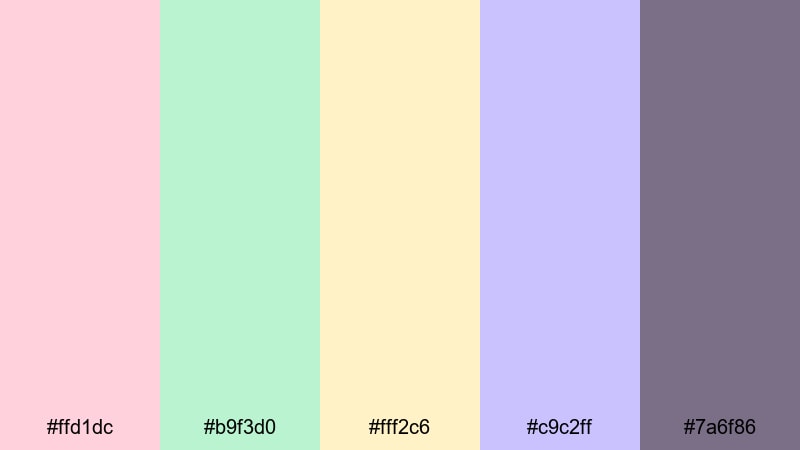
HEX: #ffd1dc #b9f3d0 #fff2c6 #c9c2ff #7a6f86
Mood: cute, friendly, cozy
Best for: Kids party flyer
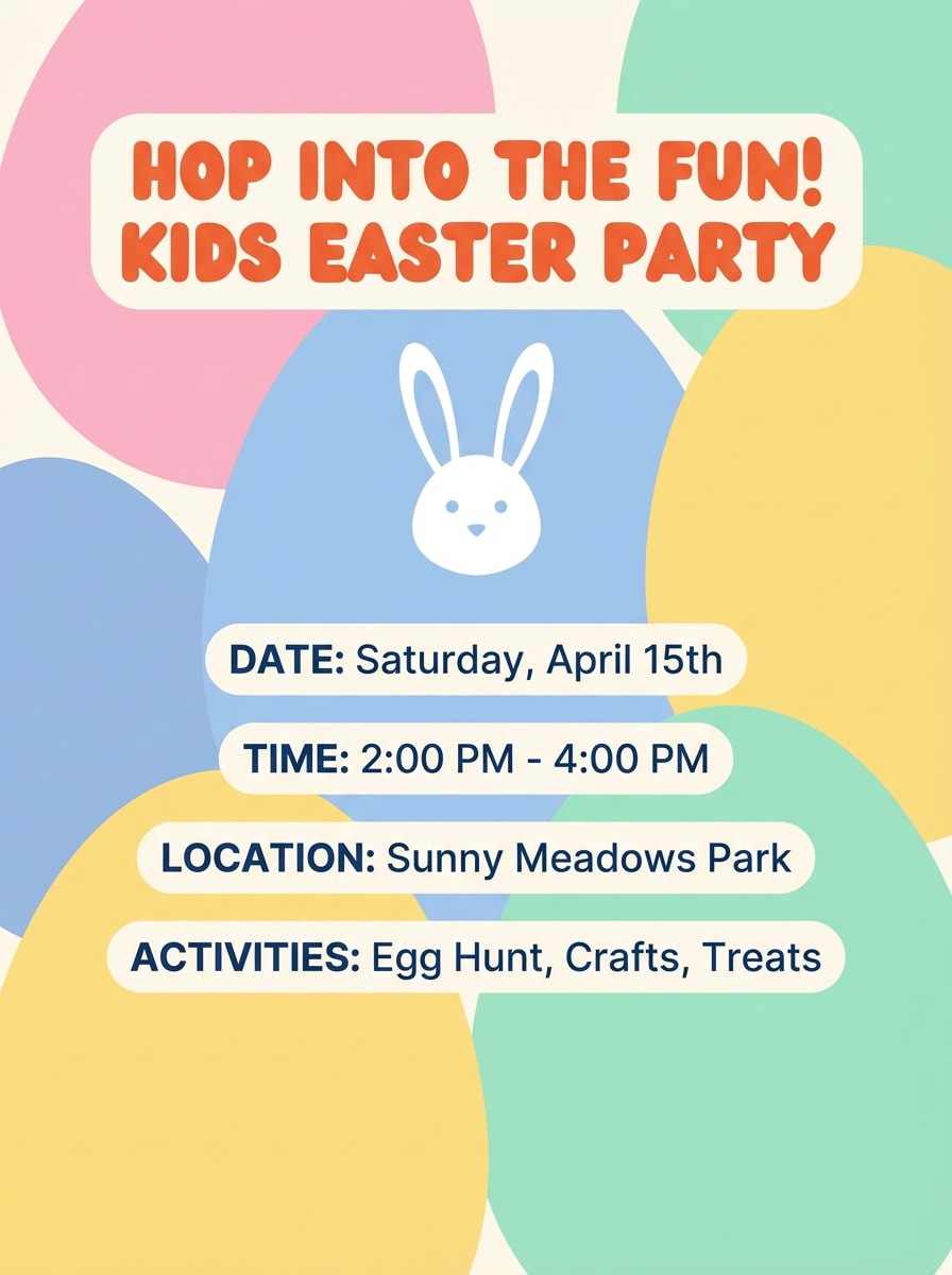
Block out the layout with #ffd1dc and #b9f3d0 as large background panels, then use #7a6f86 for all text to keep contrast stable. Save #fff2c6 for date/time callouts and #c9c2ff for small button highlights or sticker shapes so the flyer stays playful but organized.
Image example of bunny blush & mint generated using media.io
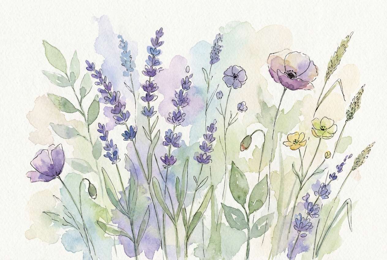
3) Lavender Meadow
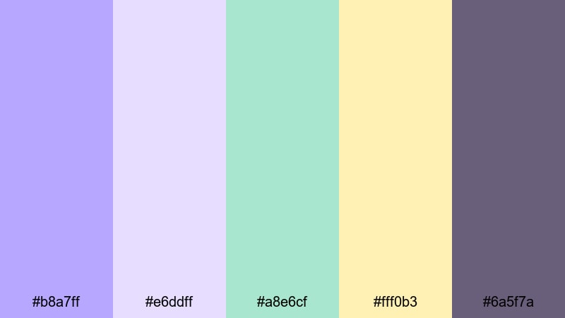
HEX: #b8a7ff #e6ddff #a8e6cf #fff0b3 #6a5f7a
Mood: springtime, calm, whimsical
Best for: Botanical illustration
Make #e6ddff the paper-like background and wash #b8a7ff across main shapes. Use #a8e6cf for leaf forms and secondary fills, then add #fff0b3 only as small highlight spots so it reads like sunlight. Keep captions or UI labels in #6a5f7a for calm contrast.
Image example of lavender meadow generated using media.io
4) Jellybean Brights
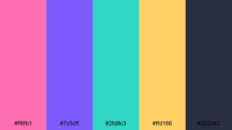
HEX: #ff6fb1 #7c5cff #2fd8c3 #ffd166 #2b2d42
Mood: energetic, playful, bold
Best for: Social media post
Use #2b2d42 for the base background or frame so the bright easter tones stay readable on mobile. Let #ff6fb1 and #7c5cff carry the main shapes, then pick one accent (#2fd8c3 or #ffd166) for buttons, price tags, or highlights to keep the composition controlled.
Image example of jellybean brights generated using media.io

5) Pastel Picnic
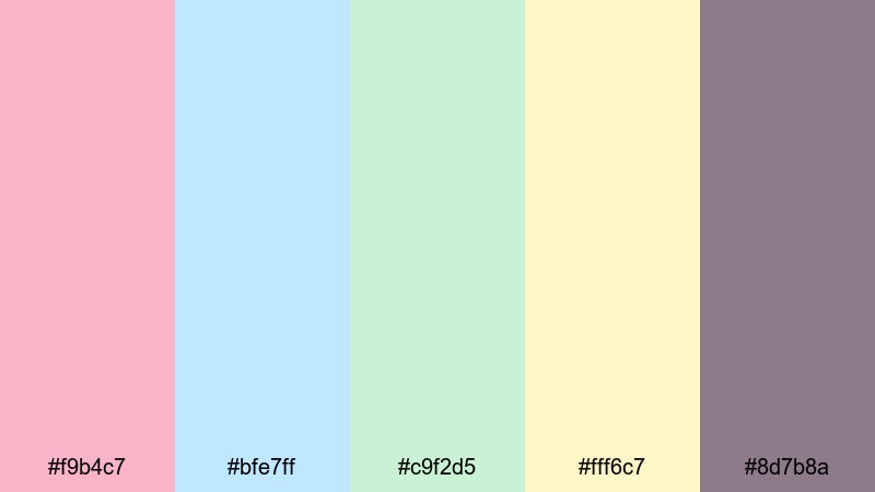
HEX: #f9b4c7 #bfe7ff #c9f2d5 #fff6c7 #8d7b8a
Mood: light, friendly, fresh
Best for: Website hero banner
For an easter palette for UI, keep #bfe7ff or #c9f2d5 as the hero background (solid or soft gradient), then use #f9b4c7 for the primary button. Set headings in #8d7b8a and reserve #fff6c7 for micro-highlights like icons, badges, or hover states.
Image example of pastel picnic generated using media.io
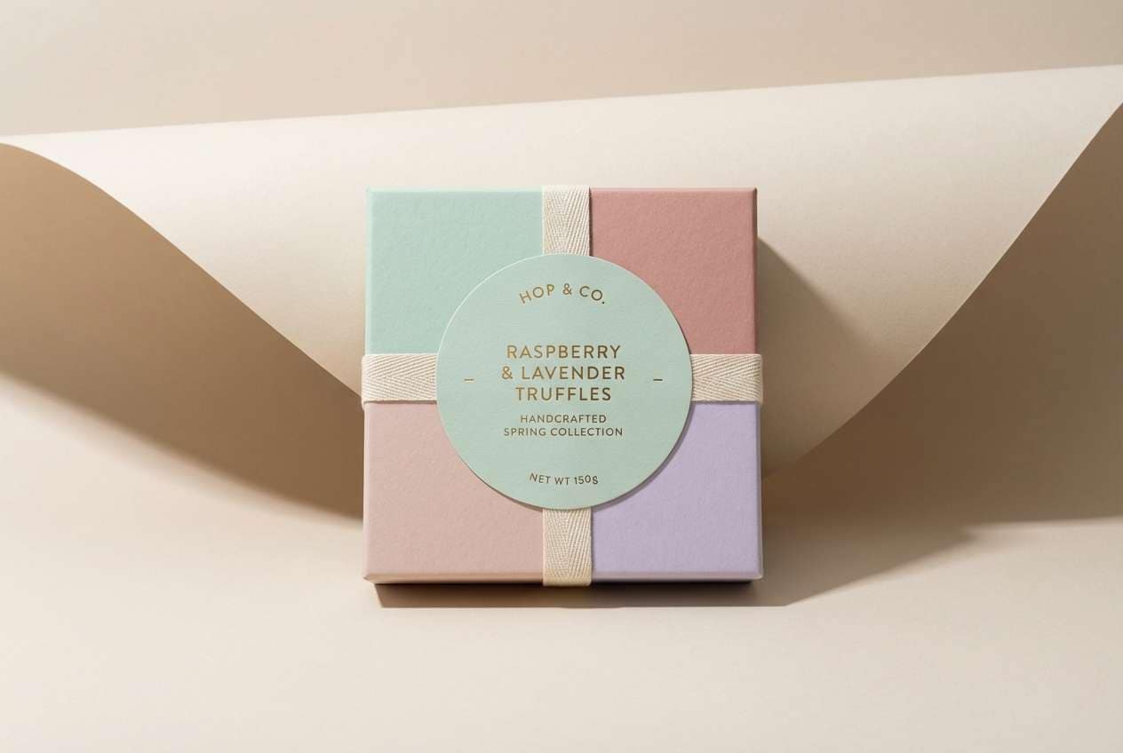
6) Spring Candlelight
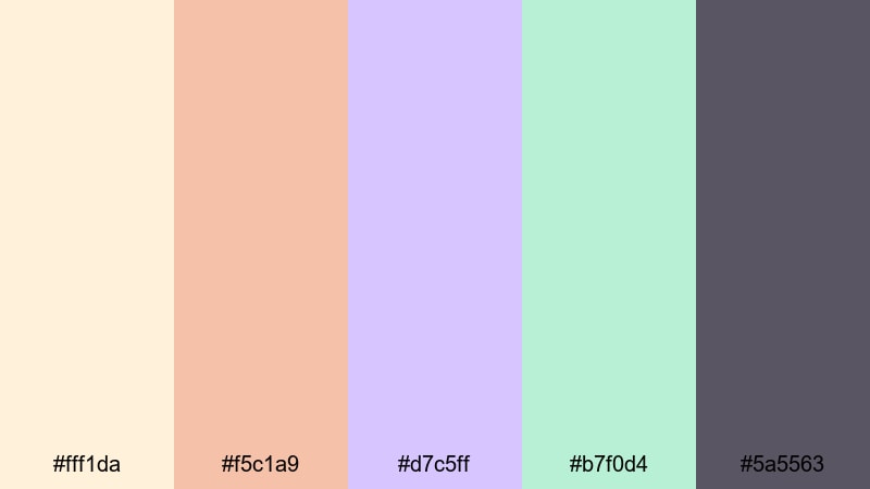
HEX: #fff1da #f5c1a9 #d7c5ff #b7f0d4 #5a5563
Mood: warm, soft, elegant
Best for: Product packaging
Use #fff1da as the label background and #5a5563 for product name and details to keep packaging clean. Bring in #f5c1a9 as brand accents (seals, corner marks), use #d7c5ff for premium cues on secondary panels, and keep #b7f0d4 for subtle pattern highlights or small icons.
Image example of spring candlelight generated using media.io
7) Robin Egg Blue
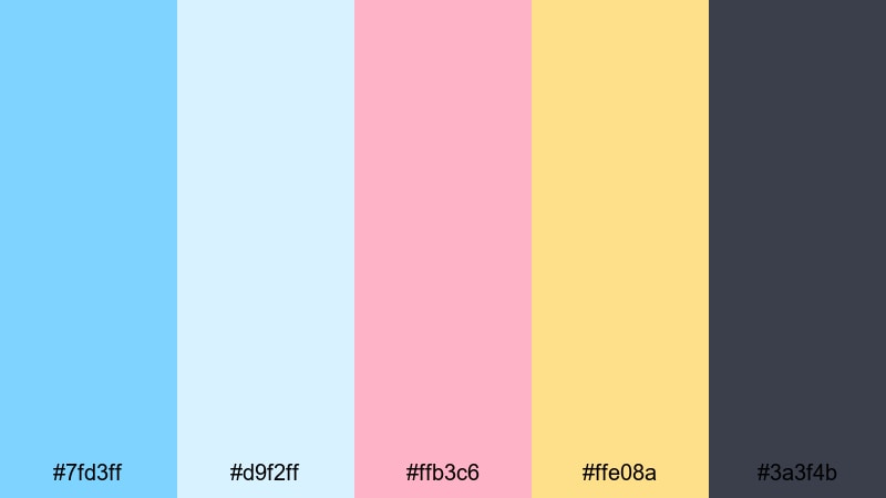
HEX: #7fd3ff #d9f2ff #ffb3c6 #ffe08a #3a3f4b
Mood: crisp, happy, uplifting
Best for: Email header
Make #7fd3ff the main header bar and keep #d9f2ff as the spacing color around text and icons. Use #3a3f4b for typography so it stays readable in inbox previews, then place #ffe08a on offer badges and #ffb3c6 on small decorative highlights to keep the easter colors clear but not busy.
Image example of robin egg blue generated using media.io
8) Tulip & Cream
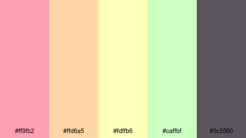
HEX: #ff9fb2 #ffd6a5 #fdffb6 #caffbf #5c5560
Mood: sweet, sunny, approachable
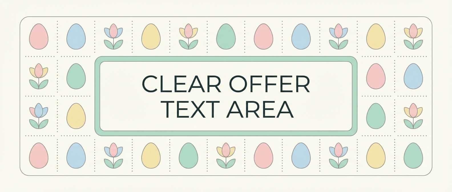
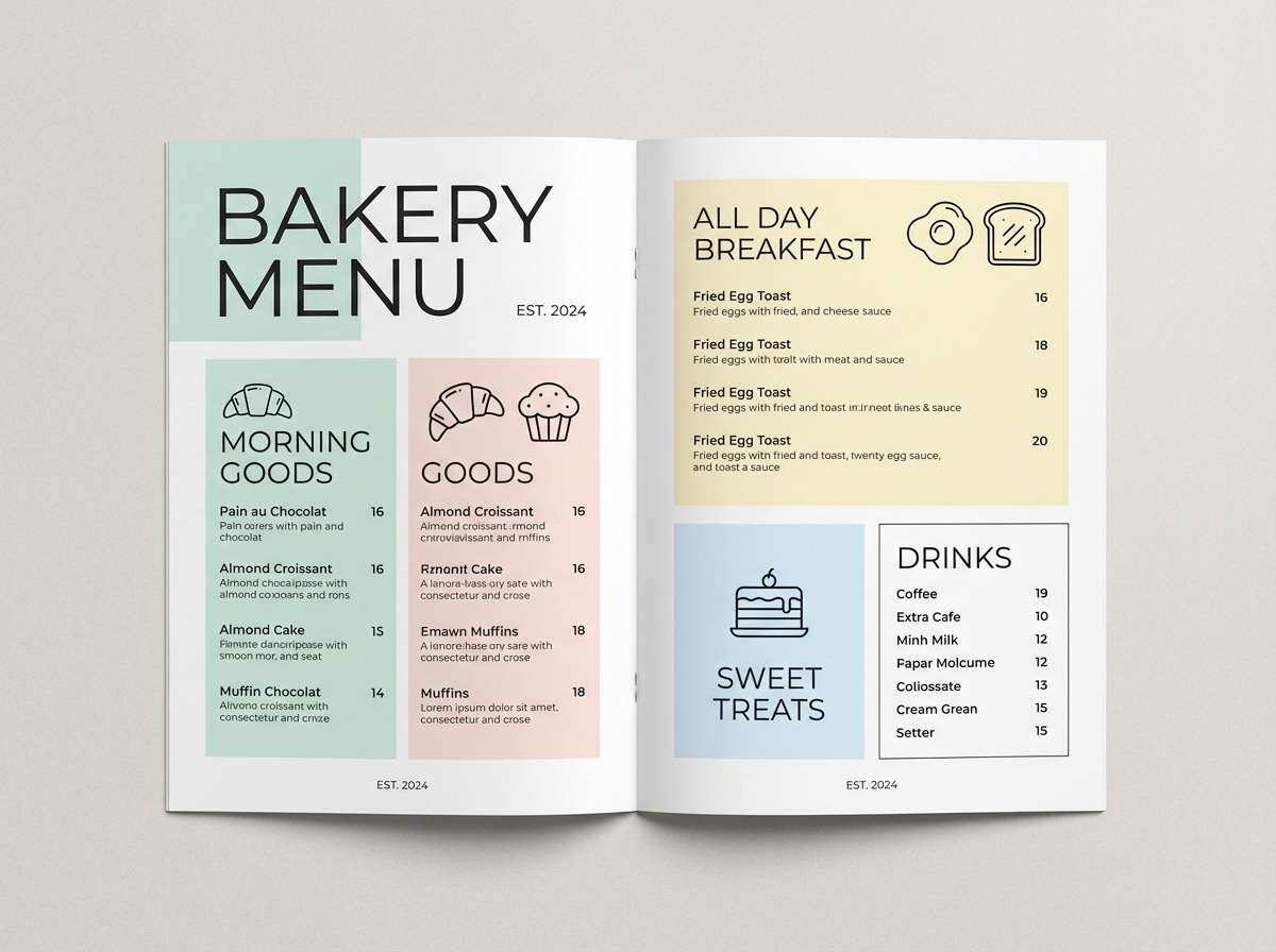
Best for: Bakery menu
For a menu, set a warm base with #fdffb6 or #ffd6a5, then use #ff9fb2 for section headers and feature items. Keep all body text in #5c5560 for stable contrast, and use #caffbf as a small button/highlight color for prices, labels, or special tags.
Image example of tulip & cream generated using media.io
9) Speckled Egg Neutrals
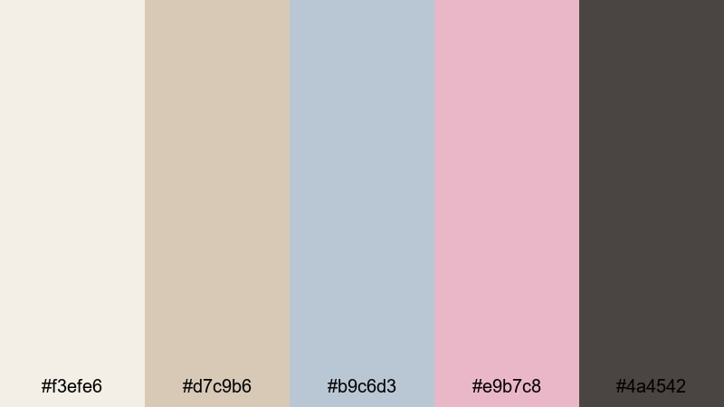
HEX: #f3efe6 #d7c9b6 #b9c6d3 #e9b7c8 #4a4542
Mood: minimal, modern, calm
Best for: Brand identity
Build the system on #f3efe6 backgrounds and #4a4542 typography for a clean, modern easter color scheme. Use #b9c6d3 for UI surfaces (cards, nav bars), #d7c9b6 for warm supporting blocks, and keep #e9b7c8 as the seasonal highlight for buttons, tags, or limited-edition stamps.
Image example of speckled egg neutrals generated using media.io
10) Carrot Patch Pop
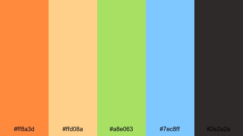
HEX: #ff8a3d #ffd08a #a8e063 #7ec8ff #2e2a2a
Mood: zesty, fun, outdoorsy
Best for: Event poster
For an easter palette for posters, put #ffd08a as the background so the headline in #ff8a3d reads from a distance. Use #2e2a2a for critical details (date, place), then balance the layout with #7ec8ff shapes and #a8e063 highlights for icons, arrows, or section markers.
Image example of carrot patch pop generated using media.io

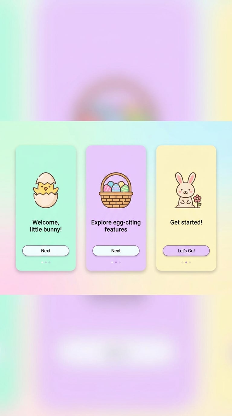
11) Cotton Candy Sunrise
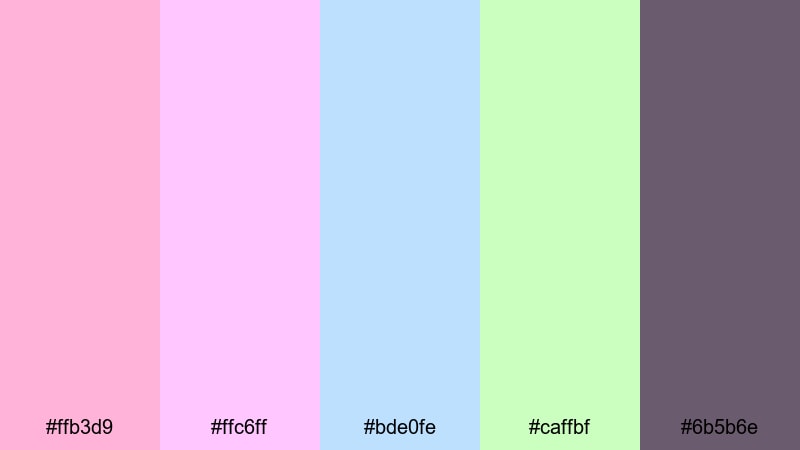
HEX: #ffb3d9 #ffc6ff #bde0fe #caffbf #6b5b6e
Mood: dreamy, soft, optimistic
Best for: Mobile app onboarding
Use #ffb3d9 to #bde0fe gradients as onboarding backgrounds, and keep headings and small text in #6b5b6e to stay readable on light screens. Make #caffbf your primary CTA button color for a clear next step, and use #ffc6ff for secondary highlights like progress dots or feature chips.
Image example of cotton candy sunrise generated using media.io
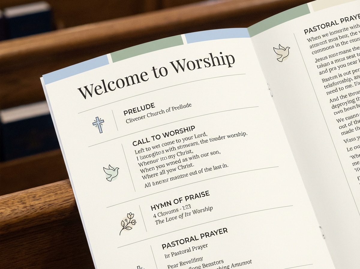
12) Church Sunday Calm
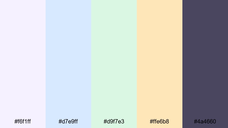
HEX: #f6f1ff #d7e9ff #d9f7e3 #ffe6b8 #4a4660
Mood: peaceful, respectful, bright
Best for: Service program
Set #f6f1ff as the page background and use #4a4660 for titles and body copy to keep a respectful, readable program. Use #d7e9ff and #d9f7e3 as section panels or dividers, and reserve #ffe6b8 for highlights like times, key notes, or small icon accents.
Image example of church sunday calm generated using media.io
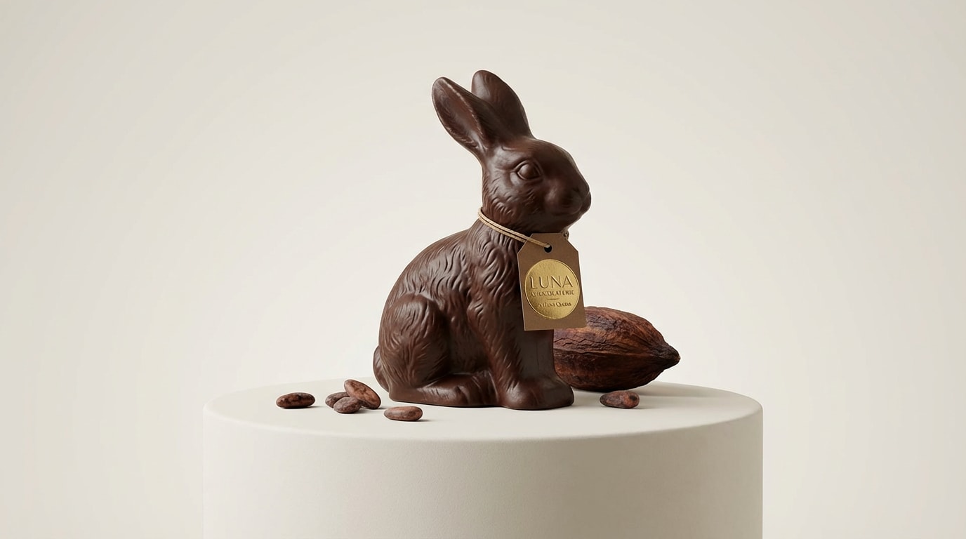
13) Chocolate Bunny
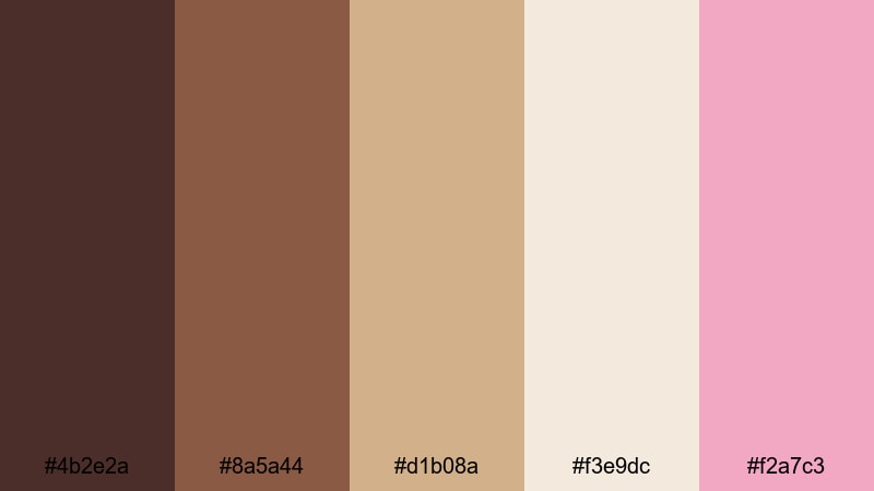
HEX: #4b2e2a #8a5a44 #d1b08a #f3e9dc #f2a7c3
Mood: cozy, nostalgic, indulgent
Best for: Product ad
Use #f3e9dc as the background so the chocolate browns (#4b2e2a, #8a5a44) feel rich without making the ad too dark. Set product names and pricing in #4b2e2a, use #d1b08a for supporting panels, and apply #f2a7c3 as a seasonal CTA or badge highlight.
Image example of chocolate bunny generated using media.io
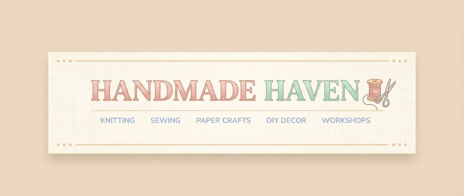
14) Easter Basket Weave
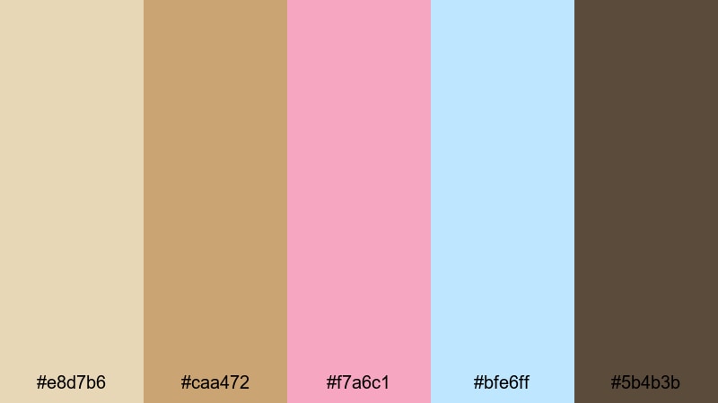
HEX: #e8d7b6 #caa472 #f7a6c1 #bfe6ff #5b4b3b
Mood: handmade, warm, rustic
Best for: Craft blog header
Let #e8d7b6 be the background and use #5b4b3b for headline text so the header stays readable. Add #caa472 as frame lines or pattern bands to suggest texture, then use #f7a6c1 for primary buttons and #bfe6ff for small link highlights or icon fills.
Image example of easter basket weave generated using media.io
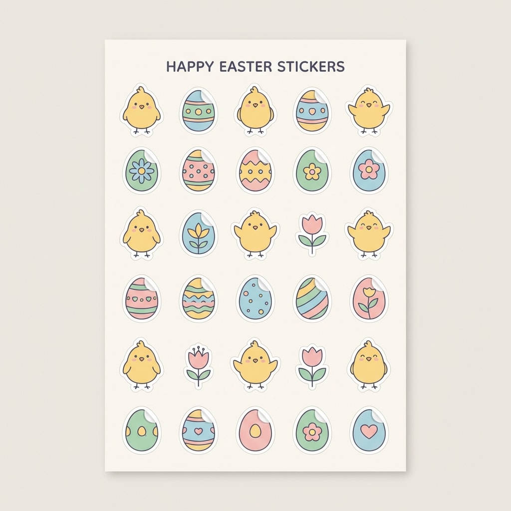
15) Peeps Marshmallow
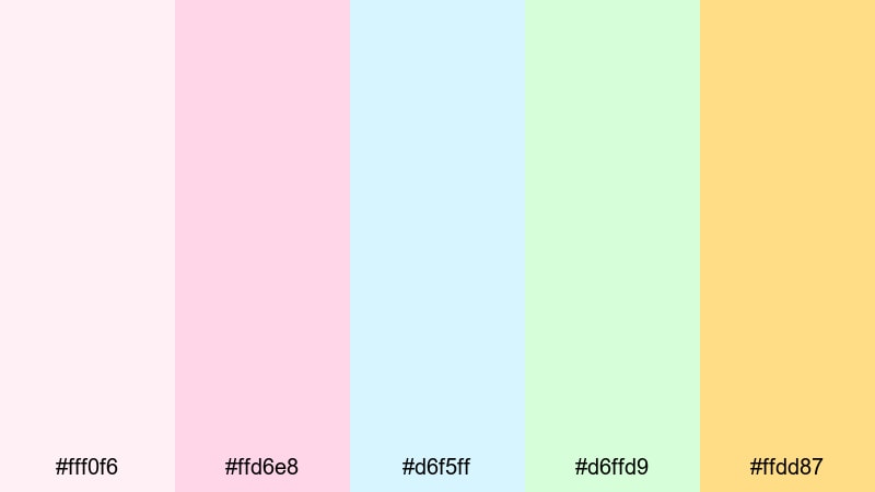
HEX: #fff0f6 #ffd6e8 #d6f5ff #d6ffd9 #ffdd87
Mood: sweet, airy, playful
Best for: Sticker pack
Use #fff0f6 as the base fill for negative space so each sticker stays clean at small sizes. Assign one dominant pastel per sticker (#ffd6e8, #d6f5ff, or #d6ffd9), and keep #ffdd87 for tiny highlights (sparkles, cheeks, small stars). For text labels, add a darker outline or shadow to maintain readability.
Image example of peeps marshmallow generated using media.io
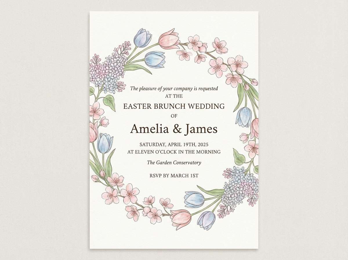
16) Garden Party Pastels
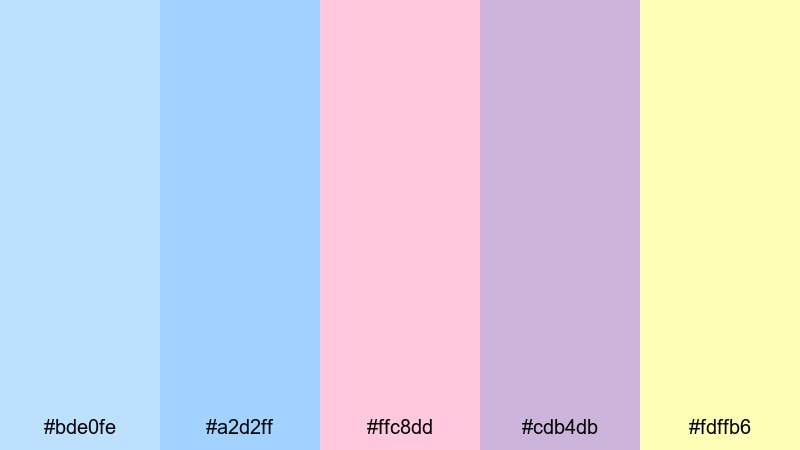
HEX: #bde0fe #a2d2ff #ffc8dd #cdb4db #fdffb6
Mood: festive, light, romantic
Best for: Wedding easter brunch invite
Keep the invite background in #bde0fe or #a2d2ff for an airy base, then use #cdb4db and #ffc8dd for floral elements and secondary headings. Set body text in a dark neutral (or add a darker overlay) to ensure legibility, and use #fdffb6 as a small highlight for separators, icons, or a thin border.
Image example of garden party pastels generated using media.io
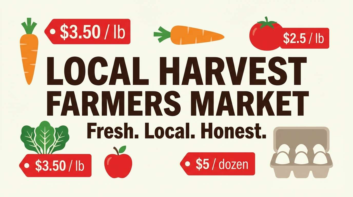
17) Spring Market Fresh
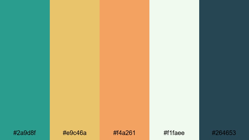
HEX: #2a9d8f #e9c46a #f4a261 #f1faee #264653
Mood: fresh, modern, earthy
Best for: Farmers market banner
Use #f1faee as the background, then set headline and key info in #264653 for strong contrast outdoors and on screens. Add #2a9d8f for structure (bars, icons), and use #e9c46a and #f4a261 for pricing callouts and highlights so the message reads fast from a distance.
Image example of spring market fresh generated using media.io
18) Easter Night Glow
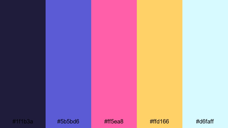
HEX: #1f1b3a #5b5bd6 #ff5ea8 #ffd166 #d6faff
Mood: modern, vibrant, dramatic
Best for: Landing page UI
Start with #1f1b3a as a dark-mode background, then put main text on #d6faff cards or use it for key highlights so readability stays high. Use #ff5ea8 for CTAs and links, keep #ffd166 for badges and micro-alerts, and use #5b5bd6 for secondary buttons or focused states.
Image example of easter night glow generated using media.io

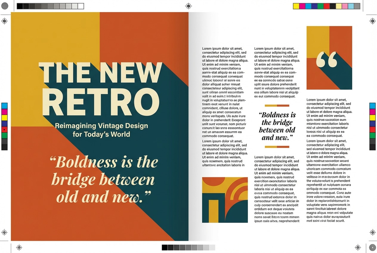
19) Vintage Egg Dye
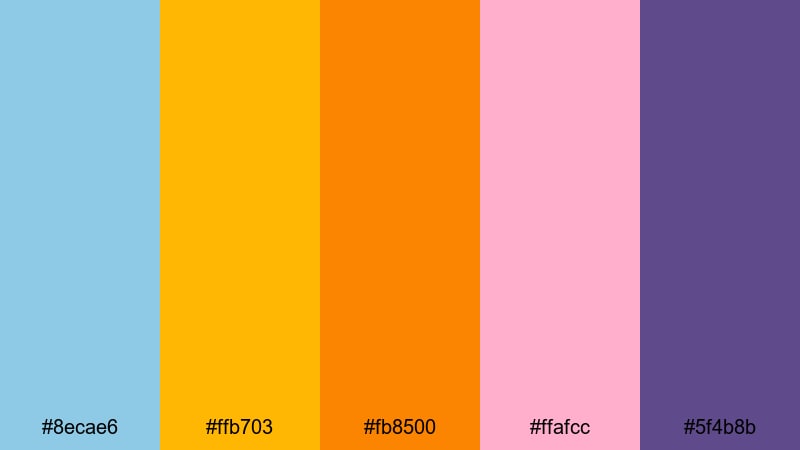
HEX: #8ecae6 #ffb703 #fb8500 #ffafcc #5f4b8b
Mood: retro, artsy, punchy
Best for: Editorial spread
Use #8ecae6 or #ffafcc as background panels to keep the spread light, then place headlines in #5f4b8b for a retro contrast. Add #fb8500 and #ffb703 as pull-quote and highlight colors (charts, callouts), and keep plenty of whitespace so warm tones do not overwhelm the reading flow.
Image example of vintage egg dye generated using media.io
20) Daffodil & Sky
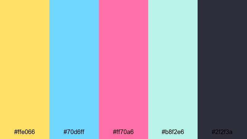
HEX: #ffe066 #70d6ff #ff70a6 #b8f2e6 #2f2f3a
Mood: bright, hopeful, upbeat
Best for: Presentation theme
Use #b8f2e6 or #70d6ff as slide backgrounds and section bars, then set text in #2f2f3a for projector-safe contrast. Reserve #ffe066 for key metrics and chart highlights, and apply #ff70a6 sparingly for emphasis (labels, key takeaways, or a single CTA slide).
Image example of daffodil & sky generated using media.io
What Colors Go Well with Easter?
- Pastel pink + mint: friendly contrast that feels springy; great for kids events, stickers, and playful UI.
- Lavender + butter yellow: calm base with a warm highlight; works well for invitations and editorial layouts.
- Robin egg blue + charcoal: crisp and readable; strong choice for email headers and web typography.
- Warm cream + cocoa brown: cozy and premium; ideal for chocolate, bakery, and product ads.
- Dusty blue + blush: modern, brand-safe easter tones; fits packaging and identity systems.
- Deep indigo + neon pink: a modern twist on easter colors; best for dark-mode landing pages and campaigns.
How to Use a Easter Color Palette in Real Designs
- Pick one "egg color" as the accent, not five: in a pastel easter color palette, choose a single CTA color (often yellow or pink) and keep the other pastels for backgrounds and illustrations. This keeps buttons obvious.
- Build contrast with neutrals, not saturation: instead of making pastels louder, pair them with a steady text color (charcoal, deep mauve, or indigo). This is especially important for an easter palette for UI and email.
- Use patterns as a secondary layer: light speckles, gingham, or simple egg outlines can add easter character while staying subtle. Keep patterns in the lightest two tones so they do not fight headlines.
- Adjust for print vs screen: for invites and packaging, keep backgrounds slightly warmer (cream) to avoid a cold look on paper; for screens, test your easter hex codes on both light and dark modes for accessibility.
Create Easter Palette Visuals with AI
If you already have an easter color scheme, you can generate matching mockups, posters, UI hero sections, and packaging concepts using Media.io text-to-image. Start with one palette name from above, describe the layout, and mention clean background, flat vector or realistic studio lighting, and your target aspect ratio.
- For UI: ask for a "2d ui mockup" and specify buttons, cards, and typographic hierarchy (use this easter palette for UI testing).
- For print: include "print-ready layout" and a clear grid; this works well for an easter palette for posters and invitations.
- For product shots: request "realistic studio shot" with soft shadows and minimal props to keep colors accurate.
Media.io is an online AI studio for creating and editing video, image, and audio in your browser.
Easter Color Palette FAQs
-
What are classic Easter colors?
Pastel pink, baby blue, mint green, lavender, and soft yellow are the most common easter colors, often balanced with cream or light gray for readability. -
How do I choose a readable Easter palette for UI?
Keep pastel tones for backgrounds and surfaces, then use a dark neutral (charcoal/indigo) for text and one accent color for primary buttons. Test contrast for links and small labels. -
Can an Easter color palette work for modern branding?
Yes. Use muted pastels with warm neutrals (off-white, tan, charcoal) and apply the brighter tones only as seasonal highlights or limited-edition packaging accents. -
What is the best Easter palette for posters?
Choose a high-contrast set with a clear headline color and a strong text neutral, like Carrot Patch Pop or Daffodil & Sky, so the message stays readable from a distance. -
How many colors should I use from an Easter color scheme?
In most layouts, use 2-3 colors plus a neutral. Keep one as the CTA/highlight, one as the main background, and one as a supporting surface or secondary element. -
Where can I find an Easter palette with HEX codes?
This page lists 20 easter color palettes with HEX codes, so you can copy values directly into Figma, Photoshop, Canva, or CSS.
Next: Spring Color Palette


