

A fiesta color palette is all about high-energy warmth: spicy reds, zesty oranges, sunny yellows, and fresh greens or teals to cool the mix down. It’s a go-to choice for celebrations, summer campaigns, and bold branding that needs instant attention.
Below are 20 fiesta-inspired palettes with HEX codes, plus practical pairing tips (neutrals, accents, and type) and AI prompts you can use to generate matching visuals.
In this article
- Why Fiesta Palettes Work So Well
-
- marigold salsa
- cactus sunset
- papaya spark
- chili & teal
- pinata pastels
- serape stripes
- tamarind spice
- agave breeze
- bougainvillea pop
- citrus carnival
- desert fiesta neutrals
- mango mojito
- rose clay glow
- midnight maracas
- lime firecracker
- terracotta toast
- carnival candy
- oaxaca market
- sunlit papel picado
- copper & guava
- What Colors Go Well with Fiesta?
- How to Use a Fiesta Color Palette in Real Designs
- Create Fiesta Palette Visuals with AI
Why Fiesta Palettes Work So Well
Fiesta color schemes are built around warm hues that naturally feel festive—reds, oranges, and yellows read as heat, sunlight, food, and celebration. They’re attention-grabbing by default, so they work well for posters, promos, and bold brand moments.
What makes a fiesta scheme look “designed” instead of chaotic is balance: a cool counter-color (teal/blue/green) and a light neutral to give the eye a rest. That contrast helps your layout keep clarity even when the colors are vibrant.
They’re also flexible across styles—playful, rustic, romantic, or modern—simply by adjusting saturation and adding the right dark anchor for type and outlines.
20+ Fiesta Color Palette Ideas (with HEX Codes)
1) Marigold Salsa
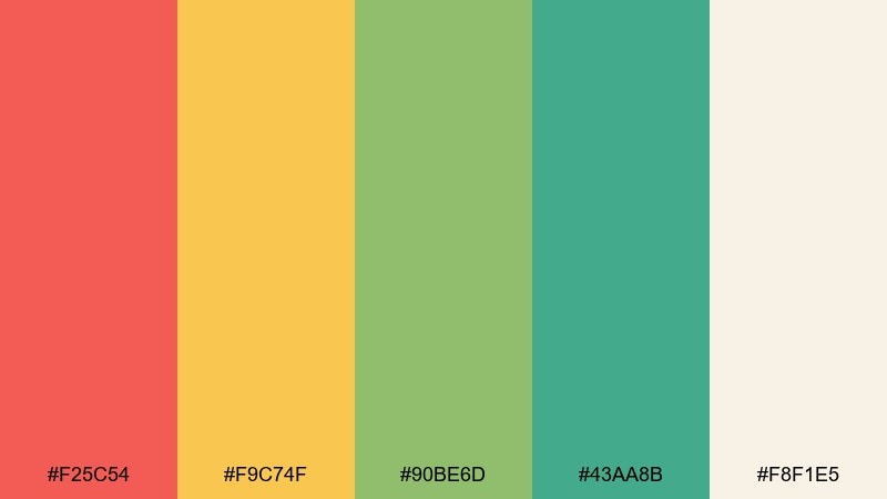
HEX: #F25C54 #F9C74F #90BE6D #43AA8B #F8F1E5
Mood: sunny, playful, energetic
Best for: summer festival poster design
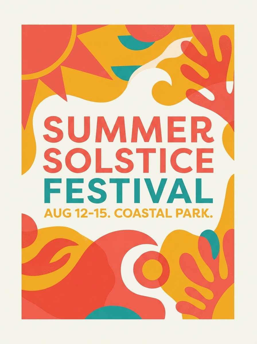
Sunny and playful, it feels like marigold garlands, fresh limes, and a coral sunset over a busy plaza. The warm red and marigold grab attention, while teal keeps the mix modern. Use the cream as breathing room for headlines and negative space. Tip: keep body text dark and let the coral handle calls to action.
Image example of marigold salsa generated using media.io
Media.io is an online AI studio for creating and editing video, image, and audio in your browser.

2) Cactus Sunset
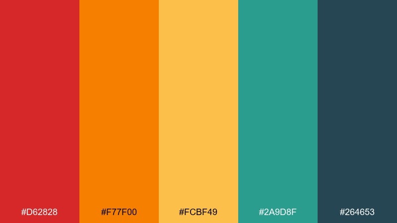
HEX: #D62828 #F77F00 #FCBF49 #2A9D8F #264653
Mood: bold, sunbaked, dramatic
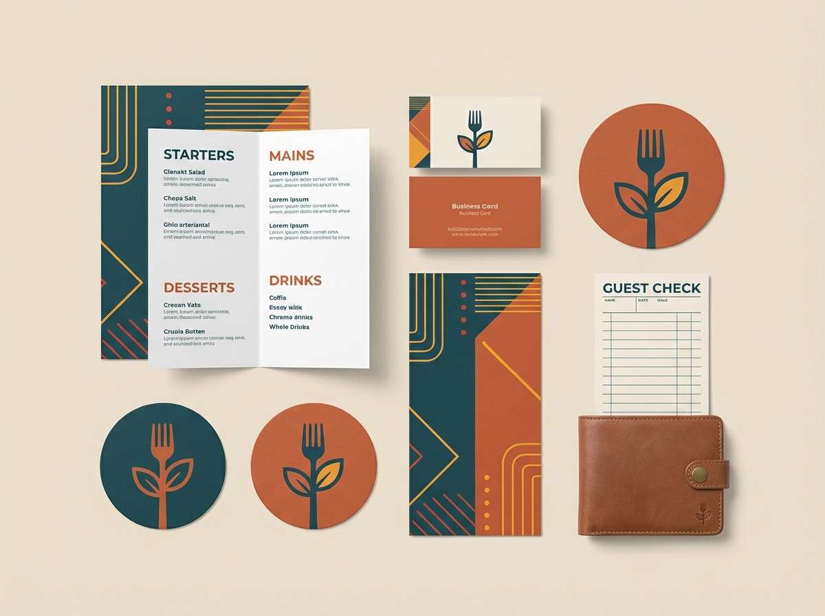
Best for: restaurant branding and menu design
Bold and sunbaked, this fiesta color scheme evokes chili heat, orange dusk, and cactus shadows. The deep navy-green gives the brights a strong base for menus and signage. Pair it with uncoated paper textures and simple iconography to keep it authentic. Tip: reserve the red for featured dishes or limited-time badges so it stays punchy.
Image example of cactus sunset generated using media.io
3) Papaya Spark
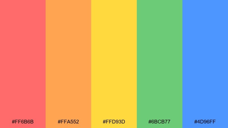
HEX: #FF6B6B #FFA552 #FFD93D #6BCB77 #4D96FF
Mood: youthful, bright, friendly
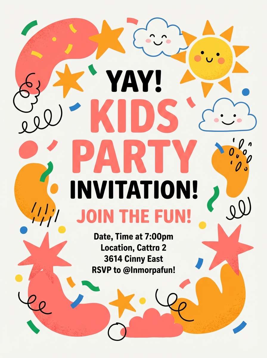
Best for: kids party invitation flyer
Youthful and bright, it brings to mind papaya slices, confetti, and balloons under midday sun. The warm trio works best as big shapes, while green and blue support icons and small details. Keep backgrounds mostly light so the palette stays cheerful instead of loud. Tip: use the blue for names and dates to improve readability on warm fields.
Image example of papaya spark generated using media.io
4) Chili & Teal
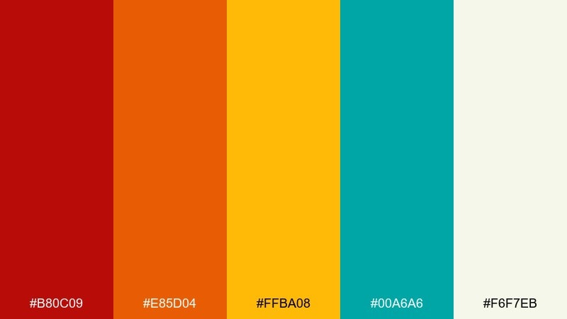
HEX: #B80C09 #E85D04 #FFBA08 #00A6A6 #F6F7EB
Mood: spicy, modern, high-contrast
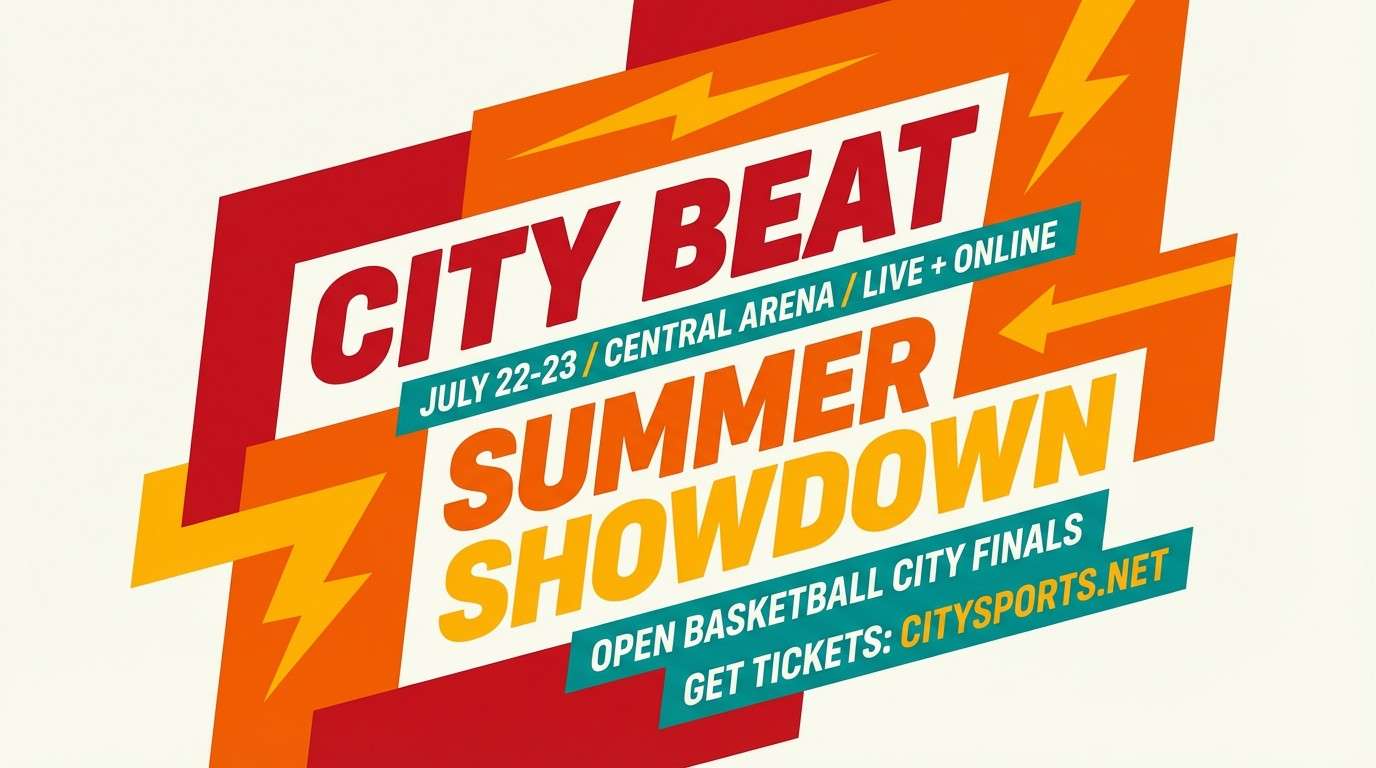
Best for: sports event promo poster
Spicy and high-contrast, this fiesta color palette looks like hot sauce, citrus peel, and a cool teal splash. The teal is your secret weapon for balancing the hot reds and oranges in large blocks. Use the off-white to soften the layout and keep copy from feeling cramped. Tip: place teal behind key numbers or dates so they pop without shouting.
Image example of chili & teal generated using media.io
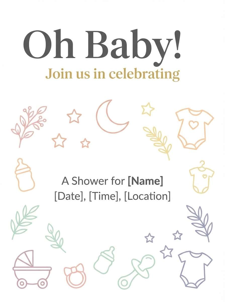
5) Pinata Pastels
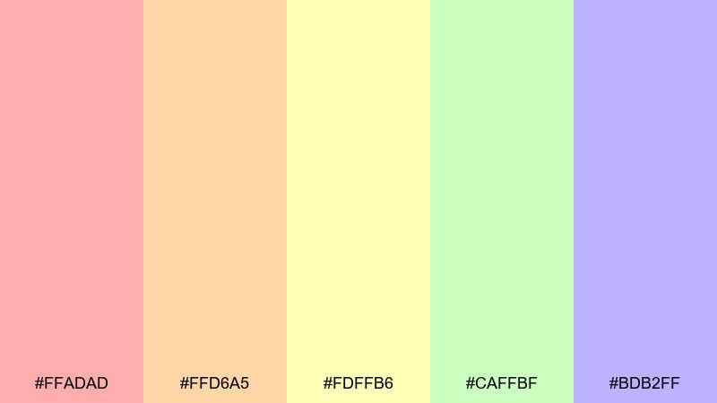
HEX: #FFADAD #FFD6A5 #FDFFB6 #CAFFBF #BDB2FF
Mood: soft, sweet, celebratory
Best for: baby shower invitation design
Soft and sweet, it feels like tissue-paper tassels and a gentle sprinkle of confetti. These fiesta tones work best with lots of white space and thin line art. Pair with a warm gray type color to avoid harsh contrast against the pastels. Tip: pick one pastel as the headline color and keep the rest as supporting shapes.
Image example of pinata pastels generated using media.io
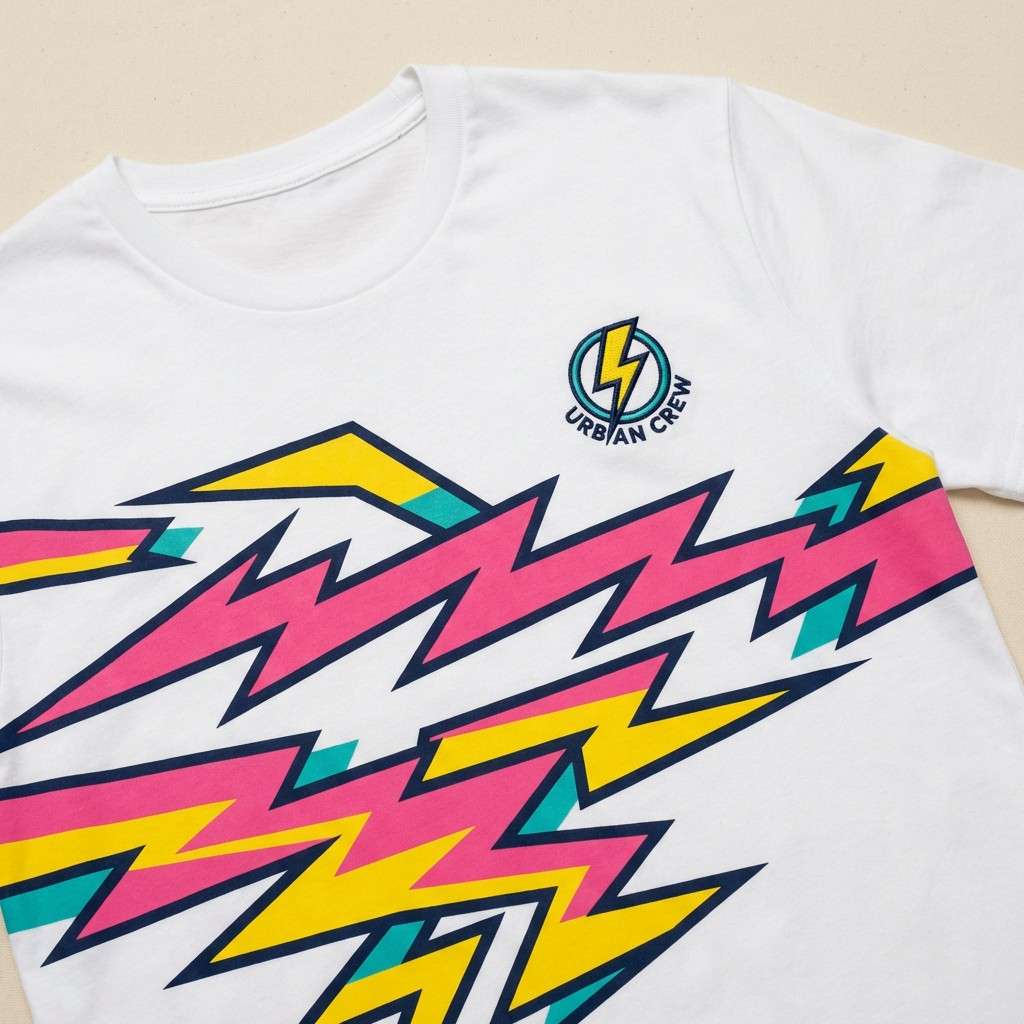
6) Serape Stripes
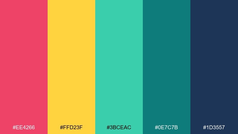
HEX: #EE4266 #FFD23F #3BCEAC #0E7C7B #1D3557
Mood: festive, graphic, punchy
Best for: streetwear t-shirt graphic
Festive and graphic, it channels woven serape stripes with a bold, city-ready edge. The hot pink and yellow make striking fiesta color combinations when you anchor them with the deep navy. Teal shades add depth for secondary stripes, patches, or tag labels. Tip: keep the stripe count low and spacing consistent so the print stays clean.
Image example of serape stripes generated using media.io
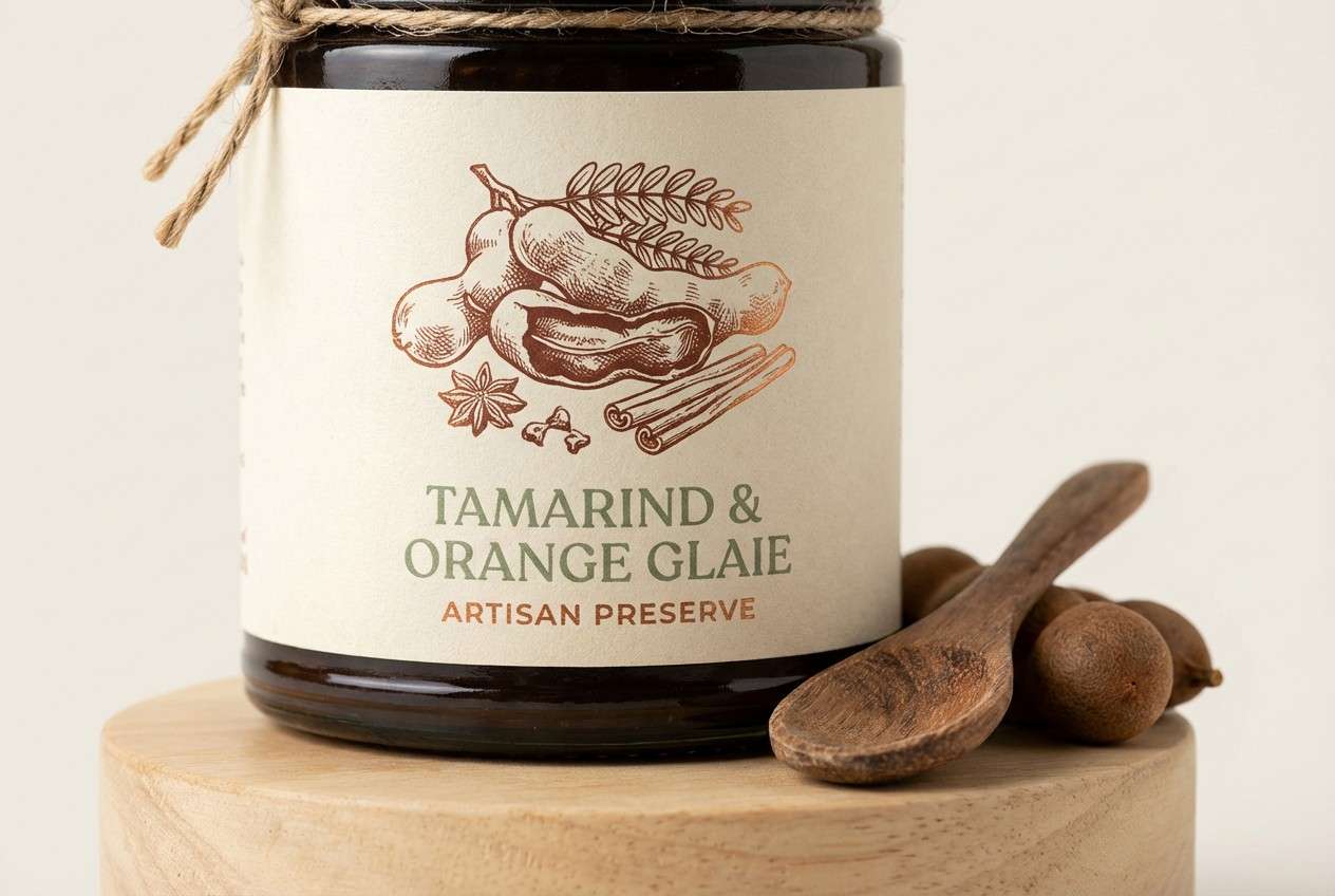
7) Tamarind Spice
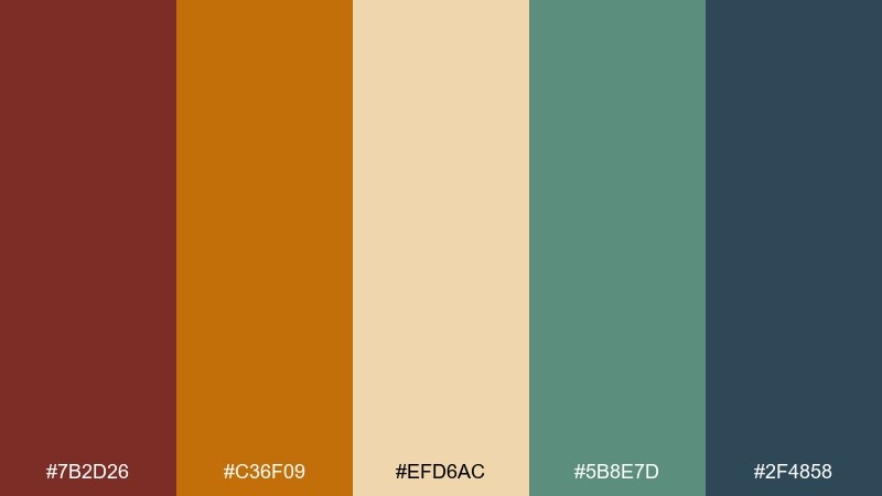
HEX: #7B2D26 #C36F09 #EFD6AC #5B8E7D #2F4858
Mood: earthy, rustic, grounded
Best for: craft food packaging label
Earthy and rustic, it suggests tamarind candy, toasted spices, and weathered market wood. The cream and muted green keep the palette grounded while the coppery orange adds warmth. This fiesta color palette shines on kraft-paper labels, especially with stamped typography or hand-drawn illustrations. Tip: use the dark blue-green for ingredient lists to maintain legibility.
Image example of tamarind spice generated using media.io
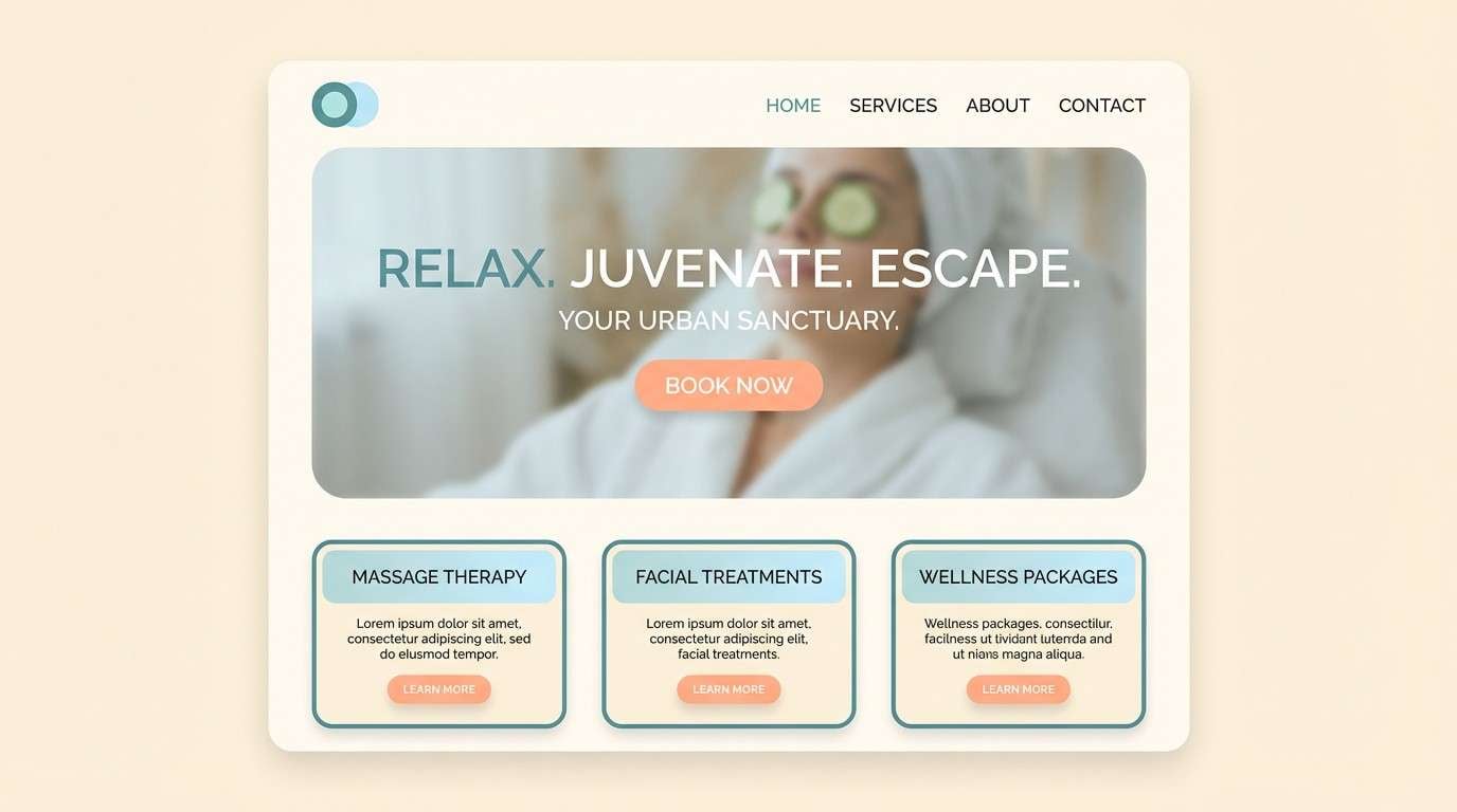
8) Agave Breeze
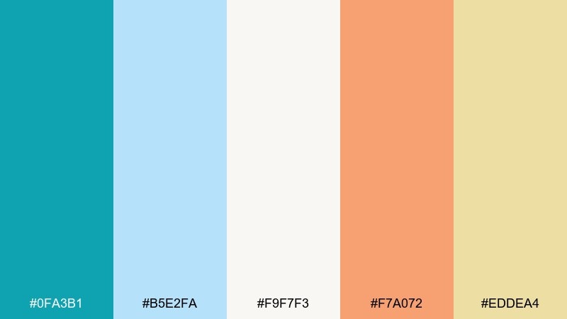
HEX: #0FA3B1 #B5E2FA #F9F7F3 #F7A072 #EDDEA4
Mood: fresh, coastal, relaxed
Best for: spa landing page UI
Fresh and relaxed, it reads like cool agave leaves against a light seaside sky. The blue tones create calm sections in UI, while peach adds warmth for buttons and highlights. Keep the cream as the main canvas so the design stays breathable. Tip: use teal for icons and links to build consistent navigation cues.
Image example of agave breeze generated using media.io
9) Bougainvillea Pop

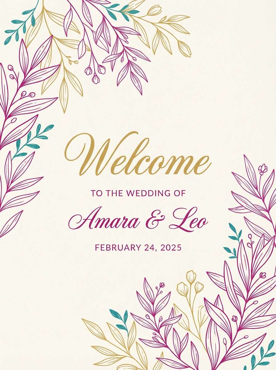
HEX: #D81159 #FFBC42 #8F2D56 #218380 #F4F1DE
Mood: romantic, vibrant, confident
Best for: wedding welcome sign and stationery
Romantic and vibrant, it evokes bougainvillea blooms with golden sunlit details. This fiesta color palette works beautifully for stationery when you let cream lead and use magenta as the signature accent. Bring in teal for monograms or border lines to keep the look fresh, not overly sweet. Tip: print the darkest purple for small text to avoid magenta blur on paper.
Image example of bougainvillea pop generated using media.io
10) Citrus Carnival
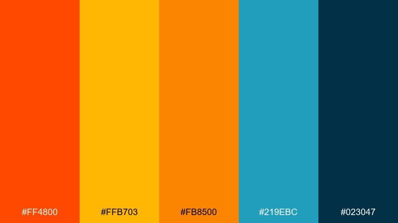
HEX: #FF4800 #FFB703 #FB8500 #219EBC #023047
Mood: loud, confident, modern
Best for: YouTube thumbnail template
Loud and confident, it feels like citrus wedges and neon marquee lights after dark. The navy makes the oranges look even brighter, perfect for high-impact thumbnail blocks. Use teal for secondary badges or category tags to separate content types. Tip: keep text in white or pale neutrals and outline it with navy for crisp readability.
Image example of citrus carnival generated using media.io

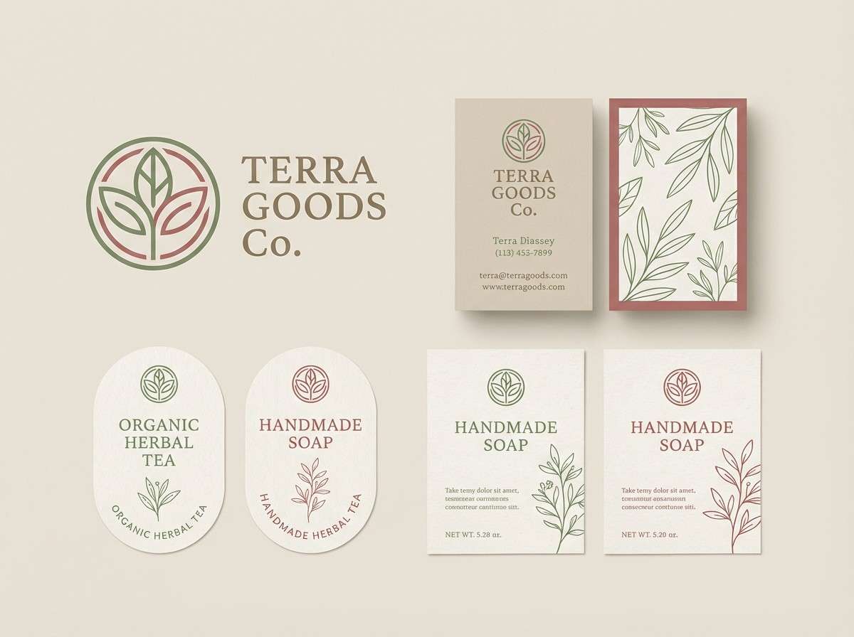
11) Desert Fiesta Neutrals
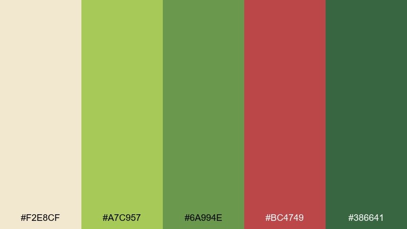
HEX: #F2E8CF #A7C957 #6A994E #BC4749 #386641
Mood: natural, warm, approachable
Best for: eco market brand kit
Natural and warm, it suggests desert clay, sun-faded canvas, and fresh herbs. The greens handle backgrounds and supporting blocks, while the dusty red is ideal for logos and stamps. Pair it with recycled textures and simple sans-serif type to keep the brand approachable. Tip: use the light beige as the primary field to prevent the greens from feeling too heavy.
Image example of desert fiesta neutrals generated using media.io
12) Mango Mojito

HEX: #FF9F1C #FFBF69 #CBF3F0 #2EC4B6 #E71D36
Mood: refreshing, tropical, upbeat
Best for: cocktail bar social ad
Refreshing and upbeat, it brings mango slices, minty fizz, and a bright patio vibe. These fiesta color combinations stay balanced when you let aqua lead and use orange for the hero drink callout. The cherry red works best as a small accent for prices or limited offers. Tip: keep gradients subtle so the teal remains clean and modern.
Image example of mango mojito generated using media.io
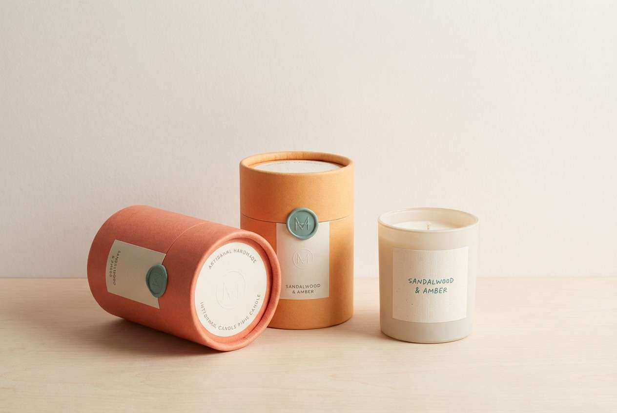
13) Rose Clay Glow
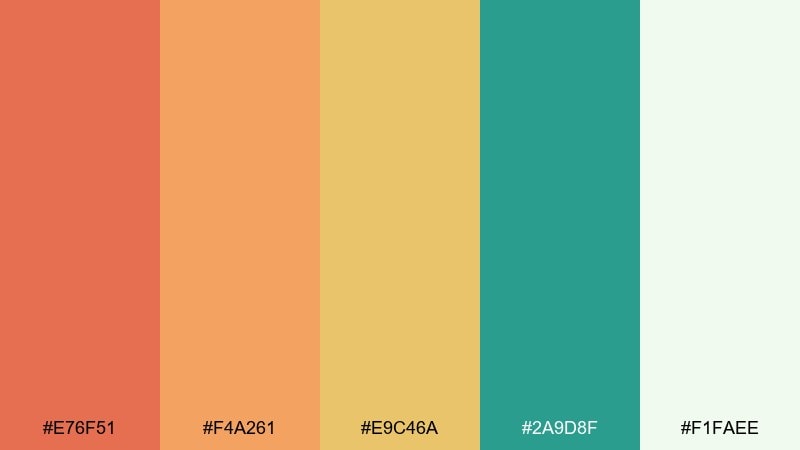
HEX: #E76F51 #F4A261 #E9C46A #2A9D8F #F1FAEE
Mood: warm, friendly, artisanal
Best for: handmade candle packaging
Warm and artisanal, it looks like rose clay pottery with a soft candlelit glow. The coral and apricot feel inviting on labels, while teal adds a clean contrast for scent names. Pair it with matte paper and minimal line icons for a boutique finish. Tip: use the pale minty white as the label base to keep the warm tones from overwhelming.
Image example of rose clay glow generated using media.io
14) Midnight Maracas
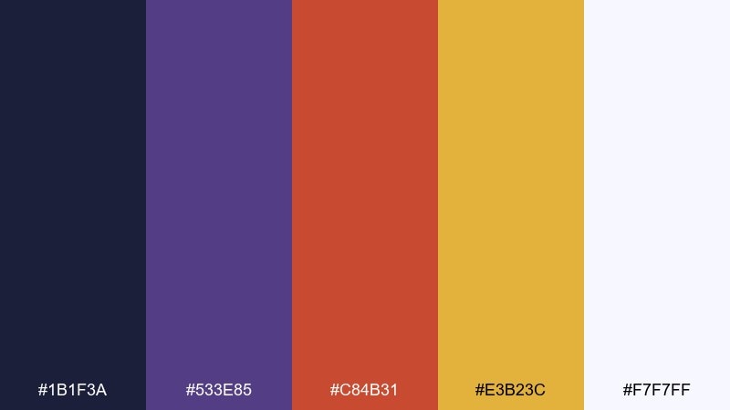
HEX: #1B1F3A #533E85 #C84B31 #E3B23C #F7F7FF
Mood: nightlife, rich, high-contrast
Best for: concert flyer design
Rich and high-contrast, it feels like a late-night plaza with brass highlights and deep shadows. The indigo and violet set a moody base for loud typography, while copper and gold add energy. Use the near-white only for key text and small details to keep the flyer dramatic. Tip: keep gradients minimal so the dark background prints cleanly.
Image example of midnight maracas generated using media.io
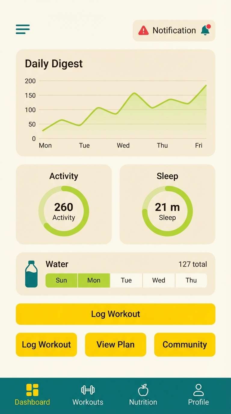
15) Lime Firecracker
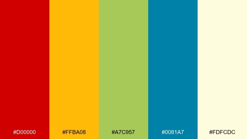
HEX: #D00000 #FFBA08 #A7C957 #0081A7 #FDFCDC
Mood: punchy, sporty, lively
Best for: fitness app UI accents
Punchy and lively, it reads like a firecracker pop followed by a cool splash of water. Use the cream as the app canvas, then bring in yellow for highlights and lime for progress states. The red is best reserved for alerts or key action buttons so it stays special. Tip: keep the teal consistent for navigation to prevent color overload.
Image example of lime firecracker generated using media.io
16) Terracotta Toast
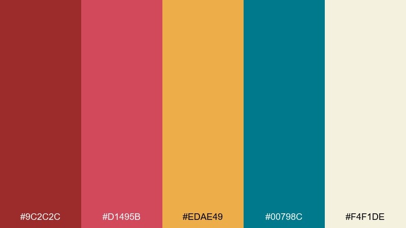
HEX: #9C2C2C #D1495B #EDAE49 #00798C #F4F1DE
Mood: cozy, confident, retro
Best for: home kitchen brand packaging
Cozy and confident, it suggests terracotta tiles, toasted corn, and vintage enamelware. The deep red and dusty rose feel nostalgic, while teal brings a clean counterpoint for modern packaging. Pair it with simple patterns like dots or border stripes to enhance the retro vibe. Tip: use gold-yellow for callouts and keep the rest of the label mostly cream.
Image example of terracotta toast generated using media.io
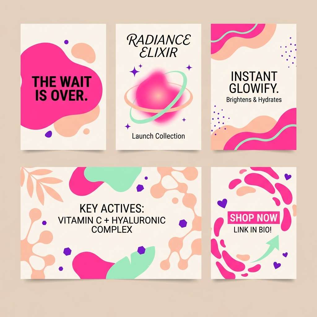
17) Carnival Candy
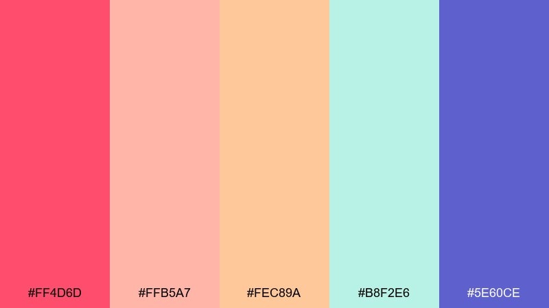
HEX: #FF4D6D #FFB5A7 #FEC89A #B8F2E6 #5E60CE
Mood: sweet, trendy, upbeat
Best for: beauty launch Instagram carousel
Sweet and trendy, it feels like candy wrappers and glossy lip tint in soft daylight. Let the hot pink lead as the hero accent, then soften it with peachy tones for backgrounds. Mint and purple work well for dividers and small icons that keep slides organized. Tip: maintain consistent spacing and use one bold color per slide to avoid a busy look.
Image example of carnival candy generated using media.io
18) Oaxaca Market
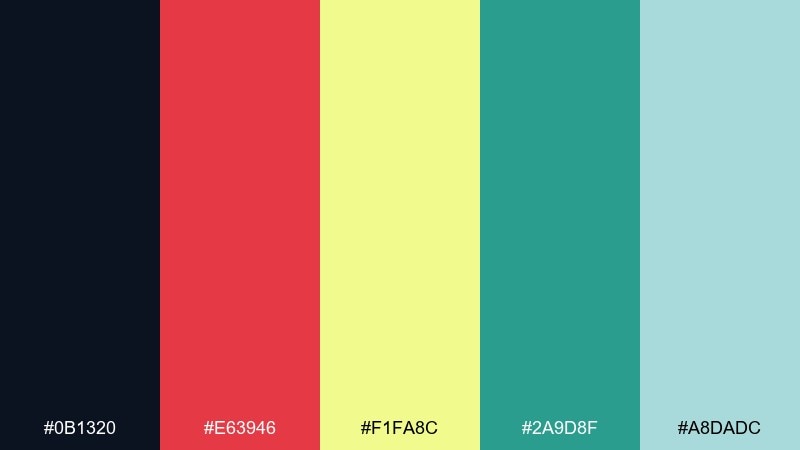
HEX: #0B1320 #E63946 #F1FA8C #2A9D8F #A8DADC
Mood: cultural, lively, crafted
Best for: travel editorial spread
Cultural and lively, it recalls hand-painted signs, busy stalls, and bright textiles under shade. In a travel layout, the near-black keeps photography captions and body copy crisp. This fiesta color palette really shines when you use yellow for pull quotes and teal for section headers. Tip: limit red to one or two focal elements per page to keep the spread refined.
Image example of oaxaca market generated using media.io
19) Sunlit Papel Picado
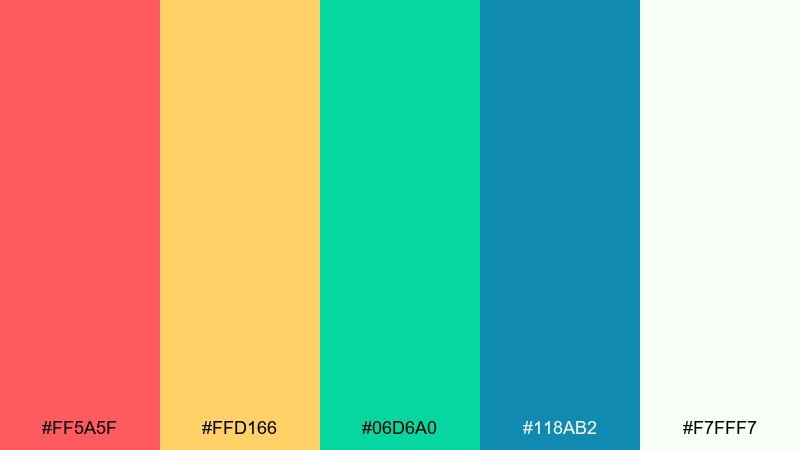
HEX: #FF5A5F #FFD166 #06D6A0 #118AB2 #F7FFF7
Mood: bright, airy, celebratory
Best for: spring event banner
Bright and airy, it brings to mind cut-paper flags fluttering in a clean spring breeze. The coral and yellow feel welcoming, while green and blue add a fresh, modern balance. Use the soft white as the main field so the colors feel sunlit rather than heavy. Tip: repeat one accent color in small icons to unify the banner from end to end.
Image example of sunlit papel picado generated using media.io

20) Copper & Guava
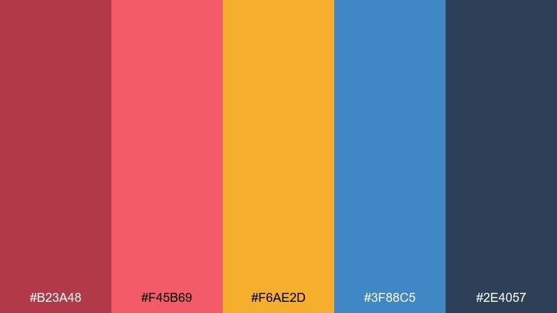
HEX: #B23A48 #F45B69 #F6AE2D #3F88C5 #2E4057
Mood: bold, polished, contemporary
Best for: brand hero section for a startup
Bold and polished, it feels like guava juice with copper signage and a crisp modern edge. The warm reds create strong headlines, and the golden orange is ideal for key metrics or badges. Use blue for links and hover states to keep the interface feeling trustworthy. Tip: anchor large areas with the slate tone so the brights stay sophisticated.
Image example of copper & guava generated using media.io

What Colors Go Well with Fiesta?
Fiesta colors pair best with a steady “anchor” and a clean neutral. Try deep navy, near-black, charcoal, or dark teal to ground warm reds and oranges, then add cream, off-white, or warm beige for space and readability.
For modern contrast, combine hot coral with teal or aqua; for a more earthy vibe, match dusty red with herb greens and kraft-like neutrals. If you want extra pop, use a bright yellow sparingly as a highlight rather than a full background.
For typography, dark slate or deep blue-green usually reads cleaner than pure black on warm, sunlit palettes—especially on paper and textured backgrounds.
How to Use a Fiesta Color Palette in Real Designs
Start with a simple ratio: pick one dominant color (often a light neutral), one warm hero color (coral/red/orange), and one cool support color (teal/blue/green). This keeps the design festive without looking noisy.
Use warm tones for calls to action, badges, and focal shapes, then reserve cool tones for navigation, dividers, and secondary labels. When everything is saturated, the layout loses hierarchy—so treat brights like seasoning, not the whole meal.
If you’re designing for print, test small text on the darkest palette color (not the brightest). Magenta and orange can blur on certain papers, while deep navy/indigo stays crisp.
Create Fiesta Palette Visuals with AI
If you already have HEX codes, you can turn them into poster layouts, UI mockups, packaging labels, and social templates in minutes—just describe the composition and specify which colors should dominate.
Use the prompts above as a starting point, then swap in your brand’s type style (modern sans, elegant serif, playful rounded) and adjust the aspect ratio for your platform. Keep the background neutral when you want the fiesta colors to look sunlit and premium.
With Media.io, you can iterate quickly: generate multiple variations, pick the cleanest hierarchy, and keep your palette consistent across assets.
Fiesta Color Palette FAQs
-
What is a fiesta color palette?
A fiesta palette is a vibrant color scheme built around warm reds, oranges, and yellows, usually balanced by fresh greens/teals and a light neutral to keep the design readable and energetic. -
What neutral works best with fiesta colors?
Warm off-whites, cream, and sandy beige are the easiest neutrals for fiesta tones. They soften high saturation and help bold accents (like coral or marigold) stand out without overwhelming the layout. -
What are good contrasting colors for a fiesta theme?
Cool teals, aquas, and deep navies create strong contrast against warm fiesta hues. They add structure for UI, borders, icons, and typography while keeping the palette modern. -
How do I keep a fiesta color scheme from looking too loud?
Limit the number of dominant brights. Use one warm hero color, one cool support color, and let a neutral background take up most of the space, then apply the remaining hues as small highlights. -
What color should I use for text on bright fiesta backgrounds?
Use deep navy, charcoal, or dark blue-green for body text on warm or pastel backgrounds. For dark layouts, use near-white for headings and keep long paragraphs on lighter panels. -
Are fiesta palettes good for branding and UI?
Yes—fiesta colors are great for brands that want warmth and personality. In UI, keep the interface mostly neutral, use teal/blue for navigation consistency, and reserve reds/oranges for primary actions and highlights. -
Can I generate fiesta-themed design mockups with AI?
Yes. Provide a clear layout description (poster, invitation, packaging, UI), name the dominant colors, and include constraints like “no photography” or “clean vector style” for more consistent results.
Next: Amaranth Color Palette


