

Pacific blue sits right between ocean teal and bright cyan, making it an easy “modern coastal” anchor for brands, UIs, and print.
Below you’ll find 20 pacific blue color combinations with HEX codes, plus practical pairing notes and AI prompts you can reuse to generate visuals fast.
In this article
Why Pacific Blue Color Combinations Work So Well
Pacific blue reads clean, friendly, and contemporary—cool enough for tech and finance, but bright enough to feel human. That balance makes it a reliable “primary accent” across web, mobile, and print.
It also plays well with both neutrals and color: whites and charcoals keep it crisp for UI, while warm peaches, corals, and sands bring coastal energy without turning neon.
From a practical standpoint, pacific blue provides clear hierarchy. Used sparingly for CTAs, links, or key data series, it draws attention quickly while preserving readability.
20+ Pacific Blue Color Palette Ideas (with HEX Codes)
1) Coastal Glass
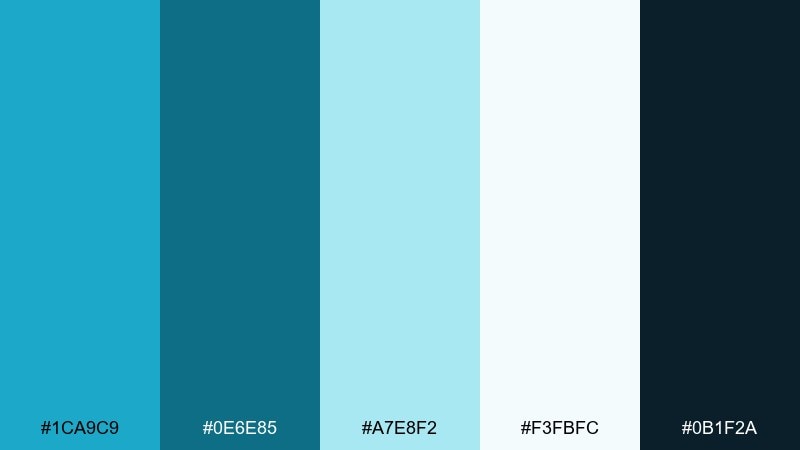
HEX: #1CA9C9 #0E6E85 #A7E8F2 #F3FBFC #0B1F2A
Mood: airy, coastal, clean
Best for: website hero and SaaS landing pages
Airy and coastal, it feels like sunlight moving through clear water and sea glass. These pacific blue color combinations stay crisp thanks to icy tints and a deep ink anchor for contrast. Use it for modern landing pages, fintech, or travel brands where trust and freshness matter. Pair the darker teal with plenty of white space, then reserve the bright blue for CTAs and key stats.
Image example of coastal glass generated using media.io

Media.io is an online AI studio for creating and editing video, image, and audio in your browser.

2) Reef Sunrise
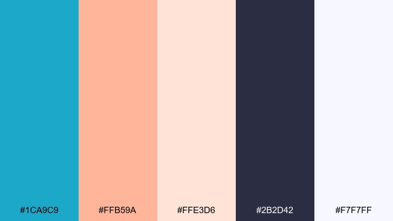
HEX: #1CA9C9 #FFB59A #FFE3D6 #2B2D42 #F7F7FF
Mood: warm, uplifting, playful
Best for: event flyers and summer promotions
Warm and uplifting, it evokes coral reef mornings with soft peach light over bright water. The peach and cream tones make the blue feel friendlier and less corporate. Use it for flyers, seasonal sales, or lifestyle posts where you want energy without neon harshness. Keep the dark navy for headlines and use peach as a highlight stripe or price badge.
Image example of reef sunrise generated using media.io

3) Harbor Slate
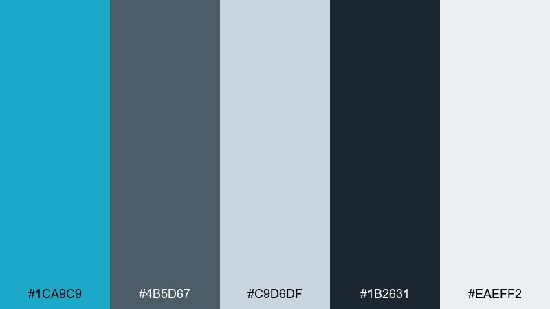
HEX: #1CA9C9 #4B5D67 #C9D6DF #1B2631 #EAEFF2
Mood: cool, professional, grounded
Best for: corporate branding and reports
Cool and grounded, it feels like a harbor skyline under overcast skies. Slate grays and near-black navy keep the bright blue refined and boardroom-ready. Use it in annual reports, B2B branding, or dashboards where readability is the priority. A good tip is to set charts in slate and reserve the blue for the key series to avoid visual clutter.
Image example of harbor slate generated using media.io
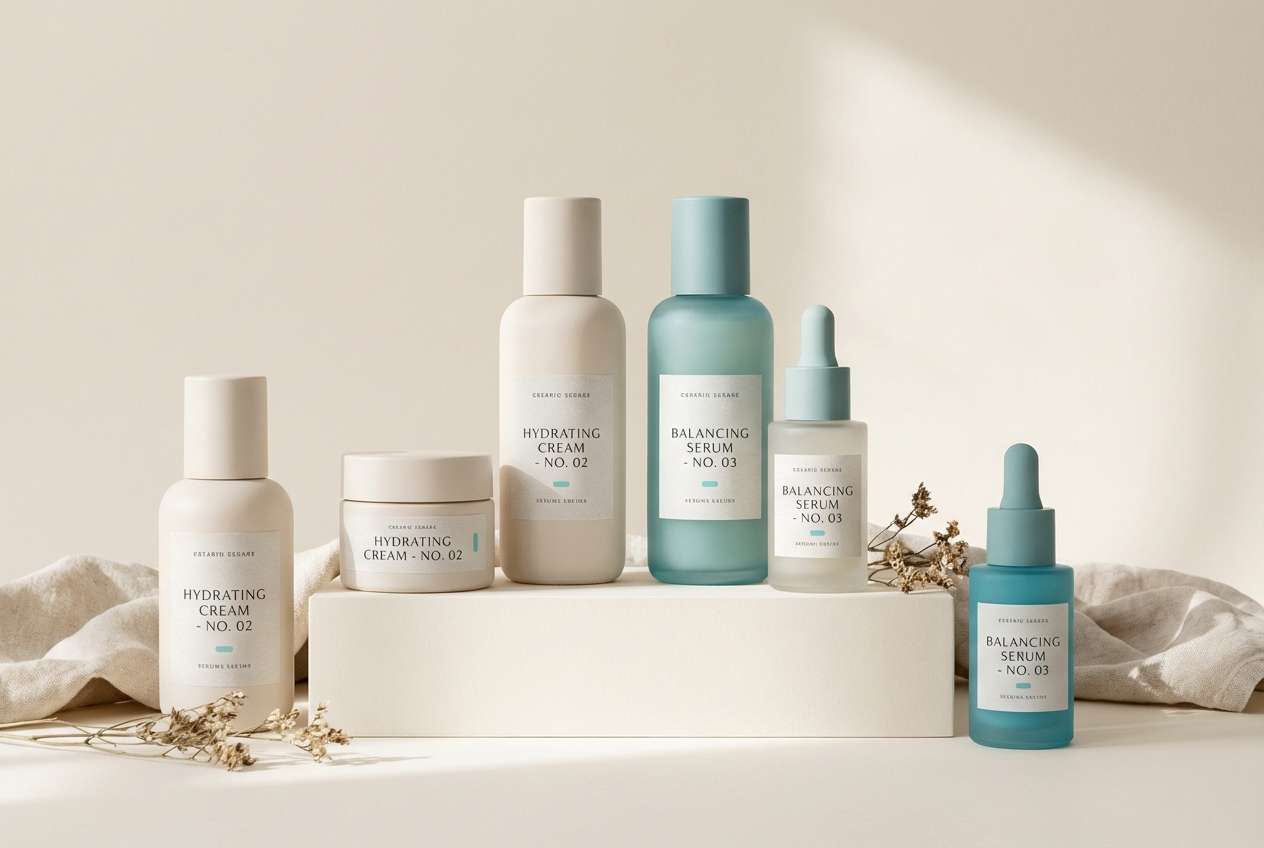
4) Seafoam Linen
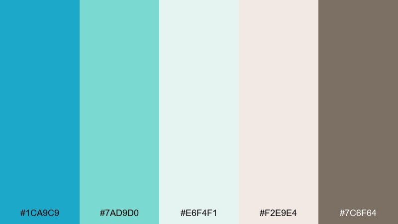
HEX: #1CA9C9 #7AD9D0 #E6F4F1 #F2E9E4 #7C6F64
Mood: soft, calming, organic
Best for: wellness brands and spa packaging
Soft and calming, these pacific blue hues suggest seafoam drifting onto warm linen fabric. Creamy neutrals make the blues feel gentle, while the taupe adds an earthy, natural touch. Use it for skincare labels, spa menus, and wellness websites that need quiet confidence. Try matte finishes and keep typography in taupe for a premium, understated look.
Image example of seafoam linen generated using media.io
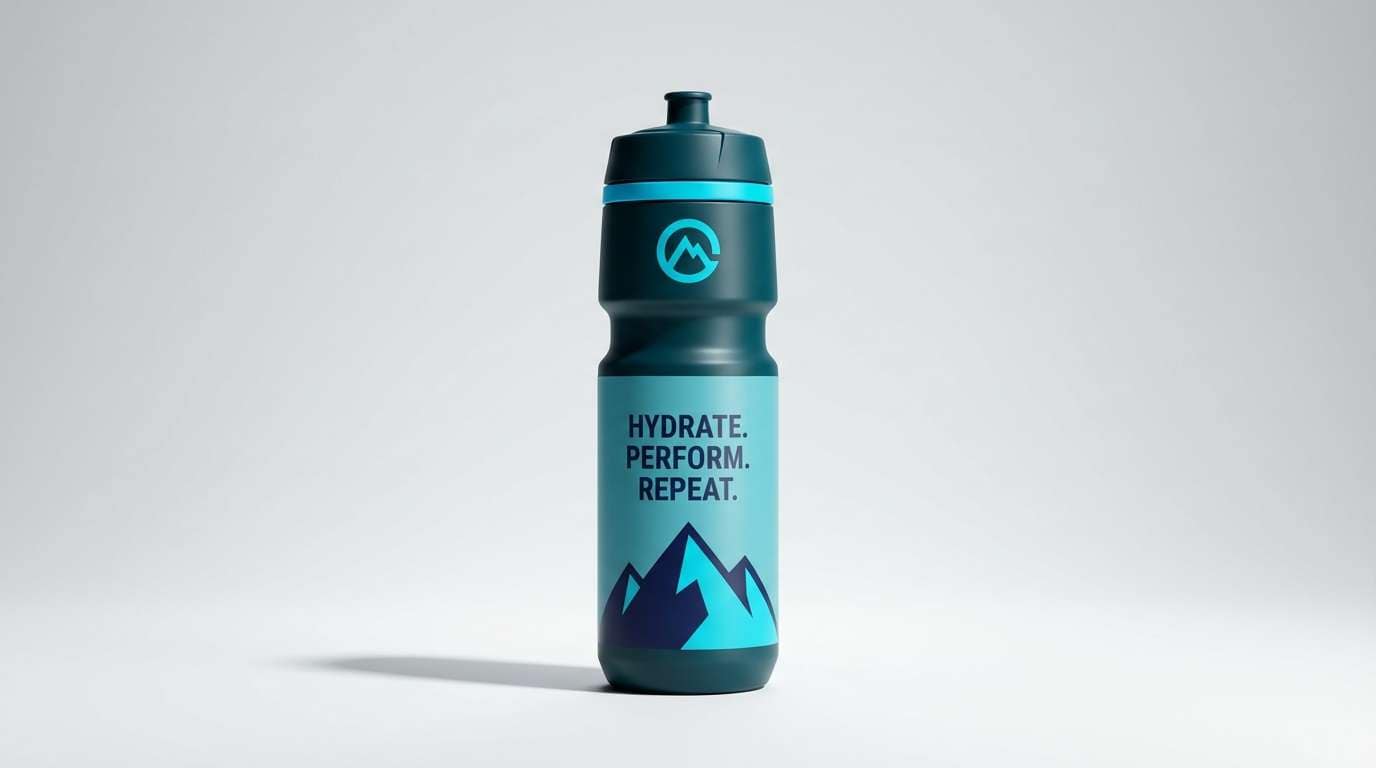
5) Deep Current
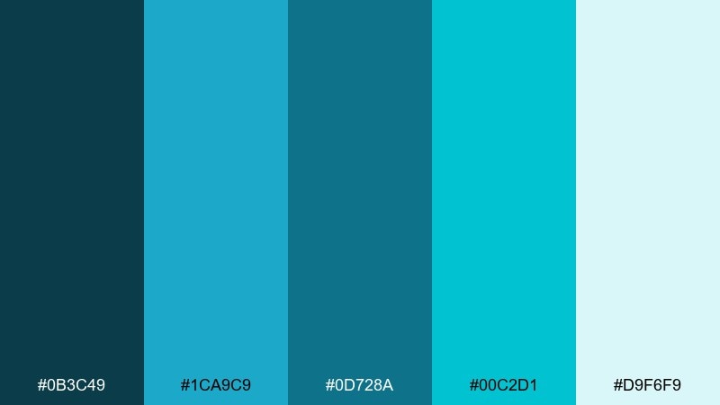
HEX: #0B3C49 #1CA9C9 #0D728A #00C2D1 #D9F6F9
Mood: bold, aquatic, high-contrast
Best for: sports branding and outdoor gear
Bold and aquatic, it feels like diving into deep water with shafts of light. The darker teal grounds the palette, while cyan accents add speed and clarity. Use it for sports branding, swimwear tags, or outdoor gear where you want motion and toughness without going full neon. Keep the light tint for background panels so the bright accents pop cleanly.
Image example of deep current generated using media.io
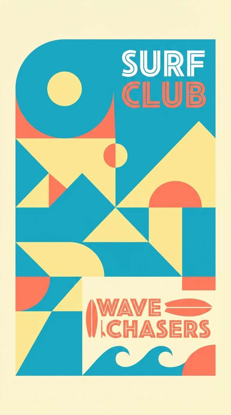
6) Surf Club
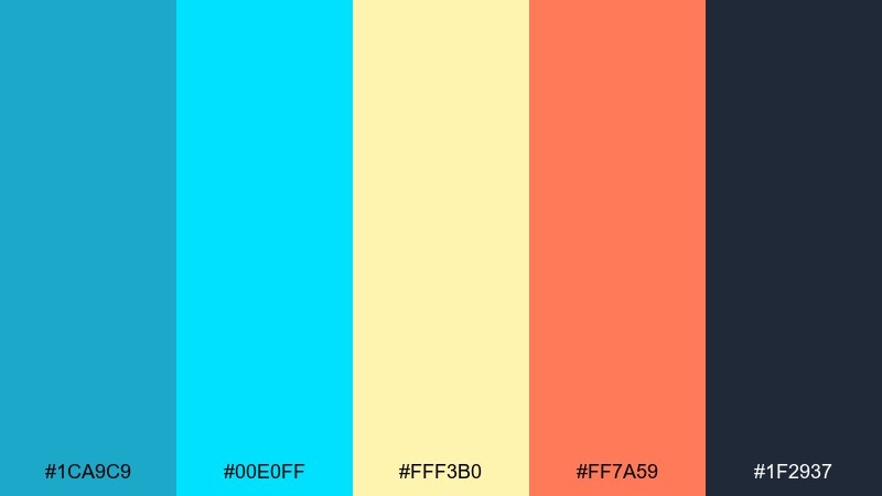
HEX: #1CA9C9 #00E0FF #FFF3B0 #FF7A59 #1F2937
Mood: fun, sunny, energetic
Best for: social media campaigns and posters
Fun and sunny, it brings to mind surf stickers, beach umbrellas, and bright salt air. These pacific blue color combinations work because the cool blues are balanced by cheerful yellow and a punchy coral. Use it for social campaigns, summer posters, or youth-focused brands that can handle high saturation. Let the navy handle text, then use coral sparingly for highlights so it stays punchy, not chaotic.
Image example of surf club generated using media.io
7) Glacier Ink
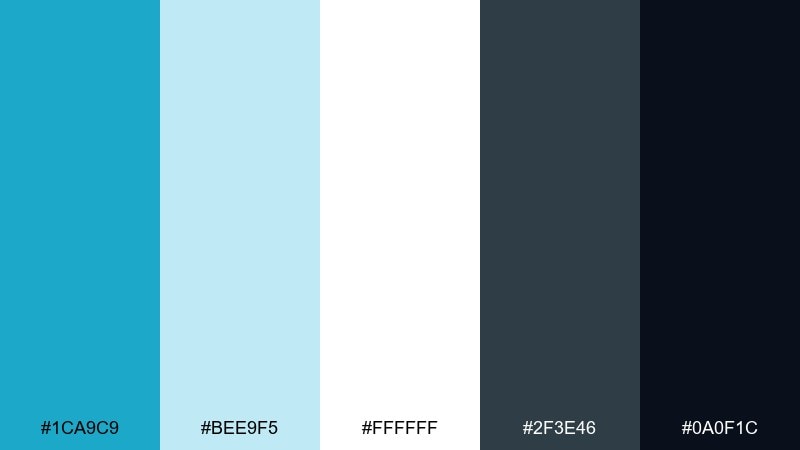
HEX: #1CA9C9 #BEE9F5 #FFFFFF #2F3E46 #0A0F1C
Mood: crisp, modern, minimal
Best for: mobile app UI and fintech
Crisp and modern, it feels like glacier light against dark ink. The pale blue and white create strong breathing room, while the charcoals keep everything sharp and legible. Use it for app UI, fintech onboarding, or data-heavy screens where hierarchy matters. A practical tip is to use the bright blue only for primary actions and keep secondary elements in slate.
Image example of glacier ink generated using media.io
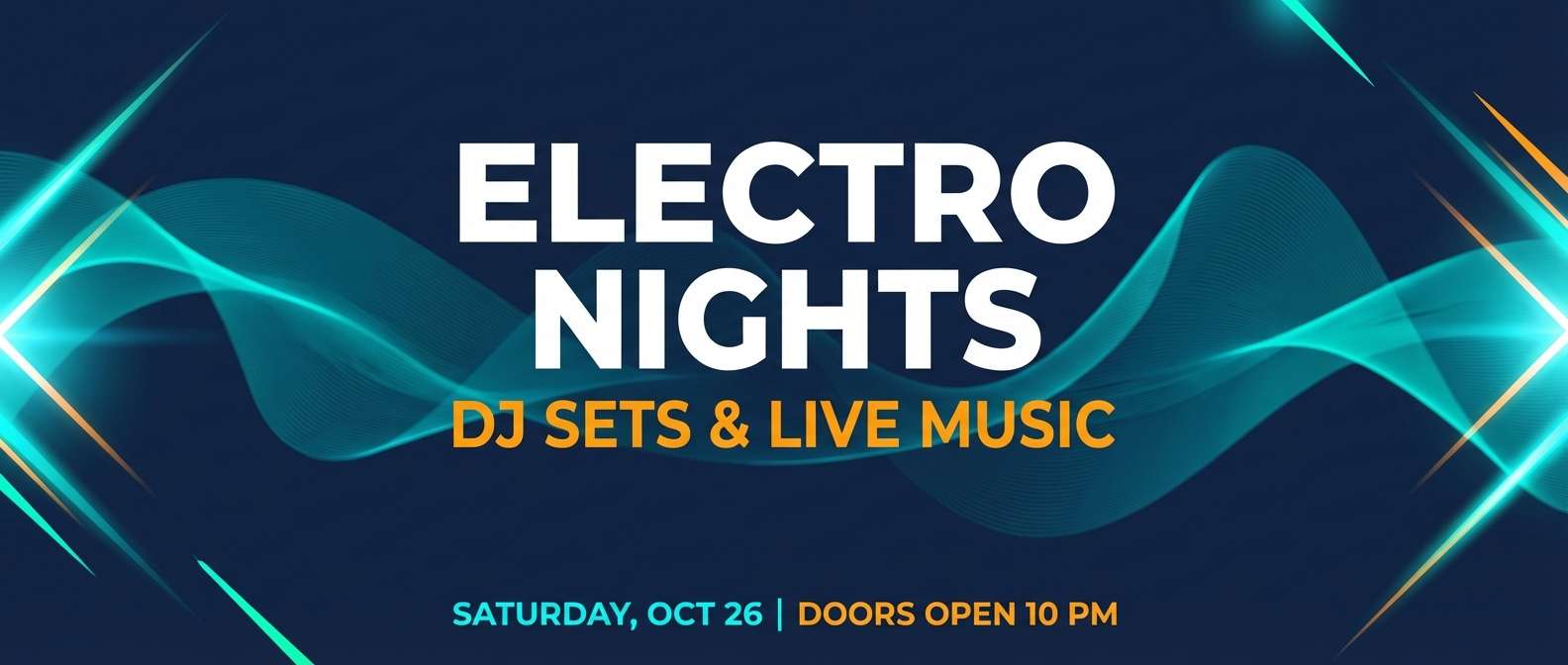
8) Marina Neon
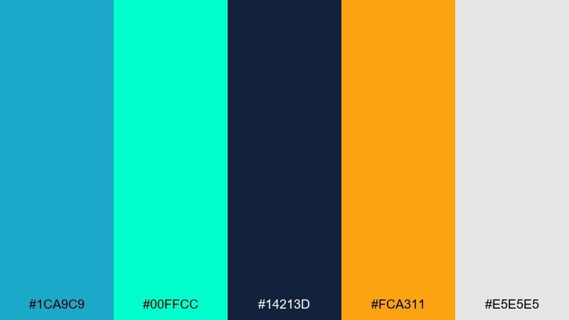
HEX: #1CA9C9 #00FFCC #14213D #FCA311 #E5E5E5
Mood: electric, youthful, nightlife
Best for: music promo graphics and banners
Electric and youthful, it hints at marina lights and late-night reflections on water. The mint and amber accents create a lively tension against the deep navy base. Use it for music promos, streaming banners, or nightlife branding that needs instant visibility. Keep backgrounds navy and drop in amber only for key callouts to avoid competing highlights.
Image example of marina neon generated using media.io
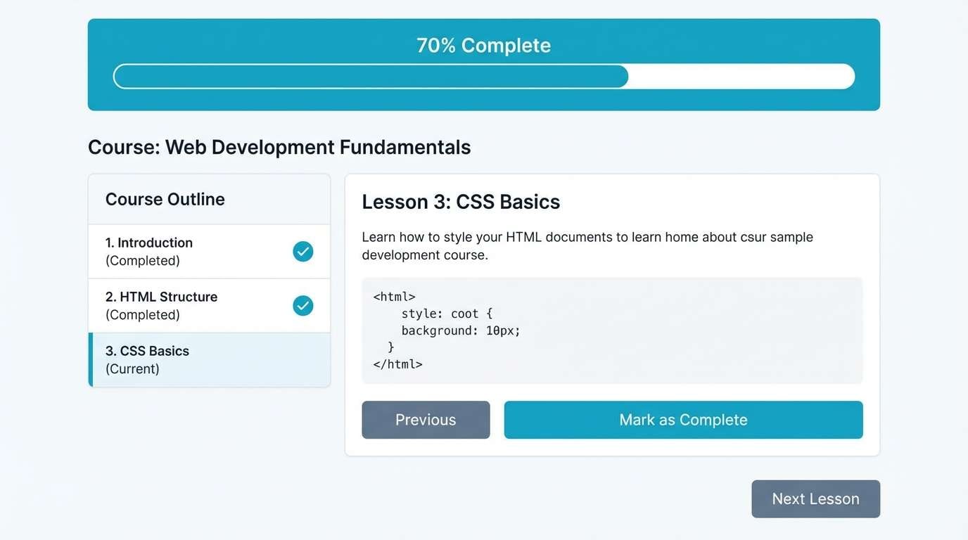
9) Calm Study
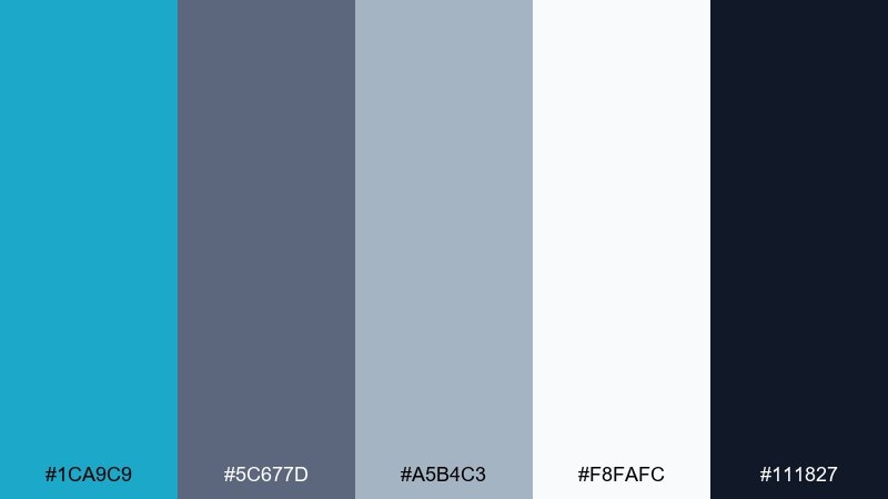
HEX: #1CA9C9 #5C677D #A5B4C3 #F8FAFC #111827
Mood: quiet, focused, academic
Best for: e-learning platforms and course pages
Quiet and focused, this pacific blue color palette feels like a tidy desk by a window on a cool morning. The blue reads as clear and approachable, while the grays keep things serious and calm. Use it for e-learning, documentation sites, or course landing pages where long reading sessions are common. A helpful tip is to use the light gray-blue for section dividers so the page feels structured without heavy lines.
Image example of calm study generated using media.io
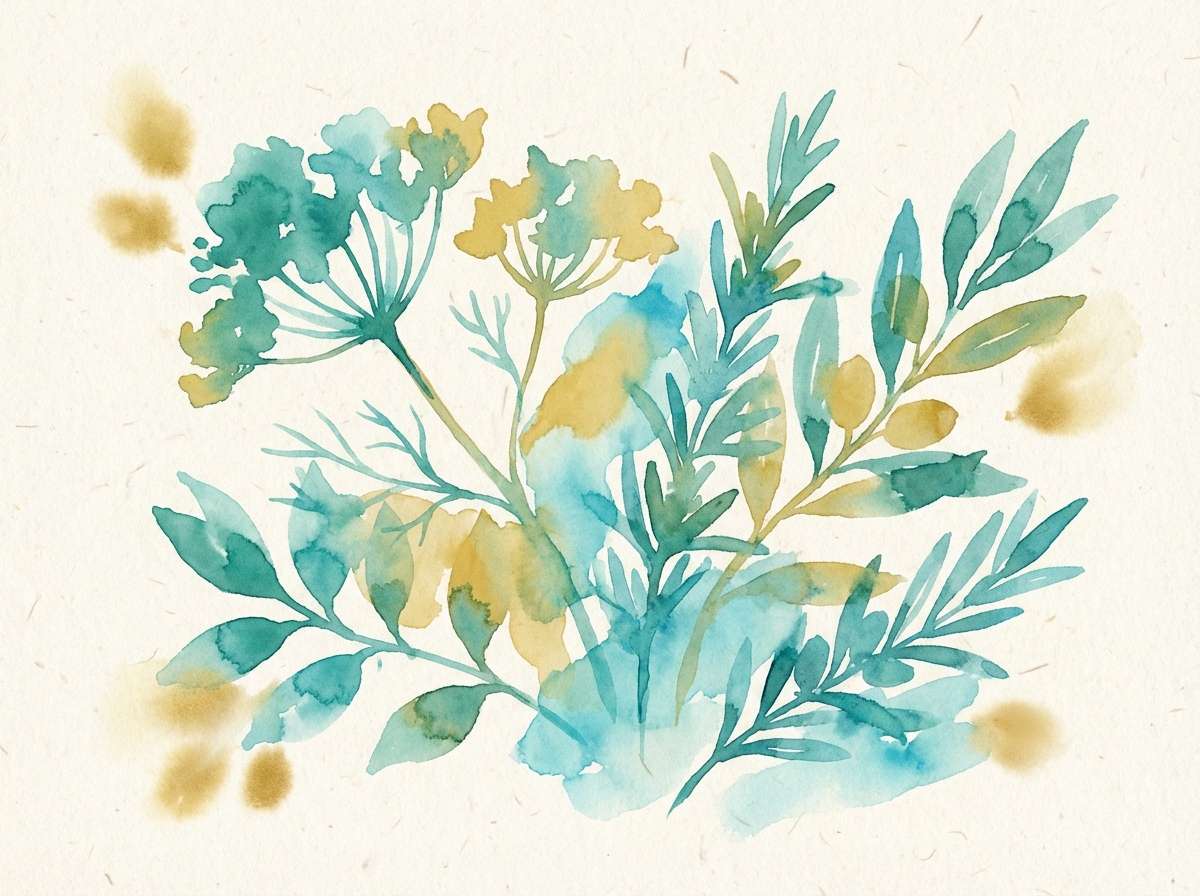
10) Botanical Tide
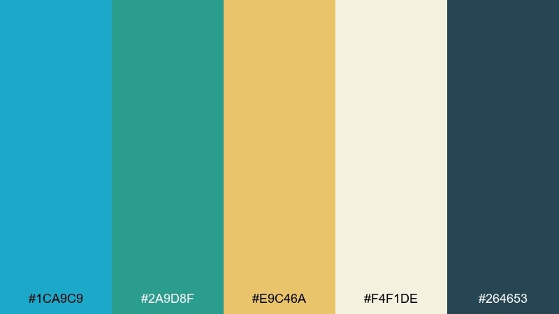
HEX: #1CA9C9 #2A9D8F #E9C46A #F4F1DE #264653
Mood: fresh, earthy, Mediterranean
Best for: botanical illustrations and stationery
Fresh and earthy, it suggests coastal herbs, sea breezes, and sun-warmed stone. Teal-greens and a golden accent make the blue feel natural rather than icy. Use it for illustrated stationery, garden brands, or café menus that want a Mediterranean lift. Try watercolor textures and let the navy-green handle outlines for a hand-crafted finish.
Image example of botanical tide generated using media.io
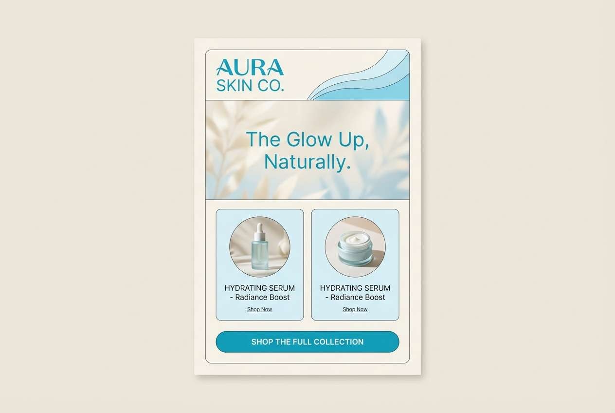
11) Ceramic Spa
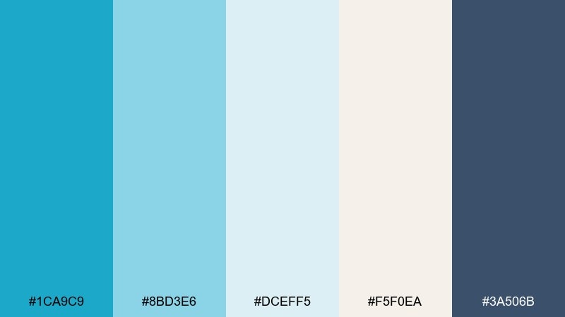
HEX: #1CA9C9 #8BD3E6 #DCEFF5 #F5F0EA #3A506B
Mood: soothing, clean, premium
Best for: beauty landing pages and email design
Soothing and clean, the pacific blue tones evoke glazed ceramic tiles and soft steam. The layered light blues create gentle depth, while the steel-navy keeps typography crisp. Use it for beauty emails, spa landing pages, or minimalist product launches. A smart tip is to set the background in warm off-white so the blues feel less clinical.
Image example of ceramic spa generated using media.io
12) Stormy Pier
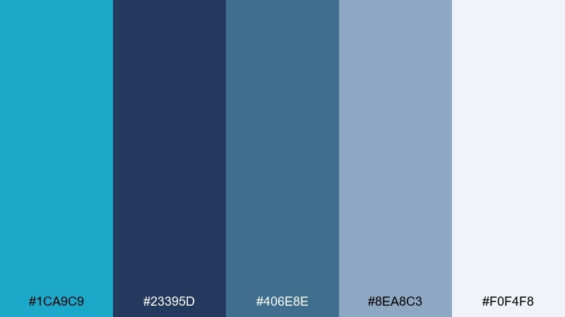
HEX: #1CA9C9 #23395D #406E8E #8EA8C3 #F0F4F8
Mood: moody, coastal, confident
Best for: brand identities and pitch decks
Moody and confident, it feels like a storm rolling past a pier with steel-blue waves. These pacific blue color combinations are ideal when you want energy without losing a serious, executive tone. Use it for pitch decks, brand identities, or product one-pagers where trust is essential. Keep slides mostly light and bring in the darker blues for section headers and key metrics.
Image example of stormy pier generated using media.io
13) Sandbar Minimal
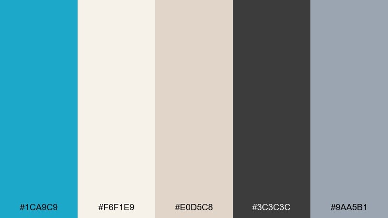
HEX: #1CA9C9 #F6F1E9 #E0D5C8 #3C3C3C #9AA5B1
Mood: minimal, airy, boutique
Best for: portfolio sites and minimalist logos
Minimal and airy, it recalls a pale sandbar with one bright ribbon of ocean color. Cream and beige soften the overall feel, while charcoal keeps it sharp for typography. Use it for portfolios, boutique logos, and product catalogs that need restraint and polish. Try keeping the blue as a single accent line or icon color so the design stays quiet and premium.
Image example of sandbar minimal generated using media.io
14) Island Party
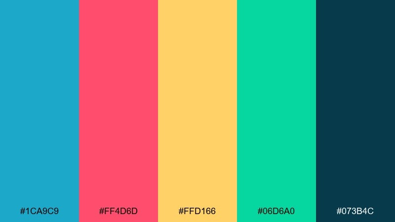
HEX: #1CA9C9 #FF4D6D #FFD166 #06D6A0 #073B4C
Mood: tropical, bold, celebratory
Best for: festival posters and merch graphics
Tropical and celebratory, it looks like island signage under bright sun. These pacific blue color combinations shine when you need loud contrast and fast readability. Use it for festival posters, merch graphics, or summer drops with big shapes and playful type. A good rule is to pick one warm highlight per design so the teal and blue do not get overwhelmed.
Image example of island party generated using media.io

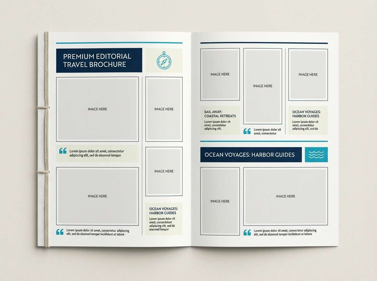
15) Yacht Brochure
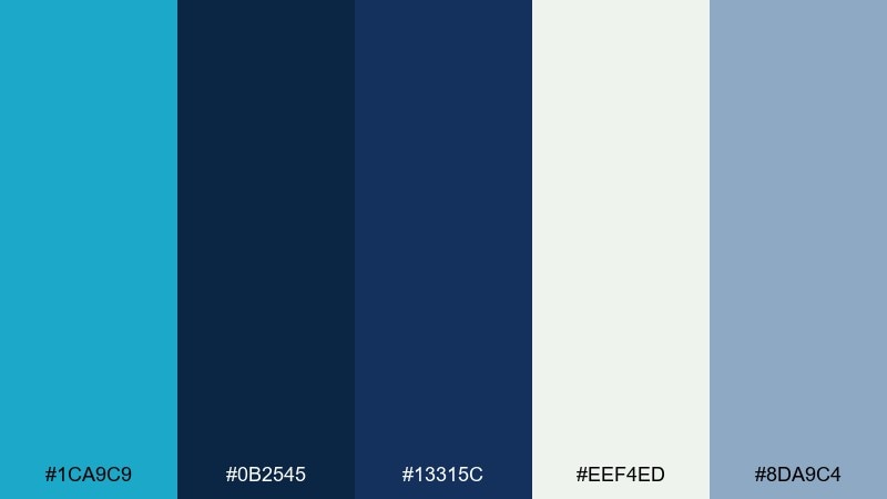
HEX: #1CA9C9 #0B2545 #13315C #EEF4ED #8DA9C4
Mood: luxury, nautical, polished
Best for: travel brochures and premium services
Luxury and nautical, it suggests polished decks, deep water, and crisp uniforms. The dark blues create a premium base while the pale green-white adds a clean editorial feel. Use it for travel brochures, yacht services, or high-end hospitality pages. Keep photography cool-toned and use the bright blue only for small navigational cues and links.
Image example of yacht brochure generated using media.io
16) Cloudy Lagoon
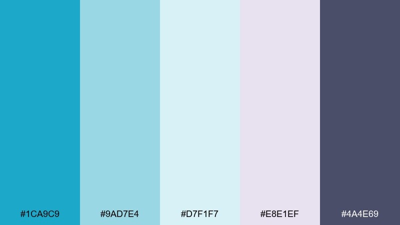
HEX: #1CA9C9 #9AD7E4 #D7F1F7 #E8E1EF #4A4E69
Mood: dreamy, soft, modern
Best for: wedding invitations and gentle branding
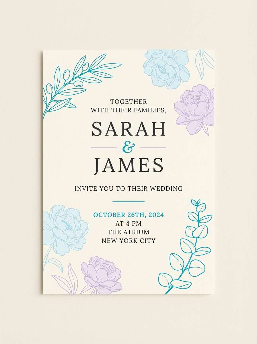
Dreamy and soft, it feels like a lagoon under light cloud cover with a whisper of lilac haze. The cool pastels keep the blue delicate, while the muted indigo adds structure for text. Use it for wedding invitations, boutique wellness branding, or calm social templates. For best results, print on textured stock and keep line art in the indigo for clarity.
Image example of cloudy lagoon generated using media.io
17) Ocean Editorial
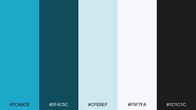
HEX: #1CA9C9 #0F4C5C #CFE8EF #F5F7FA #1C1C1C
Mood: editorial, crisp, confident
Best for: magazine layouts and lookbooks
Editorial and crisp, it resembles glossy ocean photography paired with sharp black text. The pacific blue color palette reads sophisticated when anchored by near-black and balanced with airy blue-gray paper tones. Use it for lookbooks, magazine spreads, or brand stories that need a clean, modern voice. Keep accents minimal and let the blue appear in pull quotes, section markers, or thin rules.
Image example of ocean editorial generated using media.io
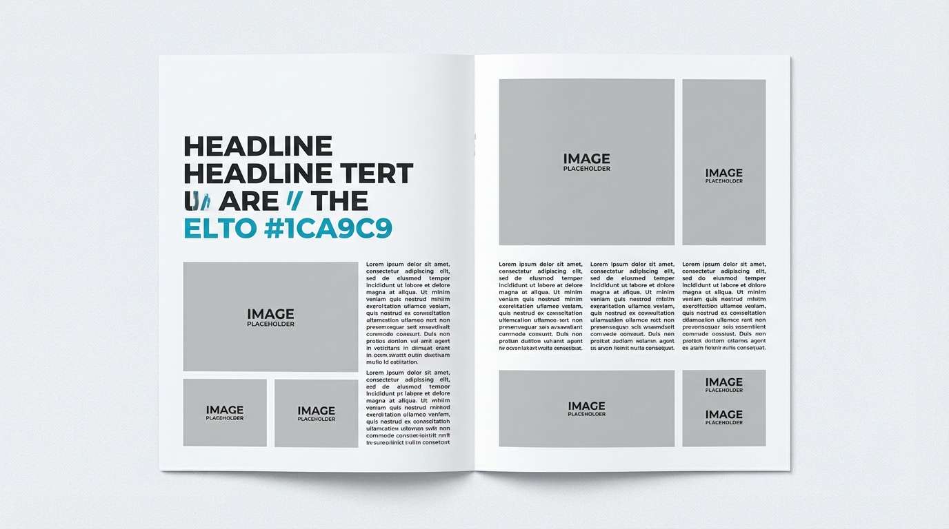
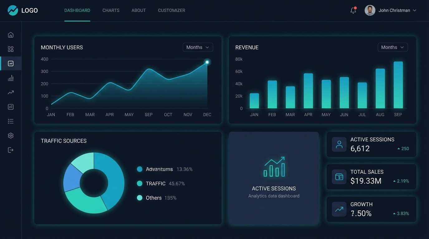
18) Tech Dashboard
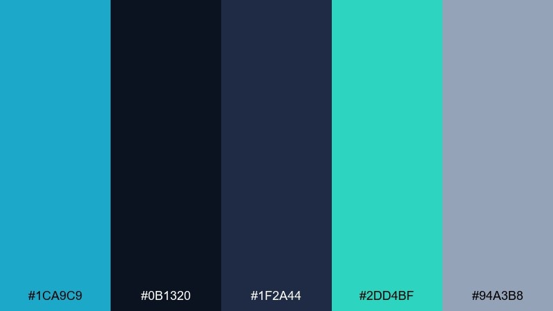
HEX: #1CA9C9 #0B1320 #1F2A44 #2DD4BF #94A3B8
Mood: sleek, futuristic, data-driven
Best for: dark mode UI and analytics tools
Sleek and data-driven, it feels like a night-mode cockpit with glowing indicators. Deep navy layers build depth, while teal and bright blue highlight interactive states. Use it for analytics tools, developer platforms, and dark mode UI where contrast is non-negotiable. Tip: keep charts mostly in blue and teal, and use the gray only for grid lines and secondary labels.
Image example of tech dashboard generated using media.io
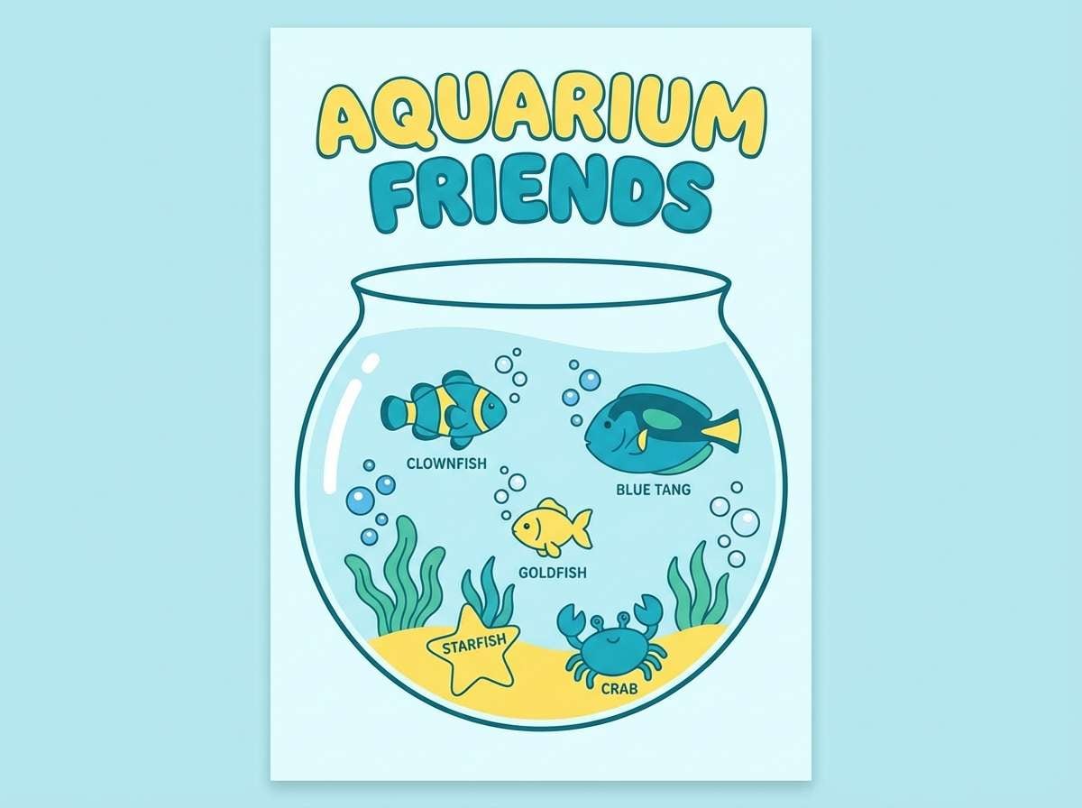
19) Kids Aquarium
HEX: #1CA9C9 #7CFFCB #B8F2FF #FFE66D #FF9F1C
Mood: cheerful, friendly, kid-safe
Best for: children apps and educational posters
Cheerful and friendly, it looks like playful fish tanks and bubble trails. The bright tints keep everything approachable, and the warm yellows and orange add instant joy. Use it for kids apps, classroom posters, or museum signage that needs high visibility. Keep text in a dark neutral and use the yellow for highlights to avoid glare on screens.
Image example of kids aquarium generated using media.io
20) Night Swim
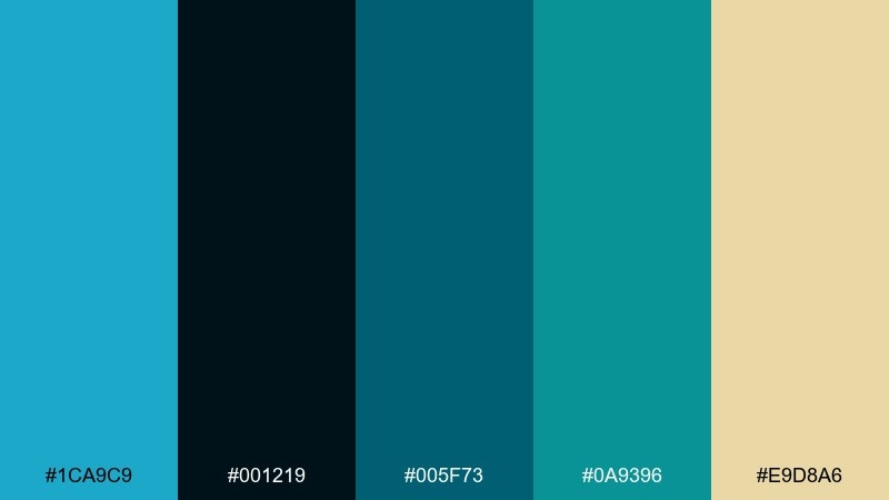
HEX: #1CA9C9 #001219 #005F73 #0A9396 #E9D8A6
Mood: mysterious, cinematic, cool
Best for: album covers and cinematic posters
Mysterious and cinematic, it evokes moonlit water with a warm glow in the distance. Deep blue-greens build atmosphere, while the sandy accent adds a subtle spotlight effect. Use it for album covers, film posters, or moody brand campaigns with a premium edge. A strong approach is to place the warm accent only on the focal element and keep the rest in layered teals.
Image example of night swim generated using media.io
What Colors Go Well with Pacific Blue?
Pacific blue pairs naturally with crisp neutrals like white, off-white, and cool grays for a clean UI feel. Add deep navy or near-black to create strong contrast for headings and accessibility-friendly text.
For warmer balance, try sand, peach, coral, and soft yellow—these make the blue feel more lifestyle than corporate. If you want a nature-leaning look, add teal-greens, muted olives, and botanical gold accents.
In dark themes, keep pacific blue as a highlight and use layered navies for depth. A small amount of mint or aqua can help interactive states stand out without turning the screen into “neon mode.”
How to Use Pacific Blue Color Combinations in Real Designs
Start by assigning roles: one primary (pacific blue), one dark anchor (navy/charcoal), and one light base (white/ice tint). This keeps layouts consistent across pages, screens, and marketing assets.
For branding, treat pacific blue as an accent in logos, icons, or link styles, then let neutrals carry most surfaces. In print, add texture (matte stock, subtle gradients) so bright blues feel premium rather than flat.
For data viz and dashboards, reserve pacific blue for the “key series” and use muted grays for grids and secondary labels. This reduces clutter while keeping the most important numbers visually obvious.
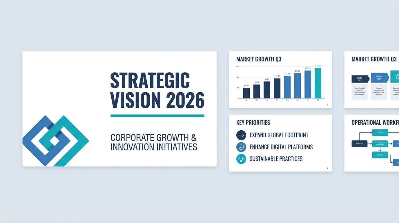
Create Pacific Blue Palette Visuals with AI
If you want fast mockups for a landing page, flyer, packaging, or a dark-mode dashboard, you can generate visuals from a simple prompt and your selected HEX colors. This helps you validate mood and contrast before committing to a full design build.
With Media.io’s text-to-image tool, reuse the prompts above (or swap in your own layout keywords) to create consistent palette examples for presentations and mood boards.
Pacific Blue Color Palette FAQs
-
What HEX code is closest to “pacific blue” in these palettes?
#1CA9C9 is used as the main pacific blue anchor across most palettes in this list. -
Is pacific blue more cyan or more teal?
Pacific blue typically sits between cyan and teal: it has clear blue energy with a noticeable green tint, which makes it feel ocean-like and modern. -
What’s the best neutral to pair with pacific blue for UI design?
White or very light blue-gray backgrounds with a deep navy/charcoal for text work best, because they keep contrast high and make pacific blue feel crisp. -
Which accent colors make pacific blue feel warmer?
Peach, coral, sand, warm cream, and soft yellow add warmth and make pacific blue look more friendly and lifestyle-oriented. -
Can I use pacific blue in dark mode interfaces?
Yes—use deep navy layers for backgrounds and reserve pacific blue for primary actions, active states, and key chart series so it stays readable and intentional. -
How do I stop pacific blue palettes from looking too “medical” or cold?
Add warm off-whites, beige/taupe typography, or a small warm accent (like amber or peach), and avoid using pure white everywhere. -
What file types should I export for web and print when testing these palettes?
For web/UI, export PNG or SVG assets; for print drafts, export PDF with the right color profile from your design tool and run a quick proof to check how blues shift on paper.


