

Pastel blue and purple palettes feel airy, calm, and modern—perfect when you want a soft look without losing structure. They’re especially popular for UI, wedding stationery, wellness branding, and gentle decor concepts.
Below are 20 curated pastel blue purple color palette ideas with HEX codes, plus ready-to-use AI prompts so you can generate matching visuals in minutes.
In this article
- Why Pastel Blue Purple Palettes Work So Well
-
- misty periwinkle dawn
- lavender cloud drift
- powder blue orchid
- icy lilac whisper
- blueberry milkshake
- wisteria skyline
- coastal amethyst
- cotton candy dusk
- moonlit hydrangea
- frosted violet breeze
- baby blue mauve
- lilac fog studio
- dreamy iris gradient
- soft plum daylight
- peri blue minimal
- arctic lavender glow
- violet mist stationery
- blue lilac ui kit
- pastel galaxy nursery
- serene orchid spa
- What Colors Go Well with Pastel Blue Purple?
- How to Use a Pastel Blue Purple Color Palette in Real Designs
- Create Pastel Blue Purple Palette Visuals with AI
Why Pastel Blue Purple Palettes Work So Well
Pastel blue-purple sits in a naturally soothing zone: blue brings clarity and trust, while purple adds creativity and a premium feel. Together, they communicate “calm but elevated” without looking cold.
Because these hues are light by default, they create generous breathing room for layouts. That makes them ideal for interfaces, editorial designs, and print where readability and hierarchy matter.
They’re also highly flexible: lean bluer for a clean, modern look, or lean more lavender for romantic, dreamy moods. Small shifts in tint can completely change the vibe while staying cohesive.
20+ Pastel Blue Purple Color Palette Ideas (with HEX Codes)
1) Misty Periwinkle Dawn
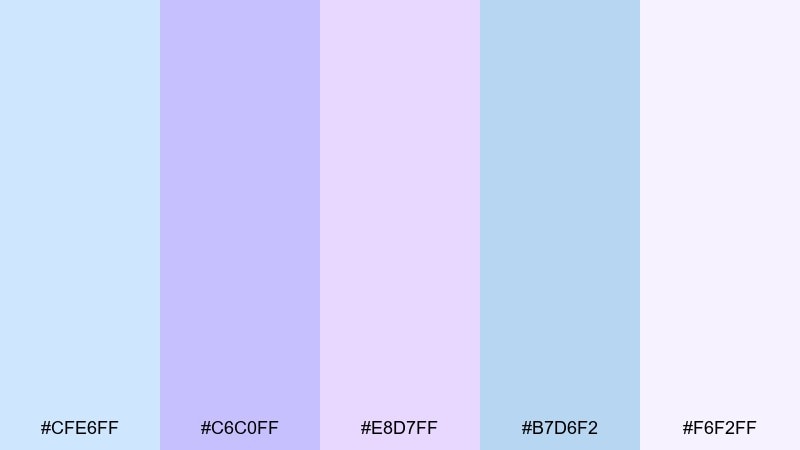
HEX: #cfe6ff #c6c0ff #e8d7ff #b7d6f2 #f6f2ff
Mood: calm, airy, gentle
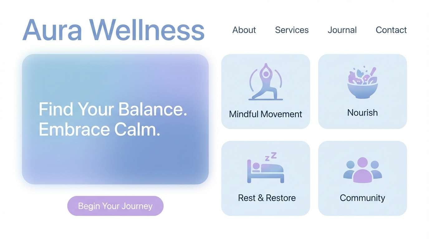
Best for: wellness brand landing page UI
Calm, airy light like early morning fog over a pale sky. These tones work beautifully for wellness, skincare, and mindful apps where clarity matters. Pair with soft white space and a cool gray for typography to keep everything readable. Tip: use the periwinkle as the primary CTA color and reserve the lavender for hover states.
Image example of misty periwinkle dawn generated using media.io
Media.io is an online AI studio for creating and editing video, image, and audio in your browser.

2) Lavender Cloud Drift
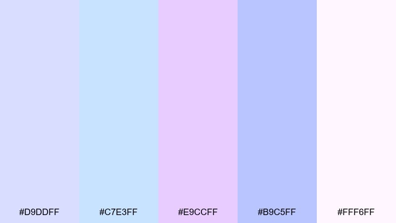
HEX: #d9ddff #c7e3ff #e9ccff #b9c5ff #fff6ff
Mood: dreamy, light, romantic
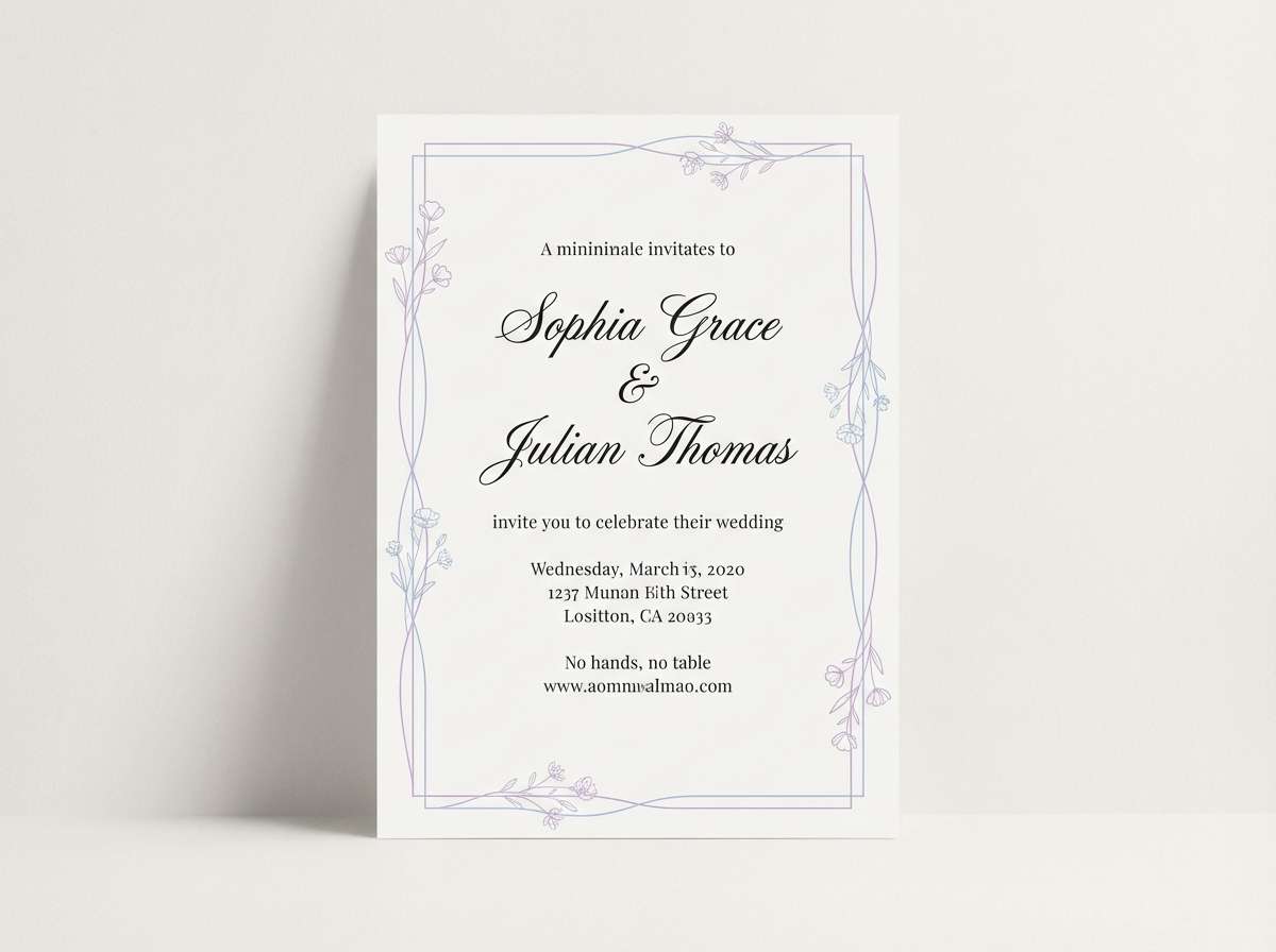
Best for: wedding invitation design
Dreamy and weightless, like clouds tinted by lavender light at sunset. These pastel blue purple color combinations feel elegant on invitations, save the dates, and vow cards. Pair with warm ivory paper textures and a thin silver foil line for a refined finish. Tip: keep body text in a soft charcoal to avoid harsh contrast.
Image example of lavender cloud drift generated using media.io
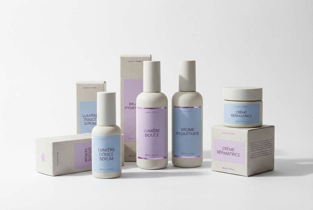
3) Powder Blue Orchid
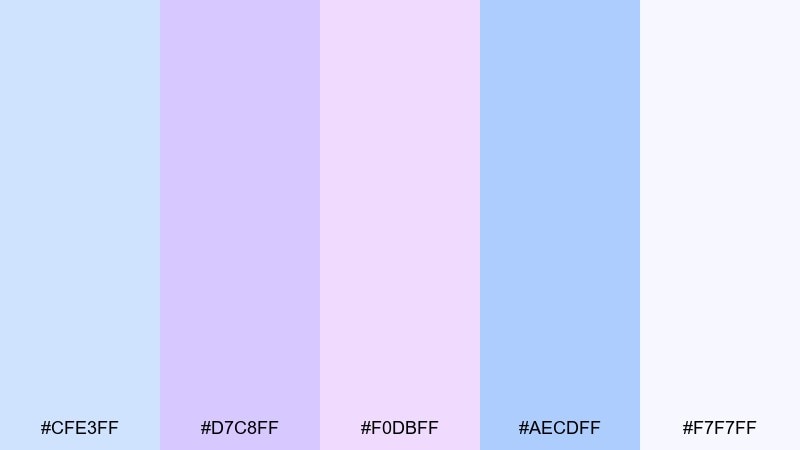
HEX: #cfe3ff #d7c8ff #f0dbff #aecdff #f7f7ff
Mood: fresh, soft, uplifting
Best for: skincare product packaging
Fresh and soft, like orchid petals against a powder-blue sky. The gentle contrast supports premium skincare packaging without feeling sterile. Pair with matte white bottles and minimal line icons for a clean, modern shelf presence. Tip: use the deeper blue as the product name color for better legibility.
Image example of powder blue orchid generated using media.io
4) Icy Lilac Whisper
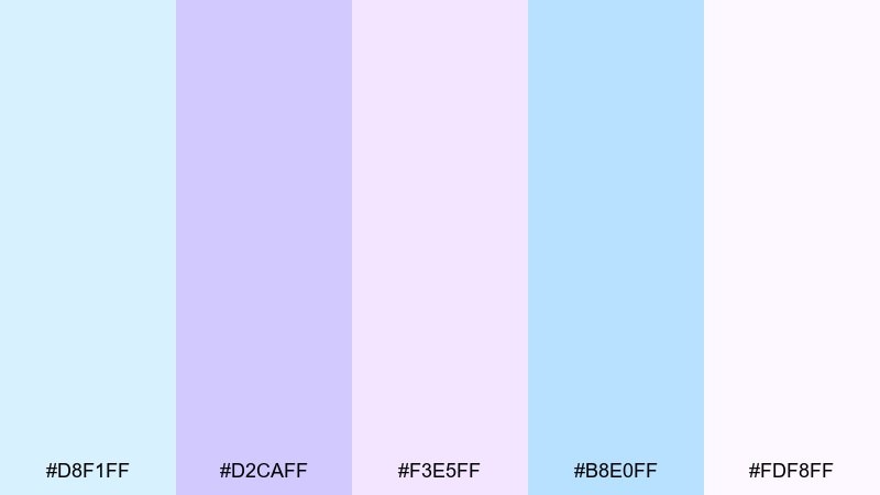
HEX: #d8f1ff #d2caff #f3e5ff #b8e0ff #fdf8ff
Mood: cool, quiet, minimal
Best for: tech startup pitch deck
Cool and quiet, like ice crystals catching lilac light. The palette keeps slides feeling modern while still approachable and human. Pair with dark navy headings and plenty of spacing so charts stay clear. Tip: limit gradients to one hero slide to avoid a washed-out deck.
Image example of icy lilac whisper generated using media.io
5) Blueberry Milkshake
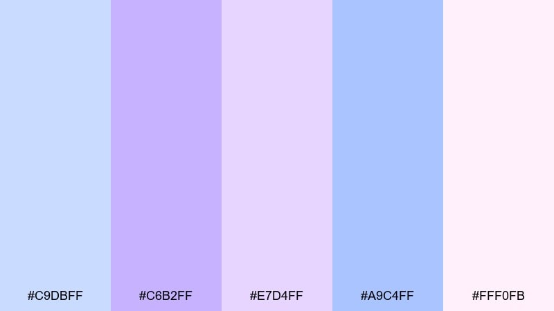
HEX: #c9dbff #c6b2ff #e7d4ff #a9c4ff #fff0fb
Mood: sweet, playful, cozy
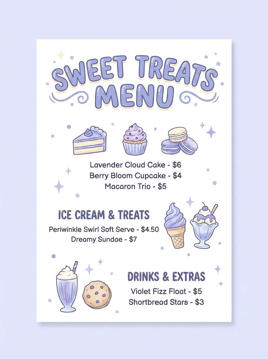
Best for: cafe dessert menu flyer
Sweet and cozy, like a blueberry milkshake topped with a pastel swirl. This pastel blue purple color palette is perfect for dessert menus, cafe promos, and cute loyalty cards. Pair with creamy off-white and a rounded display font to lean into the friendly vibe. Tip: use the mid purple for price tags so they pop without shouting.
Image example of blueberry milkshake generated using media.io
6) Wisteria Skyline
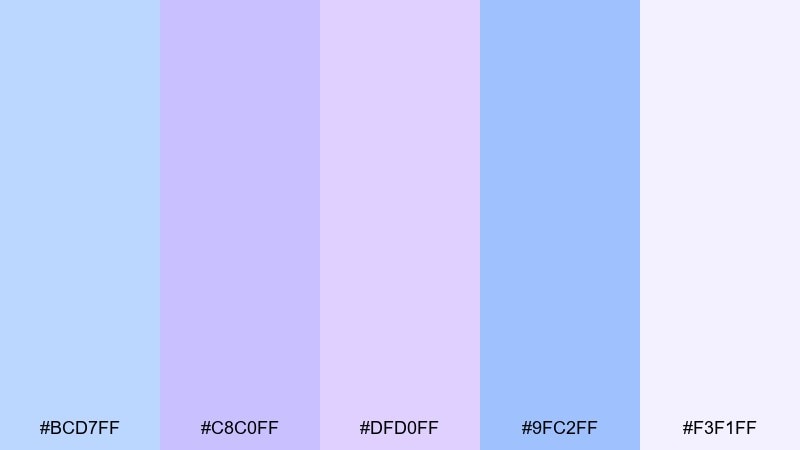
HEX: #bcd7ff #c8c0ff #dfd0ff #9fc2ff #f3f1ff
Mood: modern, airy, polished
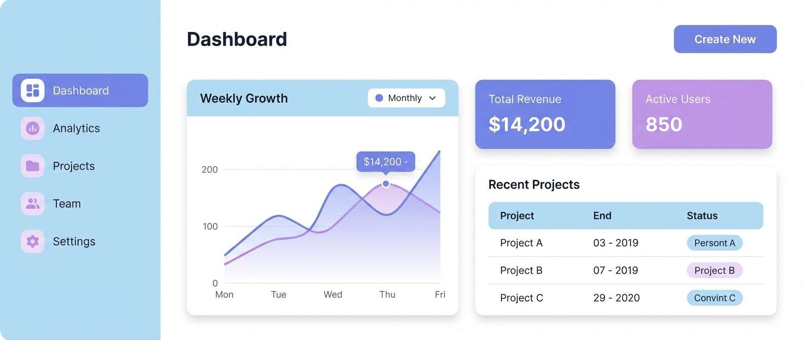
Best for: saas dashboard UI
Modern and polished, like a skyline seen through wisteria haze. The tones help dashboards feel lighter while still separating sections clearly. Pair with neutral grays, thin dividers, and one strong navy for critical alerts. Tip: keep charts to two dominant hues for easy scanning.
Image example of wisteria skyline generated using media.io
7) Coastal Amethyst
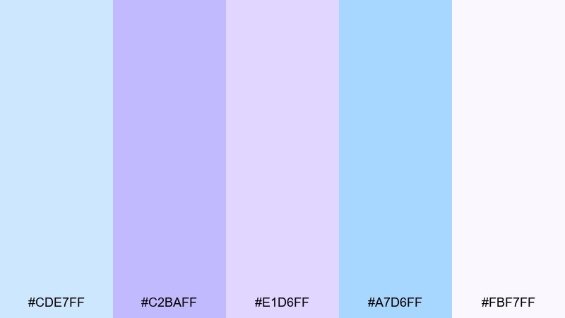
HEX: #cde7ff #c2baff #e1d6ff #a7d6ff #fbf7ff
Mood: breezy, relaxed, coastal
Best for: beach resort social post templates
Breezy and relaxed, like sea air mixed with amethyst glow. These hues suit resort social posts, travel highlights, and calm promotional banners. Pair with sandy beige neutrals and minimal photography overlays for a soft-lux look. Tip: place text on the lightest shade and add a subtle shadow for readability.
Image example of coastal amethyst generated using media.io
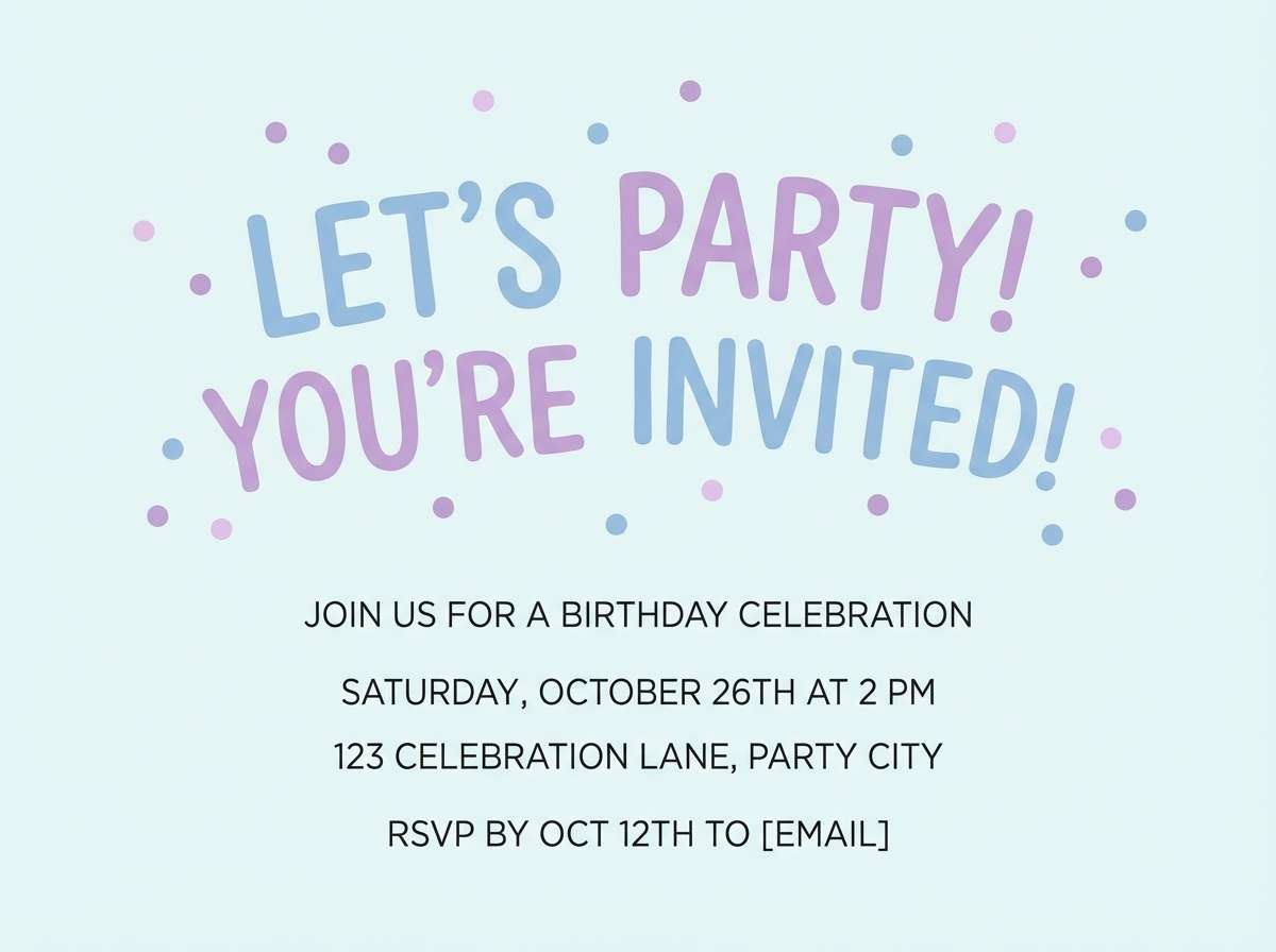
8) Cotton Candy Dusk
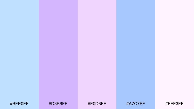
HEX: #bfe0ff #d3b6ff #f0d6ff #a7c7ff #fff3ff
Mood: whimsical, soft, youthful
Best for: birthday party invitation
Whimsical and sweet, like cotton candy dissolving into dusk. The gentle shifts between blue and lilac make party invitations feel festive without neon intensity. Pair with white space and simple confetti dots in one accent shade. Tip: keep the background pale and let the headline carry the stronger purple.
Image example of cotton candy dusk generated using media.io
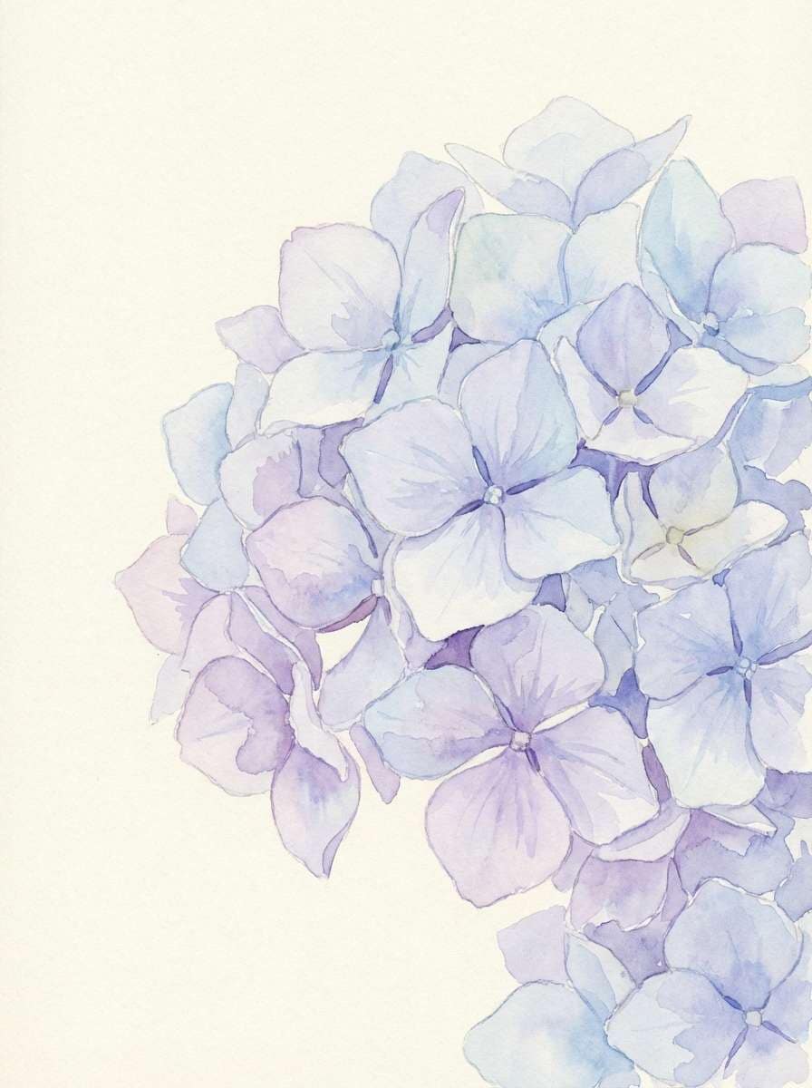
9) Moonlit Hydrangea
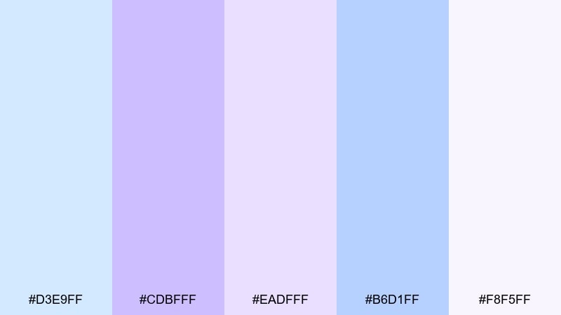
HEX: #d3e9ff #cdbfff #eadfff #b6d1ff #f8f5ff
Mood: serene, floral, elegant
Best for: spring floral watercolor illustration
Serene and floral, like hydrangeas under moonlight. These tints translate beautifully into watercolor petals, gentle shadows, and airy washes. Pair with a warm cream paper tone so the cool colors feel less icy. Tip: paint blooms with the lavender and reserve the blue for background atmosphere.
Image example of moonlit hydrangea generated using media.io
10) Frosted Violet Breeze
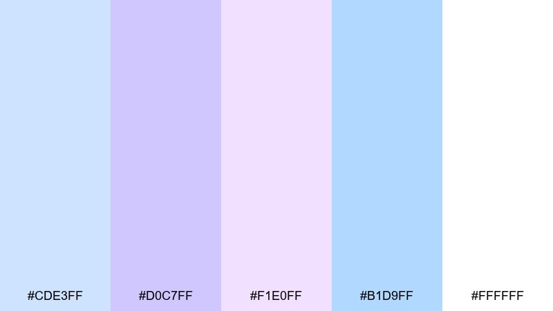
HEX: #cde3ff #d0c7ff #f1e0ff #b1d9ff #ffffff
Mood: clean, crisp, light
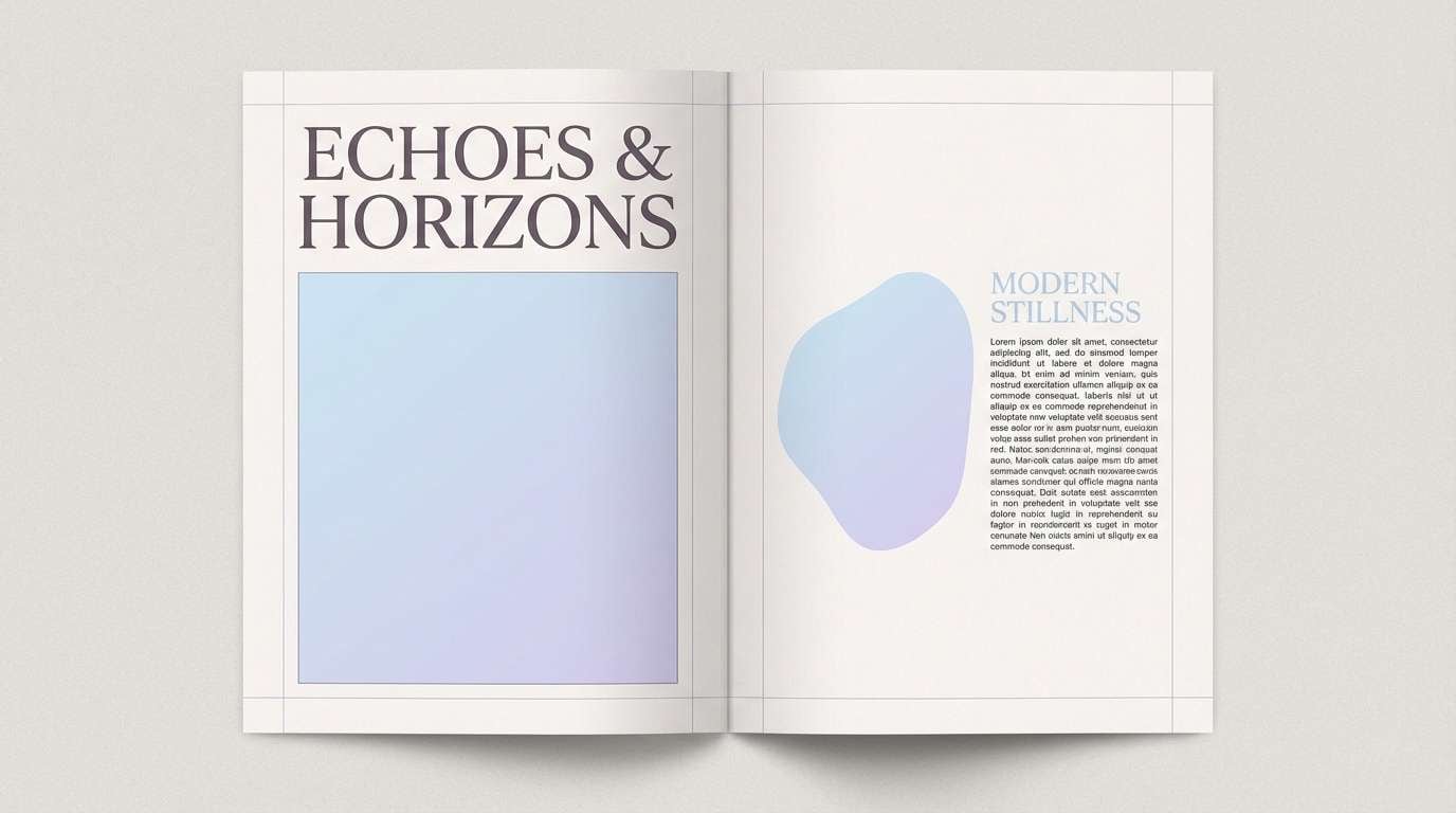
Best for: minimal editorial magazine spread
Clean and crisp, like a violet breeze across fresh snow. The high-key balance is ideal for editorial layouts that need breathing room. Pair with black or deep indigo type and one thin rule line to structure the page. Tip: keep photos cool-toned so they sit naturally in the layout.
Image example of frosted violet breeze generated using media.io
11) Baby Blue Mauve
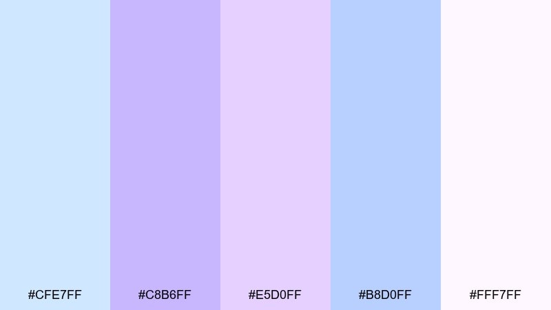
HEX: #cfe7ff #c8b6ff #e5d0ff #b8d0ff #fff7ff
Mood: gentle, friendly, comforting
Best for: nursery wall art print
Gentle and comforting, like baby blankets and soft mauve ribbons. As a pastel blue purple color combination, it fits nursery art, baby shower prints, and quiet bedtime routines. Pair with warm wood frames and simple line drawings for a timeless look. Tip: use the lightest shade as the paper base and keep illustrations in two inks max.
Image example of baby blue mauve generated using media.io
12) Lilac Fog Studio
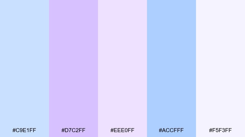
HEX: #c9e1ff #d7c2ff #eee0ff #accfff #f5f3ff
Mood: soft, creative, modern
Best for: podcast cover art
Soft and creative, like studio lights glowing through lilac fog. The colors give podcast cover art a modern edge without turning loud. Pair with bold geometric shapes and a single dark ink for the show title. Tip: keep contrast high on small screens by using the deeper blue behind key text.
Image example of lilac fog studio generated using media.io

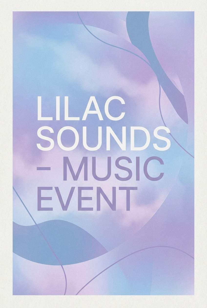
13) Dreamy Iris Gradient
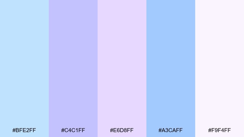
HEX: #bfe2ff #c4c1ff #e6d8ff #a3caff #f9f4ff
Mood: ethereal, smooth, ambient
Best for: music event poster
Ethereal and ambient, like an iris gradient drifting across a nightlight glow. These tones suit electronic and chill music posters where the vibe should feel immersive. Pair with a subtle grain texture and minimal line icons to avoid a flat look. Tip: set the background as a soft gradient and keep the headline in one solid shade.
Image example of dreamy iris gradient generated using media.io
14) Soft Plum Daylight
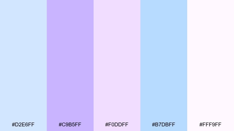
HEX: #d2e6ff #c9b5ff #f0ddff #b7dbff #fff9ff
Mood: warm-soft, gentle, optimistic
Best for: lifestyle blog header design
Warm-soft daylight with a hint of plum, like a bright room with pastel curtains. The mix works well for lifestyle blog headers and creator templates that need personality without clutter. Pair with creamy whites and a muted taupe for supporting UI elements. Tip: keep the purple for highlights and use the blues as background blocks.
Image example of soft plum daylight generated using media.io
15) Peri Blue Minimal
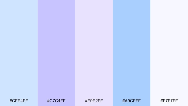
HEX: #cfe4ff #c7c4ff #e9e2ff #a9cfff #f7f7ff
Mood: minimal, tidy, professional
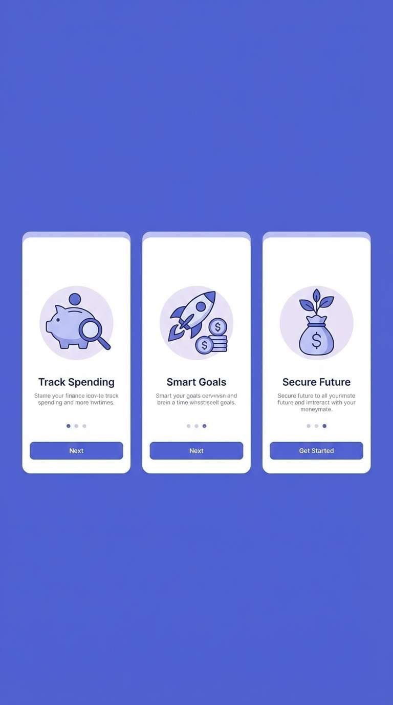
Best for: finance app onboarding screens
Minimal and tidy, like clean UI panels washed in peri blue. This pastel blue purple color scheme helps finance onboarding feel friendly while still trustworthy. Pair with a deep slate for headings and use thin dividers to guide the eye. Tip: reserve the most saturated shade for progress indicators and primary buttons.
Image example of peri blue minimal generated using media.io
16) Arctic Lavender Glow
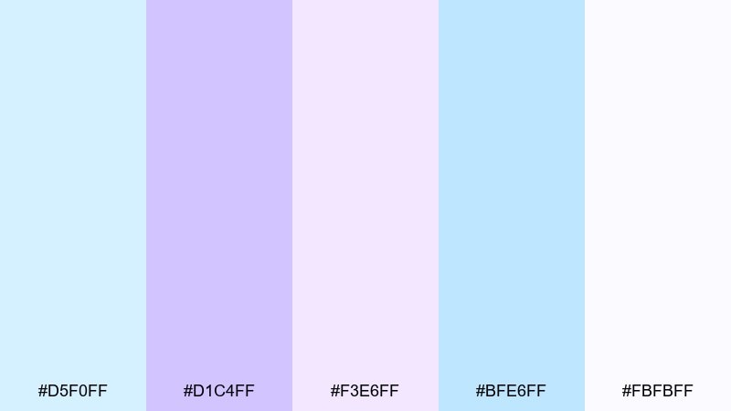
HEX: #d5f0ff #d1c4ff #f3e6ff #bfe6ff #fbfbff
Mood: cool, luminous, airy
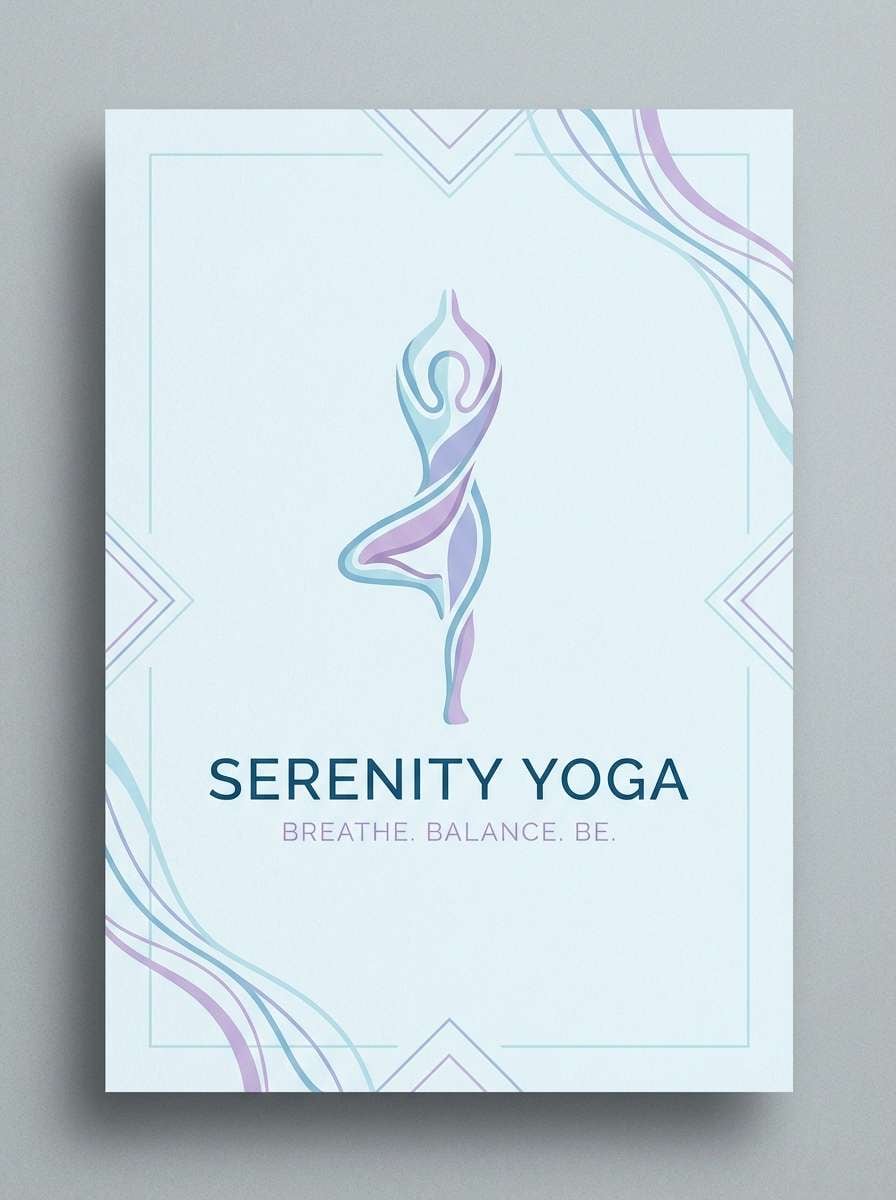
Best for: yoga studio poster
Cool and luminous, like arctic air lit by lavender glow. The lightness makes it ideal for yoga posters, studio schedules, and calming class promos. Pair with soft gradients and minimal icons so the message stays clear. Tip: use the lavender for the class name and keep details in a darker gray.
Image example of arctic lavender glow generated using media.io
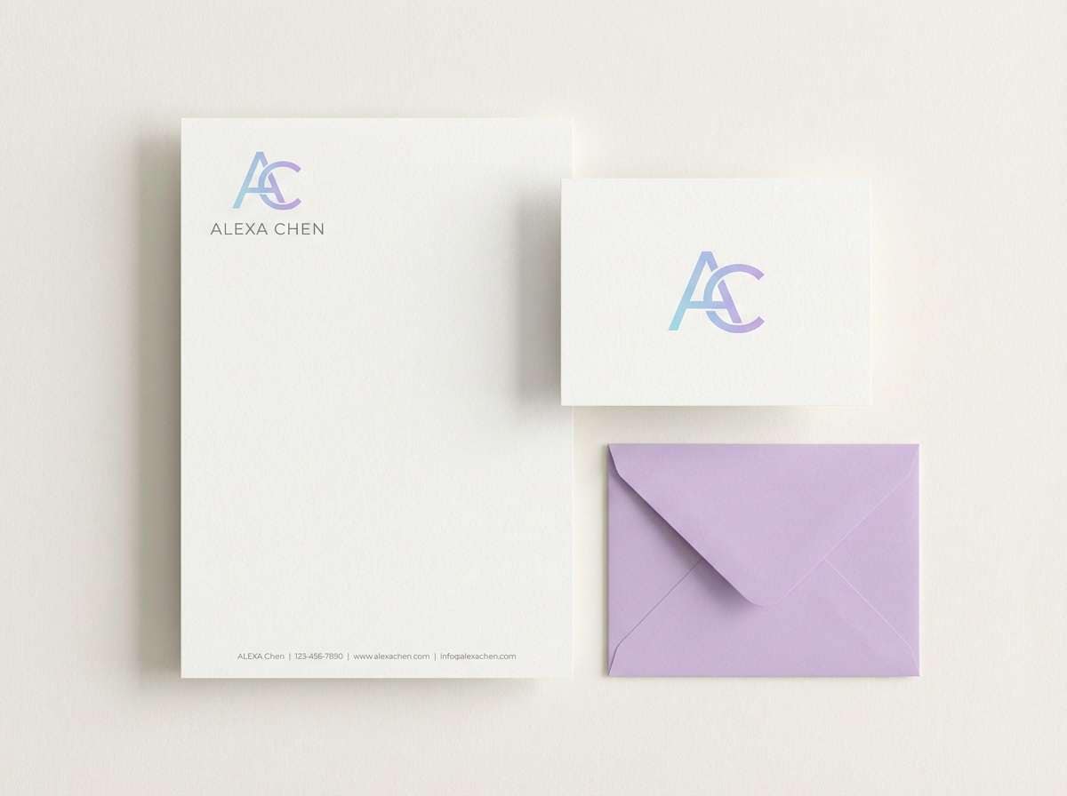
17) Violet Mist Stationery
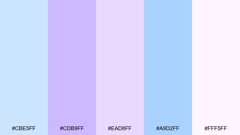
HEX: #cbe5ff #cdb9ff #ead8ff #a9d2ff #fff5ff
Mood: soft, elegant, thoughtful
Best for: personal stationery set
Soft and elegant, like violet mist settling on paper in a quiet room. The balanced hues suit letterheads, note cards, and thank-you stationery that feels personal. Pair with subtle embossing or a fine-line monogram for a premium touch. Tip: keep margins generous and use the lightest tint for background patterns.
Image example of violet mist stationery generated using media.io
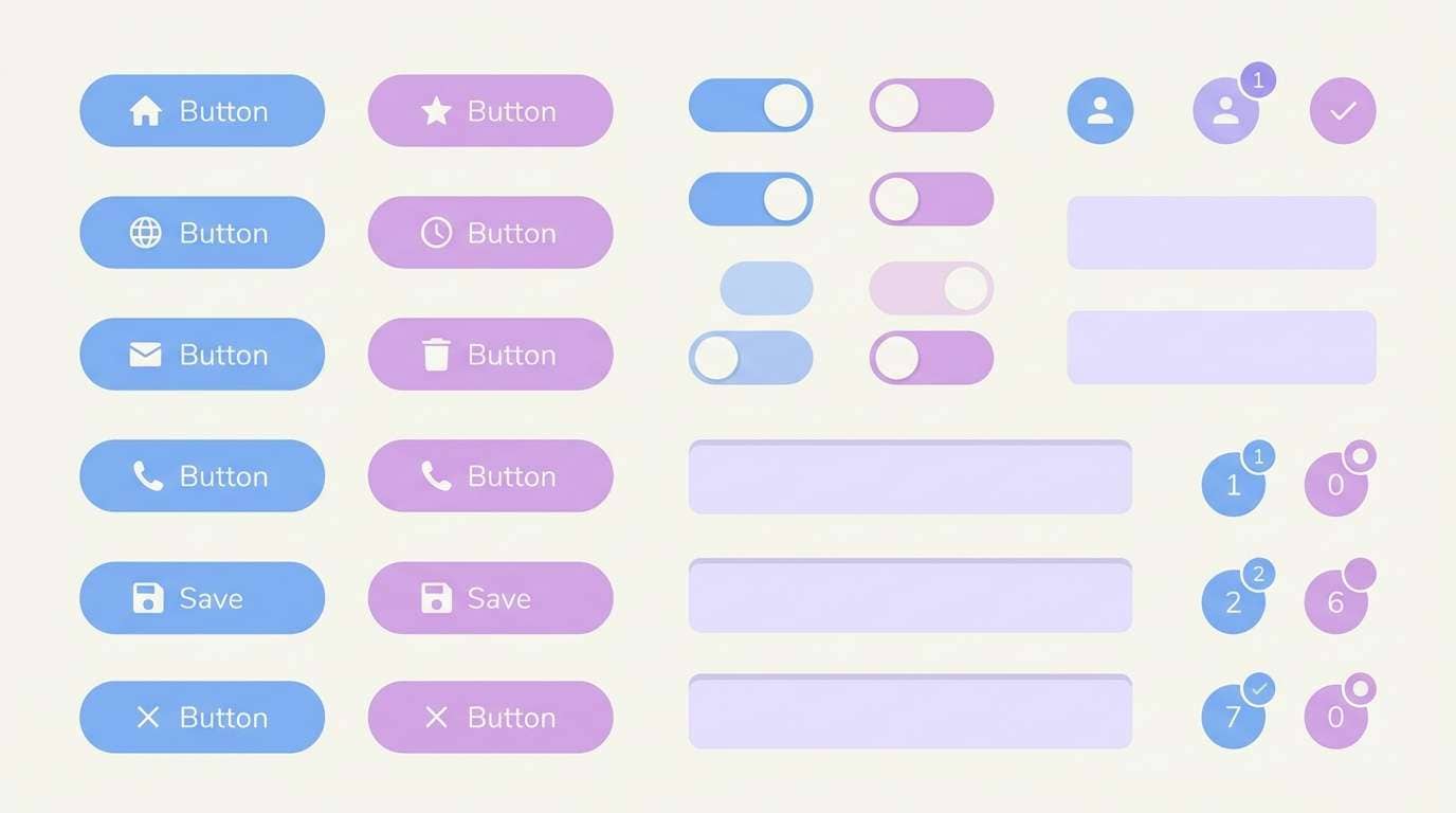
18) Blue Lilac UI Kit
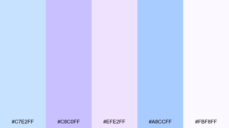
HEX: #c7e2ff #c8c0ff #efe2ff #a8ccff #fbf8ff
Mood: friendly, modern, organized
Best for: mobile app UI kit components
Friendly and organized, like neatly stacked cards in a soft lilac light. These tones are great for UI kits with buttons, toggles, badges, and alerts that need gentle hierarchy. Pair with a single dark neutral for text and icons to keep accessibility on track. Tip: use the mid blue for active states and the pale lavender for backgrounds.
Image example of blue lilac ui kit generated using media.io
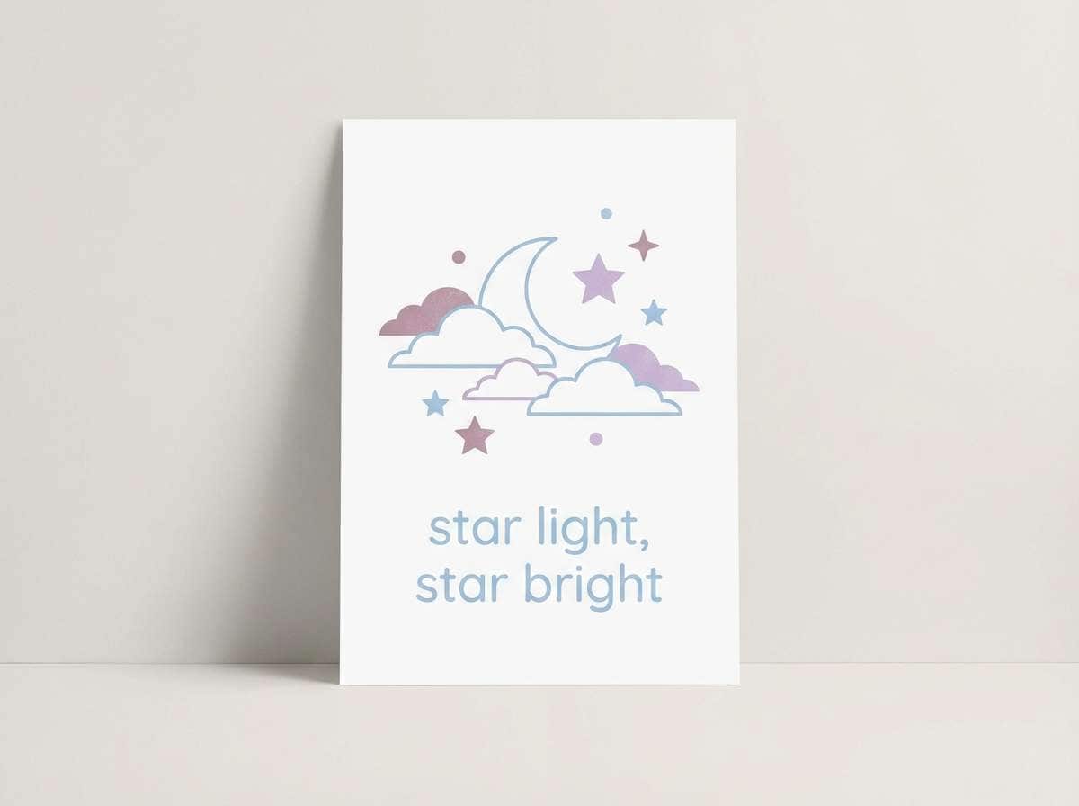
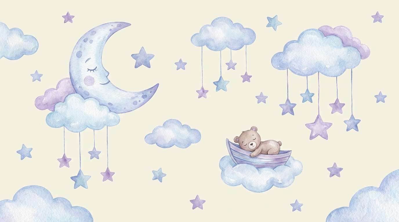
19) Pastel Galaxy Nursery
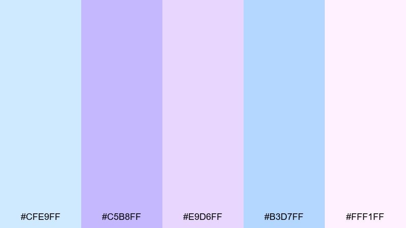
HEX: #cfe9ff #c5b8ff #e9d6ff #b3d7ff #fff1ff
Mood: wholesome, magical, soothing
Best for: nursery mural illustration
Wholesome and magical, like a tiny pastel galaxy painted above a crib. This pastel blue purple color palette helps stars, moons, and clouds feel soothing instead of bright. Pair with warm cream highlights and light gray outlines for gentle definition. Tip: keep the largest areas in the palest blue and sprinkle lilac in small details for depth.
Image example of pastel galaxy nursery generated using media.io
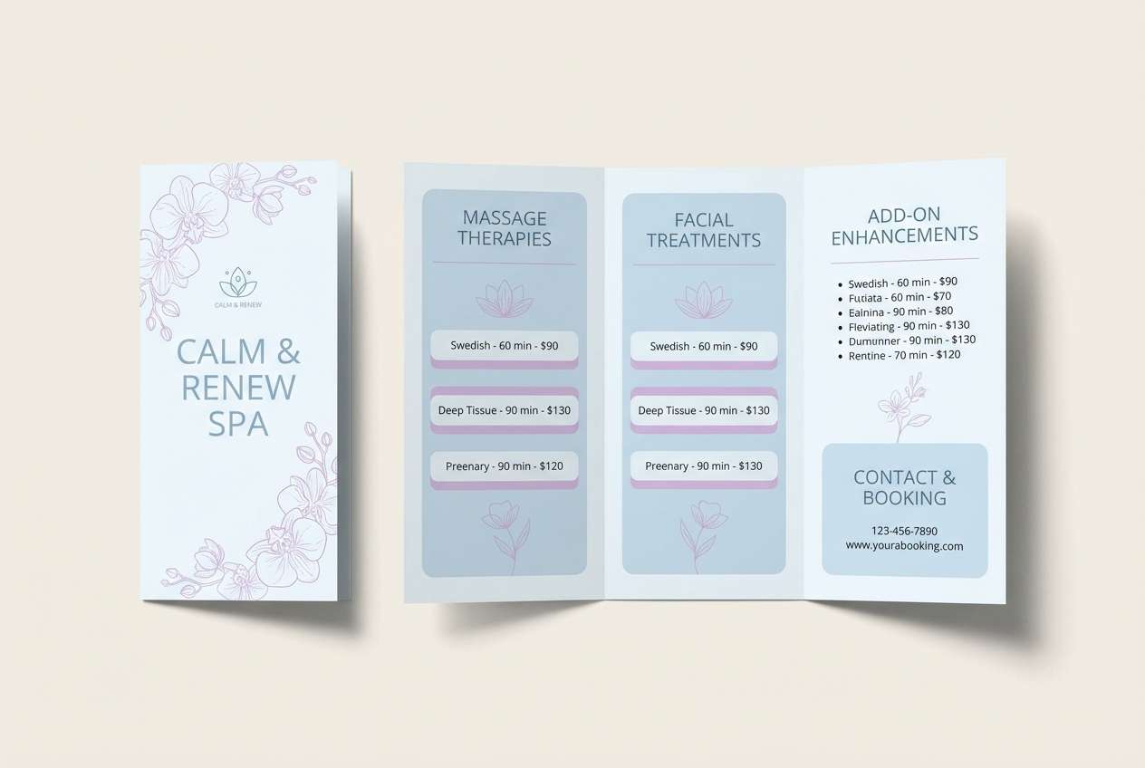
20) Serene Orchid Spa
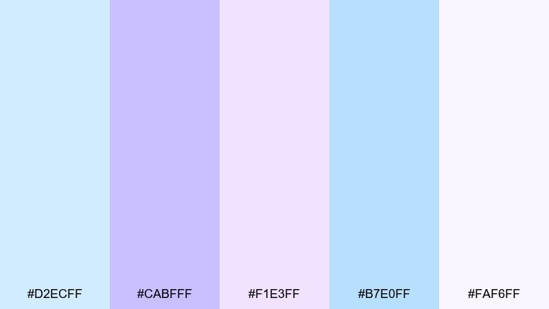
HEX: #d2ecff #cabfff #f1e3ff #b7e0ff #faf6ff
Mood: spa-like, quiet, restorative
Best for: spa service brochure
Spa-like and restorative, like orchid steam drifting through a bright room. The palette supports brochures and service menus that should feel calm and trustworthy. Pair with soft photography and a warm neutral paper tone to keep it inviting. Tip: highlight premium services in the deeper lavender and keep body copy on white.
Image example of serene orchid spa generated using media.io
What Colors Go Well with Pastel Blue Purple?
Neutrals are the easiest match: soft white, ivory, dove gray, and warm greige keep pastel blue-purple looking clean and readable. For typography, charcoal, slate, or deep navy usually performs better than pure black.
To add warmth, try sandy beige, blush, or a muted peach—these create a gentle contrast that feels welcoming. For a fresher, cooler direction, add mint, seafoam, or a pale aqua accent.
If you need more punch (for CTAs or highlights), choose one deeper anchor like indigo, royal blue, or a medium violet—and use it sparingly so the palette stays pastel-forward.
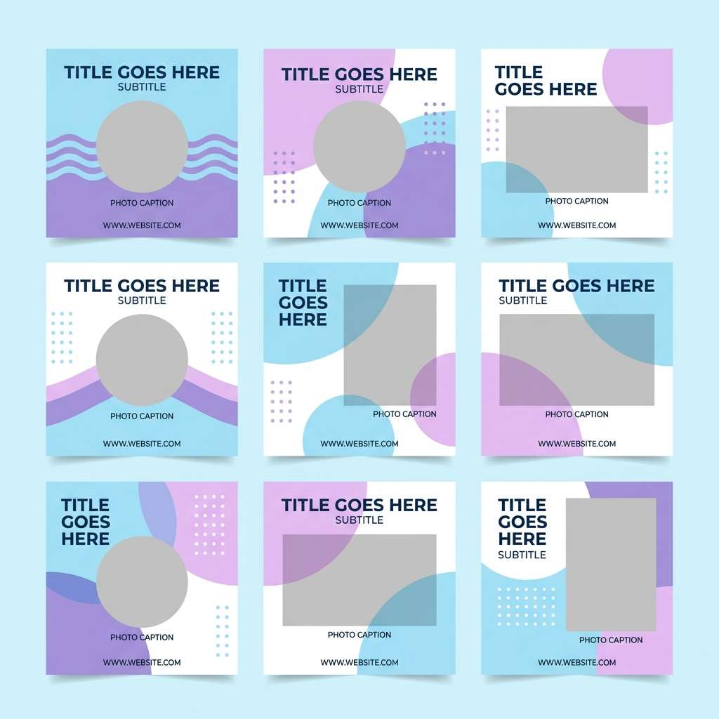
How to Use a Pastel Blue Purple Color Palette in Real Designs
Start with a light base (off-white or the palest blue) and then assign one mid-tone as your primary UI/brand color. Use lavender or lilac as secondary accents for hover states, tags, or small decorative shapes.
Keep contrast intentional: use dark neutrals for text, and avoid placing mid purple text on mid blue backgrounds. If you need gradients, limit them to hero sections or backgrounds so the design doesn’t feel washed out.
For print (invites, brochures, packaging), consider paper texture and finishes. Silver foil, embossing, and matte stocks pair naturally with pastel blue-purple and enhance the premium, calm mood.
Create Pastel Blue Purple Palette Visuals with AI
Want to see these palettes in action before you design? Generate matching posters, UI mockups, stationery, or packaging concepts by pasting the provided prompts into Media.io’s text-to-image tool.
Adjust the prompt with your use case (e.g., “mobile onboarding,” “wedding invite,” “spa brochure”), keep the palette’s vibe, and test a few variations until the visual matches your brand tone.
Once you have a strong concept image, you can extract styling ideas—layout, lighting, texture, and accent balance—then apply the same logic to your final design system.
Pastel Blue Purple Color Palette FAQs
-
What is a pastel blue purple color palette used for?
It’s commonly used for calm, modern aesthetics in wellness branding, skincare packaging, wedding stationery, and UI design. The mix feels soft and premium while still being versatile for backgrounds, cards, and subtle accents. -
How do I keep pastel blue and purple designs readable?
Use dark neutrals (charcoal, slate, deep navy) for text and icons, and keep most copy on very light surfaces. Reserve mid-tone blues/purples for buttons and highlights rather than long text. -
What accent colors pair best with pastel blue purple?
Warm accents like blush, muted peach, and sandy beige add friendliness. Cool accents like mint or pale aqua keep it airy. For strong emphasis, use a deeper indigo or violet sparingly. -
Is pastel blue purple suitable for professional UI (like SaaS or finance)?
Yes—if you anchor it with structured neutrals and strong contrast for headings and key states. Pastels can make dashboards and onboarding feel approachable while still trustworthy when typography and hierarchy are clear. -
How many colors should I use from a pastel palette?
For most designs, 3–5 is enough: one background, one surface/card color, one primary accent, and one or two supporting tints. Too many similar pastels can reduce hierarchy, so assign clear roles. -
Should I use gradients with pastel blue purple palettes?
Gradients work well because the hues blend naturally, but keep them controlled—one hero gradient plus mostly solid surfaces. This prevents the overall design from looking overly soft or low-contrast. -
Can I generate pastel blue purple visuals with AI using these prompts?
Yes. Copy a prompt under any palette, paste it into Media.io Text-to-Image, and tweak keywords like “poster,” “UI kit,” or “stationery” to fit your project while keeping the color direction consistent.


