

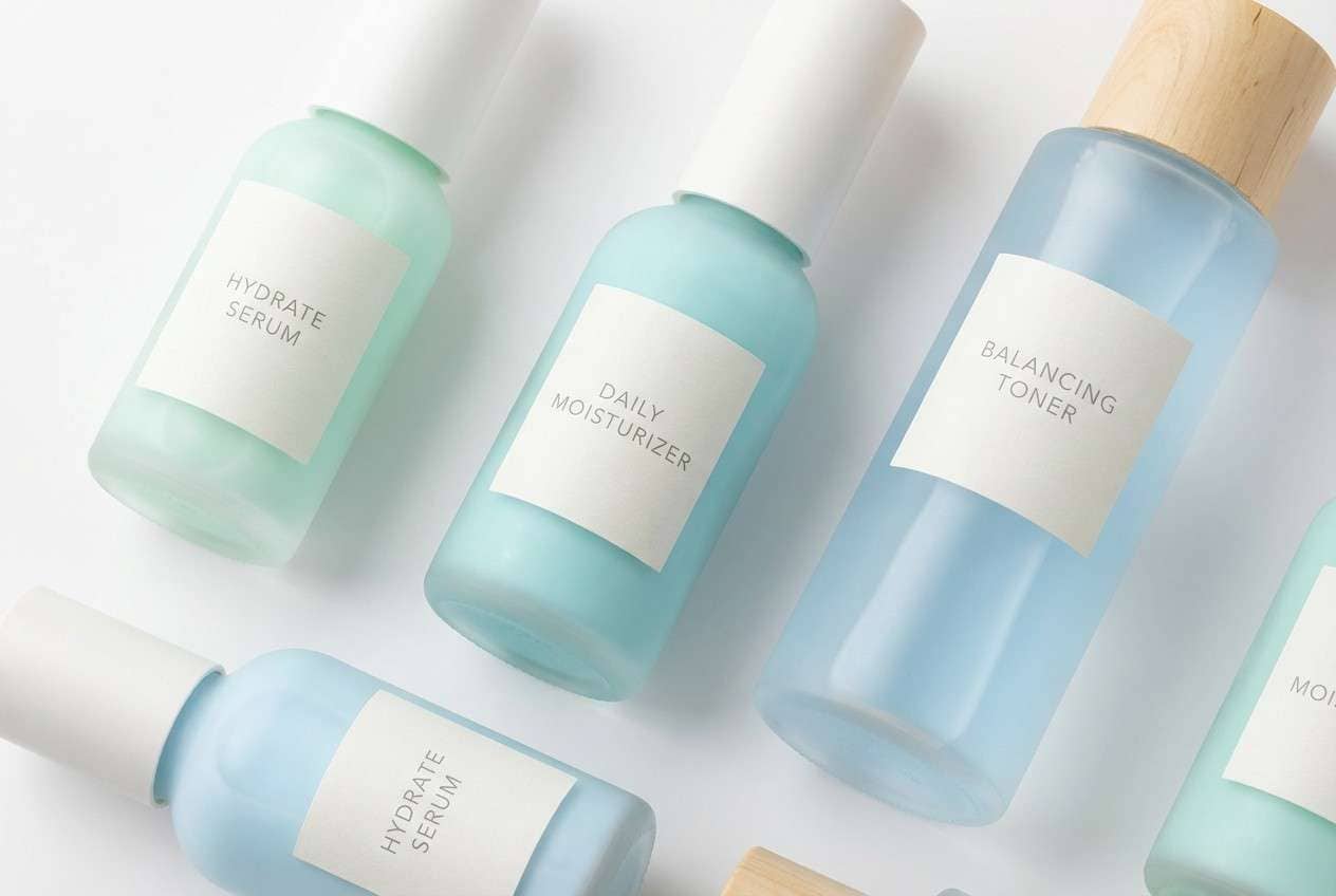
Light blue is one of the easiest colors to design with: it feels open, calm, and modern while still looking friendly across digital and print.
Below are 20 light blue color combinations with HEX codes, plus practical tips and AI prompts you can use to generate clean mockups fast.
In this article
Why Light Blue Palettes Work So Well
Light blue sits in a sweet spot: it reads as clean and trustworthy like traditional blue, but feels softer and more welcoming than dark navy. That makes it a strong choice for brands, UI, and invitations where you want calm clarity.
Because it reflects “sky and water” associations, light blue color scheme also expands perceived space. Used in backgrounds, cards, and large panels, it helps layouts breathe without looking empty.
Finally, light blue prints reliably when you pair it with a stable neutral (white, warm cream, or cool gray) and keep your darkest color for text and one primary CTA. The result is gentle color with clear hierarchy.
20+ Light Blue Color Palette Ideas (with HEX Codes)
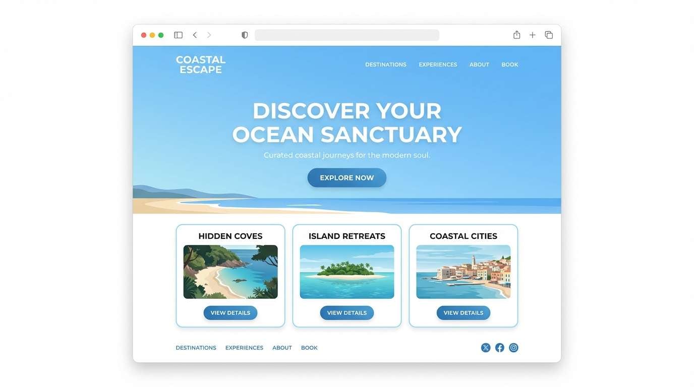
1) Coastal Glass
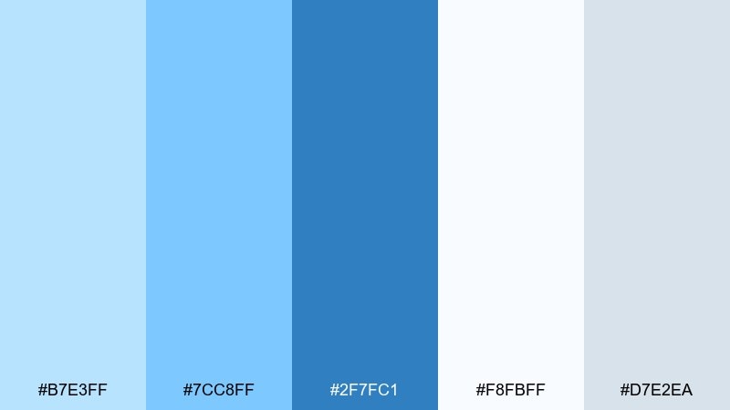
HEX: #b7e3ff #7cc8ff #2f7fc1 #f8fbff #d7e2ea
Mood: breezy, clean, seaside
Best for: travel landing page hero (2d ui mockup)
Breezy and sunlit, these light blue color combinations feel like sea glass and clear morning skies. Use the deeper ocean blue for headings and CTAs, then let the pale blues carry large background areas without glare. Pair it with crisp white and cool gray to keep the layout breathable and modern. Tip: reserve the darkest blue for one primary action to avoid a scattered hierarchy.
Image example of coastal glass generated using media.io
Media.io is an online AI studio for creating and editing video, image, and audio in your browser.

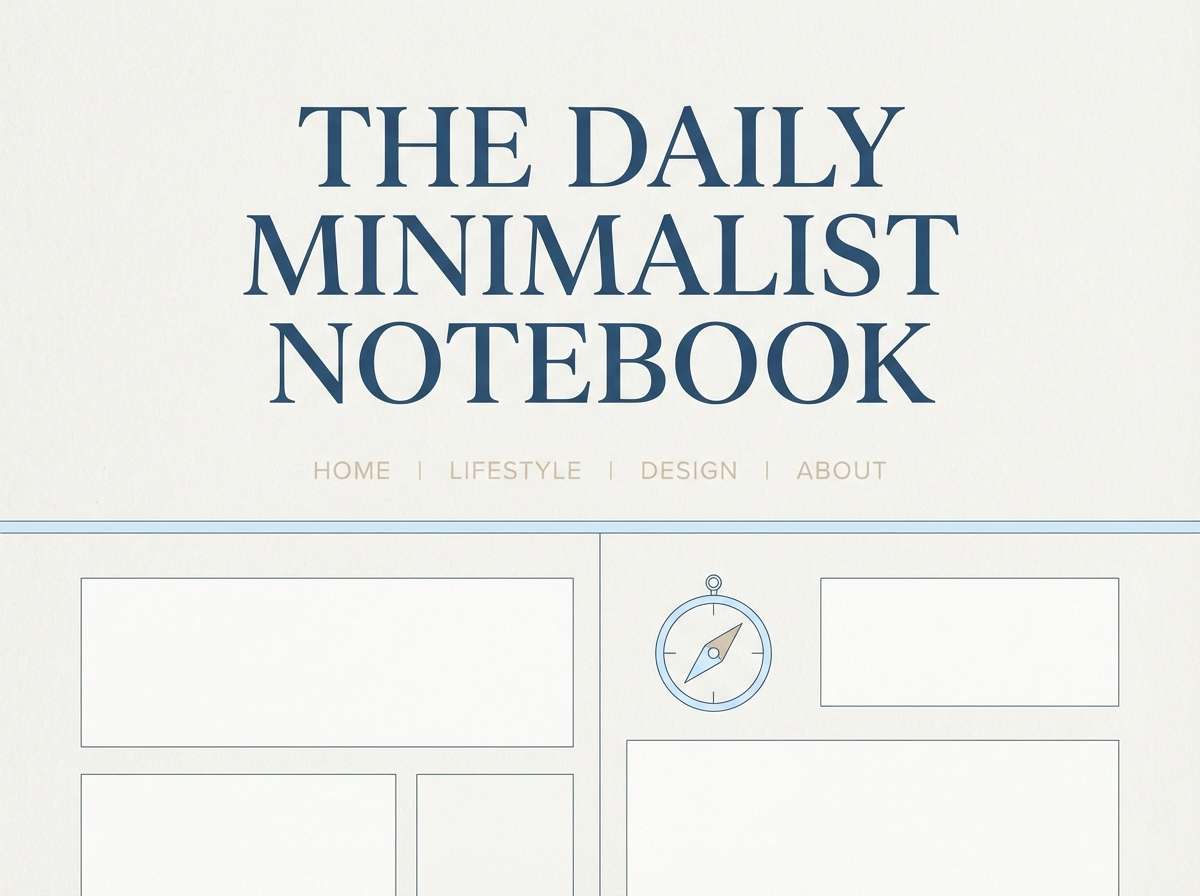
2) Sky Linen
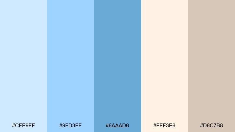
HEX: #cfe9ff #9fd3ff #6aaad6 #fff3e6 #d6c7b8
Mood: soft, airy, warm-cool balance
Best for: lifestyle blog header and section styling
Soft and airy, it reads like blue sky against sun-warmed linen. This light blue color palette works beautifully for editorial headers, pull quotes, and calm background panels. Add the peachy cream as a gentle highlight for badges or category chips, and keep body text on the deeper denim-blue for contrast. Tip: use the beige as a margin or sidebar tone to reduce the feel of stark white.
Image example of sky linen generated using media.io
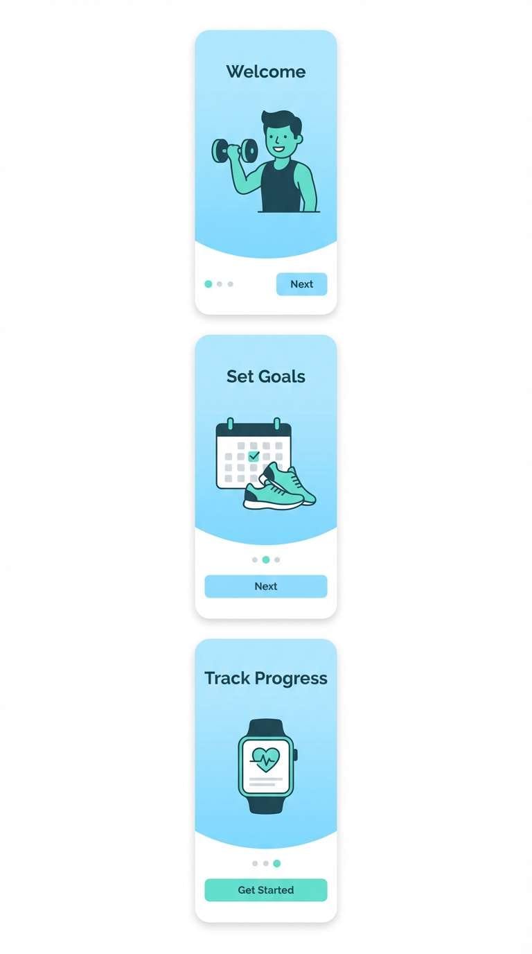
3) Ice Mint Splash
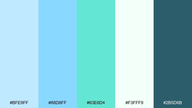
HEX: #bfe9ff #88d8ff #63e6d4 #f3fff9 #2b5d6b
Mood: fresh, sporty, energizing
Best for: fitness app onboarding screens (2d ui mockup)
Fresh and sporty, the mix feels like iced water with a mint twist. Let the aqua-green pop be your progress and success color while the cool blues carry the onboarding gradients. Pair the deep teal with white for legible copy and icons, especially on CTA sections. Tip: keep the mint accent to under 15 percent so the interface stays calm, not loud.
Image example of ice mint splash generated using media.io
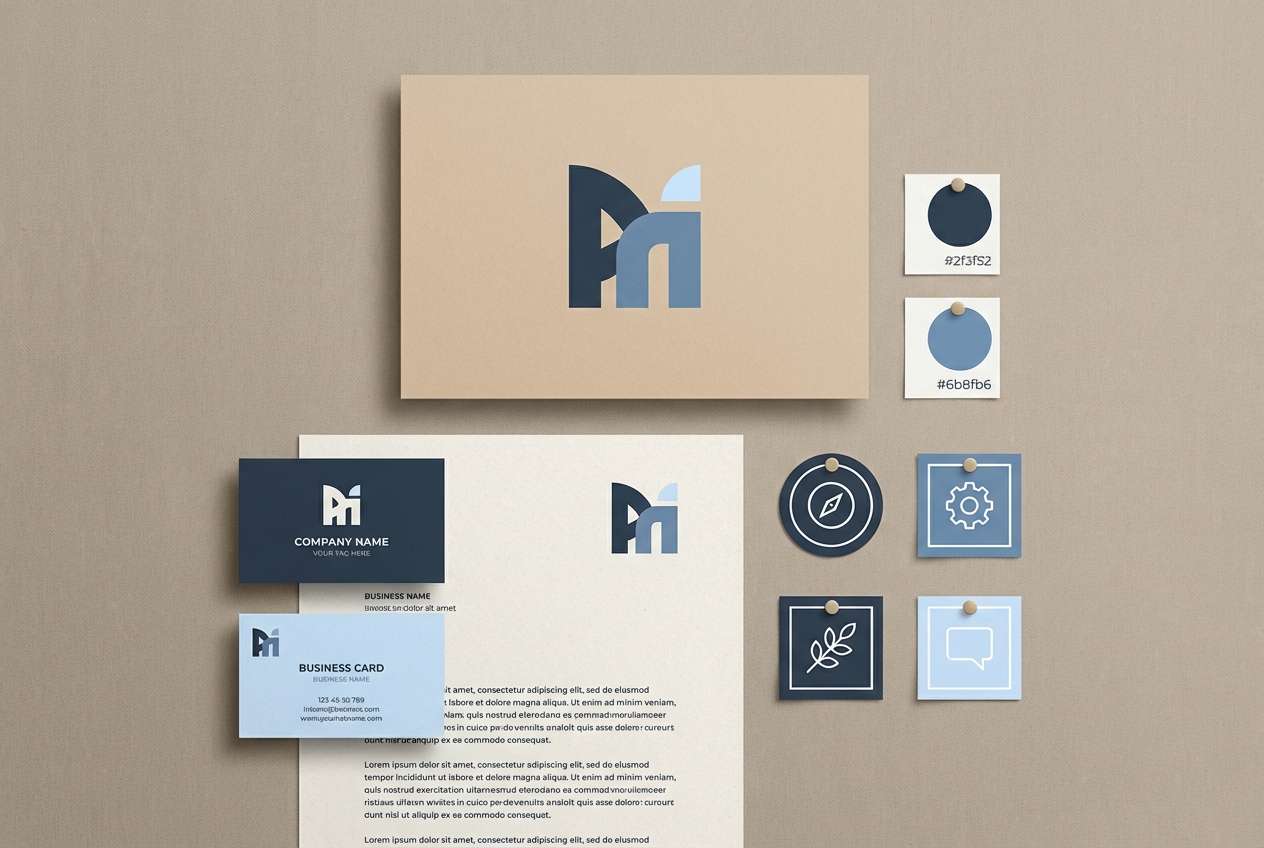
4) Powder Denim
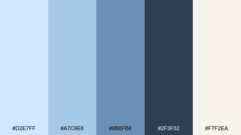
HEX: #d2e7ff #a7c9e8 #6b8fb6 #2f3f52 #f7f2ea
Mood: classic, grounded, trustworthy
Best for: brand identity for a consulting firm
Classic and grounded, these blues evoke worn denim and quiet confidence. Use the darkest slate for logos and headings, and the mid blue for supporting graphics like dividers and icon fills. The warm off-white keeps the set from feeling sterile, especially on stationery and slide decks. Tip: add plenty of negative space so the heavier tones do not read too corporate.
Image example of powder denim generated using media.io
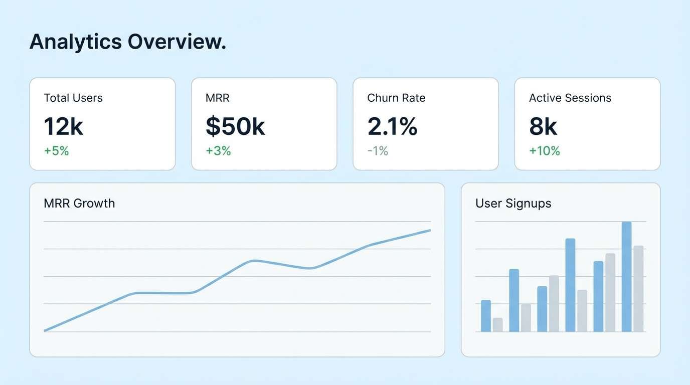
5) Arctic Dawn
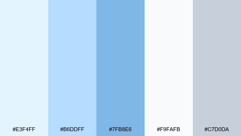
HEX: #e3f4ff #b6ddff #7fb8e6 #f9fafb #c7d0da
Mood: quiet, minimal, luminous
Best for: saas dashboard background and data cards (2d ui mockup)
Quiet and luminous, the colors feel like early light on fresh snow. They are ideal for dashboards where charts need clarity without harsh contrast. Keep most surfaces in the near-white and pale blue, then use the mid blue for selected states and key metrics. Tip: outline cards with the cool gray instead of shadows for a cleaner, modern grid.
Image example of arctic dawn generated using media.io
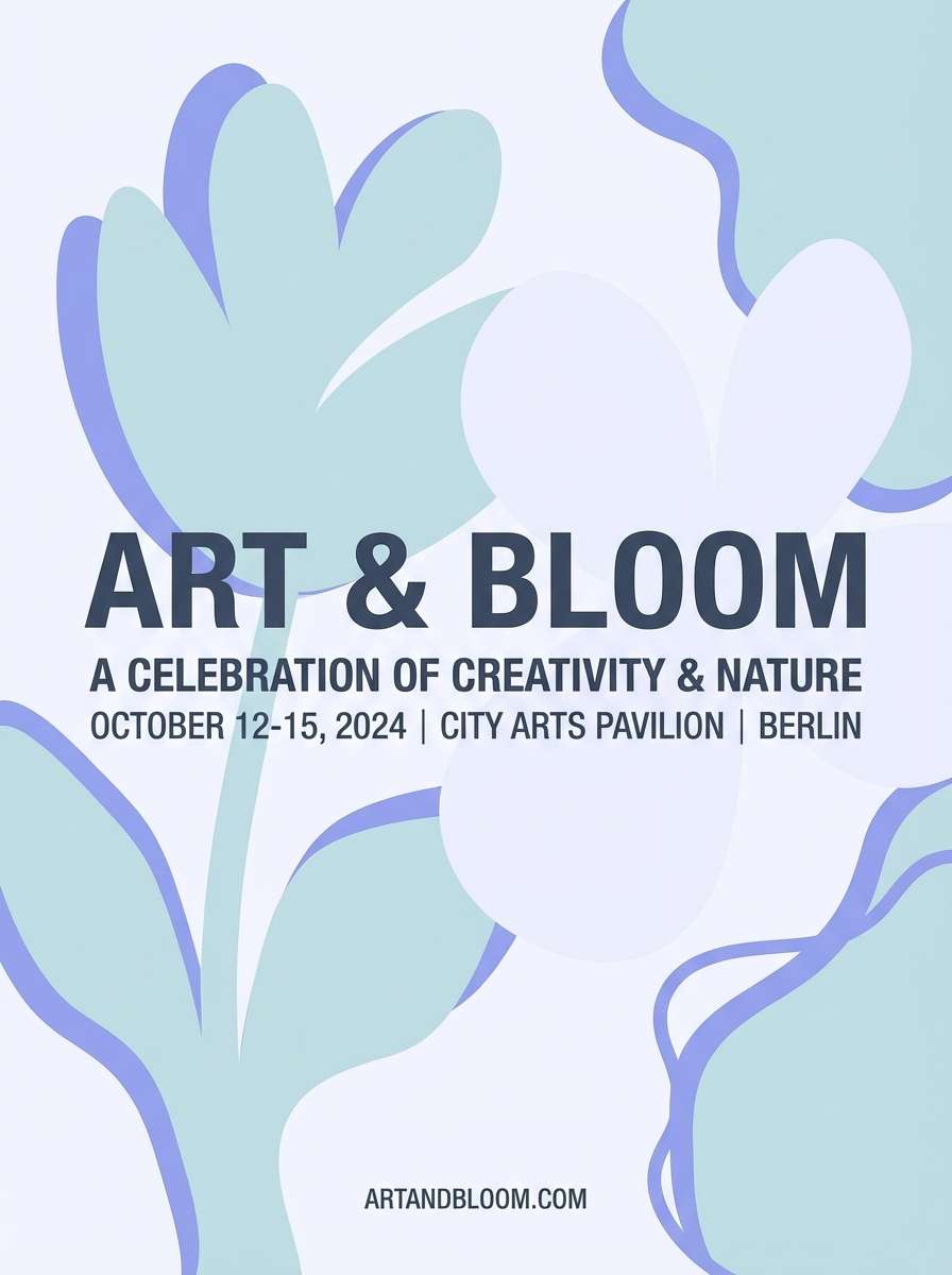
6) Cloudy Hydrangea
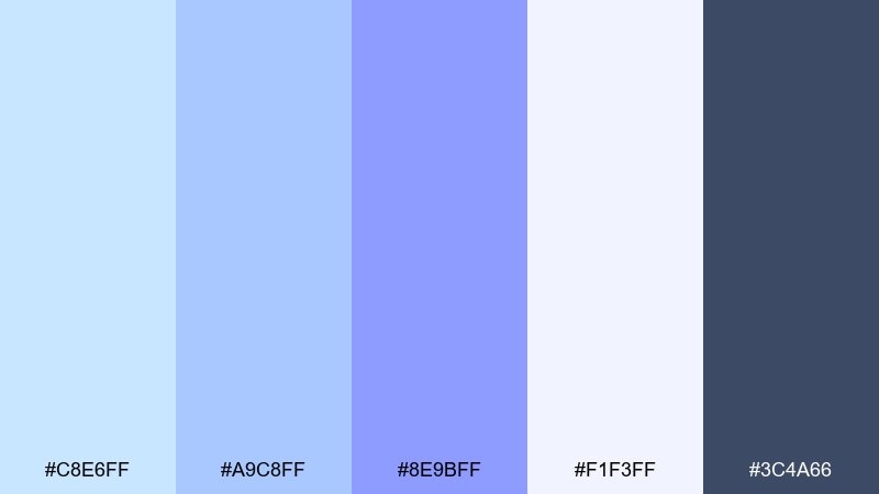
HEX: #c8e6ff #a9c8ff #8e9bff #f1f3ff #3c4a66
Mood: romantic, floral, slightly dreamy
Best for: spring event poster design
Romantic and floral, it brings to mind hydrangea petals under a cloudy sky. This light blue color scheme shines on posters and social graphics where you want softness without losing readability. Pair the periwinkle with deep slate for titles, and keep lavender-white as your negative space. Tip: try a subtle gradient from pale blue to periwinkle for backgrounds instead of flat fills.
Image example of cloudy hydrangea generated using media.io
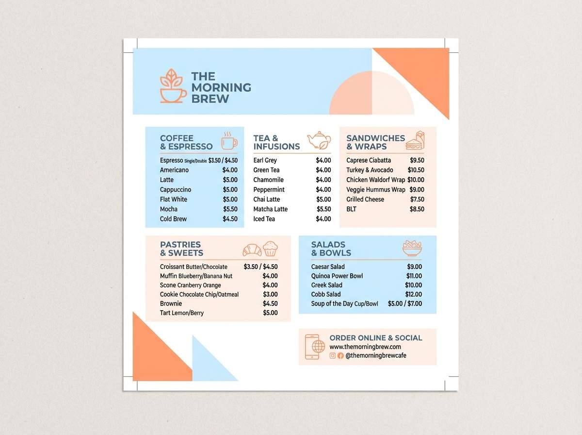
7) Glacier Peach
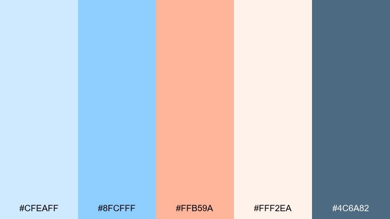
HEX: #cfeaff #8fcfff #ffb59a #fff2ea #4c6a82
Mood: friendly, fresh, welcoming
Best for: cafe menu flyer
Friendly and welcoming, this light blue color combination feels like glacier air with a soft peach sunrise. Use the peach for price highlights and callouts while letting the cool blues structure the layout and section headers. The slate blue anchors typography so the design does not drift into overly pastel territory. Tip: keep peach in small, repeated touches to guide the eye down the menu.
Image example of glacier peach generated using media.io
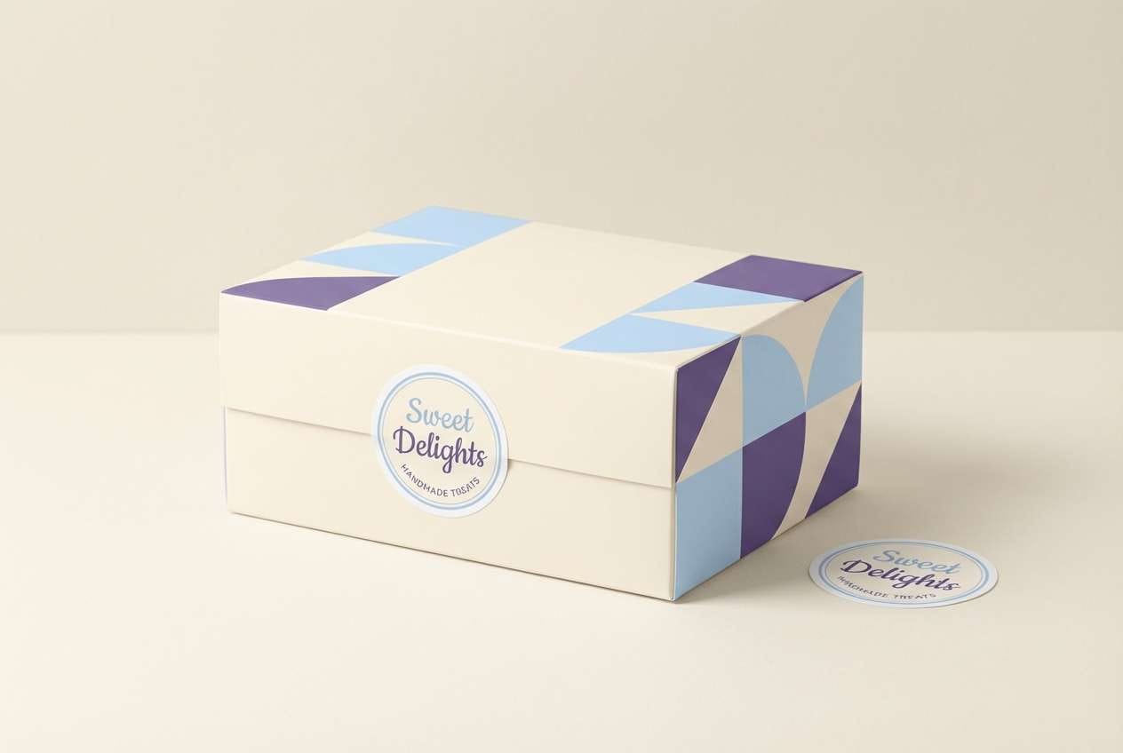
8) Blueberry Milk
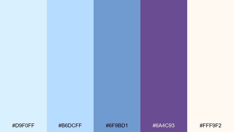
HEX: #d9f0ff #b6dcff #6f9bd1 #6a4c93 #fff9f2
Mood: playful, cozy, slightly whimsical
Best for: dessert shop packaging
Playful and cozy, it suggests blueberry cream and soft bakery lighting. The violet note gives you a surprising accent for logos, stamps, and small illustrations on boxes. Use the warm cream as the main packaging base so the blues look more appetizing and less cold. Tip: print tests matter here, so thicken small violet text to avoid muddy edges.
Image example of blueberry milk generated using media.io
9) Seaside Coral
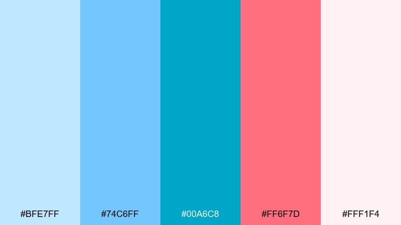
HEX: #bfe7ff #74c6ff #00a6c8 #ff6f7d #fff1f4
Mood: vibrant, summery, upbeat
Best for: social media promo banner
Vibrant and upbeat, it feels like pool water and a coral lip tint. Let the bright coral drive your promo message and discount badges, then soften the rest with pale blush and sky blue. The teal-blue works well for icons and borders where you need a crisp edge. Tip: use coral only on one or two elements per banner to keep scrolling users focused.
Image example of seaside coral generated using media.io

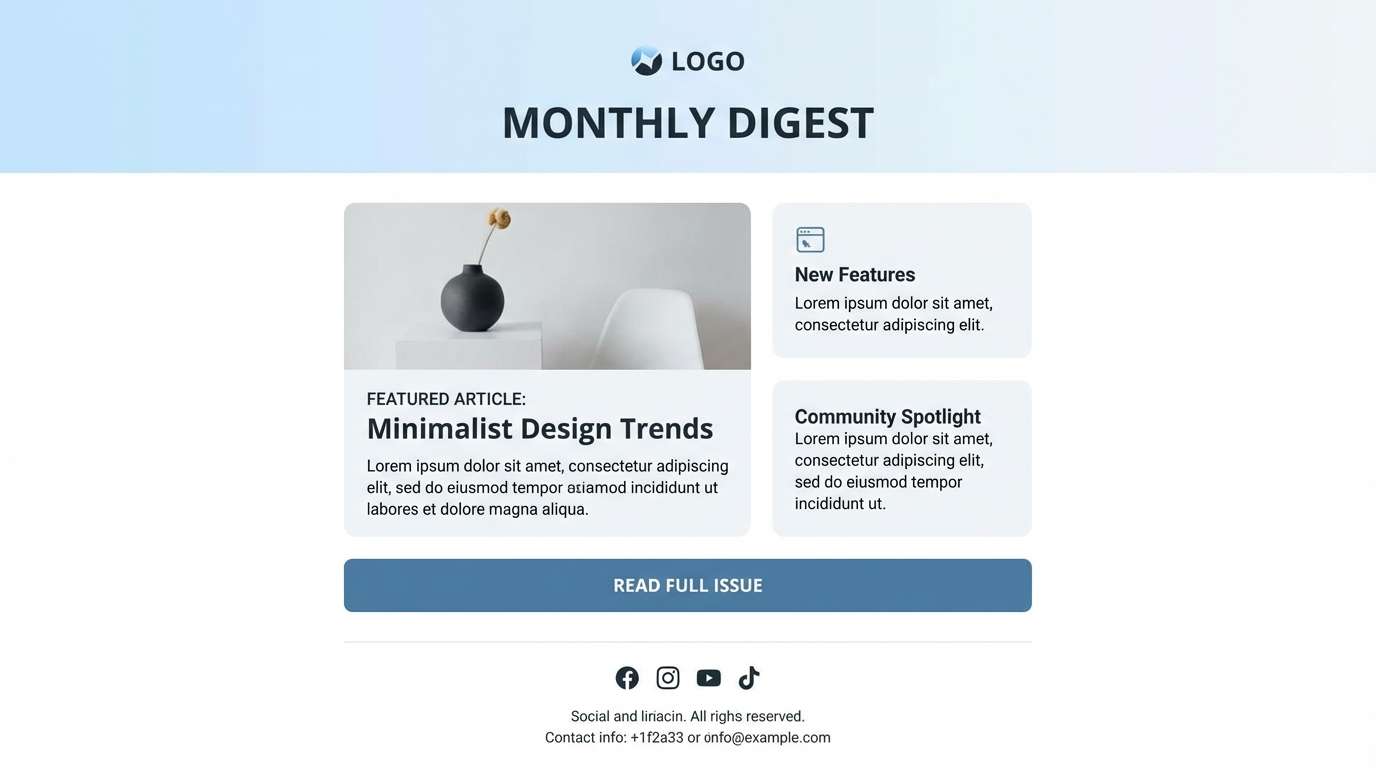
10) Rainy Day Office
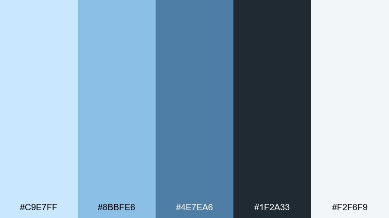
HEX: #c9e7ff #8bbfe6 #4e7ea6 #1f2a33 #f2f6f9
Mood: focused, professional, calm
Best for: email newsletter template
Focused and calm, it reads like rain on a window during a productive afternoon. A light blue color palette like this is great for newsletters where you want trust and clarity without looking stiff. Use the near-black for body copy, the mid blues for section headers, and the pale tones for content blocks. Tip: keep links in the stronger blue and underline them for accessibility on mobile.
Image example of rainy day office generated using media.io
11) Cotton Candy Fade
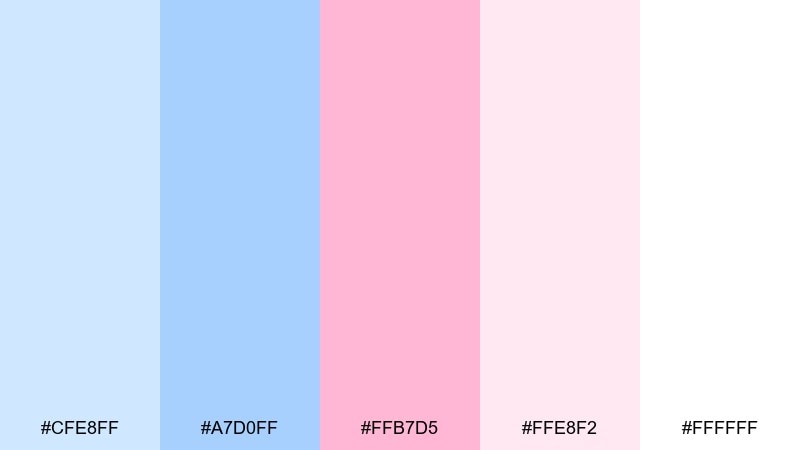
HEX: #cfe8ff #a7d0ff #ffb7d5 #ffe8f2 #ffffff
Mood: sweet, youthful, airy
Best for: beauty product ad creative
Sweet and airy, it feels like a soft candy cloud with a cool breeze underneath. Use the blush pink sparingly for headlines or a single focal product label, then let the blue tones keep everything fresh. White space is your friend here, especially for cosmetics where cleanliness matters. Tip: add a subtle two-tone gradient background to avoid a flat, overly cute look.
Image example of cotton candy fade generated using media.io
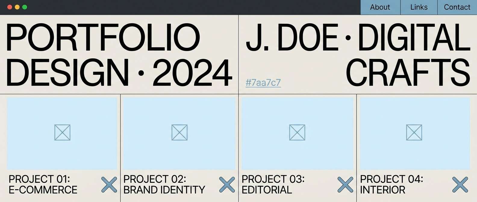
12) Nordic Minimal

HEX: #d6efff #a8d8ff #7aa7c7 #e9e6df #2a2f36
Mood: minimal, modern, design-forward
Best for: portfolio website theme (2d ui mockup)
Minimal and design-forward, these light blue color combinations feel like Scandinavian interiors and pale winter light. The warm stone neutral keeps the blues from turning too cold on large surfaces. Use charcoal for navigation and body text, and reserve mid blue for hover states or small UI highlights. Tip: choose one blue as your primary and stick to it for consistency across pages.
Image example of nordic minimal generated using media.io
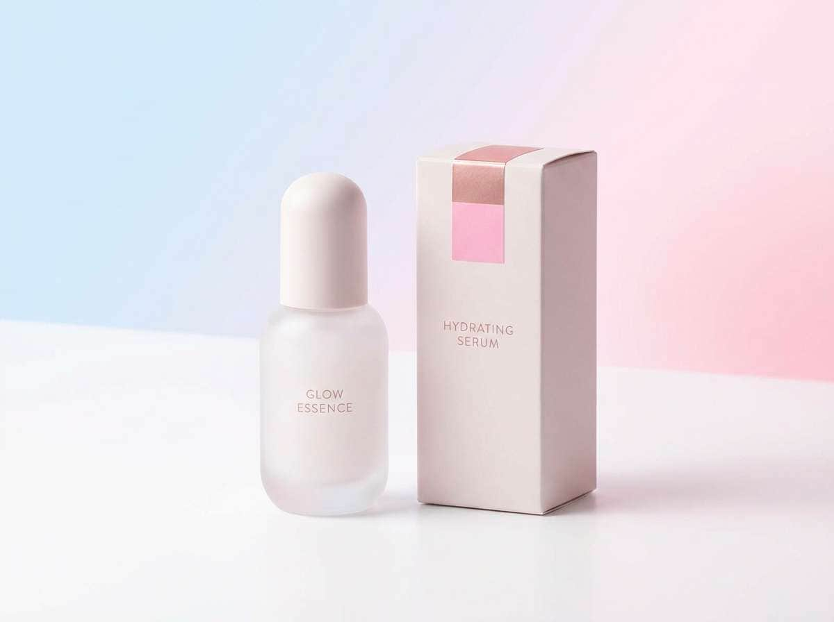
13) Spa Serenity
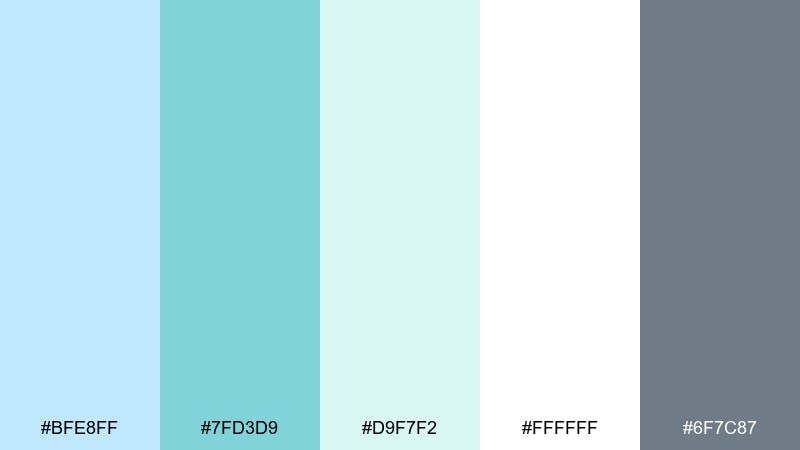
HEX: #bfe8ff #7fd3d9 #d9f7f2 #ffffff #6f7c87
Mood: soothing, fresh, wellness
Best for: skincare packaging label set
Soothing and fresh, it evokes a quiet spa room with cool water and clean towels. The minty aqua is perfect for small accents like ingredient icons and seal marks. Keep the label base white and use the soft blue for panels so the product feels light and premium. Tip: print the gray text slightly darker than you think to maintain readability on matte stock.
Image example of spa serenity generated using media.io
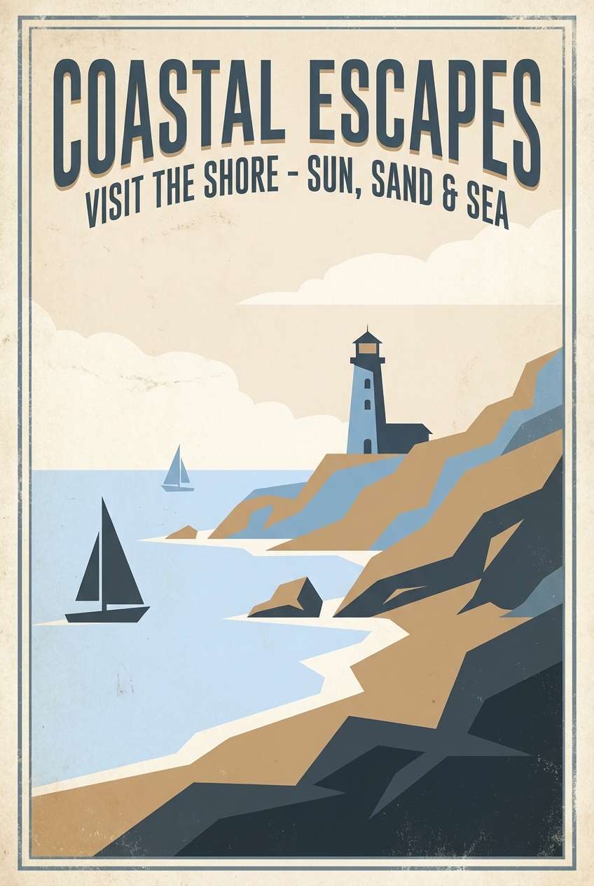
14) Vintage Postcard
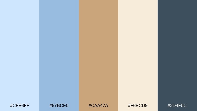
HEX: #cfe6ff #97bce0 #caa47a #f6ecd9 #3d4f5c
Mood: nostalgic, warm, travel-inspired
Best for: retro travel poster
Nostalgic and sun-faded, it feels like an old postcard tucked into a journal. This light blue color combination pairs beautifully with sandy tan for travel posters, menus, or branding that wants a story. Use the cream as the paper base, then layer the blues in blocks and simple illustrations for an authentic vintage feel. Tip: slightly desaturate your photos or textures so they match the mellow tones.
Image example of vintage postcard generated using media.io
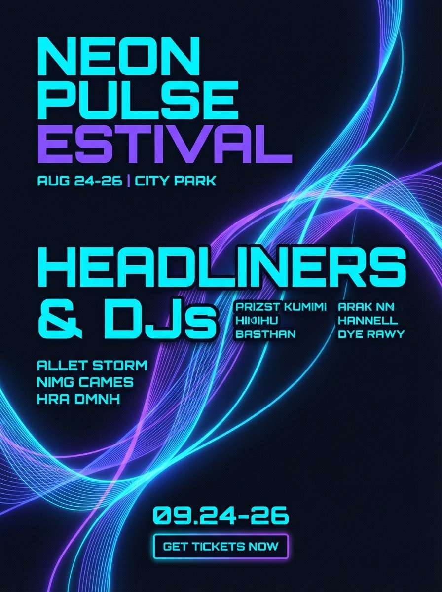
15) Neon Breeze
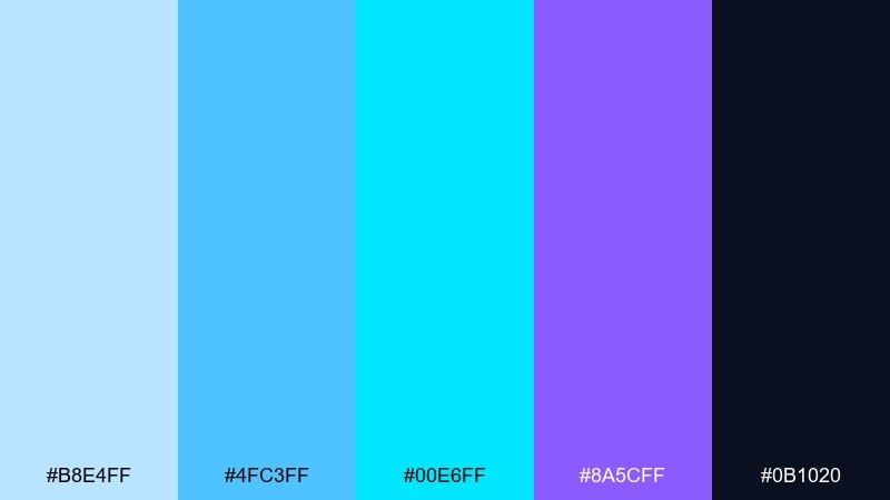
HEX: #b8e4ff #4fc3ff #00e6ff #8a5cff #0b1020
Mood: electric, bold, nightlife
Best for: music festival flyer
Electric and bold, it suggests neon signs cutting through night air. Use the inky navy as the base so the bright cyan and violet glow without overwhelming the layout. The lighter blue can soften large areas like gradients or background shapes behind performer names. Tip: keep type either pure light tones or pure dark tones to avoid low-contrast edges on vivid backgrounds.
Image example of neon breeze generated using media.io
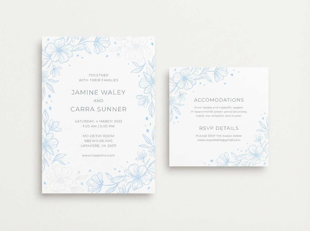
16) Winter Wedding
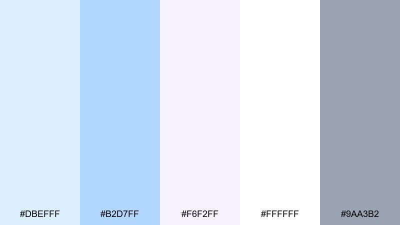
HEX: #dbefff #b2d7ff #f6f2ff #ffffff #9aa3b2
Mood: elegant, icy, romantic
Best for: wedding invitation suite
Elegant and icy, it brings to mind frosted windows and silk ribbons. The pale lavender-white adds a romantic lift while still staying cool and formal. Use the gray for fine print and envelope details, and keep the blues for borders, monograms, and subtle watercolor washes. Tip: embossing or foil on the gray elements can elevate the suite without adding new colors.
Image example of winter wedding generated using media.io
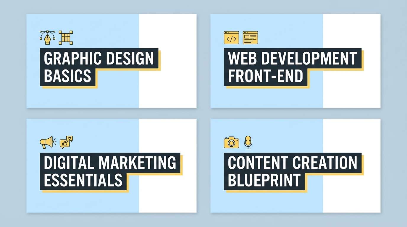
17) School Notebook
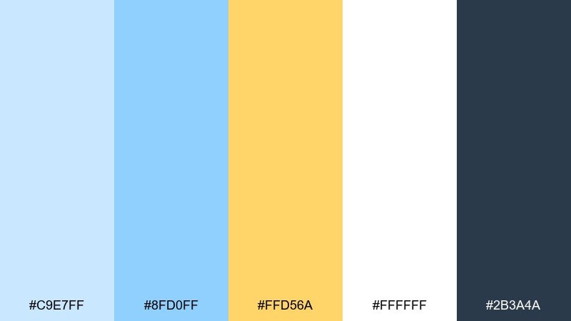
HEX: #c9e7ff #8fd0ff #ffd56a #ffffff #2b3a4a
Mood: cheerful, academic, approachable
Best for: online course thumbnail set
Cheerful and approachable, it feels like clean notebook paper with a sunny highlighter swipe. Use the yellow as a consistent tag color for lesson numbers or topic badges. The darker blue is strong enough for readable titles even at thumbnail size. Tip: keep backgrounds mostly white so the blue and yellow accents stay crisp in platform grids.
Image example of school notebook generated using media.io
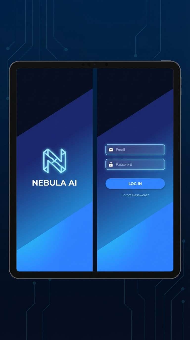
18) Tech Gradient
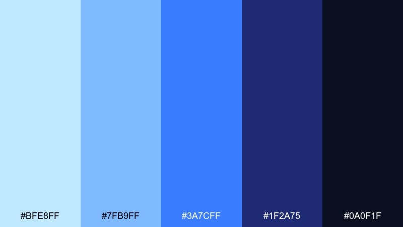
HEX: #bfe8ff #7fb9ff #3a7cff #1f2a75 #0a0f1f
Mood: high-tech, sleek, confident
Best for: app splash screen and login (2d ui mockup)
Sleek and high-tech, it looks like a deep ocean gradient lit by a cold spotlight. Build a strong vertical gradient from navy to bright blue, then keep UI elements minimal so the background carries the mood. Use the pale blue for icons and secondary buttons to maintain clarity. Tip: add a faint noise texture to the gradient to prevent banding on large screens.
Image example of tech gradient generated using media.io
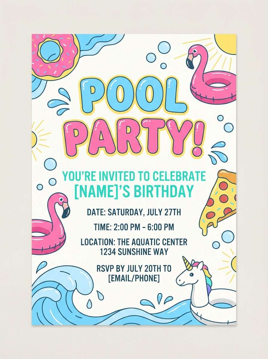
19) Summer Pool Party
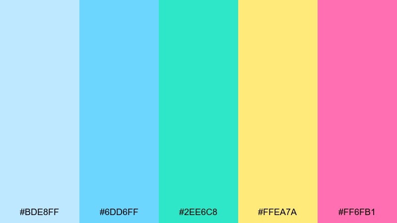
HEX: #bde8ff #6dd6ff #2ee6c8 #ffea7a #ff6fb1
Mood: fun, bright, playful
Best for: birthday party invitation flyer
Fun and splashy, it feels like sunlight bouncing on pool tiles with pops of candy colors. Light blue color combinations like this are perfect for birthday invites, especially when you want energy without going neon. Use the aqua and sky tones as the main background shapes, then punctuate with yellow for key details and pink for the name or age. Tip: keep the type in a dark neutral or very deep teal so it stays readable over the bright accents.
Image example of summer pool party generated using media.io
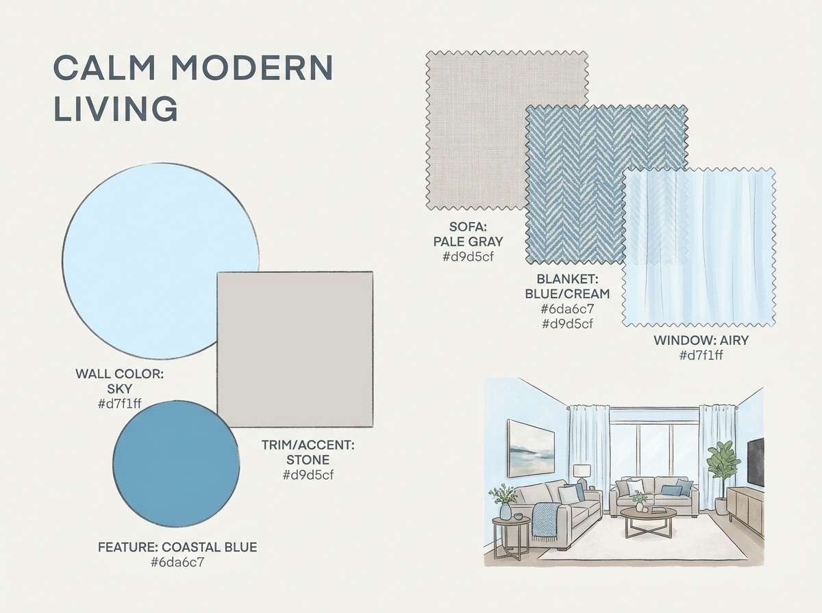
20) Ocean Fog
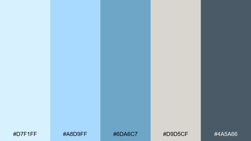
HEX: #d7f1ff #a8d9ff #6da6c7 #d9d5cf #4a5a66
Mood: muted, mature, coastal calm
Best for: interior design mood board
Muted and mature, it recalls ocean fog rolling over driftwood and stone. Use the warm gray-beige as a grounding neutral so the blues feel less icy and more livable. The deeper steel tone is excellent for captions, material labels, and small lines on a mood board. Tip: combine matte textures with a single glossy accent to mirror the soft, misty contrast.
Image example of ocean fog generated using media.io
What Colors Go Well with Light Blue?
Light blue pairs naturally with crisp neutrals like white, cool gray, and charcoal, which helps keep readability strong in UI and print. If you want a warmer, softer feel, swap pure white for cream or sand tones.
For accents, coral and peach create friendly contrast that’s great for promos, invites, and modern branding. Mint and aqua keep things fresh and sporty, while violet or periwinkle can add a playful twist without clashing.
If you need a more premium or high-contrast direction, anchor light blue with navy or near-black. This keeps the palette calm while still giving you a strong hierarchy for headlines and CTAs.
How to Use a Light Blue Color Palette in Real Designs
Start by choosing roles for each color: a main background (often the palest blue or off-white), a surface color for cards, a text color (charcoal/navy), and one accent for CTAs or highlights. This prevents “all pastel” designs that feel flat.
In UI, use light blue for large areas (hero gradients, panels, empty states) and reserve stronger blues for interactive elements like buttons and links. In print, keep light blues slightly desaturated and always test proofing to avoid unexpected shifts.
For branding, repeat your accent color in small touches (badges, icons, dividers) rather than big blocks. That repetition builds recognition without overpowering the calm, airy light-blue base.
Create Light Blue Palette Visuals with AI
If you want to see how a light blue palette behaves in a real layout, generate quick mockups with AI. It’s a fast way to test contrast, hierarchy, and mood before you commit to a full design system.
Take any palette above and reuse its prompt as a starting point, then swap in your product type (app login, poster, packaging) and your HEX codes. You’ll get consistent variations you can compare side by side.
Light Blue Color Palette FAQs
-
What is a “light blue” HEX range for design?
Most light blues sit in high-lightness values with lower saturation, often around HEX like #BFE8FF to #D7F1FF. The best range depends on your background and text contrast, so test with your typography colors. -
Does light blue work well for branding?
Yes. Light blue communicates calm, clarity, and trust, which is why it’s common in wellness, SaaS, education, and lifestyle brands. Pair it with a darker anchor (navy/charcoal) to keep logos and headlines crisp. -
What accent color looks best with light blue?
Coral and peach are popular because they add warmth and focus without feeling harsh. For a cooler accent, try mint/aqua; for a bolder accent, try violet or deep navy. -
How do I keep a light blue UI from looking washed out?
Use a strong text color (near-black or deep slate), increase spacing, and reserve one darker blue for key interactive states. Also ensure buttons meet contrast guidelines against light backgrounds. -
Is light blue good for print invitations?
Yes, especially for weddings, baby showers, and summer events. Use a warm paper-like neutral (cream/off-white) and keep fine text in gray or navy to avoid faint, low-contrast printing. -
Can I use multiple light blues in one palette?
You can, as long as each shade has a clear role (background vs surface vs highlight). Add one dark anchor and one accent so the design has structure and doesn’t feel monochrome. -
How can I preview light blue palette ideas quickly?
Generate mockups using AI with prompts like “dashboard UI,” “invitation suite,” or “packaging label,” then specify your five HEX codes. This helps you evaluate hierarchy and mood before building final assets.
Next: Birthday Color Palette


